By now you’ve probably all read about our new nailhead ottoman. And in inviting that plush little pouf into our master bedroom, the white pedestal table that used to live next to our leather armchair was sadly displaced. But not for long. We’d been meaning to upgrade our wicker hand-me-down table in the den (actually a relic from John’s older sister’s childhood bedroom) and we finally had our chance.
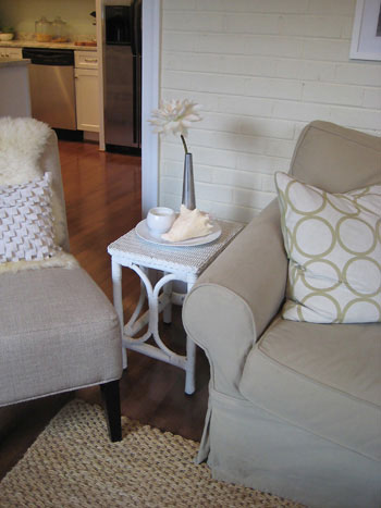
Enter the displaced DIY pedestal table stage left (you can check out how we made it here). It’s the perfect size for the larger furnishings in the den, and it’s endlessly more functional than our old teeny weeny wicker table that lived there before.
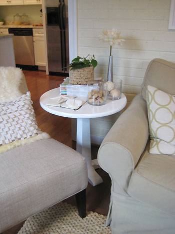
And the back of the table is actually seen just as often as the front (thanks to the fact that it lives near the super wide pass-through to the kitchen) so we’re thankful that this table looks as good coming as it does going.
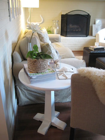
And while we’re on the subject of our new side table, we thought we’d take the opportunity to talk a little bit about tablescapes. We’ve recently received some requests for tips on displaying objects so they look chic and uncluttered, so here they are:
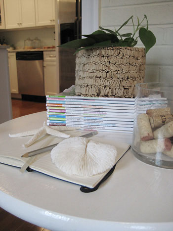
Position things at a few different heights. We like to use the “spiral rule,” where objects stairstep their way down in height. The vase is our tallest object, followed by the nearby stack of magazines topped with a planter. Then the two cylinder vases step down in height once more, and the notebook paired with two sea inspired “paper weights” is the lowest profile object of the bunch. By displaying things that are graduated in height, they look varied enough to keep things interesting and less chaotic than anything astronomically taller or shorter than the rest of the objects.
Select objects that relate to each other in some way. By choosing the natural fiber planter, the textural corks and the woven decorative balls in the vase, there’s a common underlying natural feeling that is carried around the tableau. Then the white of the flower, the sea life and the notebook complement the glossy white of the pedestal table and the repeated cylinder shape of the glass vases and the planter also relate to each other (and the shape of the table) for subtle cohesion that ties everything together. Of course this principal also works with a large grouping of super similar objects like colorful glass vases, a collection of candlesticks or white ceramic pottery. Instead of spreading out like objects, why not display them all in one place for maximum impact?
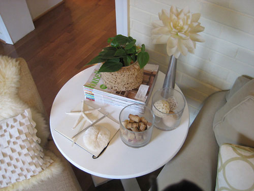
Edit ruthlessly. I know it sounds like an obvious tip, but your spaces won’t look cluttered if you take a good look at them and remove the offending clutter. This table could accommodate more magazines, some books, a box full of our TV remotes, some candles, etc. But we drew the line at a few choice objects that we love, which we can better appreciate without a sea of other items that compete for our attention. Plus there’s room to set down a drink, which is always important for a side table.
There’s magic in odd numbers. This is a basic decorating principle that is worth its weight in gold. For some mystical reason, an even number of objects can look very static and ho-hum (picture a dining room table with just two matching candlesticks on display). Meanwhile, a grouping of three or five objects is instantly more dynamic and interesting (especially when the items have something in common and are stairstepped). You’ll notice that if you count the groupings on the table above, you’ll see that there we happened to land on a display with five distinct “parts” (the tall flower vase, the two cylinder vases, the magazine stack with the planter on top, and the notebook/sea life display).
So there you have it. A few simple tips for creating fresh and fabulous little vignettes throughout your home. Happy tablescaping! And what about you guys? Do you have any more tableau tips for creating eye-pleasing arrangements with the objects that you already have around the house? Do tell.
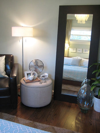
And of course we can’t go without taking one last look at the new bedroom ottoman that inspired the whole table switcheroo. Thanks little guy.
For more accessory arrangement tips, check out this bevy of articles on BHG

Lindsay says
Love it!
Melissa says
The table looks great there, much better than the wicker table. Now i’m just as curious to know if you found a new home for the wicker table.
My mom is odd number crazy. It is like a OCD thing for her.
YoungHouseLove says
The funny story about the wicker table is that by placing it in a little nook in our hallway to get it out of the way while we moved things, it actually inspired a bigger DIY project so stay tuned for those details as soon as we work up the energy to get out our hammers and anchors and saws.
xo,
Sherry
sarah says
ok, i have to ask- is it a pain to dust all those little things? it looks good, but i hate dusting!
Averill says
Your “old” table looks great in the living room — definitely a better home for it than its former spot in the bedroom.
LeeAnn says
The table does look more at home in the den! When I saw your post yesterday on the ottoman I knew immediately where you got it, because I was eyeing it as well. :) I love reading your blog since you are in Richmond. My SIL lives down there and we plan on making another visit V-day. My husband and I are going explore downtown Richmond while we are visiting. I have been reading through your old posts picking out objects of interest. However, I am still stuck on where a good place to eat lunch would be. Any favorites of yours?
Kelly says
I see you are a fan of House Beautiful as well. I was wondering what other magazines you frequent for inspiration – I already know Domino will make the list!
YoungHouseLove says
LeeAnn- As for where to go for lunch, there are so many great places. Our favorite is probably Zuppa or Cafe Gutenberg. Have fun!
And about Sarah’s dusting question, I just putter around once a week or so with a swiffer duster pad (meant for the bottom of the swiffer, but used with my hand on tabletops and shelves) and shift stuff slightly this way and that til I snag all the dust and move on to the next surface. I actually don’t mind dusting since my swiffer duster pad discovery. Oh and I have another seriously amazing cleaning product discovery, so stay tuned for a post all about cleaning tips and tricks. Wheee!
Kelly- when it comes to which mags we enjoy, we never met a magazine we didn’t like. House Beautiful, Domino, old issues of Cottage Living and Better Homes & Gardens are just some of the mags that we keep on hand for inspiration. We also love Do It Yourself magazine, Real Simple, Traditional Home, Coastal Living, Elle Decor, and R Home magazine here in Richmond. And that’s just the tip of the iceberg. Thank goodness for Barnes & Noble (or we’d have about a million subscriptions)! Oh and John loves Men’s Health Living. It has only come out two times but he really enjoys ’em.
xoxo,
Sherry
Bethany at Emmy Lu says
The table looks completely at home in your den! Just love it! And thanks for the quick how-to on dressing a tabletop. I definitely have a few sidetables and nightstands that could use a little “refreshing”.
Christy says
Great switcheroo! The poof looks perfect in it’s new home & the white table looks amazing in it’s new home. It was meant to be!
G&D says
The table looks great there! Fabulous upgrade!
Sandy says
I use “swiffers” for dusting too! Great for chair rails, windowsills, baseboards. Oh and the pedestal table looks much more at home in the LR! It all worked out for the best! Loved the tips on creating appealing tablescapes as I’m always looking for ideas in that regard; I also live by the rule of 3.
Emily says
The round table looks fabulous in that room between sofa and chair! I love a switcheroo that updates not just one, but two rooms!
heather s. says
The table looks great there!
kate says
You are so good at what you do! I especially love the spiral step tip for tables. Accessorizing is my downfall – do you have any tips for decorating shelves?
erin says
I read once that even numbers (for a very balanced look) creates a very formal feel to things when decorating, and odd numbers creates an informal feel. Maybe that is why groupings of 3 and 5 feel so much better and is more interesting?
heather s. says
I forgot to say yesterday that while I love where the table was moved I think there is too much on it. I think the purpose of a table is to actually use it – have room for a glass of water or to set down a book or whatever else you are doing without having to move a lot of decoration out of the way. When the table is so staged like this and the one in your bedroom there just isn’t much space for actually *using* the table. I guess I’m all about function.
YoungHouseLove says
Hey Heather,
We definitely agree that form is nothing without function! Since we have two ottomans right in front of the couch (serving as both flexible seating in a pinch but most of the time as foot rests/places to lay a book or a magazine) we already had the “place to put a book or magazine down” thing covered. But we did long for a hard surface (since the ottomans are leather) to place a drink and we’re super thankful that our new table facilitates that need, in fact SOMEONE had two glasses sitting on the table yesterday (one from last night and one from the night before). I’ll not mention any names (cough…john..cough).
In short, we absolutely agree that figuring out what you need from each piece of furniture is a vital part of deciding whether it will work in a space, and we’re thankful that between two ottomans and a “new” side table, our little den arrangement can meet all of our needs. Life is good when there’s a place for tea and a magazine.
xo,
Sherry
heather s. says
Makes sense. :) I was thinking more of the person in the slipper chair since it appears in the pic that the ottomans are a little further away and they would just have use of the table (though I suppose you could just move one closer if you wanted to use it as well). Don’t get me wrong – my tables have things on them but the front portion of the table is always clear for people to place things on.
I do love the jar with corks in it and need to invest in one. I save corks from special events and it would be nice to have something like that to display them in where I could see them everyday.
Vida says
I respectfully disagree. The pedestal table looks too high for the surrounding furnitureand the feet look fussy and unsteady (especially with so many things on the table). You need something the height of the ottomans or even slightly lower.
I also think that there are too many objects on it to be useful.