When Brieanne sent over her amazing nursery before and after pics we couldn’t wait to share the major transformation. Here’s her letter:
Last year my sister asked me (her younger sister with the architecture degree) to help her with her nursery for my future (and now completely adorable) niece Claire. Because my sister and brother-in-law could possibly have more than one child in their current space, they wanted a decently gender neutral nursery. Beginning with some bedding by Skip Hop my sister loved, we started a “mood board.” The criteria: gender neutral, simple, non-cluttered and CHEAP. Jen (my sister) wanted something fresh and relaxing for herself, knowing the nursery would be mostly for her enjoyment. Armed with these thoughts, I decided to do a modern ode to “The Little Prince,” even though the baby was/is a girl–it was one of my sister’s favorite stories growing up. Hope you like the nursery as much as I enjoy your blog! – Brieanne
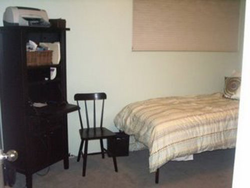
Here’s the room serving as a half-hearted guest bedroom before the big makeover:
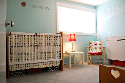
And here it is now after it has been transformed into a lovely nursery for baby Claire:
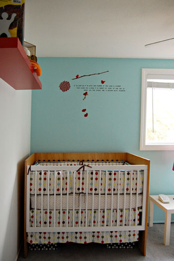
Oh and here’s a resource list from Brieanne:
- Crib and changer: Cub Kids by NettoCollection
- Toy box: my sister’s from when she was a kid
- Rocking chair: my grandmother’s
- Bedding: Mod Dot by Skip Hop, given to my sister by her inlaws
- Side table: LACK table by Ikea.
- Shelf: LACK shelf by Ikea
- Lamp: Confiscated from another room (lampshade from Ikea)
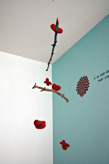
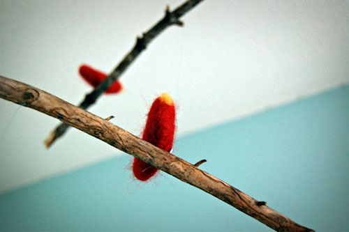
- Mobile: needle felted birds made from red wool, hung on sticks found at our family cabin in Lake Tahoe, all assembled by me “on site.”
- Mural: painted by me, blown up with a projector, image from “The Little Prince”
- Decal: Bloom, by Elephannie @ etsy.com
- Quote: stick on letters. The quote says:“It is just as it is with the flower. If you love a flower that lives on a star, it is sweet to look at the sky at night. All the stars are a-bloom with flowers.”
Didn’t Brieanne and her sister do a great job making that room cozy and adorable for the lucky little lady? Let’s play a little game we like to call what’s-your-favorite-part? We love everything from the mobile to the charming quote on the wall so it’s truly a tough call.
Update: Brieanne actually does have a blog and just shared the addy with us. Feel free to pop by and ogle the eye candy.

adhocmom says
That quote is so sweet! Really good idea. I want to put one on my daughter’s wall right now!
x,
Paula
http://www.adhocmom.com
Carol N. says
Wow, it is hard to pick a favorite. I love that the nusery is a nod to her sister’s favorite story. I think maybe the mobile is my favorite because I love hand made things. And the fact that the sticks came from their family home is special.
margie says
Does Brieanne have a blog?
YoungHouseLove says
We always link to people’s blogs if they have one so sadly she doesn’t. She should though, huh?!
xo,
s
Shelley @ Green Eggs & Hamlet says
Youngsters, can you please post a picture of the mural that’s the image from “The Little Prince”? All I see is the decal mural and I’d love to see the other one too.
Great nursery! The mobile is my favorite part, especially because it is handmade and has special connection to the family’s Tahoe cabin.
YoungHouseLove says
Hey Shelley,
The first photo shows both wall murals/quotes. One is an image based mural (you can see it on the right, it’s those birds flying to the right) and the quote on the left is the Little Prince inspired phrase with the pretty bloom next to it. Hope that helps to clarify!
xo,
s
Kasey at Thrifty Little Blog says
I love that it’s blue, but still so girly. Those little red accents are too cute, especially in the mobile. Well done!!
Jessica @ How Sweet says
Love the wall colors. Gorgeous!
K says
I love this room. Aqua and poppy-red is one of my favorite color combinations. And I love the Mod Dot pattern by Skip Hop. It is beautiful – what a great gift to her niece.
Lauren says
I can’t wait to see what color y’all are painting the nursery. We have our first baby coming in July, and I might just be waiting to start on the nursery until I get some good inspiration from you two…no pressure. :)
ps. I think we need a bump update!
YoungHouseLove says
No worries! The next nursery post (coming this Thursday) not only reveals our paint colors but also my bump. It’s a two-for-one deal!
xo,
s
Hege says
wow, lovely colours… I am thrilled!
Amanda says
I love the mobile. This bed room makes me want to go out and rent The Little Price as sadly I’ve never heard of it till now !
susan says
what fabulous color choices they made for making this a gender neutral nursery. i love it!
susan says
the little prince is also one of my favorite books. but i didn’t ever hear it read as a child. i picked it up after reading something about how much s.p. morrissey or morrissey and the smiths fame loves it! every kid should have it read to them, though :) and every adult, for that matter!
Emily A. says
I absolutely love it!
I’m marking it in my inspiration bookmarks!
Well done!!
Heather says
I am in love with the quote and the creamy blue wall color! It doesn’t hurt that this is my favorite color combination of all time.. Well done!
Amanda says
My favorite thing may be the mobile. And I love how it’s blue. It’s completely gender-neutral, and still baby-centric. What a great makeover!
Katie says
Adore the mobile- so creative and beautiful. Lucky baby Claire! The wall color is gorgeous, too.
Carole says
love, love, love, the felted birds–can grown-ups have mobiles in their bedrooms?
the colour scheme is great, too! what a lucky baby!
CarMaj says
Love that crib! The whole room is wonderful – great job!!
Leigh says
I love this nursery. It’s so cute and happy. I would love to know the name of the blue paint they used on the wall.
Jennifer says
I love the aqua/red color combo. I painted my kitchen aqua (or Tiffany blue as I call it) a while ago and never would have though of red as an accent color until I saw a magazine spread using it. I looks great in a nursery too! Calm with a dash of energy:)
Sara B says
I love love LOVE the mural, with the birds on strings!
Brieanne: if you are reading, did you paint that or was is something you purchased? If you purchased it could you share your source. I would love something like that.
(I love The Little Prince”, I read it first in french class in middle school. I love the movie version with Gene WIlder, though it makes me cry)
Sara B says
eek, sorry, just re-read and saw you painted it using a projector. apologies for speed reading.
Samantha @ i heart mini. says
Did she say what color the paint was? It’s almost identical to my master bedroom. Mine is Martha Stewart (by Valspar) Vintage Map.
I love how contemporary and clean it is! If I had it my way, every room in our house would be a nursery to decorate. Just cause ;)
YoungHouseLove says
Hey everyone,
So glad you’re enjoying Brieanne’s awesome nursery makeover! Here’s hoping she drops in to answer your paint (and other) questions!
xo,
s
p.s. Andrea, we don’t have a staining tutorial… yet. But we do recommend following the directions on the can of stain that you select to the letter. It’s usually a super explanatory process, and we prefer gel stains so if you’re on the fence there’s our two cents. Hope it helps!
Brittany says
I seriously want a mobile like that just to hang in my office. So precious and sweet. The nursery is so pretty!
Amy R. says
This is lovely! That mobile is too cute and I just love The Little Prince theme.
Caroline @ The Feminist Housewife says
My husband gave me the book “The Little Prince” on our first date…four years later we now have a son together. I am definitely going to use this as inspiration for his room!
andrea melberg thompson says
NOT related to this post. Do you have any post/info on re-staining old furniture? I couldn’t find any. We have two nightstands that are from the 1950’s. I would discribe as retro/modern. Anyway, they are a blond color. We are thinking of going an expresso color. I don’t think paint would look right. The hardware is so old it now looks like nickel.. but I suspect it is brass. We will be replacing with a nickel look, or spraypainting the current hardware nickel. Any suggestions on kind of stain. Do I just sand it first. Do I have to strip it, etc. I know from your decore everything is so nice and white, and we have painted pieces thru out our home, but is doesn’t fit these pieces. I am Craig’s listing for a dresser w/ a similar feel.
Thanks – Andrea
Tabatha says
I like the crib the best — but that’s probably because I have the same one for my gender-neutral nursery. About a year ago Overstock had them for about $200, and on other modern furniture sites they were more around $650-$700. So I’m sure that’s probably how they got theirs (to go with their cheap stipulation). The crib is awesome, made of sustainable resources and varnished with VOC free lacquer. The changing table is pretty awesome too, if I say so myself. Probably one of the best things we bought for our son’s nursery!
Laura@JourneyChic says
What is that wall color? It’s phenomenal! This girl totally needs a blog – she’s got some mad skills! :) What a great theme for a nursery – it was one of the first French books I read in school.
Sarah says
Wow, less really is more in this situation, isn’t it? AWESOME JOB!!
Melanie says
I second Kasey’s sentiment about the aqua walls for a girl. I’m a lover of many things pink, but I find the less-expected aqua both fresh and calming.
I also love that they’ve used items from their family in the design. It’s like an immediate way for Claire to connect to her Auntie & Great Grandmother.
While Brieanne may not have been focused on the green aspects of the design the reuse of items and the anticipation of another child in paint selection was brilliant! Kuddos.
JoDi says
Nice! The mobile is definitely my favorite part, especially because it’s personal.
julie says
love the mobile & the aqua/blue walls. I so hope she does come back an answer the paint question !!
~julie
Heidi says
Stunning!!
Sugar Cookie says
The blue wall color is gorgeous – definitely my favorite part!
Lisa says
Love the furniture… went to the manufacturer’s Web site since we’re crib-shopping for our new arrival expected at the end of June, and can’t believe the prices… my friend (who is a designer for Polo’s retail stores, natch) found this great set at Walmart.com that looks quite similar, and you won’t believe the price: http://www.walmart.com/catalog/product.do?product_id=9189231. Sherry and John, I’m eager to see what you’ve chosen for your nursery!
Katie says
My favorite part is definitely the color scheme. It is so sophisticated and unconventional for a nursery, and yet it really works. Makes me feel a bit bummed that we didn’t repaint our yellow guest room, which is now a nursery for the baby who should be arriving any day now. I’m looking forward to seeing what you two came up with in regards to color. . . so many choices!
Megan says
I am in agreement with mostly everyone–that mobile is awesome!
vee says
ADORABLE!
sioux falls cars says
The after is stunning and beautiful! What an amazing makeover.
anna see says
I love the crisp, clean color combos in this room. They did an outstanding job.
lana says
the mobile is hnds down an amazing touch. well done!
xo
lana
http://www.joeyandlana.com
L says
I love the color combo of aqua and red. The walls are lovely, so fresh and cheerful.
Catherine @ waking up with you says
Love the mobile and the wall colour! I did laugh though when I read that she loves Skip Hop- here we refer to Australian Hip Hop as Skip Hop. I was wondering how Australian Hip Hop was going to be incorporated into the nursery. A Hilltop Hoods poster on the wall perhaps? A Bliss N Eso coverlet?
;)
YoungHouseLove says
That’s too funny Catherine! We love learning little international idiosyncrasies like that!
xo,
s
stylefyles says
Very cute redo! She did a great job!
Michelle says
The aqua and red together are gorgeous. I grew up reading The Little Prince, and I’m filing this away for nursery inspiration.
Meg says
What a beautiful nursery!
dinah says
i LOVE the little Prince!!! it was one of my favorite stories growing up too! I love this idea.. and the colors! That blue and red looks great together! and that mum decal by elephannie looks wonderful next to the quote! <3 <3 <3 <3!!! I would love to get a closer look at the other mural :)
astaga.com lifestyle on the net says
The aqua and red together are gorgeous. I grew up reading The Little Prince, and I’m filing this away for nursery inspiration.
Michelle says
Absolutely gorgeous! An amazing transformation!