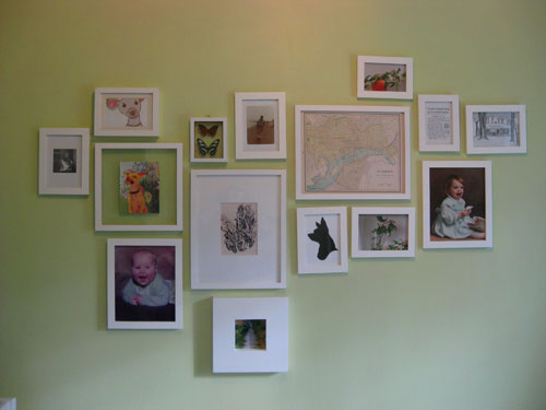
Waaaaay back when we mentioned that we’d be converting our third bedroom into a nursery, we admitted that we loved the asymmetrical wall of frames too much to remove it. But we did plan pretty much from the start to switch out some of the randomly framed prints and pictures with more kid-friendly and cheerfully toned art that’s fitting of a little girl’s nursery. So here’s what it looked like before our big art-swap-fest:
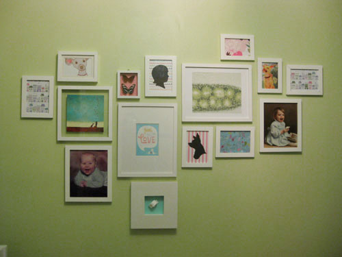
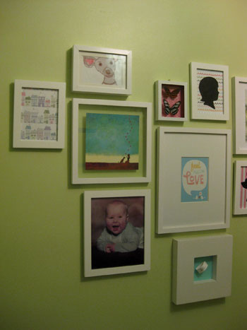
And here’s the same asymmetrical arrangement of frames after the big switch:
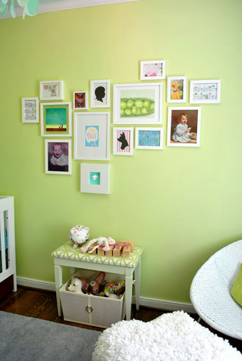
Now we’ll zoom out so you can see it in context with the rest of the nursery. Don’t the blues and pinks and greens work nicely with everything from the patterned curtains to the soft aqua ceiling? We think it’s fun and mismatched but it still feels like it goes together without anything feeling too overpowering or clashy.
And true to form we didn’t want to break the bank when it came to our little art 2.0 project. So we hit up Michael’s for some almost-absurdly-priced craft paper to repurpose as wall decor. And when we say almost-absurdly-priced, we mean that it was no more than 99 cents a sheet- and most of it was just 60 cents a pop.
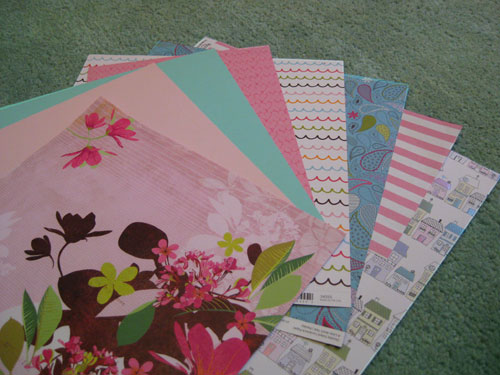
In fact we got all of the decorative paper that you see above for just a total of $4.99. And we framed some of it on it’s own (like that cute paper with house illustrations on the bottom of the pile) and used some of it to layer underneath other items that we planned to showcase- like the bean’s hospital bracelet. Of course we don’t have one yet, so I made a little paper placeholder until we come home with the real deal.
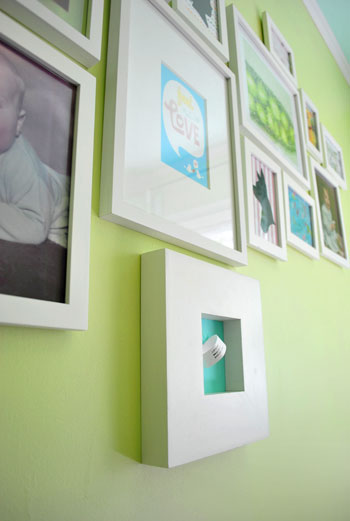
John also came up with the idea to tape some pink heart printed paper behind a glass shadow box full of faux butterflies that we already had hanging in that very spot. It definitely took them from science-y specimen-looking things to cheerful nursery decor in about thirty seconds.
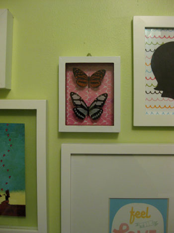
We also already had that cute black cut-out silhouette of Burger (which John got me a while back) so we carefully untaped it from the white paper backing that it was mounted on and replaced it with some fun pink & white striped paper instead. It’s instantly more playful and beanette-appropriate, right? Not bad for 69 cents worth of scrapbooking paper. We also decided that we’d love to someday incorporate a similar black cut-out silhouette of Baby P, so we framed another sheet of playful squiggly line paper and whipped up a quick placeholder silhouette that we’ll someday switch out for a real one of our little girl.
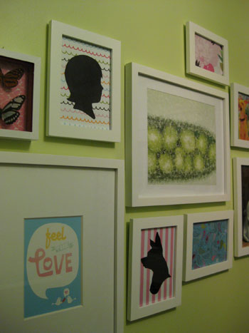
And do you see that “Feel The Love” print to the left of the Burger silhouette in the photo above? We couldn’t help getting a little DIY after we saw this adorable Skinny Cow ad in a magazine that we were reading. We loved the message, the typeface, and even the color…
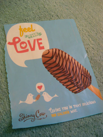
… so we scanned it and used Photoshop to remove the ice cream bar and move the cute “lovebirds” up closer to the voice bubble. Then we printed it and popped it into the frame. Voila- free magazine inspired art (check out another idea for free magazine art right here and here).

Next we trolled Etsy for affordable art that would work with our palette (we love supporting small businesses and handmade goods almost as much as DIYing things ourselves) and found that sweet aqua-toned girl & her dog print that you see in the photo below (right next to the “Feel The Love” frame). It was actually a limited edition print for just $12 and it featured a girl with her dog and a bunch of hearts floating up into the sky. We thought it was a perfectly reminiscent of Burger and Baby P’s undeniable future-friendship, and the price was definitely right so we snatched it up. Good thing we did because it later sold out (see it up close and learn more about the artist right here).
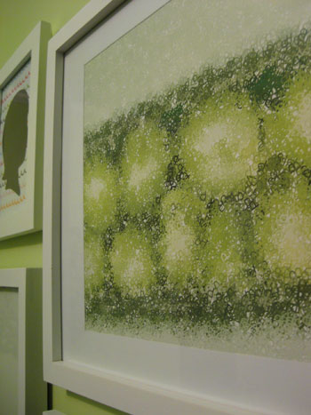
We also sprung for another print that we thought was too fitting to pass up. It’s actually a print of peas in a pod, but when you get closer you realize that the peas are made up of the letter P… as in Baby P! It’s kind of a hidden monogram of sorts- and we love that it also works perfectly with our color palette. This print actually hailed from Wall Blank and was ours for just $25. We think it was well worth the personal-ish slant that it adds to the whole arrangement. Note: Wall Blank was going to be under construction this week but they reopened their vault just for YHL readers today! Feel free to check out all the affordable art while it lasts!
So that’s how we used some 60 cent craft paper and two playful prints to give our nursery’s asymmetrical wall of frames a fun dose of color and pattern. And although it could easily cost well over $100 to deck out 15 different frames with art, we pimped ours in just $42 ($5 craft paper + one $12 print from Etsy + one $25 print from Wall Blank). And the whole room just feels infinitely more happy and fun. We keep walking in there just to look at everything. And we can’t wait to hold the bean up so she can take a gander at the wall of art that we tossed together in her honor. Especially the part where we compare her little face to our baby pictures to see who she looks more like (John’s gunning for giant cheeks like he had as a baby- which would definitely be cute).
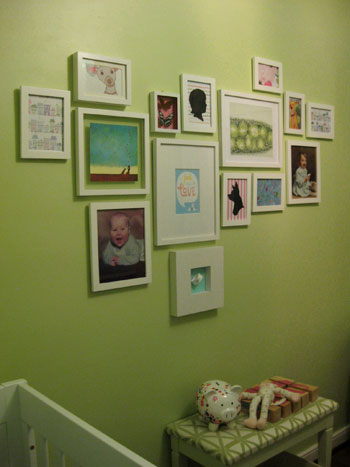
Oh and you might notice that there’s a little celery-toned upholstered bench that now lives under our art wall. We found it for $7 at a thrift store, painted, and recovered it a while back, and slid a big basket for toys that we also already had underneath it. We love that the setup worked so seamlessly with the rest of the nursery design, and we definitely welcome the added storage space and the padded ouch-proof bench top.

So that’s where we are with the nursery these days. We’re definitely rounding home plate and actually plan to share the full monty reveal next week. Time flies when you’re having fun (and having a baby apparently!). What do you guys think about our little art swap fest? Have any of you framed something that’s not necessarily art (like an ad torn from the pages of a magazine or your baby’s hospital bracelet)? Have you perused all that fun printed and patterned craft paper at places like Michael’s and Ben Franklin in hopes of gaining some cheap wall decor? Have you snatched up any great Etsy prints as of late? Let’s talk about DIY or homemade-by-someone-else art on the cheap.
Psst- Wanna see our nursery progress from the very beginning? Here’s our painting post, our big shopping spree, our crib hunting rundown, our curtain-making tutorial, our fun little chair search, our mirror-painting extravaganza, our DIY faux sheepskin project, our big dresser makeover (and subsequent drawer lining project), our closet makeover, our homemade crib skirt undertaking, our DIY mobile adventure and our shelf building project. Fun, fun, fun…

Becky says
When my husband and I first started dating (in high school!) he bought me a huge bouquet of mixed flowers the day he “asked me out” that had one rose in the center. I pressed the rose and later put it into an antique stained glass picture frame I picked up on a trip to New Orleans. That was almost 11 years ago, and the framed rose still sits on my nightstand so I wake up every morning to the first gift he ever gave me.
Ashley @ The Design Thief says
I absolutely love what you guys have done. I am working up the courage (and looking for some inspiration) to put some non-art things behind glass. Your little beanette will have an amazing room.
Carolyn H. says
We decorated with a Japanses children’s book I found at a garage sale. We selected three of our favorite images, cut them out, matted them and put them into matching frames (which I’d picked up on sale at Michaels). The result was gorgeous and cost less than $10.
Cat Alford says
Y’all probably already know this but Michael’s has a 40% off of whatever coupon every Sunday – It’s called the make your own coupon in case anyone else wants to get craft paper on the extra-extra cheap!
YoungHouseLove says
Thanks for the tip Cat!
xo,
s
Carolyn H. says
Sorry, “Japanese,” not “Japanses.” I should have done a better job proofreading.
Janelle says
I love what you’ve done with your little one’s room.
I also wanted to add some art on a budget, so I carefully cut out the beautiful pictures in “On the day you were born” (for the toddler’s room) and “On the night you were born” (for the soon-to-be-here Bub’s room) and framed them up – they look great as a grouping and cost next to nothing for an entire wall of art! (pictures will be up on my blog soon…)
Belinda says
Beautiful! Although, I never had a doubt that it wouldn’t be. You guys are inspirational x
Jessica @ How Sweet says
The room is just so adorable. I love how the photos are arranged.
Lauryn says
It looks so awesome! I love the mismatched/totally goes together feel and look of it. :-)
Gracia says
Beautiful arrangement! Not decorating a nursery, but this inspired me to do something about the bare walls in my bedroom. We’ve been living here for almost 2 years already!
Melissa Arlena says
I have done the scrapbook paper wall art from Michaels in several of the rooms in our house! I picked up 4 20×20″ frames from IKEA that are matted to perfectly fit the 12×12″ scrapbook paper. I love to use paper that is in the accent color I want for the room and I think it helps balance out with the photos I have hanging. The best part is it is really cheap to swap them out when I get tired of them :)
K says
Looks great! I love how you guys have put together a very cute, feminine nursery without doing pink on pink on pink! Great job!!
Sarah says
Love it!!
Did I miss the post where that cute bench came in? Did you put the fabric on that yourself? I love how that connects with the artwork, wall color, mobile, etc.
YoungHouseLove says
Hey Sarah,
That info (along with a bench makeover link) is included in this post! Just read the last few paragraphs for that info. Hope it helps!
xo,
s
Caitlin in MD says
I too am in the process of decorating a nursery (in time for our August due date). I used your idea of finding a mirror on the cheap (got it at Home Goods) and painting it (white).
I also wanted some art to display over the crib and wanted something cheap, cute-but-not-cutesy, and semi-homemade. I ordered the Charley Harper Memory Game on Amazon (for like $12) and picked up a couple square frames from Ikea. With the matting that was already included, it was the perfect size for four different cards from the game.
Maddie says
I absolutely love that first etsy artist with the print of the little kid and puppy. I have so many of his prints on my favorite list. Someday in the far away future I’m definitely using one of those prints in our baby’s room.
Rachel says
Adorable wall of art. I have amassed a collection of beautiful frames with the intent of filling them, but for now many of them sit with their original fake family photo in them. Weird, I know!
After hearing about all the wonderful things on Etsy I finally ventured over their today and am AMAZED at all the affordable art for sale. I browsed for five minutes and already found a beautiful watercolor of an orange marmalde cat (my favorite stuffed toy as a child). And how great would it be to have an artist do custom watercolors of our dogs?!
Also, in reading up on your nursery progress last night, I got the courage to shorten all my white faux wood blinds that were eons too long. Success! Now my entire house is filled with “custom” window treatments! Thank you!
Katelyn Likes This says
This is so pretty. I especially like the photos of the two of you as babies in the room. That’s a nice positive image for baby (and you, really)! I think I’d steal that little idea if I were doing up a nursery!
Jessica M says
My great aunt and uncle, who were unable to travel to our wedding in 2005, framed our wedding invitation (which we designed) for us – my great uncle does framing as a hobby. It’s simple and lovely, and we look at it everyday since it hangs on the wall right inside our bedroom door.
I made a shadowbox collage of ticket stubs, bus tickets, maps, sugar packets from restaurants, etc. we collected while on our honeymoon in Italy, along with a couple of our favorite photos (and a wine bottle cork we saved as well!).
The piece of art hanging above our daughter’s crib is a painting I did in elementary school. It’s a collection of my toys, and my mom held onto it all these years because she thought it would look perfect in a baby’s nursery! :)
claire says
adorable, as usual! i want to copy this – i’ve been thinking about doing something with craft paper for a long time – there are just too many pretty patterns to pass up! and i love the piggy bank (target, right?) i got one of those for my new niece (the blue paisley one – they were all adorable!)
{Gypsy Soul} says
Love your art wall!!! Great job…as always =)
Sarah says
Ah-hah. I should stop trying to read blogs and take notes in class at the same time – I miss things!! Actually – I should probably just stop reading blogs while in class all together.
Megan says
How do you go about hanging so many picture frames? I always struggle with getting the spacing perfect. Do you work the math out on paper first?
YoungHouseLove says
Hey Megan,
In the case of this wall we laid everything out on the floor to find an arrangement we liked and then sort of haphazardly just transferred it onto the wall. Since it didn’t have to be balanced and perfectly spaced it worked out quite well. But one of our favorite tricks is to use painter’s tape or paper that’s cut to the size of your frames and tape that up on the wall in a variety of arrangements until you find something you like. That way you don’t have to make any nail holes until you’re sure about where you want things to go. Oh and here’s a video all about hanging art arrangements with other tips as well: https://www.younghouselove.com//getting-the-hang-of-it/
Hope it helps!
xo,
s
Rebecca says
I just read this morning that picture should be hung 5’7″ from the ground. Is that the consensus?
YoungHouseLove says
We’re not much for “strict rules” so we just do whatever looks good to us. The center of the arrangement or picture generally looks best when it’s at eye-level (so you’re not staring up or down at it) but we really are just fans of the hold-things-up-while-the-other-person-steps-back-and-sees-how-they-look approach. Since every room is different (higher ceilings, bigger windows, more colorful walls) it just makes sense to us to take each room and see what works in that space instead of applying all sorts of general decorating rules. Oh and you can always use blue painter’s tape or paper templates on the wall before making any nail holes to “test run” the placement of frames. Hope it helps!
xo,
s
Kate @ Domesticating Kate says
As usual, you’re such a creative inspiration! Love the framed baby bracelet idea. How do you come up with these things?
YoungHouseLove says
Hey Kate,
Well, we were sitting there looking at that chunky frame thinking “it would be fun to put something 3-D in there” and John suggested a little sock or something and then we both thought of the hospital hat (which would have been too big) and that brought us to the hospital bracelet. And the fun thing about making a fake one as a placeholder is that we got to make up the weight and date of arrival, so now we have a little “guess” hanging on the wall. Time will tell how close we are…
xo,
s
Jacquelin Seybert says
LOVE the prints. I purchased the exact same blue-paisley paper from Michael’s a few weeks ago. I ModPodged it to small tiles to make coasters!
Jess says
You guys have the best taste! It all looks so cohesive yet varied, and so cheerful for a nursery! It looked great before (and even inspired my own asymmetrical photo wall in my bedroom!), but it looks AMAZING now! :)
Amy says
Your room is looking super cute! Once my baby started moving there was a lot of rearranging to be done around my house, but you have time! Just be prepared for the day when things get stripped down or moved up! Genevieve Gorder suggests getting heavy-duty velcro to anchor things down and I thought that was a great idea, as long as it doesn’t ruin your surfaces!
Brandi Ledesma says
So sad! When you first posted the link the other day, I fell in love with the girl and dog print, but I wanted to sleep on it overnight and by then it was gone! :(
It’s just gorgeous! I’m curious- How did you guys manage to get the arrangement exactly the same? Could you still see your nail holes? Did you take a picture?
YoungHouseLove says
Hey Brandi,
Do you mean how did we keep the arrangement the same when we removed the frames to paint? We just kept the nails right in the wall and painted them along with everything else. We also snapped a picture to help us remember the placement of each one, but it was pretty easy with the nails already in place. And as for keeping things organized while we switched out the art, we just took down one frame at a time so we always remembered where it went back up. Hope it helps!
xo,
s
Lisa says
I just made some silhouettes of my husband, my son and myself for free, and framed them in painted second-hand frames with bright green spray-painted mattes. Here they are (and instructions on how to make them): http://www.flickr.com/photos/lisamfb/4506325836/
Jen says
Wow! The nursery really is looking great! You are getting close and soon it will be complete (I mean with the baby in it). =)
Kelsey says
Awww, looks great guys! I didn’t know about Wall Blank, thanks, I just ordered a print!
Laura@JourneyChic says
Adorable! I love that you kept your baby pics on the wall. It will be fun to see which one of you she resembles! I’m making custom alphabet cards for our son’s nursery, and will order the room’s other art from Etsy.
I just picked up some gorgeous paper at Paper Source to frame in a series of three for our living room. Now all I need is time to go to Ikea to pick up some inexpensive frames.
Jenny says
While I love the art wall and your furniture choices I gotta say that for my taste the nursery altogether is a bit much. I think a white-ish chandelier and curtains would have looked a lot calmer. It’s too busy for me with the patterned plus colored curtains and the chandelier and even the ceiling. I don’t think I could really relax in there lol
But I sure hope your little girl is gonna feel right at home and you’ll have some fun times in her room with her!
CasaCullen says
OH MY GOSH!
my jaw just dropped…
i’m like dying over here!
so…you’re gonna die…
we added an art wall to my home office and so much is similar to the sweet bean’s nursery art wall…and i mean, SO MUCH! from the butterflies to the open glass frame…it’s INASANITY! i’m waiting for one more pic of my niece and then i’m DONE! sheesh…great minds think alike!
cheers – cc
emily says
you guys are so stinking creative! can’t deal with you photo-shopping (is that a word?) a magazine ad… brilliance I tell you! Can’t wait for the big reveal!
Amy B says
I just updated my bedroom, and almost all of the new “art” is just craft paper from Michael’s put in pretty frames. I’ve got 6 different colors/patterns, each incorporating the green and pink tones I’ve got in the room. It was quick, easy, and cheap…and it looks great!
Krista says
LOVE your nursery projects! So adorable, makes me want to have kids now just so I can decorate, haha. Looking forward to the final reveal…
keri says
does anyone know if that skinny cow lettering is by linzie hunter? i love her stuff, and she has awesome artwork – i’m using her “spam email” artwork to decorate, but she has some great kid stuff, and just illustrated a new book too :) http://www.linziehunter.co.uk/
your “feel the love” is so adorable, i’m jealous!
katy says
For my little bean, we had gotten a ton of really cute “welcome baby” cards from family and friends that I just couldn’t bear to throw away (warning: your sentimentality goes into overdrive when you become a mom!), so I selected a few based on their cuteness and fit within the color scheme of our nursery, mounted them on coordinating scrapbook paper, and framed them in these antique-y white square frames my mom gave me.
Voila – totally free (the scrapbook paper I already had laying around, plus the frames were gifts), and totally sentimental art!
Caroline @ The Feminist Housewife says
Can I live in your nursery? ; )
I love it! Can’t wait to see the entire room all at once.
The scrapbook paper is a great idea! lovely!
katy says
Oh! And I just remembered that my hubby and I have framed different geometric-ish fabric panels in our master bedroom! We cut out different areas of the fabric so they weren’t exactly the same, but still matched!
The Virginia House says
I have had so much fun with scrapbook paper in my baby room as well. I love how you alls turned out! It looks much more babyish now.
Joni says
Love it! I can’t wait until you guys buy a digital SLR (hope you guys do!), i’m curious to read about your research and what you think would be the best camera and i’m super excited to see future posts that you guys do with framings and pictures of your little girl! Congrats again!
laura says
very cute! it’s always nice to have art that means something and tells about you, so i really like this. I love using scrapbook paper as placemats for festive times like Valentine’s day and Halloween, much cheaper too!
anyway to get our hands on the print you made from the skinny cow ad? we just remolded our bathroom and i’ve been debating over art in there, this would be absolutely perfect! i’m not too keen on photoshop though i want to be.
YoungHouseLove says
Hey Laura,
Unfortunately since we scanned an ad it can only be used “for personal use” since we don’t own the rights to that Skinny Cow image, so we can’t send it to others or share the print that we made. But if you find it in a magazine (we’ve seen it a bunch of times) you can cut and paste things and photocopy them for a similar look to the photoshopped version. Hope it helps!
xo,
s
Sara @ EF eDesigns says
I love this arrangement! I actually just used some craft paper myself to put together some artwork for one of my walls (http://efedesigns.wordpress.com/2010/04/12/project-hallway/), but I’m thinking now I need to do something to make it more asymmetrical…I was already thinking about adding some vintage letters and photos. I’ll have to try it and see how it goes. If it doesn’t work, I can always try a photo arrangement like yours!
ErinEvelyn says
I’ve always loved your asymetrical group of frames, and the color composition now is 100% FAB for Baby P’s nursery!! But can I confess something? Everytime I see photos of the grouping on your blog, the highschool yearbook editor in me always wants to swap those baby portraits (of you & John, right?) so that they’re facing inward rather than to the outer edges of the collection. You’ll understand that I’m too neurotic too have an asymetrical grouping of my own now. ;)
YoungHouseLove says
Haha, that’s too funny. We might just have to do that one of these days…
xo,
s
Tara S. says
OH! How cute! I can’t speak for everyone else, but I know I would love to see a quick and easy how-to on your photoshop skills. Scanning and editing that magazine page sounds so easy but I haven’t the slightest idea how to do it. Maybe I should go rent Photoshop for Dummies at the library sometime. :)
Lisa in Seattle says
I can’t get over how good this art wall looks with the changes. One reason your blog is so inspirational is that you help us change-phobic folks see that it’s OK to change our decor!
Recently I bought this bird-and-french-fry Etsy print and am waiting for it to arrive. I also bought the vintage wildlife poster from Wall Blank.
denise @ little ant design says
The wall looks amazing – I love the attention to detail, all the cute (sometimes) missed little secrets contained within the frames.
Also a big thanks for posting about Wall Blank. I went right over to check them out and bought the most adorable and graphic print for my kids bathroom – can’t wait to get it and frame it. It will be a great addition to our soon to be remodeled kids bathroom.
msnyc says
Adorable!! Love everything about your nursery. Just one little compulsive thing bugs me….the frames are not lined up, and that would make me crazy! When can I come over and fix it? :-)