I recently found myself flipping through old copies of BHG and I came across one of my favorite little quote roundups ever in the February issue. It was actually an article all about “choosing, using, and loving color” and you know that paint is pretty much my BFF so it’s no surprise that I had earmarked the page and even circled a few of my favorite quotes. So when I recently rediscovered my earmarked and circled page o’ quotes, I thought I’d share the wealth and pass along all the great little tidbits that BHG amassed for that little article of yore (because frankly, we couldn’t agree more). They communicated so many things that we strive to explain in 1000+ character posts… all in just a sentence or two! And who doesn’t like a shortcut?

So without further ado, here are a bunch of BHG’s color-related musings that we just think are the bee’s knees (with little YHL sidenotes sprinkled throughout- you know, just to make things longer since that seems to be our M.O.):
1. “When you’ve found the right color on a paint card, go a step lighter. Colors look darker on the wall. The lightest two colors on a card deliver more punch than you expect. Unless you’re after drama, stick with them.”
*YHL Sidenote: If you’re going for a warm wheaty tone or even a rich chocolate hue, the first two swatches on the card won’t cut it. So we’d say that when it comes to colors like blue, green, red, pink, yellow, this rule rings true more than with neutrals like gray and brown (which can look surprisingly calming and not-too-dramatic, even when they’re applied in a rich saturated hue).
2. “Using different shades of color- such as various blues- is an easy way to pull a room together. To prevent monotony, vary the textures (play suede against silk) and add a pop of a different color in a pillow, throw, or vase.”
*YHL Sidenote: A colorful rug or even a not-white lampshade is another easy way to wake up a room.
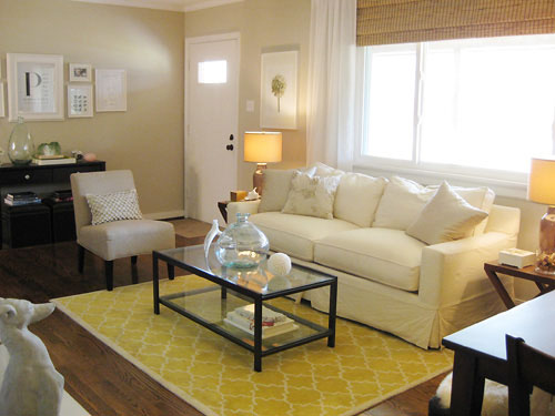
3. “Follow the rule of three. When you pick a color, use it at least three times in a room.”
*YHL Sidenote: This is a great “beginner’s tip” and it can really add balance and easy cohesion to a room- but we’ve seen many stunning Domino magazine rooms with one amazing shot of orange in the duvet while the rest of the room is all neutral and creamy tan to prove that this is one rule that’s meant to be broken.
4. “Think of hallways as palate cleansers- the sorbet that’s served before diving into the next course. Keeping them neutral allows you to branch into any color in rooms that flow off them.”
*YHL Sidenote: For the most part this is an amazingly simple concept that can really do you no wrong. In our own house we have the lightest cream tone in our entire palette relegated to our hallways and we love how it neutralizes and harmonizes all of the differently toned rooms that branch off of them. But again, we’ve seen our fair share of gorgeous and bold hallways and entryways, so if drama is the name of the game then throw this rule out the window and go for a deep eggplant, a royal blue, or even a lime green color.
5. “Look in your closet. You are your own best inspiration for color.”
*YHL Sidenote: I love this idea in theory, but since about 90% of my clothes are black it’s not a very workable approach for me. But the colors in my jewelry and even my shoes are pretty indicative of the tones that I lean towards when it comes to home decor: neutrals, animal prints, a few metallics, and some breezy greens and blues (see more of our closets right here).
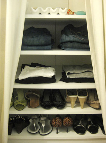
6. “Don’t sweat slight color variations between fabrics and walls. The best rooms are slightly off- stronger, lighter, softer, just not a spot-on match to a swatch.”
*YHL Sidenote: Amen! Matchy-matchy decor is the bane of our existence (read more about avoiding it here). Lots of colors “go” without being perfect matches, and you’ll end up with a room that’s textural, dimensional, and layered… which is so much more sophisticated than a flat and perfectly coordinated space.
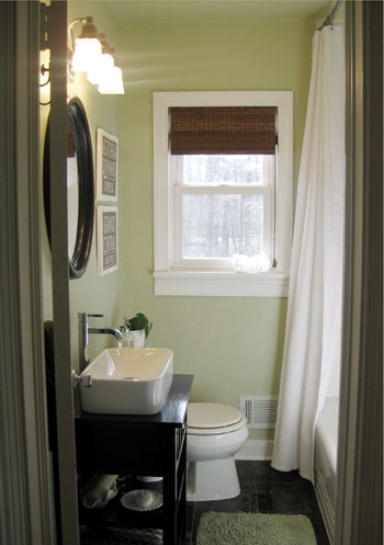
7. “When you’re spreading color around a room, think about proportion. If you’re using three colors, try a 70/20/10 distribution. For two colors, go 70/30.”
*YHL Sidenote: I’m no mathlete, but this sounds about right. So if your walls, sofa, and rug are varying shades of tan (in the mocha, cream, beige, sand, or wheat territory) that would make up about 70% of the space and then you could add 20% of another color (like a few white painted furnishings and breezy floor to ceiling curtains) and then bring in 10% of an accent color in the smaller accessories like pillows and art to liven things up (try a pop of yellow, aqua, amber, lime, lavender- the possibilities are endless). We like a lot of layering so three or more colors in a room appeals to us (some more concentrated than others so they don’t all fight for dominance) more than the two color 70/30 option mentioned above. For example, our newly renovated bathroom is roughly about 70% soft khaki green (on the walls, in the towels, in the bath mat, etc) and 20% brown (in the mirror, shade, flooring, vanity, art) and 10% crisp white (in the trim, shower curtain, sink, and small accessories).
8. “The back of a fabric, curtain, comforter, or area rug is sometimes more interesting- and toned down- than the front. If no telltale signs like hems will show, go ahead and flip it. Designers do it and so can you.”
*YHL Sidenote: Love it. I once picked up a leopard bedsheet on clearance, turned it inside out and made throw pillows since I loved the softer and more subdued pattern much better than the look-at-me-leopard version on the “right side.”
9. “Get out the digital camera. It’s amazing how a photo can point out problem spots. Add some colorful accessories, take a photo, and compare.”
*YHL Sidenote: So true. We often find it easier to evaluate rooms using photos than when we’re actually standing in them (things like balance, proportion and scale are so much more obvious- and it’s easy to see if a corner is feeling flat so you can amp it up with a quick tweak or two).
10. “In a small room, keep the walls the same color as the primary upholstered furniture. The room will seem twice the size.”
*YHL Sidenote: Again, so true. Of course you don’t have to take “same color” to the extreme since anything that’s a shade or two lighter or darker will work just as well. For example, you’ll notice that we have a cream sofa in our soft tan living room and a tan sofa in our creamy-hued den. Thanks to the slight-but-not-overly-jarring difference between the walls and the largest items of furniture, the room is a lot less “busy” or “full” looking.
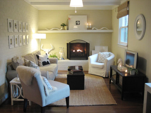
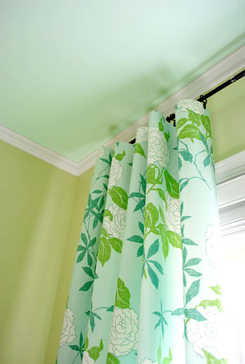
11. “The era of the bright white ceiling is over. Paint the ceiling a shade lighter than the walls to visually raise it and avoid a jarring start-stop. Go a shade darker to bring it down and add coziness.”
*YHL Sidenote: We wholeheartedly agree! In fact we’ve been slowly painting our white ceilings (we went a shade lighter in our bedroom, carried the wall color onto the ceiling in the bathroom, and went with a fun coordinating shade in the nursery) and we love the effect. Don’t ignore your room’s fifth wall!
12. “Paint is the least expensive mistake you can make. Be brave. The worst-case scenario is that you’ll have to repaint.”
*YHL Sidenote: You’re preaching to the choir here BHG. We like to say that we have a Nike-esque philosophy when it comes to paint: just do it.
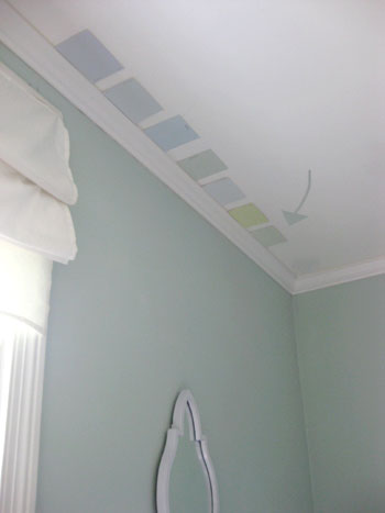
13. “To tell if a color has a pinkish, grayish, or greenish cast, look at similar swatches side by side. It’s all about comparison.”
*YHL Sidenote: This is how we have picked every single color in our house (and avoided a slew of “too-yellow” tans and “too pastel” greens and blues). Comparison is key- and be sure to check them at all times of the day so you can evaluate how changing sunlight effects the swatches.
14. “Think of neutrals as peacemakers. They can help colors get along.”
*YHL Sidenote: Everyone can use a little peace in their house. And neutrals can be defined as so many things- not only are they tans and beiges and creams and grays and mochas- they’re also whites and even gray-blues, khaki-greens and all sorts of “muddy” colors that read as eye-pleasing neutral backdrops in a room.
15. “Wallpaper or paint the inside of a bookcase to set off what’s displayed. Use yellow wallpaper in a white-built-in and wrap the same paper around lamp shades.”
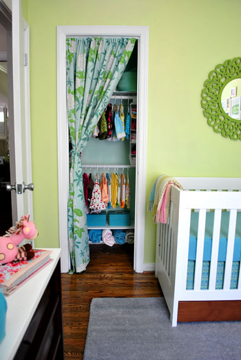
*YHL Sidenote: You can take this a step further by painting the inside of your closet a fun contrasting color (like we did in our nursery) and can even paint the inside of your kitchen cabinets to really spotlight your white china (which we also did a while back).
So there you have a whole slew of paint color picking advice and general hue suggestions to help you upgrade your home. What do you guys think? Are there any that ring especially true or inspire you to try something new? Do you have any color advice of your own you’d like to share? Spill the beans.
Psst- Looking for more paint color advice? Check out these posts for more ideas when it comes to pinning down a whole house color scheme and picking the perfect paint color.

Kate (and Ben) says
Right, so this isn’t post related (although I liked the tips; that was a great issue of BHG–I read that issue fully!).
However since John is so into graphic design and since you both worked in the advertising field, I thought I’d share the title of an advertising documentary I watched last night, “Art & Copy.” It was extremely well done with several big names in the field; and some interesting stories from a few of them.
cheers!
-K
YoungHouseLove says
Sounds awesome! Thanks so much for the suggestion. We’ll have to check it out!
xo,
s
LauraC says
Ohhhh, Ohhhh, so true, so true about the “pick one shade lighter than the paint chip you like” rule. When we bought our house a year ago, the first room to be stripped of wallpaper and painted was the kitchen. Because there was very little wall space and the cupboards were a creamy white (read: neutral), I thought I’d spice things up with a bright lime-y green on the wall. So I picked the third color in a paint chip (with my husband’s and sister’s and friend’s blessing, I might add) and it was AWFUL!!!! I added a whole quart of white paint to lighten it up, and it’s much better. Loved the shade, but even with a small wall it was too much. However, it’s really nice now, still bright, but tolerable.
liz @ bon temps beignet says
hahah ‘just to make things longer since that seems to be our M.O’ I could read YHL all day. Work, eating and sleeping would get in the way though. I have to agree wholeheartedly with numbers 7, 9 and 11. Our ceiling looks like a patch work quilt with all the test colors we have up.
I’m printing this post out right now!
Amanda@ Our Humble A{Bowe}d says
I LOVE picking paint colors, too! It definitely is the cheapest way to freshen up a room and make a statement. We actually follow a lot of those ‘rules’ in our house (http://ourhumbleabowed.wordpress.com/the-grand-tour/), but I didn’t know it until now! Thanks!!
Sarah says
great post! i have a unrelated question about your couch in the photo. i have a very similar one at home that i got 3 months ago. do your cushion covers zip off, and if so, do you wash them in the machine? my couch needs it’s first cleaning, and i’m nervous to put the covers (which zip off) in the washing machine, but i’m thinking that if i do it in a cold cycle and hang them dry it should be okay. Any thoughts?
YoungHouseLove says
Yup, we follow the washing instructions on the inside of the cushions (machine wash cold and low-heat dry). We also remove the covers from the dryer before they’re totally done and put them on the sofa because we have found that this method keeps the wrinkles away for a polished and crisp look. Hope it helps!
xo,
s
Leeann says
Such great advice! I love your sidenotes. I recently moved into a rental house in which all of the walls are painted beige (except our son’s room, which our landlord was nice enough to paint a “deep underwater” shade of dark blue-green for us before we moved in.) I thought I would love the beige walls more than the white walls of my previous apartment, but I’m starting to loathe it! Our sofa and recliner are neutral-colored, so it feels like we are living in a brown blob. Every post about paint that you make makes me want to say to heck with my landlord, whip out my paint roller, and go to town! :-)
Lindsay@Tell'er All About It says
Ok, so this is hilarious! I wrote almost the *exact* same post back in Feb/March when this mag came out! Too funny!
http://tellerallaboutit.wordpress.com/2010/01/21/i-like-the-color-but-its-a-little-too-part-2/
There was a TON of good info in there – glad I wasn’t the only one who thought so!!!
xoxo,
Lindsay
YoungHouseLove says
That’s so funny Lindsay! Wasn’t it the best article? Off to check yours out!
xo,
s
Jennifer says
Great tips, Youngsters — thanks! So glad you added the point about not following the “lighter is better” rule with neutrals. I love the contrast of a deep, saturated, menswear-inspired charcoal gray with white trim!
Jessica @ How Sweet says
I love having the cieling a different color, just a lighter version. Not a fan of the white!
Miranda says
#10 Intrigues me. “In a small room, keep the walls the same color as the primary upholstered furniture. The room will seem twice the size.”
My husband doesn’t want to repaint even though he’s always hated the color I chose. I have dark maroon carpet and our sofas are light brown suede/dark brown leather. I originally chose a yellow/green color trying to echo the look of an orchid between the carpet, walls and our white shelving. I planned accents in various blues. I wanted to brighten it up, but I realize now that it just looks hodgepodgie and I don’t know how to pull it all together.
Now I’m thinking a wall color a bit lighter than the light brown of my sofas might work? Any ideas? But then should the undertones of the wall color match the flooring (which I can’t change) or the blue accents I have (and want)?
YoungHouseLove says
Oh yeah, a lighter mocha color on those walls will definitely make the space feel less hodgepodge. Try Glidden’s Water Chestnut. And the undertones of the wall color don’t have to match the flooring at all, they just should “go” (and a soft mocha tone goes with nearly everything). Hope it helps!
xo,
s
js says
We have a big floor to 18′ ceiling bump out around our fireplace, and we wanted to paint it a bold color. We did look at our closet to chose a color – my husband is super picky about colors, so I grabbed one of his bold colored oxfords for inspriation – he couldn’t hate that! We got 3 samples in that color, from bold to pale, and painted 3 spots on the fireplace. After a week, he realized that the boldest color really was the best color (of course I knew that all along! :-). After 2 years, we are still super in love with the results.
Tara says
Loved all these tips! We’re in an apartment now so we aren’t painting much more here, but these are good things to think about for when we have our own house.
Christy says
Thank you! Many of these will actually help us for wedding decorating!
Marcia says
Love this post! I needed this a few months ago when I picked paint for my stairwell and upstairs hall (painting walls and ceiling all the same color). I chose the neutral color I liked, but it turned out, in my husband’s words, “like someone vomited peach sherbet all over the wall.” I have a couple of questions for you:
I am using Benjamin Moore Natura because it is no VOC. However, I am having the hardest time finding a very light neutral that is not too yellow. Our stairwell and hallway have no windows and not much light gets in there. After the disastrous peach sherbet (which was SW tea light and looked fine in the living room), I went with BM lambskin, but it still looks too dark to me. Do you have a favorite wheatish BM color that is lighter than lambskin? I don’t want something that is really white because the wall connects to the living room and you can see the kitchen from the living room. This color will potentially be in the living room, kitchen, stairwell, and upstairs hallway. I want something that isn’t boring to look at (too white), that won’t be too light in the rooms with windows, but also won’t be too dark in the stairwell/hallway. Oh, and I’m using eggshell if that will affect your answer.
I painted my kitchen ceiling the same color as the walls and love it! However, I am repainting and decided to go with eggshell for the paint (it is currently flat). Should I keep the ceiling flat or would look ok to paint it in eggshell also?
YoungHouseLove says
Marcia- Our advice to you is to bring home a slew of paint swatches and hold them up in your space. Since lighting varies greatly from house to house (and can really effect how a color “reads” we don’t like to toss out light neutral tone suggestions since they can look so dramatically different from room to room). Just tape up those swatches and compare them to one another to find the best one! And as for the ceiling in the kitchen, you can go flat or eggshell- either one looks great!
Kristine- Thanks for the link. Off to check it out!
xo,
s
Heather @ Side of Sneakers says
I’m absolutely in love with that nursery!!!! The curtain in front of the closet is SO my taste! :) It makes me want to take off my closet doors! Where is that fabric from?!
YoungHouseLove says
Hey Heather,
We found it at a local fabric outlet here in Richmond but it’s made by Waverly. Here’s the link: http://www.fabric.com/ProductDetail.aspx?ProductID=8268a845-163d-46bb-9d6c-60838ab6d235&CategoryID=6423f11d-06c1-47f6-8dd1-a9299821269f
xo,
s
Kristine says
Love this post! In regards to #1, I also read this other blog for color tips, and I’ve been wondering what you guys think, since you guys have a lot of light colors in your house. Here is the article:
http://colourmehappyblog.blogspot.com/2009/03/light-colour-will-never-come-to-life-in.html
Anne @ the doctor takes a wife says
I love ALL these rooms. They are super beautifuL :)
Lesley H says
Who doesn’t love paint? It is the best bang for your buck, instant gratification, easy fix ever! The BHG tips are great and your sidenotes really bring them to life. I’m so proud of myself because I’m doing the 70/20/10 rule without even knowing it! 70% neutral beiges, 20% white trim and accents (think Ikea pots, frames and animals) and 10% teal for POP!
alison says
these are great tips and even better with your sidenotes. bringing home the swatches and laying them in a row to compare is great advice which i will use soon!
Tracy says
#5 (check your closet for color inspiration) reminded me of a complaint I once read about one of the designers on Trading Spaces – I think her name was Laurie? She was a redhead. And someone wrote that they liked her designs, but they wouldn’t use her as a designer because they wouldn’t want to be limited to colors that look good on a redhead. And it’s true! Every color she used was flattering to HER!
Lauren says
I love the ceiling color tip, but our dumb popcorn-finish celings make it more difficult than just getting out the roller. Any tips?
YoungHouseLove says
Hey Lauren,
Try a nappy roller for “rough surfaces” – it should help you get into all those nooks and crannies. Good luck!
xo,
s
Karen says
I disagree with #1 “go lighter on the paint chip” theory. I think we typically wimp out and play it safe with color. Whenever my husband and I have chosen a wall color, we’ve either stuck to our initial choice, or even gone a step darker. We’ve gone pretty bold in some of our rooms, but we get alot of compliments. If you hate it, then you follow #12 “it’s only paint” theory!
I once attended a seminar on home decorating, and the woman asked the audience “how many of you have beige carpeting?” Many hands shot up. “how many of you have off-white walls?” Again, many hands shot up. She then shouted “YOU’RE LIVING IN OATMEAL!! GET SOME COLOR IN YOUR LIVES!!” Love it!!
brooke @ claremont road says
Thank you SO much for posting this. I’m a major color lover, but I’ve made the mistake of using bold color on the walls and then feeling stuck when it comes to furniture and accessories. When we buy a house where I can start fresh, I’m going to try to hold back from TOO many bold colors for the walls, remembering that neutrals will allow me to accessorize more easily (and I can easily switch out color schemes without having to repaint a room!).
custom seamstress says
These are great tips. We are going to be painting a whole house over for a new set of owners (Brother and wife). We’ll have to let them know these ideas.
Laura (youngDCliving) says
Thanks for the tips! I’ve been planning on painting my bedroom a new color for a while now and this will help so much in the planning process!
Nicole @ Geek Turned Athlete says
My husband and I are currently buying a new home, and the paint is horrible in there right now. We want to repaint, but the hubs wants to keep all the medium brown wooden floor boards and crown molding. I have no clue what colors to even look at to start! It seems like white floor boards would be so much easier to be creative! Any suggestions?
YoungHouseLove says
Hey Nicole,
Sage and celery greens complement medium brown wood floor boards and trim/molding so that’s an idea. Also golden wheat tones look lovely with it. Hope it helps!
xo,
s
Melissa says
This was great. Except the point about painting ceilings to coordinate with walls seems like a trend rather than a lasting look.
Amanda says
Hey quick question kind of unrelated, and I did check out your ‘where we got everything in our house’ post first. On the curtains in Clara’s nursery where did you get the little curtain hangers? I have forever been searching for something similar, but just don’t know where to look aparently. (I prefer to make curtains rather than buy them, but I like the look of metal hangers.)
Back to the post, I like the advice. We’ve only 2 for 11 in our home. Only painted the master bedroom and guest bath. (both green, haha.) My fiance is terribly scared I’m going to turn the whole house varying shades of green, which is not my intent, but I would be happy with it. We’ve yet to paint any of our ceilings. But we were thinking a dark chocolate for the master bedroom, and a lighter version of the green in the guest bathroom.
YoungHouseLove says
We got them from Target (on clearance). Hope it helps!
xo,
s
Jennifer says
Any advice on coming up with an accent color to go behind bookcases? I have a room that is mostly tan/maroon colors (tan walls/maroon & tan striped sofa). The trim and shelves are white. I’m blanking on a color to used behind the shelves – they really need something. Maybe even a cool pattern, like wallpaper or fabric. I’d like to go a little brighter/bolder – but can’t think what would pair with tan & maroon. Help.
YoungHouseLove says
Hey Jennifer,
What about a warm golden wheat color- sort of golden? Just bring home a slew of paint chips and see which ones look best with everything else. Good luck!
xo,
s
Danielle says
good advice and I really like your side notes.
i was wondering if you could assist me with a little color help. i am decorating my living room and currently only have a pale blue couch, navy (a little lighter than navy though) panels on two windows next to each other (so 4 panels). coffee table and side tables are glasstop with a little bit of bronzy color table. lamps are glass with a gray shade. I wanted to bring in a pop of color – i was thinking of..above the couch doing some fabric canvas prints but unsure of what fabric to use and what color to use for those base colors i already have in the room. do you have any suggestions. hopefully that makes sense!
YoungHouseLove says
Hey Danielle,
You have such easily accommodating neutrals going on in your room that you can easily add a pop of color in a variety of shades. How about warm amber or even bold orange accents? Yellow would look cheerful too, or you could go with a light aqua or soft gray-blue. Those are just a few ideas. Why not bring home a slew of paint chips and see what colors look good with what you have, then take them with you where you go accessory shopping. Hope it helps!
xo,
s
Melissa says
@Karen:
“I once attended a seminar on home decorating, and the woman asked the audience “how many of you have beige carpeting?” Many hands shot up. “how many of you have off-white walls?” Again, many hands shot up. She then shouted “YOU’RE LIVING IN OATMEAL!! GET SOME COLOR IN YOUR LIVES!!” Love it!!”
I just don’t think there is anything inherently wrong with beige walls and beige carpeting, esp. if you use pops of color in other ways, e.g. pillows, curtains, furnishings, etc. This advice sounds a little judgy and not very professional. Like the poster said above, bold walls can actually box you in with respect to other design aspects of a room.
Look at some YHL rooms (e.g. the den). Their den is beigy. Their den is fabulous.
Albion says
This is a great post, thanks! I feel bolder and more prepared to paint my house now!
Elaine says
In looking at your photos, it seems that most (or all?) of your frames are white. I love the collection of photos you have on the wall in Clara’s room and was wondering what you would think about a similar collection in all black frames.
YoungHouseLove says
Elaine – Any collection of like-frames would look good (heck, even mis-matched ones can work too). In my old Upper West Side apartment Sherry and I created a frame collection using painted brown frame so even we weren’t always all-white. Have fun!
-John
Rebecca @ Beck's Chic Life says
Great post! Thanks for all the side notes. I tend to constantly break the rule of go a shade or two lighter, becuase I am afraid of pastels! Strange I know, but they frighten me. I hope whoever buys our house next, isn’t afraid of color!
Ann says
Thanks for sharing! I found the tips to be extremely helpful (along with your additional sidenotes) and will be saving this to my favorites!
Christine says
Love this post! I’m in the process of choosing a wall color for our bedroom – probably in the gray family. We’ve got popcorn ceiling and no molding – neither of which we’re ready to tackle yet. But I would really love to paint the ceiling. Since we don’t have the molding to separate the ceiling from the wall, is it better to keep with the same color instead of going lighter? Or will that make our already small space look much smaller? Thanks!
YoungHouseLove says
Hey Christine,
We think if you take the ceiling a tone lighter (but always keep it in the same color family) it’ll just look airy and seamless, even when it comes to a popcorn ceiling without molding. By contrast, a white ceiling can look stark and jarring, and can actually make a room feel more broken up and disjointed. We say go for it! Hope it helps!
xo,
s
Sonia says
Great post! It’s not quite the same thing, but when the episode of the Office in which Jim hides Andy’s phone in the ceiling aired, I had the same phone! I was in love with the show at the time (it’s kind of been slacking lately!), and was thrilled to see that we had something in common. : )
Victoria says
I needed this post so badly! How did you know?? :)
We’re in the process of remodeling a garage apartment and I really want to paint the main room (which isn’t very big) a light blue color. This article was exactly what I needed! Thanks!!
Shannon Durr says
Thanks so much for this!! It really helped me out with my color-coordinating questions with my random colors (darker blue and lime green!–pretty random). I was a little stuck and didn’t really know where to begin so thanks for this great little article.
Courtney says
I recently found your blog and you guys are just darn cute. But I am totally in love with the yellow rug in your living room? Any chance you will share where you got it or at least post about it?
Thanks!
YoungHouseLove says
Courtney- It’s the Moorish Tile rug from Pottery Barn (it’s no longer on sale there but we’ve seen it on eBay). Hope it helps!
Katie- That’s definitely a personal preference thing (some people love a ton of diverse looking rooms while others like an overall vibe that can be carried throughout the house). We prefer the latter, so like you, a lot of our furnishings and accessories can be moved throughout the house seamlessly. We love it because we can give our spaces a fresh feeling by shifting things around and we can always add a pop of bright color with a punchy pillow here or there to spice things up. Hope it helps!
xo,
s
Kim says
I completely agree with the last part of your sidenote to #4. I painted my stairwell and hallway a bright, Tang-esque orange… and 4 years later, I’m still very happy with the results! I had to do the ceiling, too, to keep it from being a little too harsh, and the red oak floor and white trim tame it down a little. But it brings such a cheery, allover glow, and it’s a color that I wouldn’t have the stomach to put elsewhere in large quantities. Love it. :)
Katie says
Somewhat related- I’m realizing that although we have different paint colors in different rooms throughout the house(BM Palladian Blue, BM Hollingsworth Green, BM Wisteria, BM Buckland Blue), many of our accessories/furniture could easily be moved to another room without looking out of place. Do you think having such versatile accessories creates a seamless look, or do you think it means there’s not enough variety? (I’m happy w/ our things, but just wondering if there’s a design rule of thumb!)
Gayle says
TOTALLY agree with tip #9…taking photos of the room. I swear, I discover so many eyesores and problems in pics that I never notice in real life. I tweaked my kitchen perfectly & lived in it for 6 months. Took a pic one day and was mortified at how the rug was wrong in so many ways. Never noticed that in real life.
Tawna says
I have a paint color ?.
Any recommendations for a brownish gray? A little more on the gray side than brown. We painted our bedroom in Mocha Accent (behr)- and i really like it- but i think its too dark for the entire house. I want a lighter version, but not too light (i really want the white trim to ‘pop’)and I don’t want it to be purple-y at all. I live in a small town where paint samples are few, and going to the big box store is a rare-occasion. It would be great to have a few colors to chose from right off- and I would really appreciate any advice!
YoungHouseLove says
Hey Tawna,
You’ll definitely want to bring home a ton of swatches to see how they look in your space (because lighting can really change things) but off the top of our heads we’d suggest checking out Smokey Taupe 983 by Benjamin Moore. Hope it helps!
xo,
s
Dominique says
Definitely not home/paint/decor related, but I’ve made those sandwich cookies pictured on the cover of that BHG issue (Feb. 2010) and they are so freakin’ delicious!
YoungHouseLove says
Mmm, they look so good. Better go hunt down that recipe…
xo,
s
Bobbi says
Oh Sherry…you had me at Color Coordination….
I am a math person not so much on the creative side when it comes to color and design, sad for me. So, I was planning to totally and completely copy your house room by room, wink-wink, but now I can actually use these steps to work in some of my own furniture and “stuff”. Thank you so much for posting this!!
Until I can score one of your great mood boards, I can actually start making some progress in my colorless world!
Love it!
YoungHouseLove says
Aw thanks Bobbi! So glad you liked it- and good luck with everything!
xo,
s
tara says
any advice for apartment dwellers? my husband and i are looking forward to getting our first place in a few months which will most likely be an apartment with white/beige walls and the same color carpet. would it be ok to go for both painted furniture and a colored couch as well as color accessories? or is that too much color even for a blank white room? thanks!
YoungHouseLove says
Tara- That’s really a personal preference thing. A sofa that’s a similar tone to the walls might make the space feel bigger but you can definitely toss in some painted furnishings along with some pops of color in the accessories. Here’s a post about apartment decorating that may help: https://www.younghouselove.com/2009/04/email-answer-temporary-insanity/
Andrea- We LOVE Wedgewood Gray! Definitely go for it!
xo,
s
Andrea P says
Since I am Canadian, my Benjamin Moore store does not have Queit Moments….however they do have a colour called Wedgewood Gray….Sherry, do you have any thoughts on this colour?
Thanks for the great post as usual…I am uber excited about the postcard art in the office! Woot!
Beth says
I have a textured ceiling throughout my house, and I kind of hate it. I don’t have the time or energy to scrape everything off–and definitely not the money to hire someone to do it. Do you think painting a textured ceiling would look weird?
YoungHouseLove says
Hey Beth,
No way, just pick a lighter shade than the walls which will actually deemphasize it (stark white ceilings can call more attention to themselves). Hope it helps!
xo,
s
Erin says
A great tip I heard from David Bromstad of “Color Splash” was when you’re spreading color around the room have the accent color at different heights throughout the room so you could have the color in wall decor, a pillow, and on a rug. Great post!