One project Sherry and I have been especially excited about for the office is the art. The big blank wall above our desk had us thrilled at the possibility of making something cool AND paralyzed thanks to that “what the heck do we do?” question that loomed in front of us. Actually, as of a few days ago, we were feeling more paralyzed than thrilled. Sherry and I were officially stuck. We just couldn’t agree on art that appealed to both of us. So because we get lots of emails asking how we solve decorating disagreements, we thought sharing the process that got us through this little art stalemate would be a good exercise. Here’s the whole sordid play by play…
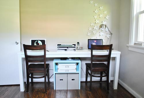
When it came to that blank wall above our desk (that we’d be staring at for at least 90+ hours a week combined) we both agreed that we wanted to DIY something (surprised?) and we thought it should be in the green/blue palette that we already had going on with our sleeper sofa and our customized bookcase. We also agreed that we didn’t want to do another big frame collage like the asymmetrical one in Clara’s room or the more balanced one above the console table in the living room and above the couch in the den.
But beyond that point, we weren’t really seeing eye-to-eye at all. Sherry thought one big piece on the whole wall would be best. I felt like two or three items might suit us better. Sherry leaned towards a photograph. I leaned towards a painting or illustration. I wanted to leave the wallflowers. She thought they should be moved to another wall in the room. And since our attempt at talking it though was getting us nowhere, we decided we needed to help each other visualize every possible idea (we’re both really visual people). So here are some of the techniques that we used:
Exercise 1: Collect A Digital Inspiration Folder- One of Sherry’s favorite things to do is to troll the interweb for inspiring images. Once she had collected a pretty decent range of art ideas – including a few that fell more in my preference category – we were able to flip through them to see which ones agreed with both of us. And while there were lots of strong contenders, none felt like “the one” (or at least “the one we could afford”).
Exercise 2: Go Where The Art Is- We may be too cheap/DIY-addicted to buy a “real” piece of art, but that doesn’t mean we were above finding inspiration in a bona fide art gallery. And lucky for us, the new-and-improved (and 100% free!) Virginia Museum of Fine Arts recently reopened its doors here in Richmond. So with Clara snug in her Ergo carrier, off we went to be wowed. The new building was definitely a wow in and of itself, and we did come across a couple of inspiring pieces – including this one from local artist Heide Trepanier.
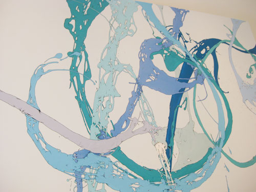
I’d actually admired Heide’s work since we first spotted it in our local Saks Fifth Avenue back in 2006 (it hung in the dressing rooms where Sherry was trying on white summer dresses for our wedding- another sweet relationship reminder). Heide artfully tosses acrylic or enamel paints in motion-filled lines, then outlines them in black. We definitely couldn’t afford an original, but I though we might be able to create a decent piece of our own inspired by hers. Alas, I couldn’t quite convince Sherry that it was the perfect cure for our bare wall (even though I was pretty sure we could pull it off, especially with her fine arts background).
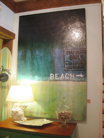
Exercise 3: Find Art In Everyday Places- Thankfully, art doesn’t only live in galleries. So for the last few weeks we kept our eyes peeled every time we walked into a coffee shop, restaurant, or home store to see if whatever they have on their walls might look good on ours. We bumped into one especially beautiful piece when shopping during our vacation last week to the Delaware shore (yep, surprise – we were blogging from the beach last week – it was Clara’s first trip to the ocean!). Anyway, here’s the beachy blue-green painting we spotted at a fancy shop called Tulip. It definitely had us saying “maybe we can do something like that.” But again we just weren’t (in the words of my wife) 100% smitten.
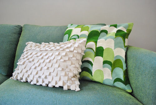
Exercise 4: Look Around The Room- Since leaving the house didn’t seem to be solving our problem, we also tried to find inspiration right in our own office/playroom/guest room itself. We already knew we wanted our art to somehow work with the blue-green color scheme that we had going on in the room… which could be why the pattern on this West Elm pillow caught our eye during our in-room inspiration hunt. Perhaps we could make a nod to the graceful arches in a large scale piece of painted wood that we’d hang on the wall? The only problem is that neither of us could decide what scale we should make the pattern when translating it onto the wall (we feared going too small with the scales would be too busy while making the scales too big might be a bit too bold and headache-inducing). So we begrudgingly moved on.
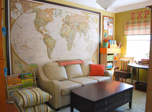
Exercise 5: Turn To Our Own Readers- Of course we also absorb a ton of inspiration from you guys every day! Between House Crashings, Reader Redesigns and all of the items you post on our Twitter and Facebook pages, we couldn’t ignore your own amazing makeovers as a potential answer to our big art dilemma. And one solution in particular that seemed like a good fit for us (especially given my nerdy love of maps) was Kate’s playroom makeover. We thought a giant roll-down blue and green map like this would work within our palette, and we could even trim it out on the wall with molding like Kate had done (or adhere it to a large thin plank of wood for a vintage-sign look like the art that we whipped up in the bathroom). Our only hesitation was that we already had some mappiness going on in the den. And we still didn’t get that “yesss- this is it” feeling that we were waiting for. On to the next idea.
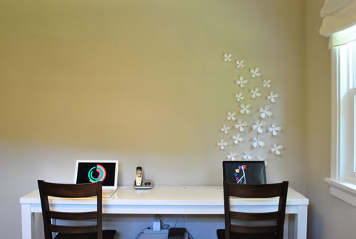
Exercise 6: Mock It Up- With so many ideas floating around in our heads, we figured one of them was bound to work if we could just see it in the room. Here’s where Photoshop came to our rescue. We used an old pic of the desk (before adding the file storage) and went to town making some rough mock-ups of what some of our ideas might look like (rough being the key word).
First we decided to explore an idea inspired by the abstract-yet-colorful painting that we spotted in that shop in Delaware. We quickly threw this together in Photoshop (and even played around with the idea of marking it with an anniversary-inspired number 7). I also left up the wallflowers that Sherry wanted to move (since I wanted them to stay) just to keep things diverse and exhaust all possibilities.
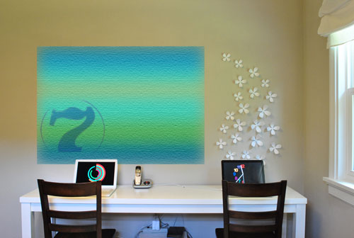
But it just wasn’t doing it for us. Maybe a poor first attempt at Photoshopping was to blame, but our quick visual was enough for both of us to kill the idea (hey, at least we were unanimous!).
Then we came back to our pillow-inspired pattern idea. Maybe we could mix things up and do a long narrow piece instead of a big overwhelming rectangle?
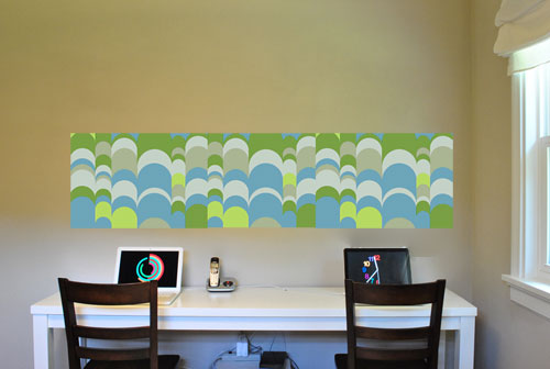
But as intriguing as this little exercise was, I was able to convince Sherry that it isn’t interesting enough to stare at all day, everyday. Plus something that repetitive and busy might make a chaotic workday feel even more overwhelming.
Next we were on to the map idea, courtesy of a sample found on AllPosters.com (which we blew up and photoshopped on the wall). It struck us as a lot more interesting to look at than the scale-y pillow pattern, but neither of us (me especially) could quite fall in love with the idea thanks to our US map that already lives in the other room. Though the idea of simply hanging a poster and then framing it with molding was a tempting DIY project.
So we were left to face a nerve-wracking scenario: all of that brainstorming had come and gone, and we still couldn’t agree on what we should spend our time and money DIYing. That’s not to say that the process of hunting for ideas together and mocking things up to deliberate over the possibilities wasn’t helpful. Because it really, really was. It magically turned our “I’m right and you’re wrong” debate into a “we’re both wrong” sense of agreement – mainly because we were able to clearly see each others’ ideas and discuss them more intelligently than any “trust me, a huge painting will look the best” reassurances that we could offer.
But while it was good for our relationship, it still did nothing for our big empty wall.

Then we learned what was perhaps the most important lesson of this whole scenario. As much as hunting for inspiration can work, sometimes it just has to fall into your lap. Even if that lap happens to be pantsless.
Let me explain. While at my parents’ beach house last Friday, I stepped out of the shower and spotted a recent issue of R. Home, our local home decor magazine. And would you believe the word that was staring right back at me?
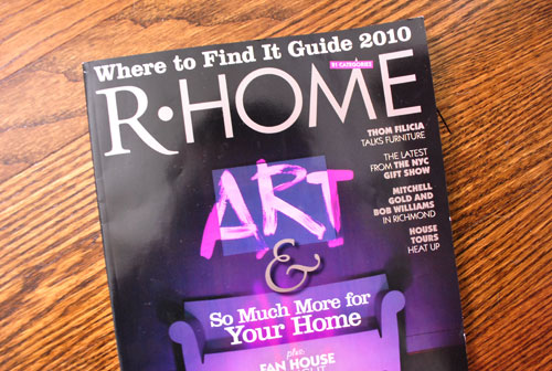
So I picked it up. And (after drying and dressing) I took my find to Sherry and we started flipping through the pages in hopes of spotting something that caught both of our eyes. And a mere ten pages from the end of the issue, one image did just that. OH HAPPY DAY.
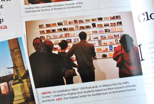
It’s actually a photo of an architecture exhibit at Virginia Tech, which features 100 postcards that appear to be leaning on some sort of thin ledge. Sherry and I were both immediately attracted to the big impact that the display had as a whole. And we also loved the idea that (when adapted to our house) it would be the perfect cure to our indecision: we could display several photos, postcards or small art prints and we could change them out if we ever fell out of love with any of ’em. Plus, we didn’t have to 100% agree on everything (if I don’t like one of Sherry’s pieces, it can just sit on her side of the ledge).
We were surprised that in many ways this final decision is the polar opposite of what we both thought we wanted (it’s nothing oversized or super bold, but the sum of its parts equal something so special and personalizable that it totally screamed “the one”). Plus in some way it fulfills all of the things we both wanted (we can incorporate photographs and abstract art and typography and on and on). Yup, we’re both totally psyched to get down to business. And everything from making the shelves, devising a hanging system, and coming up with dozens of pieces to display on the wall (with enough weight to keep them from blowing around) should be tons of fun. In fact, assuming all goes well, we’ll have that update for you in a week or two!
Have any of you ever felt stumped on a shared project? Do you have any other tips or processes you’d like to share when it comes to overcoming a decorating disagreement? Oh and feel free to toss out additional sources for art inspiration for everyone who’s struggling with a similar art dilemma.
Psst- Wanna follow the entire office/guest bedroom/playroom makeover? Click here for the intro post, here to read about the big sleeper sofa hunt, here for the DIY desk play-by-play, here for the homemade light fixture project, here for our hacked Ikea bookcase, here for the file storage we built, and here for how we squeezed in some toy storage.

liz @ bon temps beignet says
This is such a good idea. Can’t wait to see how you make the ledges so I can gently coerce my hubby into helping me do the same for our living room.
Amanda@reno366 says
Love that you guys put so much effort into each decision you make. I admire your patience, I usually jump on the first idea that I come up with! I think it’s great that you are going to be able to change things out when you want to. Is the jig saw coming out?
YoungHouseLove says
Hey Amanda,
Were not sure what tools we’ll be using just yet, but we’ll definitely spill those beans in our follow up post when we tackle the project. Can’t wait!
xo,
s
Jessica @ How Sweet says
I am stumped on my entire house! I feel that I like too many things and can’t bring it all together. But I do love that beach theme!
Beth Lehman says
Funny, that idea has been spinning around my head for some time b/c there are so many pictures that I love of my kids and places we’ve been – but I can’t choose there are so many. I’ve thought of this for the dining room and smaller collections for my kids in their rooms. Can’t wait to see how you tackle it!
Sabrina Jordan says
Personally, I would add a couple of white floating shelves where you can display your fun little things, or possibly add an old 4 pain white window. It would keep it fresh and airy and compliment the great floral art. If I had to choose 1 or the options you had above….the beach painting would win hands down. LOVE IT!!!!!
michelle says
Great ideas as per usual. Great to find solice in your blog as yesterday I had to put down my toy poodle of 16 years. Very heartbreaking.
YoungHouseLove says
We’re so sorry for your loss Michelle! Our thoughts are with you.
xo,
s
Mary says
This is serendipitous! Just the other day my husband and I were trying to figure out how we could display a whole bunch of postcards – we didn’t want to frame them or just stick them to a wall. This is perfect!
Amanda says
Out of the ones you guys have shown, I like the map the best.
Here is another idea for you. Create your own “quilt.” You can use blue and green fabrics with similar patterns or themes (even some fabric from Miss Clara’s backdrops). You could either frame squares of the fabric and put together a collage (like the nursery wall) or you could do them like apolstered headboard but on a mini sized scale. If you do them the apolstered way you can add buttons and ribbons and they can serve as a memo board or photo board as well!
Katy Stuhr says
I love this shelf/postcard idea. You will have so much fun finding cool cards/photos/etc on trips from now on. It can be a memory wall full of your special trips and events. I think I will do the same! We have a bare wall in our living room that has been begging to be decorated.
TG says
What about two pieces side by side (same size) that compliment each other (maybe colorwise or subject matter). Each of you choose a picture of your liking to coexist together on the wall. I used blown up photgraphs of places I have been that is inspirational or jogs a good memory.
Sarah says
I love the new idea, and I can’t wait to see the final result so I can be inspired. Did you ever think about a bulletin board to hang in (at least some of) the space? I just put one above my desk, and I plan to cover it in some fun fabric. I bought some cute pushpins, and with some inspirational photographs and to-do lists, it’s functional yet cute.
YoungHouseLove says
Hey Sarah,
Your fun fabric bulletin board sounds lovely! We actually also considered organizational tools like a bulletin board or a chalkboard or a cork square mounted to the wall, but we use notebooks for keeping track of most things (along with an online calendar and day planner) so we don’t really need a spot to pin things up like reminders and task lists. I guess we could have pinned up a ton of art on a large scale bulletin board, but for some reason the ledges appeal more to us for the space. Hope it helps!
xo,
s
Lauren Nicole says
INVITE ME! We prefer a small/large party. We are getting married next May and there will be around 180-200 guests. The ceremony will be in Minneapolis (where we both live), however we have a lot of traveling guests to invite. So, we’d love to invite them with letterpress invites! We can’t wait! :)
Kristin says
I love this idea! I also think it would be cute to keep blank postcards in the room for your guests to fill out and describe their stay with you so you can display and remember all the people that enjoyed your multi-purpose room!
E @ Oh! Apostrohe says
I know you’ve moved on from your map idea, but here’s a cool take on it that we had painted in our living room and LOVE!
http://ohapostrophe.blogspot.com/2010/06/grace-paints.html
Megan says
You guys are insanely brilliant!! I can’t wait to see this :)
The interior of my home doesn’t look like yours but it looks considerably better in the short months I discovered your blog.
Thanks guys for sharing with your reader.
Melanie says
I love the idea and all the progress you’ve been making and sharing. I’m fortunate to be working in a home office with 17 foot cathedral ceilings. So I had a big, big wall to fill and opted for this map from IKEA: http://www.ikea.com/us/en/catalog/products/70119430. It has the blue greens that match the rug: http://www.rugsusa.com/rugsusa/rugs/trans-ocean-disco/driftwood/139206419-36056.html.
I’ll be doing something similar to your pics/postcards idea on another large wall with some great pics of my worldly travels, UK, South Africa, Hawaii, etc. – thank you!
Thanks for all your guidance, I love my new home office completely, 100% inspired by YOU!!
Melissa says
Great idea!! You’ll just have to figure out a way to keep everything on the shelf when you open the windows (probably not for MANY weeks in our current weather pattern). :)
I am currently trying to figure out my living furniture configuration. Mostly I am just trying to get my mind around spending a boatload of money to get exactly what I want. STRUGGLE! May post on it later this week.
Melissa
http://www.houseography.net
Cassie says
For a minute, I thought that the couple looking at the postcard ledge was actually the two of you. Maybe its a sign that this is the right project!?
Also, I bet Clara would appreciate those wallflowers on her ceiling. :-)
greenwords says
I love this idea too. And the flexibility will be so nice, you can change things around whenever you feel like it.
As an aside, I learn so much from all your wonderful step-by-step examples of your DIY endeavours, and this post is a prime example. I’d love to see a post on how to use programs like Photoshop for testing ideas like you’ve done here. (Though it’s possible I’m the only one who can’t figure out how to do this myself!)
Claire says
Wow, what a process! Thanks for sharing. Its good to see you are ‘real’ and that ideas worth having are worth working towards. Thanks for letting us into the YHL psyche! I’ll now get back to my net trawling for ideas….. :)
Caryn says
Thanks for sharing the process. My husband and I frequently go through the complete disagreement on what would be best for a decor but thankfully always come up with something in the end that we are super happy about. We actually did a very similar treatment of ledges and images in our studio/office last fall. It works as office/painting studio/music room/craftiness/2nd guest room when multiple people need to stay so our walls also had to be quite versatile to match the ever-changing functionality. For ours we did 2 really long ledge shelves (that we found at Ikea) and we display some of my paintings, cool postcards, books with great artsy covers and anything else that catches our fancy. It has worked great and I’m sure you’ll love yours too! Good luck!
Carole says
what about a corkboard mosaic wall? You can either leave them natural, paint the squares, or cover them with fabric. Then you can switch out what’s on the squares. if guests are coming, tack up some flyers for local points of interest, or you could use it to help with mood boards when you’re in design blogger mode.
My kids make a lot of great art at school, so many of our big blank spaces are rotating displays of their work.
Blair says
Love the idea of the ledges. Perhaps, you can dedicate a section of one of the ledges for your guests to bring a postcard from their city/state to be displayed. They can scribble a little note on the back before they leave about their stay at your casa! I think it would be fun for you and for other guests to see who has passed through your lovely guest room (office/ playroom). :)
Also, what are the best sites to find room/decor inspiration photos? I don’t know if you’ve already done a post on that, if you have, can you please point me in that direction? We are moving to a WAY smaller apartment at the end of the month and I really need some ideas for furniture arranging/decor.
Thanks guys!
YoungHouseLove says
What a cute idea about displaying postcards from guests who come to stay with us. Fun! As for the sites we hit up for inspiration, we like myhomeideas.com, housebeautiful.com, bhg.com, and places like desiretoinspire.net. Hope it helps!
xo,
s
ABC Mama says
Excited to see how this turns out. I’ve been thinking about doing something similar with photos by just sticking them to the wall. This could be soooooo much better!
Meredith Leigh says
I can’t wait to see how this turns out! I’ve totally had an evolving version of this (albeit less classy) since college that I call the “Wall of Love”. Cards, postcards, pictures, etc. I used to tape them in a giant collage directly on the wall. I currently have a large collage frame occupying one wall in my bedroom, but I may have to evolve again to something like this once I see the final result. Love it!
Ashley E says
Cool!
The Ad Agency I work at uses ledges like that behind the main desk to display recent logo designs. It looks exactly like your inspiration photo, multiple ledges holding rows of logos mounted on white art board.
Renae says
So that begs the question…flowers staying or going? Moving them?
And since we all know that photos bend after being set on end for a while, there’s a great product you can find that actually make your photos into postcards themselves, while adding some needed rigidity. Check out photogjojo if you’re not already familiar:
http://content.photojojo.com/diy/postcards-from-your-photos/
Nope, I don’t work there, just love their quirky stuff. Can’t wait to see the reveal. Hurry please!! :) Oh, and happy anniversary tomorrow guys!
YoungHouseLove says
The flowers are moving! Stay tuned…
And thanks for the link!
xo,
s
Nikki says
Fantastic idea John and Sherry! As a high school teacher, I’ve done something similar in my classroom with rain gutters, of all things (I’m not suggesting you use a rain gutter). They make perfect little book cases drilled right onto the wall– a nice display for my classroom library! Looking forward to your end result.
Sarah says
love the idea! but i don’t see how it is not going to be oversized. the picture from r. home seems to cover a large part of the wall…i guess you will scale it down a bit? i am sure it will be great thought, looking forward to seeing it (i was hoping you would put up some of your cutest pictures of Clara)!
YoungHouseLove says
Hey Sarah,
It’s definitely going to be an oversized display, but it’s not one large piece of art like a single oversized canvas. Hope it helps!
xo,
s
Jennifer says
One of my fav posts! Love to read your discarded ideas!
Our household has one photographer (me) and one artist (him) so we actually have more art than walls. That is a whole different problem entirely – we have to pare down to just our favs and keep the rest in storage. It’s kinda hard to store canvases that are 5 feet by 4 feet….
Sarah says
ahh..ok! I am with you on loving the oversize Sherry! happy building!
christa says
don’t know if it’s my browser or the site, but often times i have to refresh to see the pics in your posts, the first time it just shows up text. just throwing it out there so you know and in case any one else has the same problem so we can alert you.
keep up the awesome work!
Autumn says
That’s going to look great! My husband and I just decided on something extremely similar–we’re going to string thine wire or jute twine (about four rows) across one section of wall in our guest room and use mini clothespins and pins to adhere postcards and polaroids and favorite photos. We went through a long bout of indecision, too!
YoungHouseLove says
Hey Autumn,
That’s a great idea! We actually toyed with installing a clothesline feature like that above the sleeper sofa so there would be a place to display Clara’s drawings when she gets a bit bigger!
xo,
s
Meredith says
I am so excited to see how it turns out!
Amanda@Our Humble A{Bowe}d says
I love the idea of your photo rail wall. I think you guys will execute it perfectly. I actually have a map in my office: http://ourhumbleabowed.files.wordpress.com/2010/06/of.jpg and my backsplash is a magnet board, (http://ourhumbleabowed.files.wordpress.com/2010/06/img_9075.jpg) so I can hang photos and change them out when I get bored.
Randi says
Here’s an idea… why don’t you have your “biggest fans” send you a postcard from their hometown. You are sure to gather some super great postcards from around the world- very quickly! And… as you work on your blog posts, you will be reminded of all the people you inspire around the world! P.S. we could send them to a P.O. Box in order to respect your privacy. What do you think?
YoungHouseLove says
Love it Randi! Here’s our PO Box addy:
John & Sherry Petersik
PO Box 36665
Richmond, VA 23235
xo,
s
erin says
Love this idea – even more so because it comes from my alma mater (go hokies!). Thinking about doing this on a big wall in my bedroom now.
Kate at Centsational Girl says
Been there ! It’s amazing how difficult it can be to doll up those blank walls with something unique and beautiful that you will love. Can’t wait to see how you construct those ledges, I need some of those for my boy’s room !
Thanks for the linky love, you rock !
xo
Kate
Jennifer says
I just thought of something that could be fun for this! Whenever my husband and I go on a trip together, we mail ourselves a postcard with a top ten or top five list of things we want to remember (anything from a great meal to watching a lady trip and fall on the beach). So far we’ve just been tossing them in an oversized glass vase, but you could prop them on your wall. Plus, if you’re the ones picking the postcards, you can sorta go with a color scheme to keep things looking cohesive.
YoungHouseLove says
We do that too Jennifer! Funny! Here’s an old post all about it: https://www.younghouselove.com/post-haste/
xo,
s
Lisa A says
Great concept for your wall! I love the idea of changeable art…in fact we recently installed 3 movie poster frames in our home office that have edges that flip up making it really easy to change out our slightly huge collection of movie posters any time we want. Keeps the room fun and different just by changing out Citizen Kane with Godzilla. Looking forward to seeing your poject!
marybeth @ www.babygoodbuys.com says
OMG, how long did this post take you to write? I’m thoroughly impressed by your thorough research and your final decision, but I’m MOST impressed by the length and meticulousness of the post itself :)
jennifer says
Sherry & John,
You’re geniuses! I saw that beach picture somewhere last week online, but I can’t find it (tulip doesn’t show it either). I’ve been scouring the web ever since in the hopes that we can snag it for our hallway. You’re right to go with something that works better wit your space. I really appreciate (as so many others do) that you allow us into your process of decision-making!
icj,
~j
Krys72599 says
LOVE this idea, and LOVE the post!
Carmen says
Love your ideas. I know that you love diy projects and they are a lot of fun, but I remembered that IKEA has those ledges. They come in two different sizes. Just a thought, if your time is somewhat limited with having a new baby and all. Can’t wait to see what you guys decide. Have a good one!
Janice says
My first thought when I saw the “big idea” was to have us all send postcards to you. That clever Randi had the same thought!
sara says
Great idea! CAn’t wait to see how it all looks!
Lindsay Osorno says
Where did you all find the US Map hanging in the den?
Thanks! :)
Lindsay Osorno says
Oh, found my answer via the link above…eBay!
kelly says
Check this out. It’s something that I made that reminds me of your post card wall.
http://kellyloves.wordpress.com/2010/03/10/monochromatic-memories-…/
tell me what you think ….
Leigh Anne says
This is an absolutely wonderful idea – I can’t wait to see how it all comes together!
Are you all definitely making the shelves, or would you consider buying long ones like you have in the dining area?
YoungHouseLove says
Hey Leigh Anne,
The ones in the dining room are super deep (so they would jut out to far into the room). We’re definitely thinking we’ll make them instead, so we can control the length and the depth for a custom look (and less moolah to boot). Hope it helps!
xo,
s