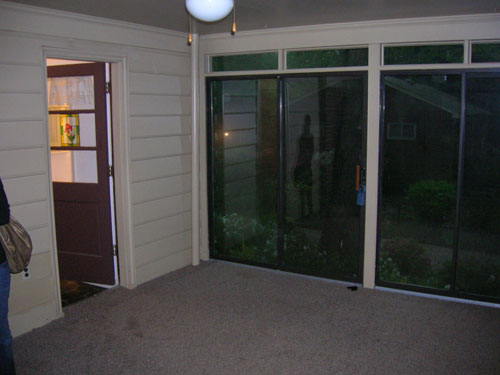
After giving our floor stencils a full seven days to dry (it’s humid here!) we finally moved all of our furniture back into the sunroom and snapped a few photos of the whole room after our three phase mini makeover (see phase one here, phase two here, and phase three here). First let’s take a look back at what that room looked like when we purchased the house four and a half years ago. Yeah, it had a thin matted rug that smelled like dog. Enticing, we know.
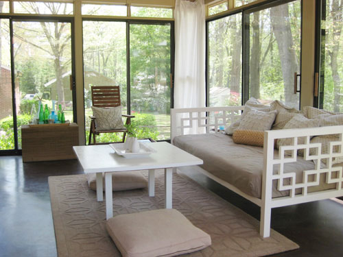
So we pulled up the rug (the very first day we moved in) and stained and then later painted the concrete floor. It was definitely a slow evolution in there, but the great views made it one of our favorite places to hang out pretty much from day one (after that stinky carpet was gone of course). Here’s the room as it looked about a month ago before our mini makeover began. There’s no denying that it was serene in there, but with tan walls, a tan rug, tan floor pillows, a tan daybed cover, tan pillows, a tan ceiling, some brown furniture, a brown floor, some white curtains, and some white furniture it was feeling a little flat. So we wanted to keep most of those neutrals but add a little color and fun (without spending over $150).
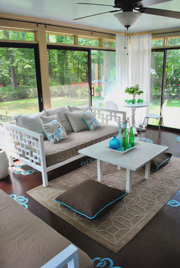
Now here’s the room as it looks today, after we added a dresser from another room, painted the daybed, hung sleek looking curtain rods, painted the ceiling, and stenciled the floor (read about those projects here, here, and here). Note: This room definitely looks different in person than it does in these photos. It’s hard to explain, but the floor is just one plane, and the view out of the glass doors is three planes, so the view is definitely is a lot more emphasized in person than the floor stencils (but in the pics the view is sort of diffused thanks to the reflective glass and the stencils are extremely high contrast for some reason). We’ve had friends and family members over (even extremely “reserved” ones) and they all love the floor- going as far as to describe it as a subtle change and the entire room as a soothing space. Sometimes things are just hard to capture in photos!
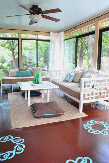
We love how the splash of aqua on the floor complements the sky blue ceiling (which really makes the room feel much more open and airy). We love the look of a blue ceiling, which is a popular choice (especially in the South). It’s sometimes called “haint blue” and we’ve written a whole post about it.
We also love that we gained tons of storage (for everything from board games to baby toys) thanks to this dresser that used to live in our guest bedroom before we turned that into an office/guest bedroom/playroom (see that transformation here).
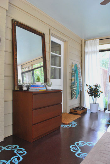
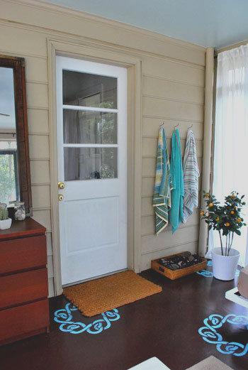
In the small tweaks category, we tossed a few colorful beach towels on our towel hooks (read more about why we need those here) and moved our fun faux orange tree over into that corner near our shoe basket. I DIYed that tree over five years ago in NYC when I needed greenery in my apartment but everything kept dying, so thanks to a few fake stems from Pier1 I was in business (I actually “planted” them in real dirt inside of a cheap Ikea planter). I know it’s odd to be attached to a strange little faux orange tree but it definitely has a special place in my heart. Although in my defense many people think it’s real and don’t believe me when I say it’s fake- maybe it’s the real dirt, haha.
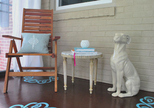
And we can’t forget our corner with the cheap-o marble table that we snagged a while back (read about that here) and my beloved ceramic pooch, which I still consider to be a major steal (learn more about him here).
We really like how the floor stencils peek out under the doormats, the area rug, and even the daybeds (thanks to the fact that they’re both on legs, so you can see the stencils running under them). And thanks to the fact that the majority of the furniture and accessories are still tan and white, the touches of blue and green that we added really feel playful and add dimension without being too much (especially in person, again, photographing a room with three glass walls was tough for us). We also love that we can change them all out if we ever tire of them. The floor and ceiling are just paint, which is cheap and easy to redo- while the accessories are even easier to swap out on a dime and in a moment’s notice.
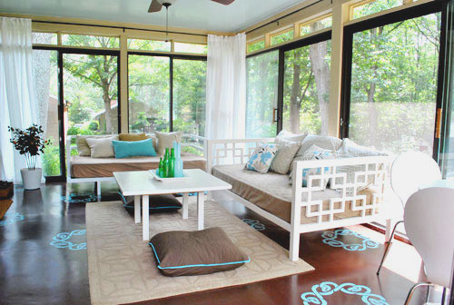
Oh and speaking of small accents, we picked up two $6 floor pillow covers (snagged on clearance at Bed Bath & Beyond, down from $19 each- they’re actually just square Euro shams that happened to fit right over our old floor pillows from Target).
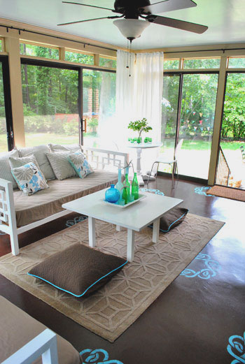
We figured that $12 upgrade added a bit more subtle contrast to the middle of the room (see how the old ones blended in a lot with the rug in the before picture?) so we’re happy we switched those out at the last minute. And should we ever want to take them back to the more neutral looking pillows of yore that’s a nice easy swap, which we appreciate. Speaking of $12, here’s the budget breakdown for this mini makeover of ours:
- $0- Dresser and mirror (leftover from old guest bedroom)
- $0- Second daybed (leftover from third bedroom which is now Clara’s nursery)
- $0- primer and paint for daybed (already owned- see that painting tutorial here)
- $20- Ceiling paint (Tide Pools by Behr in semi-gloss for sheen)
- $40- Curtain rods from Ikea (these without the finials)
- $20- Glidden oil-based porch/floor paint for stencil (color matched to Martha’s Lagoon)
- $30- Ceil stencil purchased from a local paint hero of ours
- $7- Sponge for stencil project
- $12- Floor pillow covers (clearance square Euro shams from BB&B)
- Total budget: $129.00
Not too bad considering that we updated everything from the furniture to the ceiling and even the floor. And small changes like those new curtain rods and the painted daybed really make all the difference. Surprise, surprise- we find ourselves out in the sunroom even more these days. Just soaking up the view out the window and taking in the scenery inside, too. We also find Clara staring at the stencils like she’s hypnotized. Kind of making this face. Hysterical. Apparently the girl already appreciates fun home decor. And if we ever tire of anything we can always paint it/replace it in a few quick phases without breaking the bank- just like we did these past few weeks. Woo hoo for inexpensive changes that make you smile.
What about you guys? Do you have any mini makeovers in the works? Are there any sunroom transformations going on at your house? Have you ever plated something faux in real dirt? Spill it.
Psst- Wanna follow along with our sunroom mini makeover from day one? Here’s the first phase, the second phase, and the third phase.

Cait @ Hernando House says
That looks great, you guys! I love the way you tied the stencil color into the room.
We’re still working on this mini makeover (http://hernandohouse.wordpress.com/2010/08/27/guest-room-glam/) and have several projects for it in the works at the moment.
Amy Wolff says
LOVE IT!!!!!!!!!!!!!!!!!!!!!!!
One question- of course I have a question:
I can’t remember is the floor concrete or wood? I have wood in my patio. I can’t wait for my maternity leave to create my sunroom.
Thanks for the inspiration!
YoungHouseLove says
Hey Amy,
Our floor’s concrete, but oil-based porch and floor paint (which we used) works on both. Hope it helps!
xo,
s
Caroline says
Absolutely beautiful!
Rebecca (Craving Simplicity) says
Looks wonderful!! Love the way it all came together!
Ericka says
What a great transformation without spending a lot of money! I love how the piping on the pillow covers match the stencils on the floor – what a happy coincidence!
AnnabelVita says
WOW! Seeing it all together like that makes me think I need a blue ceiling somewhere, it adds such light and pop. Good work!
I wish I was doing some mini-making over, but all of that is on hold whilst flat hunting, and it’s kinda killing me.
But does mean that soon I’ll have a whole new place to fiddle with to my heart’s content.
Mandy says
You guys never cease to amaze me!! That is incredible, I really wish I had your knack for reusing and repurposing things in our house! And now, I know that I need to get a sunroom, stat…
liz @ btb says
I love all the pops of blue throughout.
Alison says
LOVE IT! I have to admit I was a bit skeptical after you painted the stencils on the floor, but now that everything is done, they give the right amount of pop. Another job VERY well done! Thanks so much!!!
Amanda says
You guys never fail to inspire me to take on quick room makeovers for cheap. I just love visiting this blog!
Rebekah says
I may in the minority, but I actually like the old way ALOT better! :-/
It looks a bit mishmashed right now. The blue stencils are so distracting. But, I do appreciate that you used mostly what you already had, so bravo for that! :)
Ellen C says
Looks great! You all are so creative…love it :)
Barb says
I love the look of the curtains now that they are functional as well as decorative!
Taylor says
I love everything about this makeover!!! The stencils look fab, love the ceiling and the now white second daybed…
except the wall color. It looks so dark and clashy to me. Maybe a slightly cooler tan/greige would do it for me.
Melissa says
This is great – Thanks for sharing the pics! I love the stenciling, what an inspiration.
heather s. says
Kudos for trying something new but I’m still not digging the floor stencils. I think they make the room look too chaotic and distract from the awesome view and the goods you have in the room. I preferred the room before.
Theresa says
Love, love, LOVE the sunroom! I’d spend every waking moment in there if I had a room like that!
We moved into our 1950s ranch house back in April, and there is so much to do–I still haven’t unpacked all the boxes yet. The only room that “feels” close to done is the master bedroom, and even that is going to get a makeover as soon as I some $$$ to work with. But at least we have a place to escape all the clutter and chaos in the rest of the house for now.
Thanks so much for all the inspiration!
Carol N. says
Love this! Now I need to add to my to-do list, paiting the ceiling of my screen porch with the Tide Pools paint! This looks like a ‘happy’ room and I bet you spend a lot of time out there in the mild weather.
Jessica @ How Sweet says
Oh my gosh I totally love it! I would live in JUST that room if it was my house! Beautiful.
corey says
I agree with Rebekah. It’s not working. The tan walls look out of place with the new color palette, and that serene feeling from the before pictures has been lost.
Pam @ diy Design Fanatic says
Looks fantastic! What a wonderful room! You really spiced it up :)
Angela says
I have to say, I am also not liking the stencils. I love everything else about your house…but the stenciled floors..not so much. I also prefer the room before.
kathleen@betweenblueandyellow says
The colors are beautiful! Love how you worked in all the turquoise.
Suzy says
It looks great! I love the turquoise piping on the pillows! Perfection!
The only other thing I would do, if I were you, would be updating the back door to a sturdier version. We had a backdoor like that and it was the place someone decided to use to break into our home!
jacki says
Wonderful room! I really love the stencils!
Dennis says
Wow it looks great! Does Burger ever get startled by the statue of the dog? :]
YoungHouseLove says
Hey Dennis,
Oddly enough he seems immune to it. Even when we first brought it home we thought he’d go crazy but I guess since it doesn’t move or smell like a real dog he’s not convinced!
xo,
s
Mike @HA says
I’m not loving the stencils, sorry, don’t hate me! My eye is really drawn to it in a distracting way, at least in the photos. I know it might look different in person though. I DO love the curtain rod upgrade, painted ceiling, painted day bed, and the extra from the guest bedroom (which had made it’s way from the master if I remember!). Great work!
YoungHouseLove says
Hey Mike,
You’re right, it definitely looks different in person! It’s hard to explain, but the floor is just one plane, and the view out of the glass doors is three planes, so the view is definitely is a lot more emphasized in person than the floor is (but in the pics the view is sort of diffused thanks to the reflective glass and the stencils are extremely high contrast just due to the way the camera captures the room)! We have had friends and family members over (even extremely “reserved” ones) and they all love the floor- going as far as to describe it as a subtle change. Sometimes things are just hard to capture in photos!
xo,
s
Jan says
WOW — Why does this not seem like a “mini” makeover? The changes are magnificent and such a fun, classy room — just like out of a magazine. I WANT THAT ROOM! I have a screen in porch which seems to have basically the same dimensions, and I could, indeed, incorporate some of your design ideas. You are SO good!
kristi says
You definitely added some pizazz to this space! Like Rebekah and heather commented, I too liked the room more before. I just thought the colors were so soothing and tranquil. But I do applaud you for taking risks and changing things. I’m usually too much of a scaredy-cat to try anything different in my house. So kudos for that, and if the room makes you happy – that is what counts. :)
Jen says
UGH you guys are amazing! Come and decorate my place please!! Actually, we recently had to get rid of our curtains in our living room do to wear and tare of having an almost 2 year old! I was wondering if you had any suggestions on a good place to buy inexpensive new ones?
Thanks!
Jen
YoungHouseLove says
Hey Jen,
Ikea! They have a ton of cheap curtains for the taking. We also like Target and even JC Penney for other affordable options. And overstock.com. Hope it helps!
xo,
s
DJL says
Love most of it … Love the pop of turquoise all over.
One part I’m not a huge fan of is the dresser. I think that it feels like a bedroom dresser in a cool space. I can understand the practicality of it, but I don’t think it fits in, in terms of look or color/finish.
Ludmila {creamylife.com} says
I LOVE IT! I needed to write all in caps, so you understand how much I love it! The popping aqua (which I think is turquoise, because I love the color) looks stunning!
jennifer says
we actually have 2 mini makeovers in the works…
1. our side entryway, which is small and poses some storage issues for shoes. we want to use it in the winter instead of tracking snow onto our living room door mat and have boots lying around everywhere.
2. our daughter’s “big girl” room… we are kind of stumped on this one. it is currently painted with obnoxious neon strips [thanks to the previous owner’s daughter] and it has been left as is until now. we are still trying to figure out what to paint it [we are trying to stay away from all pink walls]. we picked out her bedspread [http://www.ikea.com/ca/en/catalog/products/40163288] and now we are trying to figure out what wall color[s] to coordinate with it. on the plus side we don’t plan on moving her in there until her 2nd birthday at the end of april.
Jeni says
Eeks, I agree with the “not a fan of the stencil” comments…and the “not a fan of the wall color” remarks…and the “it was better the way it was before” sentiments. To each his own, I guess. But the curtains look great to me!! Enjoy your new room and thanks for sharing the transformation with us.
Sheree says
It looks amazing! This has to be one of my favorite rooms that ya’ll have redone other than your bathroom. Great job and thank you for sharing all your hard work with us!
Erin @ Cultivating Home says
It is so inviting! It looks like the perfect place to curl up with a nice glass of tea (or wine) and a good book. Your results are strong motivation for me to work on spiffing up my own porch. Great job!
Amanda @ Our Humble A{Bowe}d says
We’re currently in the process of giving our boys room a facelift. Refinishing some furniture, making a rug, and new art.
http://ourhumbleabowed.wordpress.com/2010/09/07/magazine-artwork/
Rachel @ The Avid Appetite says
Wow! It’s amazing how seemingly small changes make such a huge difference! Chocolate and turquoise is my favorite color combo – great job!
Jena@InvolvingColor says
This looks fantastic! The stenciled floor really pulls the room together once all the furniture is back in place. You truly have an eye for design!
OwningSingle says
It really looks amazing!
Mandi says
Everything looks great, wonderful job. I love the bold stenciling, particularly with the new ceiling color and (as you point out) that there is a huge competing view out the three windows to tone it down. I love that paint line too, I used it in my gross-floor basement when we moved in.
Although I love the idea of the dresser and it’s appearance, I worry that a laminate piece is not going to hold up exposed to the elements – I hope you’ll report back on how it’s doing in awhile. I’ve lost some pieces to humidity myself.
YoungHouseLove says
Hey Mandi,
We’ll definitely keep you posted on any updates, changes, or humidity issues we have! The old bookcase that we had in there for around 3 years was laminate so we’re thinking the dresser should be ok, but you never know! We’ll be sure to share the continued evolution!
xo,
s
mar says
Overall this is a great makeover from a good space to begin with. However, I don’t really dig the floor pillows. They are such a casual element in a room and seeing floor pillows so orthogonal to the rest of the space takes the lightness away from them. They’re probably Burger’s fave place though, so …
I do lurve the floor stencils and color scheme. Great job!
YoungHouseLove says
Hey Mar,
It’s true, Burger would probably disown us if we moved those pillows! He jumps down from the daybed onto them since the concrete floor is really hard on his knees (smart guy).
xo,
s
Kara from Kara's Korner says
Lovin the new open and airy update with the pops of color. So relaxing and interesting all at the same time!
Patti says
This looks amazing! I can appreciate how it must look different in person with the view being the thing that draws your eye but even so, this is beautiful and so inviting. I wanted to ask … how did you know the painted stencil (in turquoise no less) would work so well? Did you try it in an inconspicuous spot first? I would be afraid to do something this bold without first knowing how it would turn out. Good job guys!
YoungHouseLove says
Hey Patti,
You’re right- the key is seeing something in person to get more confidence that it’s right for your space. We had seen Sunny’s stencils in a number of our friends’ houses and in person in her store, so we had confidence that we’d love the look and it’s definitely our favorite change in the entire room. The old chocolate concrete was delicious looking, but concrete in general (even when it’s painted) can look a bit flat and heavy, and the stencil is just the ticket to give it a bit more energy and take away from that “slab of stone” feeling. Plus it’s just paint, so we can always easily paint right over it if we tire of it!
xo,
s
Jill says
It looks fantastic! I’m wondering about the white door…any paint left over from stenciling?
YoungHouseLove says
Hey Jill,
We do love a painted door… but we also love how the white door works with the white furniture. Time will tell…
x,
s
Jenny says
Hi there,
I love your site, but I have to admit I really don’t like this makeover – especially the floors. It’s tacky and will look dated very quickly.
Otherwise, keep up the good work and passing along amazing tips!
YoungHouseLove says
Hey Jenny,
Our rule is that if something is “just paint” we’re willing to go for it! Sure it might look dated and we might tire of it, but we can just paint over it!
xo,
s
Lauren Z. says
hey guys!
holy honk I LOVE your blog! The fiance and I JUST bought our first home together {wahoo! for a 1960 ranch!} and I have your house as my inspiration! Everything from painting all the golden pine trim white to hanging our curtains “high and wide”! :)
Couple of questions and thank you in advance! I have scoured your blog fordays for answers but cannot find them!
1) We have a LARGE bay window in the living room and the actual window is “bumped” out with the window sill about a foot from the floor. One part of the window is parallel to the wall and the other two are on 45 degree angles. A tipped over trapazoid of sorts. The blinds are hung on the actual windows. Do I hang the Vivian curtains still high and wide on the wall even with the low window sill or hope for roman shades? I don’t know what to do with my bumped out wall and window sill.
2) How do you feel about the Behr paint color ” Sage Tint” or “Pale Lichen” for painting over paneling in our three seasons room? Too green or greige? Paint colors have me dazed and confused.
Honestly I think you guys are the best thing!!! Any help is greatly appreciated!
YoungHouseLove says
Hey Lauren Z,
Without being in your space we’re not sure our advice will be accurate (paint looks different in different lighting situations and sometimes we have to try a few curtain hanging approaches before we settle on the one that we like best. So our best advice would be to test out a big square of paint on your wall and try hanging the curtains high and wide and see how they look. Good luck with everything!
xo,
s
Skye says
This is my first time to comment on your page but I have been reading it for a while. I was always a little overwhelmed at your website – I never knew where to start! But I have dedicated some time to explore it and see what all it has to offer and now I am HOOKED! I think you guys are really inspiring and so fun to read. Thanks for doing what you do and sharing it with us! This room is beautiful and I cannot believe it all happened for only $129 dollars. This girl is jealous!!
Ashley Stinson says
It looks great, you guys. I can’t believe how much higher the ceiling looks now that you painted it blue… it must look even bigger and more open in person! I would love to have a sunroom like this–what a great place to hang out. Thanks for sharing… :)
Amanda says
This is amazing you two!!! I have to say i was kind of bummed when you mentioned that you were doing a makeover on the sunroom, because I was in love with it, but now I love it even more!!! I can’t believe what a huge overall change you got with just little changes.