Here’s where we explain the second half of Farah’s home makeover (click here to read our first post on the subject). Basically HomeGoods offered us some free merch for our house and we asked if we could pay it forward and transform someone else’s casa instead. Unbelievably they agreed. And we decided that we couldn’t stop at just sprucing up Farah’s mom cave after we laid eyes on her family room. So we have another before and after for all you transformation loving fiends. Here’s her cute family again, just to refresh your memory.

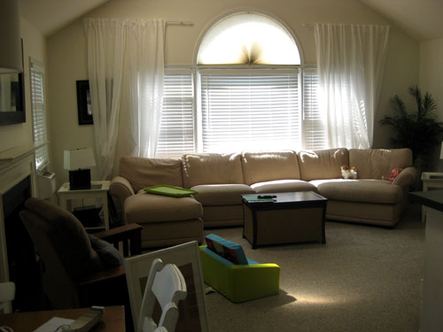
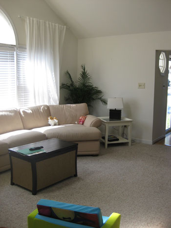
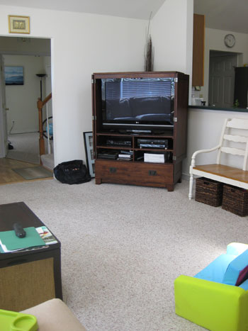
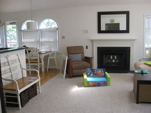
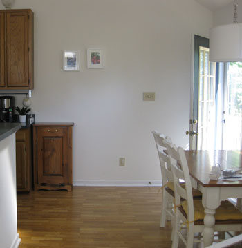
And here’s their family room before:
Here’s the same room after we got our mitts on it:
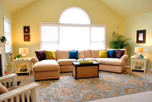
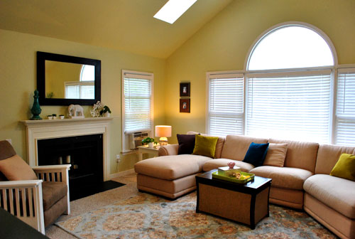
It was pretty much a blank slate, and we were lucky enough to be able to work with a lot of Farah’s existing things (the sectional, the recliner, the side tables, the wood frames, the coffee table, etc). So it just came down to adding some room-making accessories and bringing in a ton of kid-friendly function for Laila without cramping the grown up’s style.
One of the biggest changes came from suggesting some warm artichoke green for the walls (Benjamin Moore’s Nantucket Breeze color matched to satin Behr paint). The room glows like candlelight with a soft green tint. And thanks to everything from the new table lamps to the soft texture-adding rug, the space really feels warmer and more inviting.
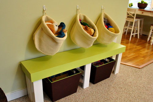
Farah even primed and painted the existing recliner (see how here) and we brought in a cute green bench (which used to sit unused in a corner of Laila’s room) to create an entire area that could be devoted solely to her toys and games. Because it’s always nice to work in some kid-space within a public living area. You know so they don’t feel banished (like those old formal living rooms where children weren’t allowed and the sofas were covered in plastic).
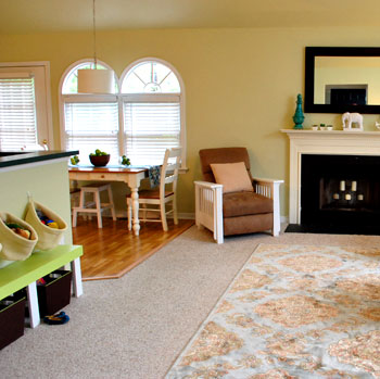
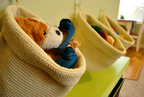
We thought hanging three white hooks with inexpensive Ikea baskets on the wall above the green bench would add even more stash space for Laila and her gear (while keeping things looking organized and simple). Plus we’re not gonna lie, it was a whole lot cheaper than buying a big cabinet or console table to fill up that wall.
And over in the kitchen, we moved the white bench (which used to live where we put the green bench) over into the kitchen near the table. See, whenever Farah entertains she pulls the table out into the room and adds the bench. This way she doesn’t have a blank wall in the family room anymore when she has guests over. And Laila now has a little zone to enjoy every day. Win-win.
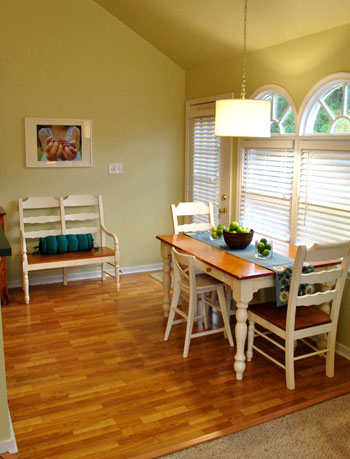
And see that print above the bench? We’ll explain more about that in a bit.
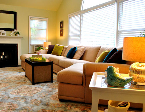
But first, here’s another POV of the seating area:
And another one:

And another one:
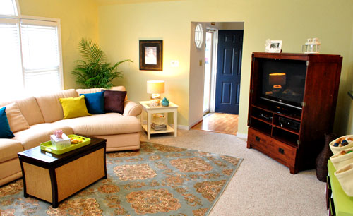
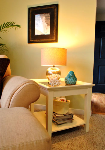
And see that basket under the side table atop that stack of mags? It’s just one of two leftover woven Ikea baskets that we got for the wall above the green bench. We thought they would add even more function if we used each of them to corral Laila’s board books. Now adult reads and kid reads can peacefully coexist without looking like a doctor’s waiting room.
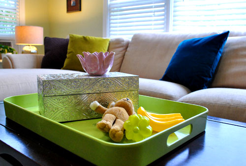
And not only did we make a little Laila zone with the green bench and those hanging baskets, we also tossed a few of her toys on a plastic (read: unbreakable) tray on the coffee table. Since kid stuff tends to inexplicably migrate around a room, I figured that embracing that fact by using some pint sized play things for the reveal would depict how the room would really look after Laila works her decorating magic. Let’s just say I was channeling my inner two year old. Plus how cute are those tiny plastic bananas? Maybe plastic fruit will be my new obsession akin only to ceramic animals.
Here’s that photo that we said we’d get back to. It’s actually a portrait that we shot of Laila in the backyard holding mini grapes.
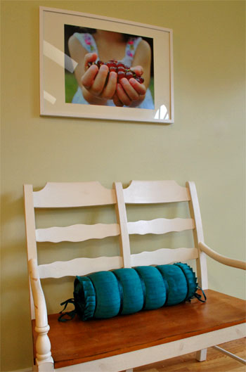
When Farah said she was looking for a berry-related print for a frame that she already had to hang above her bench in the kitchen, she asked if we could shoot photos of her own daughter’s hands holding berries for a one-of-a-kind customized result. One DIY photoshoot with Johnny P the photog and twenty bucks later (we had it printed at a local shop downtown) we had our one of a kind print for the wall. Now Farah can enjoy something a bit more custom than anything that she’d ever find online or in a big box store.
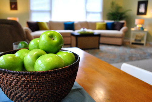
Oh, forgive me for being captain obvious here, but here’s a cheap (and edible) centerpiece idea for you. Nothing beats a bowl full of fresh green apples:
This is just a gratuitous basket detail shot because I can’t get over those cute blue shoes that match our color scheme. I’m shallow like that.
And now for another budget breakdown:
- Paint: $100 (five whole gallons- we suggested Farah paint the ceiling & adjoined kitchen to avoid breaking up the room)
- Rug: $299 (8 x 10 from HomeGoods)
- Kitchen blinds: $60 (faux wood blinds from Home Depot to unify the kitchen windows)
- Side table lamps: $29 each (from HomeGoods)
- Blue bird: $9.99 (from HomeGoods)
- Blue finial on mantel: $12.50 (from HomeGoods)
- Pillows: $55 (brown ones from HomeGoods, rest from World Market)
- Custom Laila hand photo in kitchen: $20 (printed locally at Uptown Color)
- Decorative remote box: $15 (from HomeGoods)
- Kitchen table runner: $12 (from HomeGoods)
- Kitchen bench pillow: $20 (from HomeGoods)
- Baskets under green bench: $22 (from Target)
- Hanging toy baskets above bench & under side tables: $30 total (from Ikea)
- TOTAL: $713.49 ($296 spent by Farah thanks to HomeGoods!)
We went into this family room (and semi-kitchen) makeover with the Trading Spaces spirit- we definitely gave Farah her fair share of homework, from painting the walls to hanging the blinds and even priming and painting her recliner. So we assumed the total would come to around a thousand dollars a la Vern Yip or Genevieve Gorder from their glory days on TS. Needless to say, we were pretty darn psyched when we crunched the numbers and realized we were about $300 short of that, especially since we squeezed in some big ticket items (like a giant 8 x 10 rug, tons of paint, and matching side table lamps) as well as a slew of accessories (from pillows and a table runner to baskets and hooks, a ceramic bird, and even a large custom photograph of little Laila herself). We had so much fun with Farah and family! Thanks for letting us barge in and order you around like Doug Wilson. What about you guys at home? Do you have a corner in your family room for kid-paraphernalia? Or small plastic bananas as coffee table decor? Somebody please say yes to that.

jessica says
very off the subject-but i have that exact dress on today Farah’s wearing in your pictures-nice taste ;)
Thu says
Hi,
Let me start off by saying I love your blog and everything that you all do!! Do you have any idea where Farah got their coffee table in the living room? Love, love, love it!
Thanks!!
Loyal Reader,
Thu
YoungHouseLove says
Hey Thu,
We don’t know! Here’s hoping she can stop in with that info when she gets a moment!
xo,
s
Robin says
Love the makeover and love the idea of you doing more spots like these. It’s so fun and inspiring. What a great idea since you’ve run out of rooms in your house to makeover!
Cait @ Hernando House says
That looks awesome!
Also,I just picked up a box similar to that from HomeGoods and now I want a tray to go under/with it. Oi.
Caroline says
This room looks so cozy with the new paint! Love everything about it!
kristy says
Funny enough, even though I absolutely love this space and what you did with it, I totally adore Farah’s dress! @jessica (or Farah!) – would you mind spilling the beans where you picked up the frock? :)
Nota Supermom says
Love that rug, and what a great price.
HomeGoods, here I come!
Is there a HomeGoods tag, so I can see where you’ve used other articles from there?
YoungHouseLove says
Nope, we don’t have a HomeGoods tag, but if you search “homegoods” in our site’s search tab it should take you to other posts with HomeGoods stuff!
xo,
s
r8chel says
Wow – that transformation is striking! I love how you carried through the blue from the front door. It looks very cohesive.
alicia says
um, so can you come to my house? I’d be happy to have you help me create these rooms (I love the previous office post) in my house even without the added gift card. I can never think up awesome layouts/colors/themes like you do.
Maggie says
beautiful transformation!! I love how the room looks more polished, but still comfortable and seems fitting for their family. Awesome job….I’m taking tons of notes on your family/baby/kid rooms for when I have a baby.
Lisa says
Wow – That room looks awesome!!
danielle says
wow – nice work! very impressed. i loved these posts.
seriously you could do some awesome work in my house – Farah is a very lucky lady! I would spend a lot more than that too for that kind of transformation.
I especially love the kid play area with the hanging baskets.
Jackie says
Hi love the room!
Do you know what the name of the paint color from Behr is?
YoungHouseLove says
Hey Jackie,
It’s actually a Benjamin Moore color (Nantucket Breeze) color matched to Behr paint (in satin)- so they got the swatch from BM and took it to HD to get it scanned and color matched. Hope it helps!
xo,
s
Smitha says
That looks amazing. What a difference paint and few bright pillows and a rug makes. I wish you guys lived closer to us so that I could bring you over to my house to work your magic. Just moved in 2 months ago and haven’t done much decorating because i am 8 months pregnant with zero energy.
Sarah says
Love it! Any chance you could do side by side before/after comparisons at some point? (I know, I know … in your spare time, right?)
YoungHouseLove says
Sadly side by side comparisons result in everything being really small, especially when the photos are horizontal. That’s why we stick to the admittedly annoying (but more detailed and easy-to-see) scrolling process that we use to share pics. Hope it helps!
xo,
s
Brigid says
If there was ever a picture to show how great a statement rug looks on top of wall-to-wall carpet – this would be it! I need to frequent HomeGoods more often to try to track down such a reasonably priced, and gorgeous, 8×10 rug!
Jessica @ How Sweet says
Wow – that looks great!
Kate@TwentySixToLife says
Great job guys! It looks really great!
Irene says
this is so much more refreshing than what I’ve seen on HGTV lately. Most of the time they get rid of all the furniture and start again in rooms this size. Working with what they had was all they needed!
Kelley says
Ya’ll are on a roll today! Great transformation :)
Farah says
John & Sherry:
Thank you for an incredible home makeover! The mom cave is divine. Laila adores her new space in the family room and Luke loves the color scheme! Thank you for all of your hard work & patience!
I also need to credit my hubby, Luke, for jumping in and doing a good majority of the “homework” we were assigned. Painting those vaulted ceilings was no joke!!
To answer the above questions: My coffee table was purchased on sale at Pier One three years ago. It’s actually a trunk–super handy for storing blankets and toys.
Thank you for the compliments on the dress! It’s Ann Taylor Loft and it’s my fave! Thanks again for everything, Petersik clan!
Much love!!
Farah (Luke & Laila)
YoungHouseLove says
Aw you’re welcome Farah (and Laila and Luke). Thanks for the fun, and for sharing that info for people!
xo,
s
Blair R says
Bows relentlessly before, John and Sherry, makeover royalty.
Aya M says
So, question…I have a window in my master bedroom similar to the one above(just the large middle domey part, not the whole shebang), and I can’t figure out whether to figure out a way to hang curtains(our ceiling is 15′ high), or to use some roman shades. In the afternoon/evening, the sun turns the place into a desert hot room, and I’m not sure of an attractive way to fix this problem.
Any suggestions or tips?
YoungHouseLove says
We would definitely recommend some nice roman shades or bamboo blinds (or the same faux wood blinds that Farah has, which cut a ton of sun and heat). Hope it helps!
xo,
s
Ellen says
Love it! Do you know where are the lamps on the end tables from? (The one behind the blue ceramic bird…) I need them!
YoungHouseLove says
Hey Ellen,
We got those at HomeGoods for just $29 a pop (we listed their source in the budget breakdown at the bottom of the post). Hope it helps!
xo,
s
Sara says
What a beautiful transition. I am planning to paint my currently coral/yellow sponge-painted master bedroom into something a little more mellow (and less spongy!). We have beautiful forest green curtains and dark brown furniture with silver fixtures. I’m trying to decide what to do with the walls because we love the dark green but don’t want to close the room off with too much dark color. I was thinking a beige maybe? The ceilings are vaulted which brings in more space but I’m still a little lost… any suggestions?
YoungHouseLove says
Ooh this artichoke color could be really nice with forest green, brown furniture, and silver fixtures. Any soft sage or celery color is nice because it has green undertones but won’t be too dark and overpowering.
xo,
s
Krystal says
I love it! It’s amazing how simple little changes make a world of difference (in both make-overs).
On a random note, I had the craziest dream last night where I was shopping at Wal-Mart for a new bathroom rug after mine disintegrated in the washer/dryer. I couldn’t find anything I liked and ended up walking to the cash register with this hideous orange and hot pink polka dotted shag rug (even stranger…my bathroom is taupe and dark green) when a tiny John and Sherry appeared on my shoulder telling me not to waste money on something I didn’t love and man, was that rug ugly. I’m not sure how the dream ended since I immediately woke up, but I still find it too strange and funny not to share :)
YoungHouseLove says
Hey Krystal,
Love it! Hysterical that we were little mini decorating angels (or devils) on your shoulder!
xo,
s
Chicago Cuisine Critique says
The room looks great. Awesome job. :)
Ryan says
Wow! This type of makeover post is fantastic. So nice to see the transformation right away as opposed to hoping mood board customers eventually make the changes you suggest. Only complaint: it’s hard to tell how much of the striking improvement comes from the actual changes and how much just looks better due to the obviously more professional ‘after’ photos.
Meghan says
We are currently in the process of transforming our tiny living room into a space that will store kids toys since I am 6 months pregnant with our first. Its fun finding pieces of furniture that can function in an adults living room but also as storage for all of those fun toys! We have dedicated 90% of the storage in the living room to future toys. The problem for us is that the living room is also the front entrance and we have no closet so we are tackling the playroom/living room/front entrance dilemma… currently the living room/play room is winning and the shoes and coats are being pushed to another room. But its almost complete!!
Linda says
OMG I just LOVE that rug!
caree says
Love the lovely fanlight transom window. We have a large one above our front door that is blinding us as we sit in the living room in the evenings. I can’t really tell by the photos, but what did they have in that window? And did you change it? Any other ideas for large fanlight transoms and reducing sunlight glare? I’ve looked at faux wood blinds just for fanlight transoms and boy are they pricey!
Thanks!!
YoungHouseLove says
Hey Caree,
They had a fan-like paper shade that covered it but they decided to frost it with window film so it would diffuse the light while looking crisp and uncluttered. Looks great now!
xo,
s
Kathryn says
Love the color, love the baskets, love the photo print, love the whole makeover with one exception… they PAINTED a Morris Chair-style recliner!? Sacrilege! I’d do anything I could to preserve the finish on a similar style antique chair I inherited from my grandmother, and seeing that just hurts.
YoungHouseLove says
Hey Kathryn,
We’re certain that recliner wasn’t an antique or even a reproduction! We think they got it at Big Lots or another big box store a few years ago!
xo,
s
Jennifer says
Love the light over the dining space. Any idea where that came from? Great transformation!
YoungHouseLove says
Hey Jennifer,
Farah and Luke found a drum pendant for a regular table lamp and DIYed it into a pendant with a light kit before we arrived! Looks great huh?
xo,
s
Stephanie says
Looks great! Maybe I keep missing it, but I cannot find where the green bench came from. The one under the Ikea storage baskets. Where is that from? Thanks!
YoungHouseLove says
Hey Stephanie,
That was already something Farah had (it was sitting in a corner of Laila’s room unused). She found it at a consignment store for $20 or so!
xo,
s
Tiffany S. says
Your magic touch never ceases to amaze. I could tell it needed some color, for sure. It looks stunning now!
Laura@JourneyChic says
The color scheme is gorgeous! Isn’t HomeGoods the best for cool, inexpensive rugs? We found our living room rug there as well.
Now that my wee one is taking an interest in toys, we need to come up with a place to hide them, because right now our living room looks like a daycare center!
Laura says
I love it! The rug makes the whole room, and I love the new paint color. So many great ideas and details. Beautiful!!
Leah says
That room looks so beautiful! My living room is big and blank slate-y as well, so you’ve given me some good ideas :) Also, I love those Ikea baskets hanging in Laila’s toy space. Could you tell me what they are (if they have a name)? I’m a total Ikea noob, and I can’t seem to find them on their website.
YoungHouseLove says
Hey Leah,
We couldn’t find them on the site but they’re in stores in the marketplace (they come in sets of two and two different sizes). Hope it helps!
xo,
s
Cecy says
Love it that it’s not over the top, but the hint of colors makes it look perfect. It’s not too done up that you wouldn’t dare sit in it….it’s just perfect.
Debbie says
I LOVE what you guys did to Farrah’s home! Do you know how many ideas you just gave me? Thanks for blogging all your nifty ideas. Keep’em coming. :)
Kate says
I love both rooms! But I must admit, you guys are the devil on my shoulder as well… I love how good those rugs look on top of the carpet, they add so much to the room! Luckily I think the rooms in my apartment are too small for them, I don’t need to spend money on a rug right now, haha.
Nikki says
It all looks awesome. I see you snuck in a white ceramic animal above the fireplace. Spreading the love, eh?
YoungHouseLove says
Farah already had that amazing white elephant! It was fate!
xo,
s
Joy says
Wow!!!! I am so impressed. I think y’all should do more of these makeovers and if you are ever in Canton, Georgia you are welcome to come help me out!! :)
Danielle says
Great reno! How did you decide to take out the curtains? I agree that it was the right decision, but I’m not sure I would’ve thought of that…
YoungHouseLove says
Hey Danielle,
We played around with a few options (holding the rods at different heights, etc) and decided that since the curtain panels weren’t for privacy (thanks to the faux wood blinds) we could eliminate them and keep all the windows in the room feeling more cohesive (since the large wall of windows felt unbalanced when compared to the kitchen windows and that smaller side window when it had curtains but none of the other areas did). Hope it helps!
xo,
s
Michelle @ Ten June says
FAB.U.LOUS. Seriously guys, you outdo yourselves every time. This space is amazing. Forget Trading Spaces, lets see a show hosted by the Petersiks!! :)
xo- M
Hilary says
The last two posts have solidified my belief that there should be a Youngsters design firm for hire. You two would be great-super creative, price conscious. I know you stopped making the custom mood boards, but I still think it would be such a nice side business.
PS: I wish there was a HomeGoods near me. I love that Ikat chair in the last post.
JessieBelle says
The REAL question is though, what happened to Laila’s Backyardagans chair? ;)
YoungHouseLove says
Haha, that went back into Laila’s room- but we’re betting it’ll make some appearances in the living room too!
xo,
s
Jane says
Hullo Team P! (my husband and I call ourselves Team S, so I thought I’d share the nickname :))
This is my ????th visit to your site, but only second comment. I have to say thanks for the daily doses of inspiration!
.
One cool kiddie corner idea I saw was in an Ikea showroom. They painted the bottom half of one kitchen wall with chalkboard paint. I thought it was a great way for a Mom to get her cooking on and still keep an eye on the kiddies.
Cheers,
Jane
Marilyn says
Love it! Please Treade Space my house next!!! pretty please :)
Erin @ Where Beauty Meets Function says
It’s so bright and cheery now!! I love it!! And that rug just pulls the whole room together…love it! :)
You can come by and tell me what to do anytime you want. LOL Actually…just tell me what to do above my couch and I’d be happy. :)