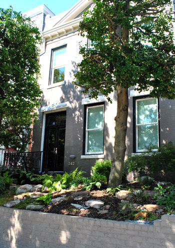
When our good friend Noah Scalin (who happens to be a published author slash skull enthusiast) recommended that we check out his mom and dad’s amazing house in Richmond’s hip downtown district called The Fan, we were intrigued. And when we got there we couldn’t snap pictures fast enough. Chuck and Mim are both well known fine artists who used to live in NYC before relocating to their charming 100 year old Richmond home. And their love of metropolitan loft-like living is obvious even in their historic casa. Let’s have a virtual look around, shall we?
Here’s the lovely exterior…
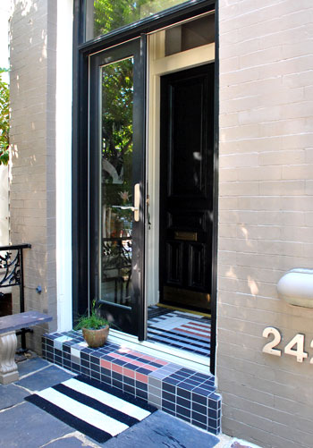
… and the entryway (complete with custom tile work commissioned by a fellow artist that Chuck & Mim adored).
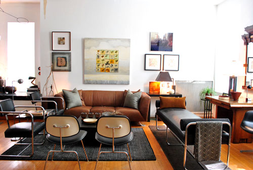
This is their light and lovely living area complete with chairs that Chuck found on the street, thrift store items, a ton of DIY art, bartered accessories (trading is free, why not, right?) and even an item or two from Target. They also worked in art from various student exhibitions at VCU, which is a great way to collect amazing one of a kind pieces without draining the ol’ savings account. We love that even though their house looks like it’s full of bank-breaking antiques and reproduction pieces, it was all affordably acquired over time on the cheap. Chuck even hired one of his handy art school students to patch missing boards in the home’s original flooring to save money (and support the arts, haha).
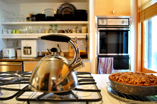
Here’s their modest yet totally charming and functional kitchen complete with open shelving and a nice little peninsula with plenty of space to serve up a home cooked meal (or eat that entire mouthwatering pie like I wanted to do the whole time we were there).
We love that the house itself is full of historic and stately details (like the gorgeous high ceilings and this amazing staircase) while more modern furnishings and art still feel right at home. Gotta love the whole mixed & matched thing when it’s done right.
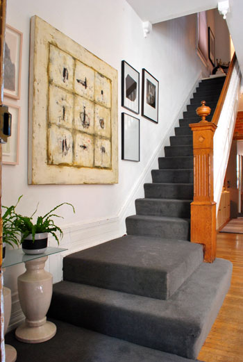
Chuck and Mim’s home really is a testament that the style of your house (like their historic 1900’s home) doesn’t have to dictate every item that you bring into it (since they have many modern, industrial, and clean-lined pieces it all feels cohesive and just seems to “fit”). So just because your house may be 100 years old doesn’t mean every piece in it has to be an antique. We love that Chuck and Mim can appreciate and seamlessly introduce a nice mix of objects both old and new.
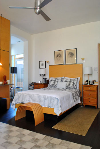
And their artistic eye for special “moments” that they can create in a room is super inspiring. Check out that glowing recessed rectangle in the wall below:
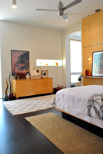
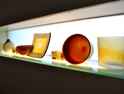
That’s actually a cool little niche they added that’s backlit thanks to light streaming in from outside (it also has a light source below that illuminates the sleek rectangular pane of glass, even at night). It’s such a great place to display their pretty collection of glass bowls, plates, and vases. We just love that they took a detail-less solid wall and created a one of a kind feature.
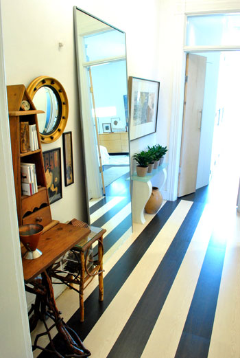
We also love the hallway that leads to their bedroom. See, the bedroom floor is dark while the area on the other side of the hallway has lighter bleached floors. So to keep things feeling cohesive instead of mismatched, Chuck and Mim opted to redo the hall flooring with both colors – so they flow right into each other. All while creating an eye catching transition. Genius.
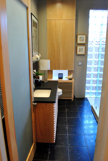
They also recently tackled a big bathroom reno, where they not only designed a cool linear sink vanity (see those horizontal strips of wood on the front that create such a great modern texture?) but also designed a totally gorgeous radiator cover with the same horizontally spaced strips to mimic the vanity. And they reused the original bathroom door. The doorknob was re-chromed and the interior panel of the door was removed, then recycled glass from a window originally above the radiator was inserted. Seriously, it was just a gorgeous room (and of course we love the work-with-watcha-got spirit). The thought they put into every little choice that they made was so inspiring.
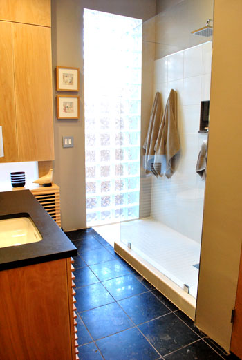
It also felt really open thanks to the large glass block panel that they added to let in loads of light (there used to be a door there, which led to an unused upstairs porch). And the addition of the nearly invisible floating glass shower enclosure and the rainhead fixture definitely made it an envy inducing space.
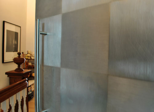
But just in case you still doubt this duo’s DIY creativity, check out these amazing metal doors that were inspired by this favorite designer of theirs. Chuck saw them in a design book and decided to recreate the cool checkerboard effect himself.
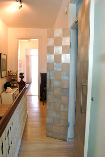
He just taped off a bunch of squares (so that part of the door would stay smooth) and sanded the other exposed squares that weren’t taped off (to create that brushed look). Long modern Ikea handles polished things off nicely- without costing an arm and a leg.
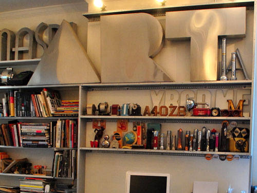
And since these two are real-deal artists (they both have pieces in galleries and art shows in their honor) they actually need and frequently use their studio space. Here’s a peek into Chuck’s studio which bowled us over in the “collectable” category. Those gorgeous metal letters all come from store signage that used to hang right here in Richmond (he’s not afraid to drive over to shops that are undergoing a renovation and ask for their old letters). And his bevy of fun gadgets like flashlights and old school pencil sharpeners had us feeling all nostalgic. No wonder the man has no shortage of creativity when he’s surrounded by such fun things.
And we’ll leave you with one more DIY project that Chuck took on since it’s too good not to share. After spotting an interesting (but über expensive) light in an upscale Paris design store, he decided to try to replicate something similar at a fraction of the cost. He saved up a ton of clear film canisters (which you can hunt down online, find at a local photography shop, or collect if you still use a camera that takes film) and poked small holes in the tops of each of them so he could thread a string of white holiday lights into them. This homemade mass o’ lights has moved around quite a bit (it’s definitely a flexible “fixture”) and it now it sits in the corner of his big open living area, adding tons of glowing ambiance to the room (and making us feel even more drunk with DIY desire).

So there you have Chuck and Mim’s amazing house right here in Richmond. They really are two of the sweetest people around, so a huge thank you goes out to them for opening their doors and letting us share their stunning home with all of you. We hope you’ve seen something that has you inspired. Wanna play the what’s-your-favorite-part game? We’re torn between those cool stainless doors, the one-of-a-kind radiator cover in the bathroom, the striped hallway, and that surprise cut out in the bedroom.
Psst- Why stop virtually barging into people’s homes now? Check out a slew of other inspiring spaces in our House Crashing gallery.

Snickrsnack Katie says
Very pretty!!!
From London says
Love this house, really stylish and real and full of soul, not just done up and bland. Pure class.
Viv says
I could move right in. The mix of old and new is stunning. It must have been so hard to pick the pictures to feature. I especially love the bench at the end of their bed and the lighted niche.
mike @ the lil house that could says
the fan in the bedroom is awesome
Cait @ Hernando House says
The film canister lights are cool, and I like that they patched their original wood floor instead of ripping it out. Their shower is pretty amazing!
brandt @ New House on the Blog says
Wow, that bedroom looks MASSIVE – I’m not sure if it’s the angle of the camera or if it’s actually that big. Also, I love that bathroom – especially the shower – a nice modern and contemporary look to what should be a boring part of the day.
Ashley says
Hands down the shower is my favorite detail. And the old commercial letters are cool too!
Nichole@40daysof says
I must admit that I don’t always like historic house with modern interiors, BUT all I could think when looking at these pictures was “What a beautiful space!”. Great house to crash!
http://40daysof.wordpress.com/2010/11/01/time-to-feel-sorry-for-the-husband-again/
Kelly @ diy my home says
I LOVE LOVE LOVE this place! Everything, especially the shower, and checkerboard door, and light niche, and and and :)
Thanks for sharing!
Mike @HA says
That looks so good! They did an amazing job of not only mixing old and new but mixing old and modern! That’s no easy task to pull off! A+
Laurel-Dawn McBurney says
WOW! I LOVE this home… this is just proof that art can truly MAKE a home! Thanks for sharing!
abodelove.blogspot.com
Adrien says
Hey, I’ve been there! It really is the coolest house ever.
Jessica @ How Sweet says
The black and white floor is pretty cool!
Melanie says
Its NMS, but I can appreciate how beautifully designed it is.
Love the shade garden in front!
J'Anns Boutique says
Gorgeous house!
http://jannsboutique.blogspot.com/
Patti says
Love this house! I’m stealing the radiator cover idea for my house!
Miranda says
I’m in love. Are they in the market for a thirty-year-old daughter?
Mia says
LOVE the floor in the hallway, and I’m extremely jealous of that shower!
liz @ bon temps beignet says
I have to say, I’m a fan of The Fan. I love the striped floors, the metallic door, and I don’t think I ever met a giant metal letter that I didn’t LOVE.
Angel says
I would LOVE to hear where the fan in the bedroom is from. Here’s hoping for a driveby through the comments! Beautiful home!
Tatiana says
Everything about their home is so amazing! I love the metal doors. And the diy project with the film canisters is such a great idea.
annabelvita says
Gosh your new camera is lovely, these all look professional! I might have to invest in a proper camera myself (I currently use a Canon G11).
I love the living room of this house, and the kitchen.
Melinda says
What an interesting and unique place. You can tell they’re artists for sure. I like the modern eclectic style, and I also like how effortless yet how-did-they-do-that awesome some of the rooms feel. Very nice! :)
carolyn says
I just love that it’s your friends parents’ home! Although it’s not totally my style, I love the mix of old and new, the tile in the front entry, and all the wall art. Very cool and cozy home!
Terisia says
Absolutely beautiful
Melody says
Out of the many things that I loved, the striped hallway, and the film canister light set are my favorite!
Elizabeth says
Is this a single family home or a townhouse?
YoungHouseLove says
It’s detached on one side but connected on the other- kind of like a brownstone in NYC. Maybe Chuck or Mim can clarify as to what they call it.
xo,
s
Irina@CanDoGal says
Wow. It’s always amazing to see how people’s personalities shine through their interior spaces. A really beautiful home with amazing thought put into it. Quite inspiring.
Cheri@IHeartOldHouses says
Cool place! My favorite has got to be the transitional striped hallway, because I think it would work for any house and any style.
Miranda says
I love the metal doors. I wonder if that would work with metal wall/door panels? Like the rest, too — but it looks like a lot to dust. Am I the only one who thinks like that? Between that and little kids, my decor is pretty sparse!
ginnie says
i love their entryway!
P says
I scrolled down to look at the photos before reading anything and I thought this was a home you’d looked at as a potential purchase. First thought” “BUY IT!!”
Erica says
Wow, this is so weird. I was a student of Noah’s about 5 years ago, and I think my sister was a student of his mother’s. I never would have pictured this, not really sure what I pictured, but it wasn’t this. It’s beautiful though, and something to aspire to for my own home. Thanks!
aimee says
omg–I LOOOVE this house. And the bathroom is to die for–Chuck or Mim: I have been wanting to do a walk-in shower like yours, but the contractors in my sleepy little town never know what I am talking about unless I show them a picture… Could you pls tell us where you ordered the big wall o’ glass and approx measurements? So so elegant and clean-lined all over! Lovely job!!
YoungHouseLove says
Here’s hoping Chuck or Mim drops in with that info for you.
xo,
s
kat says
gorgeous home!! I love the living room – it’s cozy but classy.
Huge improvement over his last place too!
Kim G. says
Noah is awesome! He designed the proposed new veggie license plates for Virginia: http://www.veggieplates.org/index.html
His parents have a lovely home. :)
Jeanne says
I am a big fan of doing what you love. Not so much of what’s hip or following other people’s trends. This dude’s got his own style down pat! Love the collection of pencil sharpeners!
Kate (Southern-Belle-Simple) says
what a lovely house….i always enjoy seeing artists’ homes and how they style them. definitely won’t be mistaken for a “catalog living” spread. blah and generic is SO overrated! xoxo
Usha says
What an awesome home and an amazing, cohesive mix of old and new! So many features to love….but I especially liked the simplicity & ingenuity of the lighted rectangle in the bedroom. Also I’m hoping they can drop in with info on where they scored the long, leather settee (with bolsters) in their living room. I’ve been looking for something like that forever – it looks like it would be perfect under the window in our little family room.
Lonely Wife Project says
The DIY canister light is amazing! Going on my list of projects.
Amy says
Random question, not related to this post; what do you use to clean/wash your hardwood floors? I currently use Murhphy’s Oil Soap, but I’m not to pleased with it. I was thinking of buying in a steamer mop but I’m not sure that’s hard wood floor friendly?
YoungHouseLove says
Hey Amy,
We love using watered down Mrs. Meyer’s liquid soap with a microfiber cloth (it’s very mild and it keeps our floors looking great).
xo,
s
Jasmine @ Eat Move Write says
That house is amazing. It’s like something off of HGTV. I love the incredible modern feel, yet the house itself has so much charm. Adore!
Lisa says
This is — hands down — my favorite of your crashes! This home packs a design wallop while still feeling, well, homey! It works in every way possible.
Katie D. says
QUOTE ME!
“and those who were seen dancing were thought to be insane by those who could not hear the music” -friedrich nietzsche
Heidi H. says
Woooow. The best thing about this house is that it’s so personal. You can really see the character of the people who live in it. Best kind of decorating out there, imo.
My fave part, though, are the open shelves in the kitchen. I am sure that no matter where I live, (even now, in this wee apartment of ours) I will have open shelves in my kitchen. I took all the doors off the upper cabinets in our kitchen the second we moved in & I couldn’t be happier with the custom-feel & openness it brings. Love it!
Tara @ Tara Being Tara says
I love this house! My very favorite house feel is when old houses have surprising modern twists inside of them. Love that juxtaposition.
Design Girl (Cori Busch) says
Love the tile work at the entry and love their living room!
LiveLikeYou says
Can’t wait to finally visit Richmond and see all the great homes.
Audrey says
This is by far my favourite house-crashing you guys have ever done – I don’t even know where to start to list my faves (that shower! those floors! the whole living room!)… I thought I wasn’t a fan of the whole modern-meets-historic, but you’ve totally changed my mind! I think the art makes the space.
P.S. Clara and Burger’s Halloween costumes were adorable! Hope you guys had a great first Halloween :)
Chuck and Mim says
Thanks for all your wonderful comments about our home.
We really appreciated hearing from you!
To answer a few of your questions–
Angel, the fan in our bedroom is from Modern Fan Company and purchased locally.
Miranda, we already have a 34 year old daughter and recently adopted Sherry and John (our House Crashers), but always willing to take on another. 8)
Elizabeth, our townhouse is a single family dwelling, built in 1909, and is located in the middle of an historic district in the city. It is detached on both sides.
Aimee, the glass wall in our new bathroom was ordered by my contractor and is 80″ high and 50″ wide. The bathroom was completed just before the photo shoot–glad several of you commented on it!
Usha, the settee in our living-room is vintage, probably from the 40’s and was purchased around 20 years ago in a local antique shop.
And last a question to Kat. Wondered what you meant by “Huge improvement over his last place too!”
If you have any other questions, please feel free to ask us.
YoungHouseLove says
Thanks so much for dropping in with that info Chuck & Mim! So glad everyone’s loving your house as much as we are!
xo,
s
Anna says
I used to live a block away from this house and would always walk my dog by that block because I enjoyed the amazing garden work in front. During the summer, beautiful vines cascaded over the brick enclosing the plants. So pretty! Even from the outside it looked sheek and modern and now these wonderful pictures prove it! Both my sister and I are major YHL fans and love seeing homes in our wonderful city of Richmond! We really have some amazing houses and neighborhoods here. Thanks for the virtual tour!