Woot, it’s Friday! And we’re hard at work painting the trim in the living room at this. very. moment. So it seems like as good a time as any to go house crashing. We thought we’d share pics of this amazingly inspiring NYC pad that we virtually house crashed while we’re off getting our paint on. One thing’s for sure – Herman and Eduardo (the proud owners) definitely have made every last inch count. Speaking of size, their pad is just 500 square feet and it consists of a modestly sized kitchen, dining area, living area, bedroom, and bathroom. But it feels luxe and lovely, like it’s all anyone would ever need. It’s such a good example of living simply and making the smartest use of your space. Plus Herman and Eduardo did a ton of stuff themselves (from demo and floor planning to sewing their own pillows and curtains). But enough chitchat. Let’s start with the living area…
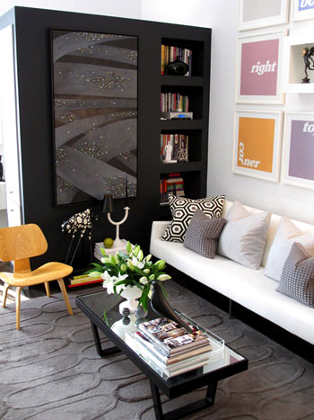
See that big black piece that they added to create a nice partition (from the bedroom) and tons of storage (accessible from all three sides)? It’s genius. An of course we love the art and those pillows and that gorgeous texture-rich rug from West Elm.
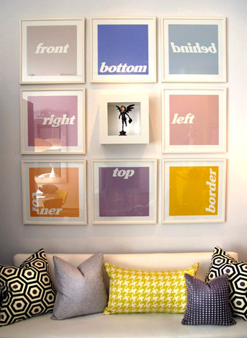
Speaking of that colorful art, we like that it doesn’t take itself too seriously (and it’s just begging to be DIYed for anyone out there in need of some wall interest). And there are some of those DIYed pillows that Eduardo made.
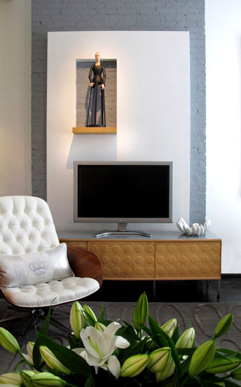
Here’s the TV that’s placed across from the sofa in front of a charming painted brick stripe (which was built out with drywall to include a little display nook- such a fun modern departure from the average wood mantel).
And see those Knoll Bertoia chairs over yonder? They’re like a celebrity crush. I know I’ll probably never be able to get my mitts on them, but oh how they make me weak in the knees (John says I’m allowed to look all I want, I just can’t touch. I know, I’m a lucky lady).
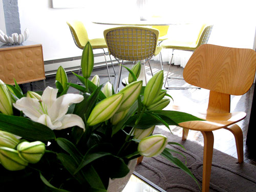
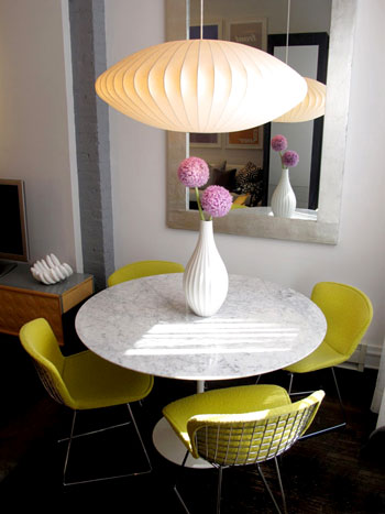
As you can see from the last picture, the living area is just a few feet away from this über chic dining zone complete with a gorgeous marble topped tulip table (get that look on the budget with this similar version from Ikea). Oh and speaking of budget, Eduardo made that gorgeous mirror himself.
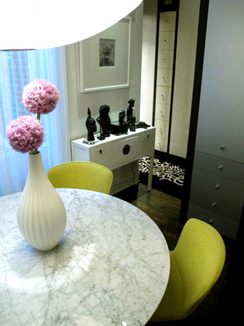
And around the corner there’s a short hallway that leads to a dreamy bedroom. But I’m getting ahead of myself. We’ll get there in a minute (but check out those great built-in drawers for a second):
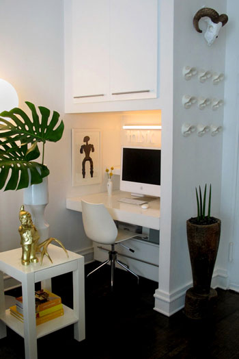
Before moving back to the bedroom we have the office, which is really just a corner of the same room that includes the kitchen, living area, and dining zone. And get this, they built the desk themselves. And then covered it with plexiglass for a slick look.
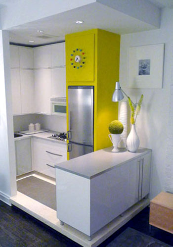
Speaking of the kitchen, here’s that corner (they raised it up a bit on a clean-lined pedestal to help define that zone in the room). It’s amazing how there’s room for everything and even a nice large span of countertop work space thanks to the peninsula packed with storage that was also added to subtly section off the area. Plus the counters and cabinets are from Ikea, so they didn’t break the bank. Even though they look like they did with that customized everything-fits-perfectly layout.
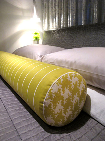
The time has come to revisit the bedroom that you saw a peek of from that second dining room shot. It’s gorgeous and dramatic yet super serene, complete with lovely metallic curtains along the back wall paired with a gleaming silver texture-rich headboard and a sunny yellow extra long bolster pillow. And in money-saving news, not only did Eduardo make that pillow, they actually got the coverlet from Bed Bath & Beyond. Sweet.
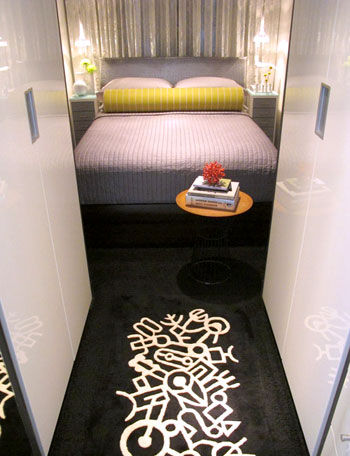
Next we have a peek at the bathroom (small rooms are hard to shoot- but we love this glimpse!):
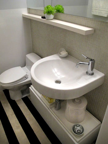
So that’s Herman and Eduardo’s amazing home. Sometimes it’s the smallest spaces that force people to be the most creative- and we love soaking up all the eye candy and inspiration. We’re sending out a big thank you to H & E for sharing the virtual tour while we paint the day away. Oh and you can drop in on Eduardo’s blog here for more info and inspiration. Now let’s play the what’s-your-favorite-part game. I’m obsessed with the gorgeous metallic headboard and the punchy art in the living room. John’s digging the amazing three sided storage unit in the living room and the cool modern light fixture in the dining area. Your turn.
Psst- Check out more house crashing adventures here.

katie kindness says
i was content with my life, until this moment. House swap??? Thanks for “ruining” my morning :) :)
YoungHouseLove says
Haha, you’re welcome:)
xo,
s
Becky says
We actually have the Knoll Bertoia chairs in the cafe at work. If we ever decide to sell any off, I’ll let you know!
YoungHouseLove says
Yesssss!
xo,
s
duck-billed placelot says
Aww! Where’s the picture of the proud owners in their beautiful space? I always love that part, seeing the happy-shiny-faces of the people who created such interesting and breath-taking homes…
YoungHouseLove says
Hey Duck-Billed Placelot,
They seem to be a bit shy (sometimes it’s hard to coerce people to send photos when it’s a virtual crashing, although I can be quite persuasive about it in person, haha) but you can see Eduardo’s cute face over on his blog!
xo,
s
Becky says
If you’re ever in DC, you can stop by the office and you can sit in one. :)
Kimberly says
I absolutely love the kitchen! What an amazing use of space and it still looks light and open. Certainly gives me inspiration for my (comparatively) much larger kitchen space!
And by the way, the gray paint in your hallway with the white trim looks so fantastic! I can’t wait to see how the living room turns out! (Moonshine was my pick too!)
Ali says
I too love seeing organized and beautiful small square feet homes! They did an incredible job with the layout and the design! :) I love the kitchen and then office zones!
~ Ali
Michelle @ Ten June says
The only thing I love more than glimpses of the Petersik abode is when you guys house crash! And this home does not disappoint. Any clue where the chair in front of the tv “mantle” is from?!
YoungHouseLove says
Here’s hoping hey drop in with that info soon for ya Michelle!
xo,
s
Cait @ Hernando House says
Love it all! And I’m so jealous of the saucer light and those Bertoia chairs!
Jodi says
I can’t believe how such a small space can “read” so big! The punch of color, extra storage, and the raised kitchen (never would have thought of that!) creates an amazing space. My favorite thing…the homemade pillows! Good luck painting trim today, by the way! Can’t wait to see it!
Emily says
I love this! I live in a similar sized condo in Boston (434 sq ft). Im not as fortunate to have such a well laid out space. But I’ve gotten such great inspiration.
Amy W says
This isn’t related to your post, but I have been following the sad story of baby Scarlett, who is battling cancer at the age of 3 months old! Her parents write a wonderful blog about their journey, and today they gave you guys a shout out. Thought you might want to know that your blog not only inspires people to decorate, it also helps them through tough times. Their blog can be found here,
http://brandiandchris.blogspot.com/. We are rooting for you baby Scarlett!
YoungHouseLove says
Yes! We’re rooting for Baby Scalett over here too! We actually got an amazing note from Brandi about how she has been taking photos of Scarlett on fabric each week inspired by our weekly Clara photos and we couldn’t have been more touched to hear it. Such a lovely family, and we wish them nothing but the best!
xoxo,
s (& j & c & b)
karen @ our slo house says
Wow. You said it, when you said “making every inch count.” I can’t believe how much style is oozing out of their place.
I hope my house has even half the style when we’re (eventually) done with it! : )
I’m off to Herman and Eduardo’s blog now…
Emily says
Oh, and their blog is fantastic. I’m adding it to my collection!
duck-billed placelot says
Sherry – so it is; well, can you blame me for missing a link after those gorgeous pictures (probably)? And great, another design blog that makes me want to pet my screen! Anyway, I love the striped bathroom floor, and the sheep(?)’s skull. And the two-fabricked bolster. And the unifying chartreuse. And the everything.
Ryan says
The space is beautiful, but it certainly doesn’t look homey or lived in. I can’t imagine relaxing on the couch in front of the TV. To me, it looks like someone snapped pictures of the Ikea floor models. Beautifully done, though.
blog is the new black says
Love this wall art!
Ro says
This space is amazeballs.. I love it so much Ive gone over this 4 times… sent to 3 friends.
WOW.
Thanks for featuring.. and now im heading to their blog to drool some more.
Ro
Angie @ The Country Chic Cottage says
All I have to say is…WOW!! Gorgeous space!! Sometimes I wish I was forced to live in a small space…it would make you think of things differently…
Lara says
Wow! Can’t believe their use of space! And so open feeling, too. What am I doing with my 1200 sq. ft.?!!
I guess more downsizing is part of the answer. I’m a homeschool mom of three kids and this is a constant struggle for me.
I HAVE gained a ton of inspiration from you in this area, Sherry, and have implemented it in several ways that have helped my family this past fall. I check in every day. Thanks for sharing “up-close-and-personal” how other personalities operate (i.e. not pack-ratty like me:)
I appreciate you and your blog!
Lauren says
Love the homemade extra long yellow bolster pillow. It makes the bed-pun intended. This house really makes me want to par down and simplify before we move in May. Thanks for the great inspiration!
bridget b. says
wow, i could never imagine living in such small quarters. guess that’s the texas girl in me–we love our space. they’ve done an excellent job though. their home looks great!
tiny typo alert: i think you meant “Even THOUGH they look like they did with that customized everything-fits-perfectly layout”
YoungHouseLove says
Thanks Bridget- all fixed!
xo,
s
Liz Cordeiro says
Love this!
P.S. So happy that you are going with your instincts and chose gray for your walls! My husband and I recently painted our kitchen and family room BM Stonington Gray because we loved the blue undertones and are so happy — it is much warmer than he ever thought it would be and really makes the white molding stand out! Also, goes so well with our ‘Possibilities’ mocha sectional (heavy grey understones) from JC Penney (who’d thought) and our orange/white damask Safavieh indoor/outdoor rug and two Durham end tables from Ballard. Love it and so glad you are going a similar route — you will be so happy with end result! Keep up the good work!
Tanya says
What a gorgeous place! Thanks for introducing us to it. I love the hits of cheery colour. Am especially obsessed with the grey painted brick. So mod!
~Tanya
dans-le-townhouse.blogspot.com
alison says
I’m amazed and inspired every time I read your house crashing posts. I love how Herman and Eduardo made their 500 sq ft space so stylish and open. Very creative!
laura says
I am really digging the colors they chose and the sweet modern patterns of all the pillows/bedding. Love the neutral color scheme with the bright punches of color and pattern!
Katy says
Awesome!!! One of our rugs is featured!!! This just made my day! Not to be a sale woman or anything, but I design for this collection! You can see it at this link. Thanks for giving me a boost of motivation to rug design on this Friday morning! Am I allowed to post this?
http://www.momeni.com/lrgview.aspx?p_Params=&p_ItemID=NEWWANW106IVY2030&p_PageName=Coll
YoungHouseLove says
Of course! People would love to know where it comes from I’m sure. Happy rug designing!
xo,
s
Jill Stigs says
I love the kitchen……….my fave is small white kitchens. Just would have to tone down the paint color surrounding the fridge just a tad. :)
Love their place!!
cass says
Love it!! I can’t quite figure out the floor plan. Is the office behind the black lr wall??
YoungHouseLove says
Hey Cass,
Good question! We think the bedroom hallway is behind that black living room cabinet, but we’re not sure. Here’s hoping Eduardo and Herman drop in with that info soon!
xo,
s
Lauren M. says
I LOOOVE this post! My husband and I are going to be moving into a teeny tiny NYC studio in a month and I have been brainstorming ideas to give the different living areas separate yet cohesive since they will be within feet of each other. This was such an inspiration!
Any other websites or ideas you guys have? I know you have experience with the teeny tiny NYC thing! Thanks!
Lauren
YoungHouseLove says
Hey Lauren M,
Apartmenttherapy.com is a great site full of smaller space inspiration! Anyone else know of any other blogs for Lauren to check out?
xo,
s
beth says
I’m doing the happy dance that you are painting trim because:
1) I can’t wait to see the transformation in your home, especially paired with the gray (I think the gray paint is going to look stellar once you get the trim painted.
2) we move in a few days and have a lot of 80s oak to paint, and I’m eagerly awaiting your tips for painting wood trim. I’m terrified of it peeling. Sanding? Oil based primer for longevity (ewwww??). So many decisions!
susan says
Love
1. Use of art without cluttering up the place.
2. Bold colors
3. Storage drawers under the desk at foot level. Clever…
We can see they don’t have to worry about storing kid stuff! susan
Allison Suter says
I’m a small space fanatic, and very much a minimalist. I’m in love with this apartment.
Thanks for sharing – and for sharing Eduardo’s blog… a newby for my RSS feed for sure!
Taylor says
Having lived in Manhattan for several years myself, I am drooling over this space! It is absolutely gorgeous. Only thing is that sofa doesn’t seem deep enough to actually seat anybody!
Julia M says
Such small details, but I am DIGGING that long cylinder pillow on their bed and the floor in the bathroom. But ESPECIALLY that pillow–off to find a tutorial to DIY one myself. Love. Love LOVE!
http://chrislovesjulia.blogspot.com
Lindsay says
WOW. Cool stuff! Am I the only one creeped out by that black-sporting barbie thing over the TV??
P.S. My favorite is the “yellow” fridge. Awesome.
Melody says
The built in drawers, and the black partition are my favorites!
Shannon says
Wow, I love it! They did an amazing job! And Eduardo can make me pillows if he wants, hahaha! Great job!
Yay, I finally posted a picture of my boy’s room on your facebook page and already got a couple good ideas! I can’t wait to see what more people think!
amyks says
I love the “Lego like” television console…would love to know where that came from. The whole place is so great, though.
Suzanne says
Yes, we need a floor plan diagram if possible! Thanks.
It’s a beautiful, beautiful space. I have an 800 sf that I’m always looking for space ideas for.
YoungHouseLove says
Hey Suzanne and Amyks,
Here’s hoping they drop in with that info!
xo,
s
Kate says
Love it all!
Jenn says
I’m in love! My former apartment was this size and no way did it look this cool! I love the modern EVERYTYING! Especially the art, rugs, and chairs… simply fabulous! =)
xoXOxo
Jenn @ Peas & Crayons
Sarah K says
Beautiful house! Thanks for the peek!
Ally says
So cool! I’m really loving the bright green around the fridge in the kitchen.
mabel says
Love this house crash , and love your quote on the Bertoia chairs. So much so that its on today’s Knoll’s facebook page.
Thx for being a fan :)
Beth says
WOW! Love this space. I’m always so fascinated with how people maximize tiny spaces – as I’m afraid I would fail miserably at it. So cool and stylish and unbelievably functional. Great Job H & E!!!
Now if only I lived in NYC…le sigh.
Liz says
Wow, I can’t believe this is all under 500 sq. ft. It’s amazing what a little planning can do to make a room (or apartment) seem like it’s 100x bigger than it actually is. Thanks so much for sharing this awesome house with us!
Rebecca says
Although this particular design style is not my personal style I do appreciate it for what it is. They did a GREAT job! Thanks for sharing.
Anytime you need to share a house crash or reader redesign as a way to allow you to get things done around the house or just live life….please DO! We (I) thoroughly enjoy those too!
Your site is the BEST! Thanks Again!
Elizabeth says
I’m just glad they have a television…and don’t act like they never use it!
Cate says
I love the fridge, and would love to know what kind it is. Nice place!
Alyssa @ Perpetual Blind Date says
I love this space! What an inspiration to make my apartment so much prettier with the space that I have! It’s all about function!