Our master bathroom came with a mirror dilemma. Instead of having the traditional mirror-over-the-sink set up, there’s a window (seen here on this moving day pic that we snapped before we removed those bi-fold doors).
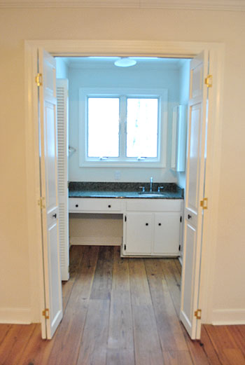
But although that picture makes the window look all glow-y and angelic, staring out at the house next door (it’s a side window) isn’t exactly ideal for brushing your teeth, shaving, fixing your hair, or walking by after a shower in the buff. Nor is that the first impression that we really want to make on the neighbors. So we knew we needed a privacy solution stat.
We also needed a functional mirror solution too. The room is (ironically) far from mirror-less. There’s a full-length one on the water closet door (yep, just broke out “water closet”)…
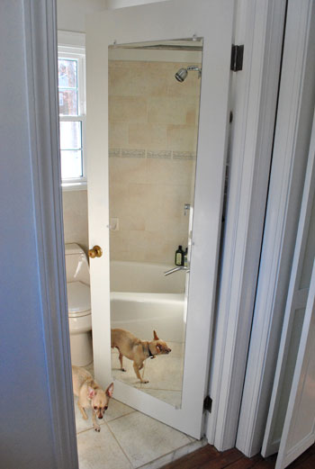
…and another on the nearby medicine cabinet (that’s two mirrors in one 4′ span of wall if you’re keeping track).
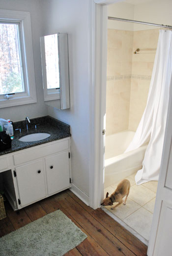
And yes, those are both shots stolen from old posts (so you don’t have to worry that Burger spends all of his free time posing for pics in our bathroom) since you know we have since removed the ol’ backsplash to yield this result:
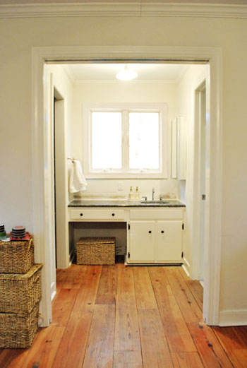
Anyway, back to the mirror dilemma. After living with the mirrors-to-the-right layout for a couple of weeks (while singing “To The Right” instead of “To The Left” a la Beyoncé), the traditionalist in us was just itching for one in front of our faces. Right smack in the middle of the window. Although we had an embarrassment of riches when it came to the number of mirrors surrounding us in the master, we just didn’t have one where it was most sorely needed. So we opted for a not-so-traditional solution. This:
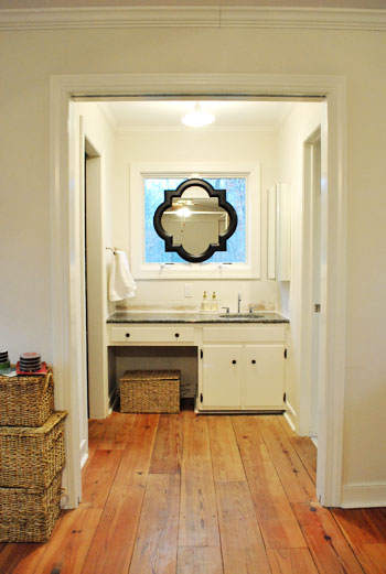
Call us crazy, but we hung a mirror right on the window frame itself. Sure we’ll miss some of the light that it let in, but thankfully we have two other huge windows in the bedroom and a third in the bathroom- so the room’s not hurting for light). And we definitely won’t miss the actual view of the house next door (and the fear that we were making quite an odd first impression by sharing so many tooth-brushing moments). And the function. Can we just talk about the function? I am a man. So that stuff is king. And I can’t even tell you how much easier it is to shave without having to keep my head at a right angle to see what I’m doing.
The mirror itself is from the Allen + Roth line at Lowe’s. After searching unsuccessfully for a perfectly sized round one at HomeGoods, TJ Maxx, Marshalls, Pier 1, and World Market we were more than happy to spill 65 beans on one with such a distinct shape and clean look (a whopping $614 cheaper than this similar version from Restoration Hardware). And all it took to hang it was one screw in the center piece of wood between the windows and a small square of velcro on the bottom (to hold it firmly in place from the bottom so it wouldn’t teeter from side to side). Bonus: the windows can still be opened and closed while it’s hanging thanks to the knob placement at the bottom of the panes (instead of the center, which would have been blocked by the mirror).
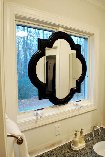
And let’s revisit the shape. We mentioned we were originally looking for a round mirror because the wife thought it would add some nice curves to those angular windows, but it needed to be huge because something that was under 28″ wide wouldn’t allow both of us to see our entire faces in it (thanks to our 10″ height difference) if it was hung completely centered (top to bottom) on the window- which Sherry was adamant about. The miracle of finding something this shape meant that there was a little extra span of reflective room on the bottom thanks to the irregular shape- which is almost like two ovals overlapping at 90 degree angles) which makes Sherry positively giddy about all that added “mirror real-estate.” Here’s a direct quote: “not only can I see my face, I can see my neck!” The girl was beside herself with joy.
Oh and for those wondering why we didn’t opt for a mirror that could be mounted on the side wall but folded out so we could look see our faces by looking straight ahead, we just thought that would look more bathroom-y, while this solution looked a lot more decorative and would read more as “vanity in the corner of a bedroom” instead of “sink across from the bed.” Plus it’s balanced, and you know we have a thing for balance.
But the project was not complete until we said goodbye to the old mirrored medicine cabinet.
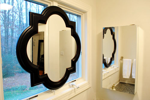
So we took it off the wall, along with the towel bar on the opposite side (we now keep a white towel folded next to the sink which seems to do the trick) and added both the medicine cabinet and the towel bar to our ReStore donation pile.
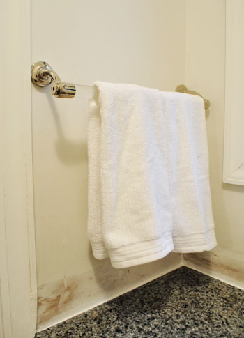
Doesn’t it look even less bathroom-sinky in there now that those two elements are gone? And we don’t mean to tease, but painting the entire bedroom is on the agenda for today or tomorrow. Woot! We also might paint the mirror frame white (or a softer color to help it blend in with the window moldings like gray) though we haven’t decided on that 100% yet… so we could go either way.
And as for how it looks from outside, it’s one big tan shape from behind (nothing too messy looking) so it just a symmetrical light brown shape suspended in the middle of the window. Which oddly enough blends in with all the colors of the tree trunks and other exterior elements. And of course frosting the window could add even more privacy when it comes to the view from outside, but since the neighbor’s house is actually a ways away, we don’t think they can make out our shapes anymore with so much of the window obscured.
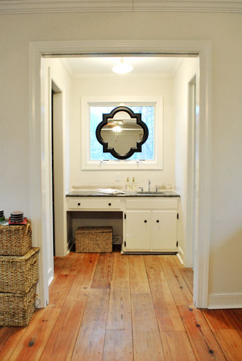
Words can’t describe how spoiled we feel to have a mirror above the sink again. Seriously, it’s rocking our world right now. And we’re not the first people to do the whole mirror in front of a window thing. Check some others out here, here, here, and here. What do you guys think of our not-so-normal solution?
Update: See how our sink mirror project turned out here.

Kita says
Wow that looks so interesting! I love how you can still see outside but of course you have to have a mirror in your bathroom!
-Kita
Allison says
LOVE it! We found and bought the same mirror from Lowe’s and hung it in our half bath! I love the look of it! Great job! Can’t wait to see the room(s) painted! :)
Austyn says
Are you considering the old frosted glass technique on the windows behind the mirror? That might look kind of neat and sort of graduate the textures of the mirror with the surrounding frame and wall. Just curious, you’ve probably already thought of that ;o)
YoungHouseLove says
Hey Austyn,
We thought about it but for now we’re leaving it clear since it lets in lots of light and no longer allows the neighbors to see anything with much detail (we have almost an acre of land, so it’s not like they’re right on top of us, but when the window was unobscured it seemed easier to make out shapes and figure out what we were doing!
xo,
s
A says
I have never thought about a mirrow over a window before, but I have to admit that yours looks fantastic! This room looks wonderful!
Mandy Ford says
Great solution – and I think the mirror would be gorgeous painted gray. Looking forward to seeing more of the transformation!
Meri says
I really love that window there (and the bathroom layout in general) – was nervous at first glance of this post. But I am seriously loving that mirror on top of the window. Wow, gorgeous!
diana says
Brilliant! Simply brilliant!
I was just thinking, waiting for the page to load, that in some distant future you could replace the window with a wide and shallow one, and to bend your knees (talking to John) to shave. And then, ta-daaaa! Me: 0, you: one million bucks! And the thing with the towel bar, this is to prove you were born to be a Queen (talking to Sherry). 50 points for Gryffindor!
Amanda says
I was just going to post a bunch of links where that has been done before because I LOVE that look. Congrats on finding such a perfect mirror. Painting it grey sounds perfect to me. You guys getting a snow day there yet?
YoungHouseLove says
Hey Amanda,
No snow yet! Getting ready though!
xo,
s
Cait @ Hernando House says
Definitely not something I would have done, but it looks great in your space! I would consider leaving the mirror frame dark because it seems to make the countertop stand out less (but of course that could change after you paint).
Ami @ beyondpeasandcarrots says
love it! so creative!
Nicole Jenkins says
Is the mirror frame wooden?? I purchased a smaller version of this mirror at Target a few weeks ago and was a tad disappointed it was a plastic frame… it was a very inexpensive mirror–and on clearance to boot and it’s not that big a deal, but just curious about yours, as I too need to replace a mirror in my bathroom and quite like this shape.
YoungHouseLove says
Hey Nicole,
It feels kind of like a thin metal veneer but we’re sure we can sand it to rough it up and spray prime & spray paint it if we decide to go that route…
xo,
s
heather s. says
I saw that mirror at Lowes and almost bought it a while ago! Great pick…and it will look even better once you paint the frame a lighter color (gray or white would look amazing).
Zynny says
love it- definitely vote for painting it to match the molding on the window or the color of the bottom cabinets.
Kaitlyn says
So smart!
I never would’ve thought of that solution! Although, I would definitely paint in white, or at least lighter. From the pictures, it looks like its photoshopped in!
Kristine says
Love the mirror! What a great find! Please Do NOT paint the mirror white. Leave it black, b/c it shows up more as a focal point and ties in wonderfully with the granite countertop.
Can’t wait to see what color you paint the bedroom. So exciting!
Jennifer says
Nice job guys! Love the mirror shape too–it’s really unique and I think you made the right decision to get that one instead of a round one! My vote would be to paint it white! :-)
Emily says
I have been reading your blog for years, but this is my first comment! I love the mirror-window look! Although, I would keep the mirror black to tie in with your granite. I was actually thinking that painting the trim an inky black to would be amazingly striking since it will draw your eye out to the tress. LOVE this idea and the mirror!
Also, i am so envious of the wood floors in your master. They are fabulous!
Future Mama says
I like it! Just like it is or painted would look nice, I think :-)
Much love,
Future Mama
http://expectingablessing.blogspot.com/
K says
Are you going to keep the mirror frame black? I guess I need to see what it will look like when the whole room comes together.
Kate says
What an interesting idea. I love the shape of that mirror, it really fills up the space without being just one giant square. Very cool.
Emily @ Merrypad says
Interesting. I’m not sure I’m sold on the solid black-ness but I know you still have to do a lot in the space/walls/etc. Gray would be really pretty. Nice shape.
Is the back of the mirror finished? I’m always considering how it looks from the yard.
YoungHouseLove says
Hey Emily,
It’s one big tan shape from behind (nothing too messy looking) so it just looks like a big light brown quatrefoil shape suspended in the middle of the window. Which oddly enough blends in with all the colors of the tree trunks and other exterior elements.
xo,
s
Alison says
I LOOOOOOVVVEEE this!!! The mirror looks great against the window and I love the lines of it! I think it looks great it black too, against the white of the window… reminds me of a stained glass window.
Stephanie Phillips says
I’m 5’2″ and my hubby is 6’2″, so I can relate to the mirror obstacles! We also have a recurring problem with me hanging art only to discover that I hung it at “midget height.” What is the recommended height for wall-hanging anyway??
We repainted our nursery this weekend! I bought Frog Tape, per your recommendations, and loved it! SO much better than the old blue stuff!
YoungHouseLove says
Hey Stephanie,
We have always heard eye level- so the center of the frame is at the center of the average eye line (maybe 5’7″ or so could be considered average?). We don’t really stick to rules like that and just eye things and do whatever looks best depending what the art is near (we like art and mirrors to connect to the pieces under or near them).
xo,
s
sarah @ handbagsnpigtails says
I wasnt too sure of it at first but the more I looked at it, I like it now.(As if you needed my approval:)). I have the exact same mirror but its the smaller version from Target($20). Ive seen this larger one all over blogland and do love the huge size of it. I cant wait to see it painted if you decide to change it up.
And YAY! on the bedroom painting…we cant wait to see it:)
Blog is the New Black says
I think it looks really great there!
Emily says
I love, love, love that mirror from lowes! We’ve tossed around the idea to get a set for our dinning room, which is need of some tweaking, but we can’t seem to drop the $128 for two mirrors. Maybe someday…
Kim says
Great solution! Love that instead of focusing on how strange or inconvenient it was, the problem is solved and is unique as well! Sometimes I think problems are actually hidden gems and opportunities for things you would never have been able to have if everything was “right”.
Bethany Annechino says
I actually think that was a great idea. I suggested the same to someone in a similar situation and it looked just as delicious in their home. That mirror is perfect in the space and far more beautiful than a standard round or oval would have been. I personally would hold off on painting the frame until all of the other elements and wall paint are in place. I can see how it may seem too glaring, but it looks nice with the granite and I think it adds more visual interest than it would in a lighter color. Now you have me looking around to see if I have a place for such a fabulous mirror. ;)
Mariah says
What a great idea! I love the unusual shape of the mirror framed inside the larger rectangle of the window. In fact, I like this mirror so much I think I may get it to replace the dinky rectangular one currently hanging over my white brick fireplace. Thank you for the great inspiration!
Bryn Alexandra Interiors says
I LOVE the mirror in front of windows look. It’s very rare to be able to do this, but you guys lucked out. Natural light is the best for getting ready, and what better than to have it shining right on your face when getting ready? I’m jealous!
Megan says
I went to a Parade of Homes this past summer and one of the homes had not one, but two mirrors hanging in front of wall-to-wall mirrors in the master bath. Great solution!
Beth@Just{Heart}It says
LOVE this solution! Love the shape of that mirror. SO much more interesting than a round one. I even love the color – I don’t think you need to paint it at all. What other plans do you have to make it less bathroomy? Planning to skirt that hole where you currently have the basket? Planning to change hardware or light fixtures? Anything else? :-)
YoungHouseLove says
Hey Beth,
Lots of plans swirling around in our heads! We’ll share them as we go! We try not to get too far ahead of ourselves to keep things nice and approachable so we don’t get all intimidated by everything that we have to do.
xo,
s
Tempest says
I think painting it a lighter color would definitley be needed, it’s almost shocking now how dark it is compared to everything else! Grey or white would be gorgeous!
Megan says
How does it look from the outside? Can you take a picture from your neighbor’s perspective?
I’m always worried how any new window treatments look from the exterior of the house.
Looks great on the inside, though. I love that mirror. I had it in my cart at Lowe’s, but ended up putting it back b/c I didn’t really have a place for it.
YoungHouseLove says
Hey Megan,
The back of the mirror is all one color (tan) so from the outside it’s a nice clean shape floating centered on the window. Doesn’t look bad at all- especially since it’s the same color as the tree trunks around it- which makes it oddly blend in with the exterior landscape!
xo,
s
jillian says
It looks really great and seems like the perfect solution!
ALittleBite says
Hi! I really like the shape of the mirror. Just a question though, did you apply some sort of bluish film to the window or is it the lighting?
YoungHouseLove says
Hey ALittleBite,
Just the pics. The blue sky makes things glow sometimes!
xo,
s
michelle krommer says
I started reading your entry and thought wow i have a solution I just saw in a magazine! and as I went through your blog you did sorta what the magazine did and hung a mirror over them. In the mag they frosted the glass then hung 2 rectangular mirrors with ribbon and it looked fabulous! i read so many magazines so it could have been in house beautiful, southern living, or country living. Maybe cottage living, haha i don’t quite remember. looks good though can’t wait to see what else you guys do!
stephanie says
YOu two are so smart! Can not wait to see what is next!!!
Constance says
I had a feeling that side mirror was going to tackled soon (I mean, when has that really ever “worked”?). Great job!
tracylee says
I have that mirror in my (loosely) Moroccan-themed bedroom – it is one of my favorite things in the house! The color of the frame is so rich, I think the contrast looks great.
Jyl says
Looks awesome! What a creative way to add style and function!
Did you do anything to the back of the mirror to make it prettier to look out when looking through the window outside? Like covering it with a pretty fabric or painting it white?
“…I can see my neck!” lol…
YoungHouseLove says
Hey Jyl,
The back of the mirror is all one color (tan) so from the outside it’s a nice clean shape floating centered on the window. Doesn’t look bad at all- especially since it’s the same color as the tree trunks around it- which makes it oddly blend in with the exterior landscape!
xo,
s
Witty Wife says
Hi guys – I love the new mirror! Such a clever idea; I’m sure it would have taken me weeks to figure out how to address the problem!
I’m still trying to figure out why there was a medicine cabinet with a mirror to the right of the sink to begin with; why did the previous owners not just install a regular medicine cabinet? A mirror seems kind of useless there, since you can’t see yourself in it!
Is the frame of the mirror wood? I typically love black, but it seems so stark in your sink area (or perhaps just the way it looks on camera.) Are you thinking of painting the frame at all? Or leaving it black?
YoungHouseLove says
Hey Witty Wife,
We mentioned in the post that we’re on the fence about painting it. Lots of opinions in both directions in the comment section though for sure! We’ll share whatever we decide to do with it when we do it (or don’t do it- hehe). It sort of feels like a thin metal veneer, but we’re sure if we sand it down and then spray prime and spray paint it, that would do the trick.
xo,
s
Jen says
When I saw this post I totally thought I was gonna see that u tore walls down! Haha u never ever cease to amaze me! Beautiful and such a good idea. Never woukd of thought of that!!
Megan says
I have to say this is not one of my fave YHL ideas…but I am thinking if the mirror was painted white it would seem like a custom made window/mirror? Definitely not digging the black though…it seems to call more attention to the space that I thought you wanted to blend in…?
YoungHouseLove says
Hey Megan,
We mentioned in the post that we’re considering painting it white for just that reason. We’re getting lots of opinions in both directions for sure! We’ll share whatever we decide to do with it when we do it (or don’t do it- hehe).
xo,
s
Elizabeth says
What a great solution!
I assume you’ll be painting that area as well? I think the black might make more sense if there was more saturated color in that area. So I hope that you wait a bit before painting the mirror, it might end up being perfect once there is some color on the walls. :)
Monica says
I love the way that turned out!
carolinaheartstrings says
That mirror definitely does the trick. A very eccletic looking mirrow. Perfect fit for that spot.
operaglass says
What an ingenious solution. I think it would look gorgeous painted white!!
Stacie M. says
I love it! I think it’s a great solution. I even like the contrast of the black and white. But it will be interesting to see it a different color too.
Meghan, UK says
Wow! It looks so much lighter, brighter and larger in there! The mirror is very successful, I’m loving it. Are you any further on with lighting options? (Clearly something for a future post, but as with everyone else who reads this blog, I’m eager to know answers to not-yet-done projects!)