You might notice a theme when it comes to posts like this and this and this and this. Making this house feel like ours seems to be just as much about stripping things down and removing stuff as it is about adding new furnishings and wall colors. Just like the old matted carpets in the sunroom and the bathroom of our old house had to go (along with the crocheted duck curtains, the wallpaper, some small doorways, a few bi-fold doors, and the linen closet door) we’re all about working with what we have. Which could mean altering things a little bit to help them fit more within our aesthetic instead of just junking them and starting from scratch. Which is why the granite backsplash around the bathroom sink (which happens to live in a nook on one wall of our bedroom) had to go.
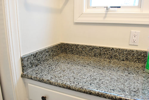
Wait, before you get all nervous, let me explain. We thought the backsplash made the sink scream “Look! I’m a sink! In the middle of the main bedroom!” And removing it might make it whisper “Hey. I’m a sink. But I look more like a piece of furniture because I’m slick like that.” We don’t actually mind the location of the sink, we just want to make it fit in more with the rest of the room instead of sticking out like a sore thumb. So this little project is step one of that process.
Thanks to some waterproofed caulk around the edge and some semi-gloss paint on the walls of that alcove, we won’t have any issues with splashing or water damage (our last house didn’t have a backsplash in either bathroom and the caulk and semi-gloss paint approach worked like a charm. I would even venture to say that the caulk & semi-gloss paint method took a licking and kept on ticking. Yes I just pulled out that hokey little rhyme. You’re welcome.
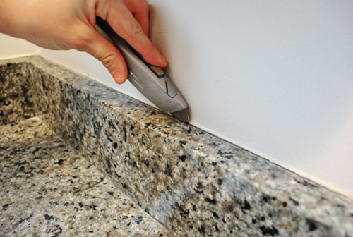
So here’s how it all went down. First I scored the clear silicone caulk by running a box cutter along the top of the backsplash:
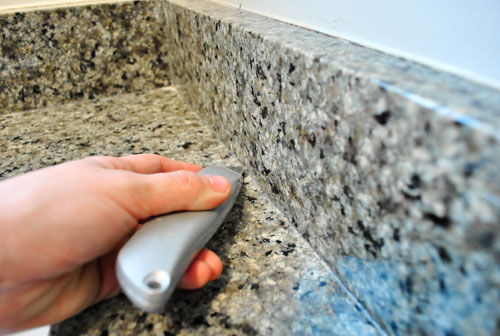
Then I scored the caulk between the counter and the backsplash using the same method:
Next I used a thin metal spackle knife to get in there behind the backsplash and the wall and pry it away slowly:
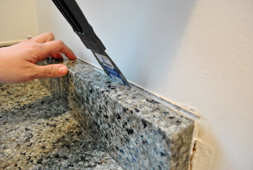
I was able to teeter (yes, that’s a technical term) each of the three backsplash pieces back and forth away from the wall and back again until they completely broke free of the wall and could be lifted out. Those suckers were heavy but I got ‘er done. In fact I’m pretty psyched that I was also able to do this whole project on my own while John was on Clara duty (she says with pride, while simultaneously patting herself on the back and brushing her shoulders off).
Wait. Did I mention I started it without talking to John first? I just wanted to see if removal was even possible and once I got into it there was no turning back. Or telling John what I was doing since the sink looked like this. I would have been in so much trouble (cue all the kids in class saying “ooooh” when the principal gets on the loud speaker and calls someone down to her office by name).
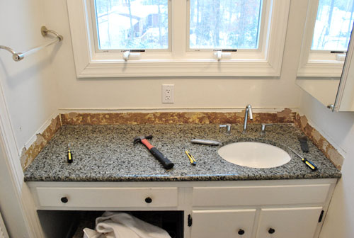
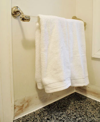
I wasn’t totally going rogue though. I knew he’d go for the backsplashless concept since we had chosen it for both of our previous bathroom overhauls in the old house. So I just crossed my fingers that I could strip things down and make them look a bit more presentable before he and Clara came in to see what I was up to. So here I am furiously scraping the silicone caulk off the surface of the granite counter with the same spackle knife I used to remove the backsplash pieces (it worked really well without scratching the granite at all):
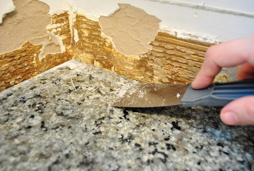
And here I am using the same trusty spackle knife to get in under all that nasty glue and flake it off to reveal a slightly roughed up (but much less gnarly and bumpy looking) piece of drywall:
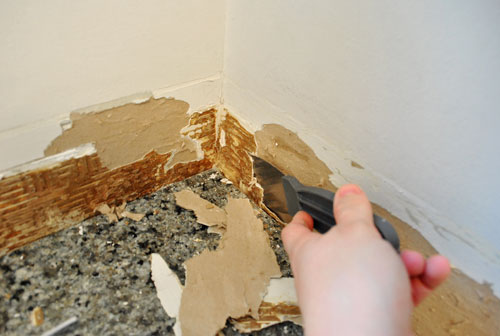
Here’s what it looked like when John came in to see what all the noise was about. Thank goodness it was a lot less grody looking once all that glue was scraped off. And he was, dare I say it, pleased (!) with the surprise project that I sprung on him. Whew.
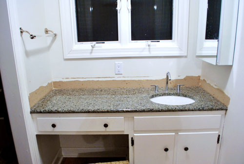
Then it was time to skim coat all the roughed up drywall so it would again look seamless like the rest of the wall. Some people would choose to mud the wall when skim coating, but I actually used some of the same lightweight Dap spackle that I mentioned in this post, which I was able to sand down to a totally smooth and even surface that looked seamless with the rest of the drywall (but remember, don’t sand until the spackle is totally dry). Then I used some white waterproof paintable caulk (I like the Dap door and window stuff) around the perimeter of the counter to fill and seal any tiny hairline cracks between the granite and the wall so no water could collect or drip back behind the counter or vanity.
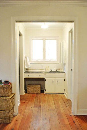
Here’s what she looks like now from afar (ignore the baskets and all the junk that we have yet to organize):
It’s not too bad when you compare her to her glory days (this next photo was taken when we first moved in, before removing the bi-fold doors and of course that backsplash).
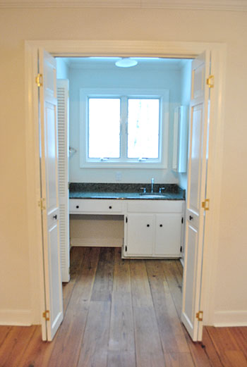
My apologies about the bad blue light, I’m still learning how to tell the Nikon who’s boss.
Anyway, I know the after pic above this one still might not look like much, but we’re psyched. We can picture how great some wipe-able semi-gloss paint will look on the walls of that little nook, and we have some other big plans for that area (to make it look even less bathroom-sink-ish). Oh and as for where those three slabs of granite that I removed will go, we’re sending them off to the Habitat For Humanity ReStore since someone else might be able to use ’em. You know in case they buy a house from someone who went crazy and stripped out their backsplash while the hubby was watching the baby and they’d now like to add it back in. Haha.

Kate (Southern Belle Simple) says
Sherry….you are superwoman! That’s all. :) Happy Friday! xoxo
Mariela says
Wow! It makes such a difference, it looks great!
Julie says
I’ll admit I was nervous about the idea at first, but then seeing the before and afters, you’re right — it definitely makes it less obtrusive and more subtle that there’s a sink at the end of the room. I like!
CC says
Thanks for posting this! We have yet to put a tile backsplash in our kitchen and have been playing around with different tile colors. Never thought about getting rid of the backsplash that our builders put in. Thanks!
Lindsey d. says
I wasn’t sure where you were going when you started this post, but by the end I was really surprised by how much lighter the vanity now looks sans backsplash. Any plans yet for a chandelier or window treatments in that nook?
Also, any suggestions for seasonal decorations now that Christmas is over? I go all out for Christmas and now that they’re packed away my house looks a little bare. I’ve got a big bowl of oranges on my kitchen table, but I’m clueless about other winter appropriate decorations that won’t look like I forgot to put away some of the Christmas decorations.
Thanks!
YoungHouseLove says
Hey Lindsey D,
Yup, plans for a new light fixture and something for those windows are definitely on the agenda. Hopefully soon! As for seasonal decorations, a bowl of oranges (or apples, pears, etc) always look fresh and charming. White stuff can look wintery and pretty without screaming Christmas too (like white woven orbs from Target, or a bunch of white roses or daisies). Just play around and see what you like!
xo,
s
Charisa says
That’s a brilliant idea! Who would have guessed that this simple fix would create such an impact!
Amy Wolff says
wow… that is crazy.
I never would have thought to do that………. you were meant to do this- you have the eye for style!
Mona Alicia says
Okay, I must say I never would have thought to do this but it really does make a difference. I learn so much from you guys :)
Emily @ Merrypad says
Wow – THANK YOU for sharing. I never would have realized a change like that would be so impactful or easy.
Kelly says
Looks great! If you haven’t tried yet, try shooting RAW and downloading a free trial of adobe Lightroom. Then, you’ll be able to tweak the light balance as well as if need be subtract the blue easily from the image. You can shoot me an email if you have a question :)
LoquaciousLaura says
John & Sherry, I’m wondering what else you’ll do to the nook. I’m specifically wondering if you’ll junk the medicine cabinet. It looks so funky sticking out from a side wall!
YoungHouseLove says
That is definitely on the outgoing list! It’s not functional at all!
xo,
s
Natalie says
That’s something I would never even think of doing, and it looks GREAT!
Blair R says
Wow, the difference is amazing! I would have never thought of doing that, or that it could make such a difference. Great job, Sherry!
Robin says
I never would have thought to do that! Genius. It looks really great!
Alisa says
Wow! That little change made a huge difference! We have a off-white laminate wall-to-wall backsplash in our guest bathroom that has been driving me crazy since we moved in and now I know exactly what I’m going to do with it :) Thanks for the play by play!
ESBlondie says
Wow! You are so inspiring Sherry! I would never think to do something like that, but you totally updated the look. I enjoy your no fear attitude when it comes to tackling projects like this.
Tracie @ Gurtler + Home says
I’m still just mesmerized by those gorgeous floors. You are definately on your way to creating a Pottery Barn House(aka beautiful).
Cait @ Hernando House says
I probably never would have thought to do something like that, but it definitely looks less sink-ish now! You go girl!
amy good house says
Great tutorial – but where did you get those baskets? Love them!
YoungHouseLove says
Hey Amy,
They’re from Michael’s super cheap (they have 40-50% sales all the time on baskets). Hope it helps!
xo,
s
Christa M says
Wow, I would never have thought to do that! Good for you girl! Glad to hear John approved…you guys are a great team!
I had my own Home Improvement project last night. I finally went and purchased a cordless drill and some wall ledges from Target on sale for $21 each(reminiscent of the ones you had in ye olde dining room) to add to my dining/sewing area. It really brings the two functions together to make it look like a room instead of a cluttered mish/mosh area. And I have you to thank for the inspiration! Unfortunately one of the shelves was defective and I didn’t know until after all was said and done and the anchors were in the wall, so I have a return to make and can hopefully find a Target that has a not-so-defective Wall Ledge, since I scooped up the only two ledges that my Target had in stock.
http://www.target.com/Wall-Ledge/dp/B003EI0V0O/ref=sr_1_6?ie=UTF8&searchView=grid5&keywords=ledge&fromGsearch=true&sr=1-6&qid=1294413268&rh=&searchRank=target104545&id=Wall%20Ledge&node=1038576|1287991011&searchSize=30&searchPage=1&searchNodeID=1038576|1287991011&searchBinNameList=subjectbin,price,target_com_primary_color-bin,target_com_size-bin,target_com_brand-bin&frombrowse=0
Keep up the great work!!! Oh and Thank you!
Rachel says
Wow! This is a change I would never think to make, and it completely changes the look. Awesome!
Sarah K says
Thought you went crazy when I saw the beginning of this post, but it looks GREAT! Good choice.
Janie says
You guys need a baby crowbar. They are the bomb for taking things off things without breaking them.
Abode Love says
I would have never thought about removing the backsplash… you guys really know what’s up. I will definitely remember this tip– and it doesn’t look WAY too difficult, so thanks! Looks really amazing- can’t wait to see what’s next!
Erin @ Domestic Adventure says
I wouldn’t have expected that little project to make that much of a difference, but it really does! Genius! And I still just love the floors in your bedroom…
Janie says
Sorry for double posting. You know to seal the damaged drywall with shellac or special primer before you paint, right? Just checking.
YoungHouseLove says
Hey Janie,
Now that the damaged drywall is coated with paintable spackle it should be fine- but we might prime it before we paint just in case!
xo,
s
Denise says
Love the new sleek backless look!
Sherry, what is the fix if the space between the wall and the countertop is not hairline? Were you keeping your fingers crossed while you were removing the backsplash?
YoungHouseLove says
Hey Denise,
Yes, I was pleasantly surprised that there was only a small crack between the wall and the counter to fill with caulk. I would imagine if it’s super large you might not be able to do anything very seamless (you could fill it with an inch of caulk but it might look a bit silly unless you could somehow paint or stain the caulk to match with your countertop so it looks seamless).
xo,
s
Dennis Bullock says
What a great idea guys! It looks fantastic!
Angie @ The Country Chic Cottage says
Okay I never would have thought of this! I do love the transformation! Brilliant really! :)
Carrie says
Looks great without the backsplash!
Also….I’m so jealous of your wide-plank wood floors! Gorgeous!
Tracy says
Totally love this idea! The vanity looks more like a custom-built piece of furniture rather than a sink. Awesome job.
And Sherry, I love that you did this project on your own! Girl power! :)
Liz Riddell says
I just have to say I love your blog and those hard wood plank floors in your bedroom/bath are amazing! I look forward to everything else that you guys do. By the way — I am a southern gal who lives in Brooklyn and it’s snowing today!
Heather says
Looks great! Do think this would work in a kitchen also or do you need a backsplash in the kitchen? We are getting ready to put in butcher block countertops from Ikea and behind it I want to put beadboard– not sure if we need o buy enough to do a wood backsplash trim also or if the beadboard will be enough (since our nearest Ikea is nearly 4 hours away!)
Thanks!
YoungHouseLove says
Hey Heather,
In a kitchen we’d recommend at least a 3″ lip with semi-gloss paint above it (just for hot oil splatter from the stove, etc) but of course you can remove that standard builder lip and take tile from the counter up to the underside of the cabinets (which seems to be a more modern and clean look these days).
xo,
s
Heather Jo says
Isn’t it funny how something so small can actually have a huge impact… it’s like the raising the shower curtain.
Shannon says
It looks gorgeous!!! I love no backsplashes. . . brilliant!
Lynn says
Love those little changes that make a big impact on everything but the budget. I also love the sink faucet. I really like the clean look of it attaced directly to the counter but it seems like I always see water puddled around them. I don’t notice this with sink mounted faucets. Is this a problem or am I missing something? Can’t decide if my design sense or my OCD will prevail.
YoungHouseLove says
Hey Lynn,
Hmm, maybe it depends on the maker? Ours don’t have any issue with any water puddling around them. The water just sprays into the sink, so there isn’t really any on the counter for the most part.
xo,
s
Kana says
Can’t believe how big of a difference it makes…!! It totally looks a lot more YHL-residence-esque now!
Sara @ House Bella says
Looks great! I’m not a fan of those backsplashes either – in our master they put in a wood one over the Formica. Yeah. It’s gotta go.
Michelle @ Ten June says
THANK YOU for being so awesome. Seriously! We’re in the middle of a bathroom renovation (our master bathroom, which has not been touched since its installation in 1952!) and I come back to your blog DAILY for advice. Your old house renovation tips ROCK. We’re trying to do a lot of it ourselves (we call it “YHL style”) so your advice means the world. THANK YOU John & Sherry!
Em says
Wow, I didn’t know granite could be removed without taking the drywall with it! Maybe some french doors or curtain panels in that doorway would help define the space so that it’s not “sink in the middle of the master bedroom” and more “here’s the bedroom flowing into the dressing and bath area”
Cathy says
That looks way better- I didn’t think from the original photos that you would be able to separate the little edging bit from the main part, but congrats for making it look so seamless! Can’t wait to see what you do with the rest of the house!
Mike @HA says
That’s a great idea! Much more subtle. We’ve struggled with a similar issue in our new (to us) house. Sometimes we want to change things that are working perfectly fine just to make them “ours”. Sometimes it feels like a waste of time/money since there was nothing wrong with it but you have to like your house, right??
Staci says
Okay, when you said taking it off would make it look more like a piece of furniture than a sink, I was skeptical. Like, that would really make a big difference?
Well, I’m converted. Very nice job. Can’t wait to see the dramatic effect when you get curtains up in that doorway. :) :)
Monica F says
It looks great! I would have never thought about doing that. I have the same type of back splash in my tiny bathroom. Maybe I should give this a go.
Crystal @Beautifulhaven says
Great idea! I would of never thought to do that. A beautiful pendant (or 2) would make that space.
Tiffany says
How pretty would a slip-covered chair look there…In a fabric that coordinates with your duvet…and the granite…to pull it together and make it less bathroomy and more dressing roomy. :-)
Amanda says
Looks great Sherry! I love the last sentence!
Sarah says
Wow! Small change but what a difference!
How long did it take you?
YoungHouseLove says
Hey Sarah,
The whole project (not counting drying time before I could sand) probably took me about 40 minutes. Maybe an hour to be on the safe side (the skim coating took the longest, I probably had the backsplash down in ten minutes).
xo,
s
Jessica says
That looks really good! I don’t know if you remember my comment from awhile back, but I too have this same “nook” in my master bedroom. I really wish I could show you a picture just because of the similarity of the two… But anyway we have backsplash on the sides but I’m almost certain that the back of the sink goes all the way up which would mean this idea might not be an option for me! “Fishsticks!” LOL
Just wondering something though. Are you still planning on closing off this space with some type of door, etc? I guess I just assumed that you wouldn’t have to work as hard to make the area look less “bathroom-like” if you were planning on closing off the space. I know you like open-living (as I do, which is why I have not closed our space off in the 2-ish years we’ve lived in our home.)
BTW, love your blog and the inspiration you constantly leave me with! :)
YoungHouseLove says
Hey Jessica,
We’ve discussed adding pretty glass french doors waaaay down the line, but we like open living over doors that get in the way so we’re pretty sure we’ll be doorless for a while (and even if we get doors someday we’d keep them thrown open).
xo,
s
Reenie says
WOW-Weee!! I never would have thought of removing that either. What a diff it makes with just that lil change :)