Last Friday on this post we got this comment and thought it sounded like a good time: “I love your videos and it’s crazy to see the difference in YHL style from the first house to this house! If you wanted to do a side-by-side of rooms past and present, I wouldn’t hate it :)” – Sarah
I decided I wouldn’t hate it either. So here we go. It’s a battle to the death. First house vs. current house. Cue the dramatic music and picture me in a Gladiator outfit. Of course it’s kind of an unfair fight since we’ve been in this house for eight months and it took us four and a half years to finish our first one (and we definitely expect this one to take us at least that long since it’s bigger and we have crazier plans). So think of this as finished vs. in-progress (aka: cut the current house a little slack). Oh and we stole most of the current house pics from our House Tour page, hence the big “progress” label on the bottom. Anyway, it’s on:
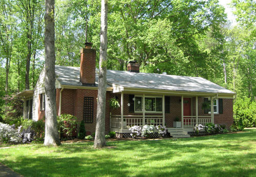
The Front Yard, First House:
The Front Yard, Current House:
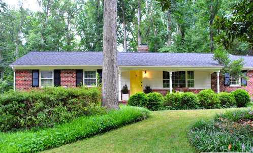
Winner: The first house. That’s an easy one. It took us over four years to upgrade it from this disaster, and we still need at least three more years on our current one, since from other angles it looks like this unfortunate mess.
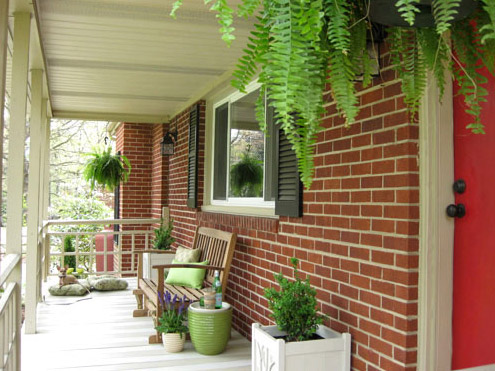
The Front Porch, First House:
The Front Porch, Current House:
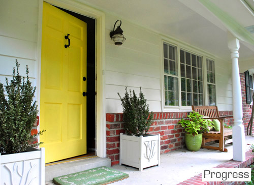
Winner: The first house. We actually would give the front door win to our second house (we loved the red but we lurrrve the yellow). But we still have big plans for boxing out the porch columns and staining the concrete and doing about a million other things at our new digs – and the hanging ferns and tan-and-cream stripes on the first house’s porch were a few of our favorite things.
The Living Room, First House:
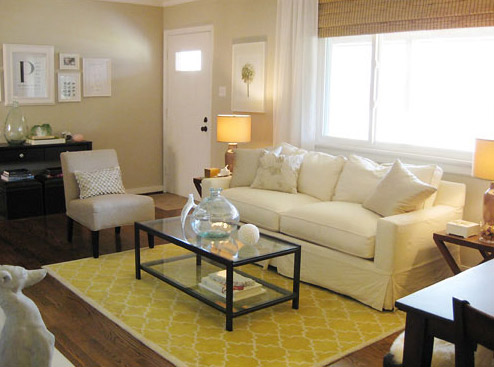
The Living Room, Current House:
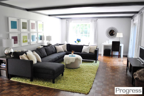
Winner: Our current house. This might be a controversial choice since our current living room is nowhere near done (and still looks like a hot mess from certain angles), but we never really used our formal living room in the first house (we had a den for TV watching and chillaxing). So we feel tons more at home in the current living room where we can sink into our giant sofa, play on the cushy rug with the bean, and even eat by the big window at the pedestal table in the back (sometimes while watching TV, we’ll admit it).
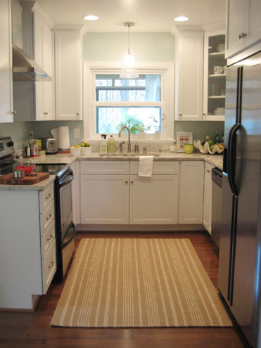
The Kitchen, First House:
The Kitchen, Current House:
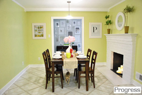
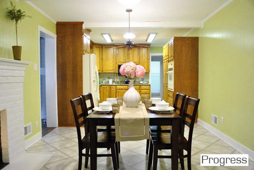
Winner: Is it lame to say it’s a tie? The first house’s kitchen made our hearts go pitter patter when it came to the granite counter, shiny white cabinets, and the stainless steel appliances… but it was tiny. The new kitchen, although extremely early on in our big makeover plan, is nice and spacious, with a fireplace and room for an eat-in area. And once we knock a huge opening to the dining room, get new appliances, paint the cabinets, and upgrade our old table for something built-in, we think the current kitchen will take the win, hands down. So I guess it’s a tie just because the last one was full of loveliness but pretty small, and this one is full of space to spread out and some serious promise.
The Hallway, First House:
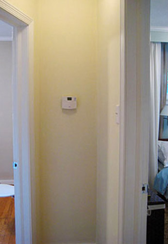
The Hallway, Current House:
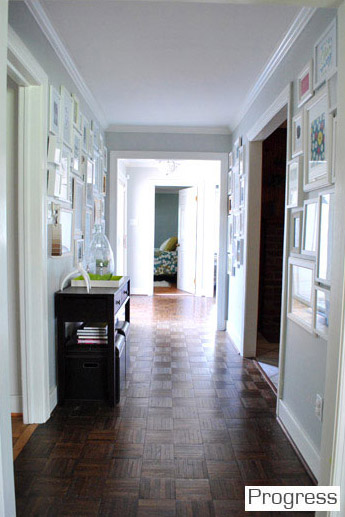
Winner: Current house. We’re so thankful to have a nice wide, light-filled hallway. And the giant family gallery of frames makes us feel all warm and fuzzy.
The Spare Bedroom, First House:
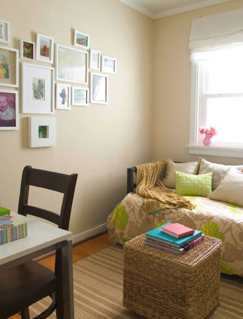
The Spare Bedroom, Second House:
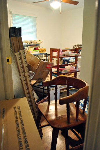
Winner: The first house. Duh. Although this picture is stolen from an old post about how messy the playroom was before my mom helped me clean it, once again it looks almost this ca-razy. So yeah, the clean little room with a daybed and a desk was a lot less hive-inducing.
The Nursery (Formerly The Third Bedroom), First House:
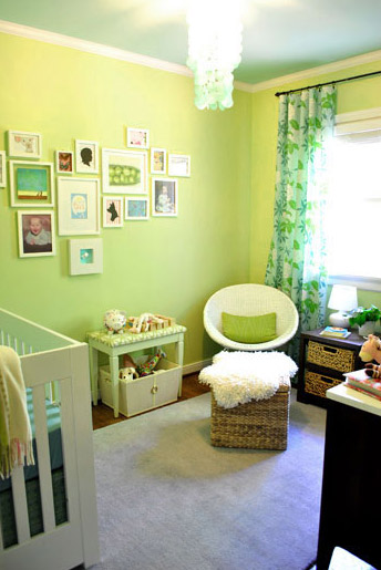
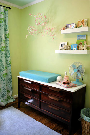
The Nursery, Current House:
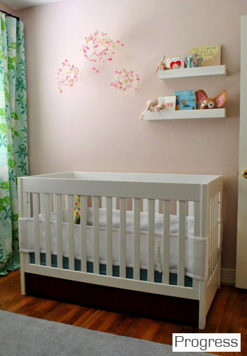
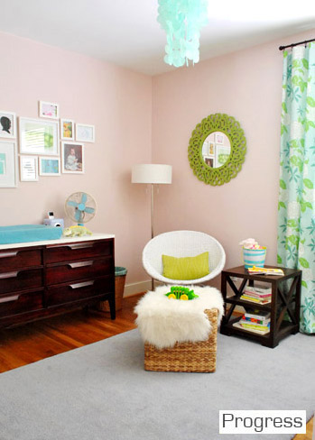
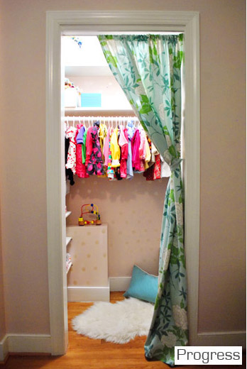
Winner: Current house. But it was a hard call. We loved the room that we took Clara home from the hospital to so much. It just was such a sentimental space. But the bigger closet in the current room (which Clara now uses as a reading nook) gives her current room the edge.
The Master Bedroom, First House:
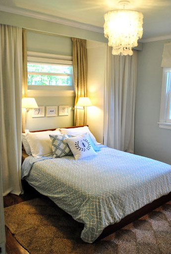
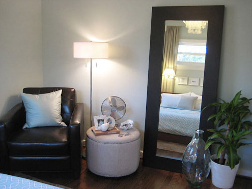
The Master Bedroom, Current House:
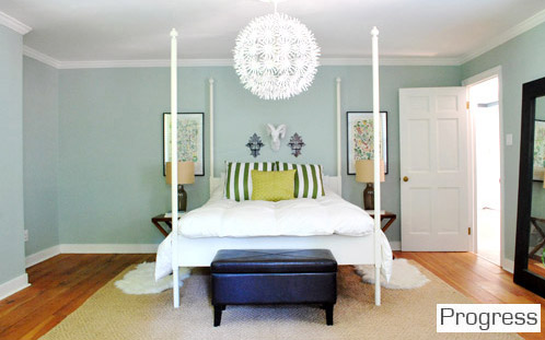
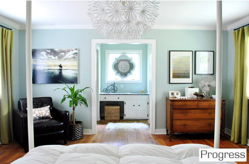
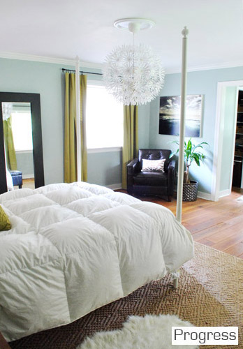
Winner: Current house. Even though it’s only about 20% done, sleeping under that big chandelier which reflects perfectly in the mirror that we hung above the sink makes us geeky-giddy. And of course having a walk-in closet and a master bathroom that’s actually connected is a huge step up. Although the built-ins that we created with doorless Ikea wardrobes to flank the bed in our first house (and provide some much needed storage) always have a special place in our hearts.
The Master Bathroom (located in the hall), First House:
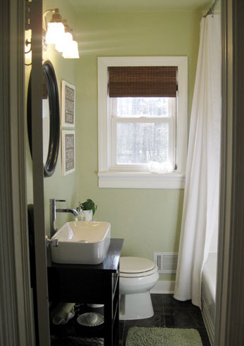
The Master Bathroom (actually attached to our bedroom this time), Current House:
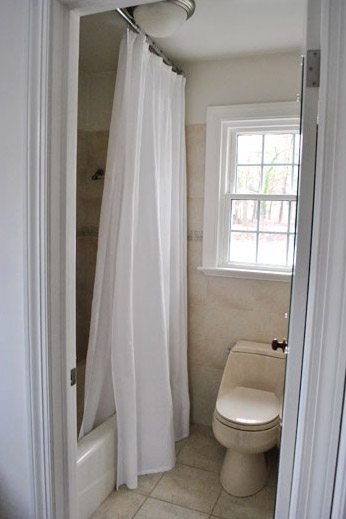
Winner: First house. By a mile. We loved that complete bathroom gut job more than words can say. And we haven’t really touched our new one. But we can’t wait to update things (check out that bisque toilet). We’ll probably love this one more someday, since it’s attached and doesn’t have to be shared by everyone in the house.
The Office/Guest Bedroom/Playroom, First House:
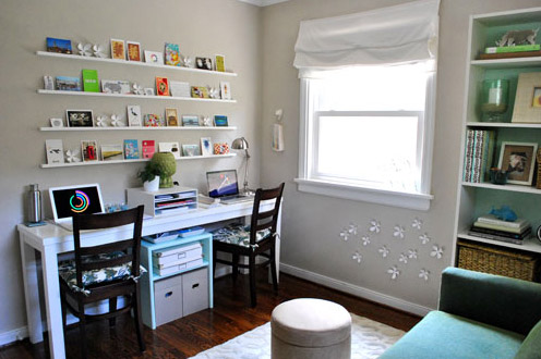
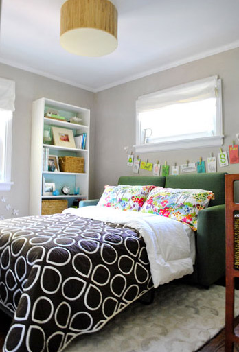
The Office & Guest Bedroom (which are now separate rooms), Current House:
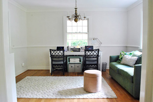
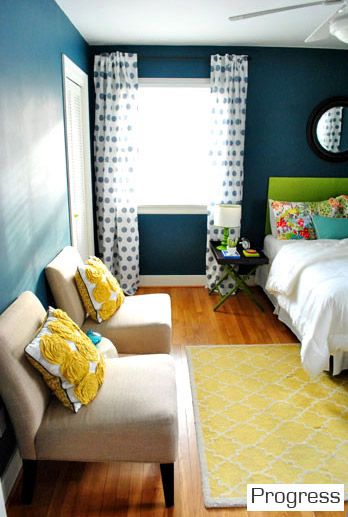
Winner: Current house. The office in our first house was such a great multi-tasking space, but it was teeny and it made us feel a little cramped when we were all in there (just look at how small the desk that used to take up a whole wall looks in the new office pic to see what we mean). And when guests came to town it was hard to do blog stuff (which definitely doesn’t stop on nights and weekends) since the office was occupied by family & friends. So although our first home’s office/playroom/guest room was such a fun space, it’s a lot more functional to have our own cheerful guest room (with its own attached bath) for guests. Although we wholeheartedly admit that our current office situation “ain’t got no alibi, it’s uggggly (hey, hey) it’s ugly.”
The Den, First House:
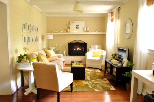
Winner: The first house. 1) Because our current house doesn’t have a den, and 2) Because our first house’s den was one of our favorite rooms ever – so cozy. Although the room that we call “the living room” in our current house could have been a den (but instead we opted to turn what used to be a formal living room into a spacious dining room to accommodate our huge family who couldn’t squeeze into the dining room behind it, which we made into the office). We decided that one huge casual room for TV, reading, playing, & hanging out was more than enough, so we didn’t need a second formal living space in the front (especially because we didn’t use the first house’s formal living room much at all).
Dining Room, Current House:
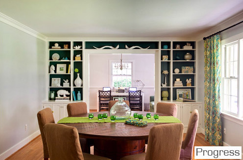
Winner: Current house. 1) Because those curtains are my babies and we’re enamored with the dark teal color that we painted on the back of the built-ins, and 2) Because our first house didn’t even have a dining room (it just had a dining nook in the corner of the living room). Well, originally it had a small dining room off of the other side of the kitchen but we closed off that doorway to turn it into a third bedroom which later became the nursery since we needed that space far more. It’s all much more clearly explained here.
The Laundry Area, First House:
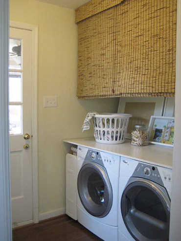
Laundry Area, Current House:
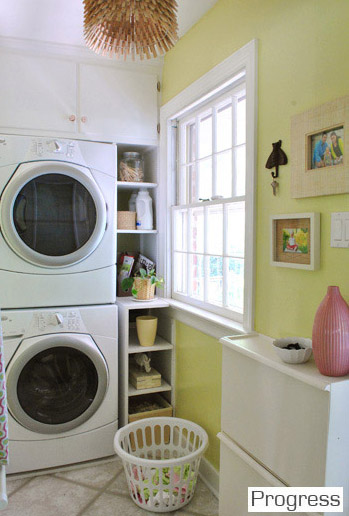
Winner: The current house. We love our new laundry space. Even though it’s narrow and we don’t have a surface for folding, it just feels happier. Plus we don’t have to fight all of our normal human urges to resist clutterering up a big long counter near the door like we did in our first house (it was always full of incoming or outbound stuff). And it’s more fun to fold laundry in front of the TV on the sofa in the living room anyway.
The Hall Bathroom, First House:
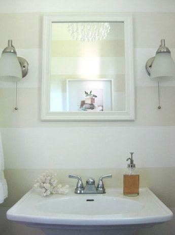
Hall Bathroom, Current House:
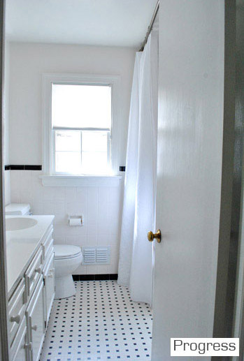
Winner: First house? The stripes and the fun glass chandelier were so charming. And we loved the pedestal sink and the pocket door too. But the new hall bath isn’t just a toilet – there’s a tub in there, which is where Clara takes all of her baths. So maybe the current house wins for function but the first house wins for sweetness? Either way, that blank slate of a bathroom in the current house is begging for some love. But we’ll count this as a point for the first house until we tackle the new one, since that was our first instinct.
The Sunroom, First House:
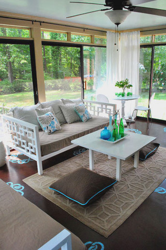
The Sunroom, Current House:
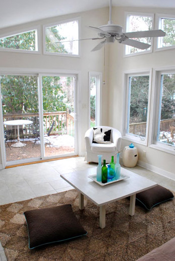
Winner: First house, all the way. We have about ten million things on the list for the current one though, so maybe in four years it’ll give our first one a run for its money…
The Patio, First House:
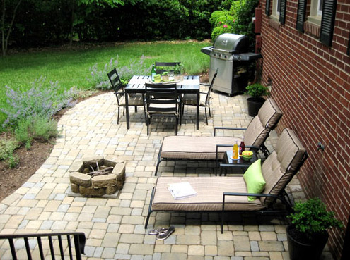
The Patio, Current House:
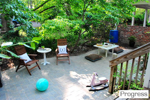
Winner: Current house. Just because it’s more spacious and cozy/shaded. But most of all because we did it ourselves (we hired out the first house’s patio since we were three weeks away from our backyard wedding and worried that if we tried to DIY it we’d get married next to a half-finished mud pit).
The Basement, First House:
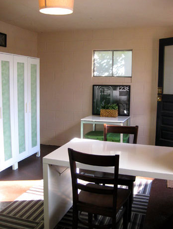
The Basement, Current House:
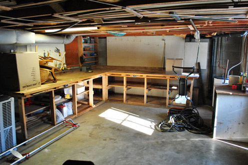
Winner: First house. Because we’ve obviously spent a little more time on the first one. Haha. But you never know what we’ll do down there with our current one someday…
The Backyard, First House:
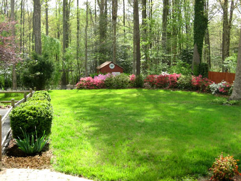
The Backyard, Current House:
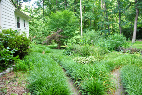
Winner: First house. We still miss that lovely flat grassy area surrounded by pretty woods. Someday we’ll get there though (after lots of transplanting, to hopefully make a little grassy spot for Clara and Burger to romp).
So there you have it. I think the final tally is 9 to 8 (with our first house in the lead). But I guess in fairness we should revisit this whole comparison thing when some of the spaces in the new house have actually been updated a bit more. That was a really fun little comparison though, Sarah. Thanks for the suggestion. It’s interesting to see how our style is gradually evolving, although we always have a soft spot for the tone-on-tone look of our first baby- er, house. What do you guys think? Have you ever looked at photos of your current house next to photos of a previous house to compare what you liked or disliked about them? Isn’t it funny how a new house is a chance to completely reinvent yourself, yet you’re usually working with a lot of existing furniture, so it still has “glances” of your first style going on? The evolution is definitely all part of the fun.
Psst- Check out a full source list for where we got nearly every last item (and what paint colors we used) in our first house here (we’re still working on one for our current house).

Erin says
OK, fantastic idea for a post! Kudos to the reader who suggested it. It is so interesting to see the differences in the spaces. One thing I’m noticing is that with the first house there was a very similar feel in all the rooms, and in the current house I feel like while everything is very cohesive, every room as it’s own personality. I like that.
And is it a bit stalkerish that I have a suspicion that you guys are working on a big project right now? I only say that because Sherry’s been posting a lot and not John, which leads me to believe John’s in the middle of a big project. Which is not to say that Sherry doesn’t do big projects, it’s just that big projects usually start with John tearing something apart so we don’t hear from him for a bit.
YoungHouseLove says
Just the cabinets for the office! There’s lots of prep work to sand and stain them (and build them up a few inches) so we hope to have that to share next week! Haha. I think we just go back and forth about posting (last week almost every last post was a John post, so I’m making up for that this week- haha).
xo,
s
Torrie @ a place to share... says
Incredibly inspiring. Makes me excited to continue watching your progress on the “new” house :).
Kristen @ Popcorn on the Stove says
I like that your style is changing! It would be so boring if you turned this house into your old house. Besides, if you don’t like it a can of paint is cheap. There are certain parts of your old house I love (like the den and the hall bathroom) but it must also be nicer to have a bigger kitchen and bathroom in your bedroom!
kaylan says
It’s so hard to pick on some of them! I love the formal living room and dining nook in the first house. It’s small, but I’ve drawn a lot of inspiration out of it because I have a similarly tiny space to work with while trying to make two (well four, since we have living, dining, kitchen, and office in one room-ish) very different functions fit cohesively into one room.
Chrissie says
I’m the same! We have a teeny house, so that room has been a big inspiration to me :-)
Kate says
We’re about to buy our first house and I can’t wait to do some of these side by sides once we get settled in! I have such big visions for the new house. It’s pretty amazing how your style can just subtly shift each year until your house looks totally different!
This was a fun comparison!
Rebecca says
I think it was a great idea to show them side-by-side. I loved looking at the different styles.
Randa says
Seriously, the bright yellow door of your current house is so amazing!
Loved the side-by-side comparison. Kuddos to Sarah for the suggestion.
Skye @ Neathering Our Fest says
That is the second reference to “u-g-l-y you ain’t got no alibi” today. Random! :) For some reason I will always lo-lo-looove your first house (maybe because that is when I lell in fove with your blog altogether) but I know before long I will be digging your current house just as much!
PS: other “u-g-l-y” reference here: http://poofycheeks.blogspot.com/2011/08/vintage-window-rehabpart-2.html
Happy Thursday!! :)
YoungHouseLove says
Haha- that’s so funny!
xo,
s
Liz says
I have to say, I think I like your first house better. I have a soft spot for small homes, and it just seemed to cozy. Although there are details of the second house that I absolutely LOVE – like the hallway, the color of the kitchen/laundry room, and the dining room. Is there anything looking back at your old house that you wished you had done, or anything you would change?
YoungHouseLove says
I really don’t think so. We loved that house with all that we have and probably always will. So we don’t wish we changed a thing because it was so perfect for our little family for those years that we spent there. Sappy but true. Haha.
xo,
s
Melissa S says
Do you know rough dimensions of your first house living room/dining room? My fiance and I are currently looking for a house and I love the way you divided the space but it didn’t feel too cramped. I was just curious for our own purposes for when we look at houses without dining rooms. Thanks so much! :) Love both houses by the way…I can’t wait to see how you continue to change the new house. Have to admit though the den is by far my favorite room out of all of them. It looks so inviting. I just want to curl up with a blanket and read a book with the fire going.
YoungHouseLove says
That room was 22′ x 12′ – hope it helps!
xo,
s
Petra says
Lovely! For the hall bathroom, do you plan to create a space for Clara, or more of a guest oriented bathroom?
YoungHouseLove says
I think it’ll probably feel like the guest room with pops of color that Clara and friends/family can enjoy alike. Who knows where we’ll end up though!
xo,
s
Sarah says
You could add cute black and white photos of Clara playing with her bath toys in a bubble filled tub to make it still about her :)
YoungHouseLove says
Sweet idea!
xo,
s
Jess @ Little House. Big Heart. says
I hope that in a couple of years when the hubs and I are ready to sell our Little House and move on that we can look back on it with the same satisfaction as you guys!
Linda says
This makes me wish I had more photos of my homes through the years! One thing that I wish blogs would include are the dimensions of the rooms. I live in a small home, so my idea of what a large or small room is different than if I lived in a large home!
YoungHouseLove says
We actually have all the dimensions of each room in our first house here (at the bottom of the page) and of our current house here (right in the diagram). Hope it helps!
xo,
s
jesser says
I’m a new reader and not sure if you’ve ever done this before, but I would love to see a comparison of both houses floorplans (or is that too intrusive? sorry if it is). Anyhow, just curious!
I love both of these houses. I live in CO and we have our own much different style houses with not nearly so much yard or so many trees. These remind me of Nashville where I went to college. Very nice. CO will always be home, but I do envy others their trees!
YoungHouseLove says
Here’s a floor plan of the first house and here’s one of our second one. Hope it helps!
xo,
s
Laura @ Hollywood Housewife says
This is a great post, especially for new readers like me!
paula says
I definitely did NOT hate that! So fun to see the comparison!
The hall comparison! haha! :)
I may have to spray paint a whole bunch of our frames white and do a gallery… I’m so in love with yours.
Heather W says
Love this post… Can’t wait to see the finished comparisons some day. Did you all ever get your picture from the artist who drew your first house? If so, is it hanging in your hallway of pics? Just curious.
YoungHouseLove says
Yes! It came out so well. We owe you a post on that- it’s hung in the hallway proudly!
xo,
s
Kristy says
I noticed that you have a lot more saturated color in this new house. Was that purposeful or did you just feel more confident in the new space? We’ve been in our house about a year and I’m feeling a bit stuck in a grey and beige rut!
YoungHouseLove says
I think we’ve been happy to embrace more color since having Clara! She just makes us wanna be playful, ya know?
xo,
s
Jess says
I think its an unfair comparison to put 8 months of work at the current place up against 4 + years at the old. You should have compared current photos from this house to what your old house looked like 8 months after you moved in there!!
YoungHouseLove says
Haha- that would have been hilarious considering we were just getting started and learning how to paint (we painted all the trim in our first house flat and later learned it should be semi-gloss and had to do it all over again). So sad.
xo,
s
Valerie Gerard says
I love the side-by-side. Since you accept post suggestions, I’d love a post on your beginner mistakes. Some basic things about DIY that you know now that you didn’t know when you started working on your first house.
YoungHouseLove says
Here ya go: https://www.younghouselove.com/mistakes-we-hopefully-wont-make-again/
xo,
s
Lauren says
I hope you’re planning to cut down the tree to the left of the front door in your current house – because it’s driving me crazy! It’s just sticking up in the middle of the photo, all “Here’s my trunk but you can’t see any leaves so I’m just here to interrupt the landscape!” Bah!
YoungHouseLove says
Oh man, if only we could move them as easily in real life as we can in Photoshop!
xo,
s
tarynkay says
Oh, I hope that you never cut that tree down! I know that some people want to cut down trees in the front yard so that you can see the house better from the street, but this seems crazy to me, especially with older, healthy trees.
YoungHouseLove says
That tree is definitely staying (we’re not so sure about the big magnolia, because it’s questionably stable, but those two oaks on the other side (one of which is in the pic) remind us of the two oaks that we had on the same side of our last house and are both very healthy. What we do want to do is work on our landscaping so we can take a picture of our house from another angle, so the tree won’t block it as much (but the yard looks crazy from that angle at this point, haha).
xo,
s
Liz M says
Sooooo want your kitchen table for my loft. I know you’ll put it on Craigslist when the time comes for the built-in you mentioned, but alas… near-western NC is a little too far to haul it.
Nette @ This Dusty House says
This was such a cute post! I’ve read some criticism of how you’ve changed your style with the new house a bit (forums… people will talk when you share your life so thoroughly!), but honestly, with the side-by-sides, I can’t agree. Your living room is so pleasantly casual and cozy now, and pulling together a beautiful home takes time and layer after layer. I think you guys are doing great job with your new place.
Chrissie says
I agree with you that the new house is lovely. I love both houses in different ways. The first one was nice and warm and cosy, but this new one is so cheerful and casual and friendly that I feel like I could walk in and feel at home right away. Don’t mind if I help myself to a bowl of cereal!
Also, I figure people who criticise those who are just doing what works for them probably have a bit too much time on their hands ;-) No one can please everyone, after all!
Mary @ stylefyles says
I love this list. If only because it’s a fun reminder of some of the projects you’ve done (totally forgot how much I love the guest bedroom in your current house) and some of the projects that you probably have in the works (sunroom, bathrooms, back yard, etc.) Thanks for reminding us that with all the renovations and little updates you’re making, you still have plenty more to share with us!!! =)
Wrenaria says
I actually greatly prefer all the pops of color in your new house that the first one lacked. I especially adore your guest room. I’d like to move in there and stay awhile. I also like the contrast of pink and green in Clara’s room much better than the tone on tone.
And I do love the stripes in your first house’s bathroom. And on your current master pillows. I’m a stripe addict though.
It’s so fun seeing your style evolve – its just getting better and better, imo.
Jenna says
Both houses are so beautiful and I have learned SO much from reading your blog over the past couple of years. We just bought our first house and tons of our little DIY projects have been inspired by you guys. Keep up the great work! You rock :)
LARY says
Loved seeing and remembering the then and the now. Great post! Is crazy how much I remember the old house, like I actually know you guys. Cool and crazy what the internet can do. haha
Jennifer K says
This is so fun & a great idea! I think you should do it every year.
John says
Whoa! I feel like I just got the abriged version of your entire blog in one webpage. Too much to comment on! Especially like the small cameo of the paver driveway… Would love to do that with our current concrete driveway and sidewalk, but we have a new const. home so I think I’d better wait until it accidentally cracks… hmm, where did I put that sledge hammer?
Lauren says
Very fun! Your first house was obviously great but I for some reason just adore your current house. So much color!
Question for other commenters: Is having a sunroom a cold weather thing/east coast thing? I live on the west coast and have never seen this before, but both of the YHL spots had ’em. I love how light and bright they are!
YoungHouseLove says
I never heard of them in the north (NY/NJ) so I wonder if they’re a southern thing? Anyone know? In the waaay low south (Fla) they call them “florida rooms” I think.
xo,
s
(a different) Lauren says
I’m from Michigan and we call them Florida rooms too.
YoungHouseLove says
Now that’s interesting!!
xo,
s
mariela says
I live in PA and most of the single homes here have Sunrooms.
Tia says
I lived in Rochester, NY for awhile, and most houses have them there. I’m a native of Portland, OR though, and they are really rare here. My theory is that homes in cold (but sunny) areas of the county have sunporches because it is a great way to use the winter sun for warmth.
heather says
I’m from New England and we definitely have plenty of houses with sun rooms or “three season porches”, they are really called either or. Three season porches though normally have big windows that are screens for spring and summer, and window panes for fall/winter. In the winter they are great for storing drinks and other fridge necessary items in cold spells.
javonne says
I live near Chicago and we have them. We call them sunrooms.
Heather W says
Here in Indiana we call them sunrooms too.
Hollie says
I’m a Florida native, and although I can’t speak for other Sunshine State residents, I have never seen a “Florida room” in any home actually in Florida. However, just about every dwelling has a porch or lanai. Probably because, unlike our northern neighbors, Florida weather is conducive to outdoor living all year long and in other areas, an “enclosed patio” provides the sunlight without exposure to unpleasant temperatures. But, for the record, the sunroom in your 1st house was to die for and I can’t wait to see how the space in your new home turns out.
YoungHouseLove says
Haha- hilarious. I was so wrong! So interesting to hear all the different names!
xo,
s
Laci Waner says
I live in central Texas in a 1940s/50s ranch without a sunroom in a historic district. All of the Victorian-ish homes have them here. None of the ranches have them. Lots of covered patios down here. Most of the people with sunrooms have them shut off from the rest of the house bc down here it is like a boiler pot in those rooms!
Elaine says
That was so fun. Great idea your reader had! I didn’t know of your blog back when you had the old house so I only have visited it in ‘flashbacks’. ;) … and a few snoops through your archives. Love seeing the side by sides and love the direction you are heading with all your updates. VERY inspiring!
Ann @ The Domestic Domicile says
This was such a fun idea! It’s refreshing to see your basement unfinished – it makes me feel a little less ashamed of the work I still have to do in my basement back room! Plus whatever you guys do with it will be a huge inspiration!
SingleMama says
Great post! I think your current kitchen is the winner…it is so much more spacious!!!!
Jen @ This Hollywood Life says
Love the side by side! It’s funny how much things change each time you move. In fact, we are moving this weekend (I really should be packing right now!) and I already have a list of things I want to change. I just posted some of our new paint colors here. I think I’m most excited about changing our 20 month olds “nursery” into a Piratey “Bigger Boy” Room. :)
Jessica says
This post was so fun! I disagree on two room winners, however….lol! I loved Clara’s first nursery most, but I think that’s because I’m a sucker for that wall color. Annnnnndddd…..I love the new house’s sunroom more! So much potential with those sky-high ceilings….
still the same final score, ultimately….haha!
Melissa S. says
I agree about the nursery. The colors in Clara’s first nursery are my idea of perfection.
woacf says
I love how you use yellow in decorating! Love it!
tara says
What happened to the 2nd horse print? Either a.) the pic of the master bedroom where it faces the sink is old, or b.) I missed a post about why you took it down/moved it/didn’t love it anymore.
Love the side by side comparison:) both houses are amazing and I love watching your style change and grow!
YoungHouseLove says
Here’s that post for ya: https://www.younghouselove.com/nine-dolla-pillows-more-free-art/
xo,
s
Lauren says
Great idea for a post! And I loved the trip down memory lane to see the old house pictures. Had totally forgotten about the shelves in your old office. Very cool!
Jeanine says
I love this post! It’s hard to pick a favorite between each of the rooms. I think both houses have such great elements. The rooms in both houses are all great in their own ways. It’s awesome to look back at all the old pictures though. I forgot what your old den looked like! I do enjoy the transition you’ve made from tone-on-tone to bold and colorful. I wonder what house #3 will hold for you two!!!! haha
Meagan says
I am still crazy about your old house. It definitely has the warm cozy homey feel that I love. The new house is great…don’t get me wrong…the frame hallway gets me every time. I just have a soft spot for the old house. But I am totally dying to see how the new house comes along. (p.s. the refinished chair is to die for. so gorgeous. and what a steal!)
Assorted Annie says
I can’t wait to see what you do with the light fixture in your new office – I have one that’s almost identical, and I’m dying to change it!
Alison says
Fantastic post!! Love it!
Zoë says
I love your first house because it was so cute and cozy and you can see the love that was poured into it. And I love your home (do you see what I’ve done there – you had a house which was your home when you lived there, and now your new house is your home) because of the layout, the colors, the creativity and again the love that you are putting into it.
We are on our second house. Our first house was definitely prettier on the outside and had a great master bedroom. It was also the house we brought our firstborn home to so I love it just for that fact alone. But it had a layout that would not work with our family of five, so our now home wins the contest. It probably doesn’t help that my memories of our first home are tainted by the debacle that was closing day. We had moved out a couple of weeks before we closed because my husband was already at his new job which was 3 hours away, but we planned to go back a few hours before closing so we could finish cleaning. The buyer asked if she could leave a few things in the shed, and a couple of items in the house. In our naivety, we agreed. When we arrived on closing day to clean house, we discovered a strange truck in our driveway, and a strange man in our house (it was still ours because we hadn’t closed yet – we could have walked away at any time). The buyer’s agent had given her a key to the house (the one from the lockbox) which she had then turned over to the guy who was going to put in hardwood floors. Our living room no longer had carpet and there was a bunch of junk in every room, including the nursery. I had wanted to go back to the house and say goodbye and have a little cry over the fact that this was the home where we became parents (I was 3.5 months pregnant at the time too). That clearly didn’t happen. I was on the verge of tears for different reasons. My husband was so pissed he complained to the Tennessee Real Estate Commission and in her written explanation, the buyer’s agent had the gall to complain that we left the house in a mess!!!!! Grrrrr, we went back to clean it up and it was trashed by the buyer before it was even hers!! Can you tell I’m still bitter over it 4 years later? But I did love that house. It was a happy home.
laxsupermom says
Love this post! Loved the side by side comparison. It’s neat to see what elements you’ve stuck with(light & bright, clean lines) even though this house has a different vibe to it. Thanks for sharing.
Katherine says
Loved this post!! I almost said “Hey!” out loud (I’m at work, oops!) when I looked at one of the patio pics. My daughter Noelle just got that awesome Vespa-like rocker for her birthday! Hope Clara likes it as much as Noelle does! Thanks for the cool breakdown!
YoungHouseLove says
She loves that thing! So funny that she has a twin rocker out there!
xo,
s
Katherine says
Oh, also…we call them sun rooms here in Wisconsin.
Ellen says
Hey! Great post. Just wanted to let you guys know I think the link for the first house bathroom redo might be wrong. It takes you to the wordpress log in screen!
P.S. I LOVE that bathroom. So classy.
YoungHouseLove says
Oops, thanks for the tip!
xo,
s
jess says
It’s nice to see how your style has changed, but by incorporating old-house pieces. That’s one of my fav things about design- combining 2 households, moving from new to old, etc and making everything work and fit together in new ways. You guys do a great job!
Irene says
Love this. I love your current house. I’d kill for it even in its current un-done-ness.
Sadie says
I’ve been DYING to know where you got the pillow cases for your guest bedroom. I L.O.V.EEEEE….them and have been hoping you’d spill the beans on it. Pretty please??!!
YoungHouseLove says
They’re from Pottery Barn a while back (a b-day gift when they went on clearance from John’s cute sisters). Maybe try ebay? I think the print is called “woodland organic” – good luck!
xo,
s
Heather says
Pottery Barn still has some. I’ve been thinking about getting them for a long time, I didn’t even realize those were the same ones until Sherry just mentioned they were pottery barn. If they aren’t the exact same they are awfully similar.
http://www.potterybarn.com/products/woodland-organic-duvet-cover-sham/?pkey=cqueen-duvet-covers-value
YoungHouseLove says
No way! Awesome. Thanks for sharing the linke!
xo,
s
Sadie says
Thanks ladies!! Pottery Barn probably scored a sale tonight :O)
Ashley says
I love the comparison photos! Of course it’s hard to compare something that is “done” to something that is still a work in progress. Both houses look (looked) great though!! And its fun to see how your style changes from house to house, as trends and tastes change.