Break out the 3D glasses! Okay, not really. Put them away. This blog will not be coming to you in any additional dimensions today.
As you saw in our latest kitchen planning post yesterday, I finally bit the bullet and learned me some Google Sketch-Up (as many of you recommended) to help us plan our kitchen renovation. But having been a loyal user of Floorplanner.com in the past and having recently become acquainted with Ikea’s Kitchen Planner, I thought I’d give you my take on how these three 3D modeling tools stack up against each other… because there’s actually not a clear winner in my book. Each have pros, cons, and a different scenario where they might take the win.
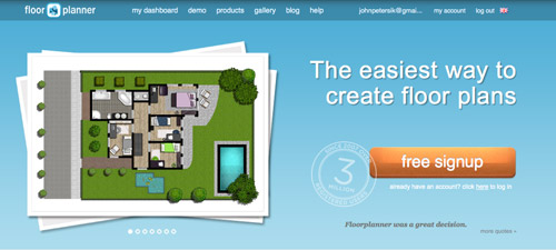
Floorplanner.com is what we’ve used to create just about every digital floor plan you’ve seen on our site (like this one), so we’ve got a soft spot for it. But when I gave it spin last week to render our new kitchen plans, here’s what I observed:
PROS:
- No software to download. It just loads in your browser.
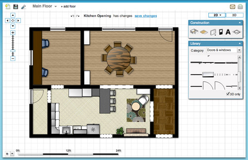
- Easy & fast to use. I find the interface very user-friendly, so if you’ve got your room measurements handy you can have a simple whole house plan done in a matter of minutes.
- Good finish options. They have a lot of standard finishes, like flooring, with adjustable colors so you can bring more life to your drawing.
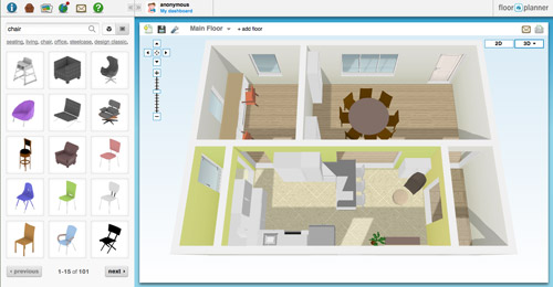
- Nice library of furniture. Floorplanner comes stocked with dozens of furniture options (chairs, tables, rugs, plants, appliances, etc) to help decorate your spaces. You won’t find perfect matches to your real life items, but you can usually find something similar.
- 2D or 3D: It lets you easily toggle between a 2D and 3D view.
CONS:
- Only kinda free. You can create one plan for free, but after that you may have to fork over some dough.
- Limited kitchen designs. Kitchens are probably one of the toughest rooms to design, so Floorplanner is quick to fall short when it comes to trying to precisely layout a kitchen (I could only find one type of base cabinet, for example).
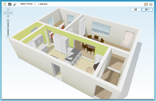
- So-so 3D rendering. I like the look of their 3D rendering, but it’s a bit clunky to navigate around and I had issues with things not showing properly (see below how my counter got wonky and my rug disappeared from the kitchen). Also, I found the only thing I could change in the 3D version were my wall colors, so I ended up working in 2D most of the time.
BEST USE: In my very humble inexpert opinion, Floorplanner is best if you’re short on time or technical skill and need to create a 2D floor plan (of one room or even your whole house). It’s also great for testing out furniture arrangements thanks to their library of stock furniture and the ease at which you can move things around in your virtual space.
On to the next one…
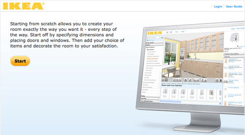
Ikea’s Kitchen Planner popped up on my radar when we were considering their cabinetry for our wall-to-wall office desk. Having had a good experience with that, it was actually the first place that I turned to when deciding to plan our kitchen’s new layout in 3D.
PROS:
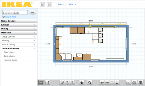
- It’s free. There is some software to download, but once you do that you can access it anytime on their website using your free log-in.
- Allows multiple designs. I’ve saved three or four different files (aka different kitchen layout options) and so far I haven’t hit any “max projects limit” like I did on Floorplanner.
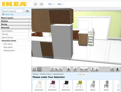
- Works with real life products. Ikea lets you design using real products from the catalog (and not just cabinets and counters, but chairs, tables, etc) so you know there’s some “reality” to your design when it comes to size/layout/planning. It even offers to print out a shopping list when you’re done. Convenient, but only if you’re getting everything at Ikea.
- Works with real life finishes too. Like above, you can pick from a range of cabinet sizes, front styles, drawer & shelf configurations, finishes, colors, hardware, etc to get a very customized look. Obviously it’s limited to Ikea’s real life finish options, but they’re pretty plentiful.
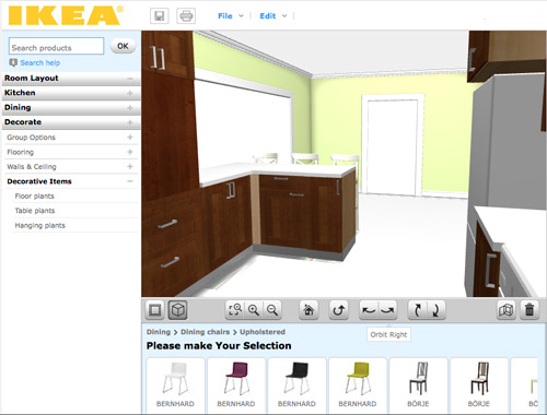
- A real-ish 3D rendering. Continuing the “real” theme, I thought Ikea’s 3D view was the most life-like of all of the three tools.
- 2D and 3D. Like Floorplanner, you can quickly toggle between these two views. However, Ikea’s version gives you equal editing capabilities in both options, so I found myself working mostly in 3D, which was nice.
CONS:
- It’s just kitchens. Unless I’m missing something, Ikea’s software only lets me create one room in my plan (which makes sense since it’s supposed to be just for planning your kitchen) but as someone who needed to see how things would look in the kitchen from the dining room (through a doorway) it fell short.
- It’s just Ikea. Since the cabinets and furnishings are only Ikea, you may have trouble finding pieces that suit you if Ikea-style isn’t your thing.
- Limited decorating options: I’d understand just being limited to Ikea furniture, but it’s also limited to only kitchen-appropriate Ikea items. So I wasn’t able to render a rug or an armchair to create a seating area near the fireplace. And why are “decorative items” limited to just plants? Can’t a brother get a fruit bowl?
BEST USE: Designing a kitchen (surprise!) especially if you plan to use Ikea products. But even if you don’t, a lot of their sizes are standard enough that you can get a good idea of what you might also be able to find elsewhere. Just don’t expect to “decorate” your virtual kitchen very much.

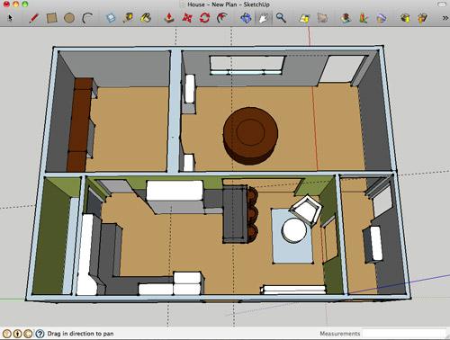
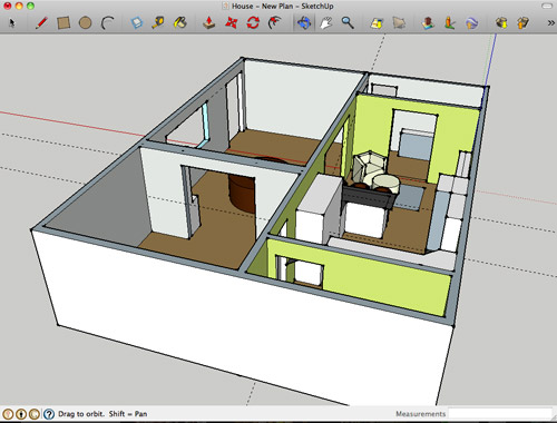
Google Sketch-Up is new to me as of a couple of weeks ago. I turned to it after being frustrated by Ikea thwarting my multi-room design (and after a bunch of you sang its praises). I’m still pretty new to it and feel like I haven’t unlocked all of what it can do (like apparently I can turn off the guides that you see in my screenshots below). Nevertheless, we’re becoming fast friends.
PROS:
- It’s free. Like lots of products in the Google-verse, it costs $0 to download.
- It’s offline. While some may see having to download software a “con,” I liked that I didn’t need to be connected to the Internet to use it or to access my files. You know, in case we have another Hurricane Irene.
- It’s precise. Google’s software feels much more “technical” than the other two, so I feel more confident that we can actually make cuts into our wall based on Sketch-Up measurements (with the help of a pro, permit, & architect of course).
- The possibilities seem endless. If you’ve got the time, skill, and patience it seems like you could render just about anything in Sketch-Up – rooms, furniture, buildings, cars, chihuahuas – so you won’t find yourself limited like the other two sites.
- Most functional 3D. Navigating through Google’s 3D rendering is the most intuitive and flexible, it seems. You can look above, below, through, and around every inch of your design quickly and easily. The rendering looks very much like a rendering, but that’s okay.
CONS:
- Talk about a learning curve. Being the most technical of the three, Sketch-Up has the steepest learning curve by far. I spent about 15 minutes watching Google’s tutorials before starting and still found myself struggling to hit my groove.
- No 2D: I find 3D hard to work in sometimes, so not being able to toggle to a simple 2D floor plan was something that I personally missed. The closest I’ve found in Sketch Up is the “Parallel Projection” camera viewed from the top.
- No built-in furniture library. Unlike the other two which have furniture options built into the software, with Google you have to download it separately from their warehouse (I didn’t know this until a few helpful commenters enlightened me on yesterday’s post, which is why every cabinet, fireplace, chair, and table was “drawn” by me for that sketch – which certainly didn’t help my rendering look any more lifelike). Oh well, live and learn.
- Somewhat inflexible. I found it difficult to make changes or tweaks along the way. If I wanted to shift my chair a bit, it took making sure all of the right edges and surfaces were selected (and none of the wrong ones) first. This took time and also gave me a lot of accidentally skewed walls and floors along the way. Did I mention I’m still learning? Update: just figured out how to group things/make components. So helpful.
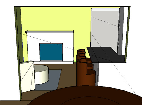
BEST USE: Anything 3D… as long as you’re willing to put in some time to learn it. It ended up being perfect for planning our doorway because I have the most flexibility to render the room AND I can trust the precision of the measurements. Now if only it didn’t take me so long to make changes…
So that’s how Sue John sees it. I haven’t spent more than a few hours with each program, so my comments aren’t based on weeks of research or anything. If you guys have had your own similar (or different!) experiences with these three tools (or others that I haven’t heard of yet) I’d love to hear your thoughts – and tips if you’ve got any.
Psst- We announced this week’s giveaway winner. Click here to see if it’s you.

Kristen @ Popcorn on the Stove says
Joe uses Google sketch up. When I make floor plans I just use Adobe Photoshop (woops!). I may need to play around with these because they kind of look like fun!
Rebecca @This Nest is Best says
Totally off topic but I just had to share my recent party planning with you! Olivia the Pig birthday for a five year old :)
http://thisnestisbest.com/2011/09/26/olivia-the-pig-birthday-party-dessert-bar/
http://thisnestisbest.com/2011/09/27/olivia-the-pig-birthday-party-decor-and-activities/
YoungHouseLove says
Oh my gosh- soooo cute! Great job! Everything looks so yummy…
xo,
s
John@ Our Home from Scratch says
Thanks for this post. Very helpful. I need to start using SketchUP. When I built my kitchen cabinets, I used a program called Cabinet Planner that was perfect and very similar to the programs above but it gave you cut sheets for cutting plywood and the lumber.
Trisha says
I love that you use the word wonky!!!
Quick SketchUp tip: when you make an object like your chair, you can make it a component or a group in the edit menu.
Nice work with your 3D-ing!
YoungHouseLove says
Just learned that- so helpful!
-John
Rebecca @ the lil house that could says
I used Sketch Up once to doodle some stripes on the wall for our office. You can see my subpar results here….http://thelilhousethatcould.com/2011/02/17/striped-walls/
Less than professional looking, though I liked that the chairs are indeed our office chairs, the bottom of one kept disappearing and I couldn’t turn the other one around. Definitely a learning curve but it was fun to play with :) Maybe someday I’ll use it again!
YoungHouseLove says
I think that looks good! I couldn’t do it! Haha.
xo,
s
simplyblythe says
this is great, thank you!
we’re just beginning to explore the idea of remodeling a kitchen now that we’ve purchased a home.
we’re loving some of ikea’s plans.
silvia says
Have you guys tried “Sweet Home 3d”? It is not online so you can work remotely from your computer, and you vae 2d and 3d at the same time on the same screen. You can create photos and video of your home. Check it out, I really like it.
S
YoungHouseLove says
Haven’t tried that yet. But thanks for the recommendation!
-John
OntarioGirl says
I love this 100 times more than the banquette idea (which was also good). So much more function with this layout AND it looks amazing. You can tell how excited you are about it and can’t wait to read all about it :)
OntarioGirl says
Ooops I commented on the wrong entry so just assume this note was for the entry when you announced the peninsula idea!
YoungHouseLove says
Haha, no worries!
xo,
s
molly says
“Can’t a brother get a fruit bowl?” !!! You are the silliest.
Penny says
Loved that part. I lol’d.
Jess @ Little House. Big Heart. says
Google Sketch-Up reminds me of the 3D modeling software I used in engineering school– Difficult to learn, but once you get it down, its a great tool.
I’ve been wanting to try floorplanner.com to start working on our bathroom remodel plans. Once you create a layout there can you change it later(ie. cut a door in a wall), or does that require a whole new layout?
YoungHouseLove says
You can add doors and windows as you go (every room starts as a square) so you can go in and edit it over time and change things like that for sure.
-John
Anna Scherling says
My hubby is a landscape architect, and used Sketchup in school for a lot of his projects. Now that he’s got a “real job” he uses the even fancier and more technical 3D rendering programs (the not free ones) but I know they still use Sketchup in the office when the need calls for it. It’s amazing what you can do in there with a little knowledge and time.
YoungHouseLove says
That’s so interesting! I like that beginners and pros alike can use it! Which is nice since it’s free!
xo,
s
Heidi P. says
How cool! I’m a landscape designer and we didn’t get to learn CAD or anything in school so that’s good to know that lscp architects use SketchUp sometimes too. I like doing it all by hand, but it’d be nice to at least know how to do it digitally.
And John, thanks for the informative run-down!
Paula in MN says
Very, very helpful. I’m downloading them now to see what works best for me. I did notice that the Pro version of SketchUp has the 2D function.
YoungHouseLove says
Oh that makes sense! Darn, wish it was free. Haha.
-John
Brandi @ His Shabby Her Chic says
Thanks for the info! I’ve been meaning to put together a floor plan for my house for a while now so this definitely helped me to understand what may suit my needs better than the others.
Anna says
Try homestyler.com it is very easy to use and looks great
YoungHouseLove says
Thanks for the tip!
xo,
s
Chelsea says
Oh my gosh! Thanks for the tip Anna – this is by far the easiest 3-D floor planning tool that I’ve tried!
Maureen @ This (Kinda) Old House says
Thanks for posting this. I am a stickler for drawing out my own floor plans, but the 3D rendering is something that may come in handy some day. I tried Google Sketch Up the other night for only like 10 mins, and admittedly that isn’t enough time to learn something. I have used the IKEA program and found it super easy, but like you said its only for kitchens unfortunately. Gonna try floorplan.com later on tonight!
Laura says
A Sketchup tip: Make sure all of your objects are grouped so you don’t have to worry about selecting every surface/line/node. You can have groups within groups within groups, too.
You can also turn off your edges (or tone them down) which will give it a more polished look. If you really want to get serious about rendering, you have to get a 3rd party plugin, because inherently it sucks at rendering. I think VRay had a Sketchup plugin and there are probably others. Consult your local architecture school for all of the current hacks…lol!
Excellent work for a few weeks time – I know it is a steep learning curve.
YoungHouseLove says
So helpful! Thanks!
xo,
s
Alexis says
Ooh now I want to try Google sketch up for my house. But it will probably take me loads more time than it took you to understand. Around how long does it take to create each rendering you made?
BTW, thank you so much for “Can’t a brother get a fruit bowl?” You cracked me up!
YoungHouseLove says
I would say that each rendering took me about two and a half to three hours, just because I was learning and watching videos and stuff.
-John
Sheena says
I absolutely love the YouTube video series:
http://www.youtube.com/user/aidanchopra
It basically walks through google sketchup for dummies and is very useful with all the little tips and tricks you can use to do different things.
Also, if you have a component that you’ve loaded or drawn, put it away from everything else so you can easily select the whole thing and then group everything (cmd + G) for easy selection later. This saves a ton of time. Keep up the good work! It’s a great tool for what you two do!
YoungHouseLove says
Such a great tip! Thanks Sheena!
xo,
s
Stephanie says
Just out of curiosity, are you getting a new fridge that is more flush with the cabinets when you build your new penninsula? I love the way it looks in the IKEA design, but I think it is because the fridge in the design is less instrusive.
YoungHouseLove says
Yup, we mentioned that in yesterday’s post. Counter depth for sure!
xo,
s
Heather / It's So Suburban says
When my husband was finishing the basement, he used a program called Punch. It isn’t free, and I’m not sure how it compares to the programs you mentioned, but thought I’d throw that out there!
YoungHouseLove says
Thanks Heather!
-John
Pip says
Not quite on topic – though this comparison post helped me see it!I didn’t realise how generous your hallway is – is it really wider than the laundry?
YoungHouseLove says
Oh yeah- it’s a lot wider than the laundry room! Haha. But that wide hallway is one of the things that sold us on the house. So airy and open and not-alley-like. Haha.
xo,
s
alissa says
Oh nelly John – you will LOVE sketchup so much more if you use groups! Once you’ve drawn that whatever (chair, object etc) select all of the lines/planes etc that make it up, right click and select ‘make group’. VOILA! now you just have to select one thing to move it. double click on the group to make changes to the object.
Sketchup is a great program (I’m a commercial interior designer) sooo fast and once you get the hang of it you’ll be able to whip things together quickly – without skewing any walls:)
YoungHouseLove says
Great tip Alissa! Thanks!
-John
Kati W. says
I tried Ikea’s kitchen planner but could never figure out how to open it once I downloaded the plugin. ARG. Any suggestions? I supposed I could always turn to Google Sketchup….
YoungHouseLove says
Not sure, I didn’t have an issue with that. Maybe it was a glitch and you might try re-downloading it?
-John
Kati W. says
Possibly. I tried a few times, but the computer I was working on is pretty old. Guess I’ll try on my new one!! Thanks John!
Michelle says
What browser were you using Kati? I don’t think it works with Chrome. I remember I had a problem opening it, but it worked when I used Firefox.
Alisa says
I have a friend building us a wall of shelving for our laundry room but we live an hour apart so he’s been drawing up sketches in Sketch-up to communicate and it’s been wonderful. I just snapped pictures of the area and took measurements and he was able to get something put together really quickly in that system. I think (I could have misunderstood) that he was able to figure out exactly how many sheets of lumber we’d need with the info on there too so we knew exactly how much it’d cost before diving in.
heather says
Now these are more my style programs!
My husband just informed me this winter we’re doing ours in Chief Architect kind of, I honestly don’t know anything about it except it’s some pro thing which allows you to make the entire house and check for building conflicts right down to design details.
http://www.youtube.com/watch?v=4nk417-L7ag&feature=related
At our office we have B.I.M (Building Information Modeling). I don’t do it, but I do marketing so I’m privy to it. It includes every aspect of the building down to the bolts. It allows you to see the final product, make quick changes and you can fly through wall portions to make sure there are no conflicts (I.E. no wall segments through an HVAC pipe, room for the insulation to meet R-Value, etc.) This is a cool video on it. It’s pretty much for commercial use, but still wicked awesome to see.
heather says
woah, I had no idea it would embed that video. WTF?
YoungHouseLove says
Haha – it’s been doing that lately… so crazy, eh?
xo,
s
YoungHouseLove says
Thanks!
-John
Gaidig says
Just to be clear, BIM is not a single program it is, as the video says, a “technology”, Autodesk produces a program called Revit; the Microstation equivalent is called Bentley Architecture; and there are other software companies that put out BIM software. BIM is great, IMO. It’s a little extra work in the beginning, but it saves so much time overall and helps prevent all kinds of conflicts and allows more problems to be solved in design. It does things like automatically change labels when you change a wall to a fire rated wall.
YoungHouseLove says
Thanks!!
xo,
s
heather says
Gaidig is completely right. It’s not a single software, I didn’t make that clear.
meg says
Hi John –
First off YAY 3d!!!! I studied 3d modeling as part of my BFA in digital arts and used it for a long time to make 3d graphics for games and virtual worlds. I got fed up with sitting behind a computer for days on end – so I quit that job and got one working for Dear Genevieve on HGTV as an asst interior designer. The tv business was horrible so that didn’t last long.
So instead, I tried to combine my love of interior design + computer art and tried to start Dovely Design, doing 3d renderings of design plans (here are some: http://www.flickr.com/photos/dovelybee/2839584557/in/set-72157606983535486) but it took too long to be profitable. So now I’m back to just working on computers again. boo hoo.
Anyway – LOVE that you’re promoting this. Its so great to see people take up learning new software. The computer really can help us do so much more than read email and check facebook.
-Meg
YoungHouseLove says
Wow- it sounds like you’ve been busy! Haha. I love hearing about what jobs lead people to other jobs and all that. I’m nosy. Haha.
xo,
s
Emmanuelle says
Thanks for this post.
I quite agree with your pros and cons.
On my side, I often use http://www.homestyler.com/designer (autodesk homestyler).
It is good in 2D and 3D, has a great furniture library and decorating tools and has a “snapshot tool” that renders your floor plan as if you had taken the picture yourself.
YoungHouseLove says
Thanks for that suggestion! You’re not the first to recommend it- we’ll have to check it out!
xo,
s
Victoria says
I LOVE SketchUp! In design school I had to learn AutoCad, (which I have not used once since graduating) but I find myself using (and learning new skills) on SketchUp ALL the time. Start playing around with making things into groups so that you can easily move furniture around. Likewise, layers are great when considering multiple layouts or colors. And scenes are super handy for getting back to your favorite views (and just wait till you start importing your own textures!) Have Fun!!! (and take the time to learn your keyboard shortcuts!!)
mike @HA says
Thanks for explaining the differences. I’ve used floor planner and sketch up but not the Ikea one. I used sketch up for like 2 hours and quit because I wasn’t jiving with it but your post makes me want to try again!
Krista says
Thanks guys, I’ve been thinking about trying Google sketch-up for a while now but have been slightly intimidated by it to be honest. I think I’ll give it a go though!
PS: John your Glee reference at the end cracked me up so much!
my honest answer says
A glee reference! I got it! I never usually get these things, so apologies for being so over-excited.
Now. If only I could start to get references to things other than TV shows aimed at teenagers. I’m off to the library…
Mackenzie says
We just started our kitchen remodel and are going with okra cabinets. I loved their kitchen design program, it was probably the reason I felt confident enough not to hire any design help. I tried to work with sketch up but got frustrated. I still want to learn it sometime though
MacKenzie says
That should read “ikea cabinets” – I’m not sure what an okra cabinet is, lol!
YoungHouseLove says
Haha, that makes a lot more sense!
xo,
s
Brettany says
I definitely second the grouping suggestion – it’s much easier to move things around that way. You can also group like objects (like walls, for example) and turn those off if you need a little more “elbow room” in your 3d model. I used sketchup in architecture school and in a professional office so it’s a great tool – and get’s easier as you go.
Erica says
Baaahahahahahahaha.
That’s how Sue C’s it.
LOL
Gaidig says
SketchUp is very popular with architectural firms, partly because you can export it directly into a real CAD program. It’s quicker than CAD for basic sketches, though. You can also get plugins that allow you to create super realistic ray-traced renderings. There is definitely a lot for you to learn. For example, you can add any surface pattern you want. It is probably easier for people in the architecture industry to learn because it has some common features with CAD program interfaces. One thing that will help you with placing furniture, etc. is creating “groups” and “objects”. You will find that the furniture you download is easier to reposition because it has been created in this way and SketchUp identifies it as a single item.
One reason that the furniture is a separate download is that it is all created by community members or companies other than Google. Companies like IKEA, Knoll, or Herman Miller produce models af their furniture for designers to use, and more is added every day. There are tons of models publicly available. You wouldn’t want to be forced to download all of them because it would take way too much memory, and you would get annoying updates all the time.
YoungHouseLove says
Woah- that’s amazing. Thanks for the wealth of info!
-John
Alissa says
I think the learning curve is because Sketch Up was designed by architecture students for architecture uses. (Actually met one of the designers.) However, I have to say that compared to some of the other 3D modeling programs I’ve used in architecture school, SketchUp is SUPER fast and intuitive.
Once nice thing is that since it’s a free (and growing in use) program, there’s a lot of stuff in their model library that other users have already built. Like I typed in “Ikea Karlstad”, and there’s your sofa! You can also type in “Lamborghini” if you wanted to see what one of those looks like as a dining room centerpiece.
YoungHouseLove says
Holy cow that’s awesome! Oh man, I might have too much fun with this information.
-John
Laura says
If you go to View>Edge Style, make sure the only thing checked is “Edges” — That will decrease the black edge lines. You will probably be happier with that look.
Stephanie Young says
Here’s my biggest suggestion for Sketchup- components and groups. It makes it easy to change/move an object w/o grabbing everything in your cross box. Once you master that you’re set. Also Layers help too. I agree it’s not great for plans (we use AutoCad in conjunction w/ sketchup) Also Ikea has a whole lotta sketchup block as to many manufacturers.
Good luck!
Malissa says
For spending only 15 minutes watching videos b4 you started I am really impressed! You’re so right about the learning curve. My first project was a kitchen for a client and every time I work on her design the drawing looks better. Because we are changing her current layout significantly I was also frustrated with the editing portion but I then leaned about groups. It basically tells sketchup not to attach whatever you deem a group to the rest of the drawing leaving you the ability to move something without stretching your whole kitchen in the process. You do have to take an extra step to edit the group but it’a worth it for the flexibility.
There is another option I can’t remember the name of right now, maybe “make entity”? But and it let’s you make one object and copy it, then if you edit your original object all the copies change too. So, it could have been helpful on your three barstools.
I’ve also heard about a shadow feature you can add to make your rendering a little more realistic, especially if you bring in some different materials on the surfaces.
I hope the tips help and the decision making drawings continue :)
YoungHouseLove says
Thanks for all the tips everyone! So helpful!
-John
HannahJo says
I used Google SketchUp when I worked for high end commercial architects, FFKR, in Salt Lake City! I ADORE it :) but yes, the learning curve. Oy! If you come from using drafting software, like Auto-CAD, its much less complicated.
Little adjustments and tweaks are the most frustrating – especially when you find your chair 3 ft below the floor (!?) on a different plane! Stick with it! It gets easier.
2 hints: you can set your own key commands, which makes things much faster. I kept a list of those commands right next to my two keyboards and two mice and I flew!
Also, you can easily import a 2d floor plan into Sketchup – this makes creating walls, etc. MUCH easier as you just “pull” them up quickly.
Good luck!
HannahM
hannahmccoyinteriors.com
Samantha Cobos says
I’m an interior designer and have used Sketchup for years. It is technical. There is a great free library for components – check out http://sketchup.google.com/3dwarehouse/
I usually start with drawing a 2D floor plan then create the 3D.
flyingbird says
You know you have to now render that chihuahua, right? Talk the talk… :-)
YoungHouseLove says
Haha- seriously. I better get started.
-John
Debbie says
when i was in college (700 million years ago) i took an engineering drafting class (i was a graphic communications major) & the part about that class i hate the most were isometric drawings (c.a.d. drawing wasn’t widely known then…like i said 700 million years ago), i just couldn’t draw things to appear correctly in two dimension. my professor took me aside & told me that it wasn’t my fault, that because i was from ND (an extremely FLAT state) that i wasn’t used to seeing in more than one dimension. i found this incredibly offensive, but i still hate isometric drawings. thankfully computers make it so much easier!
YoungHouseLove says
Oh my gosh- that’s crazy!
xo,
s
Lindsay B. says
I’m an architect and we use SketchUp all of the time for the majority of our initial design work and then transfer to more sophisticated drafting software (AutoCAD, Revit) after.
Glad you are starting to understand group and components! Those are so important. My recommendation is that the more things you group (like rooms) and make components (smaller things like furniture) the better you’ll be and the easier it will be to make modifications. Good luck!
gG says
for Sketchup, I reccomend you to make as many different groups and layers as possible. The first allow you to move objects around without worrying about sticky edges, the latter to hide/show easily different sets of objects (furniture in a room or the house’s electrical wiring).
There’s also the option to name a certain object and replicate it as many times as you like (useful for windows or chairs). When you edit one instance, all the others will change accordingly!
…yeah I like Sketchup very much!^_^
YoungHouseLove says
Thanks everyone for all the tips! Very helpful!
-John
Casey says
Are you going to keep the door to the office? It seems like you would have a lot more room for counters if you eliminated it. Once you open up the dining room wall, it seems redundant.
Just a thought…
YoungHouseLove says
Oh yes, we use that doorway all the time and like things open. So we’re not so much for closing anything- just knocking more stuff down. Haha. We’ll eventually add french doors between the office and dining room so it’s nice to just dip through that door for a glass of water from the kitchen instead of walking around and going through future french doors, etc.
xo,
s
Jen says
I think you’re doing great as a beginning sketch-up user! A few tips that might help (you may or may not hear these from others)…definitely download stuff from the google warehouse. Then it will be much easier to move because it won’t stick to everything. If you still need to draw something in place, make sure you group it. This will help you select and move is separately. You can also have groups within groups which can be useful. As I’m sure you’ve found, sketch-up tends to be a bit sticky.
Erica says
I agree with everyone who has said to group components to make furniture or whatever! It’s been a few years since I’ve used it, but I seem to recall some kind of SketchUp library where you can download furniture and models made by other users.
Good luck!
Sara says
I love these tools! In the spirit of design/space planning, and the eventual demo/remodeling that comes with that, I have a SUUURIOUS question:
Would you ever tackle drywall installation, or is that something you bite the bullet on and hand over the moolah?
YoungHouseLove says
We actually tackled that when we gutted and rebuilt our first home’s bathroom (from the floor up!) It was a huge job though- not sure where we’ll end up with that when it comes to the kitchen renovation. It really depends what sort of quotes we get and how confident we are that we can do a mint job!
xo,
s
Kelly @ Corner of Main says
Wow! Thanks for the great tips. I was wondering how you guys made those floor plans. I can’t wait to check these things out =)