True to form, we’re all over the place over here. After switching up the ol’ blog design (and figuring out why the header was MIA for 20% of you – here’s hoping it’s back) we’ve also been plugging away at our $6 cabinet makeover but aren’t quite done with the painting/building-up process (here’s hoping we’ll have photos and lots o’ words to share early next week). But crazily enough, in the meantime we’ve also been doing some yard work, a random bedroom project, and have even started brainstorming the next phase of the kitchen. Hence this brain dump.
We’re still saving our pennies for things like new appliances to begin the next step of our slow & steady kitchen overhaul (remember when we upgraded the fireplace and wood paneling a little while back?). So as we wait for the bank account to say “sure, go buy a new wall oven that’s not bisque, and a new microwave that’s not black”, we thought meeting up with an old friend of ours to get a few kitchen ideas might be nice. Who is this mysterious old friend that we speak of? Why it’s Nancy Kulik, the lady who helped us plan our first kitchen makeover through Home Depot (they offer up Certified Kitchen Designers to help for free if you buy cabinets or counters through them, of which we got both).
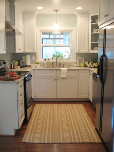
We knew that we wanted white cabinets and light marble-esque counters (they were actually granite) during the planning stages of that makeover back in 2007 – so we didn’t look to Nancy for much “style advice” during our 113 day kitchen reno. But she was truly invaluable when it came to space planning. She just knows how people use kitchens and where appliances should be placed to maximize function, and we fully believe that our first kitchen would have been half as useful if we didn’t have her free-with-the-purchase-of-cabinets advice when it came to where to squeeze in a dishwasher, relocate the fridge, and build in the microwave. Lesson learned: sometimes the pros know best. So take their advice whenever it’s free (and even when it’s not if you need it). You know, so you don’t DIY a kitchen all alone that’s semi-functional when you can DIY something twice as useful with some pro advice and a smidge of well-spent cash (assuming you can’t track down free services like those from HD or Lowe’s).
But back to our buddy Nancy. We actually kept in touch with her over the last three years since our big kitchen makeover in 07′ (she and Clara are practically BFFs). So she was sweet enough to offer to glance at a floor plan and a few photos of our current house’s kitchen to give us a little here’s-what-I-would-do advice. Second lesson learned: there are definite perks to staying in touch with any kitchen geniuses that you may encounter.
But first a little refresher. You’ll remember that the eat-in part of our kitchen currently looks like this:
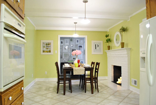
We’ve always planned to add a built-in island in place of the too-small dining table, just because when we knock out a huge doorway in the wall across from the fireplace to connect it to the dining room we thought two tables lined up through that opening would look odd (a big round one in the dining room and another one so nearby in the kitchen = crazytown).
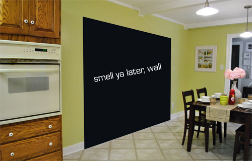
So we thought a big round table in the dining room and a smaller built-in island by the fireplace would make sense and be less “hello table, meet my friend, table.”
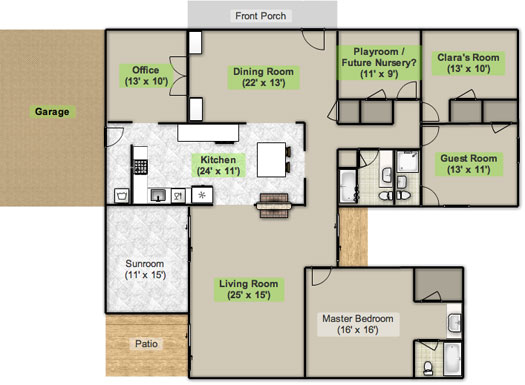
Here’s an old floor plan that we shared last November before we even moved, just to give you an idea of what we thought might work when it came to the island (with the new wide doorway to the dining room that we plan to add worked in there too):
Oh while we’re on the topic of someday dreams, we’d love to paint our cabinets white and craigslist our white, bisque, and black appliances and upgrade to stainless steel. When it comes to our counters, we plan to work with the granite that we have, but completely redo the backsplash for a crisper, lighter look. And those florescent tube lights and big brown fan? They gots to go.
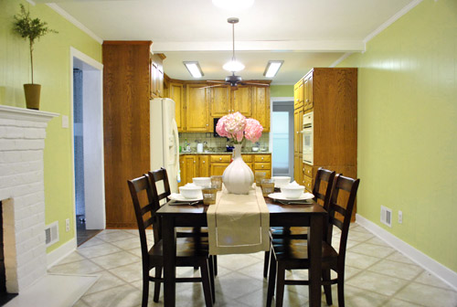
While we’re rattling off things on the list, of course we’d love to redo the floors but aren’t sure if there’s hardwood running all the way under the entire kitchen that we can refinish (we know it runs under part of it, but haven’t confirmed all of it) or if we’ll have to just redo them with something new entirely. The challenge of that is that we’ve learned that our floor joists aren’t built strongly enough to hold the weight of stone or ceramic tile (I thought slate would be awesome in there, so yeah… le bummer). We’ve toyed with everything from lightweight cork to some sort of linoleum (Candice Olsen has done some surprisingly awesome kitchens with that on the floor) but we’re nowhere near a decision. We’ll keep you posted though.
But I digress (who’s surprised?). Back to our talk with Nancy Kulik and the big kitchen idea she came up with (pretty much on the spot because she’s cool like that). Are you ready? She looked at the new to-scale floor plan that we brought with us (and a few photos) and realized that something was wrong, wrong, wrong on our little whole-house floor plan (seen three photos back, which we did months ago in November). That something? The fireplace is almost in the corner of the room in real life. So the placement of the fireplace in that old floor plan is totally off.
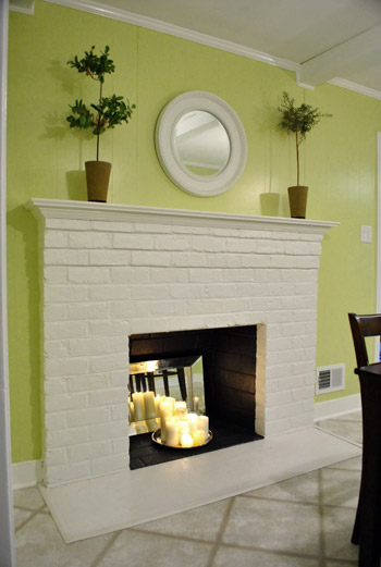
Thankfully it was drawn in the actual correct location in the newer kitchen-only floor plan that we brought with us to our Nancy meeting, but since it’s not actually centered on the wall (and practically kisses the door that leads to the hall), no island could be centered on it without nearly touching slash completely blocking that doorway (which we definitely want to keep open). So Nancy suggested something that we never would have thought of ourselves. And I mean never. Brace yourself. She proposed a floating L-shaped banquette that faces the fireplace and the frame wall.
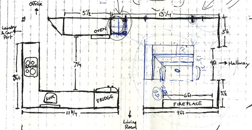
Note: don’t mind that vertical line that follows the back of the banquette to the door to the living room, she just dropped that in to tell us that we should line those things up- but the banquette wouldn’t be attached to anything, it would just float in the middle of the room to keep things open- just like an island would, but since it would face the fireplace in a way that an island wouldn’t it could make a lot more sense.
I’m not going to lie. Both of our first impressions were “thanks, but no thanks.” But as she further explained her vision we slowly started to come around. See, I’ve always adored the cozy-factor that is an L-shaped banquette. And if you search “banquette” some pretty cute images come up on google and Pinterest. A breakfast nook-ish type space like that might not be everyone’s cup of tea (there are definitely some die-hard island-lovers out there), but we actually thought it could be even cozier than our previously considered idea of an island. Especially because it would make sense of the off-centered fireplace in a way that an island never could (since it couldn’t ever be centered on it or lined up in any real way). So we took Nancy’s little scrap paper sketch home and taped out her floating L-shaped banquette idea on the floor:
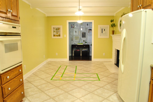
To explain what you’re looking at, the smaller L that’s being spooned by the bigger L would be the actual bench seating that faces the fireplace & the frame wall (which would make sense of the layout a bit more than a big floating rectangle that doesn’t line up with the fireplace at all). And the bigger L would be built-in cabinetry that wraps around the back of the bench seating to create a nice nestled nook that looks as good from the back and the side as the front (and provides a nice amount of concealed storage that’s accessible from the back, just like an island would have done).
As for the height, we thought keeping the tops of the cabinetry and the banquette seating the same height as the lower cabinets in the rest of the kitchen would make things feel cohesive and open (many of our inspiration images above have banquettes that are the same height as the base cabinets). And of course knocking out a huge 6 foot wide doorway to the dining room behind the banquette (which will have pretty cabinetry that faces the doorway so it looks good from behind) should keep the flow nice and airy – so nothing feels too boxed in.
I know it’s pretty much impossible to picture, so here’s John sitting at the fake banquette (although the table would be a smaller pedestal based thing, possibly square, oval, or even round – and possibly white or even a color, but probably not dark brown).
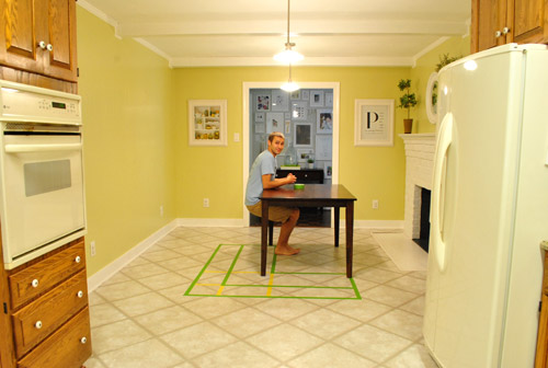
Note: we’ll have to move the lighting on this side of the room regardless of an island or banquette creation since it’s placed too far apart to make sense either way – and in the case of the banquette we’d center it over the table, not the seating (like many of the inspiration images).
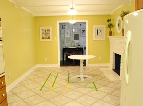
It’s admittedly still impossible to picture (and I would bet $20 that nearly everyone reading this is completely not sold on this idea), but here’s a round pedestal table tossed in there in case that helps the picture come together for a few of you (since our banquette table will definitely have a pedestal base to make maximum room for legs).
And here’s a lower square table (of course too low for a banquette, but this sized top might be right) to possibly help the vision come together a little more. As of now we’re both actually bigger fans of a rounded top – like the one above – but who knows where we’ll end up.
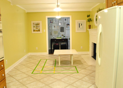
Who am I kidding. This probably doesn’t help anyone. And you all think we’re crazy to consider this. I know it. And we might be. But we’re excited enough about it to at least keep this idea on the table for now. Har-har.
See how the fireplace in the corner almost makes sense in that location with the cozy banquette facing it (which will be lined up with the doorway to the living room, so that doesn’t feel random either)? Nope. You still don’t see it. Haha. Well in person it actually has a lot of balance and makes considerably more sense than any island shape / placement that we’ve taped out on the floor over the last eight months (of which there have been many). We might just have to build our cabinet-backed banquette with cardboard or something to try to envision it further. Or use some serious photoshop magic to help picture it (the challenge is finding photos of the backs of banquettes since so many shots are looking into the L-shaped seating nook as opposed to looking over its shoulder from this angle).
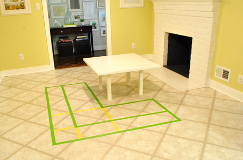
Oh and ignore the crazy white fireplace surround on the floor, since it seems to encroach and crowd the table waaaaay too much. When we redo the flooring in the room that’ll be remedied since we have plans to double side the fireplace down the road so you can peer into the living room through it (but will either make it gas or keep it completely inoperable so kiddo(s?) can crawl through the hole like it’s a secret passageway – so there won’t be a huge tile rectangle on the floor anymore).
I’ll leave you with this picture again, because it’s the one that makes my brain hurt the least when I try to picture things:

So all of this is to say that we taped off a crazy shape on the kitchen floor and we’re seriously considering some sort of cozy banquette-ish breakfast nook as opposed to a centered island with an off-centered fireplace nearby. It should be interesting. And the odds are that we’ll end up making some semblance of a decision someday. And we promise to keep you posted. Off to dip back into the aforementioned bedroom project and the office cabinet makeover. Ah DIY, you fickle friend. Maybe next week we’ll be less scattered. Who are we kidding? Probably not.

Amanda T says
Love the new blog look. Just letting you know, I’m on IE and the header is still MIA. When I open it on my iphone I get it though.
Keep up the great work!
YoungHouseLove says
Oh boo. We thought we fixed that. So sad. Can we ask what version of IE you’re in? Possibly a very old one? We thought we had it working 100% in IE7 and IE8. Thanks!
xo,
s
Amanda T says
Hey, I’m running 7 and now I can see the header, but none of the pictures will load. I just get the blank box with the red X.
Thank goodness for the iphone!
Good luck!
YoungHouseLove says
So sorry! We didn’t change anything on our end with the pics (they’ve been stored on an amazon.cloud server for the past three years) but it could be something like the anti-virus software on your computer (it can inexplicably block our pics, but if you enter YHL as a safe or authorized site they might pop back up). Hope it helps!
xo,
s
Rachel says
I think the idea of a banquette is great! It’s super cozy looking, especially near the fireplace. Can’t wait to see what you decide on!
Kelley says
I totally fell for it as soon as I read the first mention! I think it’s a great idea. I can’t wait to see it unfold!
Gemma says
I loooooves it! That Nancy one is a Genius i tell ya .. a Geeeeenius! Is it done yet!? ;-)
esther aka craftyvox says
While a breakfast nook like that would never be something I could have come up with myself (gotte love having Nancy’s around that do!!), I have to say the idea is totally awesome. I can definitely imagine how it’ll look in your kitchen, and I think it’ll fit the rest of the place really nicely!
Kim says
I think it’s smart to use “stand-ins” to try out the island/banquette (Isle-ette? banq-land?). Before you spend money on something like this, you want to make sure you will like it and it will work in the space.
Jennifer B. says
I like Isle-ette! I can’t wait to see what you guys decide to do!!
Meghan, UK says
The kitchen friend is a keeper. This idea looks completely freaky with the kitchen-as-is, but thinking of it with the blown-out wall helps a lot. I’m excited by your plans! Can’t wait to see how it turns out (eventually!!)
Quiana says
I love the idea of a banquette but totally agree on your bet that most readers aren’t completely sold. Guess I’d need to better visualize what it’d look like with the opposing wall opened up because for now it seems to break up the room too much. It’s awesome though to play around with several ideas! Good luck!
annabelvita says
You know what? I totally love it. We have a loveseat in the kitchen at my mum’s place (it abuts the cabinets) and it’s everyone’s favourite seat in the house. If you make the banquet semi-squishy it will give you the “two cosy places to sit” that you lost from ditching the formal living room (which you might miss once kiddo(s) is (are) older.
I never really was sold on the idea of an island to be honest, with the long and skinny-ness of the room. I think they’re nicest if you have a proper “great room” style room, to define the kitchen area. I think this could be totally great.
But I might pretend I’m not sold on it, just to make you build a banquette out of cardboard. haha.
(You could have a bench on the side nearest the fire and a stool near the hallway (or that old high chair thing for clara!), as I think it would be nice to have the option of facing the kitchen whilst seating).
Woo. Love it! That lady friend of yours is a genius.
annabelvita says
PS. Built in storage drawers from the back? http://www.nordysconstruction.com/Slideshow_Banquette.htm
I second whoever said glass (maybe fake for little uns) would be awesome on the back for china ware etc)
Martha says
“…as I think it would be nice to have the option of facing the kitchen whilst seating.
That was exactly my thought. Why would the short side of the L face the hallway when the action usually happens in the kitchen. Would it work to flip the banquette, so it opens into the kitchen? It would feel part of the kitchen since it is your “eat-in”, the view would be more interesting, it would be easier to serve food from the kitchen, and when Clara is older, you can keep an eye on her while she does her homework.
BTW, I immediately loved the banquette idea.
YoungHouseLove says
Our favorite two views from the kitchen are the frame wall and the fireplace, so we wouldn’t mind facing those areas (as opposed to looking at dirty dishes in the sink, haha). That’s actually the way we sit at the current table, so maybe we’re just used to it. We just think the L facing that way is the only way to balance the off-center fireplace (by facing it, and sort of hugging it from afar so it makes sense). If it faces the other way it would just make the room feel bottom heavy I think (fireplace too close to the wall, with L-shaped cabinetry down there next to it). So hard to explain, sorry! Hope that makes sense!
xo,
s
annabelvita says
Martha – I meant like a padded ottoman bench, not one of the built in ones. This wouldn’t interrupt the visual effect of nestling the fire, but means you can sit facing the kitchen if someone is cooking or you just really want to stare at dirty dishes :)
Couple A Saving says
I love it! When you were talking about having the island i never really thought it was a good idea. I thought it would block off the fireplace and you would never really be able to see it. Maybe you can try putting your bench from the kitchen table there to test it out.
YoungHouseLove says
Oh yeah! We could definitely break out some ottoman benches that we have around the house to make an L shape! We’ll have to drag some more stuff in there soon!
xo,
s
Hayley says
Ditto. The island idea didn’t jive with me – the kitchen is a slightly odd place for a fireplace, but with a banquette you’ll make sense of it rather than hide it. Kudos on being open to such a left field idea!
Lucy says
hey guys!
just thought I’d let you know, Firefox 6 isn’t showing blog post photos today :-( But I can see the header! (Looks great!) x
YoungHouseLove says
Oh man, I have no idea why that would be. I don’t think that’s a browser issue- so maybe it’s anti virus software that you have running on your computer that’s blocking them? I have heard you can go in and tell it that YHL pics are “approved” by entering our url or something and all the pics will show up. Hope it helps!
xo,
s
kristen says
Same here – I could see photos yesterday but now they’re gone on all posts, just not this one.
Work blocks photos on some other sites, but never this one…
YoungHouseLove says
We have our pics on the same amazon.cloud server that they’ve been on for the past three years so we’re stumped. Wish we changed something so we could change it back- but we don’t touch that stuff! Maybe it’s just an amazon.cloud glitch for some folks and they’ll fix it on their end? No idea!
xo,
s
Erin C says
I’m having the same problem in IE- love the new header but I can’t see any of the photos.
kristen says
Same here – work blocks photos from some blogs, but never this one until today. I can see the header and all the pictures on the sidebar, but none in the post.
YoungHouseLove says
So sorry guys! Wish we could help! It seems like it’s affecting around 2% of our readers so it’s odd that it would be an issue on amazon.cloud (which is where all our pics are stored) since it would most likely affect everyone. Can’t figure it out though since we didn’t change anything and it seems like most folks can see them- which is what leads me to think that it could be a virus software that just got an update (which can be remedied by adding us to your safe list so it lets those images load). Again so sorry for the trouble! Wish it was something we could fix on our end!
xo,
s
Jamie says
I am having the same problem. I am usually always able to see the pictures so I don’t think it’s an anti-virus software problem
YoungHouseLove says
You might just all be running Norton or something else, so in general those issues usually happen to a number of people at the same time and Norton makes an update or a change and it occurs. We didn’t change anything about our photos at all (we never do, they’re always hosted on amazon cloud, where they’ve been for the last 3 years). So sorry! Wish it was on our end so we could fix it!
xo,
s
Clarissa says
Same issue to report as well. Firefox and IE both don’t have photos. Not sure what could have changed. This morning the header didn’t show up on IE but the pictures did, now the header works and the pictures went kaput. There’s always tomorrow!
YoungHouseLove says
So sorry guys! We can promise you that the photos are being hosted in exactly the same place they always have been so this has nothing to do with the blog redesign but does occasionally happen to small groups of readers. And it kills us! There’s nothing we want more than you guys to see our pics! But it’s sadly not anything we can do on our end. We have passed along that anti-virus tip since it has worked for people in the past. Hope it helps and we hope they’re back up soon for ya!
xo,
s
Rebecca @ the lil house that could says
I love those cabinet designers and they’ve helped us twice so far! We went to Lowe’s both times and as long as you have your dimensions and make an appointment, they’ll give you a little virtual layout for free! We did it with our old kitchen and it was great to be like “add a corner cabinet there, wait no a lazy susan, put glass in it” and actually be able to see it. The second time was for office built-ins, for which they wanted $5k, so we obviously didn’t go through with…
And you got yours for $6. I’m still jealous about that… ;)
susan says
I love the pictures of the already done kitchens and I think it would look great in yours. Are you going to change the flooring? susan
YoungHouseLove says
Yes! Someday! Haha.
xo,
s
Sarah says
I really love this idea. Can’t wait to see it realized. Also can’t wait to see when your cabinets are painted!
lizzy says
yay! the header is showing up for me today…but the rest of the pictures aren’t! boo!
YoungHouseLove says
What? Oh no! The pics in the post are missing? Yikes, don’t have any idea what would cause that since we haven’t changed anything on our end with regard to those. We have heard that some people’s virus software can block them (but you can go in and enter our url to tell it to unblock them). Hope it helps!
xo,
s
Aimee says
Pictures aren’t showing for me either. Windows 7 – IE8 :-(
YoungHouseLove says
So sorry! That issue doesn’t seem to have anything to do with your browser or the redesign (we didn’t change anything with regards to our photos) so our best guess would be that your anti-virus software might have started randomly blocking them but you can add YHL to your “safe” list to hopefully get them to pop up again. Hope it helps! Wish there was something we could do on our end to help!
xo,
s
Ally says
i’m on windows 7 and i’m good to go, everything looks great. It must be the work of an anti-virus program. New format us suuuuperb you guys :)
Pammy says
This is the saddest thing ever. The blog photos in this post and all previous ones aren’t loading anymore on my office computer… I don’t have the ability to change any of the security settings. I guess i’ll be reading YHL in the evenings from now on :(
YoungHouseLove says
So sorry! It also could be that your work blocked out pics. Here’s hoping it’s just a day or two glitch. Sometimes a few folks say they’re gone and a day or two later they say “yay! they’re back” – which of course thrills us to no end!
xo,
s
Aimee says
Works now!! Must have been a glitch this morning :-)
YoungHouseLove says
Whew- thank goodness! So sorry for the trouble!
xo,
s
Holly@Loveoflifeblog says
I am a huge fan of these and think it will look lovely! It’s so cozy and inviting and great for family dinnners!
Leigh says
I like the idea! Are you worried about losing out on all the extra workspace that an island would give you?
YoungHouseLove says
Nah, I think we really wanted seating/tabletop space for snacks and homework and all those casual activities (that a big 8 person table in the dining room might feel too formal for). I think if we had to lose all of the storage, we’d be sad, but two sides of cabinetry sounds perfect.
xo,
s
sunnie says
I think its an amazing idea! Like the round pedestal table best. Really looking forward to seeing the finished effort. I’m a huge fan of all you do.
JennyB says
wowie-zowie…I think it could be SOO fabulously cozy! And it’s something I never would have thought of but seeing the sample pics of other banquettes really helps. This is VERY exciting, guys!
I’m also interested to see how you deal with the light situation. We have a large boxed, recessed light in our kitchen that we hate but have no idea how to change it/fill it?/fix it. The ceiling is also plaster which is kind of scary to me. We may have to hire it out but we’re still paying 2 mortgages (can’t sell old house–11 months and countint) so spending $ is out. We may have to live with it for a while!
Samma says
I wish I remembered which blog I saw it on, but someone recently posted pictures of helping their parents make a former florescent lighting eyesore into a coffered ceiling with indirect lighting and a chandy. It looked GREAT, and was what I thought of when I saw the ceiling fan/ florescent lighting pic.
YoungHouseLove says
Oh yeah- wasn’t that Jenny from Little Green Notebook? I loved that!
xo,
s
Jen M says
I totally think this will work. Why not try something new and different, because really, thats what your all about in this new house right?
John@OurHomefromScratch says
I like the seating idea. Have you thought about it facing the kitchen instead of away from it? You guys are excellent planners, I like the tape layout idea, did you pick that up from NCIS? Very crime scene-ish! ;)
YoungHouseLove says
Haha- I was channeling the Law & Order guys the whole time. As for facing the kitchen, we did consider that direction but it sadly wouldn’t make as much sense of the off centered fireplace (making the L sort of curve around it instead of face the other way seemed the most balanced). Who knows where we’ll end up though!
xo,
s
Sami says
That was my initial thought. For me and my lifestyle it makes more sense that I can see and interact with the kiddos at the table while I’m in the kitchen cooking. When they’re little I’d be afraid I couldn’t see their little heads behind the bench. And once the pass through is knocked out b/w the dining room and kitchen I don’t if the hallway kitchen entrance would be used so it’s ok if it encroached a little that way. But then again it has to work best for you guys and the flow in your house. I love the idea though – it would really add something special and unique to the kitchen!!!!
Jessica says
Ooooh….I sort of love that it will face the fireplace. How cozy to have breakfast with a fire going in the background….or even just the “feel” of a fire going, if you should opt to keep the fireplace non-functional!
Caitlain says
I love the idea of the banquette and have been admiring several on Pinterest myself!
Marian says
I’m in IE7 and I see it today when I didn’t see it yesterday. :)
I am also unabashedly in love with banquettes! Sometimes I find that cardboard boxes really help in visualizing the space when the ol’ tape on the floor trick isn’t quite doing it for me. My husband thinks I’m crazy for keeping a stash of them broken down in the basement, but when I’m trying to get him to “see” something, it really helps to pull those out.
Can’t wait to see more!
Amanda @ Our Humble A{Bowe}d says
I actually like the banquette idea. I think it will be a cozy breakfast nook or homework area for Clara. Or, if someone is cooking, others can be present, without being in the next room. And, you’ll still gain cabinet space, but you can make the nook a fun place with upholstered seats, a colorful table and pendant. Can’t wait to see it!
Katie @ explanationrequired says
I like this idea better than the island, which I always felt was a little strange given that it was pretty separate from th rest of the kitchen. And I’m jealous of the idea in general!
Melissa @ A Place to Nest says
I can totally see what you are talking about and I think it is a great idea. Very cozy! Only concern with round table- that is the one I love too- is can everyone reach the table to eat at it. Keep in mind future sibling for Clara. Maybe a longer oval type shape might work. But only you would have every shape and size of table on hand to give several visuals :)
YoungHouseLove says
Ooh an oval could be really nice too! We’re definitely hoping to get maximum space to work/eat without making it too crowded in there.
xo,
s
Molly says
this is exactly what I wanted to mention. as the youngest child and shortest adult in my family, the parental unit sort of forgot to take into consideration how far I had to reach when sitting at a banquet table. with the round table and L-shaped banquet layout, I only see two spots that can comfortably reach the table.
nevertheless, I am really excited to see what you do. and another cabinet painting tutorial (in addition to the office built-ins) might finally convince me to tackle my bathroom vanity.
Andrea S. says
I immediately thought oval/round, too. I think an L might seem too sharp and boxy.
Martha says
Interesting idea and could be fantastic! But I, too, have trouble visualizing things like this.
Just a suggestion…before you install your new $6 cabinets in the office, why not arrange them as if they are the cabinets that would be back of the new banquette? The size and scale may not be exact but it could give you some indication of what it would look like to see cabinets in that location. just an idea…
YoungHouseLove says
Ooh that could work! I’m not sure we have enough cabinets to really properly visualize it, but it might help a little!
xo,
s
annabelvita says
Or would the three parts of the console behind Karl, with the leather ottomans work?
Pip says
Isn’t it great how a different set of eyes can see a whole new idea? Banquette idea could be fantastical! things that flipped through my mind : how many kiddos can you fit round the table – space for 4,6? Not sure how it would feel having your back to the front door & kitchen? Waaay down the line; easycare upholstery which still looks good. So many juicy dilemmas ;) Really hope you keep working with this concept!
Meagan says
I like the concept, I’m having a hard time picturing it though. I feel like maybe if the L when the other way so you were looking into the kitchen instead of with your back to it then maybe I’d get it more. Growing up I always did my homework in the kitchen while mom was in there fixing dinner. I just imagine Clara doing homework there, but her back would be to you. Does that make sense? I don’t know how it actually feels in your space though. But I love the inspiration photos, and I know that y’all will love whatever you wind up with. And this will be a way comfier seating space than an island for sure.
YoungHouseLove says
She could also sit on the banquette facing the fireplace so her back wouldn’t be to me, it would be to the dining room- does that make sense? It would be L-shaped, so I figure people could face the fireplace if they’d like and then easily chat with folks on the other side of the kitchen by turning their head to the side. Hard to picture though. We might bring in some benches and make an L shaped arrangement to see if it feels weird to face that way. With the current table people sit with their back to that side of the kitchen, so maybe it’ll feel totally normal.
xo,
s
Brooke says
I think it’s brilliant. It’s going to look great!
Kari says
I think it’s brilliant. Once I saw your inspiration photos and the tape I was sold. As you would say, le sigh that fixing our own kitchen is like number 832 on our list of to-dos, way behind “enjoy our life more because after 3 houses we’re tired of spending every waking minute painting.”
Christine says
I’ve seen most of your inspiration pics and fully admit that I’ve been thinking of ways to get a banquette into my kitchen space as well. Even if I just go Candice Olsen style and do 1 built in bench with the table and chairs. I just hadn’t thought of going floating. I can picture what you’re talking about, and it does make more sense to me than the big island did, I was worried that it was too far from the main kitchen to be terribly useful. All of the storage on the back of the banquette will be amazing too, what a great spot for board games, extra china, etc!
I love the new look on the blog as well. I run a Mac with Safari/Firefox and OS 10.6.7 and everything looks perfect!
Christin says
I’m using IE7 as well, and I see the header today which I didn’t see yesterday. I am wondering about the pictures though. I get the little red x for all of the pictures you post now when I didn’t before. Total bummer because your blog is my absolute favorite out of all the ones I read!
YoungHouseLove says
So sorry about that! We didn’t change anything on our end with regard to the pics, so our only guess is that your anti-virus software might be blocking them, so if you go into the setup and tell it to allow YHL pics they should pop up. Wish it was something we could help with on our end!
xo,
s
Kelli says
I LOVE the idea of the “L” shaped banquette!! I think it would look much better than an island due to the fireplace. Plus, banquettes are fun and cozy!! Can’t wait to see what you decide on!
Anita says
I’m late to the comments part on the blog redesign, but I just have to say that I LOVE IT. You fixed or added so many things that I hoped you would. Great Job! My one small wish is that you please update the ‘We’re Digging’ section a little more often…
YoungHouseLove says
Ah yes, we’d love to refresh that more often! So many projects/comments/posts/baby things going on. Haha. Here’s hoping we can get on it soon!
xo,
s
Ashley says
I absolutely LOVE the idea of a banquette. That would be a great place for a cozy bowl of soup in the winter when it is snowy and cold… Do you have a gas line in the kitchen (i.e. you might be able to get a gas insert installed so the fireplace would be working). My mom has an insert and they aren’t nearly as obvious as they used to be and it keeps the house tres toasty!
YoungHouseLove says
We don’t currently have a gas line in the kitchen but we had a gas fireplace in our last house (in the den) and we loved it!
xo,
s
Larissa says
I’m always so impressed with how thorough you are! Taping, trying out different tables, measuring… It has helped me be (slightly) more ambitious when it comes to projects around the house. Thank you!
Adriane Wacker says
I love the idea of an Banquette, and I love the white pedastal table! You guys are always coming up with something new and amazing! Great Job…
Reenie says
Lots to read today….I’ll be back later.
I see no header today ….and didn’t see it yesterday =( Oh and don’t ask me which IE I’m in…..cause I don’t even know what the heck it is!!! HA! =)
YoungHouseLove says
I bet it’s an old old version (we have it working in IE7 and IE8) so if you feel like updating yours (it’s free!) it’ll hopefully pop up for ya!
xo,
s
Reenie says
It’s working now…..woot!!! I can see the header:)
YoungHouseLove says
Yayyyy!
xo,
s
Katie T. says
I love this idea! I am a huge fan of banquets and have pinned that 3rd inspiration picture myself. It’s the best of both worlds (the worlds of kitchen islands and banquets, obviously)… and if anyone could make this idea totally killer it’s you guys!! Can’t wait to see it come together.
Michele says
Love the redesign! I just have one small suggestion. The text could be a little bigger or have a little more leading. I’m not sure if it’s actually different or if it’s just the overall effect of the new colors/layout, but it’s just a bit harder for me to read than before.
YoungHouseLove says
Thanks Michele! We’re definitely still tweaking things, so hopefully we can figure that out for ya!
xo
s
Gina @ Running to the Kitchen says
Just to let you know, I’m on IE and see the header fine. Sorry you’re having tech issues. They are so annoying ;)
As for the banquet, I actually LOVE the idea. I think it’s a perfect way to “use” the fireplace in that room given it’s position. Can’t wait to see what you guys end up doing in there!
Sara @ Russet Street Reno says
A banquette would be cool, although I don’t see why it matters for the fireplace to be centered on the island. I don’t think anyone would notice with your ninja styling skills! I’d rather have an island, personally.
YoungHouseLove says
We’re just concerned because with the new opening from the dining room (which is the first thing you see when you enter the house) you’d see a big island with a fireplace hugging the wall on one side behind it. Haha. In the words of Katie Bower: awkwaaaard.
xo,
s
Shelley says
You made me crack up with your “in the words of Katie Bower: awkwaaard.” Hilarious!
Rachel says
I can see the header today (at work in IE)!! Thank you Youngsters!
YoungHouseLove says
Yay! So glad it’s back!
xo,
s
Dana says
I love the banquette idea. What a cozy spot to sit and color or play board games with your little one. We have a sitting area in our kitchen an it’s the best seating in the house. Plus you gain some more great cabinet space-maybe some glass front cabinets facing the dining room for storage of pretty glassware, serving pieces,etc.
Katherine O says
Personally, if my opinion matters…you know, some random chick that could be a horrible decorator (even though I don’t believe that for a second)…
I think it’s brilliant. How incredible cozy would that be? It would quickly become my favorite spot in your home. Think about it…coffee in front of the fireplace on a chilly morning, snuggled in the corner with a few pillows.
Lovely.
I think it’s a fantastic idea and definitely one to consider wholeheartedly.
threadbndr says
Not 100% sold on the banquette, I haven’t seen a ‘floating’ one before (only tucked into nooks and corners), so I’m reserving judgement until you do your photoshop magic.
My only concern with either a permanent island or the banquette backed by cabinets is that a fixed item would limit the flexibility of the entire space. If it were my house, I’d probably go with something on casters so that I could clear the entire space if necessary.
My house has only a galley kitchen, but at my mom’s she went with a small island on casters and it’s wonderfully flexible.
Lauren says
Not going to lie…when I first read that she wanted to put a banquette in, I was like “WHAT?! That is more crazytown than two tables (dining and kitchen) lining up!” Buuuut after seeing some of the examples you posted and seeing the tape layout, I Love it! No, I LURVE IT! The floating John was the clincher though. haha
I think having the extra storage behind the seats will be A-to the-Awesome, and because the fireplace is off centered, this may just be the perfect fix.
Owww…and just think of all the white animals you could place along the back of the seats!!!! (insert crazy evil scientist laugh here)
I can’t wait to see the finished product!
Amelia says
I love the banquette idea! I can totally picture it with the tape on the floor. Maybe I just have a great visual imagination. I think it looks best with a round table. For some reason that little square table looks too harsh and crowded where the round one feels cozy. And, maybe it’s just me, but I would totally be banging my hip into the corner of that square table every time I walked into the kitchen!
Allison Suter says
I LOVE the idea of a banquette. I want one myself with all my heart and soul. I think the big problem with visualization is that usually people have them on a wall / in a corner, but I think it seems like just about the neatest idea ever to have it in the middle of that space!
P.S. You like your good-old Canadian designers, hey? Sarah Richardson, Candice Olson…
YoungHouseLove says
Haha- yes. All the good ones are from Canada! Except for my Nate from Chicago!
xo,
s
rachael says
Its eh, not hey! Haha, I know we get made fun of for it, but if you’re gonna use the word eh, you gotta get it right :)
Shannon C. says
I actually love the banquette idea. I think it would be great for the space. It does feel like it mushes up against the fireplace though. Removing the rectangle of hearth will help some but can you not scoot the whole banquette thing over toward the left?
YoungHouseLove says
There’s definitely some wiggle room. We’d probably build it so it could be moved until we love the placement and we’d secure it at that point.
xo,
s
Holly says
This IS an incredible idea! I do love it. But I was thinking back to the left some, too — if you realign your light over the actual table (closer to the fireplace) it seems not centered in that doorway looking out to the picture wall. Unless you are looking to do recessed lighting, then I guess it wouldn’t matter. But with the huge open doorway from the dining room, shifting might not be too terrible…then your table could also line up in the (pic wall)doorway. But I’ve got to give it to you and Nancy…clever! And I’ll love it either way! :o)
YoungHouseLove says
Not sure about the light anymore. We just saw a rendering with it centered and it still looked nice! More this afternoon!
xo,
s
Alecia says
I was thinking the same thing. Then you wouldn’t need to move the light much if the table were centered under the light with the banquette around it. That would leave more space for extra seating/bench on the other side of the table near the fireplace.
YoungHouseLove says
Definitely a possibility!
xo,
s