Well, we can check cheerful desk chairs off of our wish list for the office.
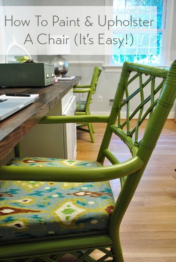
You can read all about how I prepped, primed, & painted them here. And now for the quick upholstery deets.
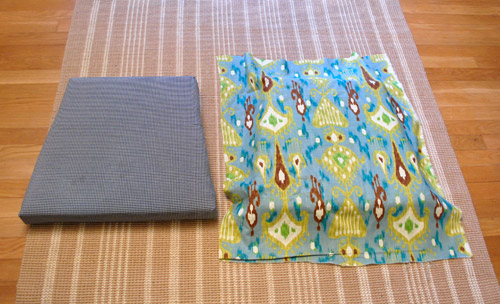
I had some leftover fabric from the dining room curtains on hand so I laid it over the detached seats and centered one of the grellow thingies (that’s a technical term) and trimmed the fabric around the cushion, leaving enough that I could easily pull and staple to the backside. Update: Here’s an affiliate link to the same fabric on amazon for anyone looking for it.
Making sure it was staying centered, I carefully turned it over and shot four staples into it while pulling it nice and tight (I have a basic manual staple gun for around $20 from Home Depot). Those staples went in at noon, three o’clock, six o’clock, and nine o’clock.
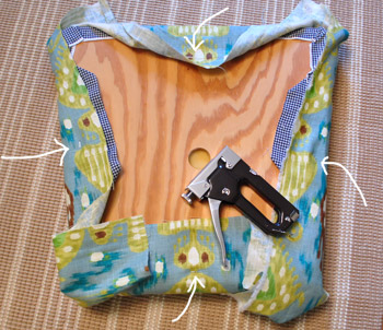
That way I could flip it back over and ensure things still looked straight and that the fabric was pulled tight enough (if it wasn’t, it would just be four staples to pop out instead of a dozen). After confirming the pattern still looked nice and straight from the front, I flipped it back over and spaced out about six staples per side (while pulling the fabric tight along the way).
When it came to the corners, I just treat those like wrapping a present. It’s hard to describe in words that don’t make it sound like a super complicated ten step process (it’s not) but I basically just fold the fabric into little triangles like the side of a present and staple them until they look good from the front. The front is all that matters – so the back can look all weird like this:
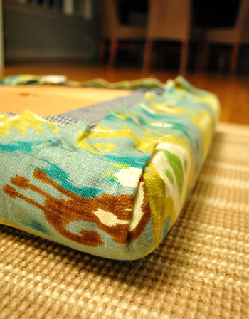
As long as you turn it over and things look great, you’re golden.
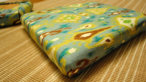
So I just did the same thing with the next cushion (lining up the grellow thingies in the same way so it would look like Cushion #1’s twin). About 30 staples later that cushion was done too.
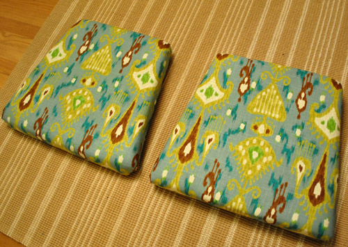
The entire upholstery project probably took me thirty minutes from start to finish. Maybe 45 because I kept pausing to watch Housewives of Beverly Hills. Oh and the reason I just went over the fabric that was there was because we didn’t have any cushion/fabric related issues (other than the fact that we didn’t like the fabric). So it wasn’t like we had odor problems or a flat lifeless cushion to deal with (which would have involved removing the fabric and the cushion and getting new foam from a place like JoAnn Fabric).
Then of course the hard part was waiting for my spray painted chairs to fully cure so they were nice and hard and ready for every day use abuse. I gave them two sunny days outside (which also helps speed up off-gassing since spray paint can be stinky until it’s fully cured)…
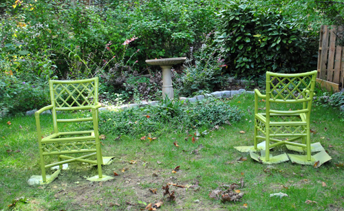
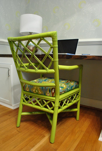
… and a third day in the sunroom (with the windows cracked and the fan going to continue to allow them to completely dry before bringing them inside). Then late last night I danced a giddy little chair-time jig and slipped the newly dressed cushions onto those so-fresh-and-so-green chairs (securing them with the same four screws that I removed from the underside to free them here). The result was nothing short of magic. But the cool kind involving levitation and mind-reading. Nothing weird like a bad card trick or a double sided quarter.
This photo’s coloring is probably the most true to life (below). They look so great with the white cabinets and the dark wood counters.
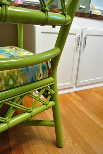
Yeah, we’re kind of obsessed. We love how the more intense greeny-yellow in the chairs’ paint & fabric relates to the soft pop of color in the stencil. Instead of taking away or competing with the stencil, they just seem to bring out the grellow pop on the wall- so they enhance/add to it (if that makes sense). Although I’m not sure how well it’ll come across in pics (colors seem to vary by monitor). In person the pairing is pretty darn amazing.
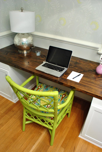
Since the stencil is so subtle and the chairs are so bold, they sort of layer in together – so it’s not chaotic and weird (which would probably happen if the stencil were more high contrast or the chairs were more washed out). The key is to keep things at different levels (ex: bold pillows on a more subtle tone on tone rug or sofa). Since if everything textile, accessory, and furnishing were fighting to be the star it might get kinda… Lady Gaga. Not that there’s anything wrong with that if it’s what you’re going for.

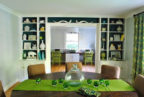
The best view of all is through the dining room. Me-ow. And I love that the table runner is easily switched if I feel like cutting the green… but for now I dig it. Can’t wait to add some large scale art above each chair for some much needed height in the office (but nothing too crazy to compete with the chair + stencil combo).
But now, back to the close ups.
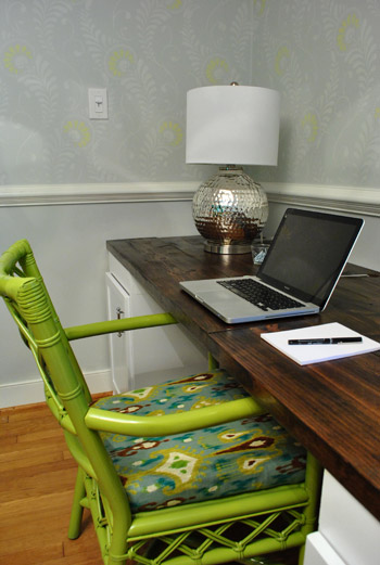
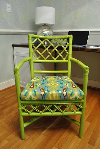
Our office just got a whole lot happier. And we did too. Picture me serving up a nice cheesy grin.
These $35 secondhand babies have certainly come a long way. Here they are right after we bought them from a local secondhand store:
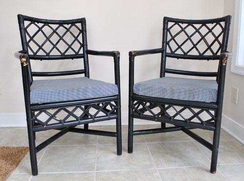
And since we already had the fabric on hand, our makeover total was just $18 (the cost of three cans of Ivy Leaf spray paint from Michael’s). But if you wanted to add the initial cost of the chairs ($35 a pop) and the fabric ($12.99 for a yard, which was all I needed for both seats) it comes to a nice even $50 (and fifty cents) per chair. Which makes me all sorts of hyper since similar chairs (like these and these) are in the $200-$250 range. And don’t look now, but this guy is $694 on ebay. Woah nellie.
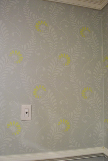
Oh and just to keep it random, I snapped another pic of the stencil. Because it makes me happy, and it’s so hard to capture. Elusive little guy. Of course the pop of color looks yellow in this pic, but it’s a lighter shade of the chair in real life.
Have you painted or upholstered any chairs of late? Do you have extra fabric laying around that you’re itching to use? Do you have the same magic hierarchy as I do (with levitation and mind reading at the top and bad card tricks and double sided coin gags at the bottom)?
Psst- Check out the first half of this chair makeover here.
Psssst- We just announced this week’s giveaway winners. Click here to see if you’re one of them.

Jennifer says
LOVE!!!!!!!!!!!!
Sew View says
Me too. Are you going to put castors on them? One of your links had castors and it seems like that would be great for an office chair.
YoungHouseLove says
We think casters might make them too tall to be comfy at the desk, but we’re keeping an eye out for little ones!
xo,
s
Lena says
Maybe you could cut off a little bit from the legs and then add casters? Or is the material difficult to cut?
YoungHouseLove says
Not sure if we can cut them down (it’s a faux bamboo and we worry about it splintering). We’ll have to see what we can find!
xo,
s
melody says
I love that fabric!
Kristen @ Popcorn on the Stove says
I LOVE the way these turned out!! They look amazing in the space. The color and the fabric work so well together and none of it competes with the wall stencil (I think because it’s more subdued). Wonderful job!!
gayla says
love it!!! i wish my working quarters were 1/2 as fun!
Stephanie Phillips says
Oh happy day! They’re so cheerful!
kathy from ct says
Wow, all that hard work paid off. Looks Gorg!
laxsupermom says
Love the chairs! They turned out fabulous! I love the way the fabric repeats from your dining room curtains. If there was one thing I’d change, it’d be your table runner. The long shot has just one too many green items, and I think it’s the runner throwing it off. Remove the runner and the whole shot gets that awesome Sue vibe.
YoungHouseLove says
Yup, that’s an easy swap I can make whenever I’m over the greenification of the dining room! Haha. For now I love that it breaks up the big brown table- but I’m sure I’ll switch things up a lot since I’m such a fool for pillow and other small color changes!
xo,
s
Monica says
A golden yellow runner would be great for Fall (and go with the front door!)
YoungHouseLove says
Ooh yeah I’d love that!
xo,
s
julie g. says
Will you all please come to my house? I just can’t take it anymore!!!
YoungHouseLove says
Haha- sure. On my way!
xo,
s
Jodi @ A Colorado Weekend says
These came our great! They really look amazing for the dining room.
Lucy says
LOVE!!!!! They look great :-) I wasn’t sure when you said green in your last post, but they look stunning, brilliant job! xxx
Crystal says
Fabulous! They look great! I’m so glad you went with the grellow. And I am in awe of the stencil.
I recovered some dining chairs for my friend. Such an easy but impactful change: http://theweekendhomemaker.com/recovering-dining-room-chairs
YoungHouseLove says
Gorgeous! I love that fabric choice!
xo,
s
Carol says
Great job! They look beautiful!
Jess @ Little House. Big Heart. says
Wow! These really look great. I was a little hesitant that they’d be too bright, but they really tie in with the dining room!
I’m over-anxious and usually only let my spray painted projects cure for a day (if that). Do you typically let all your spray paint projects cure for three days?
YoungHouseLove says
I always try to give it at least 48 hours and ideally 72. I’m the most impatient person in the world but I just remind myself that the longer it cures the stronger and more impervious to dings it’ll be (and there won’t be that bad spray paint smell either).
xo,
s
Amanda @ Our Humble A{Bowe}d says
Oh la la! So fancy now! I love the grellow pint and the fabric pairs so nicely with the room. Like you, I love how bold the chairs are against the subtle stencil. Great work!!
The last thing I refinished and upholstered was a free bench for our front porch. http://ourhumbleabowed.wordpress.com/2011/06/15/warmer-no-hot-bench/ Man, that was a lesson in patience. There were several times I almost gave up to paint it. I’m glad I didn’t, though. Now, I have to sew new fall pillows with some left over fabric!
YoungHouseLove says
Wow- that looks awesome!
xo,
s
mike @ the lil house that could says
love the green! we rocked a green area rug in our office:
http://thelilhousethatcould.com/2011/03/01/on-a-magic-carpet-ride/
YoungHouseLove says
So fun and playful! Love it!
xo,
s
alexandra says
The simple joy of getting exactly what you want out of a project. :] Looks awesome…and maybe its just me…but I really like the leaning pictures you have on the desk and think they would look great above each desk space…it seems like if you has something bold…especially now, itd seem kinda busy. Sometimes less is more?
YoungHouseLove says
They’re just too small scale-wise, but we love the color palette and simplicity of them! If only the frames were a little bigger!
xo,
s
Amanda says
Didn’t you make those prints though? So couldn’t you just print them bigger and use some larger frames? They do look really nice with the room.
YoungHouseLove says
Yup, just don’t have larger frames on hand! Maybe down the line though – not sure! We also don’t want too much crazy symmetry, so we might hang one big picture on one side and two on the other – definitely still figuring things out and taking it one day at a time! Haha.
xo,
s
BethanyB says
love the pop of color its so cute. and your right, it looks great with the new wall. Can’t wait to see it all pulled together and it looks good enough already to pull the family together for that oh-so-famious, eat-your-heart-out holiday thats right around the corner.
Katie says
Love the chairs. I was in Michaels yesterday and thought of picking up that spray paint to do my island chairs. Do you like the way the colour turned out? By the by I may have just waited the past six minutes hitting refresh on your page so I could read today’s post before I started the day.
YoungHouseLove says
Haha, so glad I finally hit publish to get that post up for ya! As for the color, yup – we love it! The only thing about that spray paint is that it didn’t seem to cover as well as Rustoleum so we needed three cans instead of two. Hope it helps!
xo,
s
Liz says
I feel like you could easily sell those beauties for $250 a pop a la Cash & Cari. Have you ever thought about flipping stuff before? I know you have plenty of extra time to do so (that was sarcasm).
YoungHouseLove says
Haha- I used to dream of finding some store in Richmond who would sell my little furniture makeovers, but with baby + blog + book there’s just no time! Maybe in a few more years when Clara goes off to school?
xo,
s
Shelley says
They are so happy! Totally a room changer. Love them with the dark worksurface.
Saleha says
I believe you mean diningroom curtains and not livingroom curtains, no?
Looking awesome though!! X
YoungHouseLove says
Oh yes, off to fix that!
xo,
s
Molly O says
So pretty! As for art, how would your “twig & berries” prints look over the desk? Or would the ORB be too dark in there now? Just a thought…. :)
YoungHouseLove says
Those are actually really skinny frames, so they’re better over something smaller (like a side table) since the desk would make them look oddly thin. Haha. Thanks for the idea though!
xo,
s
Meg@Keeping up with the Jenks says
I love them! Especially the view from the dining room, great pop of color. I have to say, they are a little bit more green than I though that they would be, but it totally works. I’m sure that the grellow accent in the walls reads differently in person.
Now I want to run out and find thrifted chairs to redo!
Although, I probably need to wait until we actually have a house for them….
Kay says
oooo Bold! I like the vibe coming through the pictures-like even on a gloomy day (soon to come w winter boo hiss!) theyd cheer me up. Good job.
Lindsey says
Yeah! Looks awesome. And so loving how the whole thing looks from the dining room’s perspective. I also love how the small patches of brown in the fabric pick up on the dark wood of the desk top.
I had earlier imagined the library file thingy being freshened up to a bright lime or apple green, but now I’m thinking the dark teal of the back of the bookcases might be a nice balance with everything.
I can just imagine you stealing glances as you pass by the doorways to the office, giddy happy.
Paige says
LOVE the chairs. That green is one of my favorite colors of all time. Literally. (said like Rob Lowe on Parks & Rec)
Do you have a certain style of art for the walls in the office that you’re thinking about? I’m trying to picture something in my mind that won’t compete with the stencil and all the colors going on in there + the dining room…can’t wait see what you go with.
YoungHouseLove says
Haha, love the Rob Lowe “Literally.” As for the art, we’re not sure- maybe some sort of soft photograph of a winter sky or a soft black and white print. Definitely nothing too punchy and high-contrast- but hopefully something with some nice sophistication to keep it from skewing too kid-room!
xo,
s
Paige says
yeah, in my mind I was thinking something B&W would look the best!
Krysta @ Domestic for Dummies says
I love the way they look from the dining room! Great job!
I redid some very old, nasty chairs that my boyfriends parents were going to throw away:
http://domesticfordummies.com/2011/03/chair-redo_08.html
YoungHouseLove says
Oh my gosh I love the lines of them and knew they’d look awesome the second you showed the before! Amazing makeover!
xo,
s
Gina @ Running to the Kitchen says
They look awesome and totally make the room pop when you see it from the dining room angle.
Claudia says
LOVE them! I love the bright green!!
Ade@fortheloveofpainting says
So cute…great job!
Carol says
I haven’t upholstered my DR chairs yet. Been meaning to for a long, long time (notice I didn’t say how long). Really long. You’ve inspired me to get out there and get `er done.
Christa M says
Amaze-balls! So fresh and so green green! Lovin’ it! I’m definitely part of Gang green, my eye is just drawn to it!
Rebecca @This Nest is Best says
Oh my word! They look FANTASTIC! They are the perfect pop of color for the room.
seriouslysassymama says
I am so in love with that stencil. The chairs look great.
Madeline says
The chairs look amazing!
I got a steal on four dining chairs from Craigslist and recovered them to match the rest of the apartment:
http://madelinekronfeld.blogspot.com/2011/08/getting-craftsy-with-craigslist.html
YoungHouseLove says
Love it!
xo,
s
Rhune says
I like how the chair’s color picked up a couple things on the built-ins; things I know I’ve seen but never ‘noticed’ if you know what I mean. The single bud of pom-pom flower on the large vase on the left, and the mushroom looking figurine on the bottom right. And then there’s Sue, coyly marked her appearance in the room, perhaps thinking: ‘That was all me.’
YoungHouseLove says
Hah, oh yeah Sue loves knowing she started it all!
xo,
s
Brandi @ His Shabby Her Chic says
They look great! The rooms look so cohesive now!
Sarah - { rad: renovations are dirty } says
wow… those chairs are stunning now! You did an amazing job: I love how fresh and vibrant they are now.
I think some black and white photography would look great over your desk, btw.
I love everything you’ve done to your computer room! You guys are awesome. :)
Brittany says
Love em’! That room is looking AWESOME!
I found similar vintage chair/table set from a local thrift store about a month ago for my outside patio. I’m deciding on what color I want to paint it, right now its an UGLY brown. Here’s a link to my blog post featuring it.
http://thesundrenchedbungalow.blogspot.com/2011/08/woo-to-hoo-thrift-store-finds.html
Any ideas on what color I should paint it?
YoungHouseLove says
Wow- what an amazing score!!I actually really like the warm taupe ones you’ve shown. And of course navy or white or green is awesome too!
xo,
s
Erin says
I used the same color on two garage saled lamps awhile back. They went from blah to amazing! Pardon the crazy pictures, there’s a lot of pattern going on in the background since it’s from apartment living days and I “wallpapered” with tapestries =)
http://knickknackcraftywack.blogspot.com/2010/02/my-lovely-lamps.html
YoungHouseLove says
I love them! And your tapestry “wallpaper”!
xo,
s
Graz says
LOVE IT! In that first picture it’s like the chair is smiling proudly. “LOOK AT ME :D Aren’t I just Gorgeous??” lol Made me smile. Great job!
Rachel Tatem says
I don’t think I would have gone with that fabric with that color but it works so well in the room. It always amazes me how sometimes a small amount of work can transform something!
Deb Ramsthaler says
YAY! They look FAB-OH!
Melissa says
My mom and I are going to re-cover my dining room chairs this weekend in a gray/white chevron fabric. I’m so excited. I wish I had the guts to paint the chairs though. They’re a beautiful antique wood that doesn’t quite match my taste but the set used to be my mom’s and she’d probably be crushed if I painted it. Who knows, one day I may get the courage.
tinajo says
LOVELY – the color and fabric is perfect. Like a vitamin pill! :-)
Emma says
I am really nervous – I’m tackling my first furniture painting project this weekend! I am going to paint an old nightstand (hand-me-down from my parents) gray. I’m so glad in your last post about the chairs you included the 4 pictures of each coat of paint – I’ll definitely be using that advice. Thanks and wish me luck!
YoungHouseLove says
Luck!!!
xo,
s
tara says
I just love this whole room. So cheerful, so happy, so peaceful at the same time.
I’m about to (gulp) reupholster a chair for the first time. It’s a rocking chair find for $20 at the flea market which I couldn’t pass up because my feet can touch the floor in it and when you are a4’9″ that is hard to find.
I have not only the seat to do, but also a full front and back and I haven’t figured out how to get that off yet….
Anyway I can upload a pic and get some expert advice?? LOL
YoungHouseLove says
Haha- I actually did a rocker that sounds extremely similar! Check out all the details here and here! Good luck!
xo,
s
Monica says
You all did a FANTASTIC job on this & I especially admire your mad spray painting skills! I reupholstered our dining room chairs recently using the same method & I love how they turned out! :)
http://stagingbym.wordpress.com/2011/09/26/how-to-reupholster-dining-room-chairs/
YoungHouseLove says
Those look gorgeous!
xo,
s
Karen F says
LOVE!
Sarah says
LOVE the chairs and LOVE the walls/stencil – not totally loving them together in the same room though (I think they do compete and clash a bit), but I seem to be the only one thinking that, so perhaps I’m having a color blind day or something! The individual elements are really beautiful, though, and it’s really fun to watch it all come together.
YoungHouseLove says
It definitely could just be your monitor (sometimes things read a lot darker or more intense or clashy on certain screens)!
xo,
s
Shara says
I have to agree, Sarah! Love the chairs, love the walls… But not a fan of them together. I think I personally would have preferred white chairs with perhaps a more solid or subtle stripe fabric-maybe in grellow- for the upholstery. Just seems like the two prints and colors are competing for attention….I feel like the chairs would be more at home in the living room or something. However, maybe we just have crazy screens :) Or I’m just not brave enough when it comes to color! (pretty much my entire house is white, cream, pale aqua, brown and grey… so there’s your proof that I’m not terribly gutsy or creative with color… Haha)
YoungHouseLove says
Oh yeah- these chairs definitely aren’t everyone’s cup of tea! They’re feeling very happy and Jonathan Adler to us – especially since the stencil is so subtle that the room still felt mostly-gray. But folks who don’t go for ceramic bananas and bright lime and orange probably won’t love them! Haha.
xo,
s
Dani says
I’m with Sarah and Shara, I love the walls and the chairs. But it all feels like too much all together for me.
Then again, I’m not a fan of that fabric in the first place, so that could be playing into it. The chairs just seem so GREEN!
heather s. says
I agree with you ladies. They seem to clash both in color and the detail – soft flowery stencil vs. bold ikat fabric. In the pictures they just look like they are competing for attention.