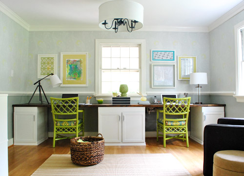
This art wall makes us so happy – and we didn’t overthink it (to the point of what-should-we-frame paralysis – which can happen if we’re not careful). Although we did talk about a few other options and eliminate them based on certain factors, such as:
- one giant piece of art on each side of the window = too symmetrical for our taste, and too repetitive with the big rectangular window in the middle (so it would look like three big boxes)
- open shelving = too much shelving since there are two walls of it thanks to the dining room built-ins (it would be shelving with more shelving beyond it)
- mirrors = too much, since we already have a large framed mirror hanging over the file cabinet on the opposite office wall
So we decided to use frames that we already had in a balanced-but-not-completely-symmetrical arrangement. And as is the usual agenda, we tried to go with things that have meaning, feel personal, and make us smile. Are they perfect? Nah. But perfect is overrated. They just make us happy like our chipper green office chairs. So in a way, the fact that it’s not perfect is kind of perfect for us.
We liked that we had a “John’s side” (the right) and a “Sherry’s side” (the left) so since John loves maps, typography/handwriting, travel, and high-contrast geometric shapes, he ended up with this little medley:
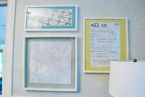
Not only does it represent a bunch of things he loves (type, maps, travel, geometric shapes, etc), it’s also personal because:
- the map is a typographic map of Richmond by a local artist (it’s actually made up entirely of words, more on that here) – I just painted the Ikea mat with the same gray paint that we used under the chair rail to help it pop
- the handwritten/typed item on the far right is a blown up copy of a tiny comment card from a meal that we shared in Alaska during our Honeymoon (we wrote things that we ate and what we saw on the comment card and kept it as a souvenir to remember that day)
On my side I knew I wanted Clara to paint me something (everything she makes is my favorite thing ever, what can I say?) and I liked the idea of framing a textile that I loved (some fabric leftover from Clara’s weekly project, which I also used a few years ago to reupholster a bench that now sits in her nursery).
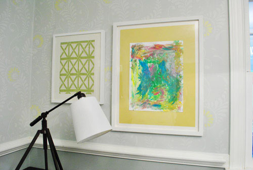
It doesn’t hurt that the lattice shape of the fabric ties in with the lattice detail on the chairs… and also seems to relate to the high-contrast geometric print on John’s side. Gotta love happy accidents like that. To us that just screams: meant to be.

As for how we approached the whole office art thing, here’s the order of this whole project (although we’ve done this multiple ways so there’s definitely not one “right” formula):
- Went through our existing frames to see what we had to possibly work with (and found the five that we used for a grand total of $0 spent)
- Laid the frames out on the floor in groups until we hit on a balanced but not symmetrical arrangement that we liked
- Hung the frames without anything in them, just to get a sense of how they’d look on the wall instead of the floor
- Began the art hunt (we figured we could trim/blow things up to work with the frames we had – although sometimes art comes before frames for us – it varies)
- Pulled our typographic Richmond map out of the playroom since we knew it was one of the things we wanted to hang (and painted the mat for that frame with leftover wall paint from under the chair rail)
- Went through our “memory box” full of movie stubs and love notes (it’s just a shoebox-sized container full of keepsakes), which is where we found the comment card from our honeymoon (which we blew up 420% at a copy shop to fit the frame)
- Dug up some sentimental fabric that I loved (which was also used here and here)
- Found a high-contrast print in my little file o’ art from years past that worked nicely on John’s side (it balanced out the handwritten comment card and the detailed type-map)
- Stripped Clara down to a diaper with some water-based Crayola paint and had her go to town on a large sheet of paper that would fit the frame I wanted to use with it
- Ran to Michael’s to grab some large colorful sheets of paper to create “mats” for some of the art (to better fill the frames and tie in some happy color since the office is our cheerful little bubble of unicorns, rainbows, and puppy dogs)
It definitely feels mixed & matched yet balanced enough for us – and it’s bold & happy without giving us a headache. We like that the color palette is diverse (Clara’s painting is full of color and there’s a black & white print, so it’s pretty varied). Even with all those colors/styles, the dominant tones (like teal and grellow) relate to the chairs and the dining room curtains – and the white frames help unify things. We definitely plan to play around with room accessories in other colors though (some pops of orange or coral on the desk might be fun) so we’ll have to see where things go…
Oh and here’s the view from the dining room. I love that the office is so light-washed and the dining room built-ins are so dark. It really helps keep the spaces from blending into one big rectangle-fest. Oh and I’m on the hunt for a new runner that’s not so matchy (plum could be fun – or even textured burlap).
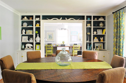
As for how much this entire update cost us, since we already owned all the frames we just spent around $9 at Michael’s on the large colored paper “mats” and $4 at the copy shop (FedEx Office) blowing things up. So that’s a total of 13 bucks for five pretty big pieces that we get to stare at whenever we’re not gazing at our laptop screens.
We still have other office things on the agenda, like: getting a permanent rug (most likely longer, not as wide, and darker), adding more permanent art to the other side of the room…
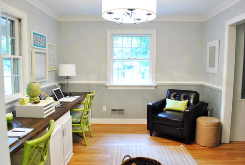
… hanging some window treatments (probably homemade roman shades), and adding a proper lamp and side table for the leather chair corner, etc. But for now we’re just grateful to have something on those have-been-blank-for-the-last-ten-months walls. Can’t believe we have stared at blank walls for almost a year. The shame! Especially since the frames were just sitting around in our playroom and it was only $13 to fill them with some happy-go-lucky stuff.
But enough about us. Have you guys ever blown things up at a copy shop like a comment card from a memorable meal? How about stripping down your toddler and “commissioning” some custom art? I thought I was going to be really Type A about colors and design but I just gave her every color of the rainbow and watched her go to town. My little artist…
Psst- Here’s another post about a ton of sentimental things we’ve framed around the house.

Holly@Loveoflifeblog says
I never thought about blowing up something to frame it until I began reading your blog! Such a great idea. And I love the new art.
Kristen @ My Covered Bridge says
Love the art! I just made my first paintings ever for my dining room –
http://mycoveredbridge.blogspot.com/2011/10/my-new-art.html
It’s was a fun project!
YoungHouseLove says
So pretty!
xo,
s
bridget b. says
@ Kristen: sweet!
Kristen @ My Covered Bridge says
Thanks!! :-)
Kristen @ My Covered Bridge says
@Sherry – Oh and put me in the camp that thought you sat on the right side…
Amanda @ Our Humble A{Bowe}d says
I love that you went with an asymmetrical arrangement. It adds character. And, you each got pieces of art that represent you. I think that’s the best part.
We have our kids make art for us and family. In fact, we recently hung some paintings they made in a gallery wall: http://ourhumbleabowed.wordpress.com/2011/10/24/gallery-wall-details/
YoungHouseLove says
So sweet!
xo,
s
Rebecca @This Nest is Best says
Oh, I looove it! It’s so evident you have an art background – I have such a hard time putting multiple pieces together like this and making them look cohesive, but you’re totally rocking it!
CandiL says
The handpainted by Clara picture puts a smile on my face! Love it!!
Rachel says
I can totally see it all coming together now! The art really seems to make it cohesive. This is random, but based on the lamps, I thought you sat on the opposite sides :)
Becky S. says
Me too!! :-)
kELLY says
Me too too!!
Morgan says
I thought the same thing!
Nikkidd says
Ditto here!
Melanie @ Mailbox Journey says
That office is so inspiring! Just sitting in there would get my creative juices flowing :p
Elizabeth says
That office just keeps getting better and better!! Hooray
Jodi says
I had really pictured Sherry on the right and John on the left. This is throwing me for a loop! It’s like asking me to sleep on my husbands side of the bed!
I love the art work and how it all ties in Sue the Napkin!
YoungHouseLove says
Haha- I actually used to sit on the right but have been on the left for the past few months. We switched when we built the desk for some odd reason!
xo,
s
Azure says
I think it’s the lamps. The heavy black lamp looks more masculine than the clear glass lamp.
YoungHouseLove says
Yup, originally we were going to put the tripod on John’s side but it cut into his writing space (since we’re both righties, it worked better to the left of my computer since no one writes there).
xo,
s
tina says
Our playroom has a wall full of kids art, LOVE it.
Seriously Sassy Mama says
I like that the that the art is not formal.
Rhonda says
Is that Snow City Cafe I see… I love Snow City!!!! Makes me miss AK.
YoungHouseLove says
YES!!!! MOST DELICIOUS MEAL WE EVER HAD. Had to frame it. Haha.
xo,
s
Kelly {the Centsible Life} says
LOVE the way they all seem to tie together and pop. I know you said it’s a happy accident, but I definitely think part of your subconscious must be fine tuned for decorating. ;)
We have so many bare walls I don’t know where to begin, and we’ve been in our house for four years! Someday we’ll get it done.
Erin says
It looks fabulous! I love the way you personalize. I’m going to have to dig through my boxes of mementos and get something up on my builder beige walls. Thanks for the inspiration!
Miranda @boucksy says
I think it’s great you have such different things on both of your sides! …But is it weird that I automatically assumed you (Sherry) would sit on the right side? Ha!
YoungHouseLove says
I actually used to! For some reason we switched when we built the desk- probably because I drink water all day and it keeps me closer to the kitchen (and the bathroom- haha)?
xo,
s
HeidiG. says
Your site is such an inspiration. I really appreciate how you take your updates & projects one day at a time. We did 3 months of everyday craziness remodeling our house, scraping down our popcorn ceilings, texturing, painting and now we are so exhausted we haven’t done much in the last month or so. Lots of good lessons we can learn from YHL!
kristen says
We just got a new kitchen table and I have spent many hours hunting down a eggplant table runner in RVA with no luck! I ended up picking up some fabric at Joann’s to make one myself :)
YoungHouseLove says
Love that idea!
xo,
s
diana says
Really great! On the list is there a new rug, maybe? (you know, I have plenty of ideas for you:). Good idea with the runner, and plum will make a nice choice.
YoungHouseLove says
Yup! Mentioned that on the bottom (along with a few other things on the list)!
xo,
s
Courtney says
LOVE IT! my husband and i are real cheese-pots when it’s comes to keeping things like tickets from the movie on our first date and the gifts bottle of wine from our b&b on the honeymoon. I LOOOOOOVE the idea of blowing up the images and making them art. LOVE IT!
my wheels are a’turnin!
Erica says
AW! I love love love it! I am in the works of redoing my office and I love how simple, yet perfect you guys did this. Such inspiration to use things we already have. I might find a letter my hubby wrote me now. Thanks so much for the inspiration!
Maureen @This (Kinda) Old House says
Love this! I love looking at how clean your house is. LOL Mine is a wreck right now since we are moving/switching rooms. The choices for artwork are perfect. I love the idea of having some real personal touches instead of run-of-the-mill prints,etc. Still trying to find my Pinterest challenge project too, by the way! Can’t wait for that!
Angie K says
When my son was about 3 I gave him a canvas and paint and let him go to town. He did an amazing job…people always comment about the art asking where I got it. I tried this again when he was 8, but he ended up putting too much thought into it and we ended up with a “mud” looking picture. It made me sad that he was so quick to become so hindered by what other people thought.
If only we could keep them little for longer!!!!
YoungHouseLove says
Totally agree! I’m tempted to make Clara paint me something once a week! I love that reckless abandon that she has now!
xo,
s
Karla says
I love this too! Maybe you can do something similar to what you did with your ‘P’ pumpkin. You can tape off words or you can do it in reverse. have her finger paint the whole canvas then tape off letters, paint over it and then peel off the letters? That could be cute!!
YoungHouseLove says
Such a fun idea!
xo,
s
Kate says
Up to this point, I really disliked the color on the chairs, and I especially didn’t like them with the fabric you put on the seats. But I totally get it now with the colorful art. Still may not be my style, but I really see it coming together and appreciate where you’re going with it. Great job!
YoungHouseLove says
Thanks Kate! One of the challenges with sharing stuff on a blog is that unlike a makeover show, it takes months and even years to get to the after! So a lot of people have no idea what’s going on in the middle part (especially us sometimes- hahah). We just take it one day/project at a time and build as we go! Those chairs looked crazy at first to some folks because the rest of the room was sooooo neutral (gray walls, white trim, white desk, white file cabinet, wood desktop) – so when they were added without art and accessories and all that good stuff they definitely stuck out a lot more instead of tying in!
xo,
s
Saleha says
I agree! For me it all clicked after you added the lamps. Looks awesome now!!
Anna says
I completely agree, Kate. I was just going to post this but you did it for me! I love the art on the walls and am still not in love with the color of the chairs — but they do go together. Definitely seems like your style, John & Sherry! Great work guys.
Merideth says
It clicked today for me! What fun to see the room evolve :)
Beth says
I love your approach to putting up and choosing art. We just hung groupings of art in our basement, and we were looking for the same kind of feeling: balance, meaning and fun. Perfection is totally overrated!
Meg@Keeping up with the Jenks' says
I have to learn to wait until ya’ll are done to see if I like it! With the new art, the lamps totally work! Love it.
I love the idea of blowing up something sentimental and making it art. I’m hoping to try something like the “P” art. My husband hates sappy stuff, so I don’t think he would let me blow-up anything too personal (like a favorite card or something). Ahhh, the joys of decorating when your significant other has an opinion about it. I don’t know how you and John do it!
Again, great job!
YoungHouseLove says
Aw so glad Meg! I knew the lamps might throw people off without art (my mom was confused) but once they weren’t the only thing on that wall it would hopefully balance out. Mom already called to say she loves it! Whew. Haha.
xo,
s
John@ Our Home From Scratch says
Really like the idea of hanging up maps. I like the old antique ones, makes me feel like Indiana Jones is gonna come over and have a scotch with us. Big fan of your desk lamp too. I’m aiming to replace ours.
Penny says
Oh man, is that the secret to getting Harrison Ford to show up and hang out with me? Time to go buy a million old maps.
Meagain says
Darn…I wish I could say that I like it….I’m more of a symmetrical type girl. There just seems to be too much going on…
YoungHouseLove says
No worries! Art is definitely one of those personal preference things!
xo,
s
Elisa @ The Self Life says
Happy = check. Unsymmetrical = check. Awesome = triple check. We are also aalll about hanging concert tickets and fun cards, although they all remained at 100%. Hah. http://theselflife.com/2011/08/01/guest-room-tweakin/
YoungHouseLove says
Such a sweet little cluster! And those curtains are awesome!
xo,
s
Rebecca says
LOVE IT! You guys definitely have “the eye” for hanging pictures/art. I am working on hanging items on our picture wall along the staircase, trying to get the non-symetric layout it hard but looks awesome when you get something good.
Ade@FortheLoveofPainting says
I love how all of your framed pictures have a special story!
I came up with the perfect pinterest idea…can’t wait to show you! Hey I may even give it as a few Christmas gifts…
Andy says
I would use some of the orange flowers that are in grocery stores right now to test drive the pops of orange idea. Or plumy purples. Kmart usually has Martha Stewart Christmas stuff in plumy purples, you might find a runner there. You could sew something too, maybe from place mats?
YoungHouseLove says
Fun ideas!
xo,
s
Krystal says
This is very weird and it’s been happening for about a week now, but this post doesn’t show up when I go straight to YoungHouseLove.com however it does show up when I go to the website through the Facebook link. I just thought I’d let you know. About the art: I am absolutely loving the Richmond typographic map and wish I could find one for either of my two hometowns (it’s been about a year of searching without hope).
YoungHouseLove says
Sounds like a cache-ing issue with your comp. If you empty your browser’s cache it should pop right up! Hope it helps!
xo,
s
Krystal says
That did the trick! Thank you.
jordan says
It is so fun to see you adding layers! Is the black chair a keeper in the room, or just a temporary fill in(looks good, just curious)?
YoungHouseLove says
It’s actually brown leather! Yes, it’s staying for now. We use it a lot more than we did in our bedroom (to read to Clara, etc) and love how it works with the dark desktop (although in the pics it looks much darker than it does in person).
xo,
s
Lisa says
Just curious – what do you have in that corner of your bedroom now, where the leather chair was?
YoungHouseLove says
The rocker I upholstered is hanging out there now.
xo,
s
Lisa says
Ah, of course! Sure wish I had the smarts to keep a cohesive pallet and style throughout my house like you have. My rooms are all so different, it’s impossible to move furniture, pillows, art, etc between rooms. And go figure, Hubby won’t let me “start from scratch” and re-do the whole house! :-(
Brandi @ His Shabby Her Chic says
It looks great! The office is really coming together! I would have never thought of blowing something up to fit a frame, even though now it seems like such a no brainer…
Wom-mom Ethne says
There’s nothing I love better than hanging my kids’ art. You can give her holiday-themed colors to make lots of decor for any given holiday. Love that + it’s free or almost free.
Kate says
Oops… little typo — I think in the last paragraph you meant “copy shop” not “coffee shop”. Fun art :)
YoungHouseLove says
Haha, you’re right! Thanks!
xo,
s
Stefanie says
Love this post! Your office looks great. I take lots of inspiration for artwork from your home.
In regards to roman shades…have you DIY’d them before? I’m looking to put light colored shades in a linen fabric in my kitchen but all the ones I’ve come across are EXPENSIVE! Do you know a place that has them on the cheap or how do I DIY them?
Thanks!!
YoungHouseLove says
I have pinned some things over on Pinterest about how to make them. For cheap ones you can try Ikea too!
xo,
s
ESBlondie says
Looks straight out of a magazine PRETTY!!
heather says
From one blogger to another, I have about 30 yards of burlap at my house (from my wedding) including a bunch of table runners. I will gladly send you one. Or yards of burlap. Please. Take it from me. I’m in burlap overload.
YoungHouseLove says
Aw Heather you’re so sweet! Our no-swag policy keeps us from accepting but it’s so kind of you!
xo,
s
heather says
No problem! I thought that only applied to businesses, etc. not readers too, but I completely understand! I got ours at Joannes with a coupon, I think I paid $1.99 a yard – maybe. They have all different colors too, not just natural.
YoungHouseLove says
Thanks so much for the tip! We’ll have to check out JoAnn!
xo,
s
Staci says
Typo in the last paragraph, I’m sure you meant copy shop not blowing up a coffee shop ;) Unless you’re the rabid anti-Starbucks types…
Love the art, and the balance is 100% perfect.
YoungHouseLove says
Thanks! All fixed.
xo,
s
Reenie says
Love it :)
molly says
Nope, never had copies made at a coffee shop!!!! hehe
YoungHouseLove says
Haha- all fixed.
xo,
s
Krysta @ Domestic for Dummies says
I love it! It looks much more complete. Can’t wait to see what kind of rug you pick out!
Paige @ Final Clothes-Out says
I love the room even more now that it has art! I didn’t think it would make such an impact, but it really pulls everything together.
The quirkiest thing we have framed on a wall is a record of “our song.” It’s in a frame that’s glass on both sides, so you can see the wall color in the negative space.
bridget b. says
this looks great. the arrangement is perfect and i really like that this wall contains only inanimate objects/prints. i’ve been wanting to do a gallery wall in our living room, but i was weary about picture over-load since we already have a gallery wall of actual pictures in our front entry hallway.
if the living room wall contains meaningful objects (but no pictures) it should work out well.
i also never would have thought about upgrading mats with paint or colored paper. great idea.
Kristen @ Popcorn on the Stove says
I love that both sides are different! It works so well :)
Anneliese says
This is one of my all-time favorite posts of yours… the art is spot-on and so personal (love that!)
Have you ever considered a round rug for that room? Seems like it would echo some of the other circular things going on (light fixture/side table) and bring in some curves. It would also keep the rug out of your chairs’ way…
YoungHouseLove says
I actually have thought about that a bit! It’s a bit harder to find them but we’re definitely open to that possibility too!
xo,
s
Carol says
I am a stickler for function and it would make me crazy if my chair fought with the rug every time I sat down and stood up from my desk chair (many, many times considering all the water and potty breaks!) Anneliese’s great suggestion also made me think of an asymmetrical hide (that would just happen to perfectly correspond to the extra spaces needed to move your chairs??!!) I think Ikea might have some. It’s hard to tell from the pics, but it looks like a narrower rectangle will look like a runner? Anyway, if anyone can find a solution to a tricky problem, I’m sure you two will!
YoungHouseLove says
A faux cowskin is definitely another option! We love the idea of breaking up all the angles with something a little more organic!
xo,
s
Karen J says
I like the idea of a round or faux hide rug too. I’m dying to try this faux antelope rug but haven’t figured out a place to put it. Maybe someone else can use it:
http://fabulousfurs.com/product.asp?pn=11089ANTELOPE58X93
YoungHouseLove says
Ooh so cool!
xo,
s
Meaghan says
Oh, I just love it. This is my favourite room of your house. Even though, they are all really my favourites. It’s so hard to choose!
YoungHouseLove says
Aw thanks Meaghan!
xo,
s
Jaime says
Very nice! I like it a lot. The chairs make sense to me now. You really have a knack for design.
Erin S. says
Snow City Cafe!!! I’m drinking coffee out of my Snow City mug right now! Love that place — we went there for a delicious lunch when we visited Alaska a few years ago. . . and we also posed for lots of silly pictures since our last name is Snow. :)
YoungHouseLove says
Isn’t that place the best? We talk about it weekly. Sometimes daily now that we have our new art. Haha.
xo,
s
Elisa @ The Self Life says
OH man — I’ve been wanting to go to Alaska for ages and you guys are not helping! Hah!