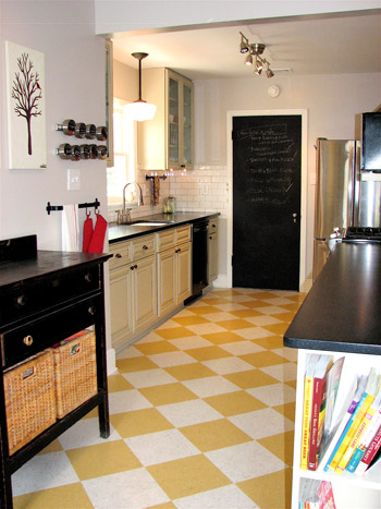
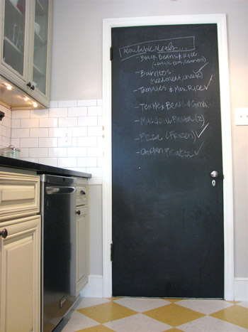
Still working on the drywall situation for our new opening! While we get that together and snap some pics for this afternoon, let’s look at an awesome kitchen makeover – you know to keep the momentum up. Of course we perked up when we spotted the words “1948 ranch style house” and “kitchen renovation” in our inbox. Then we saw the awesome before & after pictures attached and, well, see for yourself. This is one of those makeovers that reminds us that whatever the budget, making one or two daring or unexpected choices can make the room (and make it feel like yours). We’re loving the playful choices like the yellow floor and the chalkboard pantry door along with a ton of functional upgrades like the large glass cabinets and the glossy white backsplash. Here’s Kathryn’s email:
We had a very outdated kitchen in our 1948 ranch style house. We bought our house in 2009 knowing that we’d have to do something about the kitchen – the overhead light didn’t work, the stove worked about 50% of the time, and it was claustrophobic.
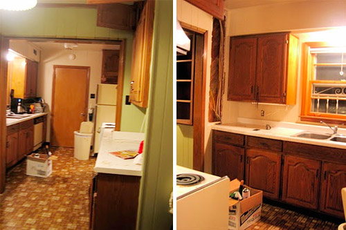
We used the first time tax-buyer’s credit plus some other savings to re-do the kitchen and ended up redoing everything to make more sense of the room and update the dark and dated feeling (we removed a soffit, got new flooring, new cabinets, new counters, new lighting, new backsplash tile, new appliances, a new sink & faucet, etc). Hope you like it as much as we do! – Kathryn
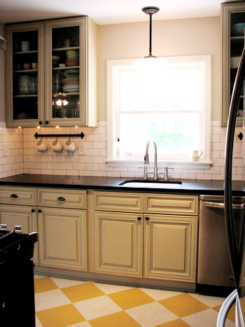
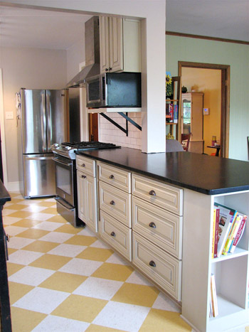
Isn’t that amazing? A big thank you goes out to Kathryn for sharing! She has more awesome after pictures here on her blog, and you can see more of the in-progress pics here. It’s like a totally different room, huh? And when you take a moment to really check out those cabinets (the lines of them, the glass fronted ones, the fact that they go all the way to the ceiling instead of hitting a soffit, the abundance of large functional pull-out drawers, the open bookcase for cookbooks on the end of the counter, etc) it’s clear that the room’s not only a lot easier on the eyes, it’s a lot more fun to cook in too! So let’s make like the floor and have some fun… playing the what’s-your-favorite-part game. Mine are the glass cabinets, giant drawers, and the pendant above the sink.

Rebecca @This Nest is Best says
That floor is fantastic! I do really love the chalkboard – we have one in our kitchen as well and love it.
Karen J says
Great job. It’s nice to see some different colors used too (although I love white kitchens).
Megan says
Oh, the floor! How cheerful and unexpected- I love it.
Deidra says
I just have to let you know that I’m finishing painting my bathroom and stole Sherry’s idea of wearing my clothes inside-out. My nephew insisted we video chat so I could see the hole left from his first lost tooth. I pointed to my shirt (there is some interfacing from embroidery, so it looks particularly weird inside-out) and told my sister I was stealing “$herdog’s idea” for painting .
She insisted I let you know it’s catching on. So there you go! :)
YoungHouseLove says
Hahaha- I love it. Work it Deidra.
xo,
s
[email protected] says
oh my! what a genius idea! you should see how many outfits i’ve ruined thanks to painting! i stepped in a tray of paint once (well, fell off the ladder and landed in it) and let’s just say i was COVERED in paint.
YoungHouseLove says
Oh my gosh- that sounds like something I’d do!
xo,
s
Jamie says
So gorgeous! I’m in particular love of the subway tile and the black countertops. Fantastic.
Amanda Wells says
LOVE those floors! http://www.amandadovewells.com/?page_id=45
Robin @ Our Semi Organic Life says
Love it! Esp the floor and the subway tile!
[email protected] says
Beautiful finish selections! I love seeing homebuyers putting the tax credit money back IN to their homes! Thanks for sharing!
Jenn @My Southwestern Life says
WOW! Yet another amazing Reader Redesign. I can hardly believe that’s the same room!
Veronika says
Hi! I have something unrelated to the post to tell you!
I was just watching the Nate Berkus show (in fact it’s still on)he was doing a kitchen makeover and he used the exact same cork floors that you chose for your kitchen! They looked awesome!
Just thought I’ll let you know!
YoungHouseLove says
WAHOOOOO! Sorry for the caps lock. You know I love me some Nate! Haha.
xo,
s
Veronika says
sure do! that’s why I rushed to tell ya!
Patti says
I love the contrast of the vintage-y looking cabinets with the bold yellow floor tiles! It doesn’t look like the same room!!
Naomi says
I love it! It looks modern, but it also looks like it marries well with a classic ranch-style home. Well done, guys! :o)
emily says
Great use of tax credit funds! What an overhaul.
Petra says
Wow, what a transformation! I love the chalkboard door. What kind of paint was used for the door, if it was done that way?
YoungHouseLove says
They actually sell chalkboard paint at places like Home Depot and Lowe’s now (usually in the spray paint isle for some reason). Hope it helps!
xo,
s
Brandi @ His Shabby Her Chic says
That kitchen is gorgeous!! It makes me jealous and I want to redo mine now!
Connie says
I love the play on the classic (subway tiles, cabinet doors, etc.) against the industrial (stainless steel appliances, clean lines, etc.) It’s the exact balance of my style that I can never seem to get just right! Love this!
candace @ thecandace.com says
Those perky fun floors are my unexpected favorite! The whole makeover is gorgeous – they did a great job!
Allyn says
Oh my gosh, I so want to put this floor in our kitchen! It would look amazing! I also love the subway tile. It always makes a kitchen just look chic and pulled together, even when it’s in a funkier way.
Can’t wait to see updates on your kitchen!
Regan @ RenovatingRothenbergers says
Love those large drawers and the open shelving at the end of the cabinet for cookbooks! Awesome job :)
Ami @ parsnipsandpears says
OMG LOOOOOOOOVE the floor!!!
Raina@ Mamacita Spins The Globe says
That is super cute!
John@Our Home From Scratch says
They really pulled off that floor wow! Looks great!
Jess @ Little House. Big Heart. says
The floors are cheery and bright, but I love the subway tile!
Andrea @ the yellow cottage says
The yellow checkered floor is a fun throwback to the era of the house. The microwave looks a little awkward, but I guess you could argue that the brackets add an industrial edge. Overall its a much happier place to be!
Meg says
I have an obsession with chalkboard paint so that it a favorite! But the subway tile! It looks fantastic!
Kristin says
The subway tile is my favorite…fantastic makeover!
Katy says
Love the glass cabinets! And while I love the idea of a chalkboard door, I just know I would get all my clothes dirty with it! Oh well, I can just admire from afar.
~Katy
Maureen @ This (Kinda) Old House says
Incredible change! My faves are the pendant and that tile. The tile really gives a vintage feel to the room, I think. Looks awesome! Can’t wait to share my bathroom in a million years when I finish it. :)
Michelle says
Wow that looks amazing!
Sarah Jane says
LOVE the floors! So cheerful! I think they’d make me smile every time I saw them. :)
Petra says
I’m not sure if others have the same issue, the blog website is not showing up to the homepage or anything, but with a “pick which browser you’d like to use” window.
YoungHouseLove says
So odd! Anyone else having this issue? It’s the first we’ve heard of it. We haven’t changed anything on our end, but we wish we could help!
xo,
s
hyzen says
Love the whole thing, but the floor is extra fun, the pendants are lovely, the drawers are so functional, and the countertops look rich and sleek. Nice work!
Lucy says
Stunning.
Kathryn says
Hey guys!! Thanks so much for sharing my post. The kitchen was a labor of love and I think we made a best friend out of our contractor. He lived with us pretty much there for a while. Sherry, it is funny that you guys are using cork in your kitchen because we looked at almost the exact same cork flooring but went with the checkerboard because of our budget and also we originally wanted a checkerboard cork floor and that particular flooring wasn’t ok with Memphis humidity (the flooring company actually wouldn’t install it). It ended up being that our consolation prize, the linoleum tile, ultimately is my obsession now out of the whole thing!!
YoungHouseLove says
Wow- it’s so funny how things work out like that! It’s gorgeous!
xo,
s
Jamie says
I love that they built a bookcase into the end of the counter. Great place for storage.
Rachel Tatem says
It’s a slow process… but encouragement: I made it 9 months without a kitchen during our remodeling!
Claire says
That kitchen is ah-mazing. WOW! I wouldn’t change a darn thing about it. I think one of the best parts is the floor! Goes to show that you don’t need a super spendy floor finish in the kitchen for it to look chic and lovely. Love the playfulness of the yellow and white against some of the more traditional cabinet doors.
Hilary says
That’s a FUN kitchen! Love the cabs and the contrast between whites/black/yellows :)
Melissa says
what a difference! I love the chalkboard painted door, the subway tile, the cabinets and the side shelving on the counter for cookbooks. K, I’m gonna go look again and swoon over it some more…
Giulia says
I love the yellow tile and I’m always a sucker for chalkboard paint – is that a trend or will it stick I wonder?
[email protected] says
my favorite part, hands down, is the subway tile and the way it jives against the floor. i NEVER in a million years would have thought of using a floor like that…but now i’m considering it! it looks amazing. so much more fun than your typical ceramic tile.
Gwenalyn says
I have to admit I would have never thought to use yellow and white flooring, but WOW does it look great! Way to think outside of the box! Your kitchen is beautiful, Kathryn, I can’t pick a favorite part – I love the whole thing!
Anna-Lisa says
I love the floor so much! I like that it’s period-appropriate for a midcentury ranch but still goes with the rest of the modernized kitchen.
Christin says
Wow! That’s an incredible transformation – love it!!
Cheri says
I’m enamored with the sunny checkered floor and the built-in bookshelf!
Seriously Sassy Mama says
I am completely in love with the floor.
Beth says
This post has made me strongly consider removing our soffit when we redo our 1956 ranch kitchen. It makes a big difference.
Susan (Between Naps on the Porch) says
Amazing transformation! Love the flooring! Really…just love it all!
Ginny P says
What a nice re-do of a galley kitchen! Love the floors, cabinets & counters. Our kitchen is similar (actually I think the floor in the “before” is exactly the same as ours!). I’ll be bookmarking the reno for sure.
thanks!
Ashley@AttemptsAtDomestication says
I love the fun that the floor adds to the room but my favorite thing is the glass fronted cabinet doors!