We never get tired of seeing a solution like the one that Sada and her husband Reagan sent our way. They took an otherwise useless wall in their entryway and turned it into both a functional space for coats and a pretty spot for displaying art and personal mementos (we think they did an especially awesome job picking meaningful, happy art and arranging it in a really charming way). Here’s their letter:
My hubby and I recently redid our entryway! With the way that our house is laid out, I knew we were never going to be able to have a beautiful “mudroom”, however, we have this huge blank wall right by our front door.
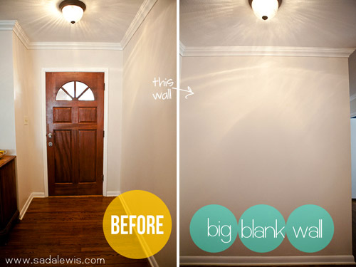
So we took advantage of it and created a little board and batten magic! Here is the before and after – Our version of a mudroom. :)
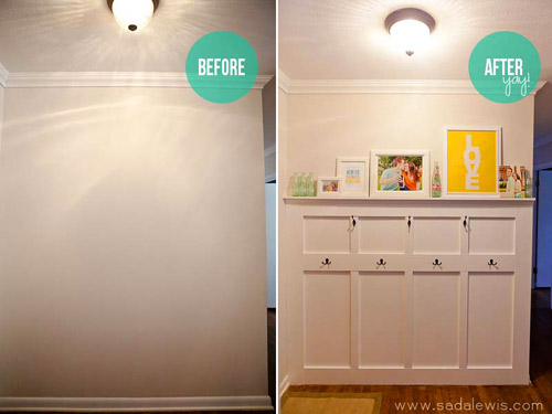
It is practical and it definitely adds a much needed pop of color.
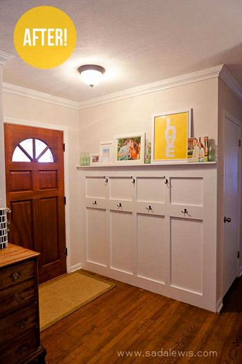
The only thing we are still working on is the light (the light fixture AND the lack of natural light, as I’m sure you can tell by my photos). We are in the process of trying to fix both, but I love how our entryway is much more cheery! I find myself just staring at it, ha!
I love your blog (and would pretty much pee my pants if this was actually featured…tmi?)! Have a great night! – Sada
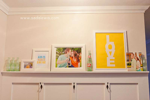
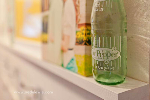
Obviously the woodwork looks great, but we’re totally into Sada and Reagan’s art arrangement (um hello, you know I love all things soda). It’s such a fun touch that they mixed engagement pictures with some of the real items they used at the photo shoot. You can click over to Sada’s blog to get more of the details on how they pulled this whole shebang off, along with sources for the art and all that good stuff. What’s your favorite thing? Sherry loves the sweet “Love” and “Always Radiate Sunshine” prints and I’m digging the dark hardware and those come-hither soda bottles. Oh yeah, I’m smitten.
Psst- We announced this week’s giveaway winner. Click here to see if it’s you.

Kristen @ Popcorn on the Stove says
What a great solution for this space! It reminds me of pottery barn now (when they have the built-ins for the mud room). I love how cheery the art is but I think my favorite details are those Dublin Dr. Peppers!
Siding San Antonio says
I totally agree, the entry way looks fantastic after the remodel! You definitely don’t need a mudroom if you have the smarts to spruce up a space you already have. Personally I love their use of yellow and other bright colors in an otherwise plain space!
itsjustmebub says
WOW this is absolutely perfect!!! Amazing job.
Katrina @ 'Sota is Sexy says
Adorable! I’m kind of obsessed with the soda bottle!
KiTx says
OH MY GOSH! This is exactly the type of thing I’ve been thinking about doing in our entryway but was too scared to try. Sada, you’ve inspired me, and it’s going on the project list!!!
Kate says
That looks great! I’m sort of interested in doing the same kind of thing in our entry area, but I doubt it will happen for a while.
Jayne says
Is your publicity responsible for the crash of another site? ;-)
YoungHouseLove says
Oh bummer! Here’s hoping Sada’s server gets a moment to breathe and is up and running shortly. Maybe try back later?
-John
Kathi says
I have a different colored version of that LOVE print – it’s from MadebyGirl if you’re interested, Sherry….
Jenn @therebelchick says
Thanks for mentioning that, I was crushing on that print hardcore! :)
Amy says
I think I just found a project to do this Sunday! I wonder if Sada wet her pants! ha ha, Congrats!
yadira batres says
Is very lovely.
I wish I could do that to my entrance, I really want a mudroom
but the layout of my entrance doesn’t allow it at the moment.
they did a great job.
<3
Yadi B.
LauraC says
Good job Sada and Reagan!
Fahm at Asia Dish says
What a cute idea! I love the happy, bright pops of color in the “LOVE” poster and the photography. Wanted to check out more but looks like their server crashed!
YoungHouseLove says
I know, bummer! Hopefully it’ll be back up and running soon.
-John
Natalie says
R.I.P. Dublin Dr. Pepper :(
This looks great! I love that it’s a way to display a collection of awesome things without using up valuable table or floor space!
Jamie P-M says
that looks amazing! what a great job!
Lisamarie says
Oh my gosh… I love love love it!
Robin @ our semi organic life says
Love this! I love the hooks!
Karen says
Hmmm… add another crashed site to your list. LOL
Love the board and batten. I really want to do this in my living room. Do you think it’s okay to add b&b to just one wall or will it look silly?
YoungHouseLove says
I think you can definitely pull off b&b on one wall, but just be sure you’re choosing a wall that makes sense – like the longest wall or focal wall. For instance, it’d be weird to put it on the small wall that behinds you when you enter the room. Check out this other reader redesign for how they delineated a wall with b&b to one that doesn’t have it. I thought it might hep you visualize it: https://www.younghouselove.com/reader-redesign-welcome-home-makeover/
-John
Kristin @ The O.C.D. Life says
I absolutely love this!!! They took a plain area and gave it so much character. Great job!!! ;)
Kim @ Yellow Brick Home says
It looks great! So, so functional and a great way to display art. Now, just imagine if the front door was painted a fun yellow like yours – yowza!
Ally says
Excellent work, Sada & Reagan :)
…and will be even cooler when the “BORB” (BOOB/ORB Light :) exits the building…or mudroom, as the case may be :)
xox
Rae says
This is a great idea! I’m struggling to come up with a unique way to use our *very* funky entry into the house from our garage. I may be able to steal some of these ideas. Fabulous!
Suzanne from Suburban Spunk says
Love this! Wish I had space to do this in my house.
Amy says
I love this! Great “mud room” in an area that has no depth from the door area…a common problem in many of ranch homes I’ve been looking at! Great inspiration!
Rebecca says
I LOVE this! Been looking on Pinterest for entryway inspiration like this, so I pinned this one!
Jess @ Little House. Big Heart. says
I love this! I’m kinda maybe trying to convince the hubs that we should do a board and batten treatment in the dining room. This just might win him over!
Karen F says
,Totally adorable, and more importantly looks like it’s always been there (not like an afterthought). Love all the artwork, too. Awesome job!
Sada says
John & Sherry – I just peed a little, fyi! :) Thank you so much for sharing our project! I just went to access my blog and was wondering why it was down. Welp, here’s why! Hopefully it makes it through the shock of gajillions of visits!! Sorry everyone! I’ll see what I can do!
Thank you so much!
YoungHouseLove says
Thanks so much for sharing your project with us, Sada! Sorry for the blog troubles (we know how frustrating that can be) but hopefully one things slow down it’ll come back up so everyone can see the rest of your awesome makeover.
-John (& Sherry)
Laci says
Sada,
LOVE this make-over, but more importantly (to me), I’m stealing your name!! I LOVE it and am adding it to the future-baby-if-it’s-a-girl list!!!! …and Texas lost a treasure with the loss of Dublin’s Dr. Pepper… :-( At least we still have Bluebell!!
mp says
SADA!!! I bow at your altar! This is beyond excellent. You and Reagan are a talented duo.
I have that light in my hallway, in a chrome finish — it’s fine for a hallway, but not an entrance. Look forward to seeing what you choose.
Nancy says
Would this also be why I can’t pin a picture of your before/after? (I post the link to your blog.) Or is there a way that you can block your photos from being pinned? I’d totally understand if that’s the case.
YoungHouseLove says
This is a question for Sada about her site right? Our photos are pinnable if you click the title of the post (the same way you comment – and there’s a PinIt button on the bottom). But some sites put code to keep people from pinning things, understandably if they share personal photos and stuff like that – so Sada could have done that with her site! Hope it helps.
xo,
s
Cassidy says
I just wanted to say that I love that you have a canvas photo! haha no one ever seems to have them (except the million that I own ;) so I love seeing them in other people’s houses. Also, I’ve been thinking of doing DIY board and batten in my 2 year old’s room on one wall with a shelf and I think you just sold me. Wonderful job!
Brenda says
I love that there’s dimension, not just a bunch of hooks on a wall. It looks fabulous!
Sara says
It looks awesome. Really neat!
Powerpuff says
Functional and so cute! I love the displayed soda bottles. I actually have some empty bottles (soda and beer) all over my house: on the fireplace mantel (including dublin dr pepper!), on top of a dresser in the bedroom, and on the kitchen window sill :)
Brandy says
LOVE this! Have an area almost exact and have been searching for something like this in person. When you blog comes back up Sada are there step by step directions?
Sada says
Yes! Check out this post – http://www.sadalewis.com/2012/02/entryway-project-board-batten-detailed-how-to.html. And feel free to let me know if you have any questions. Sorry for the inconvenience!
stephanie says
I love this look! It’s like you guys read my mind- we are going to try our hands at board and batten this weekend. I would love your opinion… (I feel like I keep asking for it, sorry). We have a typical townhouse, entryway that leads right into stairs up to a kitchen. We were thinking of framing the entryway with board and batten, carrying it up our stairs and straight back across the back wall of our kitchen. I am vaguely worried this is TOO much board and batten but….. it could be awesome…I wish I had pictures!
YoungHouseLove says
I think it sounds lovely! It adds so much architecture, I say go for it!
xo
s
Vivian says
What a wonderful idea! Thanks for sharing!
Shannon R says
I love this and totally want to do something like this in my house, but the entry wall is much longer (like 10 feet). How could you cap it off so that I don’t have the longest row of hooks ever?
YoungHouseLove says
Hmm, maybe do at all the way down the wall but only put hooks on the first half or the middle and just use the rest as if it’s chair-rail in a dining room (hang art above it, etc). Does that make sense?
xo
s
Laci says
…or you could make it slowly build up in a step-wise fashion and then down again, only putting hooks in the middle/full-height section. Does that make sense?
Rebecca @ The Copper Brick Road says
Wow! This is great! Our front door is kind of laid out like this, but we don’t have that separation from the living room. You just walk right in. This would be a great idea! Thanks for sharing!
Kim Senn says
Nicely done!
Bethany says
Looks amazing! Such a smart solution for a lack of a mudroom. I love the pops of color and all the cool soda bottles displayed.
Sherri says
I love this!! Maybe the Hubby will agree! ;)
Sarah Mc says
FYI, the white ceramic pig speaker is on clearance at West Elm with extra 15% off right now. Wishing I had someone to buy this for.
YoungHouseLove says
Oooh, awesome!
-John
Amanda says
I had to check it out simply because I love pigs and I’ve been looking for a speaker for my Ipod for ages. I squealed and bought it immediately! Thanks for the tip.
Tiffany says
First of all, Dr Pepper is my fav<3 So kudos on those bottles. They look GREAT! And secondly, this is just stunning! Just bought a house and thinking this may be a great option (on a smaller scale) for our entry area! Well done!!!
Michelle N says
This looks just like my entry way! I love this idea. I have been trying for months to figure out what to do with my entry! This is great! WOW
Annalynn says
Sada,
You must be from Texas. I noticed the Dublin Dr. Pepper bottle. Very cute entryway.
Sada says
Yep! :)
Jenn @therebelchick says
I love the pop of color that their brick a brack adds in the white space. And I know that each of those hooks would be filled up with purses and lanyards in no time in my house! ha!
Shelley @ Green Eggs and Hamlet says
Great job, Sada! I’m so jealous. We always enter the house through the door from the garage and I really wish we had a wall to build a mudroom-y space but no dice.
Briel K. says
Looks great! I went to check out her blog too and I love the look of it (from what I can see…it’s down…blah blah blah. :)). Gonna add it to my Google Reader!
Sada says
Thank you! Sorry for the inconvenience, hopefully it’s back up and running now!
binhtheredonthat says
wow that looks great. We have a wall that we could do something similar. But I wonder if it’s interfere when you open the door.
Shelley says
Looks great! And I love the usefulness of the hooks too!
jen says
I love this. When I moved here I did 2 white strips with hooks because we need a LOT of hooks with 3 kids and coats and raincoats and backpacks and our bags and computer bags, umbrella and keys, and dog’s leash should I go on?? Our coat cl oset is nowhere near the foyer, and in a small house it’s too full of other stuff to function as one. This particular foyer wouldn’t work for me but I’d love to see more of this, what can I do between the spaces. Right now the top is a great place to stash photo cards we get with pictures of our friends and family and their kids.. christmas cards and birth announcements etc but I’d love for it to be more polished. Admittedly I just used 1×3 we had on hand and I thought it looked okay till I saw this! haha.
laura says
That is brilliant! Such a simple solution to the intimidating blank wall. Thanks for sharing!
Amelia R. says
Looks awesome! And someone should probably send that poor blogger a towel . . . you know, to help with the piddle puddle. :)
Brenda says
I love this, and it has been on the to-do list in our 1960’s home. However I am concerned that it will look all pretty until the real life use starts. You know, the red backpack with a Super Mario key chain hanging from it, and the bright blue backpack with a light reflector on it, and the pink backpack, and the aqua jacket, and the navy blue jacket, etc. Yep, my kids things are not all matchy. I want them to pick out what they like, not what matches my decor. This wall could look great and the hanging space would be awesome but a large part our entry wall is visible from the living room. Any thoughts and/or suggestions?
YoungHouseLove says
If you don’t like seeing the items they’ve picked out, then sounds like you’ll have to go with some concealed storage. If there’s room for a bench you could build one in and slide some baskets under it for the backpacks, leaving the just the jackets to hang up and look a bit less cluttered (but also like your hanging storage also gets some use!).
-John