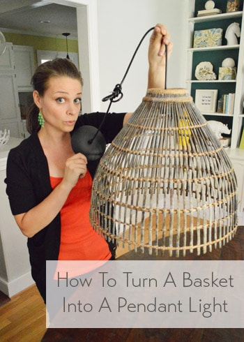
This is the story of making an old basket into a pendant light using just this $10 thrift store basket that we found along with two other simple supplies.
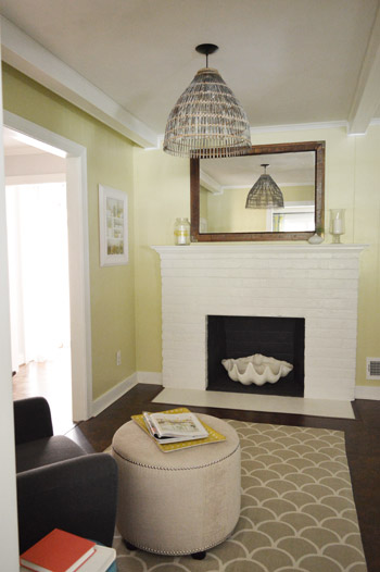
Here she is all wired up and hung in front of the fireplace.
But allow me to further illuminate the basket to light conversion process. Har-har.

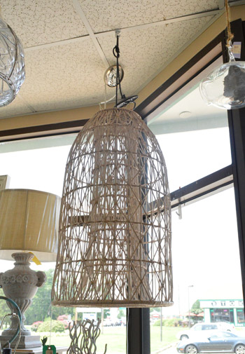
The first step was heading over to a local lighting outlet (The Decorating Outlet) to check out any existing pendant lights that they were selling cheaply (that way we could convert one into a pendant for our big basket shade). While we were there we saw this awesomesauce basket pendant that was selling for $322 (originally $460). Wowsers.
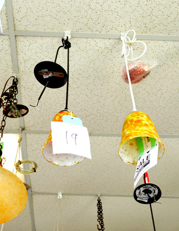
Feeling inspired, we poked around for any affordable pendant light that we thought would work with the rest of our kitchen (we wanted a simple clean-lined canopy, an oil-rubbed-bronze finish, and ideally something with a shade since that meant it would come with a piece that would hold that shade up – and therefore could hopefully be converted to hold our basket up instead).
Enter this dude, stage left (he’s the one on the left with the $19 price tag). Sure he’s not much to look at in this pic with that crazy yellow shade, but the simple canopy, oil-rubbed bronze finish, and the fact that it had a screw-on-shade-holder-thingie (that’s a technical term) under the yellow shade = jackpot.
So for $19 we made him ours. Ikea actually sells light kits that we love for $6, but since we wanted something in an oil rubbed bronze finish it would have been an extra $7 for spray paint to make it that color and then we’d need to buy a canopy (which can usually be found for around $6 but sometimes they’re a bit more ornate than we’d like) so the simple all-in-one-ness of the $19 pendant made it the perfect choice. Here are all of our supplies laid out on the table (total spent = $35, including the secondhand basket).
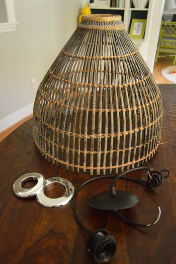
I’m sure you’re wondering what those silver donut-looking things are, so allow me to explain. They’re actually pipe plates from the hardware store for $3 a pop (the things you usually see at the bottom of a pipe to finish things off where it meets the floor, the wall, or the base of your cabinet). The issue was simple. We needed something round and solid to keep our pendant light from slipping through the opening of the basket…
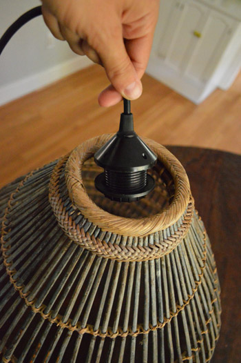
… so we bought them in two sizes since we didn’t know which one would slide through and which one would hold. In other words, we needed something big enough to support the basket and not slip through the opening (the one below was too small, so it did).
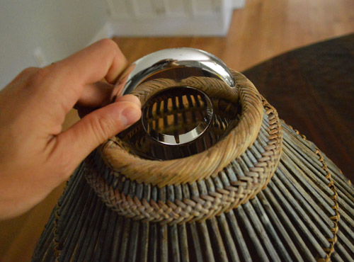
We also needed something that was the right size to catch on our light bulb part of the pendant (the one below was too big, so it didn’t hold).
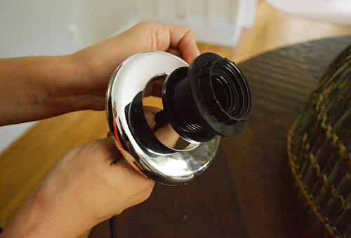
But when we swapped them and tried the bigger one on the basket, it wedged right into the hole at the top of the basket and held tight instead of sliding through like the smaller one had.
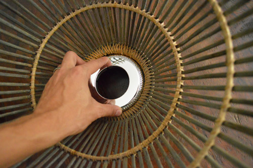
And when we tried the smaller one on the end of the pendant, it caught nicely under the piece that used to hold the old glass shade on, so we knew it should hold the basket up.
So because we needed the small one to catch on the pendant and the larger one to catch on the basket, we realized that if we stacked them and then used the plastic ring that came with the light to hold the old shade up (to hold those two pipe plates in place) it would essentially hold the basket up. So I just screwed on that plastic shade-holding ring…
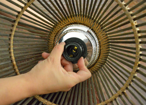
… and said a few silent prayers to the basket light gods. Then it was time to hold it up to see if it worked (while channeling Zoolander apparently). Hootie hoo, we had basket light liftoff!
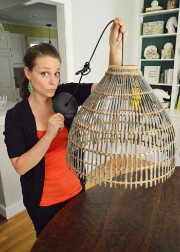
And for anyone wondering if it’s a total fire hazard, thankfully paper lampshades or lanterns and other woven-ish basket lights are totally safe as long as the bulb doesn’t rub against them and everything has room to vent (so it doesn’t get crazy hot like it would if everything were enclosed or touching). See how the bulb hangs down and away from the shade so there’s no point at which it touches or even comes close enough to get the basket hot? That’s the key.
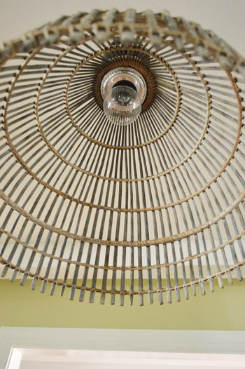
We love that it looks so clean from the underside (when we were trolling the aisles of the hardware store we were worried we might not find something quite as seamless-looking, so we’re really thankful).
That whole how-we-did-it rundown probably sounded a lot more complicated than it really was, so we made this quick video of the process, which is much much easier to understand (even on mute if you’re at work). It was a super quick process that took less than four minutes once we gathered our supplies.
Then it was just time to wire it up in the place of the flush mount fixture that we grabbed at Ikea a while back (which we think we’ll reuse in the hallway to replace an old boob-ish light that’s hanging there). Voila! Basket light in the hizzouse.
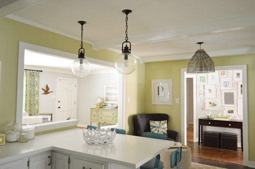
We love how it looks with our oil-rubbed bronze pendants over the peninsula. Glass and woven natural fibers are one of our favorite combinations and the simple oil-rubbed bronze wiring ties them together so they look related without being too matchy-matchy. It’s amazing how much more defined the “fireplace zone” now feels with its own little feature fixture. And thankfully it’s nearly seven feet from the ground, so even our tall family members can pass under it without a problem.
My favorite is getting to enjoy it twice thanks to the reflection of it in the mirror that I snatched from the guest room. It’s also really pretty to see it layered in front of the hallway wall. Here’s a shot from the peninsula. It’s amazing how the new chair, the mirror from the guest room, and the new basket lamp completely upgraded that little corner of the kitchen. So glad we finally started paying attention to that zone (especially since Clara spends a ton of time playing on that rug or reading with us in the chair).
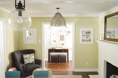
Here’s the view through the opening in the dining room:
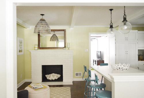
And here’s the view from the cooking area of the kitchen. The layered, textured look that the basket light brings is really nice – it even ties into the dark floor and the new mirror so there’s more of a “nautral” vibe going on, which is a nice foil to all the modern touches like the corian counters and the floating shelves.
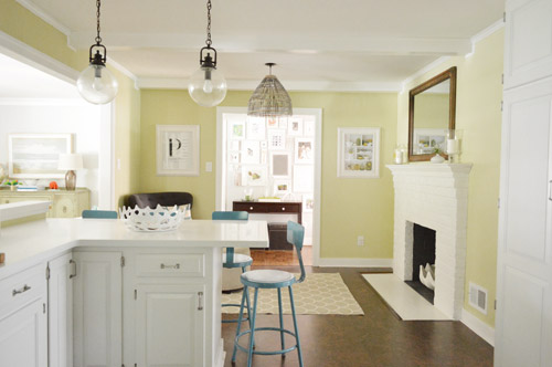
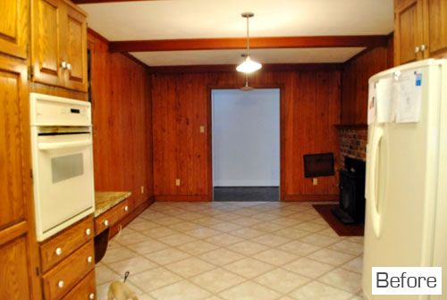
And of course it’s fun to compare what the room looked like when we bought the house:
As for what our new light looks like when it’s on, with a clear bulb it’s a party. Check out that awesome light streaming out of it. Of course if we went with a frosted eco bulb (like an LED or a CFL) we wouldn’t get those fun lines, but we’ll probably upgrade when we get to the store to check out our options. For now we just popped a clear bulb in there since we had it laying around from the old light in our hall bathroom that we replaced.
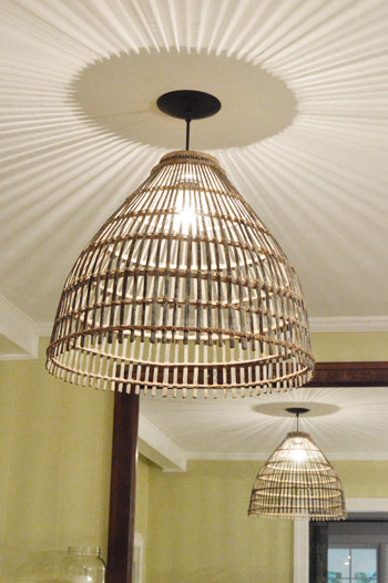
So that’s the story of our $35 basket light thanks to a $10 thrift store basket, two $3 hardware store parts, and an oil-rubbed bronze pendant from a local outlet for $19. Might be our favorite light we ever made. Well, I guess it’s tied with our clothespin chandelier and the office pendant. Have you guys been adapting/upgrading any lights lately? Or turning random things like a basket into a pendant? Or laying on the floor with the camera aimed at the ceiling to capture pics from below? Feels weird, right? Clara totally came up to me and laid right down beside me and said “what is we doing mommy?” Adorable.
Update #1: After hearing from a bunch of commenters that these baskets were actually used to catch fish in Asian and African villages, a reader named Elizabeth actually sent us a photo of them in action from a trip that she took to Northern Guinea where she attended a fishing festival.

How insanely fascinating is that?! Now the hole at the top makes sense. Apparently that’s how they reach in to get the fish once they trap it with the basket in shallow water.
UPDATE #2: We’ve finally transitioned our entire house to LED lights (they save tons of energy & money, and they’re a lazy person’s best friend because you never have to change them). For anyone wondering, these are our favorite interior LEDs. Their glow is warm & natural (not weird/blue like some of the others we’ve tried) and they use around 90% less energy.
* This post contains affiliate links

annabelvita says
OMG! I’ve been on the fence about the dark cork floors (but knew you’d noodle away at it till it worked) and also the mirror, but with this hit of dark and natural on the ceiling, it brings everything together SO WELL. Huzzah and hooray, the Petersiks have done it again!
YoungHouseLove says
Aw thanks! This basket was definitely was the missing link on that side of the room! Now I want to bring some more natural toned items up onto the floating shelves too!
xo,
s
Julie says
My sentiments exactly… except for the dark floors (always loved those). But there seemed to be something missing in that area and the mirror had me questioning the direction…and NOW? BAM! You nailed it. Keep on showing us the way :-)
Gabriella @ Our Life In Action says
How pretty! I love how the ceiling looks when the light is on. LOVE IT!
Jenn says
Shablam is right! That looks freakin awesome!!!
Emily says
Oh, I love it! I was just thinking that area needed something more than the tiny flush-mount fixture you had there (not that you asked). Great work.
Andrea Melberg Thompson says
Can you jog our memory… Hadn’t you searched for and then found and installed a drum light or shades light in here prior. New one looks great…. I thought you had posted some time ago about finding the “perfect” shade for it once before! Love the new one. I change things in my house all the time too. Perfect today, maybe a new perfect next year!
YoungHouseLove says
Yes, I mentioned that in this post! It was an inexpensive flush mount light from Ikea that we’re going to use in a hallway to replace a boob pendant. Everyone wins! Haha.
xo,
s
Emily says
It’s so cute, and it’s a totally new idea to me. Rock on! It’s amazing how far the kitchen has come.
heather s. says
Looks great! I was convinced you were going to use the basket as a light over the dining room table when you first showed it to us so I was surprised to see it in the kitchen but it works there as well.
YoungHouseLove says
Yeah I thought it would work there but it was a little small over that 70″ table so we invited it into the kitchen. Haha.
xo,
s
Katie says
I thought the same thing!! But since it didn’t work over the round dining table, Maybe John and Sherry can head back to Farmville and pick up the monkey chandelier and really get the party started!!
YoungHouseLove says
Haha, monkey light, here we come!
xo,
s
Allyn says
Blue Steel makes everything better.
Betty says
nice work – side comment, every time I see the open space from what you’ve done, I can’t imagine all those years of people living with the wall between the kitchen and dining area – how closed up that felt – the opening was such a natural thing to do
YoungHouseLove says
I know, right?! I keep meaning to invite the realtor who sold us this house over just to show her how much more open it is now! I think once we finish and furnish the deck I’ll do it! I’d love to hear what she thinks our house could sell for now. Not that we’re going anywhere! Haha.
xo,
s
Melissa Sharp says
Not only that wall, but remember all those accordion doors the former owners had in every doorway? Yikes!
Reenie says
Love it.
“what is we doing mommy?” VERY Adorable!!!
Natalie says
Lurv it! The natural”ness” is perfect!!!!
Melanie M. says
That is such a great idea! Question: does John have to duck to walk under it? My husband is 6’9″ and I can’t do any hanging light fixtures that aren’t over a counter or table. It’s very limiting!! But I guess I still love him :).
Thanks! Love your blog!
YoungHouseLove says
Thankfully it’s almost 7 feet from the ground, so my 6′ hubby can easily walk under it! That’s his rule. Nothing he has to duck under :)
xo,
s
Chrissie says
That’s a good rule! Because there’s always that one time you forget to duck…
YoungHouseLove says
Oh yeah! He hit his head on the office chandelier a million times before we raised it and sprayed it and added a shade. Thankfully no more head-hits are going on!
xo
s
Lilly says
That looks hot. Really nice touch in the kitchen. Love the whole nook.
Callie says
loooove it!! Gorgeous! The woven natural look is such a perfect contrast with the more shiny elements of your new kitchen…amazing job! Haha and Clara is hilarious. Starting young ;)
Vidya @ Whats Ur Home Story says
WOW! Totally speechless. Love the shadows it casts on the ceiling and the reflection in the mirror.
Lowes sells pendant light kits for $15.99 in various finishes. I used them to turn my World Market capiz fixture into pendants.
http://whatsurhomestory.com/capiz-love/
You guys have such an eye for things like this. Aren’t such thrift stores great? We were in your neck of the woods this weekend while coming back from Va beach. Went to this great store Home Emporium (thanks to Kim from Sand & Sisal for blogging about it) and found an oversize wine bottle like the one PB sells but for a fraction of the price! If you haven’t been to that store you should definitely give it a try.
http://whatsurhomestory.com/fun-in-the-sun/
YoungHouseLove says
Love the links! Off to check them out!
xo,
s
Marge says
The Lowe’s kit works like a charm. I used a different one (in the second to last photo here) but the price was the same as Vidya’s. My only complaint is that the cord hasn’t completely straightened out after a few weeks–but I think I’m going to survive since the price was right (the Goodwill pendant rang in at $5).
YoungHouseLove says
That’s great to know guys! Thanks!
xo,
s
Christine says
Oh my goodness! That is so cute and it looks amazing with the mirror! You guys have the swankiest kitchen I’ve ever seen!
Lilly says
U should put ur little hive vases back on the mantle for a little pop of color to balance out with the rest of the kitchen colors.
YoungHouseLove says
Oh yes, things move around a lot, so that mantel will probably look different every week!
xo,
s
Morgen says
That is too cool. It’s so much fun wandering hardware stores looking for things to make your project work, that aren’t made to be used in the new creative way… did that make sense? Great job!
Kristen | Popcorn on the Stove says
Looks good! What a clever project :)
PS – Love the part about Clara at the end. so cute!
bridget b. says
love it! what a transformation that space has been through with just a few swaps. really nice!
Erin @ His & Hers says
That basket looks like it was made to be a pendant shade. Seriously. Love how the ceiling looks with the light on!
Mrs Patty says
A…maz…ing! That little sitting area is really shaping up nicely!
Emily says
This is so great you guys. Well done!!
Jessica says
I think that the light is AWESOME! I love it. It looks BEAUTIFUL there. I honestly thought the basket was going to end up as a light over the dining room table. Did you think of putting it there? You do have to be sure that whatever you use over the dining room table now doesn’t compete with that light. Cause it’s awesome.
YoungHouseLove says
That was originally where we thought it should go but we held it up and it looked so dinky (that table seats 8 and is 7′ wide so it’s giant). That’s when the idea to bring it into the kitchen came up. Haha.
xo,
s
Kate says
I adore it! When you first mentioned turning the basket into a light, I thought for sure it would live over the dining table. But I love where it ended up! and I like the idea of adding some natural tones to the open shelves. I love watching spaces evolve.
The Mrs @ Success Along the Weigh says
Ahh! I love it and I love the pattern it casts on the ceiling! Very cool.
Kyle says
Looks great! I love it too.
Oh, and hahaha, when you said you love the reflection in the mirror from the guest room, I thought you literally meant you could somehow see it FROM the guestroom and I was racking my brain trying to figure out how many mirrors would have to be in the hallways for you to see around those corners, or if I’d completely misunderstood your floor plan…I guess the new mirror is such a great fit there I forgot it hadn’t always been there! (or, you know, it’s Monday morning…)
YoungHouseLove says
Hahahahahh, that’s hilarious. I totally see how you could read it that way.
xo,
s
Michelle says
I thought the same thing. . . ha ha! Love the light. . it looks great!
Ashlee says
I thought the same thing too!
Stephanie says
That looks soooo great. I half expected you guys to spray paint it. I LOVE it in that spot in the natural finish. Brings that part of the room together really well.
Zuzanna says
I love how this corner is looking right now! It looks so polished and magazine-like. How long do you think you will stick with it? ;)
YoungHouseLove says
Haha, for a nice long time I hope! It’s nice to replace that just for now mirror and chair, and then it spawned the light switch. Feels nice and cozy now instead of mostly accidental – haha!
xo,
s
Lindsay says
Looks awesome!
Ashley says
You guys continue to amaze me with how you weave and layer pieces in, giving your home a collected and sentimental look! I can’t wait to see your book.
And “what is we doing mommy?” makes my ovaries ache from the cuteness.
Crystal says
Wow! That looks great. The basket light along with the wood framed mirror add some nice natural and textural touches which keeps the room from looking to cold.
Alyson says
Looks great! Where are the ORB Pendants over the counter top from?
YoungHouseLove says
Those are from the same local outlet where we got the light kit for the pendant. It’s called The Decorating Outlet here in Richmond.
xo,
s
Nancy says
What a difference from the before picture and now. So light and bright! Love it.
Ann L. says
This looks awesome. With the oldish mirror, the basket light and the new chair, this space is shaping up to be my favorite area of your house. I love the eclectic vibe, compared to the brand-spankin-newnewss of the rest of the kitchen.
One question — did you do something to that basket, like trim it? In the picture of you holding it in the parking lot, it looks like there’s a thicker piece at the bottom that you either took off, or cut the basket a little shorter to work as your light.
YoungHouseLove says
I didn’t have to alter the basket at all, so it’s exactly the same with the same number of rungs and overhanging wicker and all that. I was nervous to cut it and thankfully it worked really well as-is! I think it might just be the lighting/background and the way I’m holding it that makes it look different in that shot, but in some of the closer pics you can see it’s the same. Hope it helps!
xo,
s
heyruthie says
“What is we doing Mommy?”….We is being adorable, Clara!
[email protected] says
What a great find! Most baskets turned lights look like
“baskets turned lights”. I like it better than that pricey version you saw too!
Oh and that before and after…..What a transformation!
Amanda @ Our Humble A{Bowe}d says
Love the basket light. Such a nice texture you’ve added.
I made a light from wood veneer edging a loooong time ago: http://ourhumbleabowedblog.com/2011/03/24/chunky-wood-moooi-random/ it casts similar shadows, too: http://ourhumbleabowedblog.com/2011/03/31/shadow-casting/
YoungHouseLove says
So cool! Love it!
xo,
s
lydia k. says
I just coveted this one on One Kings Lane this morning for $449– https://www.onekingslane.com/product/15461/581489. Yours is so much better. You never cease to inspire!
YoungHouseLove says
Aw thanks Lydia! That one is gorgeous too!
xo,
s
Karen says
If I worked from home I’m pretty sure I’d live in my pj’s. Kudos to you for not only getting dressed but also sporting some pretty snazzy earrings!
YoungHouseLove says
Haha thanks Karen! That’s totally a “let’s make a video of this” – “Ok, I’ll brush my hair and put on earrings so I look like a real person” thing!
xo,
s
laura says
LOVE IT!! I really love the added texture it brings to the space and with the new basket light and the new mirror it gives it a more eclectic look…which I LOVE. :) Good work.
Kathy PH in LH says
“what is we doing mommy” … kill.me.now! just.too.cute!!
And I was totally bowled over by the new fixture … until Clara’s comment! Oh my …
Cady says
Shut up! I love it. Your basket light looks fantastic and goes so nicely with the mirror too! I’m dreaming of something nicer for our kitchen. We have a very ugly flourescent light fixture and are limited with options. This is such fun inspiration for something new and prettier.
Jessie says
nice job, ya’ll!
Man, you two sure know how to think outside the box!!! Inspiration to us all!
kudos!
Lindsey @ arkadian belle woods says
Love it! I really love the shadows on the ceiling when it is lit up!
Jill says
I appreciate the Monday morning “Shablam” Sherry…I really do. Love the pendant!
Liz E. says
You guys never fail to amaze me! Just when I think your awesome kitchen is complete: *poof* Ikea light. *Poof* new chair. *Poof* new mirror. *Poof* new light. Every little change is even more amazing than before. Can’t wait to see the next decorating inspiration!
selena says
Wow, it looks great. I love the sunburst the bulb creates on the ceiling.
The before/after pictures make me laugh. Then I begin feeling kind of bad for the previous owners and wonder if they follow your blog and are super-sad they sold :(
Sherry, this is off the subject but I must say the color of your shirt is absolutely beautiful on you. You always look great but you could be a model in this shot. Keep up the great and inspiring work, YHL!
YoungHouseLove says
Aw thanks Selena! You’re so sweet. I’m trying to break out of the black shirt box, so sometimes I get crazy with a colorful tank top. Haha. I’m a rebel.
xo,
s
Sheryn says
I love that the mixture of elements allows for the basket light to NOT look too beachy. I’m a Florida girl and can get a bit queasy from wicker overdose, hahaha.
Laurel says
Love the sophistication that it brings to the room! I see what you mean about perhaps wanting to paint the kitchen walls…they are so young, fresh, and crisp, but your recent accessories are leaning toward refined, moody, and dramatic. Can’t wait to see what you decide!
YoungHouseLove says
Yeah, in person we LOVE the wall color, but our main gripe is that it photographs so differently – so as bloggers it can be so frustrating. Haha. If we didn’t blog we would totally keep it, but we’re not sure it’s worth all the photo adjusting to attempt to make it true to life since it photographs so weirdly!
xo,
s
Crystal @ 29 Rue House says
Your wall color doesn’t seem as bright in these pictures – is it more what it looks like in real life? I love it either way, I just always wonder if I’m seeing it how I’m suppose since you mention it photographs weird?
YoungHouseLove says
In real life it’s very subtle and soft, but not as yellow as these pics I don’t think.
xo,
s
Christine says
If you say it looks great in real life, I believe you! Don’t go changin’ just for my/our little eyes. File it under the “keeping it real” category. I swear there’s an article for a blogging trade journal/blog here— if it looks good, but not on the blog, do we change it?
YoungHouseLove says
Haha it’s true!
xo,
s