Remember when I shared our possessed painting that jumped off the wall cheap painting that we got for $20 at a yard sale…
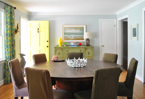
… and mentioned that we:
- mostly liked the size of it and the chunky frame (which actually came with a little dent in it – a total sign that this guy was a trouble-maker)
- weren’t in love with the art itself (it just felt sort of generic and hotel-ish in person)
Yes? Me too.
And then remember when a bunch of you (seriously, like at least a dozen of you guys) recommended that we do some sort of letter stenciling over it like this genius creation by Emily Von Henderson or this masterpiece by A Beautiful Mess (psst – you can check out other awesome painting-words-over-things art projects here, here, and here).
Yes? Me too.
Well… we were sold. And the deed is DONE!
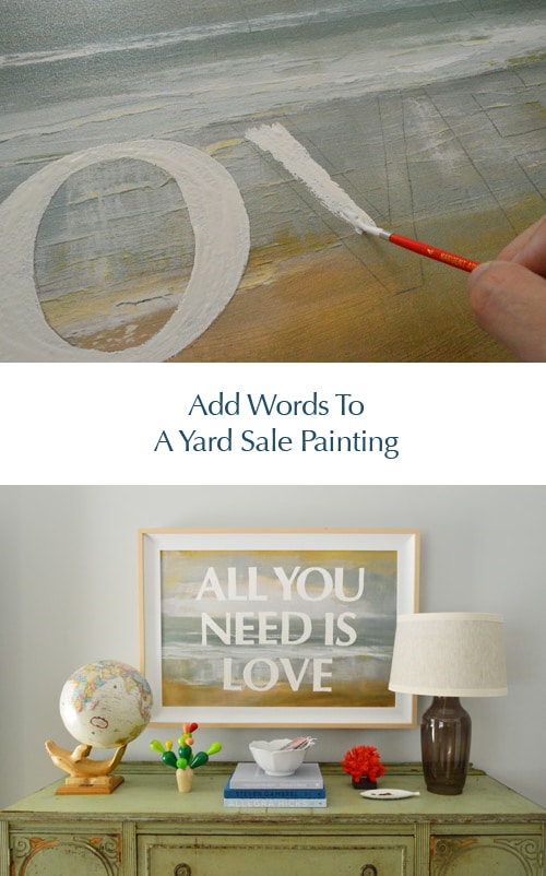
We debated just leaving the letters unpainted and covering the rest of the canvas with white paint, but actually liked the idea of white letters with the painting as the background. And it was actually really simple. Seriously, the hardest thing was deciding what we wanted our dining room wall to be saying to us every day. But we finally landed on an oldie but a goodie: All You Need Is Love. Ain’t that the truth? It somehow has:
- an ode to one of my favorite bands (my dad and I know nearly every word to every album & even watch old Beatles movies together)
- part of our blog name (same last name, haha)
- a positive general message (it’s not a bad reminder for any of us)
- a classic feeling that we hope is timeless (it shouldn’t feel “so last year” like Lady Gaga’s meat dress or The Bieb’s old haircut)
So for all of the above reasons, we went for it. The next step was faking this baby in photoshop first, just to help us picture it. Here’s a quick photoshop rendering that I threw together to see what we liked:
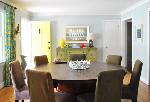
I definitely don’t think you need photoshop to visualize this though. We just had it on hand, but if you don’t I think a free program like gimp could work equally well just for laying type over a basic image and seeing what fries your bacon. Aaaand we’re back to meat.
Anyway, we realized that we wanted each letter to be about 5″ tall and the typeface we preferred was Optima Bold (with a point size of 507 which got it to be exactly 5″ tall). How did we know we needed the letters to be 5″ tall? I just noticed in the rendering above that the stripe of green in the middle of the painting was about the height of those letters on top of it. So I walked over to the painting, asked it not to jump off the wall on me, and very gingerly measured that green stripe. Five inches tall = the answer.
Then I printed each letter out in a very light grayscale ink (to save money/ink) on card stock (only one letter fit on each page, but I saved all my leftover cuttings for Clara-projects so it wasn’t too bad) and I was left with this:
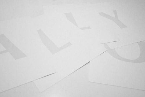
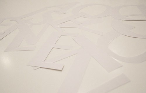
After I cut them each out carefully with a scissors (and an x-acto knife when they had interior sections to cut like the O and the D), they looked like this:
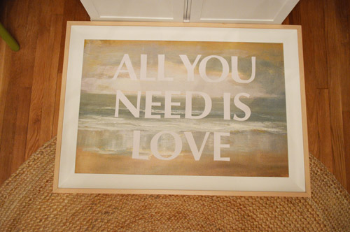
Then I placed them all on my painting so I could figure out the spacing…
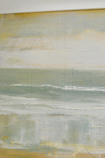
… and used a light pencil line traced around each one directly onto the painted canvas.
That way when I lifted them off it was literally just a good old fashioned game of fill-in-the-lines, which I did with white acrylic paint and a small craft brush.
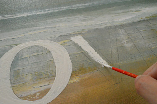
It only took one coat, and that’s all she wrote.
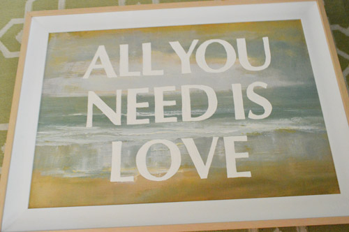
The result = something that feels modern but still has those soft tones and texture behind it. It really is a fun way to update a piece that kinda feels hotel-ish and mass produced. All of a sudden it’s all yours (picking what it says, and even choosing things like the size, the color, and the typeface suddenly makes you feel like it’s sweet and personal).
Oh and I had originally planned to paint the frame white but the wood tones in the frame tie into the exact warm oak-y color of the buffet where the paint is chipping off, so there’s something kind of sweet about leaving him naked. And John was on the No-Paint Frame Train (choo choo) so he further convinced me to leave it be for now. I’m actually loving it as-is.
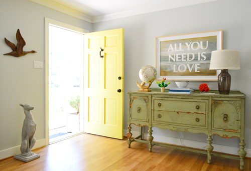
As for the cost, this update was free (since we just used what we had on hand like existing printer ink, white acrylic paint, and card stock from our stash) and the actual project total was $20 if you include the loot we doled out at that yard sale for the art itself. Not bad for a personalized painting that’s over three feet wide, right? Now let’s just hope this guy doesn’t dive off the wall again anytime soon. I like to think he did that out of boredom but now that he’s more entertained by his outfit it’ll be cool from now on.
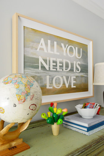
This really was an easy, cheap, and satisfying project. So if you have an old canvas, print, photo, or poster that you’re feeling meh about (or you find something ok-but-not-amazing at a thrift store) a $2 tube of white acrylic paint, a small paint brush, and a printer might be all you need to fall in love with the guy. Oh yeah and a scissors. You need those too. And you need a sentence that you like enough to stare at for a while. But that’s the fun part!
What did you guys do this weekend? Is anyone else painting over art? Were you all out yard sale-ing? It rained for about 70% of our weekend, so I totally want a do-over. Who’s with me?
Psst- Wanna know where we got something in our house or what paint color we used? Just click on this button:


Jen @ Four Marrs & One Venus says
Get out! I love this! Oh my goodness it looks spectacular in the room- such a great focal point! WOW!!
Thank you for sharing, Jen
Franny says
L-O-V-E it!
brandi says
Love this! You guys are so creative.
Lisa says
I LOVE that!!! One of my favorite things you’ve done, I think. So fun.
YoungHouseLove says
Aw thanks Lisa!
xo,
s
Christine Witt (Brush Dance) says
I love this idea! I have just the picture waiting for this kind of treatment, too!
Leah says
I picked up some fused glass art projects this weekend. It was a lot of fun to make them! I just look for glass studios coupons on groupon/other sites and try it out.
I really love your artwork. I’ve been oogling craft paint for various projects, but we live in a pretty small space. I think my husband would like me to finish up other craft projects before starting new ones :-)
Tracy a says
Love it!
Meghan says
I LOVE IT! Why have I never thought of that?!? I recently made a huge piece of wall art out of $6 wainscoting and stenciled on the words “Sitting on the dock of the bay”. I am totally trying this though!
http://createwithcents.wordpress.com/2012/08/07/making-your-own-wall-art-part-1/
YoungHouseLove says
So cute! Love all the links you guys shared of fun art projects (and beyond!).
xo,
s
mp says
My mom gave me a lecture once when this song came on the radio (I even remember where we were — on Riverside Drive near the apartment tower): she said it made her angry because love was NOT all you needed to make a marriage and life work. It completely ruined the song for me, including the otherwise-neat scene of the group singalong in Michael.
YoungHouseLove says
Haha, that’s such a funny and specific memory! It’s like when my dad once tried to explain what that song Oh What A Night was about (awkaaaaard!).
xo,
s
Katie says
I’m loving this idea!! We’re going to be moving our 2 year old daughter out of the nursery and into her big girl room soon (sniffle sniffle) and I have some old posters that could totally work for a project like this! I’m thinking a cute kid-friendly saying (Dr. Seuss maybe??) and some bold colors could be way cute :) Thanks for getting my creative juices flowing!
P.S. I got sucked into the A Beautiful Mess blog…how adorable are Elsie and her hubby? Thier wedding video was precious :)
Amy @ PaintWineRepeat says
This is fantastic!! Great update for free :)
Ami says
I love the painted words on top of the painting. Its very you. I mean that in a good way. lol
But I actually have a question about the little cactus puzzle I see in the foreground on the left side. Where did you get it? I JUST saw another friend posting about one of those on her blog – her kids were playing w/ it at the Phoenix Children’s Museum and loved it and she wants to get one for them to have at home. Also I think its adorable and I kinda want one now. lol I think my son would have a blast.
YoungHouseLove says
It’s made by Plan Toys so if you can’t find them locally somewhere they can be ordered from sites like Amazon.
-John
Tracye says
That picture looks one thousand times better! Thanks for sharing!
Dinah says
What a great idea!!!! I’m totally going to do this!!! Super easy and affordable. And do customizable!!
Yalanda says
I love the green cabinet that you hung the painting over! Did you paint it?
YoungHouseLove says
Nope! It actually came that way from craiglist.
-John
Karah @ thespacebetweenblog says
So perfect! Word art is one of my favorite things and this is just an awesome way to incorporate it. And two cheers for Free!! :)
lee says
Sherrie just wondering if your painting’s signed…read recently about paintings worth millions bought in junk stores.
YoungHouseLove says
Nope, it’s just one of those canvases that has been fake-painted (it’s bumpy and the design is applied on top – like a mass printing). Hope it helps!
xo,
s
LuLu says
That is one of my all-time favourite things you have done. How crazy simple yet stunning!!!
Also I have to tell you this story: I was out at Pier1 the other day and I saw they had these crazy, wavy doilies. I immediately thought “Oh Sherri just bought a doily stretcher.” It was like you were my best friend the way my brain was working. How hilarious is it that you’ve crept into my everyday life!
You guys are fabulous.
LuLu
xox
YoungHouseLove says
Haha, so funny!
xo,
s
Heather says
Off the subject of the post, but where did you get the great round table???? We have been looking for one that seats 8 and does not extend to an oval FOREVER! BTW – love your projects. We are in a 1940 brick cottage and are pouring in love and a lot of color. That, and raising 3 and 5 year old boys. Love seeing others make their houses homes!
YoungHouseLove says
That was from a local furniture outlet here in Richmond called The Dump. Hope it helps!
xo,
s
Olivia says
“Aaaand we’re back to meat.” Made me laugh out loud! :)
tami says
that came out great! i must ask… what is that cute wooden cactus looking thing? i love it!
YoungHouseLove says
That’s Clara’s! It’s a wooden cactus by Plan Toys. Love that thing!
xo,
s
RLB says
I’ve gotta be honest — it looks trendy and cheap.
YoungHouseLove says
No worries! After five years of blogging, we’ve learned that art is definitely one of the most subjective things out there. So what we love on our walls definitely isn’t something everyone else would put on theirs. But that’s actually pretty sweet since we’ll never all be in danger of living in clone houses :)
xo,
s
RLB says
I appreciate you not being upset with my subjective rant.
Cecily B says
Very cool idea! Maybe now it’ll love you enough to stay put on the wall!
Debbie @ Pink Texas Chick says
Yep, I must say it looks much better and I didn’t think it looked bad before but the after says so much! Pun intended. haha. Looks great and I love that it is a simple yet powerful message. :)
michelle morris says
What a great idea! I want to go thrift shopping right now and find a “hotel room”-y print to update! So fun!
Steph S. says
Looks amazing! My husband would love this. He’s such a Beatles fan. Really cool how you guys incorporate meaningful/sentimental nods into your style. Just found your blog and I’m having so much fun reading through everything. So much inspiration here! Amazing :)
YoungHouseLove says
Aw thanks Steph!
xo,
s
amy c says
great project! love the saying. it is a nice reminder about what is important.
Angie says
I love how you did this! I’ve been waiting to do something like this, but keep procrastinating. This is the exact phrase I want to put in our bedroom. We’re putting together a romantic vibe in there, but with music since the hubs is a musician.
Aleasha says
Looks like your $20 buy was quite the steal! Looks what’s on Joss & Main for almost 16x what you paid!
https://www.jossandmain.com/Zodiac-Shoreline-Framed-Wall-Art~HKH1037~E1886.html
YoungHouseLove says
A few others mentioned that. How crazy is that?! I totally thought it was an old painting when we saw it at the yard sale!
xo,
s
Judy R says
I think you could sell that on Etsy!
Emily says
Love it! what a great idea to transform art!
Brandi from Bloomington says
I love the new placement of the whale globe.
suzanne riviere says
just following these basic steps you given us with the art project can lead to all kinds of ideas to vary on the lettering with mixed typography and colors. what a great way to reinvent an art piece.
Marian says
Best. Idea. Ever. At least for old hotel art. I am so going to be trying this one. I have been buying frames for the frame. Now I have something cool to do with all the weird stuff that comes with them. Some will definately be getting the “cover everything but the letters” treatment. But waste not, want not, right?
Jay says
Did you really print out multiples of the same letter (‘L’, ‘O’, ‘E’) instead of just reuing the singles (the one photo shows what looks to be 2 ‘L’s). Not a big deal, but you made a point of stating that you used greyscale print to save ink. Also, why not just use the ‘outline’ print option to save even more ink?
YoungHouseLove says
Oh yes, I intentionally did that because I wanted to lay it all out and see the spacing from above. Spacing them out on the art without all the letters would have been tougher. The outline print option is a great tip though! I didn’t think of that. Haha.
xo,
s
Jasanna says
That looks fabulous. :) I’m going to try this sometime. Only I have a blank canvas. So I want to create the background, then do the letters too…I’m contemplating using bubble wrap dipped in paint, then lightly tapped on the canvas for the background. :)
Karen says
How did you get the cut-out letters to stay exactly where you placed them while tracing? Very cool project and love the connection to the how much the print is selling for!
YoungHouseLove says
I just went one at a time and removed the ones I had traced as I went. I didn’t make any sudden movements or sneeze (haha) so they all seemed to stay in place!
xo,
s
Trude says
I love how it turned out! You can’t go wrong with the Beatles. :)
Sam says
Love it!
Maureen says
Love.It.
Londen@sixtyfifthavenue says
Perfect way to dress up that old painting, I LOVE it!
Kal says
LOVE this!! So simple, but so cute. I love how it ties in with the globe now too :)
ashlee says
we have this print in our little girl’s room
http://pinterest.com/pin/231935449529095603/
April Shaikh says
Hi John & Sherry!
I was looking through Joss & Main this morning and saw this:
https://www.jossandmain.com/Zodiac-Shoreline-Framed-Wall-Art~HKH1037~E1886.html
Crazy!
YoungHouseLove says
Isn’t that crazy?! Some other folks linked to it too and we can’t believe it even has the same (or an extremely similar) frame!
xo,
s
Discogal says
The cutest thing about this post is Clara’s little head popping up over the side of the table. But seriously, I really love this idea! I purchased a garage sale painting for $10, years ago and got it framed, but I’m officially tired of it. This would be a great change to it!
Thanks for your originality!
Keri says
The irony here is that not only do we have a burger look-a-like living in our house, but we did the same thing with an old canvas (except ours says ‘Love is all you need”). Love that we have similar tastes and that ya’ll have inspired many of our projects, including the recent painting of our kitchen island.
YoungHouseLove says
That’s awesome! I love it.
xo,
s
Anna says
The exact same painting is for sale at Joss and Main for $320, it’s in the Zodiac event… crazy!
YoungHouseLove says
Isn’t that crazy!? We can’t get over it. Even the frame looks the same! We thought it was a really old thing when we found it at the yard sale! Haha.
xo,
s
Anna says
Oh haha just saw the last comment! nevermind, but congrats on saving $300!
YoungHouseLove says
No worries! Still can’t believe it. I keep wondering if that one is signed or somehow worth more. Haha.
xo,
s
Deanna says
Kinda love how you snuck a baconism in there :) How very Katie Bower of you :) The painting looks great!!!
Marlayna says
Did you guys know that Joss and Main is selling your $5 art for $319 under the zodiac Collection?! That’s crazytown!!!
YoungHouseLove says
We keep hearing that and it’s so funny because we were sure that art was old when we saw it at the yard sale! We can’t believe that even the frame is the same (at least it looks super similar).
xo,
s