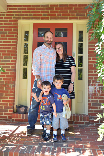
We can’t wait to share this house crashing adventure because you’ve actually seen how Lesley & Jeff live…. but that was over 4.5 years ago (before they had two sweet little boys and moved into a new home for their growing family). It’s actually a mid-century split level house in a charming woodsy neighborhood right here in Richmond, and of course Lesley and Jeff have completely made it their own.
But first, just to refresh your memory, here’s their first house – which we crashed all the way back in 2008!
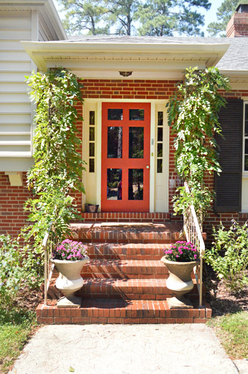
But back to their new place. You guys might remember that Lesley is a master of making ugly things into assets. For example, she didn’t like the dated iron columns full of swirls and zig-zags on her new front porch… so they trained some vines to grow around them and cover them. So charming right? No more swirly iron posts. And it was a lot more cost effective than demoing them out and redoing the porch (although they’re open to tackling that down the line).
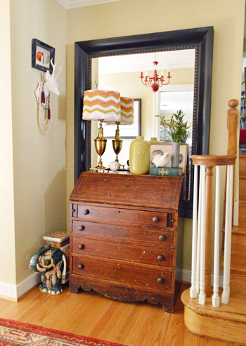
One of our favorite things about Lesley’s stye is how she mixes things. And not just anything, meaningful things. See the red chandelier in the mirror of her entryway? That was actually something she spray painted red years ago for her wedding. She and Jeff danced under that in their reception tent and now it graces their hallway. And lots of their furniture is secondhand (hooray for worn and loved pieces made from solid wood!).
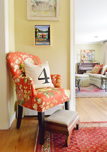
Here’s another corner of their entryway, complete with a pillow with a meaningful number and upholstery fabric that she chose to give the old seen-better-days chair a fresh look.
The family room was one of my favorites in the house. Why? Because it’s paneling, people! But they decided to embrace it. It wasn’t that flimsy faux paneling, it was thick solid wood and Lesley called it “embracing her inner Golden Girl.” How hilarious is she? So instead of drywalling over it or even painting it, she and Jeff added a few other retro touches (like that awesome old laundry sign that Lesley got from a local cleaners that was going out of business – she just asked for it and they gave it to her). Lesley is a master at effortlessly mixing and matching textiles (check out the layered patterns of those pillows, the rug, and those ottomans) to create a cozy and welcoming vibe. It was definitely one of those rooms that draws you in where everyone ends up. And see that pair of wing chairs? Lesley got them for $50 each on craigslist and didn’t even have to recover them (they had been covered with protective plastic for decades since they were bought!).
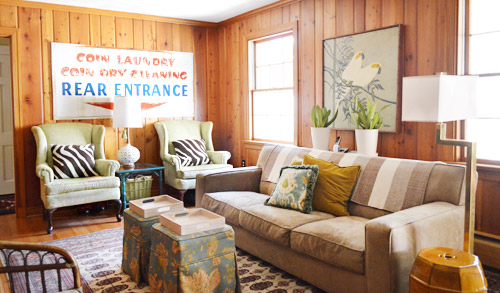
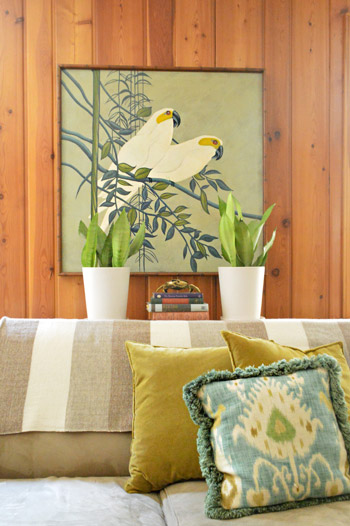
How awesome is this framed secondhand art that Lesley scored on sale for $50? Oh and the throw over the sofa is from her friend’s etsy store.
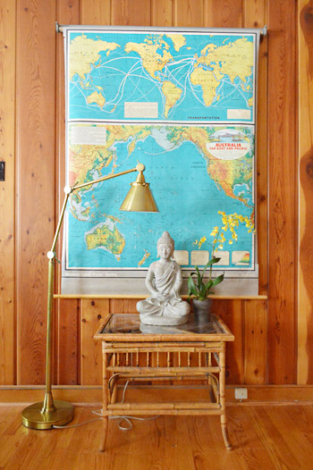
You know what John went wild for, right? This map. Lesley got it on ebay. I think the bright teal color looks awesome against the paneling with that chic gold lamp layered in.
Here’s the kitchen, complete with dark stone floors (the tile is just simple durable tile store stuff, but Lesley upped the ante by laying it in a herringbone pattern), dark painted beadboard for the backsplash that they DIYed themselves for under $40, creamy white cabinets, and dark hardware that ties into the dark floors and counters.
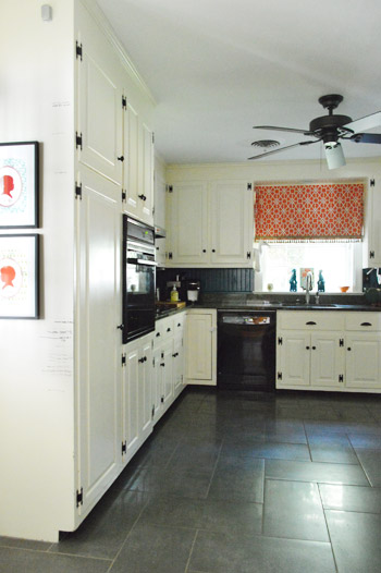
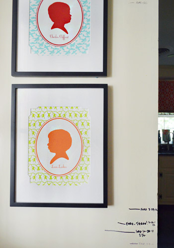
They also have a wall where they measure the kiddos and have bright silhouettes of each of them. You know we’re suckers for those personalized details.
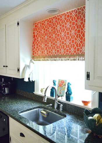
Lesley also made the curtain from happy and bright fabric with some fringe on the bottom. And check out that crane to the left of the curtain that Lesley rests her dishtowel on. Yup, I was certifiably crazy about it. And the aqua foo dogs.
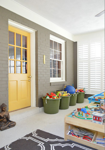
There’s an awesome sunroom off the back of the house that Lesley and Jeff converted into a playroom. They added functional toy baskets, a big train table, some rich color on the brick (Woodcliff Lake by Benjamin Moore) and the door (Goldsmith by Benjamin Moore) along with some beautiful and architectural custom window shutters. As you might guess, Clara made a beeline for that room and basically never left.
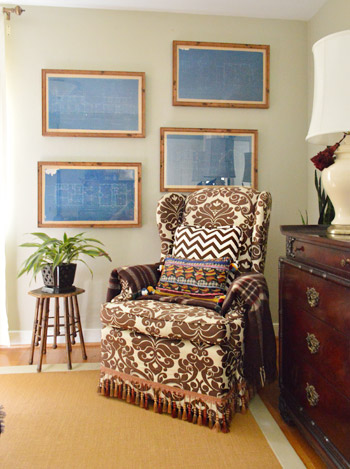
Upstairs in the bedroom is more patterned fabric, and touches of wood. And how great are those framed blueprints (from West Elm a while back)? I love how Lesley hung them in a fun offset way.
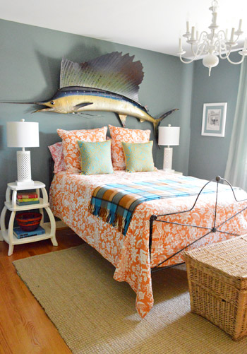
This is the guest room, complete with dusty grey blue walls, orange patterned bedding (from Pottery Barn), and a giant thrift store sailfish over the bed. And how awesome are those sculptural side tables (from PB Teen) and the textured white table lamps (from HomeGoods). It’s awesome how Lesley tempers her bold colors and accents with crisp white or rich wood to keep rooms from being too chaotic – even with a big ol’ fish on the wall.
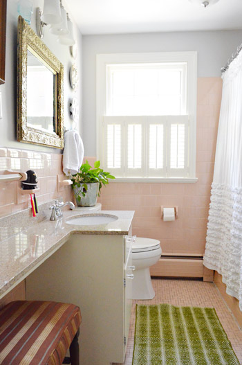
One of our favorite things about Lesley is her work-with-whatcha-got spirit. She actually embraced her pink tiled bathroom to the point that it feels totally like her. Isn’t the ornate thrift store mirror, the bright green rug from Target, and the blue-gray wall color (Metro Gray by Benjamin Moore) mixed with the ruffled curtain (from Anthropologie, but found on craigslist) so sophisticated and fun? I love how it doesn’t look too “serious” or “over designed” – it’s just easy and everything goes without being matchy-matchy. So I was so excited to share this picture for anyone else out there with a pink bathroom.
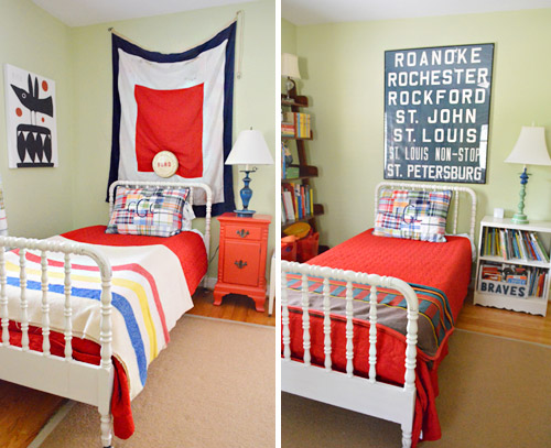
Her sons love sharing a room, and we loved how their beds were the same color/style (found on the cheap thanks to craigslist) but that the bedding was slightly different along with what was hanging over each bed (they were both secondhand finds – the flag was found locally and the old bus scroll was from ebay). We think it’s really cool to personalize each corner so things aren’t cloned but still tie together really well.
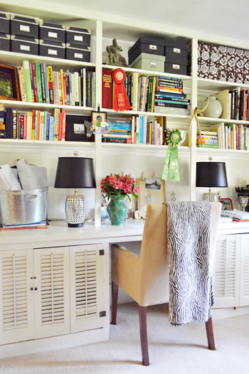
And this is Lesley’s office down in the basement. I loved everything from the black storage boxes and table lamps (those are HomeGoods lights for 30 bucks a pop) to the casual stacks of books going in all directions. Even with the blanket draped over the chair and the flowers in the vase, it definitely didn’t feel crazy-styled thanks to those random ribbons on the shelves and all of those colorful stacks of books just shoved in there. There’s something very easy-yet-chic about Lesley’s house. Like she’s not trying too hard but it still looks awesome, cozy, and personal.
So we’re sending out a huge thanks to Lesley, Jeff, and her two sweet boys for having us over so we could share all the photos with you guys! Hope you got some inspiration from things like the pink tiled bathroom and that paneled family room! Let’s play the whats-your-favorite-part game. Mine is the smart vine trick they pulled on the porch to hide those columns and the boys’ room with those matching but not too-matchy craigslist beds. And of course John loves the framed blueprints and that awesome teal map. No surprises there.
Psst- Don’t wanna stop snooping around? You can check out dozens of House Crashing adventures right here.

Ade@fortheloveofpainting says
Love this…awesome design, but a house that I could live in! Hope the tour is going well…I would come see you if you were in Sacramento!
YoungHouseLove says
We’d love to end up there!
xo
s
Jess @ Little House. Big Heart. says
I how eclectic and quirky this home is! It doesn’t stick to one style or another… it just is what it is, what the family loves.
It’s amazing how well she’s made crazy wall treatments work for her! I’ve never seen (unpainted) paneling that I actually liked before!
PS. The engineering nerd in me LOVES those blueprints. Loves loves. I see my DIYing some in the near future.
Sarah | The Accidental Okie says
Wow. She is my. new. hero. I would have walked through that empty house with a demolition list, but she made it all work! Maybe she can come to my house and tell me what to do with my ugly counter tops and loathsome carpet. I hope a giant fish is involved.
YoungHouseLove says
Haha, hilarious! Put a fish on it.
xo
s
Rebecca @This Nest is Best says
I am totally crushing on Leslie’s office! YUM!
It was so great meeting you both in Chicago! You guys were totally not dorky at all, but I definitely feel like I embarrassed myself! Read my re-cap here: http://tinyurl.com/bdtnvfj‘
Rebecca
YoungHouseLove says
Ahhhhhh! It was so great to meet you! Of course I remember your blog – such a cute name! Hahah.
xo
s
Katy @ The Non-Consumer Advocate says
I too love the vintage map. They remind me of the roller binds I made from vintage classroom maps for my sons’ rooms.
I bought them for a song a few years ago and how wish I’d bought a couple extra.
http://thenonconsumeradvocate.com/2011/05/my-sons-roller-blinds-are-famous/
Great house, I really like how she mixes old with new.
Katy
YoungHouseLove says
Ahhhhhh- amazing!
Love. Love. Love.
xo
s
Megan @ Rappsody in Rooms says
Wow! I really admire her for her unique taste and using what she has. I love that her home is not the exact same room/style that you see in magazines all the time. It makes you feel okay about expressing your own unique style!
Cara says
The rugs! I love the rugs! Oh wait… I love everything!
Michelle | Letters from Boston says
Love love love the mirror over the bathroom sink. Such a nice touch!!
Lisa says
My favorite house crash yet! Thanks!
YoungHouseLove says
Yay! So happy to share it with you guys. Lesley and her family couldn’t be nicer people and she inspires me to fill my house with stuff we love :)
xo
s
Samantha says
This makes me so happy. My hubby and I have recently decided to embrace the quirk in our own house. Trying to conform to design rules was making us nuts. We’d rather have our house be a happy place where we love everything in it.
Robin @ our semi organic life says
Love the office! My favorite room. Those black storage boxes really make it. How inspiring!
April says
I love that I can relate to this house so well because I too have a real wood paneled room and a pink bathroom that are here for the long haul. And it’s extra funny too because I have maps and globes all in my wood paneled room!
I got one of those huge street level maps of Columbia, SC from a trucking terminal (fo’ FREEE) on Craigslist and everyone loves to stand there and find their street on it, so it’s a great interactive piece in the room!
One thing I’ve been struggling with is carpet color in that room. It needs replacing badly but I can’t decide where to go. Any comments from the crowd? The color of the paneling is the exact same as Jeff and Lesley’s.
YoungHouseLove says
Ooh the street level map of SC sounds awesome. I love that it’s interactive. Anyone have carpet ideas for April? Maybe Lesley can add her ideas!
xo
s
Mallory @ R. Simple Life says
Go light! With the wood panels, light will brighten things up. At least I think so ;)
Nikki says
I think a light neutral would be great – and you could add a throw rug over top for high traffic areas (and a fun visual effect)!
Rebecca in WA says
Maybe a light green or light blue, to offset the colors I’m guessing are in the maps/globes, and to keep the room from feeling all-brown or all-tan?
sara says
I agree- go with light, low pile berber and then layer a patterned rug over it.
April says
Thanks ya’ll!! You da best.
Lesley says
I like the low pile idea, with a rug over it too. Overstock has inexpensive throw rugs with good patterns- or eBay too. Those are my go-to places!
Britt F. says
I love it all!!! I’d like to house crash them for about a week and sleep under that awesome fish in the guest bedroom. That’s talent to be able to blend so many different touches like that. I’m inspired!
Anne @ Planting Sequoias says
This is great! I really love what they did (or didn’t do!) with the paneling. It feels like a vacation cottage!
Jamie says
You need to make a visit to SWEET HOME ALABAMA!!!
Christine says
SECOND!
Mallory @ R. Simple Life says
I love how Leslie works with what she’s got – as a renter, it’s such an inspiration!
And, have I really been reading your blog for 4+ years?! It feels like just yesterday I stumbled across your dyed wedding dress post and spent hours catching up on archives. The original Leslie & Jeff post was one of the first of yours I ever read!
YoungHouseLove says
So funny! Time flies!
xo,
s
Jenny C says
This home is so eclectic, fun, and really homey! Love the fun colors and not to mention, the ONLY time I have seen wood paneling look good! High fives all around!!
Crystal @ 29 Rue House says
I love this place (mixing a lot of old/history in with today is my favorite). I love her entryway and that old bird print!
Jenna says
Did they make those silouhettes or order them! They are stunning!
YoungHouseLove says
I hope Lesley drops in with that info!
xo,
s
Marcie says
I love love love the silhouettes as well. Especially how they tie into that fabulous curtain in the kitchen.
Lesley says
Hi Jenna! The silhouettes are from gibsonlanestudio.com. They are local here in Richmond, but you can also send in your child’s photo and do it remotely. The colors and patterns they offer are awesome. :)
Kristen | Popcorn on the Stove says
I love the guest room – that giant fish is such a fun and unexpected detail!!
Ashley@AttemptsAtDomestication says
Loving all of these crashing posts! So many fresh and fun ideas!
YoungHouseLove says
Aw thanks Ashley! We thought a lot about how to share a mix of our own projects and other posts while we’re touring and we though you guys might enjoy more House Crashing adventures – so we squeezed as many as we could in before we left :)
xo
s
Jennie says
Very much loving the House Crashing … lots of fun!
Susan (Between Naps on the Porch) says
Love Lesley and Jeff’s house! It’s beautiful and feels like a home where a real family lives. Love all the touches of whimsy and the pops of color. The story about the chandelier was so sweet. Crazy about the placement of the large mirror behind the secretary…such a great look!
YoungHouseLove says
Oh yeah, isn’t that awesome?!
xo
s
Lesli says
I love how they made a shared boys bedroom look different yet the same. So cute!
Jessica Astarita says
Do you happen to know the name of the style of beds in her boys rooms? I have been looking for them but don’t know the correct name to search? Any help would be great. You guys are the best!
YoungHouseLove says
I would call those Jenny Lind beds. Is that right? Anyone else know?
xo
s
Allisen says
I inherited one from my mom. She always called it a “spool” or “spindle” bed. But I did a quick search and “Jenny Lind bed, “spool bed,” and “spindle bed” all come back with similar if not the same results. Hope that helps your search!
Christie Bird says
I totally have a pink/peach bathroom! I tried to fight it at first but after a year decided to embrace it instead. I painted the walls and ceiling a soft blue that complements the tile and added blue and white accents. I actually like it now. Sometimes you have to work with what you have!
Lesley and Jeff did an amazing job mixing color, texture and pattern. What a fun house!
Anele @ Success Along the Weigh says
This is quirky chic at its best! Love it!
LoriD says
This is my favorite house crash yet. I love that they didn’t just move in and tear everything out, as most people seem to want to do. Their style is very comfortable. I’m so glad they didn’t get rid of that retro pink tile.
YoungHouseLove says
Yes, comfortable is the perfect word for their style! They’re secure in their style (so confident and easy about things) and we love that they don’t move in and gut everything!
xo
s
Sarah J. says
so great! we bought a mid century home a few months ago, also with a wood paneled family room and pink tiled bathroom! i love to see someone else also embracing the quirks that most people would demo day one. thanks for this house tour!
Jess says
Love this house – thank you! I LOVE the red floral upholstery fabric she used to recover the chair… would love to know where she got it!
YoungHouseLove says
Hope Lesley drops in with that info for ya!
xo
s
Lesley says
Hi Jess! I bought the fabric about three years ago at a local store called Williams & Sherrill. I’m sorry I don’t know the manufacturer or print name. :(
Liz says
Love this one. Do they have a blog I could follow?
YoungHouseLove says
I wish! Someday I’ll convince Lesley to start a blog!
xo
s
Caitlin says
ahh i LOVE this house! it’s so eclectic and fun; definitely what I strive for in my own first house. Any idea what that blue/gray color is the guest room – I’ve been looking for the perfect color for my fiance’s almost finished man cave (and he’s already talking about having replicas of the fish he has caught made….sooo, good to know that color looks great with a big fish on it!) Thanks!
PS- I was all set to go and meet you guys at West Elm in Boston, but called to NYC last minute. such a bummer!
YoungHouseLove says
Here’s hoping Lesley can drop in with that info for ya! And such a bummer not to meet you in Boston!
xo
s
Lesley says
Hi! The name of the color is Blue Fir and the number is MSL124. It is a Martha Stewart color from Home Depot. :)
Melissa B. says
This was the paint color info I was looking for too, love this color for my master bedroom! Thanks for sharing Lesley!
jamie says
I really love this style and the “work with what you got” philosophy. It’s nice to see unpainted wood! It makes me feel like I’m not horrible for not painting my kitchen cabinets. And provides inspiration for how I can make them work better.
Elizabeth says
Very inspirational post to work with what you have on hand! Loved it!
Traci says
i love that iron bed in the guest room! I wonder where it came from… although I am guessing craigslist! :)
YoungHouseLove says
Hope Lesley stops by with that info!
xo
s
Lesley says
Hi Traci. My grandmother bought that for me at an antique store in downtown Richmond on my 20th birthday. It was my first piece of real furniture! I love it so much because she gave it to me, and it will also never go out of style. :)
LauraC says
What a great house! I am always drawn to shared kids’ rooms (’cause ours share) and I love how she coordinated them. Their living room paneling is identical to what we have, only ours is exclusively in our closets. I haven’t painted it either, because it’s real, solid pine (and being behind a closed door is just fine).
Christina @ Homemade Ocean says
Kind of in love with that swordfish….seriously.
Also loving the STL shout out in the boys room and that crane, oh that crane :)
Love love love
Krystle @ Color Transformed Family says
I love her house and how well she personalized everything. That’s what makes great design. We looked at a house a few years ago with a link bathroom. I totally fell in love with it! There are some awesome forums out there for people with pink bathrooms. There is also a great history lesson behind. It was practically the first time that women had a design choice of what color tile to use.
Kimi says
It is nice seeing the paneling! The Map looks great against the wood.
Again it’s nice to see the wood paneling! I don’t see it much and we have plenty of it in our home that we sort of like. We considered painting it but we like the look of wood. Thank you for sharing!
julie says
love the layered look of the house but without looking thrift store chic. i just went to the flea market in LA and saw so many beautiful pieces that i would love to work into my house
Not Going Out Like That
Melanie says
My fav house crash so far!
Lilly says
I love her their house, it’s a beautiful home. It looks lived and loved and so put together over time. It’s full of charm and warmth. Love their style. It’s the look and feel I want to embrace in my house.
tab says
ooh color!!! I love the eclectic mix of pieces and their choice to embrace the wood paneling. So much charm and style.
Laura says
Framed blueprints – what a genius idea!! We have the original blueprints of our house and our neighborhood up in the attic (from 1950s). Can’t wait to frame those bad boys!!
YoungHouseLove says
That’s going to look awesome! Send pics!
xo
s
Catherine says
I love this house for the same reason as everyone else – it is beautiful but doesn’t look overly ‘styled’ and feels very homey all at the same time. I love personalising with thrift store finds too. I really love that grey wall and yellow door in the sunroom. Gorgeous! Ok, now I have a question, I am renting and need to ‘work with what I have’ so if anyone has any ideas of how to work with black shag carpet in a formal living room (I have a dark brown leather sofa in there) I would LOVE to hear some ideas! :)
YoungHouseLove says
Anyone have ideas for Catherine? Maybe laying a jute area rug over in in the living area so the dark sofa doesn’t blend in so much?
xo
s
Lesley says
What about bringing the black in somewhere else so it doesn’t seem random? Like a bunch of black frames on the wall with b&w photos, or black and off white wide stripe canvas curtains on the windows?
Mary S, says
Loving that office, tons of storage on thsoe shelves without looking “shoved full”!
Valentina says
Genuine question: how do people get by without dish racks?!!! I have seen multiple house crashing posts on your blog and none of those kitchen counter pictures ever shows any shape or form of a dish rack. I mean, I have a dish washer too, but there are always a few items that have to be washed by hand: wooden spatulas, some pots that I need to use again soon and can’t wait till the end of the dishwasher cycle, cans and bottles that need to be rinsed before I put them in the recycling bin. For all these items that need to dry after a hand wash or rinse, I have a bamboo dish rack that sits to the right of my kitchen sink. But every time I see a photo of someone else’s kitchen, I find that, apparently, no one but me has this kind of situation. Or do people secretly take things off the counter to make the kitchen look more picked up before the photo shoot? If that’s the case, I understand. But if it’s true that people somehow get by every day without those dishracks, can you please share tips on how to eliminate the need of the said cumbersome contraption?
YoungHouseLove says
We usually just lay things out on a dishtowel and then store them when they’re dry. Hope it helps!
xo
s
Allisen says
We just use a dishtowel too. A pretty one works even better ;). It sits there most of the time but unlike a big dish rack, it’s super easy to throw under the sink when you’re having people over!
Emily R says
If I were having someone come crash my house, I’d put the dish rack away. Just cause you don’t see it doesn’t mean they don’t have it.
Miranda says
I have wondered about this, as well. A dish towel would usually allow water to run all over the counter. We started using this dish mat and it has worked wonderfully. I just wash it with the dishrag load each week and it can be stowed in a pinch.
http://www.containerstore.com/shop/kitchen/sinkArea/drainers?productId=10028619&N=74099
Lesley says
It is hilarious- we don’t have a dish rack but I’ve been thiiisclose to buying one this week! We use a dishtowel too. Not sure if either method is really ideal. No dirty dishes to wash is what would really get my vote. :)
JessE @ LoveLifeFromScratch says
I like the pink bathroom! haha ok, I like how they worked with what they had. The mirror looks great in there. Maybe I could spruce up my blue bathroom in the same manner. :)
meganleiann says
This is really an inspirational house. Although it’s not all my style, it’s so eclectic and personal that it makes good style seem attainable! They have the very trendy gray walls and white kitchen cabinets, but kept the wood paneling. I love it! It’s a home anyone could feel welcome in!
Janelle D says
I love this house crash because it’s attainable. It doesn’t look like one of those cookie cutter “suburban-chic” homes. It’s lived in, a bit country, a bit modern with vintage & meaningful touches throughout. I especially love how they embraced the panelling!
Norma says
fabulous!!! i love the pink bathroom. amazing style/ loved it