We always love a big kitchen renovation when it comes to Reader Redesigns, but sometimes making over just the corner is enough to get us inspired bigtime. Just check out what Deme and her family did to the breakfast nook of their dated kitchen. Here’s her email:
Hi Young House Lovers! Your blogs is one of the highlights of my day and I wanted to share our breakfast nook with you. After removing a thick lacquered chair rail and scrapping layers of fruit patterned and 70’s wallpaper, we ended up with some pretty fugly untextured walls.
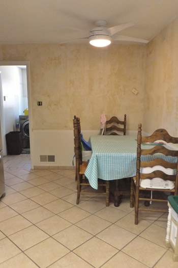
We started with a dark dungeon of a corner and ended up with something bright, fresh and uber functional for our young family of five!
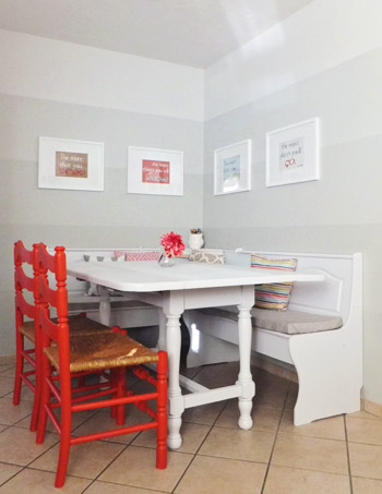
I scored an L-shaped bench on craigslist to give us some additional seating (our previous table could seat four, leaving someone in our family out of luck at mealtime). We said goodbye to the honey finish, giving it a fresh coat of white paint.
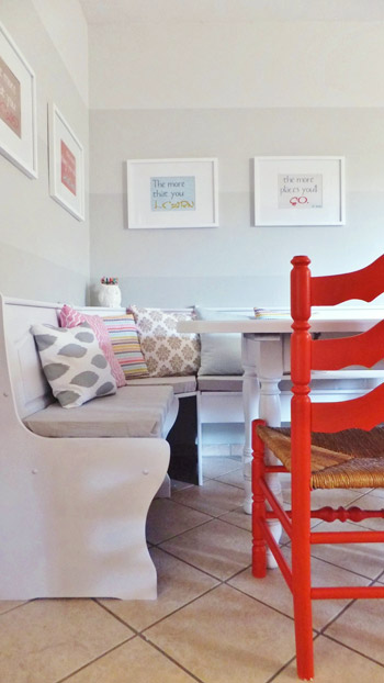
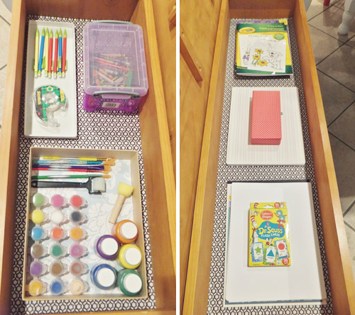
Even though the benches were a pretty standard style, they had storage in the seats, which helped solve the problem of our art/craft supplies that were scattered throughout the house. We lined them with some graphic shelf paper and they now hold all of the kids’ painting/art supplies, homework necessities, and learning activities for our youngest bambinos.
When it came time to paint the walls, I planned to use stripes to help this corner feel larger. But I also can’t help but be pulled toward the ombre trend, so we went with a subtle ombre stripe treatment for our backdrop.
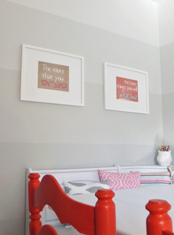
We used a digital scrap booking kit to break up one of our favorite Dr Seuss quotes into four prints (“The more that you read, the more things you will know. The more that you learn, the more places you’ll go.”). We framed them with some white lovelies we grabbed on sale at Target… they mark this space as a place to learn, explore, and create!
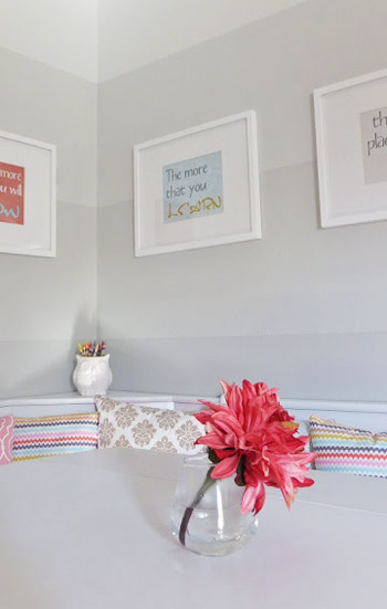
Overall we are so happy with the change to this little kitchen corner! It serves so many functions for us and I can’t help but smile whenever I walk into the kitchen… especially since the rest of the kitchen is in that ugly mid-cabinet-painting stage of DIY kitchen reno! ~Deme
It’s a fun update, right? I’m jealous of the storage benches. And I think the paint treatment on the wall is pretty awesome too. She’s got plenty more details and extra photos of the makeover (including updating their existing table and chairs) on her blog. Thanks for sharing Deme!

Jazmina says
So lovely!
Mindy says
I am IN LOVE with the gradient stripes, meow!
Jennifer says
Awesome update from granny’s kitchen to cute, modern, and stylish! :)
Brenda says
I love the shading scale on the wall! It’s neutral but interesting.
Christy Niebaum says
First of all, I’m super excited that someone else uses the term “fugly.”
I really love the benches, the bright throw pillows and my heart soars for those red chairs!
SingleMama says
That is so cute! I love the benches for extra seating :)
mjr says
So pretty! My favorite part is the paint! Good job, Deme!
Anne @ Planting Sequoias says
Now I want an L-shaped bench!!! Gorgeous.
Shannon says
I love this! The walls look fabulous! Great job Deme! :)
Shannon
Shannon Loves Design
Fabulously Vintage
Claudia says
I love the ombre stripes! I think that effect could be very overwhelming on a wall, but the subtle color changes are gorgeous!
Cassondra says
My favourite is the ombre stripe! Also, we’re thinking of adding bench seating to our kitchen dining when we renovate, how do we make sure it’ll be comfortable?
YoungHouseLove says
Anyone have tips for Cassondra? I would go for thick foam on the seat with some wipeable outdoor fabric, or if you’re more into wood seating just sit down and make sure it’s comfy :)
xo
s
Deme @ Fresh Coat Of Paint says
we added a 2 inch foam to ours and it’s pretty cushy! I wrapped it with an old sheet and gave it a trial run for a few weeks. I wanted to see how dirty it would really get before I settled on a more permanent cover. With 3 kids under five, it definitely gets messy…like cup of milk spilled and soaked into the foam messy. So, if you have little ones or clumsy ones, I would definitely recommend something that is wipeable, water resistant/proof, or even just treated with something like Scotch guard. Ours is also fairly comfortable without the cushion, but we like the added height. As Sherry said, just sitting down on it without a cover should give you an idea of it’s comfy-factor :)
Krissy says
The gradient stripes are SUCH a neat idea! And I love L-shaped benches. Every time we hit a furniture store, I linger at the benches… Nice work!
Holly says
this space is darling…and inspiring! :)
jenny says
LOVE!
Michelle Kersey says
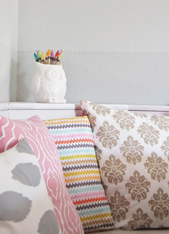
I knew John posted this when…. I got to the bottom and there was no ogling over the Ceramic Owl crayon holder in the last image…
YoungHouseLove says
Hahah! Totally John!
xo
s
Rebecca says
I snagged one of those ceramic owl vases from Michaels for $3. (Used a half off coupon, full price is $6.) It is adorable!
Dana says
Love it! It’s very similar to the color scheme/look of your sunroom area.
Andrea. says
AWESOME update! I didn’t even notice the stripes until they were mentioned in the write-up — guess I was too busy drooling over those red / coral chairs. They are absolutely perfect in that space!!
Ali Miller says
I have one lone chair similar to these that floats about the house. I am so excited to give it a happy color now! :)
Rozanne Paxman says
What a great redo. It’s actually kind of shocking what a huge difference it has made. I wouldn’t have guessed it is the same house. It makes me want to paint my chairs red!
Kara says
OMG, great job Deme! You did a fantastic job, I am so jealous. Smart choice on the ombre stripes, I think it helps the corner feel “taller”! Did you mix two colors to achieve your stripe colors, or are they each their own paint-ship color?
YoungHouseLove says
Hope she drops in with that info!
xo
s
Deme @ Fresh Coat Of Paint says
Thanks Kara! I used one paint chip from Valspar (with 3 colors). I used the lightest color for the 1st top stripe, mid color for the 3rd middle stripe, darkest color for the 5th bottom stripe, and then mixed the light and mid 50-50 for the 2nd stripe and same 50-50 mix of the dark and mid color for the 4th stripe. Hope that makes sense! There’s a pic and better details on the blog :)
http://freshpaintabq.blogspot.com/2012/08/a-new-nook.html
Chelsea says
I have the same L-shaped bench in my kitchen also purchased off Craigslist and then painted white. I am inspired to add some pillows and paint an accent chair! Great nook!
Michelle @ Lifewithacrazypup says
Ombre stripes for the win!
Tyra says
Love love love the ombré stripes. Neeeeed them in my life!
Kathleen@ Home Wasn't Built In A Day says
That is such a great transformation! I love the bright red and the inspirational wall art :)
Karen F says
This is absolutely beautiful, and so functional and cheerful, too!!!
Kate says
Did they lop off the tops of those chairs? What a good idea! It completely updated them. I don’t know if I would have even thought of that.
YoungHouseLove says
Totally looks like they did! Good eye!
xo
s
Rebecca S says
Wow! I am totally in love with this! I don’t think I could pick a favorite feature.
karla says
I love this! The paint treatment would be so cute in a kids room as well! Pinks would be adorable!
Kelli from LittleCottageOfMine says
Sooo cute!
Side note to express my horror!!! Stupid me was waiting around for an email from FLOR regarding the new date for your visit in NYC which I had previously rsvpd for. I just checked your schedule because I had not heard from them and its already closed! How disappointing! Now I must go ball my eyes out!
Sooooo saaaddd,
Kelli
YoungHouseLove says
Fret not! If you RSVPed for the first event you’re still accounted for! They only wanted new people to RSVP, so if you already did before you’re all set and should just show up. They’re expecting you :)
xo
s
Marie-Pier says
This looks fresh and lovely! We can feel the YHL inspiration! And there’s even a white ceramic owl! Great job Deme!
Deme @ Fresh Coat Of Paint says
What a crazy happy surprise to see my nook on your site when I checked my reader a few minutes ago – AHH!! Thank you SO much for sharing our space on your awesome blog!!!
YoungHouseLove says
Of course Deme! Thanks for sending it our way!
xo
s
Leslie says
Oh sweet, as soon as I saw the before pic, I thought it would be a perfect spot for a corner unit :)
Danielle says
Sooo love a nook! Thanks for the inspiration!
Kristi - SimplePrettyThings says
I love this! I went to her blog and left her a comment as well. Thank you for sharing! Ohh those chairs!
Lauren says
Such a huge improvement!! I love what she did with the walls. So pretty!
Kate says
Great job! I think my favorite part is the re-use; they didn’t go out and buy all new furniture, they just painted the table and chairs and added a Craigslist bench.
Wendy says
I love the red chairs & framed quotation!
Well done, Deme & good luck w/the reno!
Jennifer says
That was so smart to chop off the tops of the chairs to give them a more updated and proportional look. I did not see that coming.
Emma (Broke Ass Home) says
What a beautiful breakfast area! I love the ombre stripes!
Gabriella @ Our Life In Action says
Love all the colours. Those red chairs are to die for!! BEAUTIFUL!
Heather says
Love the walls! Love them so much I almost wish I had seen them last week when I painted my three year old’s big girl room.
And the fabric on the pillows, especially like the zig zag multicolor fabric!
Aly Marcotte says
Hi guys!Would love to know how to submit for a reader redesign!
YoungHouseLove says
Just send the pics and letter to [email protected]. Wahoo!
xo
s
karen little says
Love this, too! So smart and smart-looking. Wanted to visit her blog but can’t get through, for some reason. :(
YoungHouseLove says
Oh no, maybe it crashed for a second? Hope it’s back soon!
xo
s
Rachel says
It’s so white and fresh and beautiful! And scoring that on Craigslist – seriously. I need some of that luck to rub off on me.
Deme @ Fresh Coat Of Paint says
You all are too sweet! And yes, we totally lopped the top rung off the chairs so they wouldn’t overwhelm the space :)
Andrea B says
I LOVE the ombre wall! It brings so much design to the space without being in your face. Looks great!
Have you considered this for your sunroom? I think it would look really neat in there and bring out some of the architecture of the room.
YoungHouseLove says
Looks awesome! I don’t know if we’re ready to repaint the sunroom just yet but you never know where we’ll end up!
xo
s
Wrenaria says
Cute space. I’ll take the little white owl, please. Where’s he from, Deme?
Deme @ Fresh Coat Of Paint says
best part – dollar bins from Target last spring. I had to stop myself from grabbing 500!
Rebecca says
I bought an identical one two weeks ago from Michaels. In their new “spring” line of vases and planting pots for $6
Paige says
Wow! Love that! I am totally feeling inspired to add some red to my chairs.
Alison lengen says
Love this!
And ps..,,,just booked Haven conference!!!!!, are you guys going to be there?..
YoungHouseLove says
Wahoo! We’re not sure! We’re doing lots of travel for the book, so we hope we can squeeze it in!
xo,
s
jessica says
Love everything about this!