From the moment we painted that brick wall in our sunroom, we were itching to get some art hung. And we finally found time to get ‘er done after returning from a six-flights-in-four-days blitz on Friday. It’s weird how much more “lived in” a room feels when you slam some art on the walls. Seriously, I know the feeling of dragging your feet on the hanging of the art, but after nearly seven years of house-fixing-up, it never ceases to amaze us how that little step makes such a difference.
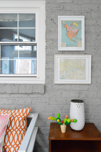
In continuing with the general theme of this sunroom design, we’re trying to spend as little money as possible and just use things we’ve already have around – at least for the meantime while we save our pennies towards things we might want to invest in down the line. We’re currently saving towards tackling Clara’s furniture-less big girl room and a guest bathroom that we haven’t touched as well as a front porch and carport makeover). So not purging money in the sunroom makes sense to us – especially since we have piles of to-be-hung art cluttering up the to-be-cleared spare room.
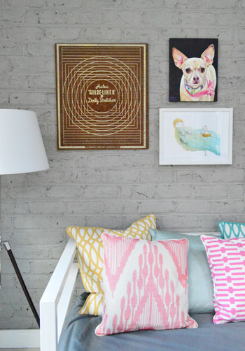
So that’s exactly how this little eclectic asymmetrical arrangement came to be. We decided it would look a lot better on the wall than in a pile on the playroom floor. Oh and the wood side table on the right looks a little heavy right now (even with the wooden art on the left side of that wall that we added to help balance things out) but we have plans to make it work a lot better down the line, so stay tuned…
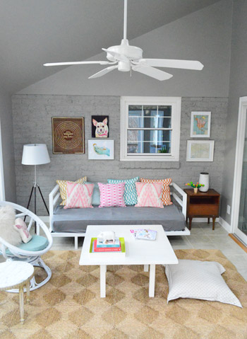
We basically brought in a bunch of frames / art-sized objects and played with them until we found a grouping that felt somewhat balanced – both with one another and with the other furniture in the room, while also subtly mimicking the slope of the ceiling. Plus, we were lucky enough to find art that tied into the colors in the pillows as well as some darker pieces to bring some visual weight into the room. The goal was a bit of an eclectic look – nothing too matchy-matchy and perfect.
And if you’re curious about how we hung everything, we put together this animated GIF to show the order in which things got added to the wall. After each one we just stepped back, held the next one up, shimmied it around until we liked the placement, and moved on to hanging that one:
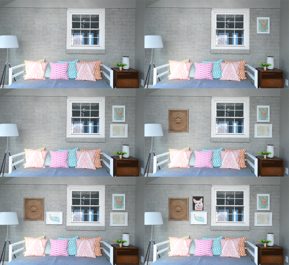
There wasn’t any methodical measuring since we wanted a casual and eclectic outcome, so the good news is that you don’t always need to break out any crazy math to get a collection of frames on the wall (although that’s usually necessary if you’re going for a completely balanced grid, like the one over our sofa).
If anyone’s curious about how I created the graphic above, check out this Photoshop tutorial. And if you’re wondering how we dealt with the crazy light and shadows that we get in that room, here’s our professional technique. Yep, that’s a giant poster of our local magazine cover that I’m using (given to us after a Richmond tour event). Work with whatcha got, am I right?
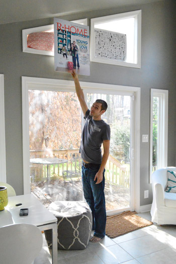
The items on the right are both maps – a North America map from a calendar we’ve had for a while (with the intention of using it for art) and the other is an old map of Richmond that has lived everywhere from our first home’s guest room to this home’s kitchen. Personally I think it’s a little “Hey, look! This is the side with the maps!” to have both of them there. But of what we had around, they were our best options for now – especially since the colors in the top one work so well in the room. We’re definitely open to letting everything on this eclectic frame wall evolve though – so it hopefully won’t be a maps-only zone forever. And we’ll keep you guys posted whenever we swap things out.

The left side is an odd mix of things I never thought we’d hang together. But somehow it kinda works for both of us. Call it stepping out of our white framed comfort zone, if you will. The big brown item on the far side is doily stretcher that we got at a thrift store this summer for $4. It caught our eyes back then because it was big, geometric and (okay) cheap. So I’m glad we finally found a spot for it. Especially since it begins to sort of subconsciously balance the wooden end table on the other side of the wall.
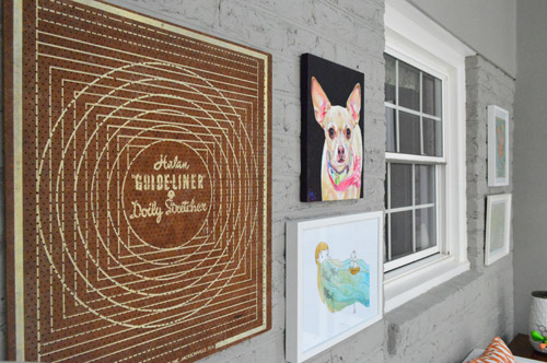
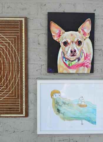
Next to it are two pieces of painterly art (one’s a watercolor print and one’s actual paint on a wood canvas). The bottom one is a print that someone brought us at one of our book tour stops. She hadn’t done it herself but she said it reminded her of us (it’s by Sally at sadlyharmless.com). We love it. Especially Clara, who is very much intrigued by the beard, the sharks, and the boat (in that order – yes the girl loves beards). The top item in the arrangement is an amazing painting of Burger that a reader’s husband painted (we met her on the book tour too, so Sherry got to gush about how talented her husband Joe is). Does that not look exactly like Burger? He’s got the same soulful give-me-your-cheeseburger eyes.
We hung all of these at night, so it was too dark to get pics of the process. Here’s our single attempt below…
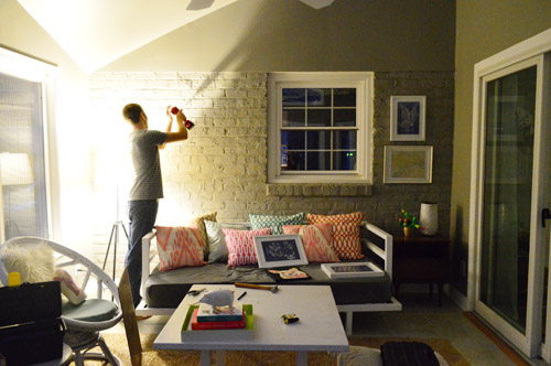
… but for those who are curious about how to hang art on a brick wall, this is the method that works for us:
- use a masonry bit (you can buy them separately for your drill) to make a plastic-anchor-sized hole into the brick (or into the mortar when you can, since that’s easier)
- hammer a plastic anchor into the hole
- screw a screw into the anchor, so it’s held strongly in place (leave about half an inch of the screw sticking out of the anchor so the picture hook or the picture wire on the back of the frame can be hung on that)
I find this method gives me a strong enough hold to hang pretty much any picture frames – I’ve even used this approach to hang some pretty heavy mirrors. And as for undoing any unwanted holes down the line (sounds pretty hardcore slash irreversible to drill into brick, right?) we’ve had some pretty great success with patching holes in painted brick or mortar – so it really isn’t irreversible at all! Just yank out the anchor with the back of a hammer, shove some paintable caulk into the hole, and paint it for a fix that’s not obvious at all thanks to the craggy and uneven nature of painted brick.
What was far less involved than hanging frames on the brick? This. It’s two prints that I coveted for a while and have finally found a place to hang (don’t mind the table and chairs under them – they’re just things we’ve had forever so they’re sitting there until we figure out something more substantial and balanced for that spot). We think a piece of furniture with storage in it will be more functional since we can sit on the daybed and the egg chair, so more seating seems like overkill). You know we’ll keep you posted…
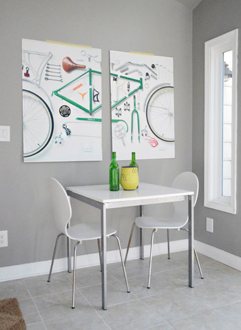
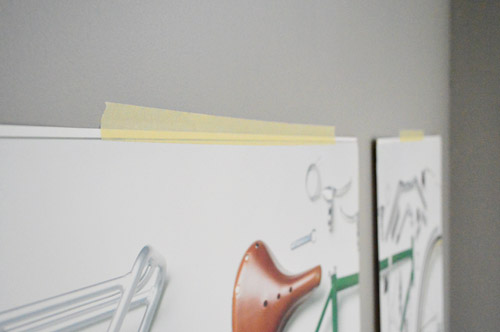
As for the bike prints, they’re only held up with masking tape at the moment (just so we could figure out the placement) but I think I’m going to build some simple wood frames for them soon. That is, unless you guys like the raw tape look. Kidding.
We wouldn’t be surprised if some of this stuff moves around a little bit still – or gets changed out entirely (I’m talking to you, map wall) – but for now it’s a BIG step in making this room feel more lived in while buying nothing but paint so far (all of the furniture is just stuff we already have, which might not be there forever, but definitely works for the meantime). Here’s the new “with-art” view of the sunroom from the living room:
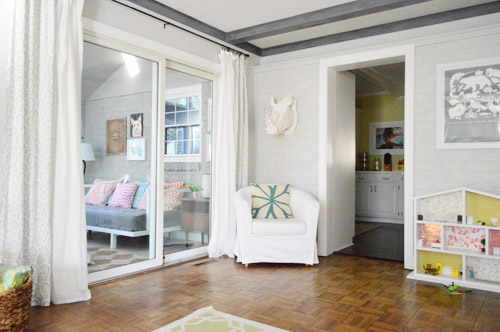
It’s really nice to sit on the sofa and actually see what resembles a room through that big slider (art on the wall = a huge step towards turning an old storage zone into a real-ish looking room). Can’t believe we just started working on the sunroom after over two years here! What are you guys working on? What rooms do you get to first? Is it the living room, the dining room, the bedrooms, and the kitchen like we tackled in the first two years? Which ones end up in the end of the pack? I guess we use those other spaces the most – so our guest bathroom, playroom-turned-storage-room, and our porch & carport are hanging out towards the back of the list going into year three…
Psst- We finally (FINALLY!) wrote about Sherry’s mom’s pre-Christmas visit over on Young House Life. Here ya go.

Emma (Broke Ass Home) says
I really like how this room is evolving. We threw together a guest room on a no-budget too. Sometimes working with whatcha got ends up being way better thane expected. Love the Burger print!
Anele @ Success Along the Weigh says
I love using maps as art! It can show you where you’ve been, where you want to go and to keep the adventure alive! (Or maybe I’m too philisophical about map framing?)
Ainhoa says
I love the bike prints! If you build the wood frames yourself, will you hang them without a glass front?
YoungHouseLove says
Yup, we saw something similarly framed at Gap/Banana and thought it looked cool. They have a glossy enough finish to the posters that we don’t think glass is necessary.
xo
s
Randy says
I’ve always been a fan of painted brick and the bicycle prints are VERY cool! Great job!
Tracie@MiddleClassMod says
I’m completely jealous of the Burger print. I neeeeed a painting of my Emily!
The bike prints look fantastic, and I’m also jonesing on your doily stretcher. Love it.
Megan @ Rappsody in Rooms says
I love how you can use the artwork that people gave you on the book tour! That is so special. And that painting of Burger is out of this world amazing! I love the ecletic and bright look. I think that is definitely how I would describe my style!
YoungHouseLove says
Totally, people have been so generous! It’s amazing. Clara has lots of fun children’s books from people, and the baked goods are going right to our hips! Haha!
xo
s
Rhiannon says
AAaaaaaahhhhH! This made my month! I’m the girl who gave you guys that print. We were so far back in the book-signing line that I didn’t think we’d make it up to the front in time, so I quickly harassed you guys when you came back from the restroom. Stalker much! :) I’m so happy you guys like the print. I too have a thing for beards. It looks awesome on that wall!You guys are the best!
YoungHouseLove says
Hahahah! It’s amazing Rhiannon! We love it!
xo
s
Danielle says
I just might have to adopt this for my front porch. It is enclosed, and other than the front door and the ginormous window, it just looks blah. Great work, and thanks for the “how to drill into masonry” instructions!
Robin @ our semi organic life says
I love the slightly different color scheme with the pastels and neutrals you’ve got going on.
my honest answer says
Love the turquoise shades with the grey walls – it matches the blog colors!
Alisha says
agreed! LOVE that first map you guys hung against the grey painted brick. Aaand all the happy bright pops in the other pieces. Also, I don’t mind the table/chairs under the bike print–you guys DO have quite a large extended family! Seems like it will be put to good use during gatherings (or even a little crafting spot with a view)
After almost 2 years in our house, this weekend my husband tackled adding electricity to the portion of the basement we call “the workshop” (pretty ironic since it was the only portion of the basement without working electricity AND where we house all our power tools, lol) We are tap dancing happy over here to FINALLY have electricity illuminating this very much needed space! Can’t believe we let it go on this long.
YoungHouseLove says
Wahoo! Congrats Alisha!
xo
s
Em says
Lovely ! Went on tackling the difficult matter of hanging art and pictures at the weekend ! Everything looks so much better and the floors are a lot less busy…
Cara says
WOW!!! Love the painting of Burger!
Karen F says
Looks great! I love the view from the living room – such a difference!
Anne @ Planting Sequoias says
I love it! It feels like a real, lived-in room now. And I love the maps–we have a HUGE one over our couch with the same sort of colors as your top map, and it’s been our “Sue the napkin” as far as decorating the rest of the space.
Kristen | Popcorn on the Stove says
I really like that you kept it simple in the sun room – and since all the frames are so large, it helps make the window blend in :) Can’t wait to see the frames you build!
Chelsea @ Riding Escalators says
Loving how it’s all coming together! I wish we had a room that we could update with little to no $$… alas, with such an old home, we have to save up until the next project – which, will either be the kitchen, bathroom, basement, or the master bedroom! Easy stuff, right? lol
Hope you had a nice, relaxing weekend!
Heather W says
Pics do make a world of difference…. Looks good. I think you should frame your large mag cover it ties into the room. Also, sherry where did you get the grey stool in the pics above? Thanks!
YoungHouseLove says
That gray pouf was from Joss & Main a while back. Hope it helps!
xo
s
Maria says
Awesome!!
And those are some creative light blocking skills, although I do see John’s arm reflected in the window in the 4th photo, am I right? :)
YoungHouseLove says
Haha, you do!
xo
s
Lesley@ChaoticallyCreative says
Love it! And the picture that you have on here where the pictures are adding themselves magically. That is so cool. It is a beautiful room! Lesley
Melly says
It’s looking really good and I love the doily stretcher as art.
I like the moody vibe of the wall color in the night shot, too.
Beth says
I am always inspired by your art projects. I have a 2012 chicken calendar that I am ready to make into a chicken art gallery! Hooray for weirdos! However, I have no frames! Occaisionally I can snap a few up at a yard sale, but other than that they are super expensive in stores (and tend to be weird from HomeGoods). Where do you guys score all your sweet frames?
YoungHouseLove says
Haha, a chicken art gallery sounds epic! Send pics when you’re done! As for frames, Ikea has the best ones (with mats) for cheap, and sometimes Target has sales or coupons but we also do the yard sale or thrift store thing to save major loot along the way.
xo
s
Kim says
Fun with GIF!
Gabriella @ Our Life In Action says
Looking good gang! I love how bright everything is.
Side note – is it just me or is John super tall? I’m 5’1 so maybe it’s just me but the fact that he can get his arm above the sliding glass doors without standing on his tippy toes (yes I checked ;-)) is impressive. :-)
YoungHouseLove says
Yes, he’s my tall hottie hotness. Haha. He says he’s 6′ even but I think he’s 6’1″ – which is especially impressive to a 5’2″ like myself.
xo
s
Gabriella @ Our Life In Action says
LOL! My hubby is 6’1, I tell him I married him for his ability to reach things on the top shelf in the kitchen….that fact that he’s a cutie may have played into it just a little ;-)
YoungHouseLove says
Haha, ditto!
xo
s
heather says
Back story: I used to totally have a thing for tall guys as in over 6′. Since I’m 5’7″ I like being able to wear heels (back when I wore them more than shit kickers) and not be taller than them. So when I met my husband, who is 5’11” I was so smitten with him I didn’t care. Plus, it’s still pretty tall and we’re eye height when I wear stillettos…the maybe once a year I do.
Backstory given: Never at Thanksgiving tell your family you were “willing to sacrifice a few inches”. They will burst out laughing, you will hear what you said as it comes out and bury your head in a pillow and your husband will just sit there with a look on his face that’s horrified as your father says, “it’s not often you hear a woman say that!”.
Christina P says
Love the map frames! My favorite thing to frame is a map! Also, I checked the “where we got it” page and can’t figure out where you got those painfully adorable and amazing pillows on the daybed! Help a sister out?
YoungHouseLove says
Oh yes, those are all from Bed Bath & Beyond and HomeGoods. Hope it helps!
xo
s
Mollie says
the bike art/table and chairs corner is totally giving me the ikea restaurant vibe. kind of makes me want to come over and enjoy a $2.99 swedish meatballs platter. :)
YoungHouseLove says
Hahaha!
xo
s
Rachel says
Since we live in a apartment, our dining room, office, and living room are the same room. It has been a pain to decorate, but the random art collection like yours has helped. I also just bought a danish teak dining table that is killer, so I can’t wait to give it some tlc and set it up!
Any suggestions for helping this room look less of a confused and identity-less room?
YoungHouseLove says
Hmm, have you tried hanging the same curtains everywhere? They’ll add cohesion and softness. Even cheap white Vivan curtains from Ikea could help!
xo
s
Emily says
Love the evolution of the sunroom! But please, as a museum professional- don’t even temporarily use masking tape to hold up your artwork! It’s not archival and any use of it could cause chemical staining on the paper. try to find an archival tape for the longevity of your artwork:)
YoungHouseLove says
Oh yes, thanks Emily! We just taped it up for the placement and plan on building frames that overlap that area (so even if it discolored that area it will be covered by a frame). Great tip for anyone without the same framing plan though! It definitely can rip or discolor prints or posters!
xo
s
Lina says
I love the art, but the GIF freaked me out! When I scrolled down there was art on the walls and then it just…disappeared! haha I thought I was going nuts, but then it all came back, and I cracked up when I realized it was a GIF and not a regular picture. Thanks for the laugh – I look forward to meeting you guys in the ATL in February!
YoungHouseLove says
Hahahah!
xo
s
Tara says
We started with the nursery (I moved in at 34 weeks pregnant with twins) that had to happen F.A.S.T. and then we have been steadily working on the master bedroom ever since. I read somewhere a long time ago that people usually do their own bedrooms last, and sometimes never get to them because it’s not public space and no one sees it. But since we have big renovations planned (total gut of a kitchen, taking a downstairs powder bath to a full bath and then re-working an upstairs bathroom just to name the Big Three) I wanted to have a retreat to get away from the madness that I would find calming and happy. Plus, we only have one closet in the master so I had to find a wardrobe/armoire to hold my clothes and it was like dominoes falling after that! Next up– Living room. This couch didn’t make it through the last move :(
YoungHouseLove says
So smart! Yes, we did our bedroom as one of the last rooms in our first house so we wanted to get to it earlier here since we learned how much it helped to have a comfy room to run to at the end of a demo-filled day. Hahah! Still took us about two years to get it together though!
xo
s
Maureen says
Love that map art!
And, on a totally unrelated note, I am about to paint our paneled bedroom, and I was wondering if you guys had that strip of moulding that runs in the corners from floor to ceiling? If so did you just paint those the color of your wall? Or the color of your trim…. I’m leaning towards color of the wall.
YoungHouseLove says
Oh yes, we just did that the wall color so it would blend right in.
xo
s
Maureen says
Thanks a bunch!
Michelle @ Lifewithacrazypup says
I LOVE THE MAPS. I want to bathe in maps, that’s not weird right? We added a couple of them in our basement a few months back.. They’re some of my favorite pieces in the entire house. I think I already sent this link a while back… here’s just the picture
http://lifewithacrazypup.files.wordpress.com/2012/08/basementpics1.jpg
and the link to the whole post in case anyone else is interested.
http://lifewithacrazypup.com/2012/08/19/updating-with-art/
We found them at HomeGoods. Sometimes you can REALLY score there, ya know?!
YoungHouseLove says
They’re awesome! Can’t believe they’re from HomeGoods!
xo
s
Cassidy says
I love the Burger canvas!!
Ashley@AttemptsAtDomestication says
I’ve done things in the opposite order. Our bedrooms are more finished than our living room and dining room.
The sun room is looking good though!
YoungHouseLove says
So funny!
xo
s
Melissa Shipman says
Love this room! And the added space you have to hang out in now! I just posted about our gallery wall process and made a gif myself! How fun!
http://lovinghere.com/hang-on-and-hang-up/
YoungHouseLove says
Love it!
xo
s
Emma says
It’s looking so good in there! And welcome back from your travels! BTW – I thought you all were headed to the Cayman Islands on your book tour as well. Did you go? I’m sure you had a blast on the road either way :)
YoungHouseLove says
Sadly they canceled that due to a scheduling conflict. Womp-womp! But we had a blast in Austin, Miami, and Ft Lauderdale!
xo
s
Emma says
Oh well-hit the Caribbean up on your next book tour. I bet you had a blast on your recent leg/ Can’t wait to hear all about it!
YoungHouseLove says
Wahoo! We’re gathering photos and links right now! Can’t wait to share it (probably at the end of the week).
xo
s
Alison says
Love the art in this room, and I couldn’t agree more with your statment about art making a room feel lived in. My husband was so disgusted with me when I insisted on hanging most of our art THE VERY WEEK we moved into our house, but I kept telling him that was what would make it feel like home. I of course was right:) and after he stopped complaining about having to hammer “like a hundred” nails into the walls, he totally agreed!
YoungHouseLove says
Hahahah!
xo
s
Andrea says
Love the masking tape. While deciding where to put stuff, I usually hang it up for a few weeks with painters tape!
[email protected] says
Have you ever used plexiglass to frame something? I have a print that’s an odd size (Hoo’s stadium, oh yeah!) and I don’t want glass over it for safety reasons, and wondered about buying plexiglass. I see it online, and it’s not cheap.
L
YoungHouseLove says
Oh yes, it’s fun! It’s cheap at Lowe’s and Home Depot (they can even cut it down for you!).
xo
s
Rachel says
Love it! It’s looking so great! I love your idea of shopping around the house. It’s so perfect.
Hilary @ My So-Called Home says
This room is fun, so bright and cheery and ready for Spring. Also, I love Sally Harless! I bought one of her prints for our gray and pink bathroom in our old apartment and plan to use it again in our nursery. That beard print is great.
http://www.mysocalledhome.com/2011/02/new-loo.html
YoungHouseLove says
Love that!!
xo
s
Alison lengen says
Those vibrant pillows rock that room! Great job!
Anika says
The art really does help the whole room go together. And I second another commenter who recommended framing your magazine cover!!
I appreciate all the tips/suggestions/links in other comments too: it’s great to be able to have these home-diy conversations all in one place!
nancy says
Didn’t notice there were maps together on the right. Do like the cool window artwork, oh wait, that’s the window!
YoungHouseLove says
Hahah!
xo
s
Angel says
LOOOOVE the burger pic!
Christina @ Homemade Ocean says
Wowza that sunroom has come a LOOONG way!!!
You guys are making my heart yearn for poufs….espcially after the video of Clara changing Gee.
Im gonna have to start saving :)
YoungHouseLove says
Ooh sometimes they’re on Joss & Main really cheap (other times they’re more, so I would watch the sales and see if they rise and fall and snag them when they’re low).
xo
s
Allison says
I love the evolution of your sunroom. Have you guys thought about extending the artwork above the brick portion of the window wall in there?
I know ya’ll said before you were trying to draw attention away from the weird slanted angle of the ceiling, but seeing the pics hung around the window really makes me think it would be cool to see you hang a whole gallery wall that extends above the brick portion. The window would totally disappear into the mix of art. In fact, like another commenter said, you could include your magazine cover in the mix. . .
I think rather than drawing attention to the half brick/half drywall, it might make it even less noticeable.
YoungHouseLove says
That’s definitely true! We just worry that the ceiling fan (which we’re keeping for functional reasons) might cut in front of anything hung above it and look weird and overlappy. Haha!
xo
s
Hilary says
The picture of Burger is amazing!
YoungHouseLove says
Isn’t it?! Looks just like him!
xo
s
Katy @ The Non-Consumer Advocate says
I like how the room shares a similar palate to the living room. I like darker colors, but here in Oregon, we sit in the dark 7 months out of the year. Logically, I should try lighter colors, but it’s so much cozier this way.
Our unfinished basement definitely sits neglected, filthy and unorganized, but I tell myself that it’s my husband’s domain. Our bedroom tends to be the in-use room that gets the least attention. We stash stuff in there *temporarily* which lengthens to months and then years.
Katy
Michelle M. says
This looks great.
I’m just kinda… Not to be weird or anything but the pic of Burger seems just a touch low to me. Maybe just my personal preference, but I woulda moved him up a few inches?
The sunroom seriously looks great though!!! Esp. That view from inside.
I wanted to let you guys know that, while it’s not from your book, you inspired me to do my very first DIY project this weekend! I spray painted the cork on a bulletin board and then painted the frame, and have hung all my necklaces up on it with clear pushpins. No more tangled/lost necklaces for me!!!! Thanks for the motivation/inspiration :)
YoungHouseLove says
Oh yes, we just held things up and hung them wherever they looked best to us in person (but I’m sure other folks would have scooched them up or down if they were there in person too). As for your DIY project, love it! Sounds awesome and functional!!!
xo
s
Carly G. says
I’m in love with that Burger painting! I might just have to ask Joe to paint my dog!
heather says
This looks so nice with the art hung up. It definitely makes it feel more homey. Before it was just kind of this gray wall, and now it feels like you want to snuggle up on the futon/couch and read a book. It’s the little things.
As for our house – we just finished insulating the entire addition. I am ready to not touch Roxul ever again but it’s now so warm. 7 months after not even having an addition, and Andy doing the majority of work himself with some help by others, we’re ready to drywall…once we order it. :) Here comes lessons learned in mudding and drywalling.
Kristin says
I spotted that Sally Harless print on your wall immediately! I met her at a local art fair and bought a whale print for my sons room. Her artwork is very interesting isnt it? Room looks like its coming together nicely!
YoungHouseLove says
So cool that you met her! Love her work!
xo
s