Q: I really love Clara’s room! Great color choices. Do you have a formula for mixing prints? I love how they are all so different – even the colors and yet they all compliment each other and totally make the room! For my boys room, I am mixing prints but find it gets very busy looking or I tend to go with the same color making it kind of boring looking. – Cappy
A: It’s funny that this comment came in about a day after I ran around Clara’s room photographing a bunch of the patterns going on in there in the hopes of making a little grid to show how we mixed & matched all of these Clara-inspired textures and colors:
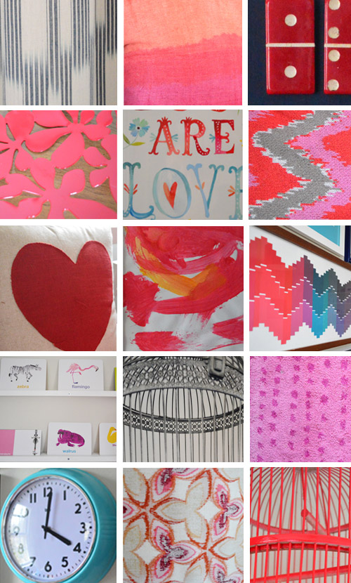
Not that there’s a foolproof formula for layering prints and patterns, but there must be some reason why we ended up with this mix of things after following the always elegant method of “just trying things and seeing how it all shakes out.” Especially since it’s not a big room by any means (it’s just 13 x 10′) and many of the choices in here were actually inspired by (and even chosen by) Clara herself, like:
- the color palette (she loves red & pink)
- some of her favorite patterns (the kid goes crazy for zig zags, hearts, and polka dots)
- the curtains that she selected with her face
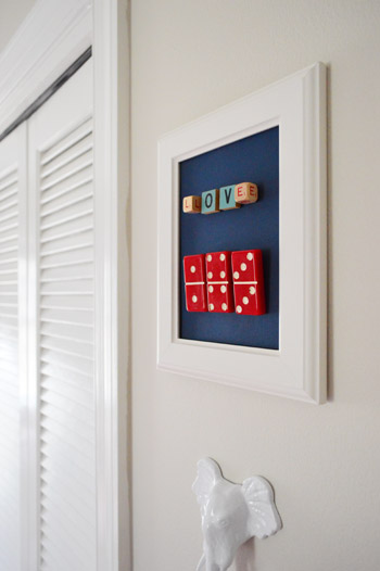
- some of her favorite animals (we worked in whales, rhinos, birds, alligators, & elephants)
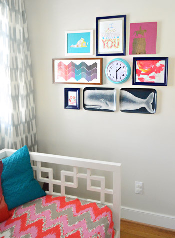
- some art that she made (which we hung in a little frame grouping next to the daybed)
- her favorite flash cards on the shelves (she picked the ones she liked the best)
So here’s what I came up with when I looked nice and closely at everything in the grid above…
Realization#1:
On one hand everything in that little grid looks really diverse with tons of patterns and shapes and textures – but on the other hand, when you look closer at the colors, many of them reoccur a lot, which helps tie everything together so things relate to one another without making the room feel like a circus. For example, there are four colors that keep showing up (pink, red, navy, and teal). Heck, even some of the patterns subconsciously mimic each other – the chevron paint chip art mimics the zig-zag blanket on the bed, and even the lamp shade fabric (bottom middle of the grid) looks a lot like the red Ikea bowl that sits nearby on the dresser (second row, left side of the grid).
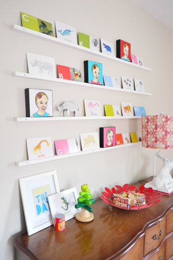
I never consciously said “this pattern on the lamp looks similar to the shape of the red bowl” but what actually happened was I thought “this red bowl might be functional and cute in there” so I plopped it down (good ol’ trial and error) and then my eyes said “sold!” – but if I stop to really analyze why, it’s probably because the lamp shade and the bowl are in the same color family and their pattern is similar, even if it’s not the first thing you notice. They’re like Adam Levine and Blake Shelton. They just look good together. And your eyes say “yup, I like that.”
Realization #2.
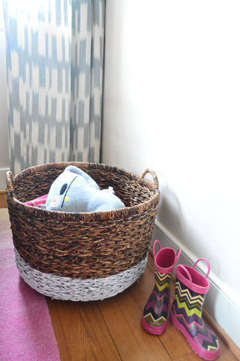
We also have a lot of neutral tones going on in the room to temper all those bolder patterns and colors (like the milky-tea-like wall color, the wood tone of the kids chairs, the woven baskets) and an abundance of white tones (in the daybed, the kids table, the floating shelves, the molding & trim, the pouf, etc).
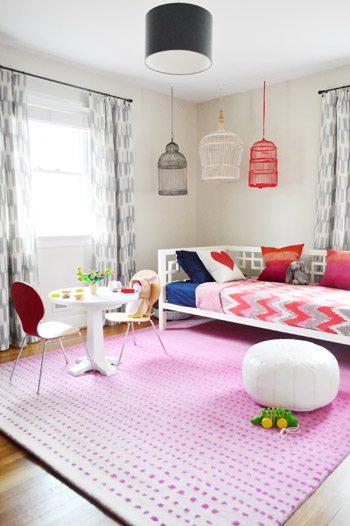
That mixed with the aforementioned solid navy tones (in the ceiling pendant, the sheet set on the daybed, the frames for much of the art, etc) definitely balances out all those bold reds/pinks/teals along with muting down the crazy zig-zags and polka dots on a few other surfaces. So although the room feels colorful, when you look closer at the furnishings and the wall color those aren’t exactly exploding with color – in fact many of them are white or wood-toned so they fall back while the brighter pops of color can shine without competing too much.
Realization #3.
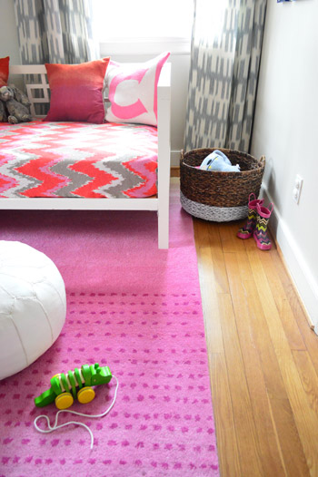
We’re total fans of the “just do what looks good to you” method (also known as trial and error) – so we’re not really ones to study formal decorating rules (we probably break those on the regular) – but I think we do end up following some of them accidentally. For example, some “traditional decorating advice” when mixing patterns and prints is to pay attention to scale: ideally you’ll mix one large scale pattern with a smaller scale/less bold one so they’re not all chaotic & compete-y. And when you look closely in here it’s definitely clear that the multicolored chevron daybed blanket plays the role of the alpha in this space (it’s large in scale and full of many colors, so things like the smaller scale two-toned ikat curtains and the polka dotted tone-on-tone rug fall in line behind it).
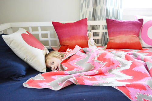
Had the rug or curtains been full of tons of colors and a larger scale pattern – like wide stripes of red, pink, navy, and teal for example – they would have competed with the bedding, so it’s funny how we subconsciously arrived at a nice mix of “best supporting patterns” while the blanket is the star (with the largest scale pattern and the wide range of colors).
We definitely didn’t go out and curtain-shop or rug-shop while thinking “I need a best supporting print or pattern that falls behind the blanket and is smaller in scale/boldness” but we seemed to gravitate towards those things when we pictured what might work in the room (well, Clara picked the curtains, so she gets all the credit there). In other words, something about the bold rug choices that we considered made our brains think “that might look crazy” – so we seemed subconsciously drawn to still-playful patterns and colors but less in-yo-face options than the largest pattern-y-est patterns.
What I’m trying to say is that sometimes your instincts make sense even if you don’t fully know why (or stop to analyze everything to death). You might just think “well the walls are bright so a neutral couch and some softly-textured-but-not-too-bold curtains make sense” and that’s essentially the same concept. And of course if you end up going with something you think will be awesome but then you get home, see it in the room, and hate it with a passion – there’s always returns & craigslist. You can read more about how we deal with buyer’s remorse here.
So my three quick summary tips for how we (sometimes subconsciously) mix and match patterns would be:
- Don’t be afraid to bring in tons of texture and pattern, as long as it relates in color so things sort of layer in on top of one another instead of competing (our “common denominator” was that many of the bold/patterned things were pink, red, navy, and teal so they tied into each other).
- Remember to use some larger neutral/white/non-bright items to temper all the boldness (choices like white or wood furniture, neutral walls, and even chocolate or navy furniture and fabric can balance out lots of bright and happy color in other places).
- Figure out which item is “the star” (perhaps it has the largest scale pattern and more color range than many other things in the room) and try not to bring in a bunch of other items of the same large scale & boldness. It can get chaotic and compete-y if too many things are fighting for attention, but by all means, layer in some other colors and smaller scale patterns for more interest and fun.
How do you guys mix and match things at your house? Do you prefer to only have one or two patterns in a room? Do you layer in a bunch? Are some bolder or larger in scale than others? I remember when I heard Sarah Richardson say that she usually uses around 10-14 fabric textiles in each room and it kinda blew my mind (in the best way possible). In fact she’s definitely one of my inspirations, right along with Clara and her enthusiastic color-palette-picking, art-making, animal-loving, and curtain-choosing ways.
Psst- Kristi, who commented right under Cappy’s question, shared this link from Ralph Lauren with ten tips for mixing fabric patterns, and it’s definitely an interesting read as well. Happy print and pattern mixing to one and all!

Rene @thedomesticlady says
I just love this room. So great. The mix of textures and colors is amazing! I just love a room that does not look “over thinked.”
Crystal @ 29 Rue House says
Love the breakdown. I’ve fully subscribed to the trial and error approach – for non-natural decorators, following all the decorator’s “rules” are just too limiting and don’t allow a person to think outside the box and make their home theirs.
Wendy @ New Moms Talk says
Thanks for a grweat post!
You noted this a bit, so I’m wondering how much of the process is intuitive or instinctive versus thought out? Do some rooms or projects land further on one of those?
YoungHouseLove says
Oh yes, a lot of times we reason things out (if this will be bold, we’ll want something else to be neutral, etc) but when it comes to how one busy-ish small pattern might pair with a few other patterns (both large scale and small) sometimes we just have to see it all together and see what shakes out!
xo
s
Jess @ Little House. Big Heart. says
I’m always scared of mixing patterns! When I do, I have one never-fail, sure-fire trick to tell me if it works:
I take a picture and send it to my mom (who happens to be an interior designer). If she okays it, then I’m good!
YoungHouseLove says
Haha, I love that!
xo
s
Kelsey says
Love it! The Adam & Blake reference cracked me up!
Liz @ Grown-up Pretenders says
I layer patterns through trial and error with mostly error.
Penny says
Haha, I can relate.
Megan@ Rappsody in Rooms says
Thanks for sharing your logic…erg forcing you to break it down. It really is interesting to think about how what appeals to your eye is defined in more of a decorating rule. It was also crazy to see how many patterns you actually have going on in the room! It doesn’t seem like that many when you look at the big picture but when you put it all together it kind of blows my mind!
Theresa says
I think you will be mixing in more shades of white based on the snowfall predicted for your area. We are already abandoning our cars around D.C. — hee hee.
YoungHouseLove says
Haha! Hope you stay safe and warm!
xo
s
Lindsay says
Odd issue….I read your blog everyday but the past 3 or so posts…I can’t view the pictures. Anyone else having this issue!! I am going to through YHL withdrawl!!!
YoungHouseLove says
Oh no! Anyone else having this trouble? Have you tried a different browser? Sometimes it has to do with an update on your virus blocking software (ex: McAffe or Norton blocks them for a few days and then they mysteriously pop back up) so maybe that’s the case? We haven’t changed anything on our end, so hopefully they come back for you soon :)
xo
s
melanie says
those paintings of clara remind me of the ones kelly taylor or donna martin had in their room on 90210. :)
YoungHouseLove says
Hahah, I love it!
xo
s
Katy @ The Non-Consumer Advocate says
What I’ve noticed about my own decorating style is that I’m never really done with any one room in my house. I start with stuff I already own or can get for free from family, friends etc. and then I gradually replace most everything as I come better, more interesting stuff from thrift shops, garage sales, free piles, etc.
The end product is less deliberate than Clara’s room, (which is, HELLO – ADORABLE!) but still has a nice curated quality that would never happen if I bought everything at once. And I really like the creative challenge of a limited budget, as I feel it forces creativity. Also, because my house is a mixture of different eras, it has a hopefully not trendy vibe that will not look so dated a few years down the line.
But the best part is that whenever I buy “new” stuff to replace what I already own, I then sell the replaced item on Craigslist and *always* end up pocketing a tidy profit.
Great job on Clara’s room, it’s so bright and cheerful, and I like how there’s lots of play space for her to set up her toys and dance around.
And room for you two to dance around as well.
Katy
YoungHouseLove says
Haha, I love it Katy! Love the “tidy profit” part. Haha!
xo
s
Kathy says
Needed this! We’re sloooooowwwlllly creeping into the actual “doing” of re-doing our den and I want to play with more color/texture, but I get nervous it’s all going compete with each other. I gave myself five-color palette (2 neutrals and 3 “bolder” colors), plus white & our existing chocolate couches to balance it out. I think we’re finally going to paint this weekend; hopefully, it will come together like it does in my head!
YoungHouseLove says
Sounds really pretty Kathy! Good luck with everything!
xo
s
katie says
Great post! Y’all definitely have much better intuition about what will work before you see it in the room than I do!!
Cassondra says
My husband already knows that I hate things to be “matchy”, they have to just “go” he gets really annoyed at these terms…but they make sense to me! The patterns go together but they aren’t too matchy, you guys have mastered it in this room!
Gabriella @ OLinA says
I must admit I really suck at this. But I am working at it, trying to mix all sorts of textures, patterns and colours…..hey worst case scenario, we close the door to the room and never enter it again….joking…not really.
;-)
YoungHouseLove says
Haha! Don’t worry Gabriella! This room used to be our storage room full o’ junk – for over two years we kept that door shut tight!
xo
s
Shayna says
Goal of the Day: Use “They’re like Adam Levine and Blake Shelton. They just look good together.” atleast twice in coversation today.
YoungHouseLove says
Haha, I need an update on how that goes…
xo
s
Cara D says
Clara’s room looks great! That is how I decorate too. Thanks for giving us the size of the room. I thought it was much larger than that. I am redecorating our guestroom to a guestroom/playroom and wanting to take out the queen and replace with a daybed. Your room looks really large with the daybed so I am hoping it will do the trick for my room too. Love all the pattern!
Diane @ Vintage Zest says
The way that I mix and match things at my house is boring so far, because I don’t have any room for anything! I’m in transition now, and started following your blog recently to get a few ideas. I definitely have more than a few now!
Before, I only had a couple of patterns in my room and did the color matching thing. I think it’s because I’m a little picky when it comes to my patterns. It’s the same way I dress too! Now, I’m definitely up for a little bit of experimenting in my new place thanks to your inspiration. :)
YoungHouseLove says
Aw, good luck Diane! It took us a while to baby-step in that direction too, but years down the line it’s amazing how much can happen!
xo
s
Anele @ Success Along the Weigh says
Great tips!
While I’d love to say I’m as adventurous in pattern matching as you guys, I have pretty plain tastes. I physically couldn’t do what you guys did in her room due to my astigmatism because patterns mess with my vision. We have bamboo blinds that are horizontal in pattern and I can’t even look out the slider because the blinds “jump” in my vision. So yeah, chevron and dots and stripes would make me a dizzy mess!! HA! I’ll just have to live vicariously through you guys! :)
YoungHouseLove says
Oh my gosh, no way! So funny about the blinds being too busy! Maybe some pretty white roman shades (I think Ikea has some cheap and classic ones) would be nice?!
xo
s
Donita says
Thank you for this post. Perfect timing! We have our new karlstad and now picking pillows and fabric to make pillows. I have several colors and designs picked out. Now I realize why. ;-) Claras room is adorable!!!
YoungHouseLove says
Aw, you’re welcome Donita! Happy pillow making!
xo
s
Jennifer I says
This was such an excellent post. Going back to try and anaylze what seems to be a pretty instinctual process for you was so much fun, and very informative, as there does seem to be some reason within what you seem to think is random. Just one of the things that really raises your blog a bar above everyone else, and why you have such success!!! This room is really fantastic, I have been really enjoying seeing it come together. Thanks!
YoungHouseLove says
Aw thanks Jennifer! Glad to help :)
xo
s
bria s. says
I am loving Clara’s room! I’m in the brainstorming stage of a Big Girl room for my gal and am thinking of something similar – neutral walls but color and print allover and under! The milky tan just doesn’t work for our house. Do you think something like Elephant Grey would be neutral but not as light? I’m working with an emerald green carpet too! haha, use what you got, right?! I’m scared to paint a kids room grey!
YoungHouseLove says
Oh yes, that would be awesome! It’s a great neutral and should fall back and allow everything else to shine.
xo
s
Marypat Sampson says
I’m definitely a trial and error person. Which means all decorating/redecorating takes forever! Off topic, you’ve probably answered this before, but where did you get the white pouf currently in Clara’s big girl room?
YoungHouseLove says
That was from Joss & Main a while back. The prices for their poufs tend to go up and down, so I’d keep watch and pounce when it gets super low!
xo
s
Lauren {L'amour chez nous} says
Helpful post! I’ve read your previous one on mixing patterns, but it’s great to see it in a new room for a refresher, especially in such a bold one! Thanks Sherry.
YoungHouseLove says
Sure thing Lauren! It’s so fun to look back and see how our mixing and matching has changed over the years!
xo
s
Miriam says
Hey,
I was wondering, because I’m thinking about how I want to decorate my daughters’ room, how everything looks at night? On one hand, I want to do a happy, bright and bold room, but I’m also drawn to more soothing colors and motifs for a bedroom, to encourage sleep ;) Would you be able to post some night pics? Pretty please?
Miriam
YoungHouseLove says
Clara sleeps in the dark, so all is the same at night as it would be in an airy and colorless room. Haha! But as for some nighttime shots, we’ll have to see if we can capture any for ya (it’s pretty much just the same room with the light on but no light coming in the windows).
xo
s
Blythe says
It is a great room…the other tip that would be good is that kids have a very good instinct when it comes to designing and clothes! If you let them pick, and I mean really pick they can come up with some winners :)
YoungHouseLove says
It’s true! I love when Clara picks out the striped leggings with her polka dot shirt. So cute!
xo
s
Amanda says
Love you guys so much! Starting around 9:00am each day I look forward to your daily post!
I was wondering do you have a tutorial for the zig-zag paint chip art? Or should I be crazy and just try to wing it!! ;)
YoungHouseLove says
Aw thanks Amanda! The paint chip art is actually a project from our book, so you can see all the steps in there. Hope it helps!
xo
s
Sherry says
What a fun room!! As long as Clara enjoys it, it must be awesome.
My little Abby says “it’s beautiful” to everything I do to her room. That always makes me smile :)
YoungHouseLove says
Isn’t that sweet!? Clara likes to say “ooh that’s beautiful” or “ooh that’s wonderful!” and I melt every time.
xo
s
Sarah says
I lurve mixing colours and patterns in my house. It’s funny, when we moved in back in 2011 I was so focused on matching and coordinating. Now things are more flexible. I have bold floral pillows mixed with tone-on-tone ones and geometrics. It makes me so much happier and it’s a more fun place to be!
Sarah says
Also, now I’m singing “baby got back” in my head…. thanks for that haha
YoungHouseLove says
Hahah!
xo
s
Starr @ The Kiefer Cottage says
I love mixing patterns.
And I love Sarah Richardson. She is a goddess. I’m sad she’s Canadian, though, because Americans get jipped when it comes to her programming. (Another House Hunters marathon?? Bring me more Sarah!)
I’ve thought about going overboard with one particular pattern and putting it everywhere. I worked in an historic home that had a bedroom done in ceiling to floor floral chintz–the rug was a different pattern, but it was busy, too. I loved it. Reminded me of the movie “On a Clear Day, You Can See Forever”–Barbra Streisand’s room in that picture was packed with pattern, and I have coveted that space for quite some time. (BTW If you haven’t seen that movie, it is a life-changer. Interesting design and costumes)
YoungHouseLove says
Sounds really cool! Can’t wait to check it out!
xo
s
Kellie says
So this is super random, and I totally get if you don’t want to delve into it, since it’s a bit unrelated to everything you’re doing in your house right now.
My husband and I are in the process of becoming foster parents, and hopefully adopting our foster child(ren). We would like to have a bedroom ready for our new kid(s), but we might not know him/her until the day before they move in. So my question is: how do I go about decorating a room for a child (like 8 years and under) and keep it gender neutral, yet not bland? Anyone else feel free to chime in!
YoungHouseLove says
Ooh that’s a great question! And congrats on your upcoming adoption! I think either a neutral color on the walls (like soft tan, gray, white, etc) could allow you to add pops of color with other items like bedding, accessories, curtains, and art – or you could go for a nice color on the walls like a subtle yellow a light aqua or celery green which could work for any aged child and appeal to either gender. You could even go dark and soothing with deep teal walls (like our guest room) or even chocolate walls and then add in lots of white and wood furniture to temper the walls. I think there are so many ways you can go, so maybe finding a starting point (a paint color you love, a piece of art or bedding that you want to draw colors from, a curtain fabric to use as your inspiration, etc) might be really helpful! Also Pinterest is awesome for finding rooms you love (whether they’re for kids or not, sometimes a living room color palette could inspire the coolest kid space!).
xo
s
Kellie says
Browsing through some of your house-crashing posts now and finding a few that inspire me! And starting that board on pinterest!
http://gallery.younghouselove.com/2011/07/stunning-in-sydney-charlies-bunkbeds/
YoungHouseLove says
Fun!
xo
s
Donna says
Such a happy little space… Have you guys considered buying a stuffed animal parakeet or other bird for one of Clara’s birdcages? It would be so cute!
YoungHouseLove says
That would be fun! We’re holding off on putting things in there to make sure Clara doesn’t decide to try to hang on them or climb them! Haha! Once that’s established (so far so good) we’d love to add something fun!
xo
s
Haley says
This is a PERFECT post for me right now! I’ve really been trying to get pattern into my life and do some mixing, but I’m always a little hesitant.
YoungHouseLove says
Aw, so glad Haley!
xo
s
Christina @ Homemade Ocean says
I love this because I think you all are the MASTERS at mixing patterns and prints and not having it look all crazy! I just love that little girls room….can I move in :)
YoungHouseLove says
Thanks so much Christina! Come on over!
xo
s
Sarah says
I may be just repeating your own thoughts here, but I think one reason your color palette worked so well here also has to do with the fact that even though you have 4 “different” key colors, they’re sort of paired and related (subconsciously? intentionally?), kind of like your reasoning with the patterns–similar but not identical. In other words, pink is just a derivative of red, and teal is technically a shade of blue. So maybe the key to working with many colors isn’t just to go with he usual complimentary colors, but to go with just a couple of favorites, then use the various shades of the same color family. Ombre IS all he rage now!
I know that I used to get all bent out of shape finding, for example, the EXACT shade of green for everything in a room, when it definitely looks better (and is less stressful) to just go with almost any shade of green.
I think it’s great that Clara’s room looks put-together and flows without being too fussy. Kids’ room definitely need that carefree element :) Letting her make some of the decisions was obviously a great move (girl has style, like her parents!), and I’m sure she’s pleased and punch to see her choices in HER room. Great job all around!
Sarah says
Oops, pleased AS punch… I’m sure Clara is not the violent type :)
YoungHouseLove says
Aw that’s so sweet! I totally think you’re onto something with the derivative color observation!
xo
s
danielle says
i notice that you mention that clara had pick on the curtains in the room and you are happy with the choice etc. she’s young of course but what would you have done if she was completely drawn to a different fabric that was clashing the look you were going for. I’m surprised she picked something that was the direction you wanted, but maybe it took her a few tries and encouraging on your part – that’s what would happen here.
I just finished my 5 year old daughters room – it was mostly done but needed a little more decorating – its an orange and pink theme and she was so drawn to this bold bright blue and white comforter that she just needed to have and loved so so much. it’s her room and the blanket was cheap so i am just making it work. it wouldn’t be my choice but it’s her room and we’re all happier when she’s happier haha. so when clara gets older and has more opinions that clash with your own how do you think you will handle it.
YoungHouseLove says
Oh yes, she liked a few other fabrics too! I think she would have picked four different fabric panels for the room if she really had her way! Haha! So she had some fun playing with a few crazier options (a bright orange one with large coral on it, a dark purple plaid, etc) but this one was definitely something she pointed at a few times – and we thought it actually could work – especially since it has navy and white in it, which are two of the colors we liked to balance all the pink & red. So there’s definitely a “we got lucky here” element, but I hope that as Clara gets older she’ll pick things she loves (and not be influenced by me – after all my mom let me paint clouds on my closet and I loved it – so there will be lots of that around here too I’m sure!).
xo
s
Dennies John says
wow! Clara’s room is really looking great!!
Loving all the patterns!!
Sara D says
Hi Sherry and John!
Seeing that moose lamp (that I love BTW) reminded me if this Amica insurance commercial: http://www.ispot.tv/ad/7Yi3/amica-value I laugh and think of you guys every time I see it!
YoungHouseLove says
Hahahahahahaha! Classic vs. closet = hilarious!
xo
s
hjc says
I have decorated this way intuitively for 20 years (yes, I’m old) – never really gave it a thought until people started asking “How did you know this would go together?” and “How did you ever think of that?” I only knew to say, “Well, it just goes together.” Thanks for analyzing the process!
YoungHouseLove says
That’s so funny, I love it!
xo
s
Kathryn says
I’m in the minority I freely admit, but the trend for pattern/colour mixing is not my personal jam. I get totally visually overtaxed! I do better with mixed textures but a more streamlined palette. That said, it’s really interesting watching Clara’s room come together. It may not be my jam, but I’ll sing along if it comes on!
YoungHouseLove says
Haha, thanks Kathryn! I’m the hugest proponent of “do what you love” in your own home, and I love that you’re dedicated to decorating your house in a way that works for you :)
xo
s
Tyra says
I love how far her big girl room has come! I feel like y’all make it happen so quickly! Jealous! Have there been any decisions made for the dresser? Paint? Stain? Keep it like it is? I could see liking it any way! Great work as always!
YoungHouseLove says
Right now we’re leaning towards painting it navy, but we’re not 100% sure yet…
xo
s
emma says
Maybe a nice, dark navy STAIN vs. paint! Would keep some wood tones to balance the sold painted surfaces.
Can’t wait to see where you end up!
YoungHouseLove says
That’s fun! The only issue is that the top is laminate, so stain wouldn’t work up there :(
xo
s
hjc says
So maybe navy stain on the body with a white painted top…
YoungHouseLove says
That could be fun for sure! Or even navy stain with a glossy white top!
xo
s
Susan says
Beautiful! It looks so well curated but completely natural at the same time. Love it!
Susan
simplymodernhome.com
Amy D. says
I tried to insert a lot of inspiration from you guys integrating different patterns but picking a couple pops of feature colors for the nursery for our little boy due in late April! I couldn’t be happier with how its turned out :)
http://projectnursery.com/projects/henriks-nursery/
YoungHouseLove says
What a charming room! Love the colors and that fun rug! Of course the giraffe is the piece de resistance!
xo
s
Alana @ Grace-Full Intentions says
I love your approach to home decor. Personally, I tend to overanalyze everything, which is why our house hasn’t been decorated in the five years we’ve lived here. I was just thinking the other day that I need to just quit thinking so much and buy what I love {i.e. go with my gut}.
http://www.domesticblissdiaries.com
Britt says
Love all you guys have done in Clara’s room!
On a side note – In response to your title… I actually met Sir-Mix-A-Lot on my 11th birthday at a small sports grill near where my brother went to college where he was doing a radio interview. He totally sang/rapped me happy birthday, and then signed my napkin. I felt like the most pimping sixth grader on the planet that night… (I’m sure Sher-dog could appreciate!) ;)
YoungHouseLove says
NO WAY!!!!! You were the coolest sixth grader ever. I would have shaved my head for that.
xo
s
Victoria says
I tweeted you guys a pillow…did you see it? I know you probably only get a couple of tweets a day…right??? :) I thought of Clara when I saw it!
https://www.jossandmain.com/Bright-Ideas-Flight-of-Fancy-Pillow-I~FXXX1095~E3793.html
Also, the bikes make me think of y’all, too, for some reason..
https://www.jossandmain.com/Bright-Ideas~E3793.html
YoungHouseLove says
So cute! Love them both!
xo
s
Elizabeth says
http://m.gilt.com/mobile/sale/home/animal-kingdom?et_cid=13618&et_rid=2f6f2dac-dad6-4a16-bf7a-43e77df3db50&et=DSR_Redesign&oeid=13618&utm_source=gilt&utm_medium=email&utm_campaign=20130305_DSR_Redesign&utm_term=13618_loc-DSRTopPicks_R4_P1
You must look at these awesome animal inspired home items! Thought of you immediately!
YoungHouseLove says
So much fun!
xo
s
Marla says
This is why I love your blog. You have taught me to bring my home to the next level. I’m transitioning from matchy matchy to coordination with freedom!
YoungHouseLove says
Aw thanks Marla! Glad to help :)
xo
s
Elle Marie says
My biggest tip for mixing patterns/style in a space is to think about WHY you like something or don’t like something. When you have that gut feeling or intuition that something is or isn’t right for a space, what is it? I have to ask a lot of specific questions to figure out why something doesn’t work for my husband, since he’ll usually just say “I like that” or “I don’t like that” or “Eww, what were you thinking?”, which doesn’t help me extrapolate much. By asking what he specifically does and doesn’t like in a design, I can figure out where to go from there, and by asking the same questions of myself I can better understand the process behind the feeling.
YoungHouseLove says
Smart!
xo
s
Katie says
That’s a really helpful post, I’m trying to find a runner for our living room but the sofa is patterned with stripes and pillows with other patterns on so I’ve been so torn on what to get! I think I’m going to actually have a go at making my own (no sew of course!) like these tenantchic.blogspot.co.uk/2013/03/friday-inspiration.html because then you can use any fabric you want to
xxx
YoungHouseLove says
Sounds cute!
xo
s