The guest bath = so much cuter. That sweet little space reminds me that even small seemingly “stuck” spaces can shine with a few easy upgrades, like fresh paint, a new window treatment, some art, and a few mixed and matched accessories. Sometimes it’s fun to embrace an old feature like vintage yellow tile (complete with a floor that looks like a scrabble board) instead of hammer-drilling it out of there. So stick a fork in this baby… for around $50, she’s a whole lot easier on the eyes.
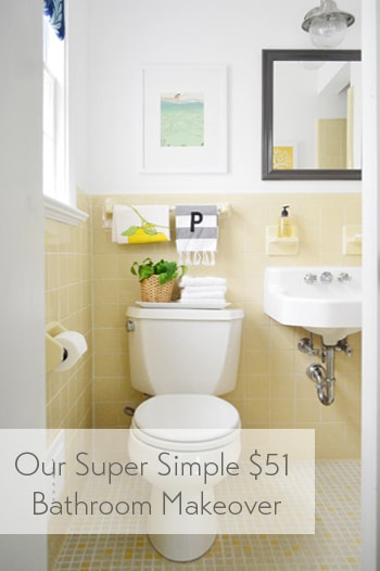
The room has this casual Anthropologie-ish vibe now, which isn’t usually something I’m very good at pulling off – so all the credit goes to the items that were already there (like the original white sink and that sweet 60’s tile). And it definitely didn’t hurt to add some art and a few accessories to fill the voids. Here’s a before shot taken from the same doorway about a week after we moved into our house:
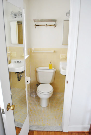
Thank goodness the I-can-see-my-full-body-while-I’m-on-the-toilet mirror is gone, eh?
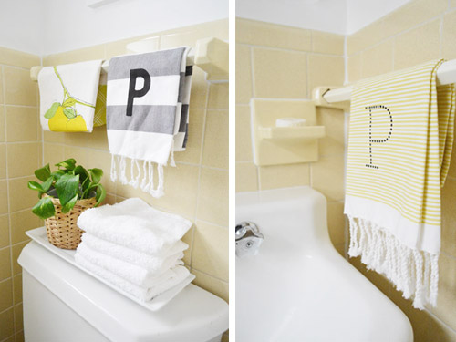
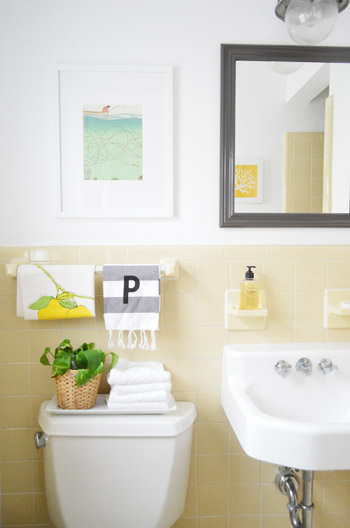
It’s a tiny room, so please excuse my lack of diverse and all-encompassing shots. The print hanging over the toilet is just a page I tore out of the September issue of Real Simple last year (I keep a flat tupperware box under the bed in the guest room full of “someday art” – so I sifted through it and thought the colors – and the water/fishing thing – was cute for a bathroom). The frame is from Target and came with the mat for $22.
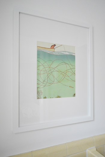
I like how the softer white frame and art works with the deeper mirror and light fixture. Instead of competing and feeling busy, the art falls back and the charcoal mirror over the sink (which I painted Silhouette by Benjamin Moore) says “look I’m the focal point.” Both of the P hand towels are from West Elm (from two different readers at book signings, which was such a fun surprise). And that lemon tea towel is also from someone at a signing. So glad we found a spot for them :)
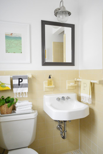
Dag guest bathroom, why you gotta be so sweet? Here’s where I’ll insert John’s terrible third grade joke about how you have to have two monogrammed P towels in a bathroom because that’s where the pee pee goes. Please forgive him.
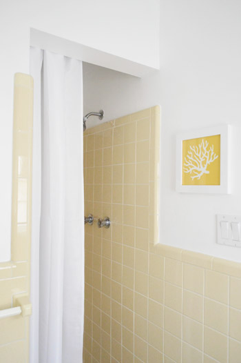
And for those requesting a shot of the shower opening, it’s a crazy-tight room, so this is the best I could muster. But you can see the art that hangs across from the mirror a little better. That’s just an old fabric remnant (from U-Fab last year) that I slapped in a frame.
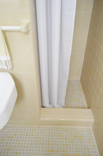
I like that it relates to the brighter yellow tiles in the floor as well as the pops of yellow in the guest room. And here’s a shot of the bottom of the shower, so you can see how that tile lip keeps the curtain from encroaching on the sink. And because it’s polyester (just like a typical fabric shower curtain liner) we just wash it to keep it clean. So far, so good (it’s been in use for 6 months).
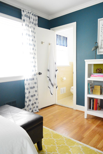
This is the view from the guest room, which is nice and tied in, thanks to everything from the blue window shade and the turkish towel on the door (don’t they look cute next to the polka dot curtains?).
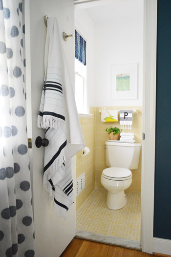
It’s so funny how an old yellow bathroom that used to feel like “the weird room” in our house suddenly fits right in.
Here’s what we did in there to snap it into shape:
painted the walls, trim, and ceiling(we did that here)frosted the window for privacy(we did that here)made a window treatment with a bold fabric remnant(we did that here)painted the frame of the mirror so it stands out morehung some art over the toilet and across from the mirrorwent accessory happy
How you like me now, list? Yeah, that’s what I thought.
And here’s our budget breakdown:
- fresh white paint for the walls, ceiling, and trim (all Decorators White by Benjamin Moore): $25 (for a quart)
- paint for the mirror (Silhouette by Benjamin Moore): $0 (already owned)
- art for above the toilet: $22 (frame: Target, art: a free page torn from Real Simple)
- coral fabric art that you see in the mirror: $0 (yellow coral fabric remnant + frame we already had)
- fabric remnant for the window treatment: $4 (from U-Fab by Iman)
- frosting film for the window: $0 (already owned from other projects like this)
- hand towels, plant, bath towel, and soap: $0 (all already owned)
- TOTAL SPENT: $51 (it would probably be around $70 total if you didn’t already have mirror paint, hand towels, & frosting film)
And that’s why I love accessorizing. The end.
Psst- Wanna know where we got something in our house or what paint color we used? Just click on this button:


Josh says
It’s kind of crazy what a couple simple personal touches can do for a room.
We’re trying to make our kitchen our own… So far so… good?
Check it –> http://bit.ly/ZPaSOG
YoungHouseLove says
I know I’m crazy, but that mess looks like lots of fun!
xo
s
Henna | HENNA BLOSSOM BLOG says
NICE! It’s so funny how we forget sometimes…the little details and a bit of color really make ALL the difference. I love the update!! And it’s fun that you didn’t have to do anything huge to get such a great outcome!
Made me think of fashion…ha, sorry to turn it back to ME (but I guess it’s what we bloggers DO). I started a fashion series (simple, fun outfits for real people). Love for you to SEEEEE: http://hennablossom.com/?p=2248
(details and pops of color) ;)
Nice job as always guys!
xo
Sandra F says
I LOVE how you worked with the tile instead of tearing it all out. My husband and I have some ugly tan/peach tile that I”m trying to figure out how to work with. Thanks for the inspiration!
jenn @ beyond the stoop says
loving it! love the P towels and the philodendron… my boyfriend claims we have a jungle in our apartment from all of my philodendrons that all came from 1 plant i had my freshman year in college ;) but they are just so cute and add the right amount of green!
also, loving the yellow. our bathroom recently got a mini make-over with pops of yellow too!
http://www.beyondthestoop.com/2013/04/bathroom-update.html
cheers.
YoungHouseLove says
Looks great! I love that tile you have around the tub. Can’t believe it wasn’t grouted!
xo
s
Sarah says
So cute!! Your guests are very lucky!
Leigh Anne says
It’s adorable! Was the light over the mirror already there when you guys moved in? I love it!
YoungHouseLove says
Here’s the post about that: https://www.younghouselove.com/a-not-so-quick-fix/
xo
s
Clare says
Wow – I love this update! and I am enjoying the continual inspiration for me not just frame what’s officially “art” but whatever pretty/cute/applicable/funny? image strikes my fancy. Looks great!!
Rebecca | the lil house that could says
The mirror looks great and those two hand towels are adorable!
Leigh Anne says
Nevermind, I just scrolled up to the before and it looks like the original was different! :-)
YoungHouseLove says
Oh yes, here’s that post for ya: https://www.younghouselove.com/a-not-so-quick-fix/
xo
s
Anele @ Success Along the Weigh says
Another victory for you guys! It all looks intentional and not like you were trying to work with what you had, if that makes sense. I have to admit in a weird flash I wondered what that awesome penny tile in your kitchen would look like on the floor. I’ve always liked yellow and gray together.
I love using calendar pages as art. I love putting big ol’ calendars on my wishlist and have people buy them for me and then I can get it for free! WOO HOO!
YoungHouseLove says
Oh man, I’ve thought about that too! The little scrabble-ish floor tile is my favorite of the vintage tile though (the walls are just subway, but the little squares on the floor make me smile).
xo
s
Nikki says
I love the way the bathroom turned out with the old tile! The tile and shower set up look just like the showers in my college dorms at Saint Mary’s College, Notre Dame, IN.
Wendy @ New Moms Talk says
It looks beautiful!
P’s are special to us, as we has a game when I was in labor with Susanna. Each goal word had a P sound: proceed, respirate, push, etc. I don’t remember all of them, but it made us laugh.
The words ended with our daughter whose middle name is Hope. I still stress the P sound to her and she laughs!
YoungHouseLove says
That’s so cute!
xo
s
Beryl says
Where did you get that basket for the plant? I love it :)
YoungHouseLove says
That was from Ikea maybe 5 years ago? I think they might still sell it though, in the planter area :)
xo
s
Ainhoa says
I was skeptical of the yellow tile but I have to say, you really pulled it off and made it work! The first shot especially is lovely.
Jessica says
I love that you embraced the vintage rather than tearing out all that adorable yellow tile. That striped hand towel is to die for and I never would have guessed that the art was torn from a magazine page. I can never find art worthy magazine pages. I just can’t believe you guys managed to make that kind of shower stall look cute. I had one once and it always felt very “locker room.” Have you had any guests over since finishing the bathroom?
YoungHouseLove says
We haven’t but my mom’s coming to stay for Clara’s birthday in a few weeks, so I’m so excited for her to check it out.
xo
s
Lorie ~ Ferndale Lane says
I love the “new” old bathroom! It’s nice to keep something quirky from the original build of the house. The yellow is bright and cheery and pops next to the blue room, love the polka dot curtains!!
Brit (House Updated) says
Looks great. Love the West Elm towels – I have some myself (and also have a “P” last name, haha). With the blue window shade, I thought you might have gone with more blue accents, but I really like the gray ones as I think it modernizes the existing tile well!
YoungHouseLove says
Yeah, since the guest room itself has all blue walls, we didn’t want to go overboard, so the blue shade in the window was enough for us to say “done” :)
xo
s
Kristen | Popcorn on the Stove says
Love the little decorative touches you guys added – it definitely has an Anthro vibe now!
Shell says
Have you thought about adding a small rug? I think that would complete the look and add texture.
YoungHouseLove says
I thought about a small square white fluffy rug, just have to hunt down the right size :)
xo
s
Jennifer Barfield says
I was going to suggest a white rug/bath mat as well. Sorry, but when I come out of the shower, I like to step on something soft/fluffy and to absorb the extra water that might still be on me (I tend to stand in my shower and dry off as much as I can before stepping out. I hate wet bathroom floors. LOL!
YoungHouseLove says
Haha, me too!
xo
s
Pamela says
Hi Sherry,
Just FYI – I found a super cute & soft bathroom rug at Target for my master bathroom’s small shower area after it was conservatively remodeled. After searching for a smaller square shape that was also affordable, Target saved the day – it’s Thomas O’Brien brand & is ~24 x 24. Mine is a creamy color, but I think it may also come in white.
YoungHouseLove says
Sounds perfect! Will have to check it out!
xo
s
Pamela says
Hi Sherry,
Just FYI – I found a super cute, soft square rug at Target after completing a conservative master bathroom remodel. After searching for a square, smaller rug that was affordable, Target saved the day – it’s Thomas O’Brien brand and is ~24″ x 24″. Mine is a creamy color, but I think it comes in white, too.
Anneliese says
World Market also has a cute round white bathmat for $12.99 if you want to echo the polka dots in the curtains.
YoungHouseLove says
Fun!
xo
s
FitBritt@MyOwnBalance says
I really like the way you’ve updated this bath! I think the yellow looks so cheery and welcoming! Awesome!
Jess @ Little House. Big Heart. says
Oh, that gray on the mirror is stunning! I’m going to have to find a place to use it! It goes so well with that buttery yellow! Well done, guys!
YoungHouseLove says
Thanks Jess!
xo
s
Joanna says
I can’t believe how accessories and paint made this room so beautiful! I love the painted mirror!
Sarah C. says
I love the yellow tile! So retro and yet so fresh!
Crystal @ 29 Rue House says
Very nice guys!! The mirror color is perfect and I love the non-symmetry (in both length and design) in the towels hanging over the toilet. It is probably for the best you didn’t hang the two “P” towels right next to each other. LOL
YoungHouseLove says
Haha!
xo
s
Meredith says
It cracks me up that you specifically call that out as something you like; I was thinking as I read this post that those towels would drive my OCD CRAZY, and if I were a guest there I would undoubtably “fix” them by lining them up and re-folding the fruit one. :) Just goes to show everyone’s got an opinion!
Donna says
I was thinking the same thing as Meredith. I am super OCD and like things to be more symmetrical and lined up. Ha ha, to each her own!
YoungHouseLove says
We just like to eye things to see what looks best (since sometimes in our heads what “should” work ends up looking wonky in person). In our case the towel rod was not centered over the toilet, so we tried looking at the art centered over the towel bar and then tried looking at it centered over the toilet and that was more pleasing to the eye – I think you pick up the toilet placement and the art more in person than the towel bar and the art, if that makes sense :)
xo
s
Crystal @ 29 Rue House says
I didn’t even notice that the towel bar was off centered with the toilet! Maybe that is why the asymmetrical design works for me plus I think the plant balances it out a little.
Either way, I just happened to pop back here and thought it was funny that my comment illicted some responses! :)
Kendra says
Where is the Turkish towel from? I love it! And, your upgrade. Sah-weet.
YoungHouseLove says
HomeGoods! Love that thing.
xo
s
Rene @thedomesticlady says
I love those west elm towels. I scored a bunch of them at the Pottery Barn outlet for $3!
keekee says
I see the forum link, but no family blog link anymore. I am using the latest version on Internet Explorer (I know, I know…it is all my office will allow!)
YoungHouseLove says
Hmm, is it version 6? That one is a tough nut to crack. Also, did you try clearing your browser’s cache/cookies/data? That could snap it back into shape :)
xo
s
Jenny says
Oh man, those West Elm towels (which we have, unmonogrammed) totally make me wish my hubby and I had the same last name. I’m generally super happy with the decision to keep my own, but silly monograms make me wish we shared one.
YoungHouseLove says
Aw, I’d do one in each first initial! Like J & S!
xo
s
Allie ~ This Yellow House says
Wow! It looks so cute now! Good job guys. You had me cracking up at the P P towels :P I love that you framed a page from a magazine and it looks so cute. I am now on the look out for pictures to frame. Thanks for the inspiration!
Janelle @ Two Cups of Happy says
I’m glad I’m not the only one that uses magazine tear outs as art. Haha. I don’t have any up right now but they’re on rotation! The fashion shoots in women’s mags sometimes have pretty set locations so I like to use those.
Andrea A says
I love this bathroom! Probably my favorite “workin’ with whatcha got” post y’all have done. I’ve recently discovered how satisfying it is to take something from outdated and weird to ‘vintage with a little sumpin sumpin’ just by incorporating elements that flatter its character.
YoungHouseLove says
Aw thanks Andrea!
xo
s
Stefanie says
It’s cute! My master bedroom is yellow and gray and I love it.
BTW, I like this post format. I was beginning to miss your style the past couple weeks.
LauraC says
John’s comment made the post. That is all. ;)
Hemma says
FYI: I see no ‘Family Blog’ in the header.
Just cleared all cookies ++.
From L- R: I see : About us, Housetour, Projects, Our wedding, Our book, Forums.
I use Safari 6.0.2
Now on to read your post.
YoungHouseLove says
Thanks Hemma! I think I remember Safari 6 being the bane of our existence (in the past, the only way for us to fix formatting issues was to ask folks to upgrade to a newer version if they could since it’s an older one that messes with code a lot for some reason). Thanks for all the info though! Would be awesome if we could conquer Safari 6!
xo
s
Annabel Vita says
I’m in love! It looks really fresh but sophisticated at the same time, and it totally looks like that lived in style rather than a sterile guest bathroom. Your guests are very lucky!
Alisa says
I am loving this all over the place! We are finishing up our master bathroom (it’s about as big as this bathroom) and you just gave me a bunch of (cheap) ideas. Thanks!
YoungHouseLove says
So glad!
xo
s
Rebecca says
I am always pulling things out of Real Simple for “some-day” art!
Gayla says
Hey!
I always hate messaging you and asking a ton of questions.. but WHERE did you get those towels? Are they the “pashima” type material?
I am drooling and green, i mean yellow with envy!
-G
YoungHouseLove says
The hand towels are from West Elm and the one on the door is called a “turkish towel” from HomeGoods :)
xo
s
Cara D says
I LOVE it! I hate our guest bathroom but it doesn’t have any retro charm to work with. All 2005 builder grade boring. i plan to do soething with it eventually. Your bath is adorable and so much easier than busting out tile!
Casey says
So cute, and I love the way it looks off the guest room! Such a good fit.
We have the gray striped West Elm hand towel with the dotted digital monogram (R) in our bathroom, layered on top of two of the yellow striped towels, but in teal. I love them! :)
YoungHouseLove says
Sounds really cute!
xo
s
Casey says
I just love the fringe. I mean seriously, why does fringe make everything better? Haha
YoungHouseLove says
Haha, agreed! Put some fringe on it!
xo
s
Lee says
Okay, this actually makes me want to install yellow tile in my bathroom, so I say that’s a job well done!
YoungHouseLove says
Haha, no way! Let’s bring back yellow tile!
xo
s
Rebecca @This Nest is Best says
We have some framed pages of Better Homes & Gardens in our kitchen, so I totally feel you :) They often have beautiful quotes with lovely typography in that magazine!
And the bathroom looks great! Love how embracing a “feature” instead of trying to cover it up can end up making things look quaint and kitsch-y instead of outdated. I’m a big fan!
YoungHouseLove says
Thanks Rebecca!
xo
s
Taylor says
I have the same gray/white striped hand towel from West Elm! LOVE IT!!! Guest bath transformation looks great. we did a lot of similar changes in ours & I think ours took on a whole new look. I think our navy to teal hamper makes the room though :)
YoungHouseLove says
That sounds so sweet!
xo
s
donita says
Cute bathroom!! *I do see the forum tab, but not the family tab. We use Google*
YoungHouseLove says
Hmm, do you know how to go into your settings in your browser and clear the cache? It’s usually in a dropdown menu at the top (maybe under “preferences”?). I think that could solve it. You also could try upgrading if you’re using a really old version of your browser, which usually snaps everything back into place. And to anyone missing the family tab for now, we added a link in our sidebar under shortcuts as well, so you can get over there that way :)
xo
s
Melissa @ Loving Here says
We have been in the process of “Growing up” our guest room, which is a slow process since we don’t want to spend much on that room since it’s used only every now and then. Still, it’s slowly coming along. We bought a curtain rod last night, so we’ll get some softer texture in there soon- woohoo!
http://lovinghere.com/great-crates/
YoungHouseLove says
Ooh curtains make such a difference! Good luck Melissa!
xo
s
Amy says
Where is that darling Turkish towel from?
YoungHouseLove says
That’s a HomeGoods find a while back. Maybe last summer?
xo
s
Christina says
John’s P P joke was just what I needed to start my day. Hilarious! Looks like you need number towels in another bathroom. 1 & 2 feels like it will fit right in ;)
YoungHouseLove says
Haha!
xo
s
Alexi says
The bathroom turned out so cute! Love to see a future post of finding “free magazine art” ;)
YoungHouseLove says
That’s a fun topic!
xo
s
Melissa @ Loving Here says
Oh, and the most important part of the comment, which I forgot to say originally is that I love the Real Simple artwork in there! The whole room looks great (I love yellow) but it really adds a nice touch!
YoungHouseLove says
Thanks Melissa!
xo
s
Julie says
Love it! But what happened to the pretty medallion shower curtain that used to be in there?
YoungHouseLove says
I think it’s off to Goodwill for that guy. It was a regular length (84″ instead of 95″) so having the bar at that height awkwardly infringed on the opening to the shower (raising the bar to ceiling height allowed us to tuck it behind the header so it’s not hanging into the opening anymore). I hope someone uses it to make pillows or hangs it in their bathroom though. I bet he’ll find a good home :)
xo
s