Some of the same folks behind Richmond’s Homearama (who are working with us on our Habitat For Humanity Showhouse – which we’re planning to update you guys on ASAP) invited us to similar-but-new show called the Massey Street of Dreams. Like Homearama, it features custom built homes that are decked out inside by designers & decorators who collaborate with each builder and their team. But this show’s the brainchild of cancer survivor George Emerson, so it’s got a charitable slant in that all proceeds benefit our local VCU Massey Cancer Center. So just like we had fun sharing these eight homes with you guys, we’re psyched to share the four pretty places that make up the Massey Street of Dreams.
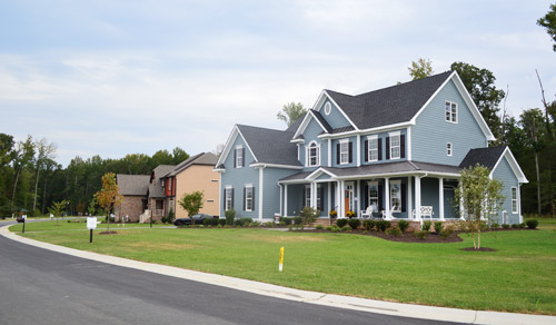
The homes are located side-by-side in a new community and (here’s the part where I’m jealous) they’re basically right across the street from water views of the James River. Each house is done by a different builder and a different design team, so they’re all pretty distinct. We love these types of tours because we always find ourselves saying “I liked the kitchen in that one the most” or “I’d take the bath from this one, but the patio from that one.”
Let’s start with the blue one first. It was probably our favorite kitchen of the group, since it was hitting lots of the trends that we’ve fallen for like gray cabinets, an accent color on the island along with a different counter material, an exposed hood, etc.
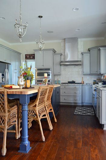
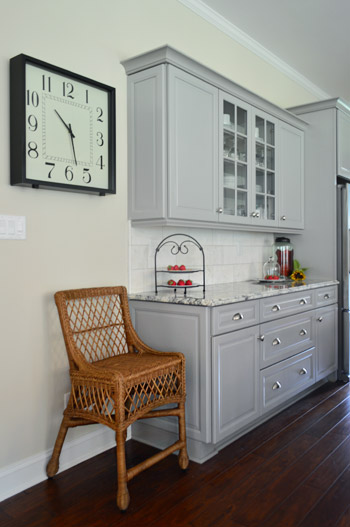
The marble subway tile backsplash was a nice classic choice too, and I don’t think we’ve ever met a glass-fronted cabinet that we didn’t like.
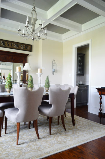
The butler’s pantry / dry bar area that connected the kitchen and dining room was a nice transition between the two spaces. The darker gray on these cabinets tied in with the color of the ceiling coffers (you can see that better in the next photo).
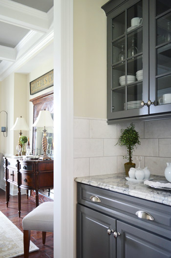
We love ourselves a coffered ceiling – especially since it lets this room get away with a dark ceiling color without making the room feel too heavy.
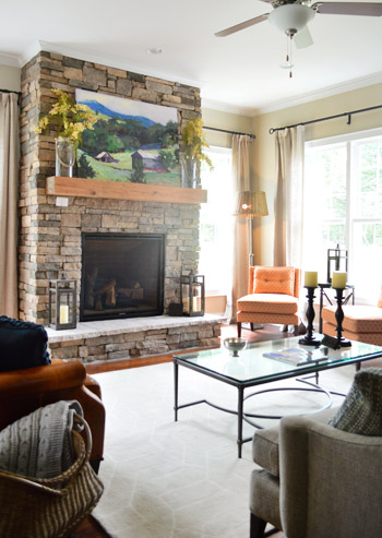
The living room was fairly traditional by most measures, but there were two patterned orange chairs in the corner that added an element of happy-casual. The stone + raw wood combo on the fireplace really cozied up the room.
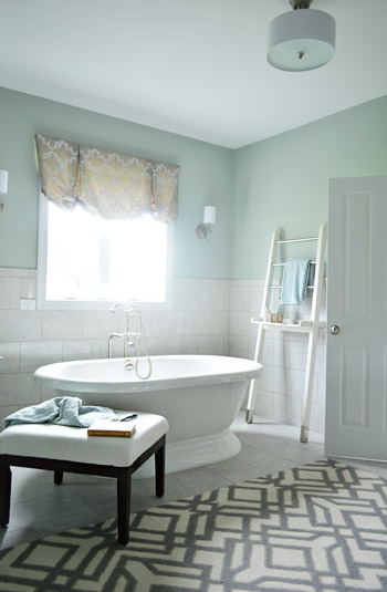
The house also had our favorite en-suite bathroom, namely because of the giant freestanding tub. This type of tub is similar to the one we’ve got slated for our showhouse project, so it was reassuring to see how awesome it could look in real life.
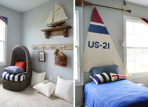
This nautical kids room was especially charming to Sherry, since she was (predictably) smitten with the egg chair. We both thought the details like the sail headboard (hung from an oar, no less) and the dock cleat hook rail were fun additions.
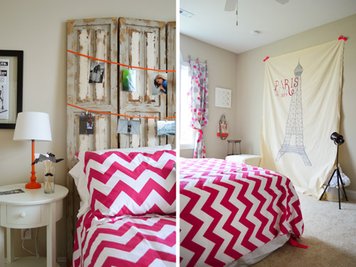
The teenage girl’s room was designed by – get this – an actual teenage girl. Apparently this high schooler is interested in going to school to be an interior designer so they let her get her feet wet in this space. It was a “Paris meets mustache” theme of sorts with fun details like actual photos of her and her friends, and this idea of a place for her friends to take silly photos against the big backdrop using props like the mustaches on a stick (in the bedside cup).
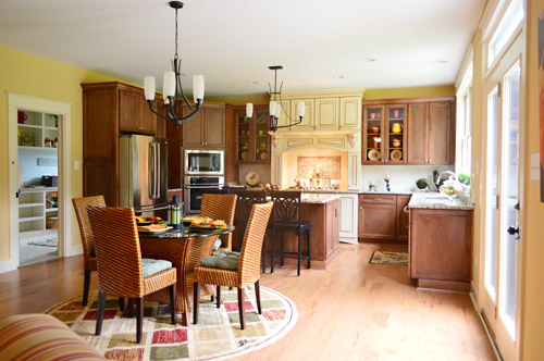
The second home had a more old world style to it, but the kitchen had one extremely modern feature. See that door to the left of the kitchen?
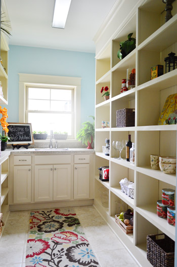
That’s a prep kitchen! According to the project coordinator of the show, they love sharing new trends in housing, and a prep kitchen is the next big thing. Essentially it’s an area where you can keep things like your toaster and your coffee maker out and plugged in all of the time, without cluttering up your kitchen counters. We’re not sure we’re fancy enough to require a prep kitchen, but if nothing else it’d serve as a nice pantry with a bonus sink.
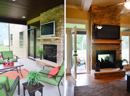
The house not only featured an open, covered porch with a planked ceiling (a kick you know we’re currently on ourselves) but it also had a DOUBLE-SIDED, INDOOR-OUTDOOR fireplace. How sweet is that? Oh, and let’s not overlook the outdoor TV.
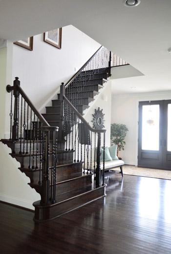
The third house I dubbed as the one occupied by “Richmond’s Kris Jenner.” I don’t know lots about the Kardashian matriarch, but I’ve picked up that she’s got a thing for high contrast black-and-white decor thanks to Sherry subjecting me to bits and pieces of the show. This house was the less in your face version of that, so I mean it as a compliment. It felt upscale, with a lot of white and gray along with some strategic punches of dark brown/black. For instance, we loved the visual oomph of this dark staircase.
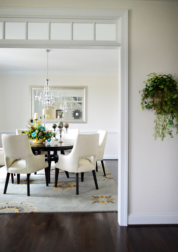
This dining room, like the one in the first house, featured a transom window in its doorway, which is always a nice added detail.
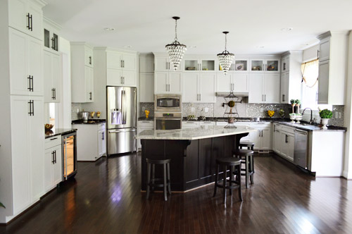
The kitchen in this home was definitely the most grand. I mean, look at all of those cabinets. And oh yeah, I couldn’t figure out how to turn that light off in the wine fridge. Oops. Just pretend ET’s in there, phoning home.
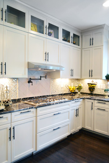
We loved the use of dark hardware to spice up the soft gray cabinets.
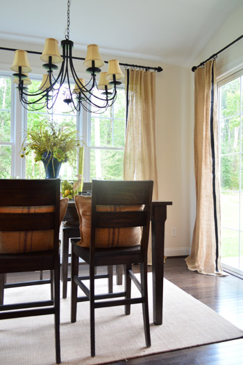
The breakfast nook off of the kitchen brought in some nice texture in the form of burlap curtains, which we learned was just some fabric that the designer added a black ribbon to with a glue gun. Sherry stood there smiling at them for a nice long time.
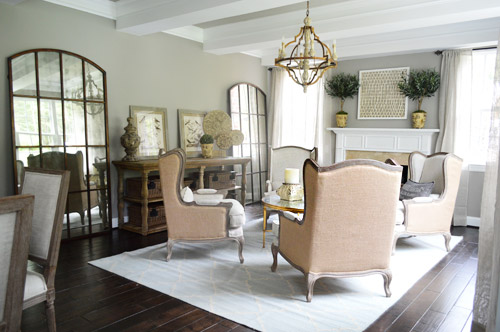
This last house was certainly the most decked out of the four – and probably the one with the most distinct style. It was packed with ornate, rustic pieces – sort like things you might find at Restoration Hardware. How great are those giant arched mirrors below?
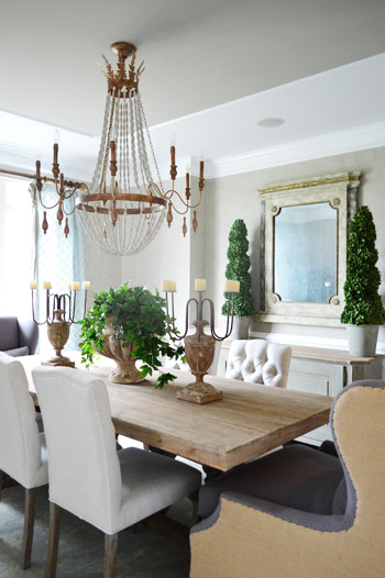
Here’s the dining room. Sherry always loves a beaded chandelier and I was digging the big cozy chairs at the head of the table… although I could see myself just falling asleep in one after a nice Thanksgiving meal and then dripping gravy drool all over the nice upholstery.
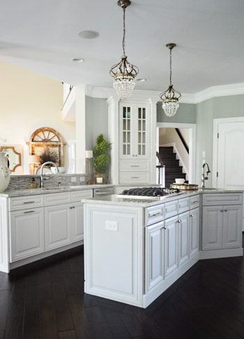
We were both fascinated by the kitchen because it was a layout we had never seen before. It was hard to capture on camera, but picture three identically shaped workspaces staggered apart but parallel to each other – one was a peninsula, one was an island and one was a wall full of cabinets and appliances like the fridge.
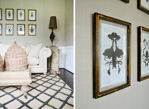
In the front sitting room there was this really interesting and well executed paint treatment that looked like grasscloth wallpaper. They even painted it in sections that mimicked where you might see the edge of one wallpaper roll meeting another.
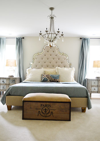
This house featured the new home trend of dual main bedrooms – one on the first floor and one on the second. Here’s the one upstairs (this picture doesn’t do the tufted headboard’s immense size any justice).
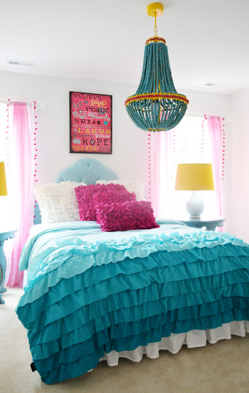
The girls bedroom strayed a bit from the rest of the home’s style (well, in color scheme at least). It seems to have been inspired by the chandelier, so we thought bringing in some of the yellow touches was nice, like those lamp shades on either side of the bed.
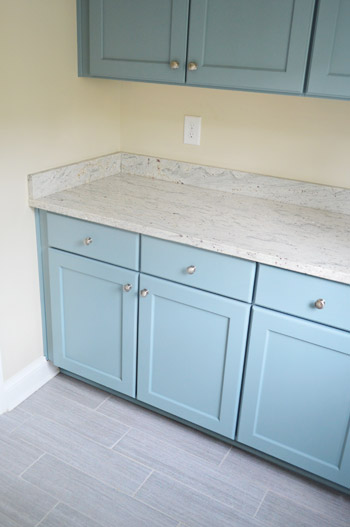
And last but not least, the mudroom in this home wasn’t styled yet but that didn’t stop us from ogling the mix of materials. The floor tile is what first got our attention, but it was pairing that with powder blue cabinets that made us excited to see how this space was coming together.
Obviously there’s a lot more to see in person, but this is a smattering of what caught our eye. These houses are open to the public Thursday through Sunday, this week and next (Sept 19-22 & 26-29) and all the info is on their website. It’s definitely a great cause!
Psst – Wanna see a finished showhouse that we designed? Click here for Our Full Showhouse Tour, which includes final pictures of every room, the floor plan, budget info, a video walk-through, and shoppable showhouse furniture & accessories.


Skooks says
Dual master bedrooms? I don’t get it.
YoungHouseLove says
We think it’s meant for flexibility so you can live in a house with young kids (and sleep upstairs with them) and use the master downstairs for guests during that stage of life, and then as you get older and your kids leave the nest you might want to navigate the stairs less, so a first floor master would be preferred (while keeping the upstairs bedrooms available for grown children who might come to stay with their kids).
xo
s
Lauren says
Also could be for a mother-in-law plan.
Skooks says
Swanky. Though, if people are having a hard time getting up the stairs in their old age, who is cleaning up there? ;)
YoungHouseLove says
Haha, that’s a good question!
xo
s
Rosie says
I like the idea especially since teenagers keep all of their stuff in one room. Us adults spread our stuff all over the house so it makes sense to have a big room for teens!
It would be great for two teenagers sharing a room too. Closet space, desk space, maybe even room for double beds as a luxury! Also… SLEEPOVERS!
Sara says
I think it’s really more likely a guest suite. That way your guests don’t have to come upstairs and see your messy bedrooms/share a bathroom with your kids.
As for for cleaning- I would imagine the cleaning lady cleans it! If you can have two masters, you can probably hire someone to clean!
Mellie says
My fiancé’s parents’ house has a dual master bedroom and their house was built in the 90s. The whole house has a really cool layout. My fiancé wanted to live at home until he was engaged so when we were dating, we spent a lot of time there. His parents loved having their master bedroom on the first floor right near the main part of the house, and having lots of privacy, and my fiancé loved having his master bedroom on the second floor and having privacy since he’s well into his 20s, which worked out great for everyone. I didn’t know this was a thing, but I can see it working for so many different uses.
Maura says
I say, if navigating the stairs is getting tough, it’s time to spend a little hard-earned cash on a cleaning service! That is very high on my future retired life list!
Julie Smart Koob says
Dual masters, and more specifically first-floor masters, are becoming more popular in the Richmond area. If the recession taught us nothing else, it taught home buyers that you could not move very two years and needed to plan for the future. By buying a home with two masters, aging parents can use the master on the first floor, while the home owners are on the second level. And then in the future, the first floor master is available for the owners when stairs become an issue.
Kris says
My dad is a custom homebuilder in NC and has been doing “dual masters” for at least 10 years! He has always called it the “in-law’s suite” which I think stems from the idea of multi-generational living. These days I think the idea extends to the younger generation (as opposed to aging parents) as young people may live at home longer after college.
And like other said, it seems to be morepopular to put the teens/young adults upstairs with the parents downstairs and closer to the main living spaces.
Tracy says
John and Sherry essentially had a dual master in a ranch at House 2. I’m sure these show-houses are swankier, but often a bedroom with an ensuite bath can be labeled “master.” We have two bedrooms with ensuite baths, one upstairs, one on the main level. The main level is the true master – obvious by the bathroom amenities and closet space. We sleep downstairs and our kids sleep upstairs. Have done it that way since the youngest was 2.
YoungHouseLove says
Oh my gosh, we did! Never thought of that! We had the original master from the 60s (our guest room) and the addition which was the new master.
xo
s
Kim says
Awesome houses! I loved the island in the grey kitchen! It was rustic and modern–right up my alley!! Now if only I had the guts to paint mine that teal color!!!
Moira says
You don’t have a close up of that mudroom tile, do you? Just curious…it might be the same tile I just put in my foyer.
YoungHouseLove says
I wish we did! It’s sort of a modern porcelain we think, with striations (very straight, very clean). Such a cool tile!
xo
s
Susan says
Would you describe that tile as wood-look at all? It looks very similar but just a shade lighter than what my in-laws just put in their new master bath. It’s amazing. It looks so warm and woody . . . but it’s tile. I thought it would be so tacky looking until I saw it in person and I couldn’t get over how great it looked.
YoungHouseLove says
It’s sort of more gray like whitewashed wood with really straight lines. Very modern!
xo
s
Leah says
I love this post! So great to see different styles featured. I loved the exterior of the blue house, but the interior of the last one. The picture of the mudroom is especially endearing to me since those are the tiles (or very similar) that I have chosen for our mudroom. Yay!
YoungHouseLove says
They’re so pretty Leah!
xo
s
John says
Nice, but how amazing it would be to see a nice ranch style house. After a while they all look the same. So how about an update on your book earnings?
YoungHouseLove says
We’d love to see a ranch too! Hopefully someone will do one for Homearama!
As for the book earnings, here’s the update: we still haven’t reached our royalty point! We heard it could be years, and some authors never reach it at all, so we’re just thankful we had such a fun experience writing it and got to meet so many awesome people on tour.
xo
s
Kimberly says
I love these houses but it seems like the first was definitely my favorite. Love the butcher block/pretty blue island with the white and gray. My stomach kind of turned at the term “dual master bedrooms.” Yikes! Too McMansion-ish for my tastes, much like the dual laundry rooms. Although I guess I can see why it would be appealing.
Ashleigh says
Any way to find out the blue paint color in the kitchen with the odd layout? Thanks!
YoungHouseLove says
Here’s hoping someone drops in with that info for ya!
xo
s
Justin says
I’ll share the paint color shortly!
IrisM says
Wow ! The photos are gorgeous!!! Really inspiring :)
Can I be random and say that you guy are too amazing :)
xo
Iris the frenchie
http://www.thecoloredmarriedlife.com
YoungHouseLove says
Aw thanks Iris. Right back atcha.
xo
s
Amber says
That prep kitchen/pantry is making me drool! I LOVE it!
Cara says
I read that dual masters are the new thing. Many couples are preferring to sleep apart and have their own space. That is sad.
I love the tub, the one I have planned for our bathroom reno looks just like it. Do you know if it was acrylic or cast iron? I’ve only seen them online and not in person. I don’t want to pay for the cast iron one but don’t want it to look cheap either.
YoungHouseLove says
I think it was porcelain, but I’m not positive!
xo
s
Amanda says
I agree that, if the idea of dual masters is for couples to sleep apart, that they’re sad but how convenient would it be to have the flexibility to switch rooms and have a nice big room for guests? I can’t see ever owning a house that large but, if I did, I could dig the extra master.
Justin says
The tub is cast iron!
YoungHouseLove says
Thanks Justin!
xo
s
Michelle says
Wow looks amazing!
KRB says
Are all of those cabinets (gray, light gray, blue) painted, or is that laquered/finished straight from the manufacturer? Interesting concept–a painted wood look for cabinets–but I wonder whether you can easily paint them later if the color falls off trend. Seems to me they might go the way of avocado and harvest gold appliances.
YoungHouseLove says
They seemed to be painted with a sprayer but I’m not sure if the builder did it on sight or ordered them that way. I know certain lines of cabinetry now come painted in different colors like gray, etc (Martha Stewart from Home Depot, Ikea, etc).
xo
s
Julie Smart Koob says
The gray cabinets in the first home, which was built by Main Street Homes, are by Kraftmaid.
Melissa says
COOL! I have been looking for a cheap solution for my dining room curtains. My ceilings are so tall most options are pricey…. think im gonna go find myself some burlap and black ribbon :) !
Patricia says
Oh my, I could live in any of those houses. How about a giveway ?lol
Lisa says
I noticed in the stairs picture in the Kardashian/Jenner house, the trim under the steps is similar to the trim under your steps. Will you guys be leaving that white or painting it black like this? It really pops, but I wonder if it only looks good with the stairs being that darker wood color.
Thanks for sharing these pics, love house crashing. :)
YoungHouseLove says
We painted ours white to try to blend it in because it’s not our favorite feature (in our hallway it made things feel a little busy). I actually wanted to pop that trim off, but it meets the front of the steps in a way that if we removed it the front of the steps would be out of alignment. Sorry, it’s hard to explain!
xo
s
Rene @thedomesticlady says
That teen room is so great. And I love the light grey cabinets.
Anne @ Planting Sequoias says
I REALLY love that first kitchen. I wouldn’t have thought to put a beige-y/yellow color on the walls with the navy island and gray cabinets, but it really warms up the space!
Beth says
Actually the color in the kitchen is Edgecomb Gray and tends to look more yellow in the picture than it is. I am the designer for the “Blue House”. Really glad you like it.
Yolanda says
Omg that prep kitchen room , I seriously WANT one!!, what I brilliant idea !! How uh- maze balls would that be to have in you’re home.
Lauren L says
So do the houses go up for sale at the end of the event? Who gets that money? How much do the houses go for? I went to the website but didn’t find that info.
YoungHouseLove says
Many of them are for sale and some are already sold. Depending on the builders, a percentage of their profit goes to the cancer center here in town (one builder who had cancer himself is donating 100% of the profits). I hope someone from the event can drop in with more info for ya!
xo
s
Liz says
A PREP kitchen???? Isn’t that the point of a REGULAR kitchen…to prepare food? Oh well, to each their own!! :) Fun post. I love home tours!
Manda Wolf says
I am loving the multiple posts a day btw.
The second house is a dream I think. Give me that house with a bit (or a lot) or land around it with water front views of the James River and I’d be one happy camper.
Katharine says
I think it’s hilarious that you like the powder blue cabinets when you’re on a mission to eliminate every inch of blue trim in the new house! Oh, the irony!
YoungHouseLove says
Haha! They’re very different tones in person (picture one being a soft gray-blue with green undertones and one being a purple-blue with peppermint undertones). Might be a you-have-to-be here thing!
xo
s
Marianne says
I was thinking the same thing.
Sarah says
I would give a kidney to have that blue house.
We’ve been debating the renovate-what-we-have or sell-it-and-build question for months…this may have just pushed me over the edge!
Christina V says
Thanks for sharing! My mother-in-law was in the Massey Center for several months last year and I couldn’t have been more impressed with the facility and especially the staff. If there’s an organization out there that’s more deserving than these wonderful folks, it would be hard to find.
PS. My husband and I inked our first house and have started our own DIY reno. Thanks for all of the great ideas (John, we’re getting a Nest – super excited!).
YoungHouseLove says
That’s so awesome to hear Christina! Hope your mother-in-law is feeling great!
xo
s
Katherine says
The prep kitchen seems like a reaction to the “open concept” kitchen trend. There are many utilitarian kitchen items that are just not attractive and people don’t want that stuff on display for company or others to see. (Toaster oven, kitchen aid, dish rack, etc.)Do you think the “open concept” trend may be on the down-swing?
YoungHouseLove says
Such an interesting way to look at it! I think people like to corral things, so places like “landing pads” near entryways and “prep kitchens” are appealing since you’d have access to things while still keeping them organized/tucked into “their spots” – I definitely don’t think super open (as in “loft living”) is for everyone, but the majority of the open houses we’re seeing still tend to have kitchens that open to living areas and wide doorways into dining rooms and offices. Of course the upstairs/bedrooms seem to have a lot more privacy than the living spaces though.
xo
s
Michelle @ A Healthy Mrs says
Oh my gosh, they’re all so beautiful — I’d take anything from any of them :)
Allison says
Seeing the last picture of the mudroom makes me wonder if you all ever considered painting the vanity in the powder room the same color as the front door. I liked your original idea of painting it a color and was sort of disappointed when you went with dark grey (though I agree that the green wasn’t working!). Might be an interesting tie-in and you know the color works with the slate!
YoungHouseLove says
We did think about that (we even had leftover paint so it would have been free) but I’m in love with the Silhouette color that’s in there for now (it’s nice to have the door and the light in the foyer be the showstoppers while the vanity is moody and sophisticated for now). Who knows where else we’ll add color or pattern though!
xo
s
Colleen says
We just installed those tiles (in the showhouse mudroom) in our 2nd floor full bath. It’s verging on awkward the amount of times I just go in there and stare at them…love ’em.
Caitlin says
Where did you purchase your tiles from? I think those might be beautiful in my kitchen!!
Thanks!
betty (the sweaty betty) says
Have y’all driven through Hallsley (off old hundred rd)? These houses reminded me of that neighborhood. I drive through there once every few months and drool. so many unique styles of homes.. all, sadly, way out of my price range.
YoungHouseLove says
Yes!! Our builder has done a lot of work there so we love Hallsley! Such a charming spot!
xo
s
Maria says
Oh great, now I have to move so I can have a prep kitchen too!!!!
That mudroom tile is similar to the tile I just used in a condo I just renovated – got it at Lowes (Style Selections Leonia Silver) and I love the way it turned out and at $2/sq ft it couldn’t be beat! It just so happens that I used Edgecomb Grey on the walls in that same condo, so I know for a fact this particular tile looks awesome with your foyer walls in case you decide the slate has to go :)
YoungHouseLove says
That’s awesome!
xo
s
Daisy says
My parents have a prep kitchen but we call it the “butler’s pantry” – it is behind a swing door and has a baking area, an extra sink/fridge/dishwasher, storage for brooms and “tall” cleaning items, food storage, etc. It is great because when you host a party you can pile all the dirty dishes in there, close the door and enjoy dessert/the rest of the night without your guests staring at dirty dishes or trying to help you clean up (when you want them to enjoy themselves).
YoungHouseLove says
Sounds so handy!
xo
s
Bree C says
We have friends who just recently remodeled their kitchen and added a prep kitchen. I didn’t realize it was a thing. They are huge entertainers and she loves to cook, so it has worked out perfectly for them. It allows everyone to still congregate in the kitchen (like people are wont to do), but still keeps the main area tidy and useful for serving. I wish we had the space for one. Love that first house, though!
YoungHouseLove says
That sounds so nice!
xo
s
Rachel says
We keep our microwave in the utility room just off the kitchen, it’s great as the microwave is handy but not taking up precious counter space (it’s a bit ugly too as my man bought it before we met!). Now I’m dreaming about shifting the washing machine out of the utility (UK houses rarely have laundry rooms, mist people have washing machines in the kitchen) and making it a mini prep kitchen! Thanks for sharing such awesome houses.
YoungHouseLove says
So smart!
xo
s
Meghan says
I am dying over that first kitchen. We’re looking to remodel ours. Also, that floor in that last mudroom with the ash-blue cabinets, drool. I don’t understand the dual master bedroom thing… but the “prep room” for the kitchen- why didn’t I think of that?! Thanks for sharing!
Aron says
I am obsessed with your blog! It seems like anytime I thinkg about doing something you all are right on time with a post that talks about whatever was on my mind. I am in the planning stage of building a new home and so many of these things are on my mind. The double sided fireplace is exactly what I want with the TV above on both sides. Did you notice if the fireplace was gas and if it had a glass front on the inside and out? I also love the idea of the prep kitchen except a little scaled down. I want to be able to leave the toaster plugged in on a counter for the random poptart but not junking up my kitchen all the time. You all are playing a part in making my dream home a reality!
YoungHouseLove says
Yes, we think it was gas and it had glass on both sides. So pretty!
xo
s
Justin says
You are correct! It is indeed a gas fireplace with glass on both sides.
Keeley @ My Life on a Plate says
I am in love with that prep kitchen. What an awesome idea! We just moved to a larger home and all of my kitchen tools and gadgets are out all the time. I’d love to be able to hide them while still keeping them accessible. Plus, it doubles as a walk-in pantry. Oh, the possibilities!
Teresa @ wherelovemeetslife says
What fun house tours! I’m all over that prep-kitchen. It won’t be in any house I own, but it sure would be nice! And my fave part? The flooring in that last shot.. I LOVE it.
Catherine says
Love lots of things about these rooms. The more casual ones though – not really a fancy pants kind of gal. Thanks for showing us!
p.s. If you were to totally ignore people who have the audacity to ask about your private financial earnings we would understand… ;)
JB says
I’ve been looking everywhere for just the right gray/cream rugs. There are two in this post that I would love to have! The one in the 1st Master Bath and the one in the last home’s living room. I wish decor items were easier to Google; I can never seem to find what I’m looking for.
Yana says
I’ve been trying to find that living rug as well – no luck. There is a similar Threshold rug at Target, but the lines are uneven and I don’t think I can live with that.
Michelle says
Have you checked the options with Ballard Designs? They have a few options of gray/cream rugs with different patterns. I purchased one recenty and I loved it. Check it out. Hope it helps.
Richmond1 says
How beautiful! I may just have to go check them out. I love to see all the new trends for homes. Even though these are much larger than I’ll probably ever own it’s definitely fun to dream.
I was flabbergasted to see my builder on that list based on the experience we and many others have had with them. Wish I could warn people… :-(
Emily says
Any way to find out what the paint color is on the living/dining room walls in the last house? It’s just what I’ve been picturing for our living areas.
YoungHouseLove says
Hopefully someone from the showhouse will drop in with that info!
xo
s
Krystle @ Color Transformed Family says
I love going in show houses. They are packed full of ideas and are so much fun to dream of what life would be like if you lived there.
Norma Neeson says
way to fancy for me..I wouldn’t feel comfortable in any of them altho I liked some of the elements. not too many people actually live like that..or do they?
YoungHouseLove says
I’m not sure! Here in Richmond those homes are a lot more affordable than they might be in other areas. Maybe 500K instead of 1M? I’m not saying they’re cheap (500K is a huge chunk of change!) but many working couples could probably get a loan for that amount – whereas very small older homes in a place like Northern VA or NY can be 800K to 1M, so a house like this would be totally out of most people’s range there – maybe 3M?
xo
s
Dani says
Wowzers. I wish you could build new houses like that in Australia (without having to fork out millions for a custom designer lol) they are AMAZING! Dont see homes here with two master bedrooms here, but I can definitely see how it would be handy for guests/people who have trouble with stairs etc.
I am stoked that our new house does have a “prep kitchen” aka a Butlers Pantry. We put our dishwasher in there too so you can close the door and leave all the mess in there with no one being any the wiser. As well as all our dirty dishes and appliances though it is an actual pantry, so our food will all be kep there. Our house is open plan (kitchen/dining/family is all one big room) so it will be nice to have the butlers pantry to keep it looking tidy.
I love the exterior of the blue one, and the kitchen of the third one kills me.
And I cant believe those prices, our new build is around the 500k mark and its a single story, flabbergasted (lol, love that word) that you could get something like THOSE for the same price! Thats it, our country is too expensive. Would it be obsessive to fly to the USA so I could see these places, coz I really want to…
Lucia says
Dani, it’s not just your country. There are many places in the USA that are super expensive! We live in California and houses like that would be at least $2Million where we are, if not more. :( I would love a butler’s pantry, a laundry room, and a mudroom… Oh, and a study, and a real backyard, and a driveway! Boohoo. It’s too expensive here.
Sam says
Thanks for sharing these gorgeous homes! My city does a Parade of Homes every year, which I love to visit with my sister. I’m excited to see what you guys come up with for your show house. I know it will be beautiful!
Diana says
I LOVE the outside look of the blue house.
Reese says
!!! I WANT A PREP KITCHEN JUST FOR MY TOASTER! (That’s probably pretty frivolous, huh? Must need more toasters then ;p)
The last house had the most comments from me. I for real thought the huge mirrors were actual windows (amazing what that can do, right?) and the ruffle duvet cover is from Anthropologie! (I wanted one in white, but my husband vetoed. We have a certain number of design vetoes, and he used one on the ruffles. Sad.).
I’m even more excited to see YOUR design house now! Thanks for the tease ;)
Chez says
Always fun to peek into other homes! Off-topic question for Sherry: We have the same rug that you moved to Clara’s room (aqua/charcoal). This rug is in our LR which is right off of the entry. We need an entry rug. Any thoughts on what rug would look good adjacent to the aqua/charcoal rug? I don’t really want a solid entry rug but also need something that will complement the other rug since you’ll be able to see both rugs when you walk in. Help? Thanks!
YoungHouseLove says
Hmm, maybe something gray or a cool tan? Like a woven/jute but in a cooler tone than a warm honey?
xo
s
Shelley @ Calypso in the Country says
I could stare at house tours all day! Thank you – I have had the craziest week and now I feel a little more relaxed after taking in all these beautiful homes!
-Shelley
Maura says
Oooh, a prep kitchen?!? I need one! Not for “prepping”, but most definitely for “make your microwave popcorn somewhere else; I’m trying to work in here”.