Update: Holy cow, you guys are full of so many fun ideas today! I’m having trouble keeping up with comments since they’re rolling in so furiously, but please know I’m reading them all and loving all the suggestions!
Happy Friday! We’ve been all over the place this week, painting the walls/trim/ceiling in the bathroom & closet, diving into some basket craftiness, de-wallpapering our biggest room yet (the 21′ long kitchen), and now we have a little Clara-room update along with some photoshop percolating as we plot our next move in there. But first, here’s the tiny (and twinkly) addition:
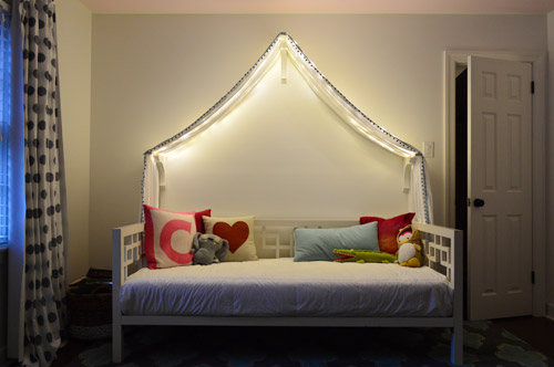
Things just got a little brighter in here…
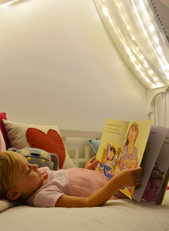
Ever since we hung her canopy, we’ve thought about adding lights to it. Both for the magic of it (Clara loves them) and also for the function of it being a well-lit place for bedtime stories. We feared traditional Christmas lights would be too heavy and make the fabric sag in weird ways (plus, they could look a little messy when they were off) so after some hunting online, we came across what are often dubbed “Fairy Lights.”
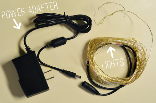
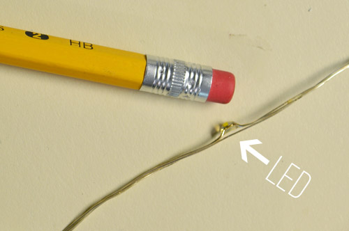
They’re basically small LEDs (check out this picture for scale – they’re tiny) that are strung on a thin wire. The particular set that we bought was 33 feet long and sold for $14 on Amazon. They’re not longer available but here’s an affiliate link for something similar.
The wire itself is extremely light and pretty moldable, so it was easy to weave it back and forth across the 18″ corbels that the fabric rests on. And by some luck of the draw, 33 feet was just about the perfect length to go back and forth four times on each side of the peak to the side brackets and secure them at each turn with white tape, so they’re not something Clara easily unwind and swing around like a lasso – but they will easily release under her weight, so she couldn’t strangle on them.
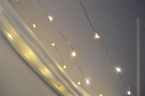
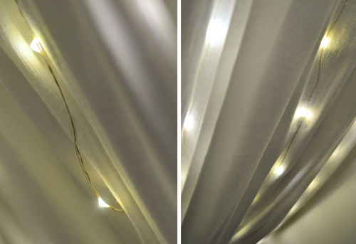
The next step was just draping the canopy back over them. The LEDs are so small that they tuck into the folds and are barely visible when they’re off. And when they’re on, well, you can see how they twinkle below. And since they’re LEDs, they’re completely cool to the touch – so we don’t have any fear of them being against fabric. I also love that they’re small resin-ish glowing dots instead of larger glass bulbs that could shatter.
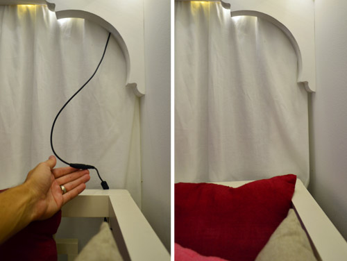
I wish the part that plugs in weren’t big and black, but we were able to plug it in behind the bed and wrap the cord around the bed in a way that it’s able to be hidden behind the canopy most of the time, but easily accessed when it’s time to connect the cords to the power adapter. See how you can see it on the left, but it’s tucked away and invisible on the right? Thank you John, hand model of the ages.
Clara LOVES them. Partly because they’re called “Fairy Lights” but mostly because she feels very special having her own set of secret lights above the bed. We intended just to put them on for story time at night or other special play times, but they actually put off a fair amount of light, so we’ve found ourselves putting them on just about any time we’re in the room and the sun isn’t fully out.
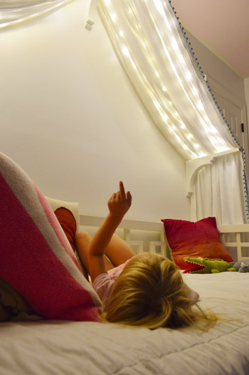
We’ve had them up there for a week or two (didn’t want to sing their praises too soon only to have them burn out or something weird) and so far they have been awesome for our gentle girl. She hasn’t touched them once, but loves gazing up at them. Meanwhile, my best friend’s four year old daughter is nothing short of an acrobat, so we laughed about how she’d probably scale the canopy and hang from the fabric like she was Pink in concert.

But even with the addition of the lights, the canopy is still definitely missing something above it. There’s still so much white on white on white that we’ve been brainstorming which way we want to go. We’ve debated painting just that peaked area under the canopy for a while and then adding something else in there (like a hanging paper lantern or mobile or even a cute little animal head or something). So here are a few ideas, thanks to our good friend Photoshop.
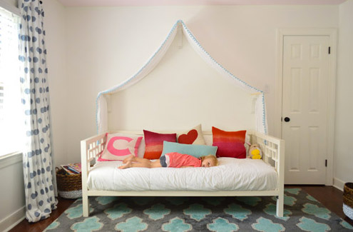
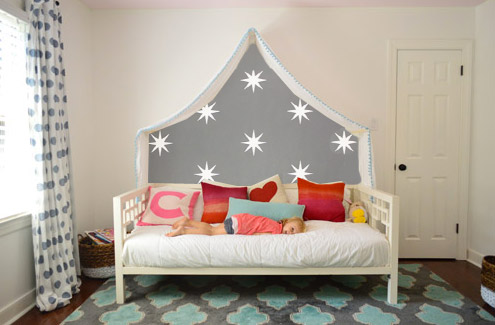
Idea #1: A gray tone on the walls to add drama and a little dreaminess to the canopy, inspired by this wallpaper by Osborne And Little.
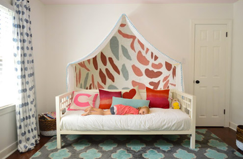
Idea #2: Maybe I could freehand some sort of imperfect painterly-ish mural, inspired by this awesome fabric covered lamp shade?
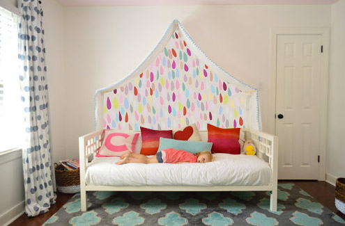
Idea #3: Another hand painted mural possibility could be something like this cluster of colorful raindrops in a variety of colors (inspired by this amazing but sadly sold out print).
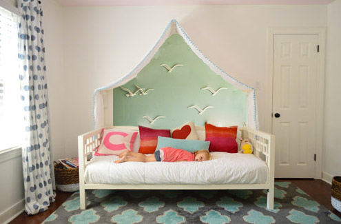
Idea #4: Then I saw this picture of a pretty blue-green wall with little birds on it and thought that could be fun.
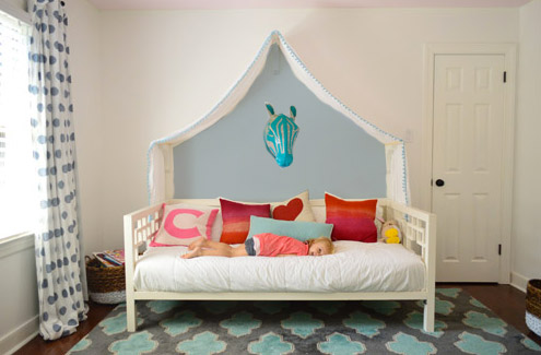
Idea #5: Since Clara’s quite the animal lover, we thought maybe a friendly giraffe or zebra (like this one from Dwell Studio) peering down at her while she sleeps could be fun with a blue-gray wall.
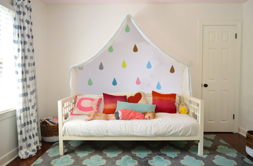
Idea #6: These little teardrops in a few different colors had my mind spinning with possibilities too.
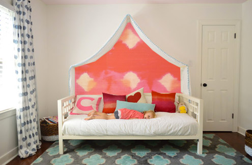
Idea #7: Then I thought about a colorful fabric hung along that back wall, perhaps something with the same large-scale boldness of this pink and red wall coverings that Jenny shared here.
Idea #8: And then there was the possibility of even darker charcoal paint on the walls and some asymmetrical handmade banners in a few colors like these (which were actually a super cool photo background for this party). Update: since this one looks chalkboard-ish there have been a lot of suggestions to do that so Clara can doodle away, but we worry that chalk dust over her bed might not be the best call (there are chalk markers but they’re not as charming, so we’ll have to see where we end up).
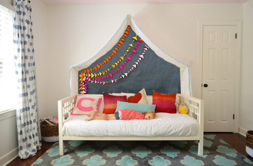
What do you guys think? Any favorites? Or combos? I think we’re leaning towards the gray background tone in Idea #1 or the dark charcoal color in Idea #8, but we’re not sure if we’ll stencil stars or something else – and we might just combine it with something 3D (like a little felt circle bunting or a hanging paper lantern or something). We’d love for Clara to weigh in on things too, and then I’m hoping to work on it this weekend (along with stenciling the bathroom floor and helping John finish that sunroom tile). What are you guys up to this weekend?
Update: Clara weighed in on these photoshopped pics as well as some more that we made based on people’s suggestions and then we made one last photoshopped picture for her, since she wanted to combine a few ideas (we even video-taped her reaction, which was pretty funny). Can’t wait to get it done and share what she liked best!

Maddy says
Oh please, anything except the zebra head. Unless you want someone to wake up with nightmares hahaha.
YoungHouseLove says
Haha! I was thinking something soft (like a stuffed fuzzy bear or a crocheted giraffe) could be cute. I think we’re a special breed of crazy (we used to sleep under a ceramic ram’s head…).
xo
s
Caitlin says
I agree! I think it makes me a little nervous having something a little heavier hanging over her head and she could possibly hit her head as she gets a little older! Love number 1 and how he strings in 8 look like kites! So fun for a young girl!
Cara says
I was going to suggest caution with the animal head, friendly or not. there imaginations are so active at this age. My daughter is a few months younger than Clara, and we’ve had to take several toys out of her room for ‘talking’ in the night. We just had a miserable week apparently caused by vivid nightmares that caused her to be scared of our house. Our house. School? See ya Mom. Walk in to the kitchen and leave her in the living room? Full on panic. Not to mention the middle of the night shrieking. As best we can figure, her fabulous imagination led to a really vivid nightmare about something happening in the house. (She doesn’t seem to remember, just that there was ‘a problem’ in the night.). So, yeah. I would be skipping the animal head over the bed.
Marissa C says
^^Dude that is creepy
Nico says
Ha ha ha, yes, no zebra.. I love the lighting
Keisha says
Cara- Does she have a video baby monitor in her room? There have been stories of people hacking into those and talking to kids. Just fyi. Maybe ask her to draw a picture of what is so scary and then have her tell you about it. Hope you get it figured out.
Kerry says
I DIE for option 1! Love the gray and the stars! I wonder if you could find a fabric like that b/c I dig the warm tone option further down — it adds interest, color AND texture! What a delightful room for your little fairy bean!
Becky S. says
I vote for either #2 or #3! I’m not going to lie, having that animal head above the bed is creepy. Or it could just be me and that I started watching American Horror Story: Coven last night!
Lauren says
I absolutely love idea #1! It plays in more with the twinkly lights idea to me, and looks great with the rest of the decor in the room :)
Jackie says
I second that!
JessicaL says
Yup! The Grey with stars!
Marianne says
Me three! I love it!
Joanna says
I think the first one is just perfect!!! And it’s not too busy and wouldn’t compete with other things you might add to the walls later.
Carmen says
I agree! Number 1 is my favorite! It plays well off of the other colors in the room and it adds a bit of fairytale whimsy.
Anele @ Success Along the Weigh says
The lights are so cute and I love how much light they give off. Gotta admit I’m kind of jealous! :)
#1 and 8 are my faves. Not really sure why but maybe it’s the dark contrast against the rest of the white. I like the bunting/banners in 8 to go with either one.
Rene @thedomesticlady says
I agree, #8 is my favorite! http://thedomesticlady.com/2013/10/18/thank-goodness-its-friday-and-my-perfect-world/
Sarah says
Agreed! #1 and 8.
Tania says
Am I too old to want to have all of that?!? :P I love it! Maybe I should add some new things into our master bedroom remodel, hmmmm
Mary | Lemon Grove Blog says
That’s got to be the best night light ever ;) Love the idea of wallpaper from Osborne And Little via inspiration pic #1!
Vidya @ Whats Ur Home Story says
Love teh lights. Though all of them are pretty I like #4 & #8.
Shannon @ Fabulously Vintage says
I’m leaning towards #1 and #8 too!!! :)
Katie {deranchification} says
Love the lights!! So many great photoshop options, but #1, #5, and #8 are my faves!!
Wendy @ New Moms Talk says
We’re going to be clamming and thrifting for much of the weekend. It’ll be a pleasant relief to the sledge hammering from yesterday (3 hours total).
We’re also hoping the massive pile of concrete pieces will be claimed by someone for free on Craigs List.
When my hub commented on how he was impressed by my motivation to get this work done. I responded, “well, I cannot envision sledge hammering, crow barring, and jackhammering when pregnant. If we want a second one, this has to be done before that happens.”
Heather says
What about chalkboard paint so she can make her own design? I love all the options, though… and those fairy lights are adorable!!
amber says
I love the chalk board paint idea. chalk dust could get messy on the bed covers, but it would be so much fun. I’d go with a non traditional chalk board paint color.
Doreen says
I like that idea too, although chalk dust would be a big problem.
I think #1 is my fav.
Love the lights!
Angel says
I vote option #1 ALL THE WAY!!!
Option #8 is runner up :)
jen says
#4 and #8 were the ones that struck me most. I think it’s because of the little shot of pink ceiling in the top of the photos and that these two options tie in that part of the room along with other room colors.
Sara says
I like option 1! They grey is the perfect simple accent for the room and won’t take away from the MAGIC of those lights! I like the charcoal too but I think the banner might be too much with the lights. Especially since Clara already has such fun colors and patterns in her pillows! You guys are genius! Anything you do will look fantastic!
Laura says
#1 for sure!
Kristy says
I’m thinking you should just paint the full back wall whatever you decide… like an accent wall. If you ever remove the canopy for whatever reason, you won’t have an oddly painted shape on your wall.
Amelia says
I’m with Kristy. It looks great photo shopped, but if the fabric moves in the slightest you are going to have either a bit of color poking out the top, or a white spot underneath. I like her idea of entire accent wall, perhaps with decals under the canopy.
Alyssa says
Agreed. If you’re going to paint, paint the whole wall and add wall art or other accents (3D?) to balance out the white door. Painting or adding that much color just under the canopy looks odd…and I love color and pattern!
carolyn says
Read my mind! I don’t think just the silhouette will work well. I vote paint the whole back wall or hand posters, pictures, etc there. Even a bookshelf would be cute
Sammi says
My thoughts exactly! Even though she hasn’t moved the canopy now, it’s only a matter of time and that will drive you crazy when the lines don’t match up. While the concept is cool, it’s not practical, especially if you think about all the use the space will be getting.
An accent wall would make rearranging the room much easier as Clara gets older.
Also, please please please make sure that plug is out of Clara’s reach. I know you said it has been left alone until now, but as a former daycare employee I can tell you it only takes one, “look what I did!” to scare you into thoughts of her being shocked or worse.
I love the lights though, I wasn’t really sold on the canopy until now :).
Amy says
I’m with Kristy, with one caveat…. what if you use #6’s teardrops, call them raindrops, and leave the area under the canopy-umbrella “dry” by not painting in there.
Nicole says
I agree completely with this train of thought too. An accent wall would look really great in here, that way if she does decide she doesn’t want a canopy one day (she can give it to me, lol) your wall is good to go. I LOVE option #1, the dark/white contrast, and it also plays off the grey in the rug. You could even put some tiny fairies in there too! Whatever you decide will be fab I know it!
Nancy50 says
Another vote for painting the entire wall – it would drive me nuts if the canopy was askew and didn’t line up with the paint line. After the entire wall is painted the accent color then I like the colorful banners in #8. PS I love the lights and want some of my own!
Kate says
I totally see the point in what everyone is saying here, but it’s just such a precious idea to have a special design under the canopy only as if that little corner of Clara’s world is more special than all the rest. May I suggest that you just add a bit of velcro to the back edges of the canopy and the wall so you can keep it in the right places to prevent it from slipping away from the edge of the painted backdrop. And if you don’t want to worry about velcro strips being on the wall permanently, you can use the adhesive from 3M command hooks to attach the strip to the wall so it’ll eventually come away clean.
YoungHouseLove says
Yes, that’s what I’ve been thinking! In the many weeks we’ve had it, it doesn’t shift much at all, and if I want to secure it more I’m sure velcro or little eye hooks or something could hold it in place pretty easily, so I don’t think that would be the sole reason to veto a design idea, but of course we’ll have to see what Clara likes!
xo
s
Jennifer says
I agree that the full wall should be painted… but if you tied in #1 by doing vinyl stars in the area under the canopy? It’ll help draw focus to that area but then you can easily move the bed and remove the stars without having to repaint. Win win!
Tiffany B. says
Amy said the raindrops with the under the bed “dry” I LOVE THAT! Plus you could use these clouds: http://www.dwellstudio.com/DwellStudio-Clouds-Sky-Papier-Mache-Wall-Decor-Set-of-3-B115-111-23-DWL4739.html
in order to get your 3D effect! (although having this scheme under the canopy would also look cool!)
YoungHouseLove says
Those are beautiful!
xo
s
Sher says
What about a dark gray with a clear dry erase paint? Think this: http://www.ideapaint.com/landing-pages/clear/
You can get odorless markers and you don’t have to worry about chalk dust.
All the ideas are super cute though :) Can’t wait to see what you choose!
sf says
Yes! I was also thinking the entire back wall was way too white. Photoshop a color onto the wall. It doesn’t have to be a strong color. Make it girly and definitely not white. White doors and trim “pop” against color, so don’t be afraid.
BTW: I’m thinking the LED lights used in this article might work as a cascading effect behind sheer the curtains at the front of my house for Christmas. Not sure how to make it happen, because I’m not electrically inclined – but I need it to go the length and width of my front windows (which are huge – I’d need a 90 inch drop and more for the width). Is that a dumb or could it work? I’ve only seen LED lights in tubes, so I’m pretty much clueless about how to make this idea happen – but these look promising.
YoungHouseLove says
Sounds like it could definitely work SF! I would look for the longest lengths possible and hopefully you can get ‘er done!
xo
s
Marci says
Sooooooooooooo cute with the fairy lights. I think I’m going to order some and then figure out how to incorporate them in my kids’ rooms since they’ll probably sell out now that you put it on your blog :-)
Anyway, my vote would be idea #1…
Courtney says
#8!!! Love love #8!
Jillian says
What about dark charcoal chalkboard paint with the banners? Thinking about good morning messages or a learning tool, but then it could turn into a frenzy of kids on the bed to write on it when she has friends over.
Then again, as she grows with the room, maybe the bed could be replaced with a desk and she could use it in the future (with the canopy over the desk). :)
Love the lights though. So fun!
YoungHouseLove says
For everyone asking about chalkboard paint, we added an update to the post (in #8) for ya! Thanks for all the ideas!
xo
s
Kat says
Raindrops! Either one! :)
Alison @ The Whole Damn House says
I LOVE ideas #3 and #8. Either way, Clara is lucky to have such an awesome big girl room! I want those twinkle lights everywhere in my house! haha! :)
Courtney says
I love 8, 4, and 2. In that order.
The first one is awesome, but the fairy lights are already kinda like stars. Can’t wait tot see what you do!!
Rochelle Gorey says
Charcoal paint in number eight (see how it rhymes!!). Love it and cant believe I am the first to comment!!
Monica says
I really like the last one – it ties into the rug, so if you intend to keep that in Clara’s room, I would go with the dark grey. You could even do chalkboard paint, though I don’t know how you feel about the chalk/bed combo.
C says
Idea no. 1! It matches with the twinkle from the canopy
Melissa Breau says
It’s so funny because I read that you wanted to add color and immediately inverted what you thought… so i was imagining color on the rest of the wall and leaving the section beneath the canopy white.
Still, some of these are quite pretty and you always manage to pull something stellar off! Can’t wait to see what direction you go with it.
YoungHouseLove says
I think since there’s a door on that wall (to the closet) painting that wall as an accent wall might not look as balanced with a big rectangle of white on that side, ya know?
xo
s
Anne says
Sherry, you could always paint the door as well with the wall… ;-)
YoungHouseLove says
I guess, but then the issue is that there are two doors in the room (one on the other side of the room that leads to the hallway so it has to stay white like the rest) and I worry one painted door and one unpainted door might be weird. Who knows where we’ll end up though!
xo
s
Bethany says
What about painting both doors the same color as the ceiling? Then they pop, and wouldn’t look crazy odd witha fully painted accent wall?
YoungHouseLove says
I don’t know if they would. Especially since the one door leads into the hall where there are many other bedroom/bathroom doors converging and they’re all white, so I think we like the peacefulness of them all being the same color in the hallway. We’ll have to see what ends up happening though! Who knows, maybe down the line all of our doors will end up charcoal or something!
xo
s
Molly says
Love the lights!!! I have Christmas lights above our bed/around the window… I might have to pick some of those up to replace them. [Our curious kitten, Oliver, chewed up the last set, we just bought new ones 3 days ago. Who knew kitties wanted Christmas light glass in their daily diet?] I LOVE the first option and the last one. I also really like 4, with the birds (= You are so creative!
Ally says
#8!!!! Very playful!
Megan @ Rappsody in Rooms says
Oooo I love 1, 6, and 8!! I love bringing in lots of bright colors there. It looks really nice and fun! Also, those lights are awesome! I totally agree about the bummer of the cord. I was thinking about hanging those around my sun room ceiling but the plug is in the middle of the wall. Now that just wouldn’t work!
hollyloo says
fyi: they make battery-operated ones as well. resto sold them last christmas.
Bailey says
I love the fairy lights addition to the canopy! How whimsical! I’d be so jealous of Clara if I were a 4-year-old buddy of hers. I like Idea #6 from above :)
Bailey
http://akabailey.blogspot.com
Ashley says
You could do chalkboard paint- then you could change up the background with a fun free hand mural that you could change with the seasons or holidays.
YoungHouseLove says
I thought about that for a second but thought chalk dust over the bed might not work for us. Maybe chalk markers though?
xo
s
Jen says
Chalkboard paint was my first thought, too! But yea, the chalk dust may do a number on the bedspread. I looked up chalk without dust and a product called Chalk Ink came up (http://www.chalkink.com/). Just a thought! Cute ideas! Can’t wait to be able to decorate a child’s room someday!
Lauren says
I love #7. Second choice #1! I’m sure it will look great no matter what though.
Jenn says
I love #7 too.
Erica says
I think painting everything outside the canopy could look pretty too. Photoshop skillz needed!
amyfaith says
I came here to say exactly this. I would paint OUTSIDE the canopy a medium-dark grey that plays well with the grey in the rug and curtains, and keep inside the canopy a light-filled island of calm.
amyfaith says
Oh, and I’d paint the door and door frame grey too, so the wall is monochromatic and the bed really pops out.
Beth says
I love number 1 and number 7 the best. I really think #1 is going to look really magical at night with the lights on it. Cute ideas!
Keelia says
All cute ideas, but I do remember as a kid my parents having to take down any posters or pictures with big faces on them (I remember a Cookie Monster poster in particular) because while I loved it during the day, at night it looked scary to me…I think the Zebra or animal head could have that same effect…
Allie says
Love the ideas and lights! I personally think the gray with stars or zebra head would be best with what you already have!
Amanda says
I really like the first photoshop rendering with the twinkle lights; it goes with the fairly lights theme. I was thinking leaving the wall white behind there and then adding colourful birds or something (similar to idea #4). That would be a nice punch of colour!
Skeeter says
I love #1, #4, and #8. If you did #8 you could do it in a chalk board paint and then she could draw the rest of her castle, dragons, princesses etc. I wonder how messy the chalk would be over the bed though. Any of the options would be super cute though!
YoungHouseLove says
Yeah, that’s what I wondered. There are chalk markers, but they’re not as sweet as chalk (but chalk over the bed just sounds like a bad call).
xo
s
Nancy says
A chalkboard wall was my first thought too, with a bucket of fat chalks – I bought handles for mine so they’re not messy to hold. I suppose it could still get messy, tho – darn!!
What about a mirror – maybe even cut to size? Or is that too Vegas? A mirror with some self-stick thingamajigs – what are they called? Window stickers, but they’re not stickers, you can move them around. Kids LOVE mirrors! And it’d add to the light in the room and also be customizable with movable decals thingies….
I loved all the photoshopped pics tho!!
YoungHouseLove says
We thought about a mirror but I wondered if that wouldn’t be as fun as something else like a paper lantern or banner or something more 3D so we’ll have to see where we end up!
xo
s
Tiana says
I love the hand painted raindrops! I also like the charcoal grey. It actually reminded me of a chalkboard, & I thought that would be cool. It also kind of makes it look like a cave, with her canopy & the banners being a grand entrance to some make-believe world. … Now I don’t know which I love more!
JenB says
I love the lights! So sweet. My boys would destroy it in a minute:( Oh well! But as for the peak behind the bed, my eyes were particularly drawn to the first one (gray with stars) and the last one, (gray with colorful banners). I love how the gray plays into/complements the grayish blue tones in the carpet and the curtain. I think the lights would reflect so nicely on the dark wall at night. Ah, to have little girls! Maybe I’ll just make a canopy for ME!
em says
I vote for number 3 because I know that is what my 6 year old girl would like. But, I would let Clara choose. Also, I think it needs a little chandelier. Maybe even that little ribbon one from Clara’s closet in the last house? I love the fairy lights and am trying to think of where we could use them in my kid’s room!
Heather says
I LOVE LOVE LOVE the grey!!!!!!!!!!
AnneMarie says
I love option 8! You could even do chalkboard paint and leave her goodnight or good morning messages :)
Sarah says
I am digging the charcoal or gray. What if you did it in chalkboard paint, so Clara (and friends) could color on the walls. You could always switch up what is there, hand draw some things on the wall and change at will? Now I’m wanting a chalkboard wall at my house!
YoungHouseLove says
I wondered that for a second but thought chalk dust over the bed might not work for us. Maybe chalk markers though?
xo
s
Jenni says
I love the idea of the fabric. Would add texture and nice pop of color and when get tired of it a super easy upgrade with new fabric!
Shelly M. says
I love idea #1! Clara can dream under the stars. Maybe you could even use some of the glow-in-the dark paint I have seen, and they could glow for her at night for awhile as she drifts off to dreamland :)
gemma@thesweetestdigs says
Oooh I think you nailed it with option 1!! It’s so pretty and adds to the magic of the space.
I did a colourful raindrop mobile for my little gal out of felt (like idea #6) and it turned out so sweetly: http://thesweetestdigs.com/2013/07/08/project-nursery-a-diy-raindrop-mobile/
Have fun!! Aren’t doing kids rooms/nurseries just the best?
YoungHouseLove says
So cute!
xo
s
Caroline says
I like the first option too, particularly the stars? Have you thought about vinyl wall stickers? I’d get some trees, and have a whole night-time forest under there. (Yeesh, I’m 33 years old and now I’m seriously debating this for my own bedroom!).
YoungHouseLove says
That would be fun too!
xo
s
Michelle M says
Oooo that would be fun! Maybe with little paper lantern strings from “branch” to “branch”
ErinY says
I’ve always loved this wall paper: http://www.pinterest.com/pin/368380444490532250/
It could be interesting while not being completely stand-outish, so it could still be a fun back drop for other elements like the bunting and/or animal head.
YoungHouseLove says
That’s really fun!!!
xo
s
Alexia says
The last option inspired a suggestion. What about chalkboard paint in that space? The Clara can decorate it any way she please!
Alexia says
*Then… mistakes in my comments drive me nuts!
YoungHouseLove says
We thought about that for a second but thought chalk dust over the bed might not work for us. Maybe chalk markers though?
xo
s
Natasha says
I’ve never had good experiences with chalk markers – they don’t erase well! If you find a good brand, let us know.
Nancy says
I like “The Clara”! ;-) I have a niece named Hadley and she refers to herself as “The Had.” If you ask her what it’s like being The Had, she’ll say, “Not bad.” lol
YoungHouseLove says
Haha!
xo
s