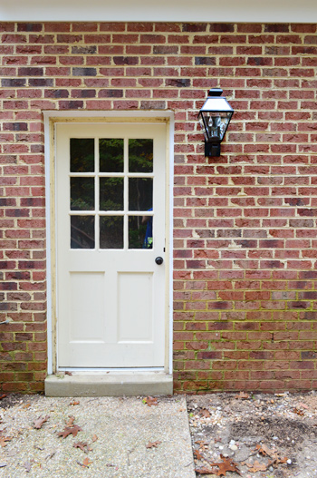
Our exterior light situation is a little ho-hum, as evidenced by this tiny fixture outside the back door on our garage (don’t mind the grimy green brick that’s screaming out for some scrubbing).
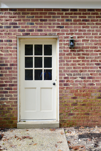
And yes, I realize the door itself is looking a little rough. It originally sported a rusty, loudly-banging storm door (not just a medium bang, this was SCARE-YOUR-NEIGHBORS LOUD) that we removed. So we’re getting ready to repair some of the trim and prime/paint it white to match the door in the sunroom veranda that we already updated.
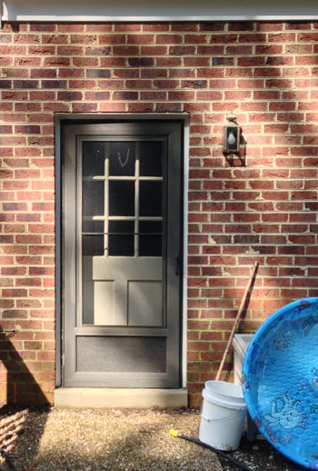
But let’s turn our attention back to the light. It was too small and very weather-worn, so we decided it was time to make an upgrade. Choosing the fixture to upgrade it with proved a bit more challenging than we expected. Maybe because we’re not really used to shopping for them. I think we might have bought three exterior lights in the course of seven years. So after hitting up a local outlet and some big box stores without anything screaming “I’m perfect!” at us, Sherry took the hunt to a few online sites to see what she could come up with. After about an hour of clicking around (and waaaay too many windows being open at the same time which led to not one, but two browser crashes) there were eight contenders:
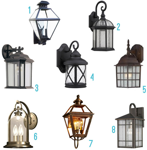
- Black lantern $69 here (inspired by the ones here)
- Seeded glass lantern $75 here
- Outdoor wall lantern $87 here
- X-Lantern $37 here
- Bronze cross-cross sconce $35 here
- Bronze lantern $79 here
- Antique copper wall light $219 here (purely just for eye candy, since it’s way above our budget)
- Bronze lantern $117 here
Making that mood board didn’t give us a eureka moment either. But what did was strolling through the lighting aisle at Home Depot and Lowe’s again, and discovering that Option #1 had gone on sale (down to $59). It had been my favorite all along anyways (Sherry was really into #6, but it was significantly smaller) and my argument for #1 was that we were looking for something large and in charge, and it was the second biggest of the bunch while also being among the three most affordable ones in the roundup. Sherry gave me one of those “hold on I’m thinking” faces and then said “ok, let’s do it.” And into our cart it went.
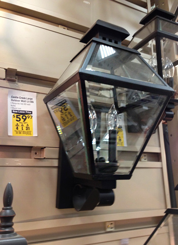
Installation was just like installing any other fixture:
- Step 1: Turn off the power
- Step 2: Remove the old one after staring at the wires to see how they’re connected (or even grabbing a photo of them with your phone if it’s your first light-switching job)
- Step 3: Connect the new one to the same wires the old one had been connected to
- Step 4: Tuck all of the wires into the backplate and use the provided screws to adhere the light to the house
- Step 5: Turn the power back on and make sure the light is connected well and working correctly
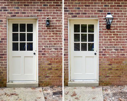
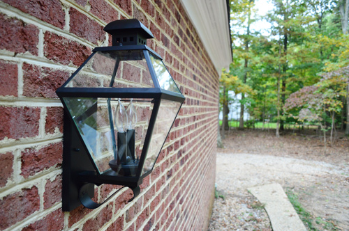
So installation went nice and smoothly, and you can see from this photo that it’s a big improvement. Well, not the door. Or that green wall. But at least the light is no longer rusty and small.
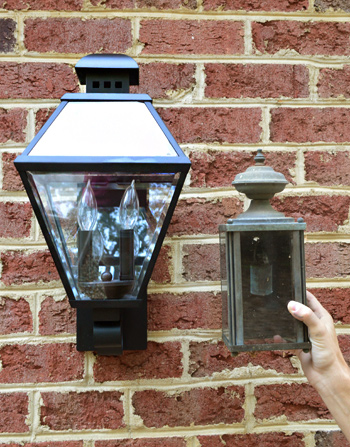
You think I’m joking about the size difference, don’t you? Here’s a side-by-side with the old fixture so you can see just how much more substantial the new fixture is compared to the old one.
We personally like an outdoor fixture that has lots of visual presence, so this guy is doing the trick for us. Just imagine this with a freshly painted door and non-green bricks and a nice welcome mat and some plants on either side. I know… that’s a lot of imagining. We have a long way to go back here.
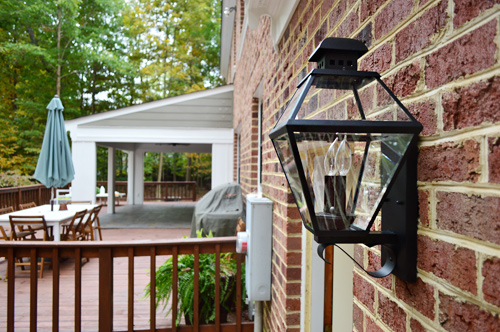
I like this shot the most, since it helps to show the size of the light, along with the traditional shape, which we think is pretty fitting with the exterior of our house (we’ve admired it on a lot of our neighbor’s homes, and also were inspired by this photo of an outdoor space with similar ones). At one point I suggested that we put them in The Artist Formerly Known As Prince The Veranda Formerly Known As The Sunroom (we’re looking for four sconces to go on the posts in there to provide some eye-level light) but after holding them up they didn’t look right – so we’re still on the hunt for what might work in there.
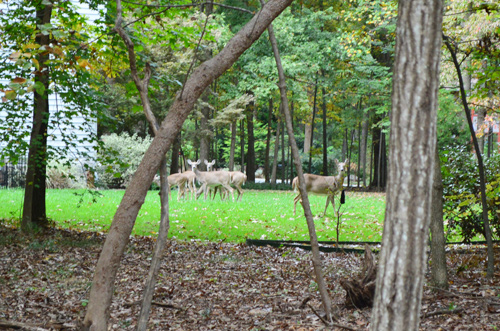
I’ll share just one more “after” photo of this guy because when I came out to take this picture I opened the door to find a herd of deer standing right outside. Of course they ran away at the sight of me.
But they didn’t go far and still make an appearance in the background of this picture.
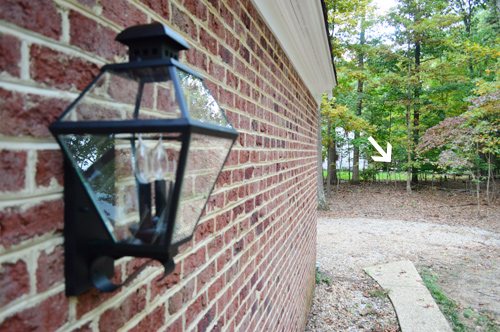
Here they are, just giving me the ol’ deer staredown, when I stepped a little closer. If you’re on the edge of your seat for more of my stellar wildlife photography (or are just a fan of Where’s Waldo: Deer Edition) we’ve got this post on Young House Life for your deer-loving pleasure.
Sorry I keep getting sidetracked. Lights. We’re talking about lights. And obviously that back door isn’t our only outdoor fixture. We’ve got one more wall-mounted one above our garage. It was also looking a bit worse-for-wear and was also on the diminutive side.
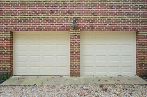
So we purchased a second one to match the one we added to our backdoor. And… the results were a little less impressive.
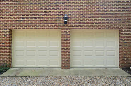
Even though it felt nice to have a sparkly new light up there – and the ORB finish commanded a bit more attention than the rusty gold – the size wasn’t reading as much of an improvement between those two giant garage doors (we’ll be painting those black or charcoal if that helps you visualize where things are going). And yes, we have more green stuff to attend to on that concrete driveway pad. Yeehaw, I smell some power-washing in my future…
But back to the light.
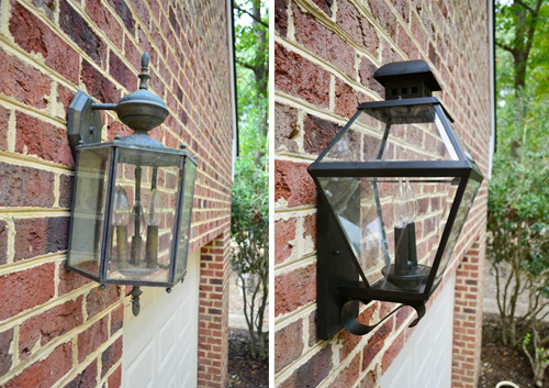
It’s not terrible, but it’s not exactly what we were hoping for. It just looks kinda lost on that big brick wall with those big garage doors. And I’ll admit we’re feeling a little defeated because of all of the lights that Sherry mood-boarded, it was among the largest of them all (it’s about 19″ high, and the biggest – and most expensive – was only 20″). Update: We also have a pergola planned for over the double garage and we want to add shutters to all of the windows on the side and back of our house eventually (as seen on Listy McListerson) so those are things to consider for this side of the house too.
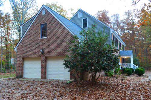
Part of us feels like we should just stick with this one for the time being and withhold judgement until we can do some other things to the garage side of the house (like the paint the doors). And the other half of us feels like we should just return it if we don’t love it there, and not settle for something that we might later end up regretting.
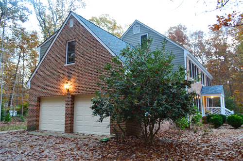
What do you guys think? Would you keep it or return it in the hopes of finding something better? Any tips for where else to look besides local lighting shops, Lowe’s, Home Depot, or Overstock?

Alex - Old Town Home says
I think the new one is definitely better than the old and would keep it if you think it can be the final light. However, there’s always the option to be a little more spendy and do a nice electric copper lantern. It would work wonderfully with the style and aesthetic of your house and it would patina wonderfully over time. We’re looking to change out our front light with a gas copper one from a company in NOLA. http://www.oldtownhome.com/2013/1/16/Gassing-Up-Our-Curb-Appeal-with-a-Copper-Gas-Lantern/
You could get in touch with them and see if they have anything that can work for your place. They’re all beautiful and classic designs.
YoungHouseLove says
Thanks for sharing the links! So helpful!
xo
s
Alex - Old Town Home says
The other thing I noticed is that of the 8 options you have listed, the one you chose (#1) and the copper (#7) work best with the style of your house. I think most of the others would look out of place on your house. But the style you chose is (IMHO) the correct choice. From the link I included you could consider something like a taller/rectangular light that surface mounts right on the brick, rather than extending away from the house. Though I like the ones that hang a bit better.
I know others have mentioned it, but I do think the one above the garage could move down a bit, and then you could place two more on either side of the doors. It’s much more involved and expensive than switching out a fixture (more lights, new wiring, drilling in the brick, patching old holes in the brick, etc), but it may well give you the look you’re after.
Penny Lynn says
Bevolo, my brother makes those lights!!!!!!! Awesome, NOLA love!!!!
Madeleine says
I agree with your suggestion Alex! Copper lanterns are beautiful and I think they would compliment John & Sherry’s house perfectly! :) x
Anele @ Success Along the Weigh says
I like the one by the door but I think something that actually hangs down instead of up would look better between the garage doors. It’s a personal preference thing though so go with your guts.
Now I’m off to read about the deer because I lurve me some deer. When we see them at the side of the road, I roll down the window and talk to them because I think it’s hilarious to watch them follow us like “that woman is crazy…does she know we’re DEER!?!”
Christina B. says
Anele, that was my first thought too! I think that the new light fixture takes the eye up too high on the wall.
If I don’t absolutely love something/it doesn’t scream “I’m perfect here!,” I take it back.
natalie says
I agree with getting a light that hangs down instead of up. That was my first thought when looking at the light in both places. The style and color is nice but they look too high.
Heidi says
Definitely Agree!!! My first thought was that the light was too high above the doors, and something hanging would be better.
Meghan says
I was also going to say the same thing!
Something like this
http://m.lampsplus.com/products/crossroads-point-23-and-one-half-inch-high-bronze-outdoor-wall-light__w6385.html
Or this
http://m.lampsplus.com/products/quoizel-oasis-23-inch-high-bronze-finish-outdoor-wall-light__w2314.html
Maybe?
Stacey Iadevito says
Many lights can be flipped upside down from how they are displayed or owned. I bet if you take the new light and flip it upside down, it will give you a better look and also as other people pointed out look more natural in that space :)
YoungHouseLove says
Thanks for the tip!
xo
s
Anna says
I’ve been debating on updating our exterior lights as well. I have big ugly floods in the back and they really aren’t neccessary to light our tiny back yard. I like your options so thanks for doing some research for me.
Isn’t it ‘Veranda’ though?
Kate says
Little typo, John. “varanda” should be veranda.
Starr @ The Kiefer Cottage says
I’d return it. You’re right that the scale isn’t quite right. Since it wasn’t right before either, you’ve spent money with little benefit (unlike the back door fixture, where it looks much much better).
We need a new front door fixture. Love #6 you posted, and I’m thrilled it’s not the most expensive option, which is usually the case.
Tanja says
I also LOVE #6 and was so sad that it was the most expensive.
Melanie says
#8 is gorgeous! I think all of the lights look fine, except for the garage door one. I think it definitely needs to be bigger. More of a showpiece.
Kathy says
I don’t think it’s the size of the light that looks not quite right, I think it’s the shape. Because it narrows toward the bottom, it actually seems to look smaller than the original (from far away, in pictures…). So, maybe your answer isn’t a bigger-than-the-new-one light. It could be a light similar in size, but just the shape of #3.
Clodia says
I think you should go ahead and return it. I think that part of the reason the light looks lost is that it juts up from where it is connected to the wall, instead of hanging down. That makes it out if line with the garage doors and incongruous. I think you can find something better.
Jennifer I. says
I say return it and wait for the right light to come along! I need to do my outdoor lights as well so can’t wait to see where you end up :)
Lisa @ Double Door Ranch says
I wanted my next project to be new outdoor garage lights (and #8 on your mood board makes my heart skip a beat) until I realized how awful the wiring in the garage is and I need an electrician to get in there asap to bring it back from the brink.
I’ll quote from my favorite DIY-ers and say “the middle makes no sense.” Give it a little more time to evolve out there, and if you’re still not feeling it, make a swap.
Instead of my lighting project, I painted a basket this week. Not quite as high impact, but fun nonetheless!
http://doubledoorranch.com/2013/11/15/painting-basket-case/
Lindsay says
I think the issue with the garage light isn’t so much the light itself but the fact that there is only one rather than two on opposite sides of the garage doors to balance things out and more visual interest. But of course with a brick wall that isn’t so easy to change! Good luck!
Brittnia says
I agree. Two lights, one on each side of the garage doors, might be more visually appealing! The light looks great by the backdoor!
Eri says
Agreed, that’s exactly my first thought. John and Sher, I think you need two, regardless of the design/size thingy. Not all two-car garages need two lights, but I think in your case the entire shape of the garage (taller with steep roof as you have the second story up there) demands two lights for a better balance. As for a brick wall — not so tough, ours is a brick house and we had our electrician add one light and one exterior outlet :) Good luck with your decision!
YoungHouseLove says
Thanks Eri! That’s so great to hear!
xo
s
Pat S says
That’s exactly what I was thinking. And yes, it probably isn’t that easy on a brick wall.
ivy says
This was my first instinct as well. Two,each on opposite sides. Nice balance and beef it up.
Karen says
Totally agree with these guys – two lights are really needed, and they should be beefy!
Janette says
I was thinking three all hung lower than the one that is up at the moment, but two might be good. I realized drilling through brink might be terrible but you could mock it up on photoshop and see if you don’t love two or three lights better!
kristen says
Won’t you eventually need a light for the French doors off the kitchen?
I say keep it for now, and then use it for those doors later so it will match the light at the back door.
YoungHouseLove says
Didn’t even think about that!
xo
s
Aimee says
Yes! Smart thinking, Kristen.
Lissa says
I agree. This sounds like a good option until you can get two new ones for the garage. I am with the others that think 2 lights would balance things out better for the 2 car garage.
Iz says
It depends what the alternative would be, if you haven’t seen anything significantly bigger already. Two lamps, perhaps? (or even 3??)I think you should keep it for now – it looks better and is good to have those two match.
p.s. I think it’s veranda, not varanda :)
YoungHouseLove says
Thanks for the veranda tips guys! All fixed :)
xo
s
Mary says
Outside light are so difficult because of the scale but I really like the ones that you chose. Did you consider turning them upside down? The bulbs would have to be different since flames don’t go upside down but it’s a thought.
YoungHouseLove says
I don’t think these would work upside down (they’d just look upside down) but I’ve always loved the idea of the hanging ones, so we might have to explore those options!
xo
s
Dusa says
What about 2: one over each garage door.
And I’m of the camp, return it now if you don’t love it.
And POWERWASHING!!!
nancys says
I would keep it. It’s the easy way out and I don’t think it looks bad at all.
Only thing I think that would look better is a light over each door – and with brick that sounds like a lot of work, too much work!
Helene says
I think the issue with the light above the garage is that it sits upward rather than hanging downward, like options 2,3,4,5,6 and 8. It’s already so high up, it needs to draw the eye down.
Molly S. says
Have you thought about adding more lights? You’ve got a massive two car garage and are relying on only one light. Garages with two doors tend to have sconces on either side plus lights over the middle of the doors- so you’d be looking at five lights. You could also just place the lights over the top of each garage door. Either way I don’t think one light is enough. I’d consider doing three of those lights as sconces on the sides of the garage doors. I think that’d look great. Just my two cents!
YoungHouseLove says
Thanks for all the ideas everyone! We definitely have a lot to think about (and maybe some pricing/photoshopping to do…). Ha!
xo
s
Kari says
Agreed. It’s not so much the light as it is the lack of lights. The light you chose is fine (although if you don’t love it, return it or use it elsewhere) but you do need two more for either side of the garage doors.
Peggy says
I would keep it. At least for now. In the somewhat unlikely event you find something a whole lot bigger for not much more money, you can swap it out and c-list this one. But it’s not that visible, so you’ll probably just get used to it.
Wendy @ New Moms Talk says
Two questions on the light:
1. Do you need it/what function does it (truly) serve?
2. What’s the worst that can happen if you keep it, or if you return it? (My hub always asks me that when I’m deciding on something. It’s quite helpful.)
On the deer note:
Yesterday I was removing more trees from our center lot, our sweet almost-year-old girl was on the ground playing with pine cones, and my hub was nearby watching her when a lovely 4 point buck came meandering through the yard.. no more than 5 feet away.
Our girl (who is so used to them) didn’t notice at first, so my hub pointed it out to her. She called after him as always, waving away, and then wondering why he didn’t come closer.
Robin @ our semi organic life says
I’d switch it out – not sure with what but though. Could there be something bigger that involves multiple fixtures – sorta like how bathroom vanity lights have 2 or 3 bulbs?
Lisa says
Keep the light, it looks good. The light is not the problem, it is the lack of detail on that large expanse of brick. Some shutters on that top window, some painted trim around the garage doors, some large scale plant pots or urns with tall plants in them, etc. Basically, the light doesn’t need to be the focal point. And it looks really nice when it’s on.
YoungHouseLove says
Thanks for the tips Lisa!
xo
s
Carmen says
I agree with Lisa! Great points. I think you guys mentioned putting shutters on the rear windows before (might be wrong about that). If you’re going to do that down the line, this is probably just a “middle” stage look compared to what you’re shooting for down the line.
YoungHouseLove says
Yes, we’d love to add shutters all around the windows on the sides and back of the house. I love thinking about how that’ll change things! So smart to take that into consideration!
xo
s
Crystal says
I agree with Lisa. Keep the light and her suggestions will probably help get the end result you are looking for! Looks great and good luck!
Susan says
I agree with Lisa. Do those updates, and the light will fit right in.
Crystal says
I second the window shutters. That would look nice especially if they matched what was on the front of the house.
YoungHouseLove says
Yup, shutters (on the sides and back of the house) and a pergola on that side of the house (above both garage doors) are on our Listy McListerson doc. They’re probably both down the line fixes after we get more on the inside of the house taken care of though :)
xo
s
Sarah A says
I agree with Lisa! Perhaps this garage is also crying out for…a pergola.
(Also, it’s veranda with an e, even though it doesn’t sound that way in your midland accent, I’m sure!)
YoungHouseLove says
Thanks! Veranda’s all fixed. And pergola is on Listy McListerson down the line, so that’s something for us to think about too. So smart to take that into account!
xo
s
Tia says
That’s it. It doesn’t need to be the focal point. This is a blank slate and though it needs some statement pieces, the light doesn’t need to be it.
Ali Miller says
I , too, agree with Lisa 100%! Whatever you guys do will look great, though. :)
SuperCutePetContest says
Yes! What Lisa said! :)
Judy G says
I agree with Lisa, too. You don’t want a big screamy light saying, “Here I am!!!” The new light looks fine. I am curious if you considered a motion detector light. I really like those for security.
YoungHouseLove says
We haven’t seen any of those that we like. Will have to keep looking!
xo
s
Sheralyn says
Keep them.
A window box with brackets may help balance the space between the bottom of the window and the tops of the garage doors/where the light is.
http://www.windowbox.com/window-boxes-planters/pvc-resin-plastic/the-sophia-window-box-including-faux-brackets.html
Other than that I completely agree with Lisa, the light doesn’t need to be the focal point especially on the large expanse of brick!
Aimee says
I agree too. I like the light as is + adding some other details. If anything, add 2 more lights on outside corners of the garage doors. But do you need that much light there?
YoungHouseLove says
We’re not sure that we do, especially if it’ll get in the way of our pergola down the line, so we’ll have to see where we end up!
xo
s
Jennifer says
I agree with both the French door in the future needing a light, and the light not being the focal point of this area when you are adding the paint, pergola, etc…
Lydia K says
Regarding the light over the garage – I know it would take a bit more effort (and probably an electrician) but why not try to center one light above each door? Or remove the center light and instead hang on on the outside brick walls on either side of the doors? Or, OMG – THREE lanterns, one on each post dividing/flanking the doors?
YoungHouseLove says
Thanks for all the suggestions guys! Lots to think about for sure!
xo
s
Janelle @ Two Cups of Happy says
That’s what I was thinking too! I think two lights flanking would look great with the (yet-to-be-born) pergola.
Christine says
I agree with adding two more lights on either side of the doors, or pergola-to-be. I think that big expanse needs more than one light. On a side-note— we are in Richmond tomorrow, Saturday, for the marathon! My brother in law is running and we are there to cheer him on!
YoungHouseLove says
That’s so exciting! John’s doing the half marathon!
xo
s
Pia says
What I was thinking! Love that!
Meredith says
I’m on the same page as Lydia, either two lights over the garage doors or 3 lights (one between and two on either side of the doors). I’m almost embarrassed to post this b/c Sherry is so much better at Photoshop (I used MS Paint-LOL), but here’s what I mean: http://i.imgur.com/tXsZ07D.jpg. If you build the future pergola high enough then I think you can get lights above the doors! Also, I would check out Ferguson (http://www.ferguson.com/branch/richmond-va-showroom) for lighting, here’s the style of light I used: http://shop.ferguson.com/product/Sea-Gull-845802-Black-71632?Ntt=sea+gull+jamestowne&term=sea+gull+jamestowne#. I thought it was a good traditional-meets-modern style that I think you guys like. I’m also swooning over this one from Shades of Light, but it’s more expensive: http://www.shadesoflight.com/product.php?productid=427207&cat=222&page=1. Maybe you’ll score something at The Decorating Outlet over the winter!
YoungHouseLove says
Love the photoshop and the links/ideas Meredith! Thanks to everyone for sharing today. So helpful!
xo
s
Meredith says
I just did more shopping (so typical of me, haha) and found these options for the veranda sconces: http://shop.ferguson.com/product/Sea-Gull-858810-Black-70997?Ns=AvailabilitySort|0||Primary_Finish|1||Sort_Order|1&N=102+221+69+196 and http://shop.ferguson.com/product/sea-gull-8801812-black-252738?tb=&Ns=AvailabilitySort|0||Primary_Finish|1||Sort_Order|1&No=168&N=102+221+69+196
Abby says
I like the light and think going larger would look weird. Think your issue is more about the huge expanse of plain brick and large, somewhat boring doors. If you add shutters on that upper window it will look much better – and I think you’d mentioned you want to get new garage doors at some point? Nice ones with glass windows will top it off.
Stephanie says
Funny, I was just outside thinking our outdoor light needs replacing! I think the light by the door looks nice, but between the garage doors looks a little off because its too high. I think you need a hanging light there instead of an upright one. Like option #3.
Sam AKA $amDog says
I recognise this is not a helpful comment design-wise, but everytime I see ORB in a YHL post (which, let’s be honest, is a lot), it triggers Naughty by Nature (“You down wit’ ORB? [Yeah you know me!]”.
For the record, I am down with the ORB.
YoungHouseLove says
Me too Sam, me too. I’m down wit ORB! Yeah you know me!
xo
s
Jess @ Little House. Big Heart. says
Honestly, I think your garage would benefit from the Pergola Treatment just as much as your old car port did. All that brick needs some serious breaking up!
YoungHouseLove says
Oh yes, a pergola is on the down-the-road list for sure!
xo
s
Katrin says
By scrubbing you mean power washing the brick, right?!
YoungHouseLove says
A few folks told us it’s not great to power wash brick too often, so we might try alternatively spraying it down with demossing stuff and scrubbing to see how that works. We will definitely powerwash the concrete garage pad though!
xo
s
Megan Poletti says
Whoohoo! Thanks for featuring my puppy post on the forums. That definitely made my day.
I’d say return the fixture. I’m a big advocate of returning things. In this case I don’t think the fixture fits in your “Phases of Decorating” theory, because the other one works just fine and it’s not exactly in the most obvious of locations that it should bother you daily. Wait until you find the right one!
Jen says
I’m in the “if you don’t love it, return it” boat. That money can go to the light you love or you can repurchase in the future even if it’s no longer on sale. There are always coupons!
Karen J says
Return the light don’t settle just because.
Emylee says
Why not do a photoshop rendering with the color on the garage doors? And maybe add in some tips from Lisa ^?
YoungHouseLove says
Could be fun!
xo
s
Kyle says
Return it and wait for THE ONE!
Don’t settle.
Ever.
Kyle says
I mean…IIIII like it. But if you don’t LOVE it, don’t settle.
Emiles says
I get the feeling any single light over a garage would be small. First choice would be to put up 3 lights – one on each side of the garages and one in the middle, but I’m guessing that’s not so possible with the brick. If that’s the case then I’d go with a barn style light, but not an actual barn light because I’m not sure it’d fit the style of your house…just something that sticks out and casts light down. And/or you could do a couple lamp posts on the side? Or lighted pavers down the sides of the drive? Uplighting of some sort since downlighting would be so high up? Oops. That’s a tangent. Short story – I’d scrap the current one.
Oh and I submit this light for your veranda…we installed them at our previous house and loved, loved, loved them! http://www.menards.com/main/outdoor-lights/wall-lights/treehouse-1-light-13-oil-rubbed-bronze-outdoor-downlight/p-1807176-c-7913.htm
YoungHouseLove says
Thanks for all the ideas everyone!
xo
s
Mara says
I agree with Emiles. My first thought was that anything will look small, no matter how large the lights are, against the two large garage doors.
Kelly says
Respectfully, I say return both. Both of those fixtures feature the bulk of the lantern ABOVE the junction box. In both cases, I think you need something that places the bulk of the lantern BELOW the box. In the instance of the rear door, the light is higher than the door frame and looks a little like the scale is wrong. Between the garage doors, you’re having the same problem. It’s drawing your eye upward when it should be drawing your eye to what it will illuminate (the garage door/driveway area). Just my two cents!
Kelly says
And, in general, outdoor lights with glass tops are usually intended to go on covered porches where the light that exits to top of the lantern will illuminate the ceiling and be reflecting back into the space you’re trying to light. These lanterns are sending most of their light up into the night sky and not to the ground where you actually need the light.
YoungHouseLove says
So interesting! Thanks to everyone for the feedback! This is awesome and we’re getting so many ideas!
xo
s
Angela L says
This was my thought, too. They are too high up; the balance has shifted from below to above, and it looks, well, imbalanced. Cute fixtures, though!
Cathy C. says
http://www.darksky.org/outdoorlighting
This seems right up your alley when picking light fixtures for outdoors, I am actually surprised I get to be the one to let you know about it! I definitely agree with Kelly that wasting watts sending light in the wrong direction can make the fixtures appear “off”.
Also, keep in mind your rule of middle ground. Although you like keeping things in budget, the right fixture will hang there 15-20 years, so spending a little more now can help substantially in the long run.
I would also look into seeing what an electrician would need to do to add the second and third lights (one on outside of the garage doors). Having the other lights there would give you the balance your eye is craving.
YoungHouseLove says
Thanks for the link Cathy!
xo
s
Maya says
What happens if you install them upside down? Is that an option?
I agree about both lights looking wrong because they’re too high, even though this was my initial favorite light too
YoungHouseLove says
I think they’d look upside-down if we put them in upside-down. We’ll keep you posted for sure!
xo
s
Heather W says
I have to say I agree. The back door isn’t bad but I thought it looked a little high. Also, I think it doesn’t look as big as you thought is because the height of it and the fact that you only have one over the middle instead of one on each side. But I was thinking the same thing if you found a large one that had the size going down toward the door or garage it might work better…
Larissa says
This is super helpful info as I’ve been thinking about replacing our outdoor lights. This give a solid answer as to what kind you should look for instead of just knowing something is off without knowing what it is.
Hey, do you guys rake all those leaves? Oy!
YoungHouseLove says
Electric blower! I’m addicted to the difference it makes. I’m the weirdo who likes blowing the driveway for the sheer “before and after” of it. Ha!
xo
s
Alan says
I agree completely. Both need to go.
Laura says
Yup yup. I’m totally on the same page here.
Amy @ a new old house says
I agree with the thought that the bulk should be below the box… can you flip the light upside down?
Sarah in Indiana says
Yes, this was my thought, too. I don’t think the scale of the light looks wrong for the garage, it just looks weird to me because it above the junction box rather than hanging down. I don’t think it’s as bad at the back door, but it seems way off for the garage. Nice looking fixture, but in the wrong spot.
sarah says
yes yes. glad i read these before i commented. it’s exactly what i was going to type. barn style light….with light pointing down. on both. i found a really really cute one for my bathroom with seeded glass. we love it.
here’s something different than we got, but along the idea:
http://www.bellacor.com/productdetail/minka-lavery-8102-a138-kirkham-dark-sky-outdoor-wall-mount-79224.htm
Katy says
I am a novice with most things Young House Love, so I thought these looked great (even though I was hoping you’d pick light number 3, 5, or 8 but, as usual, I loved how your choice ended up looking.
I still think they look nice, but I love Kelly’s points. I was thinking the garage light was too puny… Maybe a double/triple light as other commenters suggested would be a better fit. Or even adding a light on either side of the doors as well to broaden out the illumination. And I thinking adding shrubbery would fill the area nicely, but I’m loving Kelly’s tip about uplighting and how it is meant for a covered porch/bringing the eyes up/etc.
I don’t always read the comments (and this particular lighting sitch doesn’t even apply to my home right now) but today I’m glad I did! Your posts give me great tips and it’s so much fun when the comments do, too!
That’s all. Just a bit of Friday morning gushing. :)
Aimee says
I agree with Kelly. Keep the light where you need it, downward where you would step.
Caitlyn says
Yes, this! I couldn’t put my finger on what seemed off, but when I saw your comment it clicked.
Julie says
Gotta agree with Kelly! I think the entire fixture should be below the top of the door. You could just try turning them upside down…many exterior fixtures are made to go either way!
JG says
Yeah, I agree. I think the back door one in particular especially looks “off” because the top of the light fixture extends above the door frame!
Rosie says
I totally agree with Kelly about returning both. She’s spot-on about the problem with the proportions. It’s hard to find nice outdoor lights, but I think you should keep searching with her suggestions in mind.
Emma says
Veranda* x2
I would like to see another pergola/carcover type deal above those garage doors.
YoungHouseLove says
Thanks Emma! All fixed!
xo
s
amyks says
Not feeling that light either, would look better if there were three, one on each side of the doors and then the center. Or may be you need something similar to this light or some of the similar options. But, hey, I have been searching for a pendant light for outside our front door for 3 years now and can’t find anything my husband and I can agree on.
http://www.lightingdirect.com/kichler-9022-transitional-1-light-outdoor-wall-sconce-from-the-seaside-collection/p844972
YoungHouseLove says
Thanks for the links and tips guys!
xo
s
HeatherB says
I agree. It doesn’t feel quite right, but that is more because of the blank wall and the fact there is only a single light than any issue with the light itself. I also think two more, one on either side of the garages, would balance it a lot better. That combined with Lisa’s ideas above would probably make that a really nice area. For now, it is an improvement, and the expense wasn’t extreme if you do end up doing something different down the road and have to sell it. I would probably keep for now.
Ellen T. says
I think I would leave the garage light. For the time being, it will add a great deal more light, important for safety. That large area between the light and window makes a great space for a large wreath for the holidays to break up the brick and add some interest. Plus, I’m sure you will add some awesome architectural feature some time in the future that will make it look great.
Kal says
I’ve been lamenting terrible outdoor lighting at my house, too (including flood lights installed at eye level off our back deck)…
I like the sconce next to the door, but what about something that points down in between the garage doors instead? Something like this (but a different finish, maybe?) http://m.homedepot.com/p/Hampton-Bay-1-Light-Outdoor-Zinc-Wall-Lantern-HSP1691A/203273428/
caroline says
I hate it….too small…take it back to the store & keep looking for a bigger one that you love!!! That’s too much money for something you don’t like. Just sayin’
Have a great weekend!!! ;)
YoungHouseLove says
Thanks for all the feedback guys! Love the honesty!
xo
s
Jess says
I mean, they were cheap and they work, so I wouldn’t do anything else right this second, but maybe next year look into a double head sconce for above the garage like these:
http://www.dhgate.com/product/double-slider-outdoor-balcony-fashion-wall/157311597.html
http://www.dhgate.com/product/double-slider-wall-lamp-fashion-outdoor-waterproof/157578711.html
Seems like that style would give you the visual weight you want but you don’t need to hire an electrician to wire in new receptacles (PITA).
April says
There are times when settling is acceptable. It coordinates with the new light by the door (which you’re happy with), the price is right, and it’s a definite improvement over the old fixture. The garage wall is enormous, and I’m concerned that you’re not going to find what you’re looking for without installing multiple fixtures. On the other hand, how’s the light output at night? If you can pull into the garage without hitting a rogue possum, then I vote keep.
YoungHouseLove says
The light output is improved from the fixture we had before, so along with headlights when we roll into the driveway it seems great so far!
xo
s
Kaia says
I got the lights for our outside at Wayfair, maybe you could check there if you are looking for something bigger? Pretty decent prices I think too :)
Trey says
The garage light looks fine, but doesn’t seem like it would provide enough light….so my vote it to install 2 more… flanking the outside of each garage door. It’ll provide symmetry and more light.
Radhika says
Agree with Trey, I was thinking the same about installing two more on outside of the garage doors. but like many commented, you need something that will shed the light on the ground rather than into sky. but I like the light fixtures itself.
Rosalind says
I found some outdoor lights that I love for our new place on Bellacor and Wayfair!
Crystal says
If you’re not loving the garage light, and don’t mind the work of putting up the old one for now, I’d just take the new one back. You might decide later on that one light in that location just isn’t optimal anyways. It might feel more balanced to put one light on the outside edge of each door and maybe a third in the middle, but at a lower height even.
Kelsey Connelly says
Have you considered putting one on each side of the garage to even things out? Plus it will provide double the lighting!
YoungHouseLove says
That would be nice, but we’re not sure if rewiring through the brick on each side might be a rough (expensive) thing to get done!
xo
s
Isla says
I agree with Lisa, shutters would add some nice detail around the window. I would also add 2 more lights, one on each side of the garage doors staying in line with the existing light.
sarina says
I absolutely loved #4 :) I also like 3 and 5 a lot too. One of the reasons why I like those three is that they don’t have glass “on top” that can more easily catch dust/dirt. I imagine that would be an even bigger pain to clean over the garage since it’s higher up.
I guess there are three options..
1. keep the current light location and put old light back up until a “better” look comes along.
2. keep the current light location and keep this light and see if it grows on you.
3. Change the light location (if that’s possible). I looked at some different pictures and like the lighting that frames the doors. I imagine adding new lights wouldn’t be hard.. but not sure about covering up where the old light was.
Lauren S. says
I’d stick with it for now. I think it’s a big improvement over the former light, and is a nice “phase 1” for the time being.
When it comes to outdoor garage-area lighting, I prefer having two lights that flank the sides of the garage rather than one in the middle, but I have no idea how hard (or expensive) it would be to rewire for that sort of thing.
Debby says
I agree with Lauren S. Nice phase 1 improvement. It isn’t a ton of money. And sometimes those projects take a back seat to others .Like a new baby. It might be up there longer than you think. Then you can always Craiglist it when you finally change it out
Just a thought.