Two weeks ago when John shared this post about the times that we’ve made bad painting decision, we received a bunch of requests for a follow up post in the comments:
Q: I guess I just have a hard time picking colors because I have a hard time telling which swatches have grey or brown undertones. Maybe you can show some swatches (of say the teal from the built ins). One that has a grey or brown undertone and one that is more saturated? It might be helpful to see them side by side! – Aubrey
Q: Thank you for this! I actually think tip #3 (pick a muddier color) surprised me the most because I’d never heard that or thought of that. But it rings so true in my experience! Although colors don’t show up perfectly on monitors, I would *LOVE* to see a post with color samples and explanations like, “We love this peacock blue, but we think it would be too garish on a wall. Instead, we’d try this color, and probably get the effect we’re looking for.” -Heyruthie
Sounded like a good time to us. Comparative swatches will probably demonstrate more than words ever could. So let’s just let the swatches do the talking.
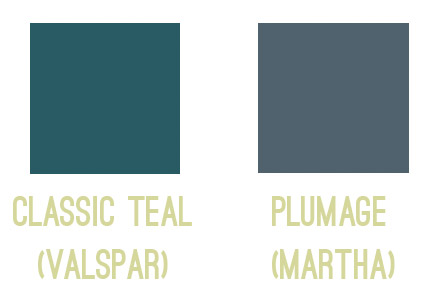
First we have the bold and fun color you might be going for on the left, so if you envision a deep teal tone, you might be tempted to use Classic Teal after seeing the swatch. But on the right, we put the swatch for Plumage, which is actually what we used in our guest room. See how grayed out the swatch looks?
Yet on the walls it’s every bit as bold as we hoped!
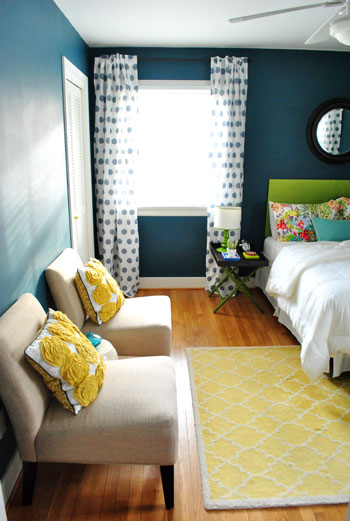
Colors in general – and especially dark ones – seem to amplify by a TON when they’re up on the walls, so we’ve had luck picking the ones that look a bit faded or grayed out, knowing that once they’re up on the walls they’ll look a lot more clear and bold. You can read more on the guest room here.
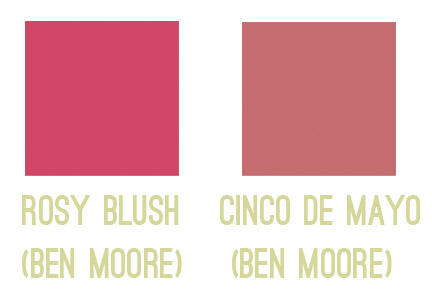
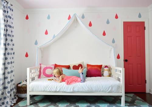
Next we have a swatch on the left that you might be tempted to pick if you want a bright and happy accent of pink – perhaps for the door of a kids room, like we used on Clara’s closet. But the swatch on the right is actually the one that we picked. A small square of it looks a lot more muted (sort of faded) compared to the bold and happy color on the left…
… but once it’s on a nice big area in the room (like the door), you can see how bright and clear that color reads. So even though the swatch on the left might be the pure and unfaded one you’re initially drawn to, in a nice large chunk it could almost read as neon. You can read more about Clara’s closet and those raindrops here.
Another coveted color seems to be a cheerful aqua tone, but in our re-painting-riddled experience it can be hard to get right. The color on the left is a peppy Tiffany Box blue… which is actually a color that seduced us when we moved into our first house… but once we had it on the walls of our dining room, well, it was a little overwhelming. Of course it depends on your room (someone with an amazing room full o’ light could make it look stunning) but in our experience, that color’s just not muddy enough not to get blindingly bright on the walls. So we’d be drawn to something like the swatch on the right, which should still clearly read as a pretty aqua tone in such a large quantity (here it is in a laundry room makeover).
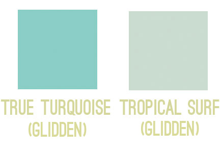
So my general rule is that for painting smaller items (like a tray, side table, accent chair, or lamp base), those more clear/unfaded/unmuted colors can be great. But for larger expanses (doors, walls, ceilings), we tend to prefer muddier tones of the same color – like a softer aqua with more of a gray-green undertone – just so it doesn’t go from chic-tiffany-box blue to punch-you-in-the-face-when-you-walk-in blue.
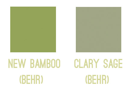
The same thing seems to ring true for greens for us. Something bold and clear can work really well on a piece of furniture or a bathroom vanity (but not necessarily all of them, ha!). But when it comes to the walls, the color on the left would likely turn most rooms into Kermit Theee Frog (I love when he says his name that way). Meanwhile, the one on the right might look dull by comparison, but on the walls it could be really pretty. Sage is always gorgeous with wood trim or cabinetry, so that could be a nice choice for a kitchen with wood cabinets or a den with wood trim.
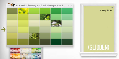
Here’s another way I thought I could attempt to illustrate the strange mystery of how a swatch with those muddy/muted undertones can almost look beige in your hand in some instances… but then when it’s on a bigger area, it’s very clearly a color. See how muted and almost wheat-toned the swatch on the left with the arrow next to it looks below? Yet when it’s in a bigger area (that’s the exact same color in a larger rectangle on the right) it definitely looks green and not tan or beige anymore.
Update: Someone asked if the muddy version of a color would typically be on the same swatch as the bright one (if you slide up or down) or if it’s on a different swatch. In our experience, it’s almost always on a different swatch, so there might be a whole range of clear tones on one swatch (from bright aqua to a light baby blue) but you’d want to go a few swatches over to the one that has a much grayer or muddier top color (like a deep blue-gray) and slide down to find those muddier counterparts.
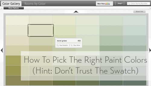
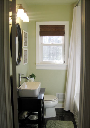
One last example would be Dune Grass, which we used in our first house’s bathroom. It looks almost completely cream/beige/tan in a small swatch (with just a tiny hint of green) – especially when it’s arranged with other green tones that are a lot less muted…
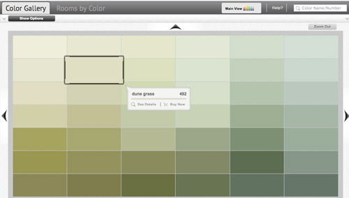
… but in our bathroom it clearly reads as a soft green color. Once again, when it’s up on the walls, there’s just a lot more of it, and it’s definitely amplified from the neutral-looking swatch. So if you’re looking for a light or subtly colored wall (be it green, blue, pink, yellow, orange, purple, etc) you might want to consider those lighter wheat or gray toned swatches that almost look like there’s just a drop of that color in them. The result can be a room that’s clearly that color, but a soft and subtle version of it. You can read more about that big bathroom reno here.
As Heyruthie mentioned, colors aren’t always great on monitors, but hopefully just seeing these comparisons might help. And when making a final choice, the best method we’ve found has just been to bring some swatches home, check them out in our lighting situation throughout the day, and then grab a test pot (or three) of paint if we’re still nervous. Those small sample pots are only a few bucks and they can save you a whole lot of re-painting trouble.
It’s also amazing how different the same paint color can look in a variety of rooms/lighting situations, so I’m sure there are folks who’ve used those bolder colors in the left columns above with great results – so it really does depend on your room, how much light it gets, and how you layer stuff in. Like this could-have-been-blinding bright blue paint color, which looks awesome in a lofted and light-filled studio – especially when it’s tempered with lots of tan texture in those pin boards and that over-sized mirror.

Oh and since we’re on the subject of buying paint, here are a few tips we’ve learned over the years about scoring a discount:
- “Oops paint” can be awesome (it’s someone else’s already-mixed paint that has been returned for some reason, but it’s usually extremely marked down as low as $1 for a whole gallon, so you can even get a few cans and mix them in the hopes of creating a color you like for a serious discount).
- If you have a favorite paint shop (ours is a local place called Virginia Paint), you might want to pop over to their Facebook page and click the Like button or sign up for their mailing list. By doing that you’ll often be alerted if they’re running sales or specials, and sometimes you can save $10 or even score 40% off.
- If you get paint from a big box store like Home Depot, you can hit up their website and check out their Paint Promotions page.
- You can also get 5% off any purchase at Home Depot or Lowe’s if you use your store credit card there (Lowe’s does it automatically, and you just have to ask for Home Depot to match the 5% off that Lowe’s provides when you’re checking out and they will).
- Sherwin Williams tends to run some great specials. In fact right now they’re having their big 40% off sale. And I’ve heard you can buy untinted gallons (like a whole bunch of them) for 40% off and then bring them back later to get them tinted at no charge (I’d check with your individual store, but that’s the rumor). So even if you’re not sure what colors you want right now, if you have a bunch of rooms to paint it’s a great way to save serious loot.
- It never hurts to click around on any paint website for promotion info. Right now Behr is having a $5 off promotion and Benjamin Moore is offering a buy-one-get-one-free deal on a quart of paint.
Do you guys have any other paint undertone tips to share? Or just some stories about going for the wrong swatch? Any other tips for getting paint at a discount?

Meagan says
Great paint tips! One problem my husband and I have had with paint is that even if we get the exact same paint color and the exact same base paint from the exact same store, the colors are not always the same. If we’re painting a large room that takes more than one gallon of paint, we mix them together to make sure the color is the same. We also ALWAYS save the left over paint for touch ups. We learned this the hard way when we had new paint mixed for a touch up and ended up having to repaint the entire room because the “touch up” paint was slightly darker than the rest of the room.
YoungHouseLove says
Great tip Meagan!
xo
s
Stacy says
We’ve had the same problem. We bought too much paint the first time around. Then had to move for a job and our house is now a rental. When we tried to touch up the second can of paint didn’t match so we had to roll the entire room. Not fun when you have a deadline to move out! Good lesson to mix them didn’t think of that.
Crystal says
Great tip most of the time but I’ve actually used the exact same paint from the exact same can for touch ups and unfortunately it did not match anymore. I don’t know if the sun faded the walls or the paint changed in the can but something changed and I had to repaint the whole room. I know Jenna Sue had a similar experience recently that she talked about on her blog. So maybe double check they both still match each other.
YoungHouseLove says
Oh no, that’s so hard! Such a good thing to know though! Double checking in an inconspicuous place is really smart.
xo
s
Summer says
Speaking of which… I’d really love to see a post from you guys about touch-ups. Our walls are too damaged/wonky for matte paint (+ we have kids) so we use semi-gloss usually, and even with well-stirred leftover paint, our touch-ups always show.
Questions for you: how often do you go through your house doing touch-ups? Do you keep up with nicks in the wall etc. (you must have them… right?)? How often do you go over dents with putty first? How do you deal with chips on corners (I have the hardest time getting paint to stick there)? AND… how do you blend in the touch-up? We can’t seem to get it so there isn’t a difference in sheen.
I love the look of a nicely painted wall, but I feel like it’s only a matter of months before all I can see is a bunch of imperfections that I can’t really fix without starting over. Am I doing something wrong?
YoungHouseLove says
Touching up semi-gloss can be hard even for the pros I’ve talked to! From what I hear, you want to fill any dings first with spackle, sand that smooth, and then when you’re painting you want to feather your paint out so far from the touch up (like three feet away from it on all sides). I’ve even heard that sometimes doing a whole wall is the best way to get a seamless finish (sounds like a lot of work though!). As for us, we typically use eggshell, flat, and satin for the most part (bathrooms and kitchens get semi-gloss sometimes, but usually satin as well) so they’re easier to touch up since they’re not as glossy (the more shine, the more touch-ups and general imperfections are amplified). I usually just do touch ups if I happen to have the paint out (for dinged up baseboards for example) which might be once every few years, and then we always do them before we sell/move out – which of course makes us say “the house never looked nicer! And now we’re leaving… haha!”
xo
s
Kelly says
I forgot to mention in my other comment that when I went into the our True Value the other day they said NOT to use sample pots as a finished product because the formula they use isn’t meant to hold up over time. They had pre-mixed pots in one brand that he said were the same quality, but he recommended always using the better stuff for your actual paint projects.
Now I’m wondering if that’s true of all sample pots.
YoungHouseLove says
We’ve used test pots for a bunch of small projects and have never had it crack/chip/fade or anything (even for outside projects that get a ton of wear, like painting a utility box, which held up for years) but I’d love to hear back from others if they have had issues! I’ve talked to two different people who manufacture paint and work at plants (not distributors who sell it at stores) and they have both said they think that “lower quality” thing is just a rumor. They also told me that those test pots of paint actually lose companies money (they cost more to make than they sell them for) but they take that hit in the hope that they inspire people to come back and buy the gallon (where they make their money) so one guy said he thinks stores encourage their customers to buy the larger quantities in stores by saying that about the test pots. The other person just said he never heard that, but he believes it’s the same paint and it’s tinted with the same machines right in the store that they use for the big cans, so that isn’t going to vary either.
xo,
s
Lauren says
I’m not sure if this is good advice or not but it works for us: if you get out paint for touch ups or if you bought the paint a while back and haven’t started painting yet, take it back to the paint store and have them shake it for you again. We do this all the time and feel like it’s much better and effective than just trying to shake it up yourself.
YoungHouseLove says
That’s an awesome tip! I bet those machines blend it better so you have a better shot at a good match.
xo
s
Holley says
I work in the paint department at a big box store. One of the things customers usually don’t know is that different tinters can produce slightly different colors. We have two (A & B), and the sticker on the top of the can tells us which tinter the paint came from. When someone needs a repeat, we always make it from the same machine – there’s a better chance of getting an exact match that way.
This is really only helpful if the repeat can is being made within a month or two, though. Vendors are always changing their formulas, sometimes machines get replaced or serviced, paint on the wall can fade – any number of things can prevent that perfect touch-up match. When it’s been longer than 6 months, I always prefer to use the color match machine to guarantee a perfect match.
YoungHouseLove says
Thanks so much Holley! Such interesting info!
xo
s
Heidi P. says
Wow. Wow wow wow. This post and all of these comments are so SO dang helpful! Thank you!!!!! I just reviewed all my swatches sitting on the counter, went to the websites, looked up muddier versions, and wrote them down. I kind of want to shake my fist at you for sitting on this info for so long! Hahaha, just kidding :D. Thank you for being smart and awesome and sharing all your smartness and awesomeness with us!!
p.s. Somewhere in there, please insert one of Elaine’s “GET OUT!” moments ;).
YoungHouseLove says
Haha!
xo
s
Kelly says
If you don’t want to mix paint, but are worried about the mismatch possibility then you can change cans at the corner. Any difference will just look like a trick of the light. If you do this make sure and leave a bit at the bottom of the can as you go. That way when you spot a missed spot you have matching paint to cover it up.
YoungHouseLove says
Never thought of that! Really smart!
xo
s
Alexis says
Thank you! This was so helpful to me. I’m not a creative type and def. need the visuals to understand what “muddier” colors would be. Now I’m thinking of repainting a room or two with this advice in mind.
Samanta says
What a great post. I just wished I’d had this before I painted our bedroom a bright turqoise, but it was a $5 can of “oops paint” so I’m not complaining too much. I’m definitely keeping that first “plumage” colour in mind, I love it!
Cris says
Hey! I’m the first one? Yay!
I just wanted to this was really helpful! I just painted my room after living in it for a too many months while it was awfully neon green, but I opted for white because I was scared to choose, booh.
I live in Spain and it’s a bit (a lot) more difficult. Can you believe you have to “buy” the paint swatches for a few euros and there are NO test pots? Most people go with whatever seems good in the store, and it’s usually terrible… My parents have tons of cans of colors they only realized were ugly having them on the wall, and then you can’t take it back either.
You guys have it so easy! Take advantage of it! Try stuff out!
YoungHouseLove says
Oh my gosh, never heard that Cris! That sounds really tough! I’d totally buy a book of swatches to hopefully have a lot of them for comparison. Do they sell them in a swatch book like that?
xo
s
Paula Guimarães says
I’m from Portugal and we (portuguese) have the same problem! There’s no test pots! And I do too have cans of colors that i didn’t use! And it’s expensive. when you think about our minimun wage (480euros per month) and a can of 2liters of paint costs 18 euros!
YoungHouseLove says
Oh man, that’s so tough!
xo
s
Andrea says
Same in Germany :( I really don’t like this at all. The smallest can is 1 litre (1 quart) If you need any paint for a small project you usually have LOADS leftover.
Also, I’m really jealous of all the beautiful colours you get. I’ve been trying to locate a nice grey colour for a rectangle on my wall (as to visualise where my desk space is). No luck. At all. Sad times!
YoungHouseLove says
I’m so sorry Andrea! That’s the pits!
xo
s
Johanna P says
Sounds like Spain and Portugal need a paint pot swap market.
The black market in home decor! :P
Kim Almeida says
I’m also writing from Portugal, and I lament with the same problem of not being able to buy test pots (or having “pots” be “quarts” for like $15!), and few swatch options to take home. Once I even asked if I could buy an entire swatch book, thinking it could really come in handy, and the guy at the trademark store said yes… for 90€ ($120)!!!! Sheesh!
YoungHouseLove says
WOAH!
xo
s
Jen says
That’s sort of why I have a problem with all of the “paint swatch art projects” you see people doing over here: paint swatches are free to take, but they aren’t free for the businesses … I’m afraid that if people load up because they want to do an art project with the swatches, we’ll see paint stores starting to charge for them.
YoungHouseLove says
Ive heard that! I’ve also learned from an industry insider (shh!) that test paint pots actually cost every company that offers them a lot more to make than they charge, but they do it to inspire people to feel confident to buy a gallon of their paint, so they’re gambling that folks will come back and buy the gallon, which is really where they make their money.
xo
s
Amy says
I live in Spain too (Madrid), and at my local paint store you can return the paint swatches when you go in to purchase the paint, so at least you can recoup that cost. Still – the lack of test pots is really frustrating!
Jen says
This was super helpful! My husband and I had some serious issues choosing paint colors for our new house, especially when it came to the blue/green color we wanted in the kitchen. I wanted somewhere between a teal and Tiffany Blue, but after about 10 paint samples, I couldn’t get the right shade. Then I found your original post and went back to the store and settled on a much lighter version of what I was looking for (like 6-8 shades lighter) and voila! The color was EXACTLY what I was looking for. We’re pairing the blue/green walls with red to give it a punch of color that brings out the green in the walls. Thanks for the help!
YoungHouseLove says
So glad!
xo
s
erin says
what a fantastic post! thank you for the comparisons and all of the helpful hints!
kara says
Great advice! I never thought about muddying down the colors, but that makes sense. Especially after we just painted our nursery and the color was a little more in-your-face than anticipated, but since it’s for a baby, it’s going to work just fine. Instead of calm and serene, it’s going to be a little more bright and happy! Really it was a win/win either way it came out. Now bring on this baby!
Ashley says
Great post! I love color and lots of it but this made me realize less really can be more. Color theory is fascinating and this was a great way to get your ideas on this across. It seems like the ‘final color’ ends up being a ‘happy medium’ of the 2 swatches you showed.
Ashley says
Now if only I didn’t still live in a rental and could go to town painting every room!
Kate says
I soooo agree with your muddier color advice! I find that these colors are more dynamic and change with the light because they have so many undertones.
This is also why I try not to paint a bunch of swatches on the wall right next to each other. You invariably end up comparing the colors to each other instead of looking at each individual color on their own. Like your example of the green in your first house’s bathroom, if you had put up a bunch of swatches, the one you picked would have looked almost beige compared to other greens and you may have picked something bolder. But looking at it on its own, you see that it is very green, just not in your face.
Ben says
Seriously this is a great help. Picking paint is a pin, particular when you have a color blind guy (who loves grays), married to a color loving wife… it’s a struggle. And the stupid naming conventions… Why? With the Yes, But No. Names.
YoungHouseLove says
Ha!
xo
s
Nancy says
Haha, Ben! I am the color-loving wife married to a color deficient (tho not color blind) guy WHO LOVES GRAYS! What gives!?! We just decided the inside of the house is mine, the outside is his ;-) But we still compromise for mutual happiness!!
I bet your wife, like me, LOVES the crazy names, too!
Meg says
We recently discovered the challenges of selecting an exterior paint color. What looks good on a swatch, or even painted on a big piece of plywood looks completely different in shade vs. direct sunlight. So glad we waited until a very sunny day to look at the sample we thought we loved for our home exterior. We ended up a few shades darker because in direct sun we got a mint green instead of the sage green we were looking for. (Green has got to be the hardest color to get right!)
In Massachusetts California paint is local for us and rated the #1 exterior paint. We just got a 20% discount from Ace Hardware and saved a ton on about half the house paint we’ll need. They also have $7 off coupons at least once a month and we’ve been using that to by gallons one at a time.
YoungHouseLove says
Yes, we found the same thing! It’s so true- outside is such a different ballgame!
xo
s
Tiffany says
Meg – what color did you end up going with? My sister wants their house to look like (http://www.pinterest.com/pin/177399672795415856/) but can’t find the source of the paint color. She’s thinking about going with Behr False Cypress. Any help would be great:)
iris says
make sure before you start using the cans of paint to mix up as many that will fit in a 5 gallon pail of one color..and stir good..every gallon will have a slightly different hue, so if you do this it will help not to see color variations….made that mistake many years ago and now mix them together for a better look!
YoungHouseLove says
Such a great tip!
xo
s
Pamela @ Little Red House says
Interesting. Thanks for sharing this. In my house, I’ve found that the bright swatches work well and look great. I’ve gone with fairly saturated/”pure” colors and nothing too gray and they look just like I want them to. Thought I will say a couple colors I thought looked great on the swatch didn’t look so great up on my wall (too intense). Goes to show you how much lighting plays a part. Although now I’m kind of interested to find a gray-ish sample of a color I like and slap it up on the wall just to see how it looks. Time for a piece of poster board and a test pot…
YoungHouseLove says
You’re so lucky! Your house must be full of light!
xo
s
Amy says
Great post! I especially know what you mean with your green paint example – we painted our kitchen a very similar color to the one on the right and I thought it was going to be gray with a hint of green. Then once it went up I was surprised by how green it actually was! Not exactly what I was going for, but it works for now! :)
Madeline @ Create . Bake . Celebrate says
Picking paint is HARD. We ended up with about 12 samples when trying to paint our upstairs grey. Everything looked great & then on our walls it looked so dark and so brown. Is it a coincidence that the word pain is in the word paint? I think not.
Here are my tips for choosing a grey: http://createbakecelebrate.blogspot.com/2013/09/create-how-to-pick-paint-color.html
YoungHouseLove says
Thanks Madeline!
xo
s
Amy says
I completely agree with paint amplifying when it’s in a larger space. I repainted our main bathroom earlier this when we put our house on the market. The paint looks white in the can, even when you stare at a small spot, but when you pull back and look at the whole room, it’s definitely light blue.
Steph says
I have made so many paint mistakes going for the right blue and finally learned that swatches for the color blue I wanted always looked like a gray. Also, I never got “good” at picking colors until I owned big ole’ Sherwin Williams fan deck. I’m happy to say I picked two trim colors for our brick house in the “gray green” family and using swatch comparison was the trick for a perfect choice. Finally, when the “burnt orange” paint you’re about to put on your dining room walls blends into the Home Depot orange paint tray you know it ain’t gonna be good. . .
YoungHouseLove says
Oh man, that’s hilarious! I can totally picture my face dropping if those oranges blended…
xo
s
Carol says
I wish I knew this a few years ago before I painted my bathroom Pittsburgh “guacomole”. It was definitely way more in-your-face green than I wanted. It stayed a couple years, but has been replaced with camel tan.
sara says
Great tips and visual!. The first example is quite shocking … it really surprises me that the Plumage looks so teal in the room. I have a peacock blue room (that I love) but when I tried to use it in another (brighter and larger) room, the colour was too bright. I may have to try this toned down trick. Thanks.
Lisa @ Double Door Ranch says
Thank you for this!!! I’m pinning this baby to reference probably daily. :)
P.S., I think Ben Moore is missing a huge color naming opportunity with Punch You In The Face When You Walk In Blue.
YoungHouseLove says
Haha! Let’s campaign for it.
xo
s
Peggy Mckee says
Very helpful advice!!!! I love features like this, and the actual DIY, of course.
Tamrah Ryan says
Great post! Also, the Behr coupon looks like an expired sale. I think have coupons on their site fairly often, though, so thanks for the reminder! :)
YoungHouseLove says
Sorry wrong link! It’s on the banner of this page (before it rotates): http://www.homedepot.com/b/Paint/N-5yc1vZar2d#/?c=1&anz=anz&ef_id=z4hPO8GSKysAAIKW:20131108151242:s
xo,
s
Kate F. says
Such a helpful post you guys! Thanks so much for the examples and explanation. Obviously, this advice may vary by store/region, but my Home Depot told me that their best paint sales are always 4th of July and Labor Day. This past year, I was able to get $5 off each gallon and $30 a 5 gallon. It was a mail-in thing and the “cash” came back as gift card, but that was good enough for me!
YoungHouseLove says
That’s an awesome tip Kate!
xo
s
Lisa says
Thanks for the great advice. I have another little tip that I learned from our local Benjamin Moore store. Instead of painting sample patches on the wall, use your small lot to paint a poster board. That was you can move the whole poster board around the room to see how the paint will look in different light. Used this technique for our kitchen and family room combo and it worked like a charm…one place the paint looked green, others it looked gray, but at least we knew in advance!
YoungHouseLove says
Love that tip!
xo
s
Melissa says
I figured out the muddied/grayed paint color thing a few years ago and it made a HUGE difference in my color selection success rate. It also makes white trim look so much crisper and cleaner.
When I’m really stumped, my husband will buy a small piece of drywall (they sell them in 3′ squares at Lowes), paint it with the color I want and we’ll move it around to different parts of the room at different times of day. A small extra step that can prevent a big do-over.
YoungHouseLove says
So smart!
xo
s
Mollie says
That teal/plumage comparison blew me away!!! I never would have guessed that plumage was the color actually on the walls. A picture really is worth a thousand words.
Jennifer says
Thank you thank you thank you! This helped IMMENSELY. I never would have guessed your guest bedroom walls were that muddy on the swatch. Makes so much sense. It also makes me more confident about the color I’ve picked for our living room (yet to be painted). I’ve worried that it was too dark and murky, but seeing what you’ve done I think it will read more warm and golden on the walls. We’ll see!!
Again, brilliant! Thank you!
YoungHouseLove says
So happy to help Jennifer!
xo
s
Sarah in Florida says
I have had more luck with loving oops paint (my old house was all oops total spent was $75 for 10 gallons wooo!) compared actually picking colors and paying full price. I struggled to pick a color, Pelican by Valspar, recently only to realize after 2 walls it’s probably not tinted right as it appears to be more Autumn Fog than Pelican but I am so over painting (who tries to paint an entire house in the first 2 months of moving in? ugh!) that I am going to suck it up and deal with it for now even though I am really not feeling it. Live and learn…and paint again another day ;)
YoungHouseLove says
Oh my gosh, that’s varsity Oops Paint use right there. Ten gallons for $75 = awesome!
xo
s
Kay says
Woah. You guys have just blown my mind.
Kris B says
This was very helpful! Thank you.
Kelly says
Great tips. We have found that a happy and bright neutral tends to work better in most spaces after years of trying to go bold. While I think it can work sometimes (like your guest room) I prefer to bring in color in other ways. Aside from our kids rooms most of our walls are a muted yellow/tan. Natural light totally changes it too-it looks yellow sometimes and tan sometimes, and in some pics it looks like cream.
The rumor about True Value is true. :) Our local True Value said that you can buy the paint on sale and have it tinted later.
YoungHouseLove says
Love that True Value does it too!
xo
s
Jess @ Little House. Big Heart. says
Thanks for this! I’m getting ready to paint our kitchen navy the next time the hubs goes on a business trip (surprise!) and this will help tons in picking out the right shade.
BTW, anyone have a favorite shade of navy for painting walls?
YoungHouseLove says
Anyone have a favorite? We have seen a lot of Hale Navy by BM around, so that seems to be one favorite that pops up a lot.
xo
s
Allyson says
I just painted my kitchen Nocturnal Sea by Behr and we love it!
Tiffany says
I have that exact same question! I found this post via another blogger. I haven’t gotten the courage to paint the walls yet, but hopefully this will help me pick a color: http://lisamendedesign.blogspot.com/2013/06/best-navy-blue-paint-colors-8-of-my-favs.html
The pictures on her post show just how much of a difference the room lighting can make!
Here’s another great navy wall: http://emilyaclark.blogspot.com/2013/10/accent-walls-when-they-work.html
Sara says
YAY for the navy lovers – I’d love to paint our bathroom navy, but am struggling to find the right shade! Off to click the links below from Tiffany – many thanks!
Lindsey d. says
I think we’ve settled on SW Smoky Blue for the master bedroom. It definitely meets the “muddier” test, but I think I’m going to ask the paint guys to add 5 or 10% more black just to make sure it is dark enough for my taste. (The fiance prefers light and bright, but I’m giving him that in the rest of the house; the master is mine…)
(http://www.sherwin-williams.com/homeowners/color/find-and-explore-colors/paint-colors-by-family/SW7604-smoky-blue/)
Julia says
Such a great post! But I have a ‘newbie’ question. Where do you look for the same color but in its ‘greyer’ form? Is it on the same swatch or is it in the same row of a different swatch?
Ok, my question is not clear so an example might help. Let’s say that the Original Teal is the color number 3 in the swatch of 4 colors. Will Plumage be number 4 on that swatch or will it be number 3 in a different swatch with all greyer tones? (I know that this two colors are made by different brands, but I hope they help to illustrate my question!)
Thanks!
Julia
YoungHouseLove says
Great question! It’s almost always on a different swatch, so there might be a whole range of clear pink or blue tones (from bright aqua to super soft but not muddy at all blue) – you want to go a few swatches over to the one that has a much grayer top color and slide down that to see what swatch will be best. For example, the swatch with the deep blue-gray at the top would probably have a pretty grayed out aqua halfway down it, while the one with the tiffany box blue tone halfway down would have a bright ocean blue at the top. Hope it helps!
xo
s
Jill says
Sherry, you should add your reply to Julia’s question here to the original post. I think a lot of people would find it helpful.
YoungHouseLove says
Done! Thanks for the suggestion Jill!
xo
s
rachael says
People also need to remember that on a swatch with 4 or 5 colors, the lightest color is not a shade lighter than the one below it, and so on. They are usually all colors that “go together” nicely. In other words, some experts suggest picking a color, and then choosing the lighter one above it, but technically it is not a shade lighter. It is a different formula all together. You should have mentioned that in the post.
YoungHouseLove says
Great tip!
xo
s
Sarah says
Loved this post! We’re moving into our first house next Friday (yikes) and it seems like all your posts are super timely these days… Thanks for the inspiration!
Also, loved your little cactus DIY post. As someone who just signed a mortgage TODAY, I appreciate seeing DIY gifts that are actually inexpensive. You see so many things in pinterest that LOOK cheap and easy and actually aren’t. I think a little cactus in a painted pot would be a great gift and I’m going to try it out!
YoungHouseLove says
Aw, thanks Sarah! Best of luck with your first house. So exciting!
xo
s
em says
This was such an informative post! I thought I was a pretty good paint-picker, but I realize I had it wrong as my rule of thumb is just to go lighter than the color you want to achieve (except outside). But, I think muddier is a better rule. BTW, we did pretty much that exact “wrong” aqua above in a bathroom and then I realized that I did not actually want to brush my teeth in a room the color of my toothpaste. So, back to the store we went for a color that seemed almost white, barely aqua, but turned out just right. It was the one time I was thankful my bathroom is so tiny.
YoungHouseLove says
Ooh, that white with a hint of aqua sounds so pretty for a bathroom!
xo
s
Katrin says
So did I. My husband always compared it to showering in an empty swimmingpool… It is on my list to be repainted soon.
Love this post! I hope I’ll be a better “paint color picker” from now on. Thank you.
YoungHouseLove says
Good luck!
xo
s
Michelle @ A Healthy Mrs says
This is so helpful! Makes choosing a color a little less stressful, and a little less guess-ful :)
Lisa says
Great tips! I’ve learned most of these the hard way. Especially after painting my kitchen what ended up being a lovely shade of school bus yellow, even though it looked soft and buttery on the swatch. Whoops!
I can confirm that you can buy untinted paint at SW and bring it back to have it tinted later for free, I just did that at their last sale!
YoungHouseLove says
That’s so cool of them! I love that.
xo
s
JustMe says
Ditto. I bought 10 gallons at their April sale, just in time for moving into our new house. I get them tinted as I need to. Also, I had bought the Superpaint, and painted my bathroom. It was too smelly. So when I took them back to get them tinted, they gave me an even trade for the Harmony paint, since they said it was the same price. They will do that ONLY for untinted paint.
YoungHouseLove says
That’s awesome!
xo
s
Lisa E says
Great advice. Definitely. In my last house I needed this advice when picking out the bathroom’s color. I wanted a nice aqua, but got an in your face color, instead. I just left it out of laziness. ;)
jaclyn says
I’m a product designer so I know color, and how it behaves, like the back of my hand. My husband however, ALWAYS fights me when I’m picking paint colors.
Sure enough, every single time I finish painting a room, he walks in and says “oh! it actually looks really good!” And I’ve had so many run-ins with the paint staff who give TERRIBLE color advice and I’m just like, “Yeah ok, just mix the color I asked for please….”
On a side note, this may seem obvious, but even though mixed paints from Lowe’s say right on the sticker, “Not refundable.” They totally are! No questions asked. So if you get home and start slapping the paint up there and then have a panic attack that you just wasted $35 on paint that you hate, it’s OK! Just return it!
YoungHouseLove says
Never knew that!
xo
s
Laura says
This is true. I’ve returned paint there on several occasions. They are always super nice and helpful about it. How else do you think they get “oops” paint? ;)
Chelsie says
This has probably been one of the most helpful posts I ever have read. I hate every single paint color I’ve ever chosen for my walls. Thank you so much. I can’t wait to try out a new color now that I have this advice. Muted and muddier, got it.
YoungHouseLove says
Aw, I’m so glad Chelsie! Good luck with your paint picking!
xo
s
Lesley says
I wish I’d read this before I chose a way-too-bold blue for our windowless kids bathroom! I’m dreading repainting it, but this post will be a big help in getting the color right! Thanks!!
YoungHouseLove says
Good luck Lesley!
xo
s
Sarah says
On the bright side, you probably won’t need to prime the bathroom before repainting!
Lindsay says
Love this post! Full of good info that I haven’t really considered, even though I’m pretty good at making color choice mistakes. Hah!
When we first bought this house, I picked a nice light yellow for the hallway, which turned NEON CIRCUS YELLOW once I had finished the whole thing. Second try after completely painting the whole thing again? Turned to YELLLLLOW! Ugh. It took me picking something that barely looked yellow at all to my eye on the paint chip for it to end up the light yellow color I wanted on the wall. At least I got some good painting practice in? Or something?
YoungHouseLove says
Haha, that’s totally good practice! And imagine all the character it built (my mom loved making me do terrible tasks and telling me I was building mounds of character).
xo
s
Sarah O. says
I guess I use Glidden paint often enough that I noticed all the greens by Glidden in the middle of this post – so shouldn’t the Celery Sticks be Glidden, not Valspar? Thanks for the great post! :)
YoungHouseLove says
Yes! You’re right! All fixed!
xo
s
Allison says
Just wanted to write that the Sherwin Williams thing is more than a rumor. I was buying paint there and one of the employees was actually telling a customer she could do that.
BTW: my absolute favorite color (and is in my son’s nursery and another room in our house) is Sherwin Williams Coastal Plain. Loooove it! Here’s a pin of the letterpress drawer we use for lego minifigs in his room, you can see the wall color in the lower middle pic. http://www.pinterest.com/pin/210402613812976886/
And I just have to brag that my husband designed and made the crib ;)
YoungHouseLove says
Gorgeous! Such a cool crib too! And so meaningful that your hubby made it.
xo
s
Erin says
That pink example up there is pretty much what happened with my daughter’s room! I am far too lazy to change it (since we had it professionally painted) and I do think with some wall decals and decor up it’ll be fine but OMG it is SO BRIGHT – and I even toned it WAY down from the original FUSHIA swatch she wanted! Thankfully she also has white paneling on the bottom of her room so it’s not ALL pink but yes. Very good advice – so hard to pick colors. We just picked for our entire house and I really do like the ones we ended up with – the kids rooms are slightly bright but oh well – they won’t mind :)
Erika says
Very helpful post! I can’t paint b/c I rent, but good info to store in my mind :) I love color, so it’s nice to know those muted shades still offer a lot of color without being “in your face”.
Love the side by side comparisons!
Mandi says
Perfect timing. My husband and I are wanting to tackle painting most of our apartment this weekend. Great advice. I feel slightly less nervous about picking out just the right shade of blue. Thank you!
Maggie S says
Other hints are that you can mix some gray or white into a small sample of paint until you like the color –paint that color on a paint stick and Home Depot can match the color.
You can also mix your gallon of paint with a white/cream paint to get a lighter color (best to figure out the proportions with a small amount of paint and then scale it up)
Also, most paint stores will re-tint your paint if the color is too bright or light.
My husband wishes that just once I would use the paint out of the can –instead of making it a LITTLE bit different;-)
Of course, be SURE to save some paint for touch-up –since you’ll never find the color again!!
YoungHouseLove says
That’s a great tip for saving too-bright paint! Never even thought about adding gray or white to it! And I love the re-tinting tip at the store too!
xo
s
Laura says
I picked an aqua paint swatch that I loved and that I thought would be the perfect color saturation I was going for; but when I started painting the actual color, it wasn’t quite right. After another trip to the store and getting another similar color (on the same strip), it still wasn’t right! (I was getting a little stumped and frustrated because I usually have a good eye for color and have a lot of experience picking out just-right colors. But this time, I was not getting it right and couldn’t figure out what was going wrong!) We don’t live close to the store and these extra trips to town were certainly not convenient since I was trying to get it done while I had help. So I finally called the store and asked them to read the color formulas to me for those two colors. That was key!! If you know even a little about color, that can be EXTREMELY helpful to find out what that subtle undertone is that you’re not liking! It made it so obvious!
At that point, I was able to pick out the one WITHOUT the annoying undertone. Since it didn’t come in a lighter shade on any other swatch, I just had them just mix it at 50% which ended up being perfect! (They can mix it at half strength or even 25% if it is a color you love but just want a lot lighter.) I love it and get so many compliments!!
This was at LOWE’S by the way. They were very gracious about taking back the colors that didn’t work out.
Lessons learned:
1. try finding out what the formula is to understand the undertones.
2. try mixing at half strength to lighten an otherwise beautiful color.
YoungHouseLove says
Great tips Laura!
xo
s
Emma says
That’s great advice!! I get really nervous with the look of paint swatches. I had an experience similar to the turqoise color you show. I picked out a great blue like that for my smallish bathroom, and once i painted the walls it was soo bright!! I added 1/2 a quart of white to temper it just a bit, but I know I need to do a full on re-paint.
Thanks for the advice!
Jessica says
I have seen a lot of blogs where they lightened the paint by 50% or something like that too… is that the same idea? To get a more muted color? I never heard of that before, but lately I have seen a lot of people going with a color they like, but lightened up. I have been confused as to why..?
Also, I love this post and totally agree! Every color I have chosen has looked so gray or unsaturated, but once on the walls it is totally different! The other thing I like to remember too; if a color looks too bright when painting, wait until it’s dry and you move furniture back before deciding. Textiles and furniture breaking up the color can really make a difference!
YoungHouseLove says
Yes, lightening by 50% can cut the intensity or darkness of color, although we’ve usually had luck sliding a few swatches over to one with a muddier undertone going down the whole thing (instead of bright marine blue to soft sky blue, we’d hone in on the swatch with deep gray-blue to soft gray-blue on it, just because it tends to read as more soothing and less in-your-face in our lighting situation. Even light blue can read as really baby-blue-ish and primary in some lighting scenarios, so a lighter and muddier blue might be a safe choice at least for a swatch choice, and then you can see how it reads in your space.
xo
s
Erin says
We did this in our house. We have a ranch with one long hallway off the living room that leads to the bedrooms, and the entry way is also connected to the living room. The living room and entry get a ton of light, but the hallway doesn’t. We painted the entry and living room one color and painted the hallway 50% of that color because the full strength looked great in the other two spaces but looked too dark in the hall. Once it was done they all look like the same color even the the hallway was a 50% mix.
Also, I completely agree about muddying things up! The color consultant from our local BM store told us to “throw some dirt” in any color choice. She was right, I would have never picked the color we have on our front door (BM Rolling Hills) from the swatch but then I loved it when it was on the door!
YoungHouseLove says
Ha! I love “throw some dirt on it” – it’s as catchy as put a bird on it!
xo
s
Lisa E says
I have never used Sherman Williams yet, but I so far I’m a Behr fan. I wanted to share this link with you so your readers can see the huge difference lighting makes. http://colorfullybehr.com/index.php/lighting-does-make-a-difference/
YoungHouseLove says
So interesting! Thanks for sharing the link Lisa!
xo
s