Happy Martin Luther King Jr. Day, guys. We’re back with a fully finished bathroom paint & trim project (we mentioned our plan here last week, and you saw a sneak half-done peek of it in the house tour video on Friday). So here’s what it’s looking like now:
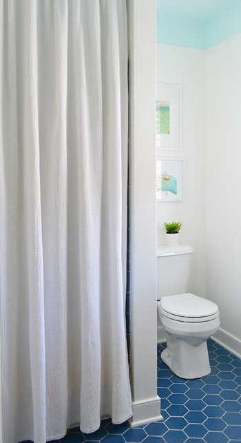
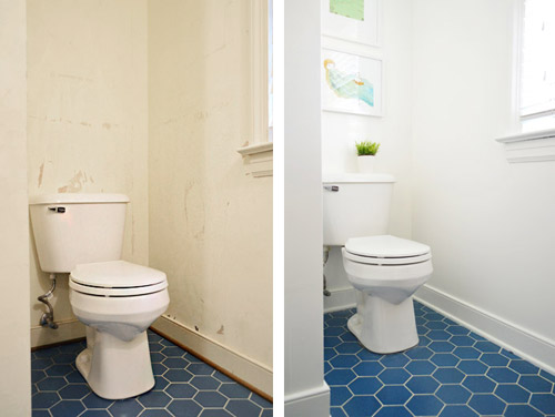
Which is a pretty stark contrast to what we started with. You might remember that we removed the glass shower doors pretty early on, but then we didn’t touch the room again until recently waging war on the wallpaper.
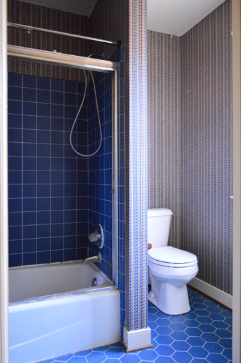
It’s a tough room to photograph due to all the doorways and nooks – especially when trying to get the ceiling and the floor in one shot. So forgive all of the super vertical crops and choppy shots. We hope they at least give you a sense of what the room looks like now.
As we mentioned in last week’s post, the thought behind the blue ceiling was to balance the floor. We’re actually charmed by the blue hex flooring, but we thought some up-high interest would be a nice counterpart. Heather’s bathroom (and this similarly blue-floored inspiration image) helped to guide our vision – especially the part about adding some simple architecture to create a transition between the colors.
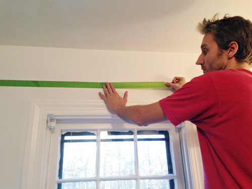
The first step was taping a horizontal border around the room where we wanted our blue color to start. We landed on about 8″ down from the ceiling, since it meant the border wouldn’t be interrupted by door or window trim but would still be substantial enough to look purposeful. I just held up my level and drew a pencil line along the wall… which then acted as my guide to apply painters tape. I wasn’t super meticulous at keeping my tape lines perfectly level since ultimately the paint edge would be hidden under the trim (so as long as it wasn’t majorly crooked, the trim would hide any small wavers or dips).
The next challenge was picking a paint color. We started off by doing some test swatches of colors we had on hand, like Nelson Blue (from our kitchen), Sylvan Mist (leftover from book projects), and Spirit In The Sky (a losing test pot from when we picked a front door color). Normally we’d go for subdued blues with a good amount of gray in them for the walls (like the two on the left) – kinda like a haint blue. But with the low bathroom lighting and the primary blue tiles on the floor, the grayed-out tones actually looked more gray than blue in here. Spirit In The Sky was exciting in a small swatch because it was bold and very obviously blue, but we worried that once it went around the whole room – and covered the entire ceiling – it would be too intense for us (paint tends to magnify itself from a small test swatch and looks a lot bolder when it’s all over the walls or ceiling). So you see how Sherry’s holding up another swatch?
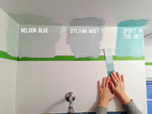
That’s Spring Mint (in an eggshell finish). Since nothing we had on hand was working, we decided to spring for a quart of a new color that was further from the blue-gray category, and more in the “pure blue” arena. Something like Spirit In The Sky, but a bit lighter and more subdued in intensity.
It took us two coats, but by that evening we had the blue border and ceiling that we were going for. As we peeled off the tape, we both wondered if we should leave it as is (i.e. forget adding molding). We decided it was definitely an option (especially if you’re someone who doesn’t have the time/money/tools to add it) but we wanted to take ours a step further. Mostly because we’re a little too in love with our nail-gun, and lattice strips are nice and inexpensive.
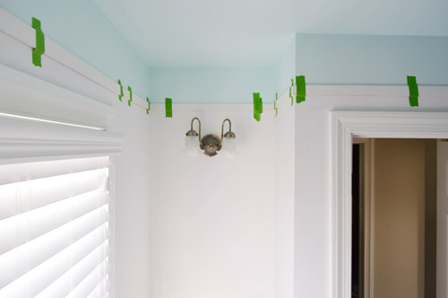
Speaking of lattice, we used the same pre-primed strips that we used for our last hallway’s board & batten. They’re super thin, light weight, and just 77¢ per foot from Home Depot. Sherry measured and cut the strips using our miter saw, and we taped them into place as she brought them up, just to keep track of how it looked and what walls were still incomplete. Despite all of the nooks and crannies in this bathroom, it took us under an hour to get everything cut and taped up… though it did involve about two dozen trips up and down the stairs between the two of us. Go quads!
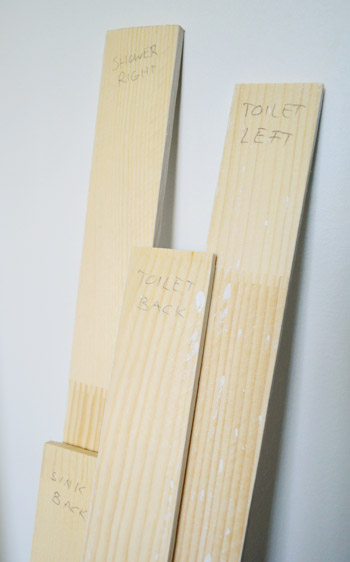
As we took them down to paint them, we labeled each one on the back so we knew exactly where they went when it was time to nail them into place. Many of the walls are similar in size, so we figured it would save us the frustration of putting the puzzle back together by trial-and-error.
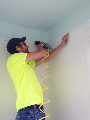
In addition to putting a coat of white (Simply White by Benjamin Moore) on the pre-primed slats, we also painted the walls the same color. Once that dried, we could finally attach the trim. This is one of those easier-with-two-people projects, so Sherry was with me holding things (the nail gun, the other end of the lattice strip, the level, etc) which made it go faster. We started with me nailing one end of our first strip with the nail gun (it was loaded with 1.25″ brad nails). Note the ear plugs, since in such a small space the sound of the gun was crazy loud.
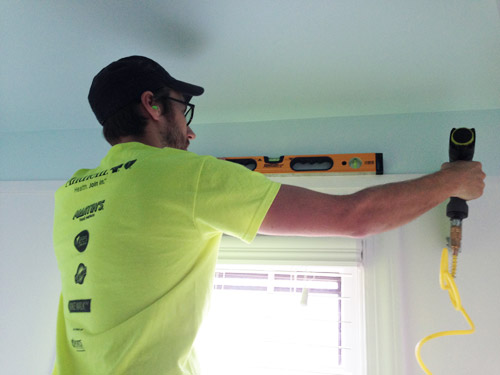
Then I held my level across it to make sure it was straight before handing the nail gun to Sherry so she could nail in the other end. This is a rigged photo since Sherry had to hop down to take this picture, but in real life it was a lot easier for her to hold the other end of the lattice up, and I’d check things with the level, say “good!”, and she’d fire a nail into her end. Then we could just continue around the room, making sure each piece lined up with the one before it.
Once we had all of the lattice hung, I went around the whole bottom edge with a bit of caulk, since our walls weren’t flat enough for them to looks seamless. I also used caulk to fill the tiny nail holes that we fired into the lattice on each end as we hung it. When the caulk dried, Sherry went over the trim with one more coat of paint – just on the front and under the bottom edge – to make sure it looked as crisp as the freshly painted wall.
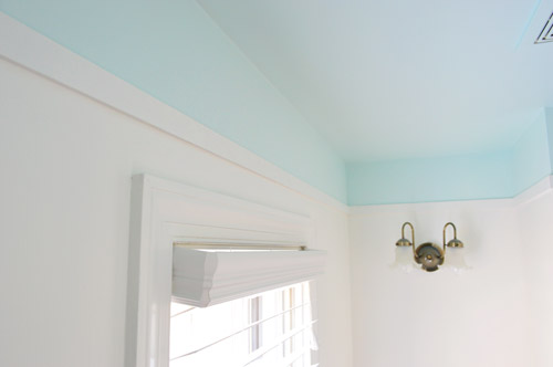
There are still lots of little tweaks that we’d like to do to this room for Phase 1 (see that light fixture above?) but so far we’re really happy with this slice of personality that we brought back into the space (you know, after ridding it of its wild wallpapered persona).
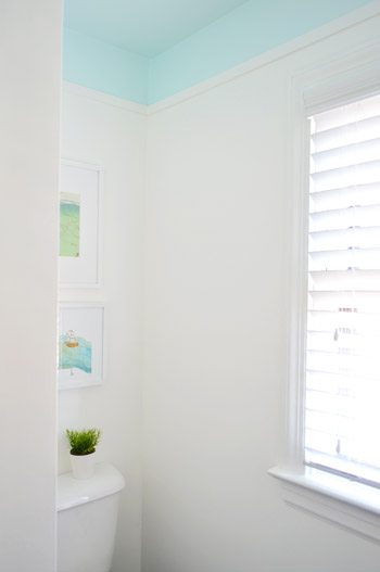
And I don’t want to ignore the power of the white paint in all of this too. Here’s the difference between our post-wallpaper-removal “gas station bathroom” look, and the post-paint after that we have going on now.
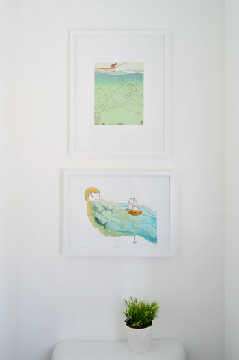
We also hung some art on the wall behind the toilet. These are prints we had from our last house (the top one is a page ripped from Real Simple magazine that hung in our guest bathroom, and the bottom one is a print by Sally at sadlyharmless.com that was given to us during one of our book tour stops last year and used to hang in our sunroom).
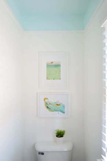
When we held them up together we initially worried they were a little too similar to be so close to each other, but decided just to work with what we have for now. The gradient of blues (the top print is a little lighter) actually seem to connect the lighter blue ceiling to the deeper blue floor in a nice subtle way.
At the end of the day, our entire bathroom update so far clocks in at a little over 50 bucks. Here’s the breakdown:
- Removing the glass shower doors (more on that here): $0
- Peeling the wallpaper (more on that here): $0
- Lattice trim from Home Depot: $25
- A quart of blue paint for the ceiling in “Spring Mint”: $30
- Shower curtain, white paint for the walls & trim, and art: $0 (we already had them)
- TOTAL: $55*
* If you don’t have a shower curtain, wall & trim paint, and art on hand, you might spend around $100 grabbing those.

We still have a few more inexpensive updates in mind for this room, but it’s already a lot nicer to walk into than the dark blue wallpapered space that we started with. What did you guys do this weekend? Any bathroom or trim projects in the works?
Psst- Last week we woke up to some surprise snow, and Clara really got into it.

Emily Mc says
That is INSANE how much brighter it is and how much it makes me love that blue tile now! Awesome!
Lisa says
Pretty much what I was going to say … and I LOVE the ceiling!
lizaanne says
So crisp and clean and pretty!!! Even the blue tile seems to be smiling now! What a great inexpensive make over that could be done in so many bathrooms to just spiff things up.
Great job!!
Janelle @ Two Cups of Happy says
I adore it! I’ve had a similar ceiling treatment pinned for a while and it’s great to see it come to life. I love the blue you chose too. It seems to have just enough green in it, to keep it from looking too sky-like.
Wendy @ New Moms Talk says
We sledgehammered a concrete greenhouse floor yesterday. It’s something we thought we might have to pay to br done, so doing it before dinner was hugely rewarding.
Now we just have to level the sand and dig out 50 cinder blocks. I’m hoping we can get a bunch done this week on that.
Ellen says
Looks beautiful! Can you tell us how tall your ceilings are? I love the look but am not sure if my 8′ ceilings could pull it off. Thanks :)
YoungHouseLove says
They’re standard 8′ ceilings!
xo
s
Ellen says
Woohoo!
Meadowlark says
Tore out 1950s recessed can lights over the fireplace and ran cat6 Ethernet cable. Believe me, it took the entire weekend and a month’s worth of my mantra “measure twice, cut once”. Although in our house it’s “measure once, drive to Home Depot twice”. Oy!
YoungHouseLove says
Haha, that’s us too!
xo
s
Brittany @ Brittany Cooks says
Love it! So fresh looking.
Lisa says
Wow, just wow. Looks SO great in there!
Jess @ Little House. Big Heart. says
I simply love this update! And I’m so glad you decided to go with the lattice in the end; it really makes everything come together and look finished. And I like how similar the two prints are, but hey, that’s just me!
We hung some Ikea Lack floating shelves this weekend. I know you guys have floating shelf experience; any tips on getting them to stay level? We’re stumped over here!
YoungHouseLove says
So sorry they won’t stay level! Are you going into studs with them? Any shifting sounds like the walls aren’t gripping them well, but if you go into at least two studs (using a level to make sure it’s level to start) it shouldn’t shimmy at all! Hope that helps.
xo
s
Jess @ Little House. Big Heart. says
Unfortunately we’re between studs on a plaster wall. :( We’re using 80lb plaster anchors but they just tilt away.
YoungHouseLove says
Boo! So sorry Jess. Anyone have tips for her? What about those spring-out anchors that go into the wall and spider out to hopefully stay put more?
xo
s
Marissa says
I had the same problem hanging our Lack shelf. I solved it by drilling additional holes directly into the metal brace– I had to buy a special drill bit from Home Depot for drilling into metal (it was only a few dollars), but it enabled me to hit two studs and get a perfectly level shelf!
BTW, you need a good drill to get through the metal brace. We have two– a cheap Black and Decker plug-in (which couldn’t get through the metal), and a Dewalt cordless (which drilled a hole in the metal in less than 30 seconds), so if you don’t have a good drill, borrow one from a friend!
YoungHouseLove says
Such a great tip!
xo
s
Jenny M says
Not the original poster, but a sympathetic old-house person…I like this idea but I couldn’t pull it off because I haven’t found a reliable way to find studs through our plaster walls. Even the super-magneto-stud-finder can’t find them. I’ve heard of a method where you make small nail holes every inch or two, just at the molding line, until you find one and then patch all the holes…I guess that would work but I haven’t wanted to hang anything quite enough to go there.
YoungHouseLove says
That’s a great tip Jenny!
xo
s
Teresa @ wherelovemeetslife says
Wow, what an amazing difference. And I have to say that the paint color surprised me a bit, but in a good way. :) I actually just painted my 11 yr old bonus son’s room a blue (Dewdrop) from the previous pink, purple, blue and yellow his sister had it. Oh yes, 4 colors! It looks great and I love how blue really reflect light.
And I am currently putting up some boards in the entry for a more functional coat rack and forgot all about the lattice strips…so perfect timing with this post! I didn’t want to deal with the batten look since all I have is a circular saw and a miter box. Lattice will cut super easy in a miter box though!
YoungHouseLove says
Oh yes, it would be so easy in a miter box since it’s so light/thin! Good luck Teresa!
xo
s
Heidi says
That’s a stunning impact for $55! Love the blue ceiling and how it pops against the white lattice and paint.
http://jax-and-jewels.blogspot.com
Rachel Laree says
Looks Blue-tiful!! I’m just now realizing that blue is your go to color. I don’t know why I’m just now seeing this. I would never think to put a lighter blue next to the deep blue, but it looks really good and that’s what your space needed!!
YoungHouseLove says
Haha, I love blue-tiful. Oh puns. You slay me.
xo
s
Phoebe K says
The update looks great! I love the blue tiles and I like how you’re working with them. Bringing the ceiling color down onto the walls is a nice effect! World of difference from the before.
Tracey Bradshaw says
Love love love it – so clean and fresh – it’s a bathroom that you can actually feel clean in now! Color choice is perfect. Enjoy your ‘new’ space.
Jeanna says
Ditto!
YoungHouseLove says
Thanks guys!
xo
s
Wendy @ New Moms Talk says
We tackled removing the concrete floor of the desert greenhouse yesterday. It was sledgehammered before dinner.
Now we just have to level the sand and dig out 50 cinder blocks.
When we get that done it will mean the end of half of the huge structure removal from our yard. I just might dip my toes in the ocean to celebrate.
Katie O says
That looks so sweet! I absolutely love it. We’ve been struggling with our downstairs bathroom (and only bathroom . . . ugh) paint for a while. When we first moved in, it was poopy brown (I maintain that ANY brown put into a bathroom takes on a “poopy” color), and now it’s a pretty blue with a white ceiling, but not exactly what I want. Plus, we’re having issues with a not-so-level house, so it’s difficult to get a good line between the ceiling and walls (without adding crown molding, which I didn’t really want to do with this small of a bathroom anyway!) I love the idea of putting color on the ceiling and bringing it down as a border on the walls. Also really digging the trim – so glad you stuck with that! I’m not quite as fond of the blue hex tile, but to each his own!
Maureen says
I love it! Really looks fresh and clean. I love those floors, but I can see why you probably want to remove them down the line. Blue can be hard to work with.
Ariane says
It looks so fresh and nice ! I need to paint my powder room again and I think I might just go the lattice trim route :) Thanks for sharing. Take care !
Lisa@Double Door Ranch says
A breath of fresh air, as always! I love how your rooms are always so refreshing, even the bedroom with the darker wall color. They’re always uplifting.
This weekend, I got absolutely nothing done at my house, and instead did some DIY for a friend and my grandma!
http://doubledoorranch.com/2014/01/20/sharing-the-love/
YoungHouseLove says
That’s so sweet!
xo
s
Julie says
Ha! Great minds think alike – I just painted my kids’ bathroom just about that same color this weekend – looks so much fresher than that red sponge paint that it’s been sporting for the past, oh, 13 years. Also, can’t wait to rock some Grout Renew (SWOON!) on the nasty now-brown grout in that same bathroom…which leads me (finally) to my question: will you use that same product with this tile in this bathroom? The grout looks pretty good, but wondered if you would “freshen” it up.
YoungHouseLove says
So funny about that same color! What a small world! The grout in this room is actually in great shape, so I don’t think I’ll be dragging my body across the floor with a paint brush in there quite yet. Haha!
xo
s
kimberly says
WOW! That is an amazing transformation! I love it and the fact that anyone can do it on a little budget! Great job!
Melissa says
Wow, the power of paint. This is the perfect example of working with what you got. Looks amazing!
Marianne in Mo. says
You guys have great vision. I was thinking there was nothing you could do to make that blue tile look good, but the end result stuns me! I never could have pictured this in a million years! Bravo!
YoungHouseLove says
Thanks so much Marianne!
xo
s
diane says
I really like the look you obtained by painting that space blue. For some reason it looks like blue sky to me as though it was open at the top. The paint gives a nice bright light. This is definitely an idea to file away for me.
Mary says
J&S, I’ve always heard that after removing wallpaper the walls would need to be textured so that they don’t show every little flaw. It sure doesn’t look like that is true with you! The walls look great. Were they textured at all under all that wallpaper? Or did your prep work (sanding, etc) just do the trick? Thanks!
YoungHouseLove says
We did a fair amount or prep on the post-wallpapered walls in our last bathroom post, but all that glue-removal, sanding, spackling, and re-sanding did the trick!
xo
s
Anele @ Success Along the Weighn says
I *LOVE* this update!! The color is perfect and the wall treatment…all of it. Another home run y’all!
YoungHouseLove says
Thanks so much Anele!
xo
s
Eileen says
SQUEAL!!! Love it!!!
Christina says
What a difference! I was really skeptical about this phase 1 update and thought there was no way for you guys to work with that tile, but it looks fantastic! I should have known it would be awesome after the updates you did to the guest room bathroom in house 2. You guys have a talent for working with what you got. It’s really inspiring.
YoungHouseLove says
You’re so sweet Christina! Thanks so much!
xo
s
Danielle says
I love how the fresh light blue combined with painting the wood quarter round instantly brightens up the floor tile! Makes them appear much brighter and a bit lighter! Love it, guys!
meg says
I also love the blue hex tile and think the white walls and ceiling accent looks amazing! We got another room painted this weekend and installed a shelf behind the sofa!
YoungHouseLove says
Congrats Meg! I love hearing what you guys were up to this weekend. It was sunny (but chilly) out, which makes for good get-stuff-done weather I think!
xo
s
Heather says
Such an amazing job! What an inspiration. Makes me want to run and do it in my rental bathroom right now! It is exactly what it needs. Thanks for all the great ideas! I am saving them for my future house.
Sara says
LOVE the look in here!
We have uber-textured ceilings (not popcorn, but almost firework-style texture)…do you think a paint treatment like this would work on a textured ceiling?
YoungHouseLove says
Anyone care to weigh in on that for Sara? We have heard from others with a textured ceiling who have painted it and liked the affect and others who say it can emphasize the pattern, so if you don’t like it matte white paint might minimize it more. Fretwork sounds cool though, so in a soft color it sounds like it could look good!
xo
s
Nichole K says
I would go for it! We have textured ceilings and walls (standard in our area) but you don’t really notice the pattern, especially if you use flat or eggshell paint. Anything with more sheen will reflect more light into the little groves and make the texture stand out more.
Leah says
You’d need a really fuzzy roller meant for textured ceilings, and you might have to touch up a few spots with a paintbrush. We had textured ceilings when I grew up, and we only ever painted them white to refresh the color. Even then, we had to go back over after it was dry (just with the roller again) to touch up spots.
Also, be prepared to be rained on by little textured bits. Put something on (handkerchief?) to cover your hair.
YoungHouseLove says
Great tips Leah!
xo
s
Sara says
Thanks so much, everyone! Would love to try this out.
Peggy says
Something on the window (Roman shade?) with both shades of blue would tie the two together nicely. In any case, it’s so much better!
YoungHouseLove says
Love that idea!
xo
s
katie says
hey guys, bathroom looks crisp & great! im particularly fond of the flooring & we love sally’s prints (we live in the same town)!
was curious as to what kinds of frames you use and where you get them? they all seem to match but are of varying sizes. love the white on them as well. are they the same frames used in your old house frame wall?
cheers!
YoungHouseLove says
Those are both from Ikea I believe! Either that or Target on clearance (those are usually the only two places I get frames aside from thrift stores).
xo
s
Kim says
I’ve been spending MLK weekend on the most tedious project! We have these rod iron banisters along the stairs and also on the top floor separating the room from the stairs and instead of taking them out to replace them with wood, we opted to paint them with a silver undercoat and a top dry/rough black coat to make it look like a vintage, kind of scratched, metal look to match our chandeliers. After 5 hours, I’m still working on the silver undercoat! I think it’ll be worth it?
YoungHouseLove says
That sounds awesome! Hope it’s totally worth it!
xo
s
Lo says
Definitely looks brighter. Where is the shot with the shower curtain open so we can see what you did in there and how the blue paint looks with the blue tile? Plus it looks like there is a band of white in there between the tiles and blue paint? Others might have a similar situation and might like to see what you’ve done. It’s like you chose to just cover up the awkward section…?
YoungHouseLove says
Oh yes, we’re covering up that crazy blue tile in the shower because we’d love to deal with that soon! It only goes up the wall to the shower spigot (which is pretty common in not-new houses since the tile-to-the-ceiling seems to be a newer concept) but we’ve mentioned in the comments of last week’s post that we’d love to deal with that tile in a future post – so we’ll definitely address it as we go!
xo
s
Sally says
This looks wonderful! The prints look great over the toilet – how large are the frames, and where did you buy them?
Thanks!
YoungHouseLove says
I think they’re from Ikea or Target on clearance (those are the two places we get most of our frames, other than yard sales and thrift stores). As for the sizes, the one on the bottom is 17 x 13 and the top one is 19 x 15.
xo
s
Saskia says
WOW what a result! when you explained last week the plan, I doubted how on earth it was going to look nice with the blue tiles etc – but it looks absolutely amazing. You guys really have such a talent!
Jenna says
I wish you guys would white-balance your before photos (esp in the bathroom and kitchen). It’s difficult to tell what has actually been improved vs. what’s just better photo-taking.
YoungHouseLove says
Sorry about that Jenna! Our camera is actually always on auto white balance mode, so that’s a constant among before & afters for this house (we used to white-balance when we shot with our D3000 a few years back, but have always favored the auto setting on our D3200). That being said, the before might have been shot at a different time of day, or the camera might automatically do something different with the white balance in a white room vs. a wallpapered or wood-riddled one. Any undertones that you see in the before photos are usually just a product of things that were going on in the room before (for example, the kitchen befores always looks extra warm due to all the orange-y wood that was everywhere, and the foyer befores look blue due to the blue trim/doors and wallpaper reflecting on things like the walls and even the slate floors.
xo
s
Liz says
The bathroom looks great! Really light and airy! Quick question: Did you use a tension rod to hang the taller shower curtain, or did you drill into the tile? I’ve always wondered.
This past weekend I spent Friday, Saturday, and Sunday painting my new condo. I only have the kitchen left to tackle. Painting can be such a chore, but the end result is so worth it!
YoungHouseLove says
We used a tension rod, but it’s hung so high it’s above the tile line anyway, so we could use a drilled one too (might fall down on us less, haha!). And congrats on all that painting! Sounds like you got a ton done in one weekend!
xo
s
charlotte m. says
Love it! It makes me want that look in my bathroom. We are hopefully one year away from a complete gut job on ours. We need a new tub and vanity. I am going to keep this in mind. Thanks you guys!
kim says
Looks good, so much better then what was there. But I would have taken the colour down to the top of the window and the door.
YoungHouseLove says
That’s so funny, that was our original instinct too! Then we held some lattice up and worried that since it’s not as chunky as the window trim, intersecting them might look weird. It’s hard to explain, but we looked at lining it up with the top of the window and door first, and then ended up liking the lighter lattice floating above the chunkier window/door molding if that makes sense.
xo
s
Isabel says
Happy MLK Day to you too! Love this little update and I totally plan on copying it for our downstairs half bath :) Not sure what color I will do but LOVE the look of the painted top and ceiling with the trim. This weekend was full-on kitchen with a few firsts: drywalling and DIY counter. There’s still lots more kitchen in the forecast but little by little we’re getting there.
YoungHouseLove says
So exciting Isabel! Congrats on your progress!
xo
s
Julianne says
You guys seriously rock….I can’t believe how amazing this looks! I would have never thought of doing that to a ceiling and really don’t have the creative eye to know that this would have been a good balance for such a strong floor tile, but man…looks great!
Even right down to the artwork. Giving me some great (cheap) ideas on how to continue dressing up our beast in getting it ready for the market! Just made my day :O)
YoungHouseLove says
You’re so sweet Julianne! Thanks!
xo
s
Patricia says
It looks awesome!
What finish did you use for the slatsand walls? Gloss, semi-gloss?
I am planning on doing something similar but wasn’t sure if I am suppose to use the same finish for the slats and the wall. Thanks!
YoungHouseLove says
All of our trim is semi-gloss but the walls and ceiling are eggshell.
xo
s
Rosie S says
Really, really pretty. The floor looks wonderful with the changes! I am trying to get up the nerve to do white walls here….is there a perfect white!!?!? I have paint chips everywhere and not one is calling to me!
YoungHouseLove says
In our last house we loved Decorators White, but the lighting in this house makes that read a little differently so here we love Simply White (both by Ben Moore). Maybe grab those two and see which one looks better?
xo
s
Rosie S says
Thanks, I will!
Amber @ Wills Casa says
I really love the tile in there. We just put a blue patterned tile down in our master shower. I didn’t want to tile the whole bathroom because I was afraid it would be too much. Now I wish we would have because it’s so gorgeous!
http://www.willscasa.com/2014/01/that-time-i-had-inappropriate-feelings-about-tile/
YoungHouseLove says
OH MY GOSH THAT TILE IS GORGEOUS!! I saw Genevieve Gorder use it on HGTV once and fell in love. SUCH AN AWESOME CHOICE!
xo
s
Hannah B. says
Amber! Your house-in-progress is gorgeous! Excuse me while I go obsessively read about all of it ;)
Sherry and John – the bathroom looks great! Such a fun detail to add :)
Jennifer says
Seconding Hannah’s comment. Bookmarking to read after work. Love the tiled wall in the kitchen!
Penny says
Amber – your tile is phenomenal. I share your inappropriate feelings.
Caitlin says
I really like the look and that color blue is great! However, I know it’s just Phase 1, but it seems to me that the bathroom doesn’t really “go” with the sink nook and master closet. The bathroom has a light, beachy, airy feel while the nook and closet feel more sophisticated. Did you consider that when deciding what to do in each little area?
YoungHouseLove says
Good question! I think we like to tackle spaces by thinking about what’s next to them – and wall color wise, the white walls in the bathroom are nice with the Revere Pewter ones in the sink nook. And since the sink nook has such a dramatic high-contrast feeling, I think our instinct wasn’t to create another dramatic and high-contrast room to “fight for attention” – so instead we leaned towards something easy and airy so they wouldn’t compete, if that makes any sense at all. Now when you walk through the sink nook it’s more of a tone-on-tone “wow” (with the floor, the big mirror, etc) and then when you turn and enter the bathroom it’s a lighter and more breezy counterpart.
xo
s
Desiree says
I have to say I thought the same thing. The bathroom is super beachy and next to the darker sink nook/closet area, it left me scratching my head. I’m also wondering why you didn’t use the tile as a jump-off point when choosing colors for the sink nook area since the tile would be the last thing to go/hardest to work with? Especially since it’s just phase 1? I read your response to this comment a few times and I’m still scratching my head…
YoungHouseLove says
I’m sure some folks would want to do the same exact color scheme in both spaces, which could definitely work too. We just weren’t crazy about bringing that dark blue tone into the sink nook and the closet, so we chose neutrals for those spaces (we also have a wood vanity in the blue bathroom that we plan to stain to tie into the sink nook). In general I think since it’s just Phase 1 we wanted to try a few different things since we know we wouldn’t have to live with them forever, so that gave us courage to go bold with the stenciled floor in the nook and the soft blue ceiling in the bathroom? Neither were very expensive, and sometimes trying a few different approaches in Phase 1 can help us decide what we like best for Phase 2 (which is forever, so we want to get that right).
xo
s
Morgan {Style Oyster} says
Looks awesome and I love that blue. Is it just me, or does the floor look cleaner now too? It probably actually is though..
YoungHouseLove says
After removing wallpaper, priming, and painting, we had some mess on the floor – so it got a nice scrubbing. It looks cleaner I think just due to less pattern/business on the walls, but is also actually cleaner since I scrubbed it to remove painting and wallpaper gunk! Haha!
xo
s
Constance says
Can I just say, HOLY CRAP! This shows impressive design vision and makes that floor look so purposeful. The whole room is charming me. This is favorite update you’ve done in this house. Wow. Love it!
YoungHouseLove says
Thanks so much Constance!
xo
s