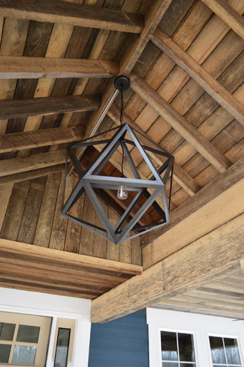
Things are moving at warp speed these days at the Homearama Showhouse, so we have tons of updates to share since last week (especially since more fixtures, cabinets, and counters are now officially installed). Let’s start on the front porch, where the centerpiece of our rustic, vaulted ceiling has been added. It’s from Restoration Hardware, so it was definitely a splurge (our team joined their trade program to save 20%) but we think it’s an awesome thing to see up there before stepping into the house for the first time.
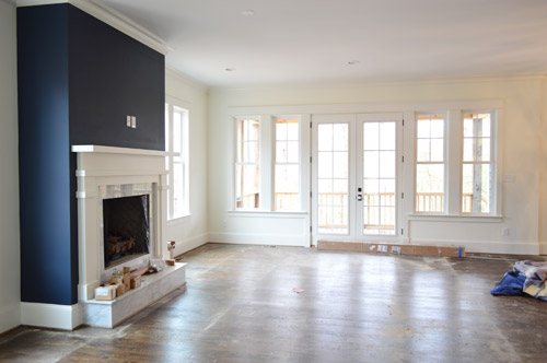
As we snapped these photos yesterday, they were just beginning to pull up the protective floor coverings, but the hardwoods were still really dusty (they’re putting a final sealant coat on them today – so we’re all banned from the house). Dust and all, this picture captures that pretty wall of windows and doors at the back of the living room that leads out the covered porch.
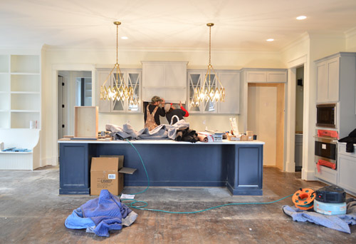
Even though the kitchen is still a work in progress – literally, you can see the vent hood getting installed below – we couldn’t resist sharing a wider shot of the navy island with those brass accordion fixtures that we shared last week above it (the island is Hale Navy by Ben Moore, the same color as the fireplace column across the room, which you see in the shot above). Speaking of the island, the builder made one a bit smaller than this in his last house and everyone’s feedback was “go bigger!” – so by jove he did. We can’t wait to get four stools in there to fill things out.
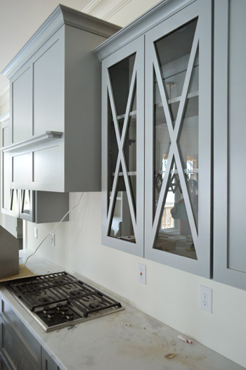
It was cool to see things come together that we had only seen in showrooms and vendor booklets months ago when we chose them. Like these glass x-fronted doors that flank the range hood. We didn’t do any open shelving in this kitchen, but thought it would be a nice touch to add a few cabinets where someone could display their nice dishes, bowls, and glasses.
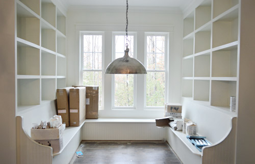
To the left of the kitchen is the breakfast nook, which has been quite the adventure to accomplish. Carpenter John (not to be confused with Builder John or me, Blogger John) did us a solid in making this space cozier after it ended up being bigger/wider than we all originally planned (other considerations like how things lined up in the kitchen and how things looked from the back of the house inched it up from our initial dimensions). There’s still a big table to be constructed and plenty of shelves to be filled, but it’s getting there – especially now that the silver dome light (donated by Shades of Light) is in.
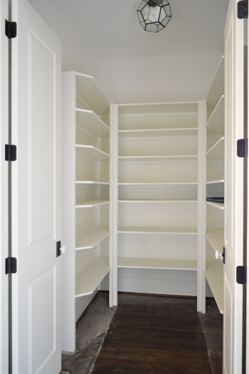
Just one wall away from the breakfast nook is the pantry. Excuse me, I mean walk-in pantry. It has me and Sherry green with envy. Is it wrong that we kinda want to fill it with candy like the store in the opening of Willy Wonka? The prism flushmount light is also from Shades of Light. It’s made of up pentagons, but we like to pretend they’re hexagons so it’s kind of a nod to our bee love.
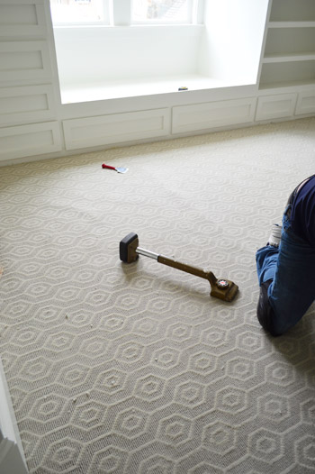
I probably shouldn’t force the hex thing there, since the carpet that we chose for the boy’s room has actual hexagons in it. We thought it’d be fun to do something a little different than plain carpet (we have hardwoods throughout the house except for the two kids rooms and the guest room), so this Revere pattern by Stanton (selected at a local place called ProSource) seemed fun without being too crazy. And as you can see, the installation was also in progress when we were there yesterday.
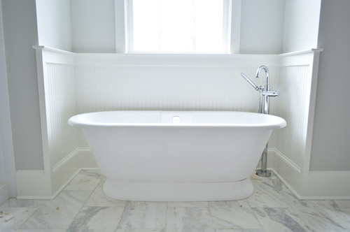
Now on to the en-suite bathroom, which is a bit of a mess at the moment, but still manages to get us excited. We’re taking this as our chance to do that luxe & light, hotel-like bathroom that I’m not sure we’ll ever have the space to execute in our own home. So we’ve chosen lots of tone-on-tone whites and grays with a few unexpected hits of color – some of which we’ll reveal today, and some that’ll come in later with art/accessories. Of course we went for a big freestanding tub that’s probably a pipe dream (plumbing pun!) for our own bathroom. You should see Sherry look at this thing lustily.
Since we couldn’t just leave the room totally colorless, we did a nice big plane of spa-like color on the back wall of the shower, which is still semi-floorless, totally doorless, and inexplicably has a mirror leaning in it at the moment.
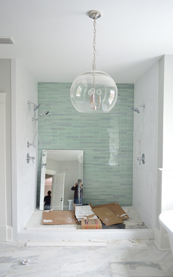
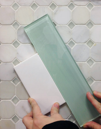
Those bluey-green glass tiles are this 3 x 12″ New Haven tile and the sides are 3 x 6″ white subway tiles, both donated by The Tile Shop. Here’s a shot from back in December (!!) when we picked it out. The shower flooring is the one in the background of this tile shot, which is their Evanston series in Frost Snow. The little glass squares mixed with marble help tie everything in the room together.
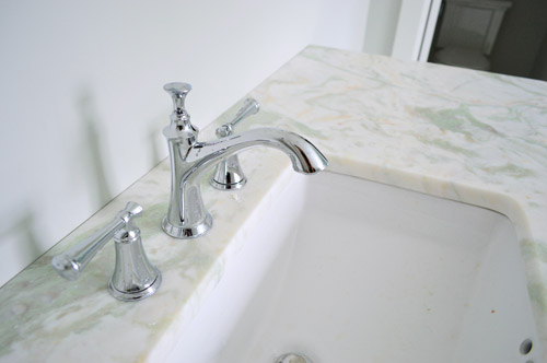
In the interest of trying to take some risks in the name of a good show and stretch outside of our comfort zone, we resisted the urge to go with all-white marble for the vanity counters, and selected something a little less common (it has soft seaglass colored veins, which tie into the shower tiles). All of the fixtures are polished chrome, including the glass chandelier from Shades of Light, and the sink faucets and shower trim were donated by Brizo (Delta donated the tub filler).
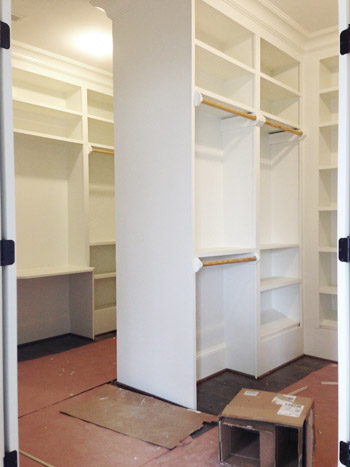
Across from the bathroom is the closet, which is another jealousy inducing space for the lady-wife. We gave the carpenter a couple of suggestions, but pretty much just let him do his thing. The layout is hard to wrap your head around, so this post with a floor plan might help (there’s a his and hers area with a storage-saturated divider).
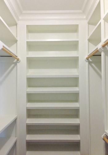
He packed it with awesome features like this angled shoe rack that’s sure to get all the Charlotte Bradshaws out there excited. No wait, Carrie Bradshaw. Oh geez, I’m such a Miranda.
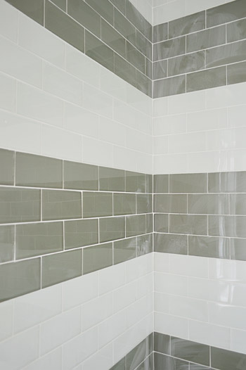
The last space we’ll share today is a peek at the shower in the jack-and-jill bathroom (this is the same kids room that has the green vanity in the adjacent sink area that we shared last week). We planned on taking a bunch of panned out shots of the whole room for you, but a headboard that’s waiting to be painted for the girls bedroom is actually sitting in the middle of the bathroom, along with a spare toilet – so we just couldn’t get those shots yesterday. But check out that shower tile! We chose two different types of colored glass subway tiles and had the tile guy (surprisingly not named John) install them in fat, 12″-ish stripes up the wall.
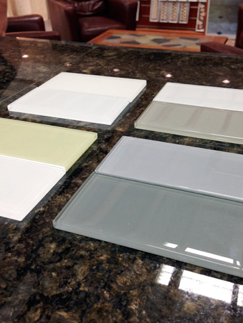
We picked these at The Tile Shop by laying out a few different combinations, including a frost white & gloss white version, a gray & white version, a green & white version, and a blue & gray version. Ultimately we picked the combination in the upper right corner of this picture, which is Snow Glass and Glass Winter.
And last but not least, since we wanted to have some fun in the kids bathroom, we went for this cool Moxie showerhead (donated by Kohler). It has a waterproof bluetooth speaker in it that stays in place magnetically, while the shower still sprays water around it. Somewhere my high school self is feeling quite embarrassed by the shower radio with spotty reception that I was addicted to at the time.

We’re scheduled to begin moving furniture in next week, so hopefully the next update we have for you will have this place looking even more like home. We’re supposed to have the whole place furnished and decorated by early April, so consider us completely 100% freaked out by this. Cue the cold sweats!
Psst – Wanna see more showhouse info & photos? Click here for Our Full Showhouse Tour, which includes final pictures of every room, the floor plan, budget info, a video walk-through, and shoppable showhouse furniture & accessories.

Madeline @ Create . Bake . Celebrate says
That Shades of Light Pendant made me NEED a geometric light fixture. Unfortunately, it was a tad bit too small for my space and sent me on a wild goose chase- fortunately, all ended happily. I found one (for under $100!) and even found a way to install it… you can read all about the debacle here: http://www.createbakecelebrate.com/2014/03/geometric-light-fixture-debacle_17.html
YoungHouseLove says
Love that!
xo
s
Erin says
It is starting to look absolutely incredible. How fantastic! I’m so excited to see the final product… you guys should be insanely proud of all your hard work and how beautifully it’s turning out!
YoungHouseLove says
Thanks you so much Erin!
xo
s
Michelle says
It’s really coming together! I am in love with the pendants over the island. Amazing choice! Congrats!
Sarah says
How much are they listing this house for?! I might have to move to Virginia! The house looks amazing!! Great Job!
YoungHouseLove says
Thanks Sarah! It’s going to be in the 500s I think. These showhouses definitely are “fully loaded” for the event, so the prices tend to reflect that (one of the houses is going to be in the 900s I think! It has a pool!).
xo
s
Anita says
Only $500K!! Holy crap, I want to move to Richmond. We live in Arlington and $500K would buy us a teardown or a one bedroom condo :(
lauren says
Oh that makes more sense. I thought this was basically a charity house for a low-income family, and I was like “Hmmmmm it seems like you could house several families in several houses if you cut back on all the high-end stuff here!”
So they’re selling it as a fundraiser? It looks freaking awesome. LOVE that breakfast nook!!!
YoungHouseLove says
Yes, we’re donating our design fee to Habitat, a portion of ticket sales and vendors working with the show are also donating to Habitat, and our builder is giving them a bunch of money from the sale of the house as well. So excited to have such a great cause to hustle for :)
xo
s
lauren says
Ohhhhh I just read the first post about the showhouse and I get it now. Very cool of you guys to donate your fee to Habitat!
heather says
This totally shows how prices vary around the country and even within one state. There’s a 5900 square foot home nearish us with almost 10 acres for about $575,000! It would easily go for multiple million in the southern area of the state though, and other areas of N.E. Yet, my husband and I found a house in the mountains which included a huge huge barn, gorgeous gardens, stunning views, 40+ acres, another couple rustic outbuildings and structure for a farm….and it was like $250,000. Whew!
heather says
((^^Note: I accidently deleted where it say the house we found was too remote to actually commute to a viable job. Location location location!))
Amelia says
So beautiful. And happy birthday, Sherry! (And me too!)
kerri says
oh my…. that light on the front porch…. *swoon* i’m totally digging those brass pendants above the island… it’s coming along great. can’t wait to see the final product! great job, guys!
Lisa | Winter Heights says
Wow!!! Those lights! That bathroom! Everything is looking amazing, love the updates.
I didn’t get to comment on the last few posts, so a belated congratulations on the Target line! I’m in need of some hooks for our front entry and am definitely looking to purchase yours. So excited for you guys!
YoungHouseLove says
Thanks so much Lisa!
xo
s
Barbara says
Ooh, how drool inducing! I love the master bath and the office. Can’t wait to see your selection of furnishings.
Mary Beth says
LOL I love how we both used the word DROOL…
????
Mary Beth says
Oh my goodness EVERYTHING IN THIS HOUSE makes me drool.
The colours, the fixtures.. Your taste is impeccable.
I couldn’t do it – I’d want to move in!!
I don’t think you’ve ever chosen something that I haven’t absolutely loved.
I’m over here doing my meagre home renovation and then I look at this and want to give up.. HAHAHA!
I will keep plugging away on my own over here! xo
MB
http://www.hystericallyeverafter.com
Karen Little says
Wow, love all the great things you’ve chosen for the show house! You’ve tied it all together in a beautiful house. Can’t wait to visit it with my daughter-in-law who lives just minutes away from it.I’ll come in from Williamsburg and we’ll have some “girl-time” there. Love this!
Amber says
That angled shoe rack is screaming for a subtle tonal ombre effect!! This house is gorgeous I love all the lighting. You will get it all done, you two are amazing!
YoungHouseLove says
Ooh that would be fun!
xo
s
tara says
it stinks that the lights above the island get lost with the glass-doored cabinets behind them!
YoungHouseLove says
We had the same reaction to the photos and wondered why! In person they stand out a lot more (there’s such a difference between 2D and 3D) but then we realized it’s the glare from the lights reflecting in the glass of the cabinets in photos (which is amplified in photos). After talking to the electrician he said he had brighter bulbs than we needed in them, so we think if we go down to the recommended wattage (and shoot them off for you guys, which is typically how we shoot all rooms so the glare doesn’t mess with the pics) it’ll be a truer depiction. Hope we can do them justice!
-John
Jackie says
I agree – so I’m glad to see this comment and response. I’m looking forward to seeing better photos of the kitchen. I can tell that it’s probably very beautiful – but the wide shot makes the kitchen look small, imbalanced, and busy with the light fixture and glass door – also the paint colors look completely different than the hale navy on the fireplace photo and the gray of the uppers in the close up cabinet picture. I can’t wait to see the pictures that show how carefully I know you designed the space :)
Also, for the up close image of the gray cabinets – the doors really do look great – I love the detail you picked. The way the color comes through in this image seems like it might be more true-to-life? For some reason though, the depth of the counters seem more shallow than average – I doubt that’s the case though and I don’t know why it’s reading that way to me.
Sorry for the random feedback! Just figured I’d supply my observations.
PS – the master bath is stunning. The fixtures, lighting, materials, and palette is truly beautiful. I love absolutely everything about it. Well done.
Best,
Jackie
YoungHouseLove says
Thanks Jackie! We definitely run around there amid the chaos (hood-being-put-up, carpet-being-laid, dusty-floors, etc) and snap what we can – but we can’t wait until they “deliver” the house to us, which means it’s all clean and finished being “installed” – then we can hopefully take much more accurate pics! The counters are standard depth, the kitchen is HUGE (that island is 11′ wide for reference – I think the average one is around 5′) and the fireplace and island are exactly the same paint color, it’s just the varied lighting (on in the kitchen, off in the living room) that’s messing with things we think ;)
xo
s
Jessica says
Yes. While I love many elements of the house, this one really bothers me. I wish that either the cabinet doors or the light fixtures were plain. Both are gorgeous on their own, but they are competing. I’m glad to hear that it looks better in person. Also, I love the navy island. I think the cabinets would look FABULOUS in white. I know, you wanted to go outside your usual, but I’m not digging the gray in this particular set up. This is one place that white cabinets really seem right. The breakfast nook looks darling. How will the homeowner dust those shelves? I guess they’ll climb over the table/benches? All in all, I really like the house. These are just the things that made me wonder.
Olivia says
Oooooh. That colour behind the fireplace! I love it! Can I ask for the name? Thank you so much, you guys are doing a great job!!!
YoungHouseLove says
Thanks Olivia! It’s Hale Navy by Ben Moore (which is also the color of the kitchen island across the way).
xo
s
Olivia says
Thank you very much Sherry! I thought it might be the same as the island, but it’s hard to judge from photos. Keep up the great work and thank you again for taking the time to tell me the colour! xx Olivia
Tori says
I would live in this house. It is so beautiful! And all the built-ins and storage! That pantry and master closet are amazing. Not sure how I feel about a door-less shower, but that one is already about 3x the size of ours, so I probably wouldn’t complain too much. :)
YoungHouseLove says
Oh yes, the doors are coming – they’re just not in yet (the floor will also get finished with the rest of the tile, and that mirror is coming out).
xo
s
Larissa says
Wait! Maybe that could be a thing. Mirrors in the shower. A design trend inititated by YHL. Then, 30 years from now, people will be wondering who the heck thought of that while they’re trying to figure out how to get the mirrors out of their showers.
The house looks gorgeous! Can’t wait to see more!
YoungHouseLove says
Haha!
xo
s
Jane says
You may wanna chk out target for barstools! they have 30% off barstools on Cartwheel app!!!
YoungHouseLove says
Thanks Jane!
xo
s
Lindsay says
Everything looks awesome! I especially love the light on the porch. (On a totally not-show-house-related side note: I used the little 2″ brush you guys recommend yesterday and I LOVE IT! It changed my DIY life. Thanks!!)
Jessie says
I love the master bath design. My husband and I are currently planning a remodel of our master bath. Would you mind sharing the soaker tub brand/style as well as an idea on sourcing and price point? Thanks!
YoungHouseLove says
The brand is Victoria + Albert, and it’s called the York Tub. We got it through our local Ferguson showroom. We’re not sure on the price point since things like appliances/fixtures that come with the house (as opposed to furnishings and accessories) are selected by us but then purchased directly by the builder – so we walk into a showroom with a total budget from the builder in mind, point at various things and ask vague questions like “this is within John’s budget, right?” and then John the builder approves and pays for the order.
xo
s
Lisa@Double Door Ranch says
What I wouldn’t give to live in that amazing house! I’m seriously considering road-tripping it down from Chicago to just be in the house. They may have to force me to leave…where does Virginia stand on squatters rights? ;)
John, I never pegged you as a Miranda. I think you’re Aidan!
YoungHouseLove says
Hahaha! I think so too. Aiden was the best.
xo
s
Nicole S. says
My opinion of Aidan has totally been colored after the fact because of his extremely annoying voice-overs for Walgreens. If I have to hear him say corner one. more. time…
YoungHouseLove says
Ha! Agreed! He does so much voiceover work lately! I feel like he also does (or maybe did) Applebees. When I worked in advertising I loved recording voice over stuff because it’s amazing how many actors do it. Will Arnett used to record GMC commercials with me, and he was so nice! It’s a pretty sweet gig for them I think (good pay, super easy, etc).
xo
s
Brittany says
I love the show house glimpses! It’s so much fun to see the splurges and direction you go when budget is not (as much of) an issue. I know slab names all vary greatly from place to place–but what is the master vanity slab material?
YoungHouseLove says
Thanks Brittany! It’s called Lady Onyx (through Eternal Stoneworks here in Richmond).
xo
s
Erin says
Got that shower head for christmas – love it! Highly recommend it to anyone and everyone!
Crystal says
WOW……..JUST WOW! You both can design my house any time. I just have one question. The kitchen cabinets, weren’t they supposed to be white (other than the island)? I think I remember you mentioned it in your last post but for some reason I thought they were still being painted white.
YoungHouseLove says
We actually went with no white cabinets in the kitchen just because we wanted to do something different and liked the white walls + navy island + soft gray cabs + navy fireplace combo. We still LOVE white cabinetry, but the gray and navy thing is really fun too – and the white walls in the living room and kitchen are really versatile for art and accessories (think: a bold rug, a bright painting over the fireplace, etc) so that’s exciting to us.
xo
s
Clara says
Haha this post needed to start with Warning: Hilarious man-references to Sex and the City included. Then maybe I wouldn’t have burst out laughing at work. Busted!
YoungHouseLove says
When I was proof reading this morning I spit out my tea from that. I needed the warning too!
xo
s
kelly says
You have impeccable taste! Not one thing I would do differently! How awesome that you get to do something so cool and with someone else’s money ;-)! The people who end up with this house will be so lucky! Keep up the good work – you are an inspiration!
Christine says
I have phrases like, “holy moly!”, “oh my gosh,” and, “oh, man!” going through my head. (I’m keeping it family-friendly here.) That porch is everyone’s dream porch! You guys have worked so hard on this. All that stuff to choose is a lot of work! Between this and the Target gig, I am so happy and proud of you guys! So cool. Love all the classic elements in this house. It’s a new house with lots of nods to those classic 1920’s and ’30’s homes. You done good!! :)
Meredith says
I love all of the “Johns” you have going on with this project. I work in an office of about 40 men, and 5 of them are named John, so we definitely have the “John X, John Y, John Z” happening. (We also have 4 Daves, so the name duplication is a little ridiculous!)
Gretchen Brown says
Wow! It’s stunning! I wish I could live there! :)
Julianne says
This house is amazing! I have serious closet and pantry envy! You two have put together an awesome mix of classic and fun.
Heather says
I bought tickets after your post last week, and I’m so excited to see this in person! Navy is my favorite color to decorate with, and that wall & the island have my heart going all pitter patter :)
Steph says
I WANT TO LIVE THERE!
I WANT THAT SHOWER HEAD!
I DON’T KNOW WHY I’M YELLING!!
Ahem. I’m okay now. This house is going to look so amazing. I love it and I wish you guys would come do my place because omg.
I lied. I’m not okay. I’m going to blame this non-sensical post on being under caffeinated. Yeah, that’s it.
leatitia says
Wow, it looks amazing you guys. A real dream house. I love the kids shower tile and shower head! And that island! And the gorgeous tub! love, love, love!
Tamara @ Provident Home Design says
Oh my gosh! It is so beautiful!!! You guys have done such a great job with the selections in this home! I especially love the patterned carpet and the striped tiles in the shower! I really love it all. Great job guys!
http://www.providenthomedesign.com
Evelina says
OMGGGGGGGGGGGG that closet. It is totally the Rolls-Royce of closets. This is my favourite house that I have evereverever seen. I vote that this house is your next giveaway!
Rosie S says
I love the way you guys mix the metal finishes on the light fixtures and hardware….but when I do it, it looks chaotic. Is there a hint you can give to mix it right!?!?! Is there any ‘formula’ you use to balance it all? Looks beautiful, cannot wait to see it all done!
YoungHouseLove says
We just try to have things occur in more than one place – so if there are two gold pendants over the island and a silver dome light in the breakfast nook, we might have a silver sink faucet layered into the kitchen area and a few gold items on the built-ins in the breakfast nook. That layering makes it feel intentional and things relate back to each other instead of having one man out (something that looks mismatched while everything else is another finish).
xo
s
xo
s
Rosie S says
Ok, got it! :) Thanks for your answer, I kind of do that, but probably not enuf, so it still does look ‘odd man out’. Off to the hardware store! LOL
Amy@TheBlissfulBee says
WOWZA! Can you say… dream home??? It’s looking amazing so far! I wish I could live there haha
xo, amy
normaleverydaylife says
It looks amazing! Love the breakfast nook and the bathrooms! The sea glass tile is beautiful. The porch is a dream I hope to one day have come true :)
Lindsay J says
Thanks for the updates. You have such talent. I have been enjoying the design of this showhouse. It is AMAZING! Everything is coming together and you are definitely being brave thinking outside the box. Definitely inspirational!!!
Lindsay J says
Can you provide the square footage of the house?
YoungHouseLove says
It’s one of the smallest ones in the show but it’s still huge to us (I think it’s around 3500 square feet).
xo
s
Lindsay J says
Thank you! That’s huge to me, yet it still feels cozy. Again, it is turning out gorgeous. You guys are so creative.
Lauren says
I love the carpeting you chose in the boy’s room, were you inspired by The Shining? :) I actually really love all of the furnishings from the sets, though I’m sure you weren’t thinking of them when you made this decision.
https://www.google.com/search?hl=en&authuser=0&site=imghp&tbm=isch&source=hp&biw=1920&bih=979&q=the+shining+carpet+pattern&oq=the+shining+carpet&gs_l=img.3.1.0l8j0i24l2.1741.3837.0.5944.18.17.0.1.1.0.178.1653.7j10.17.0….0…1ac.1.37.img..7.11.995.N0ZVWZHPN40
YoungHouseLove says
That’s hilarious! Here’s hoping the lighter version is more restful and less creepy!
xo
s
Elaina says
I was wondering if anyone else had thought of The Shining! I think the neutral version is lovely, and not at all creepy. ;)
Caroline says
Every bit is gorgeous!! That shiny tile… drool. That closet looks like the shelves at victoria’s secret. And I’m considering getting hubs the bluetooth shower speaker. It’s annoying when he turns his phone up ALL THE WAY and leaves it on the counter :)
Kara says
I’m drooling over that double shower in the master bath. I love those colors – all subtle and oceanlike. You guys are doing a fantastic job on this house!!
Rachel says
IN. LOVE.
Side note: I hope you guys put outlets in that completely amazeballs pantry so things like blender, toaster, coffee maker etc. can be set up all the time. That way they dont have to be on display in the kitchen! Might be a little late for that though lol :)
YoungHouseLove says
Love that! We’ve seen some other showhouses with that feature! Really smart.
xo
s
Vanessa says
I SO want to move into this house! Love all the details. Great job!
Paula W. says
I know you’ve mentioned that your current house may be “the one”, but wouldn’t you love the process of building your own home? Lots of decisions to make, but so exciting! Love your choices in the showhouse.
YoungHouseLove says
It’s 50% exciting and 50% so scary to choose everything at once! Haha! We’d love to help others build again (more charity projects like this, etc) but we’re so happy in our current house and neighborhood that we don’t have any plans to build something for ourselves.
xo
s
Lindsay says
Assuming the eventual buyers will allow it, I hope you guys will do a post with photos/interview on how they are using the space. That would be cool to see!
YoungHouseLove says
We would LOVE to house crash them!
xo
s
Stardancer says
I love the opportunity you have here to dream and go big. I love what we’ve seen so far: the rich navy (using it on the outside AND inside is clever), the beautiful spa bathroom, that star-like light fixture on the porch! If I could pick just one thing from this post to have and to hold, it would be that light fixture.
Are you going to be able to get some photos of the interior when it’s done but pre-furniture? I’m always fascinated by how much furniture choice and arrangement changes a space.
YoungHouseLove says
Yes, we’d love to shoot the blank canvas before we furnish it and then share all the detailed afters!
xo
s
Amy L. says
I hardly ever comment, but umm, WOW!!!! So beautiful, well done. :)
Patti says
This home is turning out GORGEOUS!! Can I suggest a video tour of the house once all the furniture is in and ready to go? It’s so much easier to see how everything relates to everything else in video. Wonderful job YHLovers!
YoungHouseLove says
We’d love to do an “all done after” vid for you guys, which we can share after the show ends. I hope it can do everything justice so it feels like you’re walking through the house :)
xo
s
Lauren says
Please tell me what that counter in the master bathroom is called!!!
I love EVERYTHING so far. Cannot wait to see things in more finished states.
YoungHouseLove says
It’s called Lady Onyx (through Eternal Stoneworks here in Richmond).
xo
s
Sophie says
OOOOOOH! I am positively drooling! Are you guys going to post a full tour of the house for those of us that live too far away to make it to the Homearama? I feel like we’ve really been along for the ride on this and I’d be heartbroken if I didn’t get to see it finished in all its glory!
YoungHouseLove says
Yes, as soon as the show is over we can share all the after pics and even a video walk-through for everyone who’s too far to come out and see it in person. Can’t wait!
xo
s
Ashley H says
Wow. It’s really coming along beautifully. The contrast between the cabinets and the blue island is gorgeous. I also love the cool Moxie showerhead. I think I might look for one for my husband. :)
You’ve mentioned that you chose things that were a little outside of your comfort zone. Do you think you guys will try to incorporate any of the design work into your own home, i.e. lights or tile or even some of the bolder colors now that you are seeing it all come to life?
YoungHouseLove says
I definitely think we’re headed there in our own home too (like the big star light in our foyer along with the bold blue front door, the striped stair runner, and the rope chandelier in the kitchen) but a lot of the rooms in the showhouse have more updated elements than our house already (at home we’ve only updated a few fixtures, so all of the upstairs bedrooms need overhead lights as well as the dining room and the office downstairs, etc). We definitely are inspired by the showhouse, so it’ll be fun to see how that tempers what we do in our house too!
xo
s
rashi says
looking top notch…has somebody purchased the house already?
Also-
PLEASE..Could you please suggest a few walk in closet fitters that you recommend! We want to refit our entire closets. And trust u’r choices.. :)
thanx
YoungHouseLove says
Anyone have any walk-in closet fitters to recommend for Rashi? This is the carpenter that works with the builder, so he’s not with a certain company or brand, but we’d love for folks to chime in with suggestions for you. As for the house, it’s not on the market yet, but we’ll share the news when it’s purchased for sure!
xo
s