Continuing our showhouse-heavy week of reveals, we’re bringing you a bunch of after photos from three more spaces – the main bedroom’s en-suite bathroom, its attached closet, and cool little atrium space. We showed you the main bedroom on Tuesday (along with the office and the butler’s pantry) so it only felt natural to continue our virtual tour where we left off.
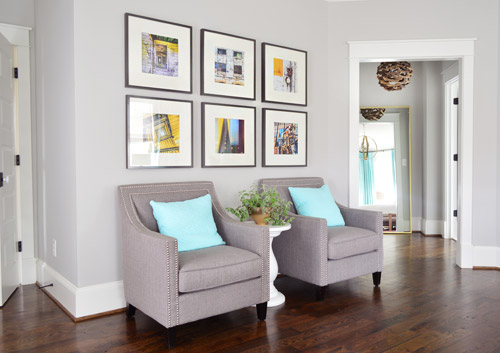
The attached bath and closet sit off a corner of the main bedroom and are separated by a space that we’ve been lovingly calling the “atrium” (it’s really more of a vestibule) which you can see above on the right side.
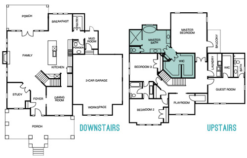
Here’s the floor plan for a clearer map of how that area is situated:
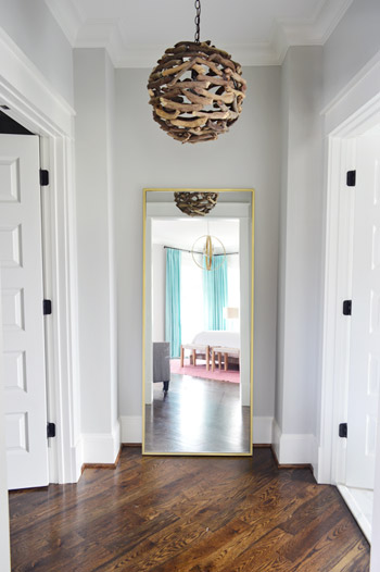
The atrium features a brass floor mirror donated by West Elm, a driftwood light from Shades of Light, and walls that are painted Stonington Gray by Benjamin Moore just like the bedroom. At one point we wanted to do a “living wall” back there with a bunch of built-in planter boxes filled with greenery, but due to the architecture of the roofline, we couldn’t put a skylight there. So because it felt unwise to cram a sunlight-less area with live plants, we scrapped the idea. It’s still a nice spot between the bathroom and the closet for a floor length mirror, and the driftwood light is one of our favorites in the house.
When you turn to your right, through the double doors you’ll see the space that we most want to pick up, stuff in a suitcase, and put in our own house.
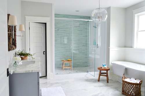
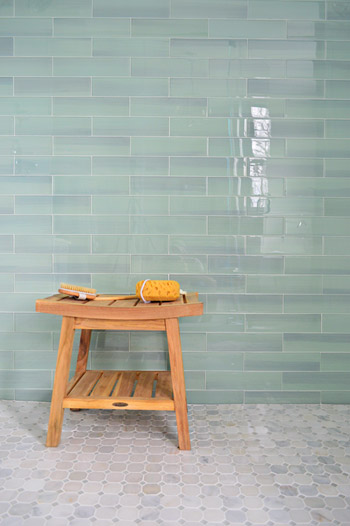
It felt fitting to aim for that spa-like effect in such an airy space (the house’s floor plan meant we knew that this room would be spacious with a big window over the tub). So pretty early on we decided we wanted a light color scheme with a wash of color on the back wall of the shower. We actually considered a more intense cobalt blue tile at one point, but it was out of stock. We love the calming aqua glass tile that we ended up with, (it’s the 3 x 12″ New Haven tile from The Tile Shop) so it was just one of those “happy accidents” throughout the room’s evolution.
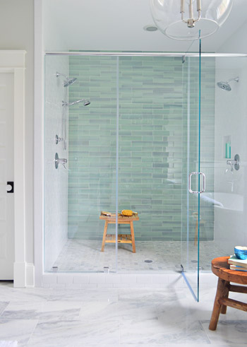
The sides of the shower are basic 3 x 6″ white subway tiles, also donated by The Tile Shop, which we picked because they were the same height as the bolder back-wall tiles (so the rows would line up), as well as feeling nice and simple – to keep the attention on that green glass tile. It’s considered a double shower since it has Baliza showerheads on both side walls, which were donated by Brizo. At the suggestion of our local Ferguson rep, whom we worked through to select plumbing fixtures, we included a handshower on one side (we learned that new builds frequently include them, just to give people options like spraying off their feet or a pet).
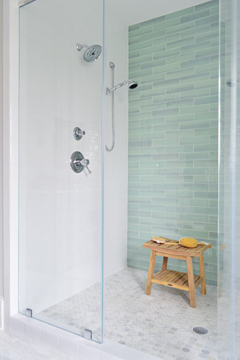
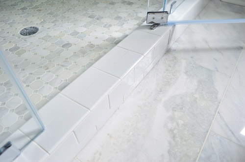
The floor tile in the shower pan is the Tile Shop’s Evanston series in Frost Snow, which featured some small aqua glass accents between the marble squares which help tie the big accent wall together with the marble floor (that’s 12 x 24″ Tempesta Neve marble) throughout the rest of the room. You can check out a detailed photo of our tile pics (and more clearly see those little green glass squares in the floor) here. We also really like how the tile installer wrapped the white subway around the shower threshold.
I’ll be honest that as the glass tile was being installed I was certain we had made a big mistake (three different tile choices for the shower walls and floor felt like they didn’t really “mesh” yet) but as soon as it was all grouted with the same white grout throughout, it tied everything together. And now it’s my favorite thing.
But let’s step out of the shower for a second and talk about the vanities (you don’t get to say that everyday), which came from the same local cabinet company (Affinity) that did the kitchen. They’re also painted in their stock gray color, which we’ve discovered is close to Benjamin Moore’s Timberwolf Gray. The walls are Moonshine.
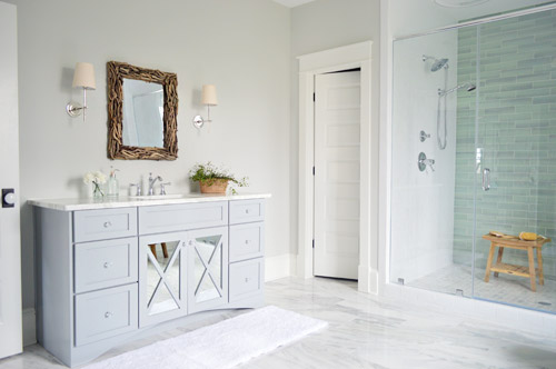
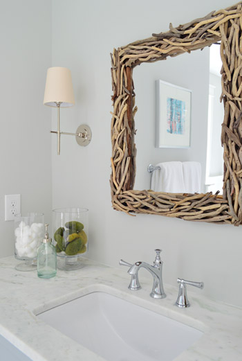
The driftwood mirrors and Soho sconces were donated by Shades of Light, the faucet is Brizo Baliza just like the shower fixtures, and the subtly green-veined counters are Lady Onyx which were purchased through a local company called Eternal Stoneworks.
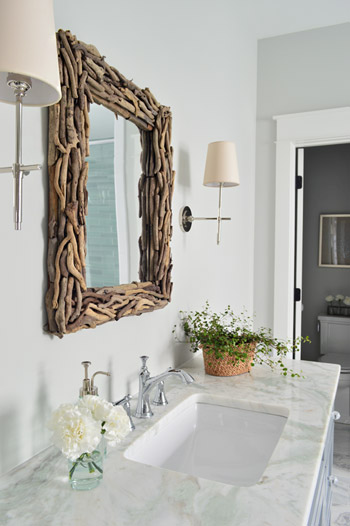
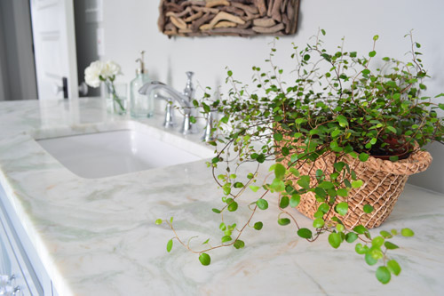
The onyx counters have a hint of the same seaglass color that’s in the shower tile, so we thought they’d be a nice counterpart to the more traditional marble on the floor. The little woven baskets are from HomeGoods.
We added a little more interest to the vanities by selecting mirrors with a soft patina effect that we placed behind the x-frame doors (similar to the clear glass ones that we chose for the kitchen). We also went with arched trim along the base of each vanity to give the built-in cabinet a bit more of a furniture feel (you can see that better two shots up). The giant bathmats are from Target.
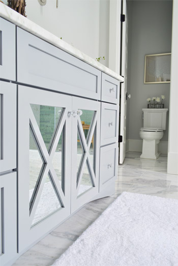
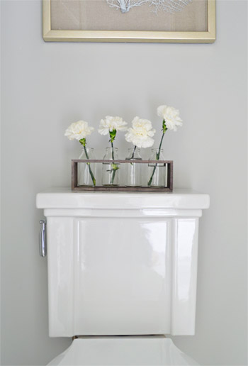
And now, let’s get weird for a second. I have to take a moment to talk about this toilet. I’ve never given toilets much thought, but when our builder urged us to pick something more stylish than a basic model we both fell in love with this one (the Tresham, donated by Kohler). And now I have this crazy case of toilet envy. So I guess that’s a thing. The little vases on the top are from World Market and the framed seafan art is from HomeGoods.
Speaking of envy, Sherry (in all her pregnant glory) has had a few moments of longing in front of this tub. Ever since one of our book tour hotels had a big soaker tub, she has been jonesing for one. It’s the York from Victoria + Albert, and the cool thing is that lots of people paint the outside an accent color. We considered it, but decided that we wanted to leave the shower as the main accent in the room – but we thought we’d toss that tip out because it could be a fun idea for your space.
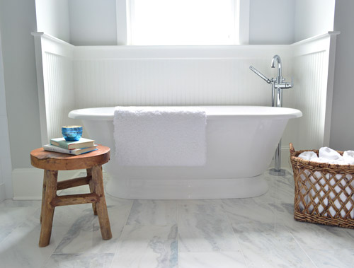
The stool and basket are both from HomeGoods, and the floor mount tub filler is the Trinsic, donated by Delta. You can see that we also had the carpenter add some beadboard wainscoting around the tub area as an accent, and to provide some extra protection from splashing, bubbles, and whatever else your particular tub fantasy entails. Mine includes nachos. Just sayin’.
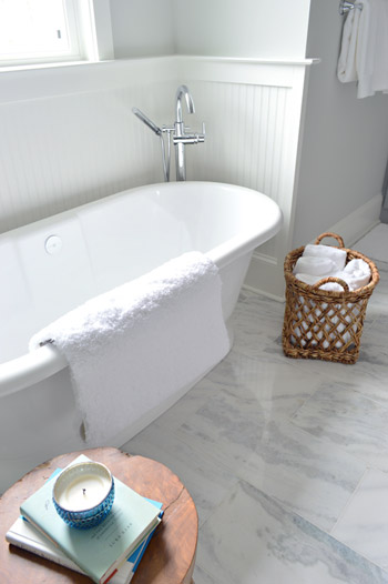
This is the view looking back on the room from the shower. Yes, I was literally in the shower when I snapped this. And yes, I did consider taking it for a test drive.
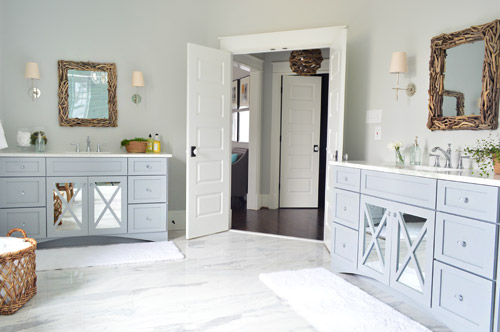
The mirrors were actually an 11th hour decision (as in, we were hanging them a few days ago) because the original chrome-y mirrors that we picked were blending too much with the other gleaming/polished items in the room and felt a little too invisible. So we decided that we needed something with more contrast and texture, and it hit us that rough driftwood frames would be an awesome reference to our lighting choice in the nearby atrium.
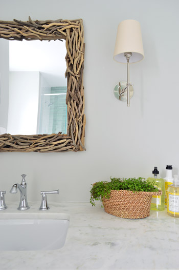
As soon as we hung the new mirrors we got more excited than we should have. Maybe we were just delusional at that point, but they’re one of our favorite last minute changes.
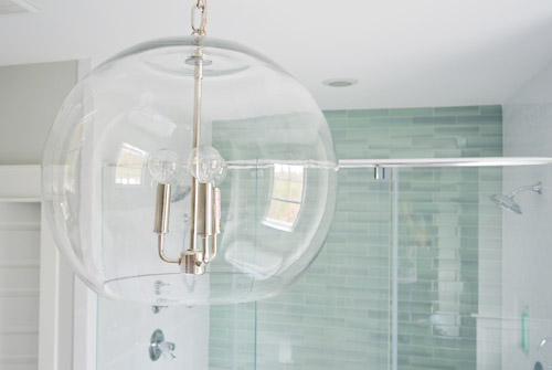
The main light fixture in here is the Clear Glass Chandelier from Shades of Light. It doesn’t pop in pictures very much, but in person it’s pretty amazing. So much so that we bought another one for the living room, but had them wire it in a gold finish to tie into some other fixtures down there.
The en-suite bedroom closet is equally envy-inducing in size and sports two sections (which make it convenient for a couple) thanks to a little partition in the middle to carve out two sides. We can’t claim much credit for how this turned out, since we mostly just nodded along as the builder and his carpenter told us their plans, but we’re happy to show off their handiwork and our meager styling of it (closets typically get a few outfits, bags, and shoes for these shows, so you get the idea but don’t have to see them stuffed with an entire wardrobe).
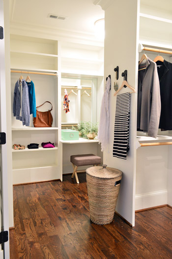
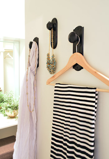
As we mentioned yesterday, we did hang a trio of our new doorknob hooks (two large ones and one small one) to create a little display space on the partition that separates the two sides of the closet. That flat wall was originally going to have a full length mirror on it, but it started to feel excessive after putting the floor mirror in the atrium – especially because we added a table-height mirror in that vanity area right behind it.
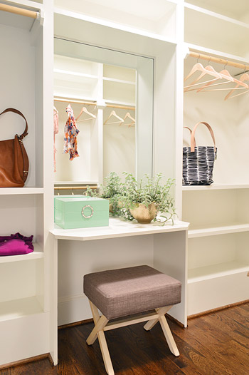
Speaking of that little vanity space, the stool is from Target, the green lacquered box is from HomeGoods, and the gold bowl with the plant in it is from World Market. The bags and clothes are mostly ours, along with some thrift store items and few scarves from Target.
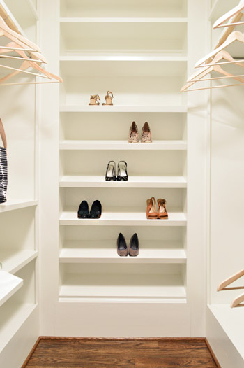
The vanity sits in the back half of the closet, which in addition to bars and cubbies, also sports this wall of angled shelves for shoes. I tell ya, Carpenter John (yes, yet another John who worked on this project) knows whats up.
The front side is mostly bars and shelves, as you can see in this shot of that area…
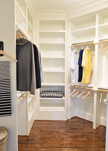
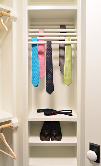
…but it does feature a built-in tie rack and a couple of shoe shelves. We bought some thrift store ties to fill it, only to get them into better lighting in this closet to discover they were all stained. Luckily some other folks working on the house had some (cleaner) spares to loan us, and my dad donated a few to the cause as well.
So now you’ve officially seen all of the main bedroom area of the house, bathroom and closet included. There’s still lots more house to show – and we’re madly trying to photograph it all before the baby comes (along with recording a video tour) but since we’ve probably overloaded you enough with photos for the week, we’re going to spend Friday at our house in a final-hour attempt to paint the office (ceiling and walls). So we won’t be posting tomorrow, but we’ll hopefully be back on Monday with a freshly painted office, which means we’ll finally be able to clear more chaos off of other surfaces – like the kitchen & dining room tables – before this baby arrives.
Psst – Wanna see more showhouse info & photos? Click here for Our Full Showhouse Tour, which includes final pictures of every room, the floor plan, budget info, a video walk-through, and shoppable showhouse furniture & accessories.

Mary Beth says
Okay, I’m not going to talk about the closet because it will make me CRY.. lol.
But the bathroom is just perfect. PERFECT. I love the spa feel, but at the same time it’s not cold or too sterile.
Well, I mean you WANT a bathroom to be sterile, but you know what I mean. lol
It’s lovely and the hues of green coming through are just right. I love the mirrored cabinets, and the natural materials that you used throughout give it just enough texture.
I’m currently redoing my entire bathroom, and this is very similar to what I’m going for… relaxing and beachy is my vibe!
http://hystericallyeverafter.com/2014/04/03/bathroom-bliss/
Congrats on such beautiful work!
MB
YoungHouseLove says
I love your inspiration images and mood boards! Good luck with everything MB!
xo
s
Anele @ Success Along the Weighn says
That bathroom wall tile? D-R-E-A-M-Y. That tub? Sinful! If I lived in that house, I would roll around on the floor in there singing opera. (And making neighborhood dogs heads explode because I’m tone deaf)
YoungHouseLove says
Roll around on the floor signing opera = the funniest thing I’ve heard in a month.
xo
s
Michael says
Great work guys!
I have a photography question for you. How did you photograph the atrium, straight-on, without your reflection in the mirror.
Thanks
YoungHouseLove says
John used an old trick we learned from a magazine shoot at our house a few years back. It’s called a “composite shot” so you shoot the mirror with the tripod in it (you clearly see the camera) and then you stand in front of the mirror and take a picture of what it reflects (the bedroom in this case) and you merge the two images so the correct reflection is in the mirror without the tripod.
xo
s
Lela says
I was wondering the same thing! I just figured it was magic…;)
Alissa says
I just thought you guys were secretly vampires…
YoungHouseLove says
Good point. Maybe we are, and the whole composite photo thing is just a cover…
xo
s
Natalie says
Holy crap that is an AMAZING trick!? I stared at it for a good 2 minutes before scrolling to the comments in hopes that someone had already asked this question. Love. this. trick!
Meredith says
I’m a little scared that this didn’t even REGISTER with me. No reflection…totally normal…OOPS. Clearly, it was effectively executed! :)
Evelina says
I think I spent way too much time trying to figure out how John made himself invisible in that shot. Glad I wasn’t alone!
Amanda says
I was going to ask this question so thanks for the answer! I was like THEY’RE GHOSTS — that’s their secret. Hahah!
This looks awesome. I love love love this bathroom and the wood drift mirrors were the right choice! And um, please can I have that tub and shower? I’ve always wanted a double shower in my future house with a rain shower head. This looks amazing.
karen says
it’s just awesome!! i love the sea green colors…and that counter top is perfect!!
do you know the dimensions of that washroom?
p.s. guys, why don’t you consider taking a few days off or even a week!! i’m sure we can all handle it.
YoungHouseLove says
Aw thanks Karen! We mentioned at the bottom of this post that we’re taking tomorrow off and next week the baby comes so we’re sure it’ll be sporadic then too. As for the dimensions of the bathroom, it’s around 18′ deep by 11′ wide I think.
xo
s
JenB says
We’ll all miss you but I’m glad you’re taking some time off. Lots of prayers and best wishes for an easy and UNEVENTFUL delivery! Can’t wait to meet the little guy:)
Nicolle says
I love everything about it! Good job guys! Btw, 1st time commenter here! :)
YoungHouseLove says
Thanks so much Nicolle!
xo
s
minneapplegirl14 says
It’s amazing! Do you ever get jealous of the showroom house and wish it was yours? Or that you could build your own instead of DIYing one?
YoungHouseLove says
We’ve definitely fallen for this house like it’s our baby, but our real house is our real baby if that makes sense. This house is so packed with amazing things, but it has never felt like ours, and we’ve known we were designing it for someone else the entire time, so that seemed to help us stay focused on making it awesome for someone else… but never to forget that we have our own little house in the woods that’s really ours :)
xo
s
Lauren says
That closet is making me cry happy tears into my coffee. It’s like art. Art you get to STORE THINGS IN. Bravo!
Leah says
Curious — why doesn’t the master closet have sections of dresser drawers? The closet is SO BIG (at least according to the schematic, as it looks to be as big as one of the bedrooms). If I lived there, I’d want all my clothes to fit into that master. Growing up, my dad built in a closet system (for my normal suburban wide closet) that had hanging racks, shelves, and drawers, and I never needed a dresser.
Then again, I suppose I could hang almost everything and use a few baskets for the rest. Just wondering if that’s a conscious choice or how things are done in fancy houses.
YoungHouseLove says
I think if the buyer wanted the builder’s carpenter to add drawers (or doors) to any of those open cubbies he could, but shelving and rods along with angled shoe racks seem to be the standard, along with little extras like a tie rack and a built-in vanity.
xo
s
Lo says
Where would one store their underwear and socks?
YoungHouseLove says
I’d either use the dresser in the bedroom or add white bins to the shelves like we did for the open shelves in our last house’s closet (they were great for socks, underwear, belts, bras, and other smaller items).
xo
s
Laura @ Rather Square says
The bathroom is so big, you could throw a bathroom-warming party in there! Love it, especially the shower and mix of tiles.
Em says
Love the bathroom! Do you know what the shower dimensions are?
YoungHouseLove says
It’s huge! Seven feet wide by 6 feet deep I think.
xo
s
Colleen says
The shower is bigger than my entire bathroom. Just sayin’
I swooned a bit. Love all of the fresh details.
Bethany says
Oh my gosh Colleen, I think it’s bigger than my whole bathroom too! When I get home from work I’m going to measure.
Angela says
That’s the size of my foyer! So the room I welcome people into my house is the size of that shower!
It’s also practically the size of some bedrooms in some new construction homes I’ve seen…
We should start something like “Showhouse shower for scale” for home related things, kind of like the “banana for scale” or “Rob Ford for scale” thing going on.
YoungHouseLove says
Banana for scale = hilarious!
xo
s
Diana says
Yep…that shower is most definitely bigger than our one single bathroom. A little bathroom envy going on over here…
Sally says
@ Bethany & Colleen & Diana…my bathrooms are each 6’x8′, so pretty much the same size as the shower. And my master bedroom would fit in the showhouse bathroom!
Colleen says
Our bathroom is 5′ by 6′! Just think about that for a minute :) In theory that should make the remodel easy, but alas it is the last thing in the house to take care of!
Julia [Chris Loves Julia] says
Hey-o, those last ditch home efforts sometimes pop out the baby sooner than expected. ;) ;)
Everythings looks so wonderful, you guys! Glad you can spend the next couple days on your home turf.
YoungHouseLove says
Haha, you would know! Smooch that little Faye for us. I loved the pic last night of you holding her while Chris put the crib together. So precious!
xo
s
Annelies says
Oh wow! I want to have that bathroom and closet!! Great choices guys! You really manage to get the spa feeling in the bathroom.
PS. I wanted to add a comment for Clara’s five brothers (so sweet and funny!), but it doesn’t seem to go through…
YoungHouseLove says
Sorry, I hadn’t checked that site’s comments since early last night. All of them are up now :)
xo
s
carolyne says
Love it.
We also installed a large shower in our bathroom and added a hand held. It is handy for spraying down the walls when you clean. Our waterfall shower head is in the ceiling though.
We purchased a bench for the shower but the water caused it to fall apart within a few months.
Who makes the one you have?
Do you know if it will withstand the water and heat of the shower?
YoungHouseLove says
That’s made by Broyhill (picked up at HomeGoods). We have no idea how it’ll weather but it appears to be made to withstand water/heat so it would be a bummer if it fell apart. Anyone have tips for Carolyne?
xo
s
Angel says
Teak!
Stacy says
Carolyne, I’d definitely look for something teak, a lot of outdoor furniture is made of teak because it’s pretty water tight. I have a small teak side table that I got from Crate & Barrel a couple of years ago that I keep in my shower and so far it’s been great. Maybe try something like that?
Maggie Jones says
Hey John and Sherry-
Love the hardwoods in the house! What type are they? The house looks awesome and congrats on your line at Target :)
YoungHouseLove says
Thanks Maggie! They’re stock oak hardwoods that were sanded and stained in place. The stain color is Jacobean. Really pretty!
xo
s
Charlotta says
The bathroom and the closet are both totally swoonworthy. I think I’m in love with both.
Yvonne says
Hello, this bathroom is just gorgeous!! You guys are so good at providing us with the source list for every single item, but I’m wondering, if you had to do a bathroom like that from scratch, if you could give an idea of how much it would cost total (i.e. if the bathrooms walls are already built and not including things like plumbing/electricity but just hardware). I know you had many items donated, but I’m just wondering if you have a ballpark figure. Trying to see what it would cost if I ever wanted to do this in my own house!
YoungHouseLove says
Oh man, it would be expensive. A bunch of the big ticket items like the tub, those vanities, and the stone countertops weren’t donated (they came out of the building budget), but I’m afraid my guess might be way off. Maybe something like 20K? The houses in the show really like to go big in the kitchens and bathrooms (top of the line appliances, stone counters, marble tile, etc).
xo
s
Yvonne says
Woah! Ok, well a girl can dream :)
Thanks!!
Britiney says
We’ve been planning a reno of our master bath which will include a lot of the same types of stuff you used here and the bids we have are around $20k. :O( *sad trombone* But you guys are so inspiring that we’re hoping to tackle some of the tiling ourselves which would save some pennies!
Sally says
$20,000 seems really low to me unless you DIY most of it. In addition to the materials, there’s a ton of tile work, custom cabinets and finishes. I think it varies based on location, because installation is a lot of the cost. I just had two relatives renovate much smaller, simpler bathrooms for >$20,000.
YoungHouseLove says
Oh yes good point, that was an estimate on materials only, not labor.
xo
s
Emily says
I got so lost in this post, in a good way! Well now I know what my dream bathroom looks like!!
Melissa Liv says
My eyes can’t handle all the details in the master bath. It’s incredible. That tile work is to die for. And those vanities, YES please. I also want to move into that closet (is that okay?). Lovely as always, YHL. Can’t wait to see the rest!
YoungHouseLove says
The master bath/closet could totally host a sleepover for 5-10 people. I think you should just move on in!
xo
s
Jen says
Beautiful! And breaking my YHL comment cherry to ask, in a bathroom that size, was there a reason you went for a single, rather than double-sink vanity?
YoungHouseLove says
There are actually two sink vanities, so each person has their own wall. You can see them both in this shot: http://images.younghouselove.com.s3.amazonaws.com/2014/04/SMBath-Both-Vanities.jpg
xo
s
allison says
It must be so exciting to see it all come together!
Question for you – on the floor plan it looks like there is a small closet (or shelves?) in your atrium – a linen closet maybe? Right where your mirror is. Did you guys decide to take this out?
YoungHouseLove says
That has always been planned as a solid wall, there’s just a triangle drawn behind it because the walls meet that way, but a hard line like the one you see where the mirror rests just means it’s a solid wall :)
xo
s
Carla B. says
I have MAJOR master bedroom, bath, closet, and atrium envy. I think I’d pitch a tent in that closet and never leave. Who’d need to?! Y’all did a great job in there!
BTW, and I’m sure you’ve answered this somewhere along the line so I apologize in advance for the replication, but what happens to all the accessories (mirrors, baskets, vases, towels, etc.) that you guys have purchased once Homearama is over?
YoungHouseLove says
A bunch of them have been temporarily donated (ex: artists loaning us paintings that we will return after the show, some companies giving us furniture to use that will be shipped back, etc). Some things are also up for sale so the buyer could purchase them if they’d like (if not they’ll be sent back to that vendor) and the smaller accessories that were donated to us will be donated to the Habitat ReStore after the show as our way of paying them forward. Some things that were purchased with the builder’s decorating budget will also be re-used in future models, etc.
xo
s
Carla B. says
Gotcha! :-)
Mike Grant says
All I can say is, “Wow”.
You have done an incredible job and congratulations on the new Target merchandise. I will be heading over to pick one or two up.
Emma says
This showhouse is literally making my heart hurt! I wish I was in the area so I could see it in person!! All of your choices are spot-on, you guys are so talented!!
Laura M says
I want to move in!!
How in the world did you get that picture of the full length mirror without a reflection of a camera? I’m impressed!
Laura
YoungHouseLove says
John used an old trick we learned from a magazine shoot at our house a few years back. It’s called a “composite shot” so you shoot the mirror with the tripod in it (you clearly see the camera) and then you stand in front of the mirror and take a picture of what it reflects (the bedroom in this case) and you merge the two images so the correct reflection is in the mirror without the tripod.
xo
s
Lindsay says
I think you guys built my dream home. Love it.
Rosemary says
I want to live in this house! It is so spacious and beautiful. Good job guys.
Steph says
That master bedroom/closet/bathroom are envy inducing. Besides the absolutely gorgeous decorating you guys did (and seriously… they’re amazing) there’s just so much room!
I could live in the master closet. I would live among all my clothes and shoes and online shop for more clothes and shoes and never be sad again.
Molly says
I feel like you are a surrogate Mama & Papa to this house. Growing it for someone else from the Gitty up so you made it as amazing as possible with the disconnect needed to let it go. It’s amazing. That bathroom, wowsers Barbie’s Dream House can suck it.
Random question. How did you decide to make the cord around on the floors the wood tone instead of white? Or is that how wood floors always are and I’m a wood/trim fail.
YoungHouseLove says
That seems to be the standard way builders do it in our area (our previous two houses had quarter round the color of the wood floors too – perhaps because it hides dust and gets less scuffed than when it’s painted white?). Some people like it better white and opt to paint it though!
xo
s
Eileen says
That’s it! You’ve convinced me. I’m heading down to Homearama from Maryland on May 3rd with 2 daughters and a friend. I just gotta see this bathroom in person.
YoungHouseLove says
Wahoo! Have fun!
xo
s
Shelley @ Calypso in the Country says
I couldn’t love those tiles in the shower more!! What a gorgeous bathroom!
-Shelley
Kim says
I don’t know if I love the bathroom or closet more… they’re both gorgeous! And I can’t wait to see them IN PERSON because I just found out my boyfriend decided to get us tickets!! Road-tripping from Philly, wooo!
YoungHouseLove says
WOOOOT!
xo
s
Isabel says
Thank you guys for going the extra mile to share with us this beautiful house. Enjoy a well-deserved break… from blogging at least! Can’t wait to see how the office painting turns out. Oh, and thank you for inspiring my husband to want a ficus tree as much as me ;-)
Christine says
Beautiful!!!
I think the link to the driftwood mirror might be mapped to the sconce – just an FYI.
YoungHouseLove says
Thanks Christine! Fixing that now :)
xo
s
Sheleah says
I love it all! One quick question…The floors in the bathroom are….? Didn’t see a reference for them. The bathroom is just dreamy. and I think the vanities and mirrors are my favorite part and the shower too!
YoungHouseLove says
That’s this guy: http://www.tileshop.com/product/productdetail.aspx?familyID=2629&recordID=416719
xo
s
Tiffany S. says
It’s all gorgeous but those bathroom vanities are STUNNING. I could stare at that veining all day (cuz that’s normal, right?).
maggie says
OH how I want to live in that bathroom and closet!! Perfect! One thing I don’t think you mentioned that I zoned in on is the doorknobs. Love them!
YoungHouseLove says
Thanks Maggie! We loved picking those out, along with the horizontally paneled doors. Here’s that post for ya: https://www.younghouselove.com/paint-light-fixtures-doorknobs-green-vanities/
xo
s
Jts says
Interesting to see more of the design.
I know this is just an imagining of how this house will operate but I think the mirror where the hooks are would be a lot more practical. A mirror angled against the wall will distort your image. Admittedly make the reflection taller and more slender , but still not accurate.
I would be interested if you would ever consider doing a show house again. I get the impression that it was perhaps a bigger task then you both originally thought, or perhaps just the ending is at a bad time with the end of your pregnancy and your liberty hook launch.
YoungHouseLove says
We LOVED this opportunity, learned a ton, had so much fun, and the team is like family. Sure it was a lot of work, but we’d totally do it again! As for a mirror on that wall in the closet, it might make more sense to hang one in the atrium (instead of leaning it) since they’d have a lot more space to step back/spin, etc (adding one in the closet would only be a few feet from the wall across from it). I’m sure the builder would be happy to add one there if the buyer requested it though!
xo
s
Hannah Wallace says
Don’t mind me, I’ll just be over here making out with the shower tile and bathroom countertops…..
YoungHouseLove says
Hahaha!
xo
s
bridget b. says
wow, this closet and bathroom are SICK! so envious. :)
Katie says
First of all, I love love love EVERYTHING you’ve done. I can only imagine how proud you are.
Second of all, okay tricksters, how ever did you manage to get a straight on photo of a full length mirror without getting in the picture (photo right under the floorplan)? Do you have an invisibility cloak or something?
YoungHouseLove says
John used an old trick we learned from a magazine shoot at our house a few years back. It’s called a “composite shot” so you shoot the mirror with the tripod in it (you clearly see the camera) and then you stand in front of the mirror and take a picture of what it reflects (the bedroom in this case) and you merge the two images so the correct reflection is in the mirror without the tripod.
xo
s
Rachael says
Can you post the listing? It is beautiful! I told hubby we need to move to this home now :) Your work is amazing. Happy for you!
YoungHouseLove says
I don’t believe there’s a formal listing yet (they still would have to photograph it and settle on a final price).
xo
s
SherryB says
You guys just continue to impress – well done! I feel like a proud sister, showing my friends, “Look what Sherry and John did NOW!”
Rachel @The Sunny Disposition Home says
I love all the wood accents. Thank you so much for showing. Enjoy your final weekend with just Clara!
Trisha says
Beautiful!
Will we get to see the balcony at all?
Also, what are the dimensions of that closet? Our new house is currently being built (rough carpentry started today!) and we have a his and hers closet very similar to this, so I was just trying to envision it with dimensions.
Thanks!
YoungHouseLove says
I think the closet is around 14′ wide by 11′ deep. As for the balcony, it turned out to be impossible to shoot, but we hope to include it on the video tour!
xo
s
Bethany says
Whoa, I think this is bigger than my childhood bedroom. Everything looks so big and beautiful in pictures, but when you tell us the dimensions I’m really like HOLY CRAP it’s enormous! At least to me, haha.
Jenna says
I love this house more than my first born. I have so much house envy that it is causing me serious issues!
Amanda K. says
i think my favorite part about the whole thing is that you guys keep calling EVERYTHING your favorite part! your favorite room, your favorite fixtures, your favorite tile, etc.
reading this, you can really tell that the whole thing was a labor of love that reflects you guys.
beautifully done, bravo!
YoungHouseLove says
Hahahaha, it’s weird how much love you can have for something inanimate :)
xo
s
Shauna says
Going to say this once. I’m boycotting your blog until the baby comes. PLLLLLLEEEEZE just take care of yourselves! I’m not going to let my itching pointer finger click that mouse button, because I think you guys owe it to yourselves to make your family ready for this huge event, and because I owe it to you, to let you do it.
This showhouse is to die for. I’ll have fun catching up on it all in a few days!!! As well as all the other fun changes and progress. But for now…just be a family. I’m sending all kinds of virtual support your way!
Joanna @ thenestbook.com says
I am seriously drooling over the master bath and closet! Awesome job… I wouldn’t change a thing!!!
Emily @ Life on Food says
Holy Moly I would totally live in the closet and bathroom. I am obsessed with the tub and the tile in the shower. There are no other words beside spa-like to describe the space. This makes me want to knock down one of our bedrooms to create a gigantic master suite.
Jodi says
absolutely AMAZING. i want that closet so bad.