Our master bedroom has moved leaps and bounds over the last few days in terms of not looking like a big empty room with a bed in it. And by leaps and bounds, I mean frames and curtains. And more frames. Plus a few more frames after that.
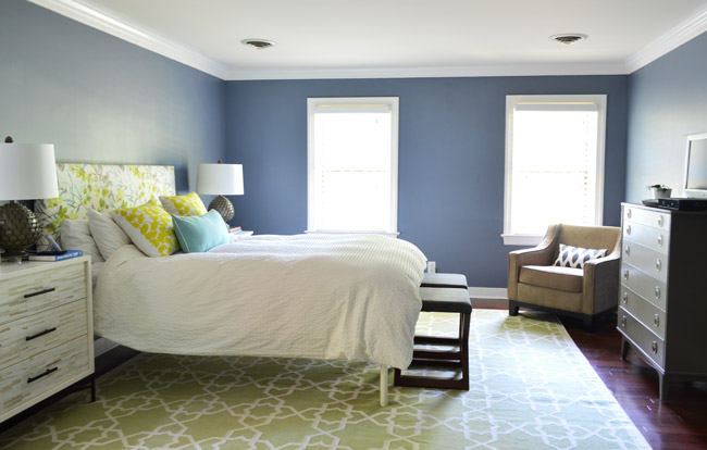
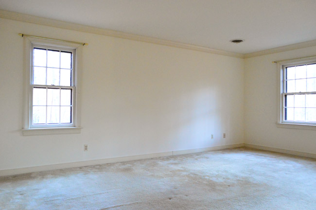
Before we started putting a bunch of holes in our walls, this is what the room looked like (and what it has pretty much looked like since we painted it nine months ago). It was in desperate need of curtains at the very least, but we’re not done with those yet, so just ignore those and let’s talk about the frames.
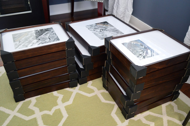
We had long talked about doing a gallery wall over our bed, and after stewing on it for a few months we decided we wanted to go with big dark frames (gasp! not white ones?!?) with nice mats. We have a gradual goal of amassing nicer frames in the house as we go (some real wood ones with nice big mats with glass and not plexi) so after shopping around at a few frame places, these large wood ones from Michaels fit the bill best. At $39 each for the biggest ones and $29 for the slightly smaller size, they weren’t cheap – but thanks to a two-for-one sale, it took the average down to $15 to $20 each, which is closer to what we spend for cheaper frames of that size.
Once home with our original frame haul, Sherry cut a bunch of templates out of leftover rosin paper that we had from projects like this and this, and we taped up a rough, mostly-symmetrical arrangement.
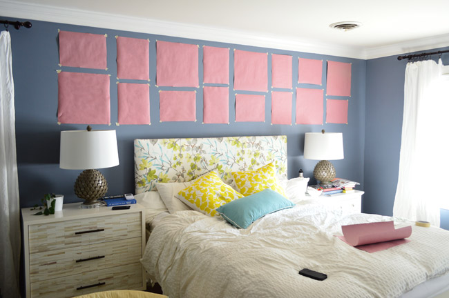
Neither of us was totally sold on it. It just felt a little too perfectly lined up. So Sherry took a stab at loosening up the rows and columns a bit. Kinda the gallery wall equivalent of unbuttoning the top button of your dress shirt. It instantly looked more relaxed and casual than the more formal/balanced arrangement that we had tried first.
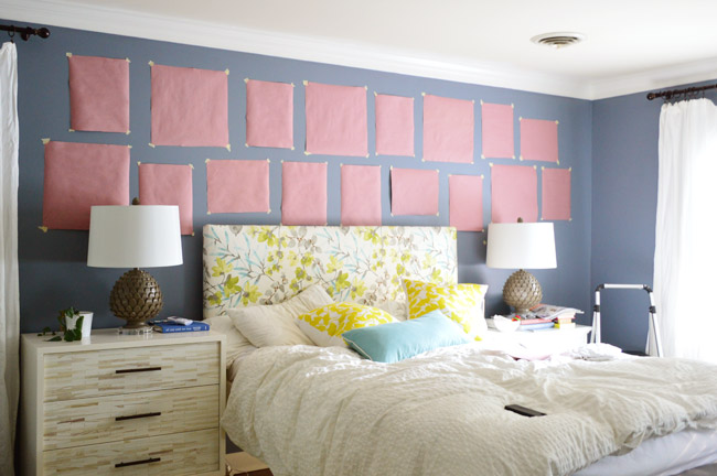
Next it was frame-hanging time. Considering the number of them (at this point we had 17), it wasn’t too bad. These frames hang nicely on one or two nails each (there’s a groove on the back lip of the wood frame) and since we had worked out their placement with paper templates it was pretty simple. Since the arrangement is somewhat mirrored from one side of the bed to the other, we used a laser level to make sure the frame on the left side was at the same height of its sister on the right (and we used a yardstick to make sure our side-to-side gaps between frames were about the same).
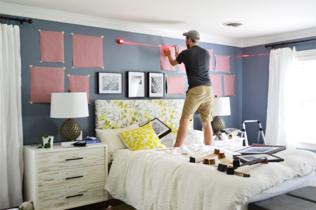
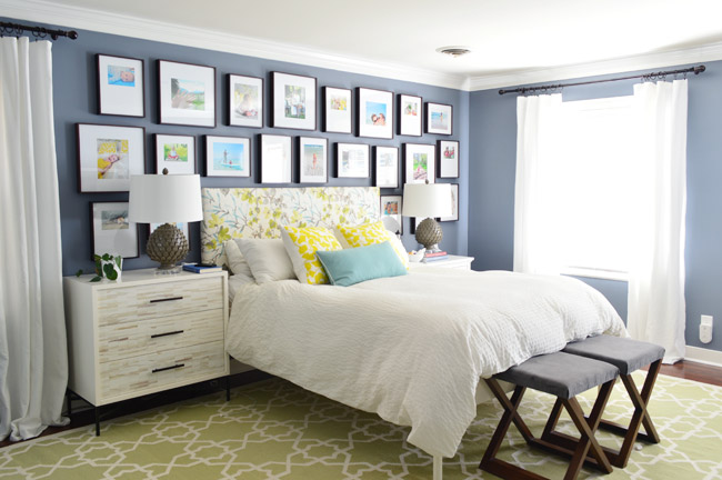
After we got the initial set of frames hung, we liked where it was going… but the whole thing was feeling a little too much like a stripe across the top of the bed, so we picked up five more frames to fill the space above each night stand for more of a full-wall-of-frames look. So when it was all said and done, we purchased five of the larger frames (they’re 11.5 x 14.5″ with an 8 x 10″ opening in the mat) and seventeen of the slightly smaller 16.5 x 16.5″ size (some of which had 8 x 10″ openings and some that had 5 x 7″ openings). Note: We later realized that the bare spot on the top left (by the curtain) felt off to us, so we inched a few frames around to make it more balanced looking (you’ll see that tweak three photos below this one).
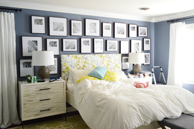
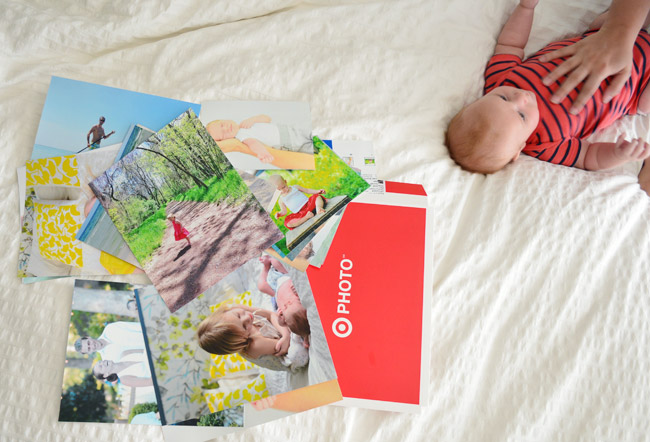
Although we’re big fans of putting just about anything in a frame, we had been looking at our family photos and realized that we had a lot of special-to-us photos that we wanted to properly frame, so a wall of family photos was the goal here. It felt especially right for a more personal space like a bedroom, and we had never seen many of these photos printed out in a nice large size like 8 x 10. So we picked a bunch and placed an in-store pickup order on Target’s website (which we discovered was cheaper for 8 x 10s than our usual go-to, Shutterfly).
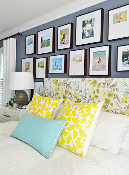
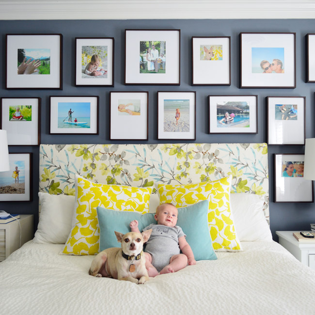
Here’s everything all framed up. We really liked going with colorful prints instead of black and white ones, especially on such a dark wall. They’re a nice balance of classic/handsome (wood frames & crisp white mats) + cheer (colorful family photos). And we like how the bolder prints tie into the colorful pillows and our headboard.
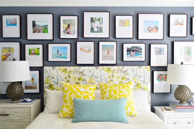
The process for picking photos was pretty straightforward: we scrolled through our family photo folders in iPhoto (we have one for each year, ordered chronologically) and flagged our favorites. That produced WAAAY too many options, so we whittled it down to the 22 we needed by choosing favorites from the favorites (for some reason it’s easier for us to pick top choices from the group than decide which ones to nix).
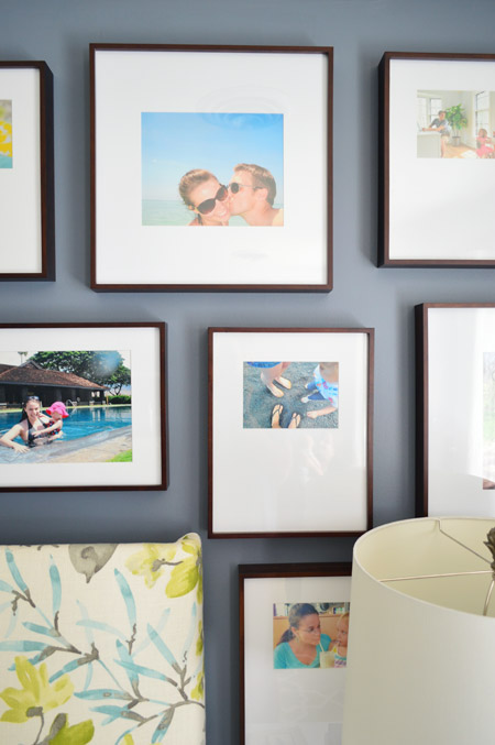
We didn’t keep any sort of color scheme in mind (there’s every color in the rainbow going on) but we did seem to subconsciously choose photos that looked more like a moment in time than a posed everyone-stare-at-the-camera shot. I think maybe we knew that a whole lot of eyeballs staring out at us might feel strange. So most of them feature people looking down, at each other, off to the side, etc. There are only a few with eyes that actually looked at the lens, like the Teddy beach shot in the top left corner.
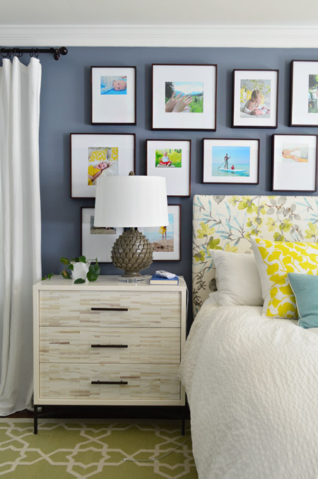
It wasn’t until we had everything hung that we realized a few other commonalities emerged. We stepped back and laughed about “all that water.” Turns out around a third of them feature us on the beach or in some other form of water (the lake, a pool, etc). It’s probably because a lot of our favorite photos were from trips we took. We actually counted six different states being represented in our photos (from Alaska and Hawaii to Florida and Delaware). Another funny realization was that three of the photos in our gallery were taken on the very bed that they now sit above. So we’re apparently a family who likes to travel… or stay in bed.
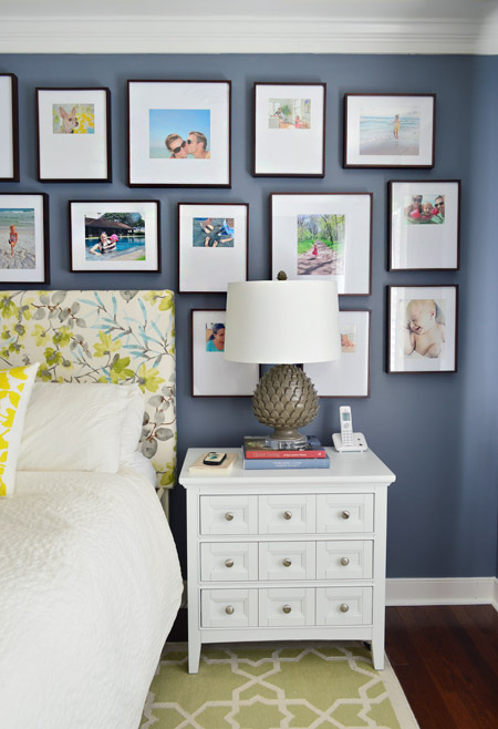
After we were all done hanging and framing everything, our formerly nondescript bedroom wall had sort of morphed into a photographic celebration of our family, which has been pretty awesome as the first and last thing we look at every day. In fact, as much as we loved the frame hallway in our last house (we didn’t think we’d ever love a frame arrangement more), our new family-gallery is right up there with it.
Oh, and even though it looks like those pictures behind the lamp are impossible to see, they’re actually some of the ones we see the most from bed and/or when we walk into the room. It’s all about the angle y’all.
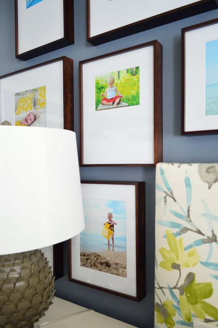
We hope our new family wall will encourage us to keep breaking out the camera and documenting family moments. Heck, it doesn’t even have to be the nice camera. We realized almost half of the pictures up here were from our iPhones or our old point-and-shoot.
Clara was napping when we finished hanging everything, so we stole the opportunity to give Teddy and Burger some brother time in front of the camera. And knowing our penchant for framing the photos taken on this bed, there’s a chance this shot could end up on the wall at some point. So meta, I know.
We can’t really picture the “before” of this room in our heads anymore without pulling up the actual before photos…
… but we’re certainly grateful for how far it has come. It’s looking a little busy to us right now, but we think a few other to-do list items should hopefully fix that. We’d like a better bench at the end of the bed and a proper set of end tables so we can use the dresser on another wall. We also still have to finish the curtains, need an overhead light, etc. Slowly, slowly.
Anyone else doing bedroom updates? Or hanging a collection of family frames? Have you noticed any subconscious themes afterwards, like a love of water, travel, or being in bed? What about eyeballs? Are they all staring out at you? Do they follow your every move, Mona-Lisa style?
Psst- Wanna know where we got something in our house or what paint color we used? Just click on this button:


Karen Lee says
Wow those look great.
I love a good photo wall!
sew says
I really like Teddy.
Julia [Chris Loves Julia] says
This is the kind of “update” that makes a house–a home. So special and heart-warming, guys.
Lisa P. says
I LOVE this and would love to do something like this in our master! You guys amaze me!!
Mary | Lemon Grove Blog says
Absolute perfection! I’ve got a few gallery walls in my head right now for our new house, but y’all are totally right, buying the frames can get pricey! I’ll have to look for some coupons/deals as well!
YoungHouseLove says
Oh and another tip John forgot to mention in this post is to use SnipSnap! It’s an iPhone app with great coupons that it searches through and they pop up on your phone. We were able to stack a “15% off including sale items” coupon on top of the bogo sale!
xo
s
haverwench says
PriceBlink is another one. You can install it on your phone or your home computer.
Crystal says
Love it! Those are the best pictures and Teddy is HUGE!! They grow so fast!
Curious about what you got in store for the curtains!
Chrissi B. says
Looks great! Love the ‘brothers’ picture!
olivia says
I love it! I’ve been meaning to do a gallery wall above my bed too so thank you for the inspiration.
Laura @ Rather Square says
Even though there’s a lot of color and different sizes going on, the fact that you used the same kind of frame style throughout helps tie everything together. Love it!
Joanna @ TheNestbook says
It looks great! I love how personal it is. Lovely job!
Kim says
Love love love this!! Also, where is that 9-drawer dresser (that you’re currently using as an end table) from?
YoungHouseLove says
That was from Joss & Main a while back. I have seen them at HomeGoods too I think (there or TJ Maxx, can’t remember).
xo
s
Emma says
Looks great! And those frames ‘are gorge. It’s *so* nice to actually print out photos. All of this digital photography kind of killed off the photo album. Now I need to go and have some of my photos printed so I can frame them :)
Angela says
Love the picture wall! Where do you have your i-phone photos printed? The only ones I’ve had done (at Walgreens) didn’t turn out well!
YoungHouseLove says
We got all of these printed at Target and were really happy with the quality. One that was flagged on Shutterfly as “not enough resolution” (we uploaded them there first before realizing Target was cheaper and changing our order) even printed out just fine!
xo
s
Julie says
Check out adorama.com. I printed some phone pictures through them and they ended up looking better in print than on my phone! They have real people review each print to make sure it looks good. Their prices are good, too. The shipping is a little high for a single print, but if you print a bunch in a simgle order, the shipping isn’t bad at all.
YoungHouseLove says
Great tip!
xo
s
Bethany says
Mpix.com is also really good quality. A photographer friend of mine recommended them one time and I’ve been happy with all of my orders. They always have sales and coupon codes too if you sign up for their emails.
YoungHouseLove says
Thanks guys!
xo
s
JenB says
I’m going to try Target and adorama.com for printing pics. I’ve never been very happy with the drugstore photos.
The wall is awesome. I’m finding, as my boys grow (2 and 4), I’d rather have pictures of them everywhere than most art I see! And I love looking at other people’s photos when I go to their house as well.
Kati says
So gorg! Thanks for the inspiration (and so smart about the stacking coupons.)
JANE in NV says
Looks great! Love the dark background showing off the frames dark and white with blasts of color that comes from the photos.
You have some wonderful family photos. That Teddy is sure a sweetie and most photogenic. He already has such a sweet personality in that Petersik smile and dancing eyes; just like Clara. The photos of the two are real family treasures.
You both have quite an eye for picture taking.
Thanks for sharing. Your progress has been astounding!
Beth A says
That looks awesome!! If you’d told me ahead of time, I would have thought that many photos above the bed would be creepy. You’ve changed my whole view on the subject!!
Marlena says
That looks great, and Teddy is growing so fast! I’ve been printing a large canvas photo or 8×10 of our holiday card each year, otherwise things don’t get printed!
Speaking of bedrooms and benches, we just ordered this for the end of our bed and it arrived last week. We still need to put it together: http://www.overstock.com/Home-Garden/Slat-Bench-in-Natural/3065357/product.html?searchidx=0 (but we ordered it in black). We also have a fabric-covered headboard, and I liked how the slats would make it airy, versus a heavy, chunky bench.
YoungHouseLove says
So pretty! I love it!
xo
s
Jennie says
Where is that white nightstand with all of the drawers from??
YoungHouseLove says
That was from Joss & Main a while back. I have seen them at HomeGoods too I think (there or TJ Maxx, can’t remember).
xo
s
Richelle B says
I love all those pops of color on that pretty dark blue/grey background. I’m sure it makes you smile every time you see it.
Reenie says
Love it! Cute pic with the brothers (Teddy & Burger) :)
Rosanne says
Love a good gallery wall and you gus do the best. I love how you brought the frames down to the nite stands, and speaking of nite stand, how come I am just noticing the one with the inlay. (Maybe cuz I hate mine now and looking for something different?) Anyway, me likey very much where did uou get them?
YoungHouseLove says
That was from West Elm after we moved in here. It’s this pretty wood detailing that almost looks like bone inlay!
xo
s
Jess says
Love it! The dark frames look great in there.
pk @ schneiderman's {the blog} says
I love the fact that you incorporated so many family photos into your space, and the Teddy/Burger image is priceless! so cute.
Amanda @ Living on Grace says
looks great!
how did you feel about the quality of target’s photo printing? i used to use shutterfly but i’ve gotten back some crummy quality from them. so i used richmond camera (AMAZING quality) but it’s pricy. what’s a girl to do?
YoungHouseLove says
We used high res photos (as high as we could, even for the phone ones) and they came out really crisp. John’s pretty picky about that stuff and he was happy!
xo
s
bridget b. @623Designs says
I love gallery walls. There’s so many different ways to do them. I actually like that y’all stuck with all the same type of frame here.
And look at Teddy, he’s getting so big! Too cute.
kim says
Looks great! We just finished a gallery wall above our bed, too, and used more personal pictures than we did in our dining room gallery. I love the way it turned out and how cozy it makes the bedroom feel.
Question: I thought you had a wall of built-ins planned for the room? Did I remember that correctly? Did you have a change of plans?
YoungHouseLove says
Now that we did built-ins that flank Teddy’s crib (and future bed) in the room next door, we thought another wall of built-ins along the bed-wall idea might be too much.
xo
s
Michelle | Birds of Berwick says
This looks awesome! We did a gallery wall behind our bed as well but it’s more wedding and honeymoon themed for us right now and we mixed up the frame types. I love how these stand out on with that incredible wall color, though.
Daphne says
That’s what I’m planning to do too. Ordered all my prints using metallic pearl paper from MPIX and bought some of my frames – the white wood shabby chic look, from hobby lobby. We also just got a huge canvas done so this week I reeeally need to get all of this hung!
Anu says
Love the dark frames. So how much did this project cost you?
YoungHouseLove says
I think after the stacked coupon and the bogo sale it was around $300. So not cheap at all, but thanks to that sale and that coupon we saved around $350!
xo
s
Beth A says
You mentioned the snapseed app for coupons, but it looks like an app just for photos. Did you use a different coupon app? Thanks!
YoungHouseLove says
Ack, sorry it’s called SnipSnap!
xo
s
Emily says
You had previously mentioned doing built-ins on that wall to balance the window. Is that still the plan, or has this taken its place? Just curious!
LOVE the departure from white frames, btw.
YoungHouseLove says
Now that we did built-ins that flank Teddy’s crib (and future bed) in the room next door, we thought another wall of built-ins along the bed-wall idea might be too much. We’re hoping once the room has more permanent furniture and art and all that you won’t notice the window placement as much.
xo
s
Julia says
I never have anything to add when you mention at the bottom “anyone else working on this___” But hey – today I do! We updated my almost 14 year old daughters room, because she wanted something more “grown up”. Honestly the biggest WOW moment came when I painted the molding and trim bright white semi-gloss. Now of course, I have to paint the rest of the semi-beige molding in the house. I’m kinda feeling like you are with the blue molding at just the thought of this project.
YoungHouseLove says
Sounds so sweet!
xo
s
Heidi says
The frames looks great – but Teddy really steals the show here! All I can focus on is how much I want to squeeze that little tummy!
haverwench says
Wait a minute, it looks like you do have curtains up in that last picture…so why do you say they’re not done yet? Are the plain white curtains about to get FUNKY?
YoungHouseLove says
Haha! Mostly we just want to hem them and move some of the rods in a bit (we mounted them too wide in some spots). We have toyed with a dipped look in a yellow color like the pillows but we don’t want to make the room too crazy, so we’re still percolating…
xo
s
Andrea says
We have a family-photo gallery wall in our upstairs hall, and it’s great to have family over and have them see their faces smiling out at them when they visit! Ours is a hodge-podge of frames, though, but there’s nothing to compete with them in the hall. :)
YoungHouseLove says
Sounds really sweet!
xo
s
Amber says
This is gorgeous! Your before and complete-after pic is mind-blowing! Those pictures really help make the room; well done!
Amy says
I love love the frames. I’ve been looking for a good deal for a gallery wall and really like how think the frames are. Can you provide the brand name or the link? Id like to purchase online since there isn’t a Michaels store near by.
YoungHouseLove says
I looked for the link to add to this post and couldn’t find it! I don’t know if all of their frames might not be online or something? Or maybe they don’t ship all of the nicer glass ones? They’re Studio Decor frames, but they seem to offer a ton of different types of them (might just be the Michaels name for them, like how Target has Threshold products).
xo
s
Taylor says
I bought the same frames a few months back to finally hang up the photos we took on our honeymoon! Love them!
YoungHouseLove says
They’re nice, right?! I was so excited to see that sale!
xo
s
Sarah @ Sarah's Daybook says
Ah! I LOVE those frames! It makes the room look so finished! Great job!
Sarah
http://www.sarahsdaybook.com
Julie C says
Looks SO good!
Teri says
This looks great, but may I suggest just one thing. I love the frames that have the matte cut so the photo is asymmetrical (ie, at the top, not the center). Maybe you could FLIP a couple of those frames at random and hang them upside down so that the photo is at the bottom and not the top. Not all – just a few – to give it a more random look. Just a thought. It’s a cool and somehow polished look, either way.
YoungHouseLove says
That’s a fun idea!
xo
s
Lisa E says
Looks great and love that you didn’t go with white frames to make it different. Teddy is getting so big. Love that pic of him and Burger. Adorable. Haven’t hung a gallery wall lately because they are already hung, but had the hubby change the lighting in the hallway. Had one boob light and it was dark. When I opened the linen closet the door blocked the light and it was hard to see inside the closet and drove me nuts. The attic has boards screwed down to walk on so it would be a pain to put in the pot lights I wanted. (He’ll have to do it for the kitchen project eventually – I didn’t want to wait.) I picked out a flexible track lighting system. It had to be flexible to go around a hard wired fire alarm. I didn’t think I’d like it, but I really do! Now the sun has arrived, it’s so darn bright, ha! However, now you can see and appreciate the pics hung on the wall and the best part, I can see inside my linen closet. :)
YoungHouseLove says
So glad!
xo
s
Summer says
The pictures add so much more color to the room! I love the gallery. Good job guys!!
April says
Love the gallery wall…I have been searching for months for what to hang over the bed and now I am inspired! By the way I love the new pace of the blog. Feels more real time and keeping up with family priorities. It makes me think I can complete projects without sacrificing family!
YoungHouseLove says
Thanks so much April!
xo
s
Stephanie says
Gorgeous! Love every inch of this.
Our master bedroom is in desperate need of some attention – the wall above the bed has been bare for 2 years now and it irks me every day but I just haven’t figured out what to hang. This is really inspiring!
Cait says
Love it!! But as a photographer it made me cringe a bit that you printed at Target, next time check out a Mpix…it’s the same quality a professional lab will give you – the colors will be better and they will not fade since they’re not ink jet printed, they’re made the same way developing film pictures are! That’s just my two cents and I tell all my clients that :)
YoungHouseLove says
Thanks for the tip Cait! We will have to check it out!
xo
s
Jaime says
As a non-photographer, I have to second what Cait said. Haha. Mpix was recommended to me by my photographer friend after I complained that I had so many wedding pictures and family photo-shoot pics that I never printed out because I couldn’t find quality prints! Yes, they are a bit more expensive than Target/Costco/Walgreens, etc but you are getting what you pay for. And really, what is a few cents/dollars when we are talking about family memories that will LAST. I am always amazed at folks who spend THOUSANDS on a professional photographer (for a wedding) and then go the cheap route on the prints to save a few bucks and the photos look like garbage.
Anyways, love your wall, and I am actually waiting on my Mpix order to come in since I bought a ton of frames to (FINALLY)frame wedding (2010) and newborn photos (2013. I can’t wait!!
tamrah says
I third that, and also a professional photog here! It’s amazing the difference.
Anyway, I love the wall! Looks gorgeous! :)
Isabel says
I also swear by Mpix! Plus, they also have run amazing promotions fairly regularly, so if you wait for those the prices are as good as places like Target. Oh and large prints are put on sale the most often, it seems. Just wanted to throw in my 2¢ in case it might help :)
traci says
I was hopping on here to say that Costco had the best price for 8×10’s by a long shot ($1.49). I just did a comparison of brick and mortar stores the other day. I hadn’t heard of Mpix, but after checking it out its price for 8x10s is actually lower than everyone except Costco. Definitely seems worth it!
YoungHouseLove says
That’s awesome!
xo
s
Emily, our house now a home says
I love how this turned out. I was just thinking of ways to finslly , officially decorate our bedroom and thought of a wall of pictures. The ones in our living room have a more formal feel. So in our room some more personal and less posed would be what I would be going for too. I adore all of the bright colors in your room!
Joules (from Pocketful of Joules) says
I’m in love with your latest gallery wall!
I do have a question for you though — I have a gallery wall in our living room and another ‘everything handmade from our 2 year old’ gallery wall by our 1st floor bathroom. Would adding ANOTHER one in the bedroom be too much?! Is there a limit on gallery wall goodness?
YoungHouseLove says
I think gallery walls dedicated to different things (kid art in one space, family photos in another, etc) all can live in the same house, and can even look cohesive throughout – like you have a running “collected art” look :)
xo
s
Liz says
Hey guys. You have done another amazing job! I’m always in awe of how great all of your projects are. Please excuse my extreme ignorance about all things photo, but the colors on your pictures look so bright and wonderful! Is this something special you do? Could I send my iPhone photos to get printed and they would look like this?
YoungHouseLove says
Thanks Liz! We usually don’t filter instagram pics (we use them on “normal”) although sometimes we’ll use Sierra (which tends to lighten/softly wash out something). So for the most part we just try to take photos with a lot of natural light and tap the screen to focus beforehand. Sometimes we shoot in HDR mode but it tends to make moving people look blurrier.
xo
s
Stacey says
I had the same question – thanks!
Ashley@AttemptsAtDomestication says
Hanging pictures are my absolute favorite way to decorate a space. Nothing more special!
DebinNYC says
L.O.V.E!
mary says
The photos and frames are gorgeous, but to me it’s way too busy for a bedroom, especially going behind the lamps and with the floral headboard. But that’s just me. Nice work!
I’m always so jealous of all your great family photos. I have very few and they all suck. Just not my skill!
Annie says
I agree. Lovely photos. But the wall just dies not work. Looks way too busy and detracts from a pretty room.