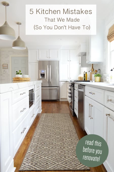
There are tons of decisions, measurements, plans (and change of plans!) that go into a kitchen remodel. So it’s usually unrealistic to assume that you’ll be able to navigate the entire thing without hitting a few speed bumps or having to course correct along the way (ten points for two driving related metaphors in one sentence!). And our journey was no exception – perhaps you already heard about our GIANT tile miscalculation on our podcast – so today we’re recapping five other mistakes that we made, noticed, and then fixed (some riiiight in the nick of time). You know, before they ate away at us for years on end as we stood in there giving them the stink eye. So if you’re contemplating a kitchen reno, you might wanna keep an eye out for these potential road blocks. I’m really nailing it with those driving metaphors today.
Mistake #1: An Almost Off-Center Doorway
Maybe you remember this picture below from our demo post showing the new opening that was all framed up between our kitchen and our living room. You probably didn’t think twice about the cluster of close studs on the left side (see black arrow), but that was actually to correct the fact that it was originally built a few inches off center. Oops!
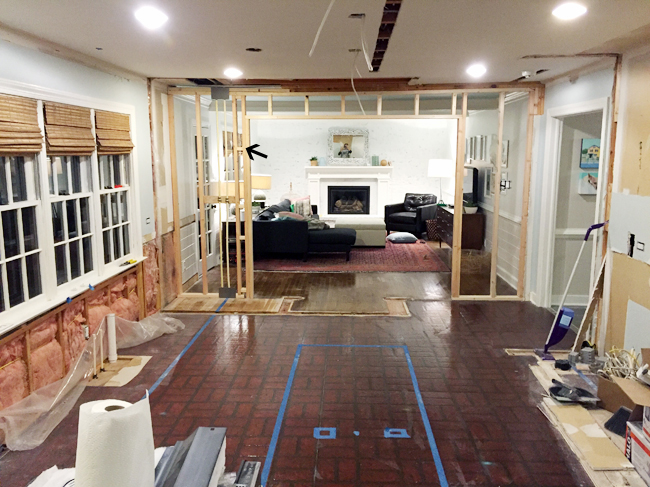
The same contractor who helped us widen the dining room doorway (which was load bearing) helped us frame this up, and that night Sherry and I both thought it looked a little off. We sorta did one of those “Is it? No, it’s not. Wait, maybe just a little bit? Eh, I’m probably being paranoid. Oh well, back to eating cookies!” But Sherry resisted the Oreos long enough to double-check everything with a tape measure, and sure enough – it was nearly three inches closer to the wall on one side.
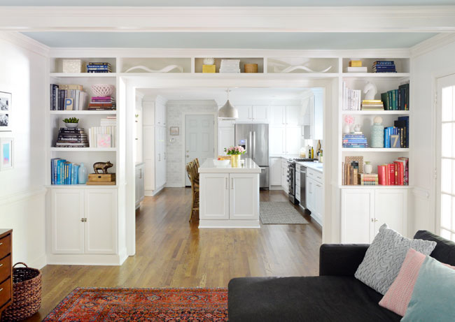
It was easy enough to correct the next day, but we’re SOOOOOO glad we caught it because leaving it even just a few inches off would’ve made our built-in bookcases look super wonky and asymmetrical on the other side (one cabinet would have had noticeably more filler pieces around it than the other, which would have been a dead giveaway).
Mistake #2: Bad Fridge Placement
The original layout of our kitchen had our fridge in a slightly different spot. As you can see in the photo below that we snapped during installation, it was originally meant to go in RIGHT NEXT to the door (the fridge, lights, and door color below are photoshopped, FYI).
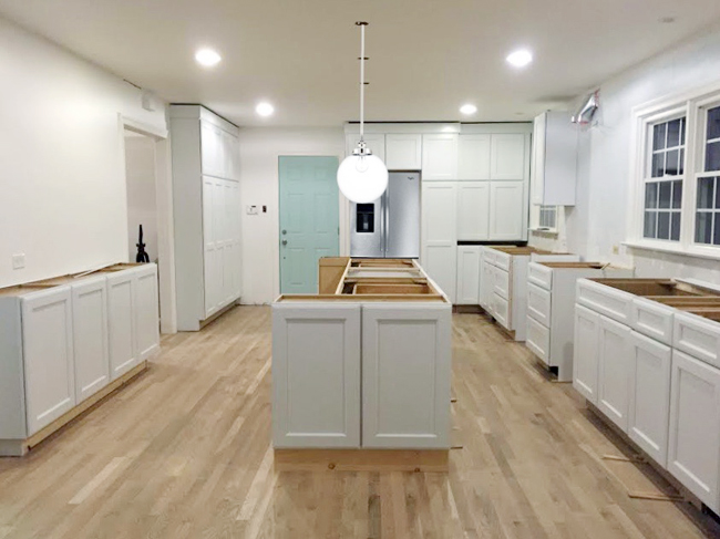
This exercise in Photoshop was because Sherry was trying desperately to convince herself that she wasn’t crazy for thinking the fridge placement looked weird. We had planned for it to go there, so it wasn’t an installation error. Our original logic was to put one big rectangle (fridge) next to the other big rectangle (door) and leave that back wall of “pantry” cabinets as uninterrupted as possible.
But when the cabinets got installed we realized the differing heights of those two big rectangles looked unbalanced right next to each other (like your eye desperately wished they lined up). So Sherry mocked up this alternate version in Photoshop, where the fridge and the door get some breathing room by moving the pantry cabinet between them.
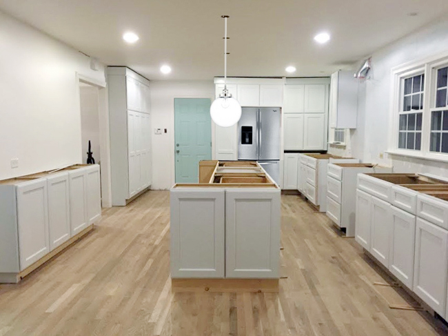
I’ll admit I didn’t think it was worth the eye-rolls from the cabinet installers, but Sherry is gutsier than me, so she didn’t hesitate to at least ask if the switch was possible when the crew showed up the next morning. They were happy – or at least acted happy – to make the change (it took them under 15 minutes!) and we’re both much happier with this placement in the end. So it’s definitely a lesson in intervening if you think you see a design regret materializing in front of your very eyes.
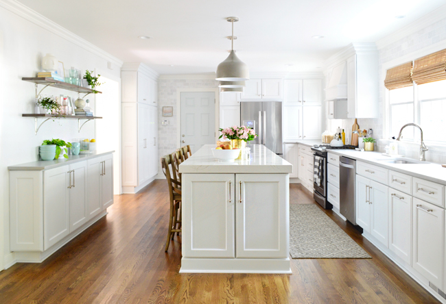
shelf brackets / cabinet hardware / faucet / lights / stools / rug / fridge / stove / dishwasher / gold vase / blinds / island counter (more kitchen info & sources)
Mistake #3: Barely There Lights
You saw them mocked up in some of the photos above, but here’s a real photo of the original lights we installed over the island. They’re barely there, right?
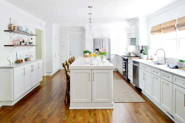
We chose these glass globe pendants originally because they were simple, classic, and affordable ($97 each from Home Depot). We thought the way they blended in would be nice (they wouldn’t obscure any sight lines) but the more we stared at the room as time went on (especially from the sofa in the living room at night) the more Sherry pointed out that they looked kinda pinheaded and unsubstantial compared to the chunky island below them. They weren’t bad per se, but they could be better…
It took us a while to decide on a replacement, since we wanted something with a little more presence – both in size and visual weight – but didn’t want to give up one of our favorite features of these original lights: the polished nickel stem. As you know, we eventually ended up designing these pendants with Shades of Light after not finding anything else that checked all of our boxes (size, shape, color, finish, price), and now they’re some of our favorite items in the room.

brackets / hardware / faucet / lights / stools / rug / fridge / stove / dishwasher / blinds / island counter
Mistake #4: Ill-Fitting Stools
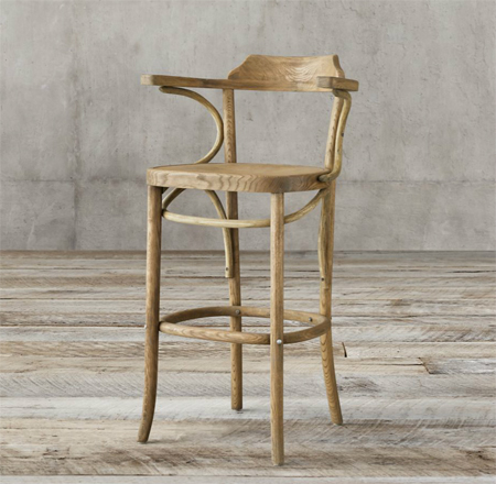
When Sherry was making her mood boards for this room, one of the items we fell in love with early on were these stools from Restoration Hardware. They were a bit of a splurge item (what isn’t a splurge item from RH?) but we kept coming back to them as “the perfect stools.”
So we paid for ’em. We also paid for the totally not-optional “white glove delivery & set-up” service that meant they just PUT THEM DOWN. They didn’t even put them down in the right spot because they arrived during floor refinishing, so they just white-gloved ’em into our garage. And it wasn’t until the day before our counter install that we brought them in and discovered our perfect stools weren’t so perfect after all. Notice the height of that arm rest? The counter wasn’t in yet, but it was as clear as day that once it was installed, these stools wouldn’t be able to tuck underneath it.
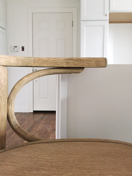
It still boggles my mind that counter-height stools would have an arm too tall to fit under a standard-height counter. Maybe Restoration Hardware assumes that no one wants their stools to slide in very far? Not being able to push them in all the way would’ve driven us crazy, so – as discouraging as it was – we returned them and thankfully got a full refund.
But lo and behold, letting go of “the perfect stools” ended up being a blessing in disguise because it forced us to shop dig more and uncover these World Market stools we had somehow missed in our initial search. They’re still wood, still have a back, and are more affordable to boot. Victory!
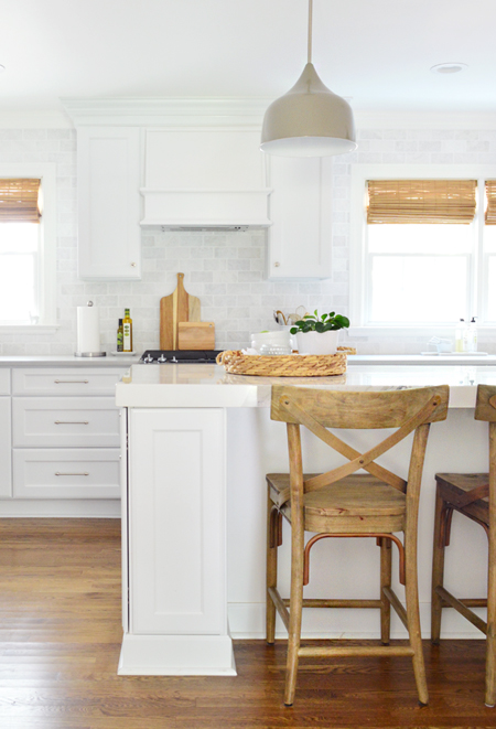
cabinet hardware / lights / stools / stove / blinds / woven tray / island counter
Mistake #5: Repainting. Twice.
We originally painted the walls of the room white. Partially because we were going for bright and low-contrast, but also because we weren’t sure if or what color we might want until more of the room came together. So before the new floors were laid, we gave everything a coat of Simply White by Benjamin Moore, just to unify everything and see if we liked it as a final color.
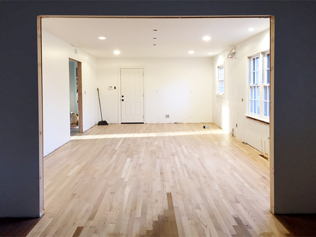
But as the room started to come together, the white was just looking too stark for us – like we hadn’t gotten around to painting quite yet. Here’s a shot as things were going in (still no island counter, wood stools, tile around the door, rug, or wood floating shelves though).
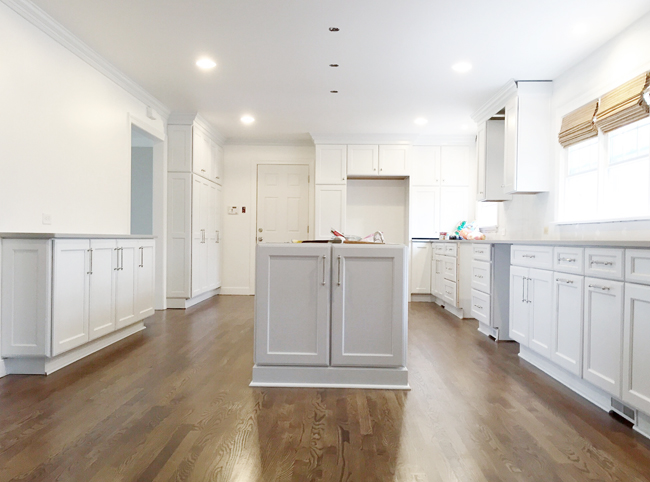
It was actually in installing the backsplash along the sink wall – and then deciding that it should continue around the garage door too – that finally pointed us in a paint color direction. Irish Mist by Behr, the same color in our bonus room, was the perfect light gray that not only created a hint of contrast between the walls and the trim/cabinets – but also picked up the colors in the tile, making all of the walls look more cohesive and balanced. It’s a hard distinction in photos, but in person it’s clearly grayer than the bright white trim.
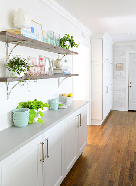
shelf brackets / cabinet hardware / mint bowls / gold frame / pink & green glasses
The OTHER repainting occurrence actually involved the garage door. It came in a stock white color, but we always knew we wanted some color on it. We originally thought about painting it Galt Blue by Benjamin Moore to match our living room ceiling, but after painting a test spot it just looked too bright and shout-y in that corner, so we painted some more test swatches and finally chose Blue Horizon by Sherwin-Williams:
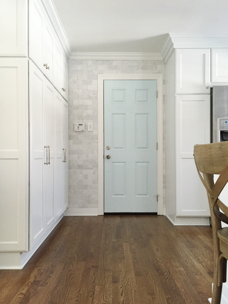
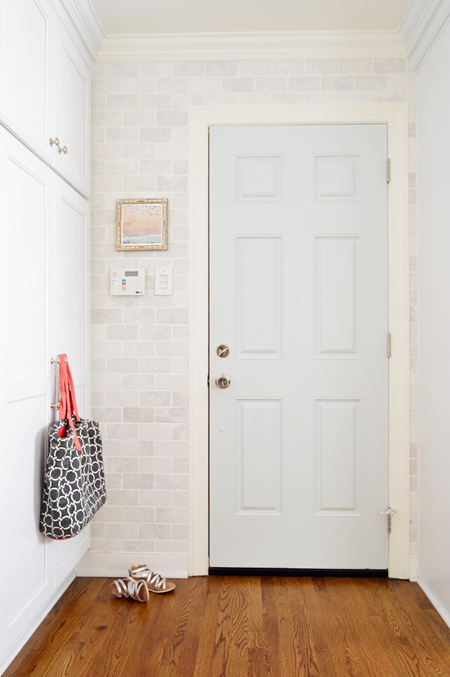
Once the whole door was painted, the color took on a more powdery baby blue tone than we hoped. We were aiming for something grayer and more muted, so we tried our runner-up swatch: Lime Light by Behr. The difference isn’t as obvious in these photos, but in real life this color works a lot better within that nook. Rather than trying to compete with the tile, it almost looks derived from it – although it’s a bit bluer.
Bonus!
So now that we’ve aired some dirty laundry about the design decisions we flubbed on the first try, I thought we’d wrap things up with three potential mistakes that we managed to avoid out of the gate. These are things that could’ve been big regrets (well, maybe small regrets) had we not anticipated them during the planning process, so they’re also things you might want to look out for if you’re headed towards a kitchen renovation.
Bonus Tip #1: Leave Space For Tile
We knew from the get-go that we wanted our backsplash tile to go to the ceiling. We did it in our last kitchen behind our open shelves and loved the impact of it, but since this wall was interrupted by windows and upper cabinets it took a bit more planning. It meant we had to leave enough space around the windows for the tile to continue all the way from counter to crown, completely wrapping around the windows. Otherwise it might’ve looked like two separate stripes of tile – one along the backsplash, and another small rectangle of it above the windows.
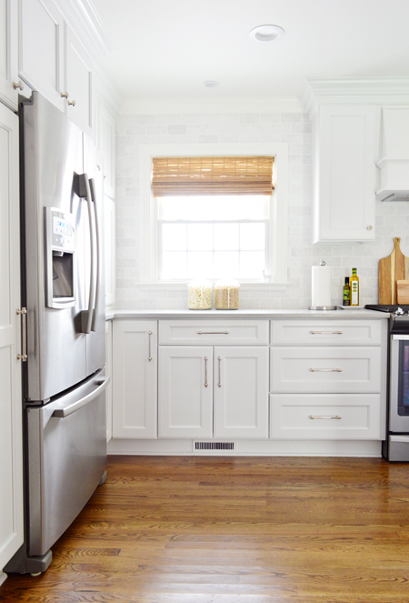
cabinet hardware / fridge / blinds / cutting board / popcorn & cereal jars
We chose a 7″ gap on each side of the windows since it allowed for a substantial amount of visible tile while working with our upper cabinet size options so nothing had to be custom. It did mean that we chose slightly narrower cabinets than we could have, but it was well worth it to us for the final look.
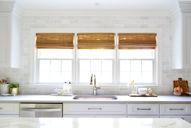
cabinet hardware / faucet / dishwasher / gold vase / blinds / gold clock / cutting board
Bonus Tip #2: Try Horizontal Outlets
Even though we got covers to match our backsplash tile, we still much prefer gazing at our tile as opposed to staring into the shocked eyes of our outlets (do they not look like little surprised faces or what?). Sherry saw the suggestion somewhere to turn your outlets on their side AND lower them closer to your counters to make them easily accessible, but a lot less obvious. So we carefully measured and marked the placement of all of our new outlets (and some old ones that just needed slight relocation) before our electrician came.
We love that we can move small objects aside to expose them when we want to use them (I nudged the planter aside for this shot), but they’re soooo much easier to conceal this way than if they floated right in the middle of the backsplash.
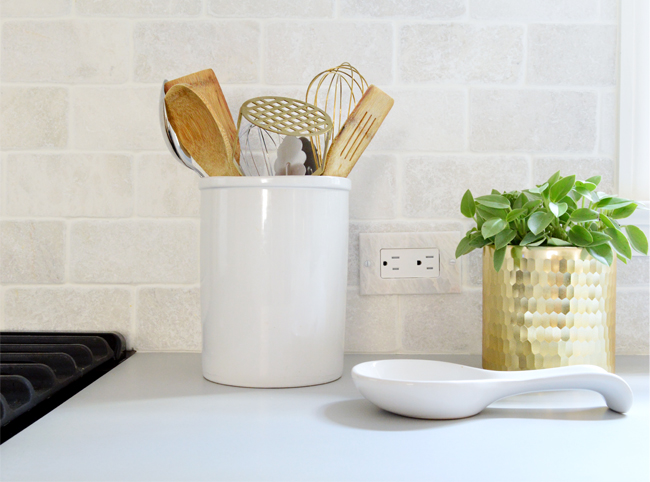
gold utensils / wood utensils / utensil holder / spoon rest / gold vase
It’s another small detail that we easily could have overlooked, but they definitely would have broken up that big wall of tile a lot more if we had skipped the effort (they were originally around 8″ higher since our last kitchen had a little mini backsplash thing and they were vertically placed a few inches above that).
Bonus Tip #3: Don’t Settle For The Default
We worked with a local cabinet company to select a brand called Quality Cabinets for our kitchen, which we liked for their…um… quality, as well as style, color, and price. One thing we didn’t like? The stock option for the exhaust hood. Here’s what it looked like in the original rendering:
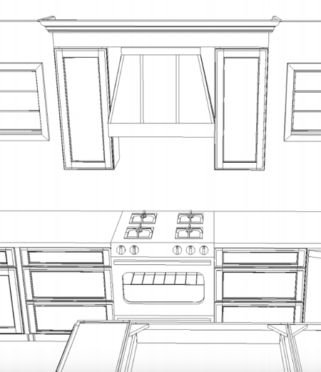
We worried the pinched-at-the-top style might end up making the two cabinets on either side of it feel skinnier, instead of bridging them all together a bit more so they read as one big unit… but it appeared to be the only option from this cabinet maker. Sad emoji. But with our cabinet guy’s help, we realized we could just order whatever 30″ wood vent cover we preferred from any company and paint it to match. Burrito emoji! (Burritos are code for happy in my book).

lights / stools / stove / blinds / woven tray / island counter
Most cabinet companies provide a can of perfectly-matching paint for touch ups, trim, etc – so that’s a good thing to use for tying in anything from another source. We ended up getting this “valance style” cover from Koch Cabinets, which slopes out towards the kitchen island, but doesn’t pinch in at the top when you face it from the front, which is something we discovered we’re both partial to (who knew two married people could have so much in common?!).
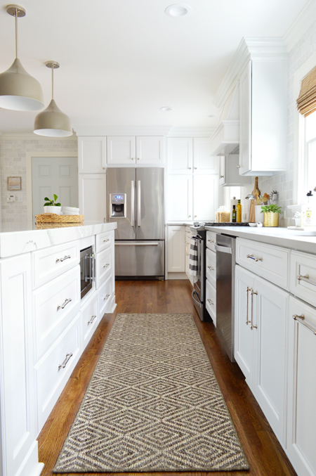
cabinet hardware / lights / rug / fridge / stove / dishwasher / gold vase / blinds / island counter
So consider this a reminder that even if you’re going with a certain cabinet maker, you don’t have to settle for the first (and seemingly only) option when it comes to something like a wood vent cover. Spread your wings and fly.
Of course there are PLENTY of other details that could’ve become #regrets had we not thought them through. Like we almost put the dishwasher on the right side of the sink, meaning it would’ve stuck out beyond the island and been visible from the front door. Now it’s nicely hidden behind the island to the left of the sink, which is even more convenient for unloading.
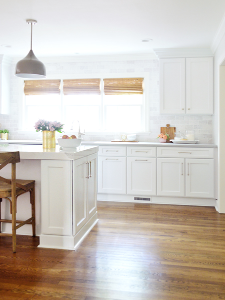
cabinet hardware / stools / lights / gold vase / blinds / island counter / cutting board
It’s pretty much like that with most major home renovations: the devil is often in the details, and no matter how hard you try to anticipate everything, there are bound to be at least a few things you overlook and a handful of adjustments you have to make along the way. My wish for you is this: may none of them involve tearing down a wall to recenter an opening by 3 inches (can you imagine?!).
If you’ve missed the rest of our kitchen remodel story, you can check it out here:
- Choosing A New Layout
- Gutting & Rebuilding
- The Big Reveal <– You can find all of the sources for the room right here!
- A Video Tour Of How We Organized Our Cabinets & Drawers
- How We Added Those Living Room Built-Ins
*This post contains affiliate links*
