We’ve shared this glorious back porch on Instagram twice (during the holidays, seen below, and last summer, seen here), which belongs to our good friends Carey & Jordan. And based on the reaction to just this view alone from you guys, we figured we should do a good old fashioned House Crash so we can show you guys more of their beautiful home. They’ve also got some really great tips about what wears well with kids and dogs (and what they wouldn’t do again), which was especially helpful since we’re currently mulling over some bathroom renos. But enough jabbering, let’s get on with the tour!
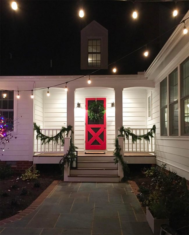
similar storm door / similar black sconces / string lights
Carey & Jordan used to live right behind us (Carey was actually one of the first neighbors to come introduce herself with a giant plate of cookies, which we basically inhaled while laying hardwood floors upstairs). But they recently moved to another house in our neighborhood because of their family of five needing a little more space. Jordan runs a renovation company here in Richmond called Spruce RVA, so it’s no surprise that their own house went through quite the transformation. For instance, here’s what that back porch area looked like when they bought it. Now scroll back up for the after. I’ll wait.
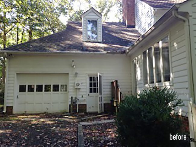
AMAZING, AMIRIGHT? Sorry for the caps lock, but IT’S SO GOOD. We took these pics back before all the leaves left us in the fall (come baaaaack leaves) so I’m thrilled to finally get this post together. Makes me all breathy and drooly all over again. Attractive visual, eh? That old garage that you see above was converted into a downstairs master bedroom since they often have both sets of their parents staying with them, so they needed more bedrooms. And the reason they didn’t mind losing that garage is because Jordan is awesome, and he knew he and his crew could design and construct a new detached garage nearby – with a second floor office for Jordan’s business.

At first glance, the exterior of the house (besides the new garage) doesn’t seem wildly different from how it looked when they purchased it.

But upon closer inspection, you’ll notice the little details they added to amp up it’s original charm. They built out the columns to be a bit chunkier than the original ones. They added some dentil molding along the roofline (I KNOW I’M SHOUTING AGAIN BUT I CAN’T EVEN HANDLE HOW GOOD THAT DENTIL MOLDING LOOKS). They also swapped the double doors for a single door with sidelights. Another neighbor of ours always complains about her solid double-doors making her foyer dark, so this is a great solution to let in more light.
And no, Carey doesn’t decorate with pumpkins year round, they’re just further evidence that these photos were from October. Nothing like getting into the Halloween spirit on the last day of February! UGH, BUT LOOK AT THE BLUE CEILING. AND THE BLUESTONE PATH.

similar black planters / door knocker / similar lantern sconces
The porch ceiling is Crystal Springs by Benjamin Moore, and the door is Poppy by Ben Moore by the way. The white siding is just the stock white that comes with Hardiplank (Arctic White).
The detached garage also acts as a nice anchor to their outdoor patio area, which is what you see when you stand at that pretty back door I’m always Instagramming. Jordan is a trained landscape architect and Carey studied urban planning, so we love that they thought to carve out some space within the paver patio for greenery.
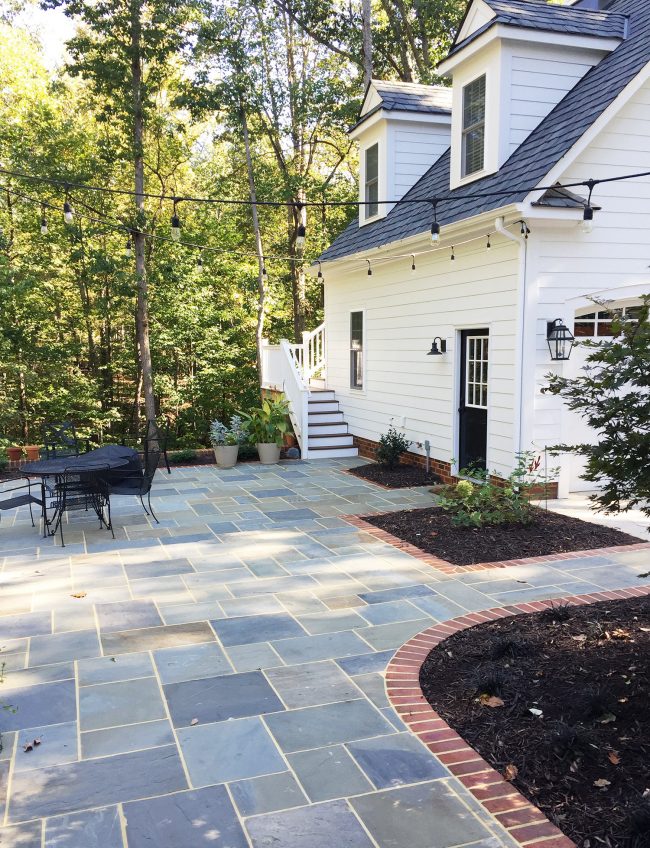
string lights / similar black sconce / similar lantern sconces
Since the back door is the family’s most used entrance, it opens into a spacious mudroom with a nook for each of their three elementary-aged kids. Picture this loaded with a lot more boots and scarves in the winter, except that it has been so unseasonably warm lately here in Richmond, it probably looks like this again.
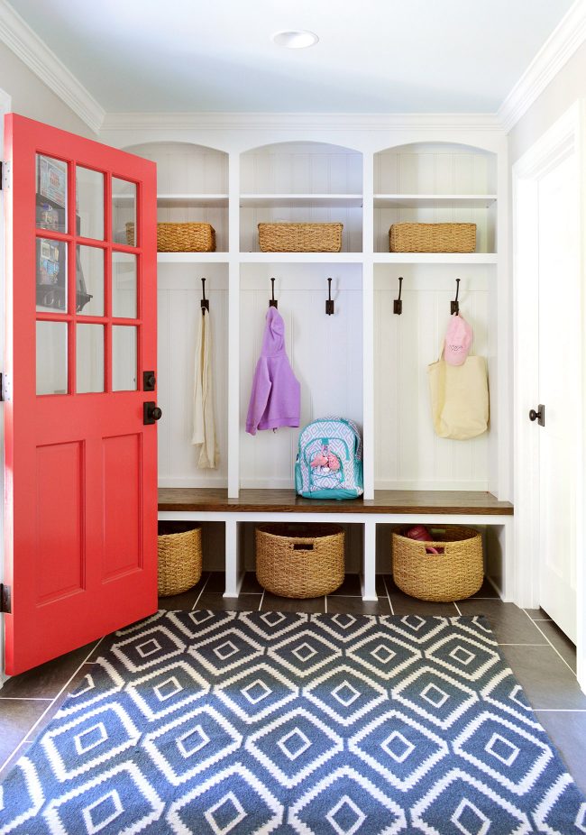
rug / round baskets / hooks / rectangle baskets
The mudroom leads into the open kitchen & family room (that red door is also Poppy by Ben Moore). The previous owners had already put the family room addition on the house, so Carey and Jordan’s main challenge here was to update the kitchen to be more functional for their family.
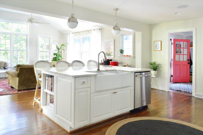
stools / rug / faucet / pendants / dishwasher / sink
One of the coolest things was that they wanted to reuse all of the original cabinetry, but reconfigure some things a little. Well, they found the contact info for the original cabinet maker in one of the drawers, so they hired him to help match some new stuff with the old stuff he built decades ago! It looks so great and you’d never guess some is new but most of it is old!
Here are some of the before/progress photos that that Carey sent us. They were pretty happy with the overall layout, but just wanted to make the stove and the island area work a little more seamlessly.
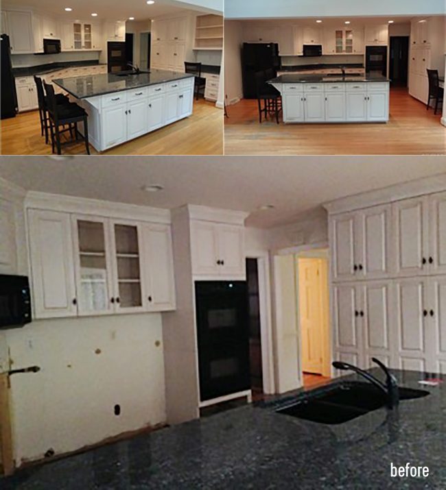
They moved the island overhang to the far side of the island in order to seat more people and make better flow to the fridge, and they traded their dark counters for a lighter granite (super durable and not too expensive – it’s really close to the stuff we had in our first kitchen!). They also lightened things up by swapping the black appliances for stainless steel. Jordan doesn’t like to send a lot of stuff to the dump, so he sold some of the old stuff that they replaced (old appliances, some old windows, etc) so others can use them instead of trashing them.
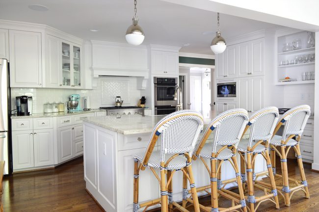
stools / pendants / mixer / flour & sugar jars
It was so smart of them to make that a lovely little accent with some tile laid in a herringbone pattern over the stove. And yes, that awesome original cabinet maker made that amazing hood for them! Those thick corbels look like one of those giant blocks of cheese THAT I WANT TO EAT. I WANT TO BITE THEM. I CAN’T STOP.
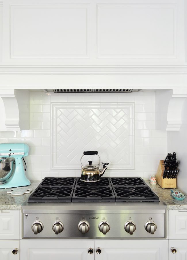
stove / kettle / mixer / knives / cabinet knobs
The bright and cheery kitchen also leads to the nearby dining room, which is painted with a moody greeny-teal color above the wainscotting (Rookwood Sash by Sherwin Williams). The hutch is a cool secondhand find from a local place called Epoch.
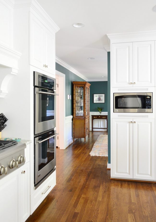
similar china cabinet / rug / cabinet pulls / cabinet knobs / microwave
Carey used an eclectic mix of furniture in the dining room, which simultaneously seems grown-up, but not too serious – and works for her three young kids. When I asked her about how the rug held up with kids and food she said it’s been great. It’s wool and has that faded weathered look so that helps.
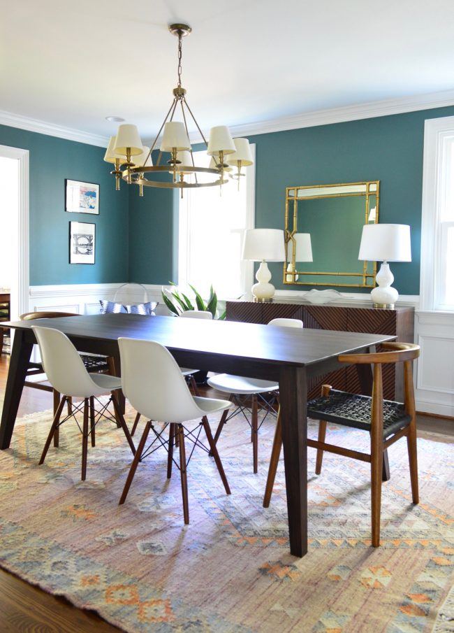
rug / table / end chairs / white chairs / similar gourd lamps / similar chandelier / gold mirror / sideboard
I love how the bamboo frame of the mirror over the sideboard ties into the lattice on that chair in the corner. It’s all a mixture of stuff that she either bought secondhand or found in accessible stores like Pottery Barn, Target, and even PB Teen, yet it all totally goes together without looking too matchy.
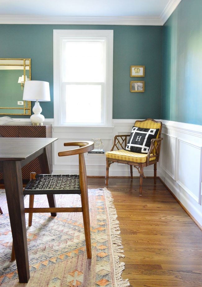
rug / end chair / similar corner chair / acrylic table / similar gourd lamp/ gold mirror
Beyond the dining room is a more formal living room that I like to call Carey’s “White Rabbit” because she pulled this room out of a friggin’ hat. It essentially only had legos on the floor right after they moved in (I don’t have a before picture but you guys can picture that, right?!), and then I visited a little while later and boom, it looked like this.
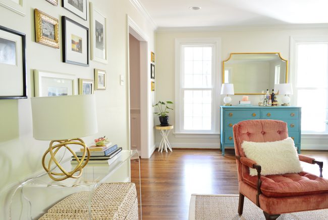
acrylic console / gold lamp / gold mirror / rug / similar pink chair/ stick accent table / gold frames
She said she literally didn’t buy a single thing except for the woven ottoman under the acrylic console, and the rest of the stuff was all things she already had (in the attic, or borrowed from other rooms that didn’t need them as much). She just dragged them all in here, moved stuff around a while, and it worked. Gotta love an almost free makeover.
As part of the make-it-work effort, Carey repainted this old dresser, which works so nicely with the gold accents around the room (she forgets the paint color, but September Skies by Sherwin Williams would be similar). Girl committed to not spending a lot on this room and using her wits and what she had around, and I LOVE that about her.
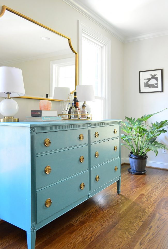
similar dresser / similar hardware / gold mirror
Also you’ve probably noticed all of the live plants around the house. Carey is the plant whisperer. And I am very very jealous. She makes me LOL when she calls me and says “I went to the greenhouse and the guy there introduced me to my new favorite plant!” Although now that I think about it I’m kinda like that with paint brushes. Also: they built these built-ins and are gradually filling them up with books. Standing ovation. Love the brass pulls that tie into the little wood table-turned-plant-stand.
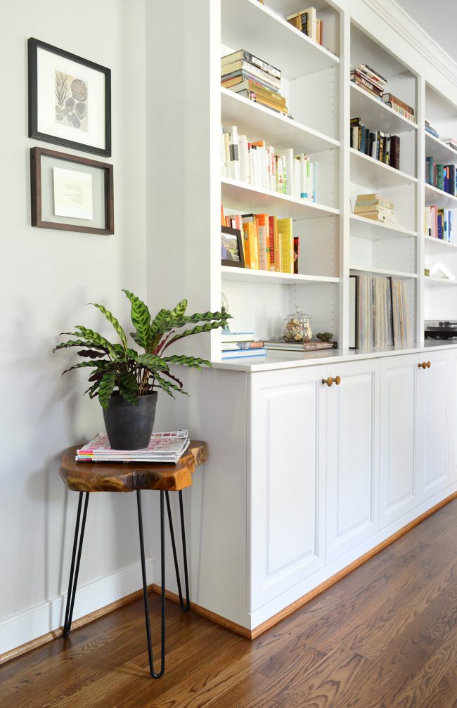
plant stand table / brass knobs / similar frames
I also love that Carey and Jordan are brave. They could have painted their bathrooms, but they opted to try some fun wallpaper in there instead. They’re a smart place to dip your toe into the wallpaper waters because it’s much cheaper than doing a big bedroom or living room – and small rooms like these are great candidates for doing something a little different. This is their downstairs powder room, right off the main foyer.
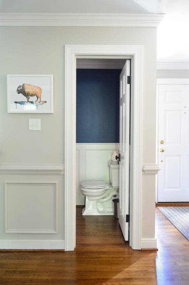
wallpaper / toilet / buffalo print / similar foyer rug
Upstairs the hall bath, which is shared by two of their kids, sports this fun graphic chevron wallpaper, which strikes a nice balance of formal and playful. I also asked how the wallpaper is holding up in the bathrooms. Carey says it has held up perfectly (no peeling from hot showers or kids spilling on it or scratching it). She said the only issue has been that she’s scared to hang pictures on it because it means making a hole that will always be there – ha! But it’s pretty great on its own. She also mentioned that the dark granite counter in here works so well with kids (it was a remnant so she saved a ton of money that way).
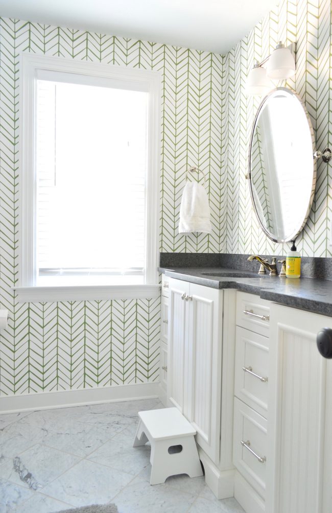
wallpaper / floor tile / hardware / mirror
One tip Carey has for anyone else redoing their home is that although she was warned that marble can stain and be high maintenance, she thought it wouldn’t be too bad in the bathroom on the floor (nobody even has shoes on in there!), but if she could do it all again she’d go with something else. Turns out toothpaste spills and any other liquid that gets on the floor can soak in and stain or leave a mark, which she doesn’t love. Good to know!
Off of their oldest daughter’s room is an ensuite bathroom since it was the original master bedroom. For that room they chose this happy cherry wallpaper and the counter in here is a Cambria quartz remnant so it holds up super well (no staining issues like the marble floor tile) and again by finding it as a remnant at a local stone yard, she saved a lot of money.
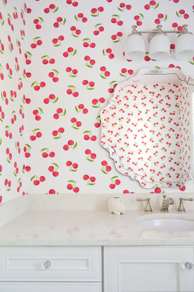
wallpaper / similar hardware / faucet / similar mirror /
Perhaps my favorite room in her entire house is their new master (remember, this is where the garage used to be). They were able to carve out this beautiful nook for a big soaker tub along with a nice bright walk-in shower that’s off to the right. ALSO THAT BASKETWEAVE ACCENT TILE. HUBBA HUBBA. (*wolf whistle*)
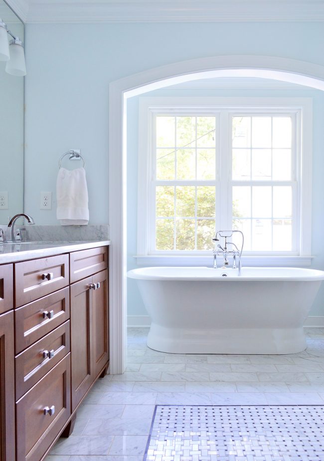
cast iron soaker tub / basketweave accent tile / main floor tile / similar vanity / tub faucet
John was talking to Jordan and fishing around for some reassurance that maybe a bath tub wasn’t really that useful (podcast listeners know we’ve been wrestling with the tub-or-no-tub debate for our own master bathroom reno) and John thought he’d get a helpful answer when he asked “So do you guys actually use that very much?” Jordan said “Oh yeah! Carey uses it just about every day!” Nice try, Johnny boy (insert laughing face emoji next to a bath tub emoji here). I’m back on the I-want-one train btw.
So there you have it. A lot of rooms, nooks, and crannies in Carey and Jordan’s lovely home. They’re super inspiring renovators and awesome friends and neighbors, so we’re so grateful they let us slip through and take these pics while our kids ran amok in the backyard (they left some pretty epic chalk drawings behind since we were there a lot longer than we thought! ha!).
If you want to see more of our House Crashing adventures, you can check out the whole collection of ’em here.
*This post contains affiliate links
