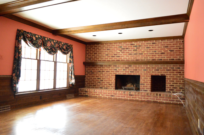
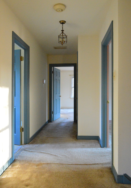
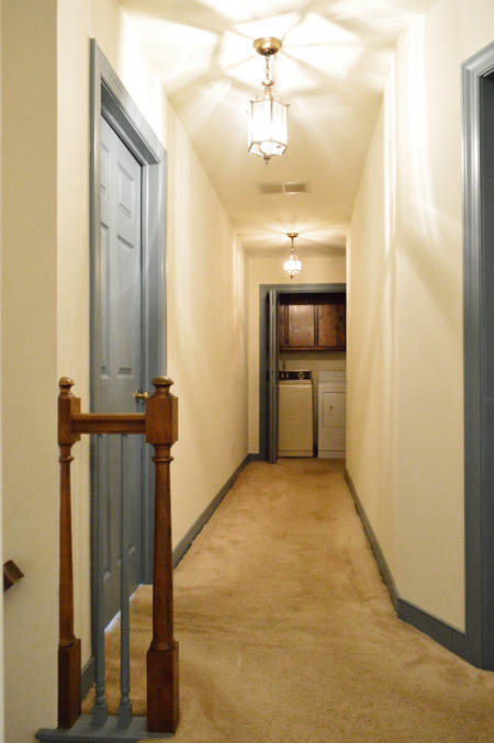
This house was love at first sight for us… even if the sight of it might have been a little unnerving (think blue trim, wallpaper everywhere, lumpy carpets, and a leaky roof). We had dreamed of getting into this sweet kid-friendly neighborhood – always hoping a house that needed lots of work would come up for sale, since we couldn’t afford any of the already-renovated ones. And after seven years of watching and waiting, one finally did! Note: We created this Shop Our House page to help you hunt down any furniture/accessories that you see in our house, along with our paint colors.
The Front
This is what it looked like when we first laid eyes on it.
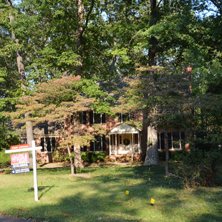
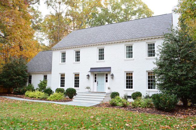
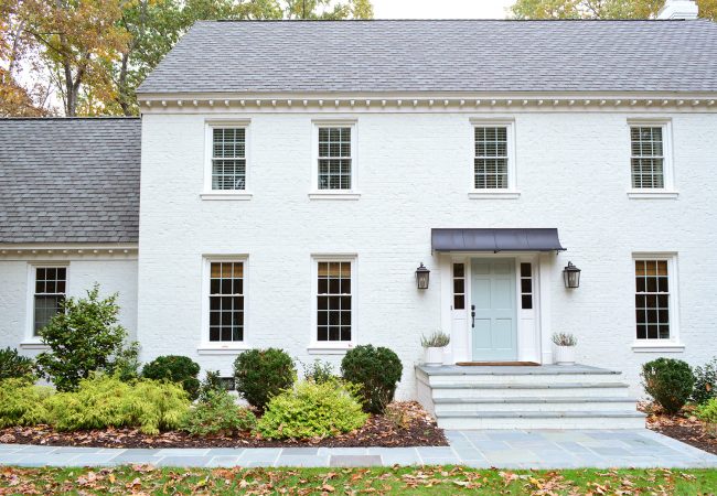
And here it is after getting some dangerous trees removed, replacing the leaking roof, getting the yard leveled and reseeding it, so that’s coming along slowly.

A few years later we painted our brick with breathable masonry paint and it was the most insane transformation ever (and here’s another post about some more exterior changes we made after we painted the brick).
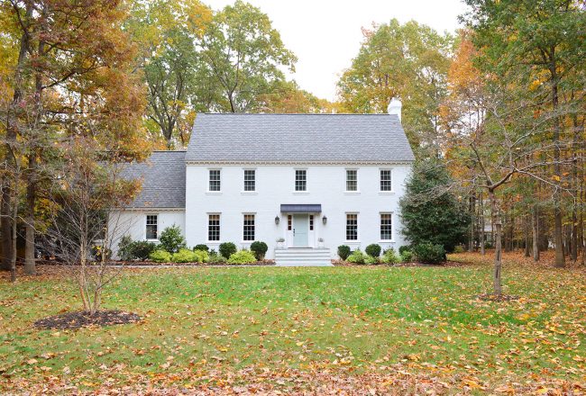
And here it is from a little further back. We’ve come a long way out here, and it has been a ton of fun to watch it evolve.
The Front Porch
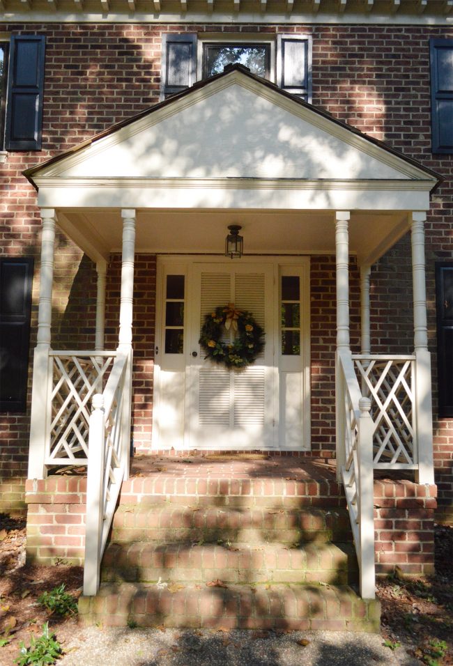
When we bought our house it had a giant out-of-scale portico that stuck out like a beak on the house, and totally blocked the view of that second story window from the ground.
But during our big house-painting adventure we removed it and made a nice simple doorframe with extra large crown molding, and added a big classic lantern on either side of the door (you can read about that crazy day here). We also DIYed those copper plant pots – more on that here.
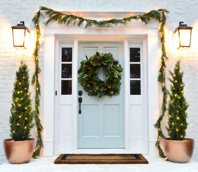
We later added a metal awning and topped the landing and steps with bluestone along with adding a bluestone path. More on all of that here.
The Foyer
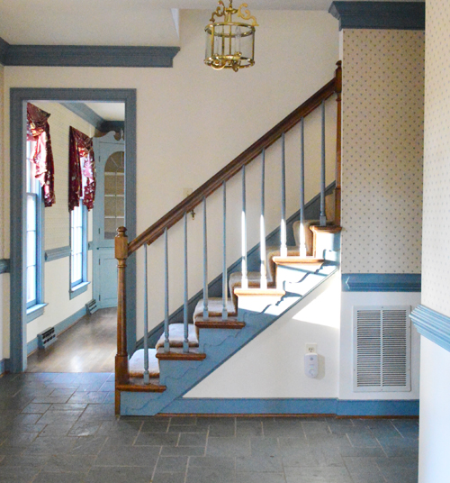
Here’s the foyer as it looked on move-in day.
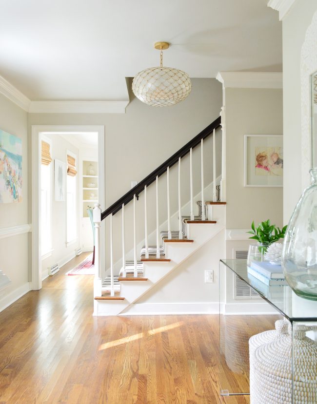
And here it is after we removed those dark heavy doors to the kitchen, stripped the wallpaper, painted the blue trim white, and gave the walls a fresh coat of Edgecomb Gray paint (along with adding a brighter door color). We also hung a new light fixture, invested in some art we love, redid the stairs, and painted the ceiling,
The Stairs
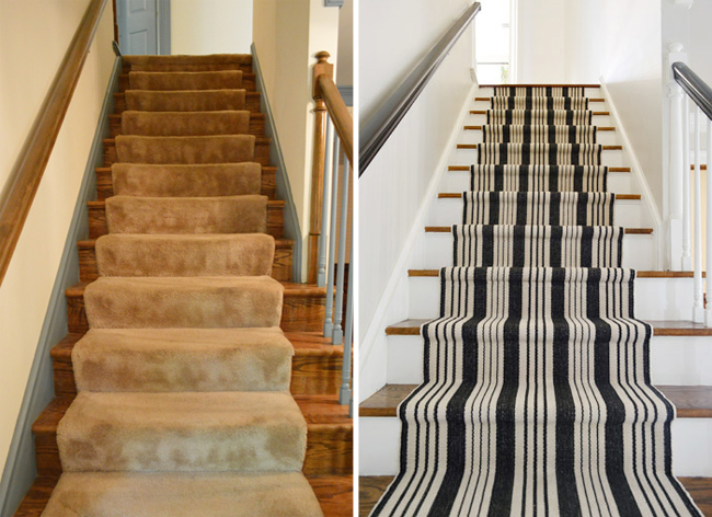
Speaking of the stairs, they started out with blue trim and balusters as well as an old beat up stair runner. We love them so much more after a little overhaul (new trim paint, spindle paint, stain for the railings, and installing a new runner made such a difference (here’s the runner we bought and how we did it).
The Half Bathroom
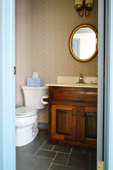
Here’s the half bathroom before.
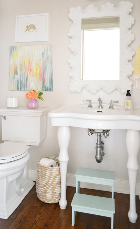
And here it is after we finished updating it. First we did an easy and affordable Phase 1 makeover to hold us over a few years before the real deal (we removed the old wallpaper, painted the trim & walls, painted the vanity, etc). A few years later we tackled our deeper makeover, which involved switching out the sink/mirror/toilet as well as repainting the walls and adding a glazed finish, which is all detailed in our second book. Sidenote: read more about why this is our favorite neutral wall color.
The Dining Room
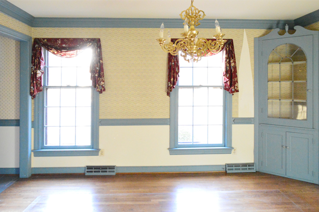
The dining room was full of more wallpaper and blue trim when we moved in.
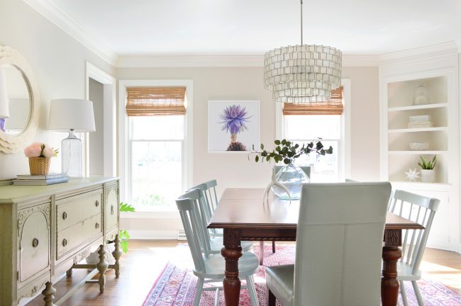
After over a year, all we had done was plop down our furniture and remove the wallpaper, but we knew that some Edgecomb Gray paint, furnishings, accessories (and some work on those corner built-ins) would add up to a room that’s a lot more peaceful & functional. We even added some colorful chairs, nice textured blinds, and splurged on a new rug and chandelier that totally make the space. You can find all the makeover details (and more shopping info) in our second book.
The Living Room
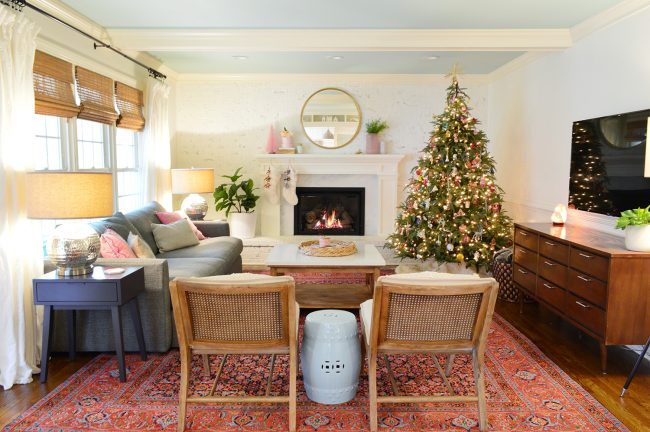
Here’s our salmon pink living room as it looked when we got the house.
We blogged about painting the walls and whitewashing the brick and later ended up painting all the dark trim & paneling to lighten things up even more. Next we painted the ceiling light blue and added a colorful rug to work with our neutral gray sofa. Some textured pillows, cane-backed chairs, window blinds, and a tripod lamp added interest, and we gleefully tackled a complete fireplace/mantel overhaul. You can get all the makeover details (and more shopping info) in our second book. Oh and when we couldn’t find a coffee table we loved for the space, we made one.
The Office
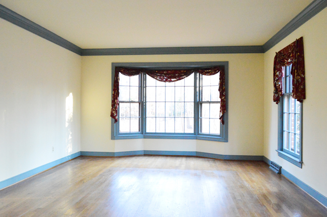
The office is a room that gets great light and we loved the bay window from first sight.
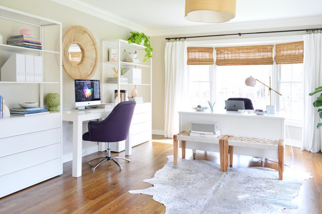
Here’s how it looks after cleaning/sealing the original hardwoods, painting all of that blue trim, adding a secondhand desk, and adding some bookcases for storage (so we could tuck our parsons desk between them). We also added a floor outlet under the floating desk and layered in some woven blinds, white curtains, a wood bench, a metallic rug, and super comfy tufted rolling chairs.
The Kitchen
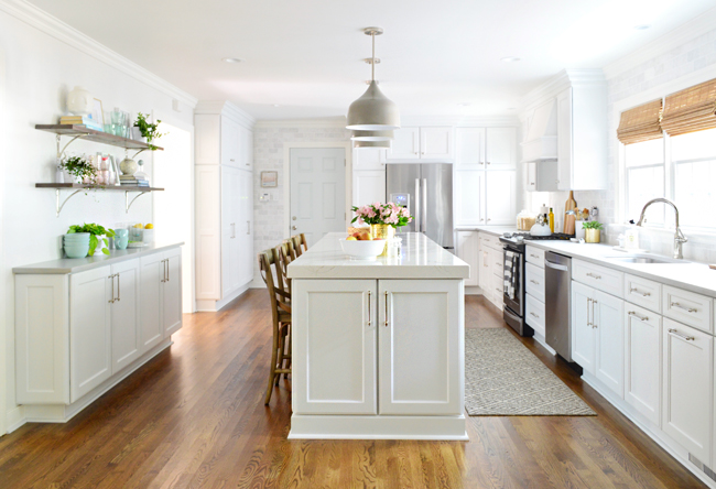
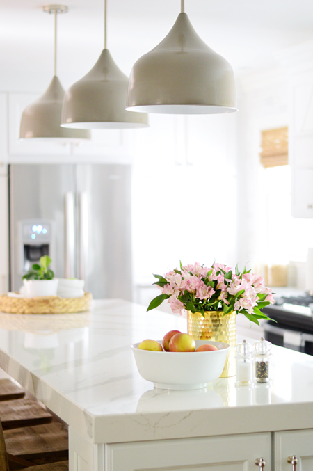
The kitchen was a really dark room with wood everywhere (on the cabinets, the walls, and even around the fluorescent light on the ceiling!).
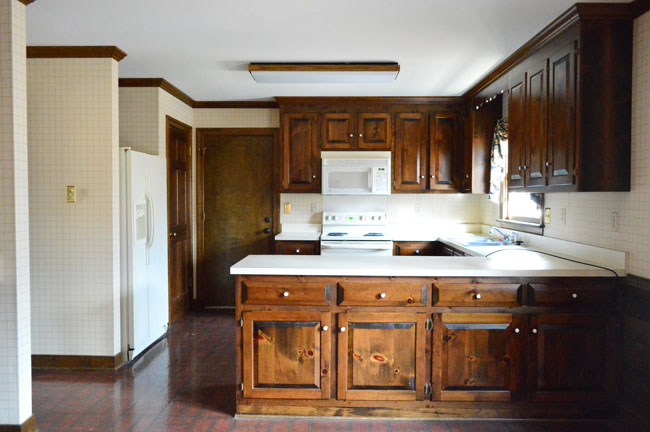
We like to live in a house for at least a year or two before doing any major kitchen or bathroom gut-jobs (so we don’t rush into choices we’ll later regret), but after a few years of small updates and living with what we had, we were pretty excited to tackle our biggest renovation to date. You can read all about how we planned the layout and added a hidden mudroom, demoed and rebuilt the space, and chose all of the materials and finishes for the room.
Kitchen Into Living Room
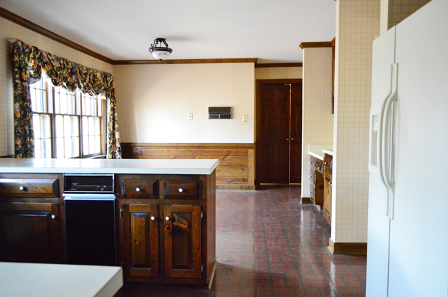
And here’s the old view of what you saw when you stepped in the door from the garage.
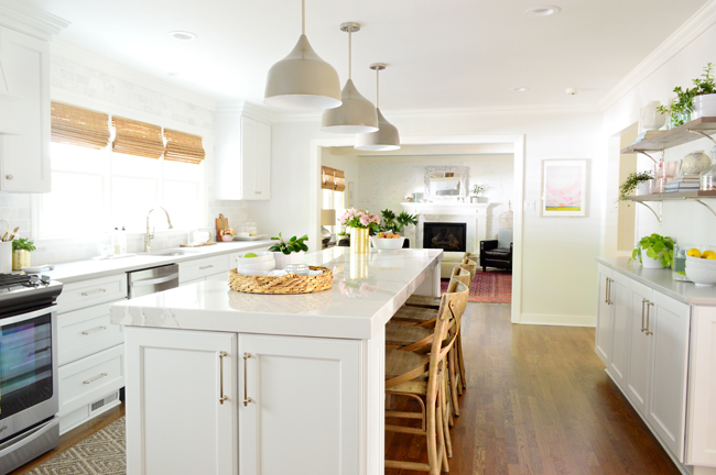
These days it’s looking a little different, thanks to knocking down that wall and completely rearranging the kitchen layout:
Living Room Into Kitchen
That view used to look like this (couldn’t even really see the kitchen):
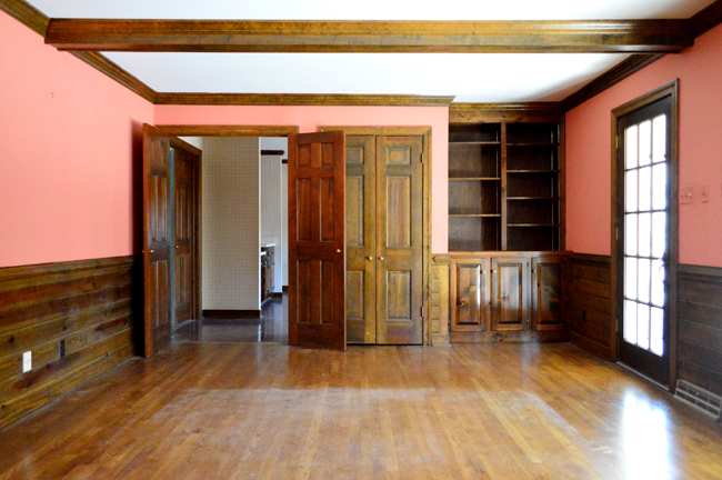
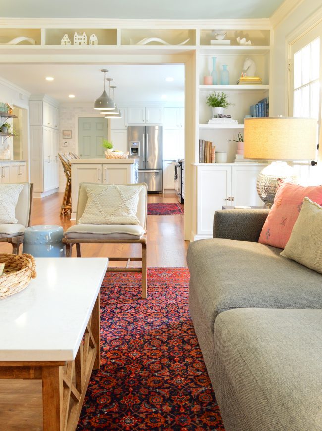
And now it’s nice and open. We especially love that we could add balanced looking built-ins for all of our books (with extra storage below).
Check out the video below for a full tour of the downstairs:
Our Bedroom
All of the rooms upstairs had old stained and threadbare carpet, and this room had some pinkish-cream trim going on too. Definitely felt a little less than fresh.
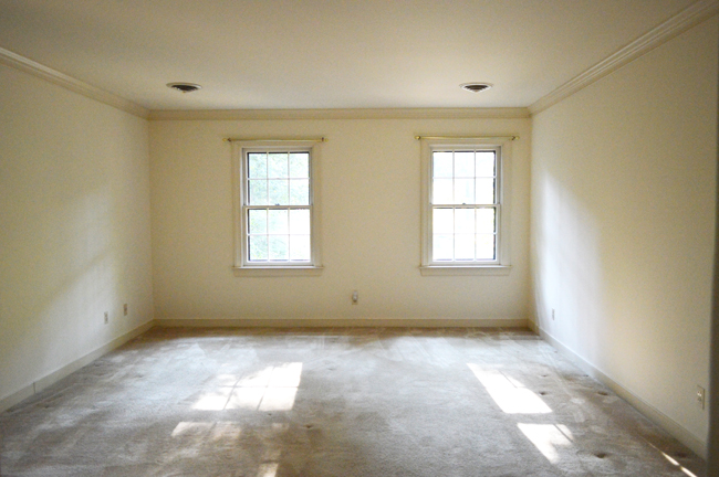
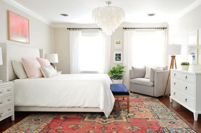
First we painted the trim/doors white and replaced the old carpeting with hardwoods that we laid right before we moved in and painted the walls Edgecomb Gray (you can find all of our house’s paint color details here). Then we hung some curtains, brought in a bench for the foot of the bed, added a chandelier & switched the bed, and got a new rug.
The Sink Nook
Beyond having a bathroom with a tub/shower/sink/toilet, the was an additional sink in a nook that was off of our bedroom. Here’s a before shot:
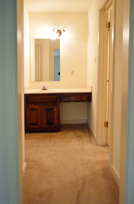
It took us almost 7 long years, but we saved up and squirreled away ideas and were so excited to finally renovate our bathroom. It’s unrecognizable! (You can read more on that makeover, including how much it cost & see lots more before & after pics here).
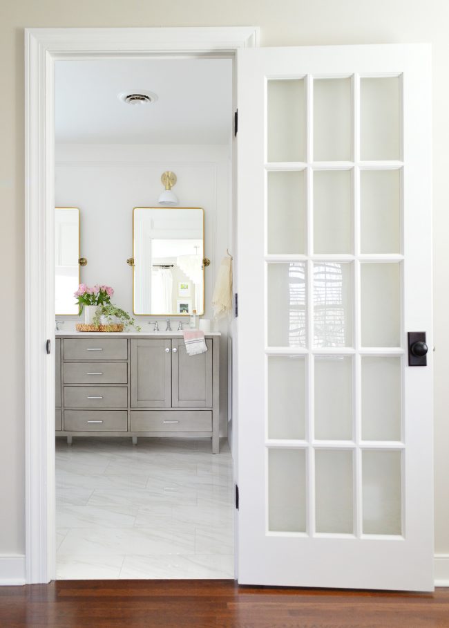
Our Bathroom
The room looked like this when we moved in:
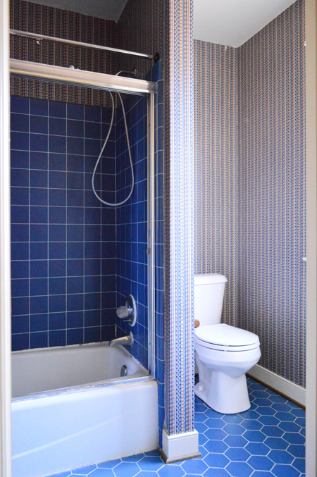
After we removed the old shower door & hung a curtain, as well as taking down the wallpaper, it looked like this (for like 6.5 years). Yes, there were tons of walls chopping things up along with two different types of flooring (and two single sinks that were separated by a wall!).
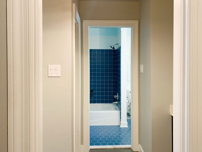
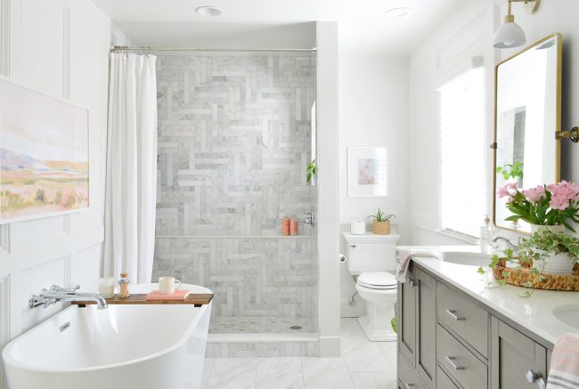
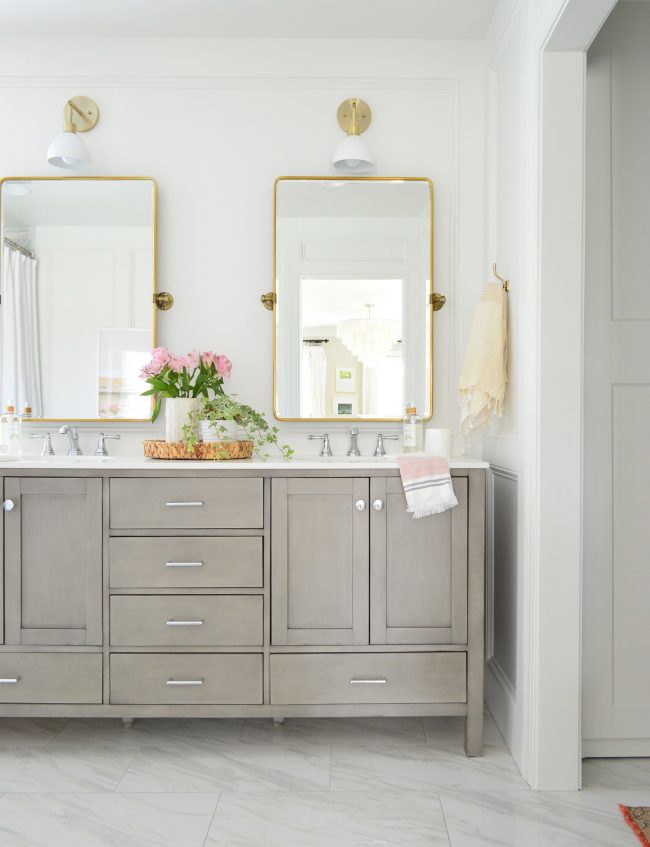
Boy did it feel good to open things up! The room has so much more light and tons of added function (a big double sink and a freestanding soaker tub – along with our favorite toilet). And the hinged mirrors over the sink are some of our favorite choices in the room, along with all of the marble tile that we laid by hand. You can read all about this makeover (including how much it cost, and see lots more before & afters here).
Our Closet
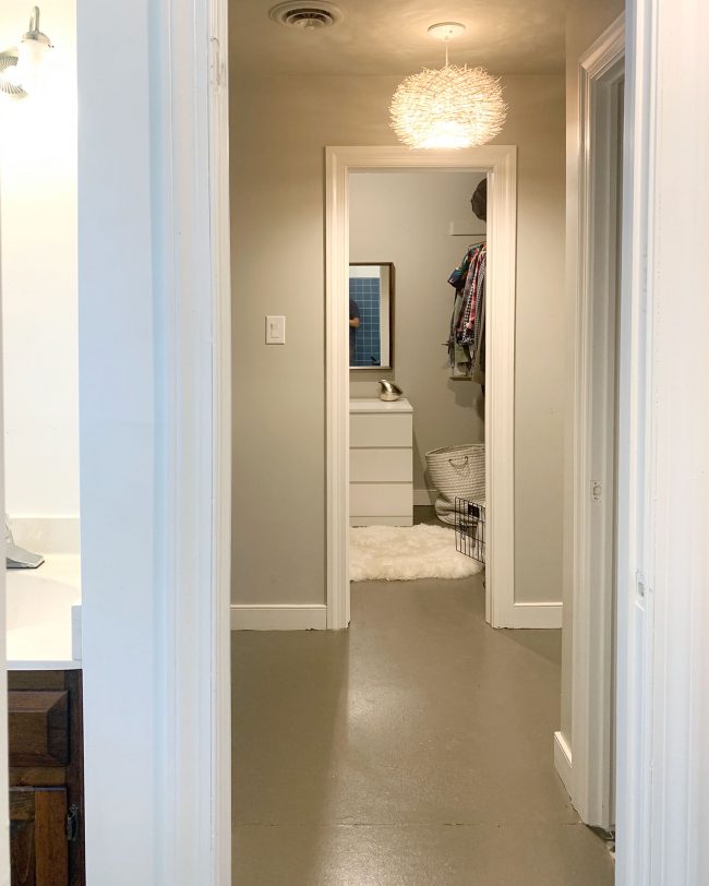
What was just a blank room with a very narrow doorway and few hanging bars…
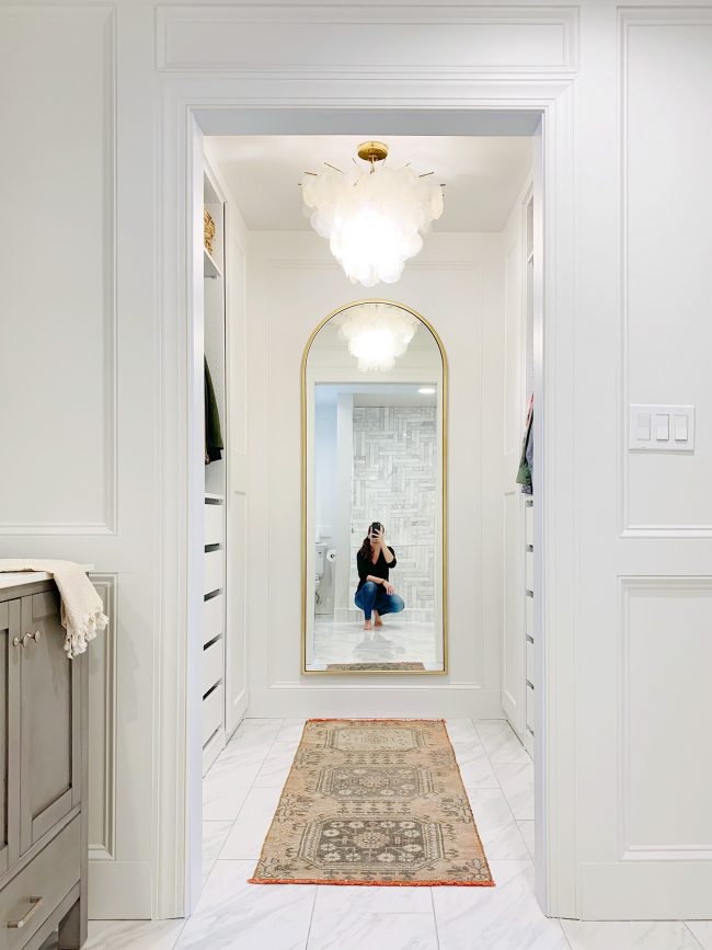
…. is now a nice custom closet (see how we made it here – complete with a video tour). The arched wall mirror and the capiz chandelier made a huge difference in the space, as well as gaining allllll that storage and adding a cozy secondhand rug (here’s a similar one). We have a spot for everything! You can tour the whole closet here.
Upstairs Hallway
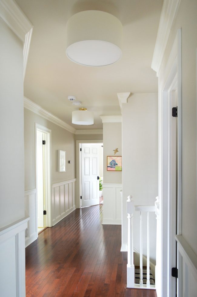
Our upstairs hallway is one of the most refreshed areas of the house. It just felt so dark and closed in before with the old carpet, blue trim and doors, and tiny rusted lanterns.
This is what it looks like after tearing up the old carpet, painting all the blue trim and doors, laying new hardwood floors, painting the walls, getting new light fixtures, new door knobs, and adding some wainscoting to give it a little more interest.
Upstairs Hallway (The Other Way)
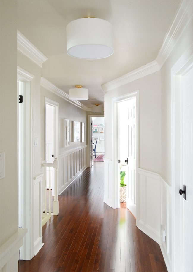
The other direction of the hall is even more of a change since it used to be “the dark side” (there wasn’t any natural light on that end – it just terminated with a laundry closet at the end of the hall).
In our biggest floor-plan-changing move to date, we took some pretty amazing inspiration from a reader named Lesley, and managed to gain a full fledged laundry room instead of just a closet. Plus we now get light (glorious light!) in that end of the hallway thanks to a new glass door that we added. It leads to a formerly unfinished storage room that was accessed by a side door, so after moving the doorway, we finished that space and turned it into a bonus room.
Our Daughter’s Room
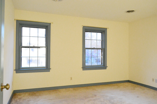
This bedroom had old carpeting and more of that blue trim going on when we moved in.
Here’s the room now that we painted all the blue trim, laid new hardwoods, and hung some curtains. We also painted the walls/ceiling and added crown molding. Then we painted a playful pink closet door and later updated the space with a new rug, a storage piece we built, and new side tables and a secondhand headboard that’s 100 years old.
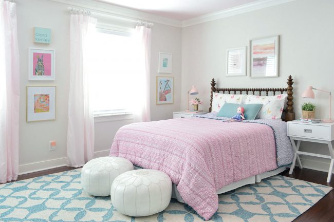
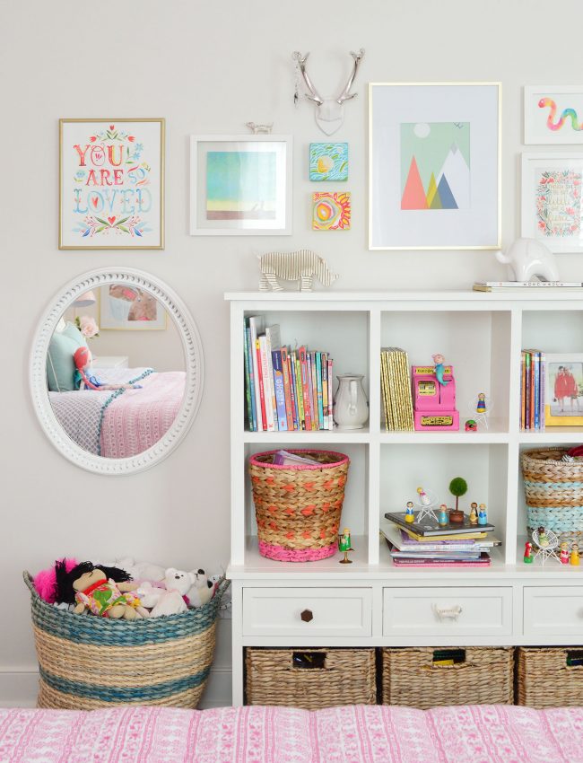
Plus we added a special vintage-inspired dresser that we designed from our Wayfair collection with a pretty pink inlay mirror over it. All the feels, guys. All the feels.
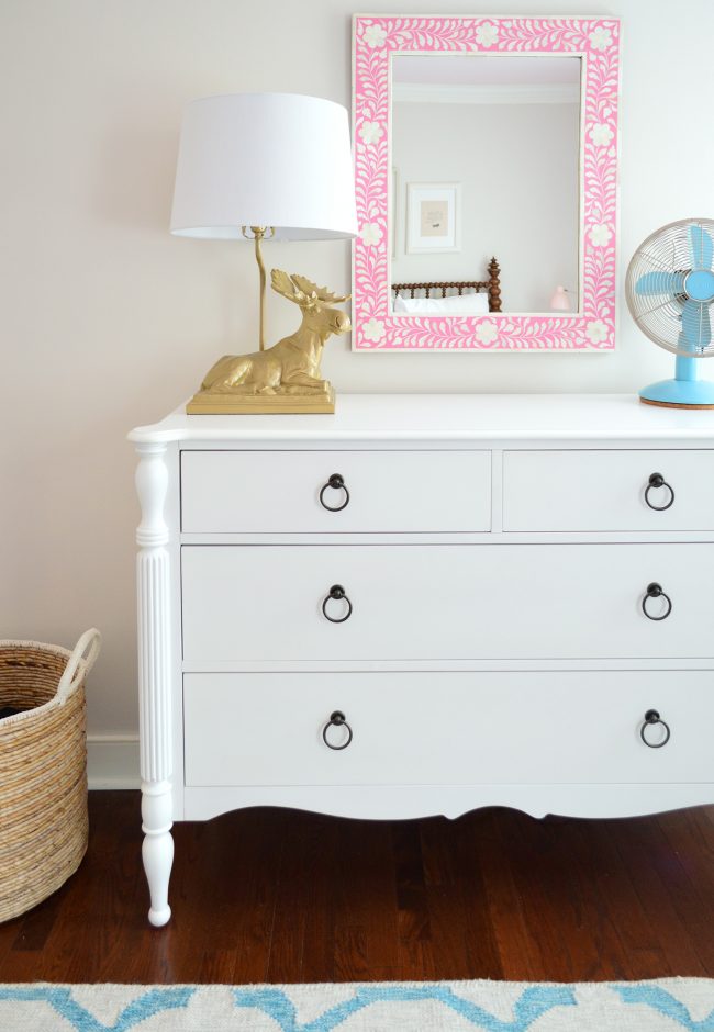
Our Daughter’s Closet
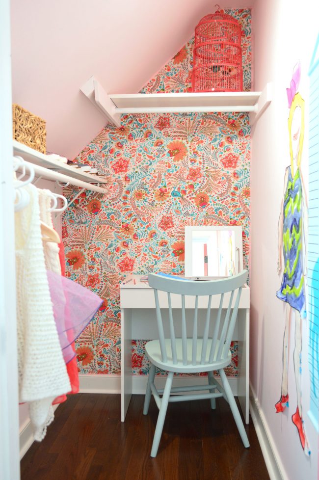
This pitched-roofed closet always felt like it had the potential to be a little hideaway within her room.
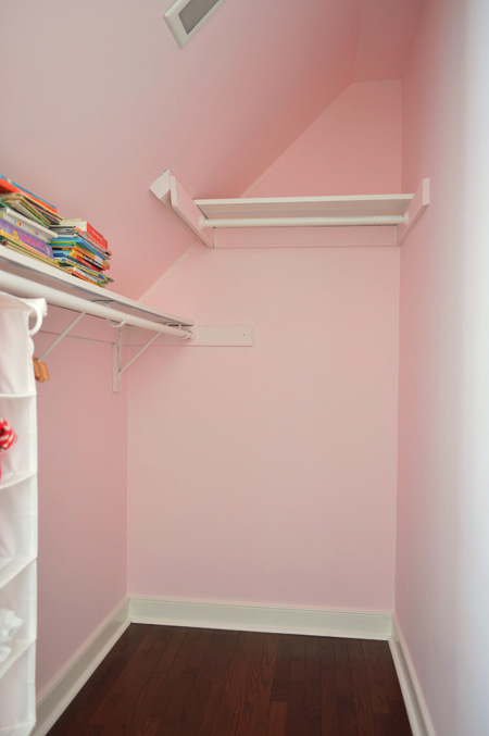
First we ripped up the old carpeted floor, laid hardwoods, and painted the walls the same soft pink as the ceiling of her bedroom. Then we brought in her dollhouse to create a little play area in the back, and upholstered that back wall with fabric. It was such a fun and easy project, and it’s one of her favorite spots in the house.
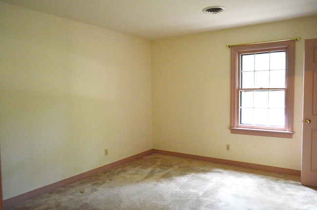
Our Son’s Room
This room started out with more old carpet and mauve trim and doors.
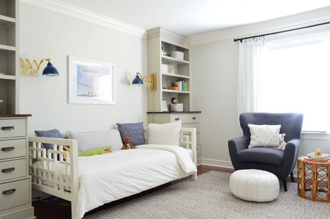
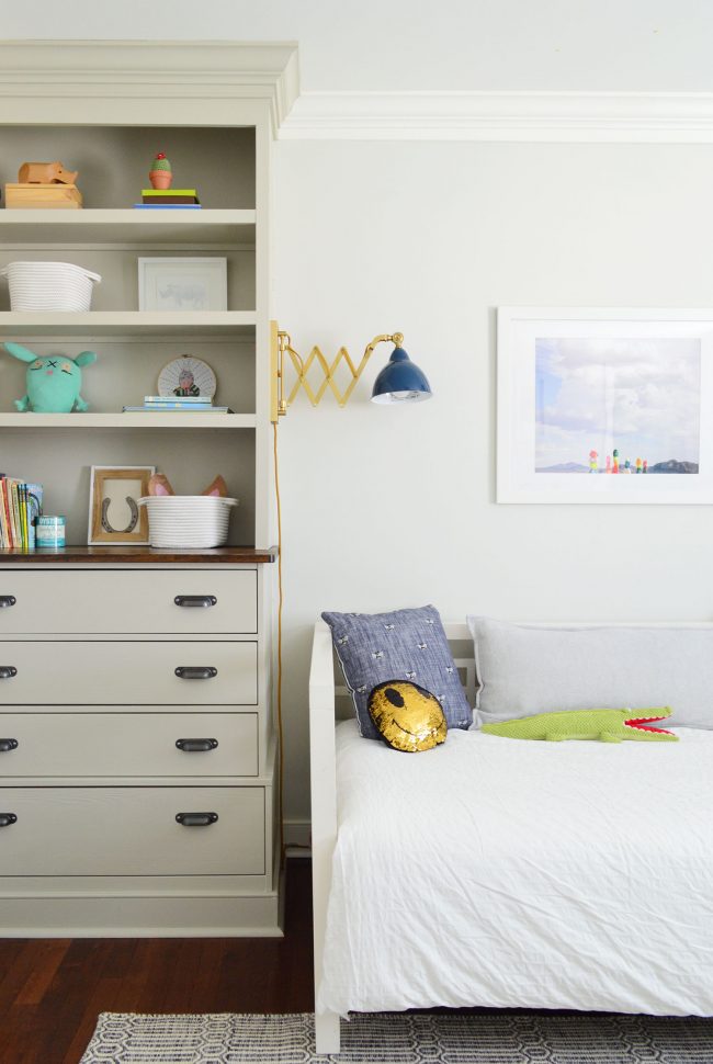
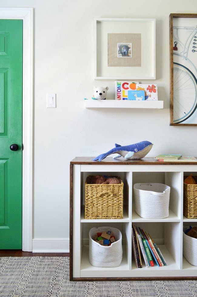
Here it is now that we painted all the pink trim, laid new hardwood floors, got a rug, added built-ins, hung extra thick crown molding, filled up the built-ins, added a cabinet for open storage, painted the closet door and hung art, and updated the room after he outgrew his crib (more on that here).
The Guest Bedroom / Art Room
This was another room with dingy cream trim and old carpeting like our bedroom.
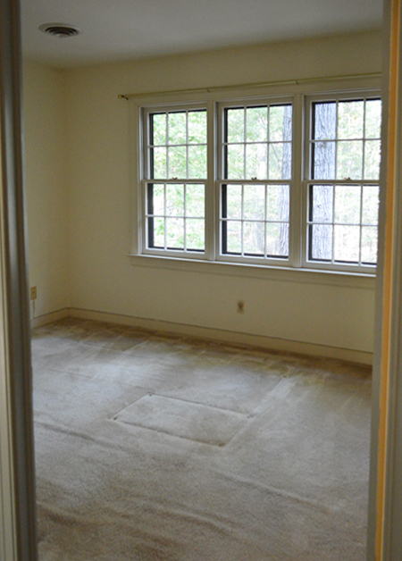
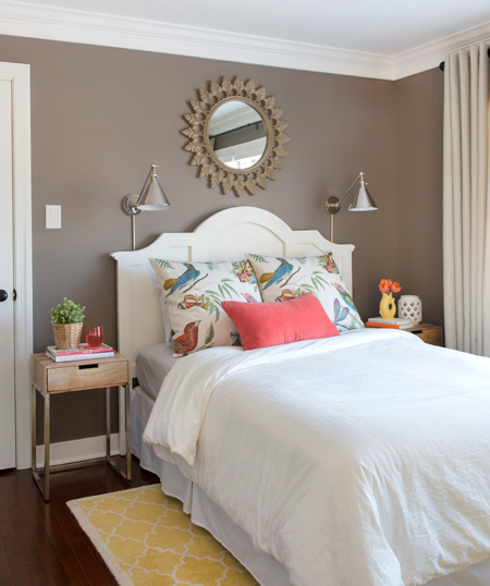
Once again we painted all the trim and laid new hardwoods. A little while later we dove back in and added crown molding, hung some swing arm sconces and a new mirror over the bed, upgraded the headboard, got new curtains, and some new pillow shams. We also created a craft/sewing area on the other side of the room so that space is used more often. You can get all the makeover details (and more shopping info) in our second book.
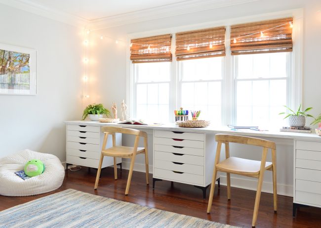
And then when we realized that we hardly ever used this room (like at all, what a waste!) we turned it into an art room that gets used every single day. Some inexpensive drawer bases and counters from Ikea plus a few cozy elements like the wood chairs, some woven blinds, and a blue rug (and string lights! Always string lights!) completed this super easy and fast makeover. You can read more details that transformation here.
The Hall Bathroom
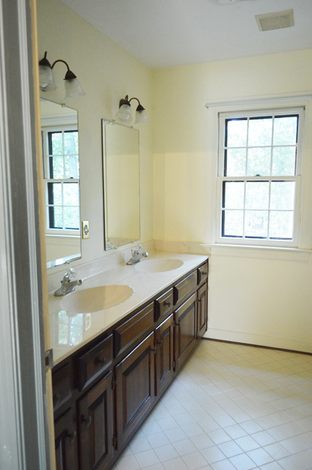
The hall bathroom upstairs originally boasted two shell shaped sinks (we had five of those total in this house), along with some dinged up cabinets and old mirrors screwed right into the wall.
First we added some new mirrors and hung the shower curtain nice and high (grab an extra long shower curtain and see how much of a difference it makes in your space!). A fresh coat of paint on the walls also helped a ton, along with new cabinet hardware, and some colorful art and accessories to cheer things up.
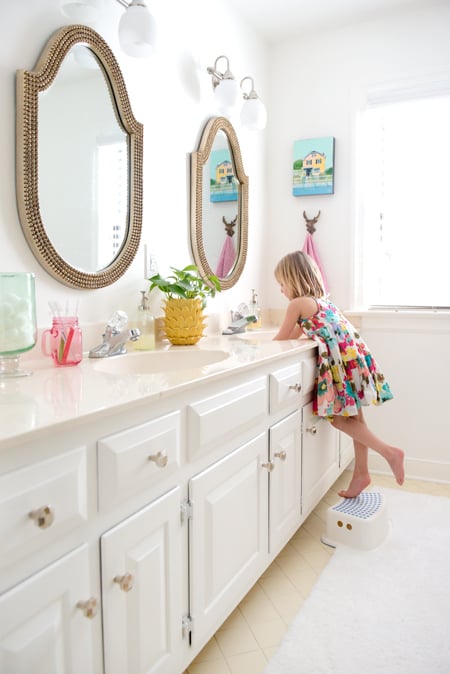
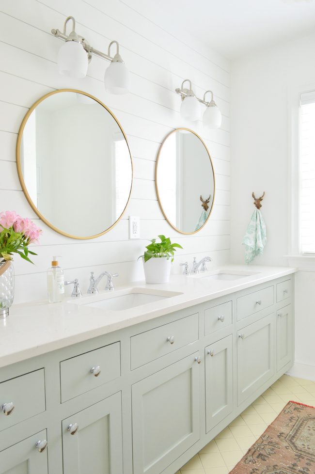
Eventually we redid things a bit more, although we loved keeping the original yellow floor and shower tile. They felt nice and updated, thanks to springing for some new cabinet doors and a new quartz countertop for the double sink vanity (keeping the same frame saved us tons of money and dust – more on that here!). And some fresh planked walls, a few affordable gold mirrors, and new faucets completed the update. This room is so happy now.
Laundry Nook
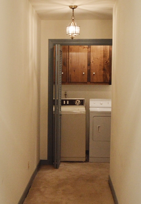
This is the laundry nook at the end of the hall as it looked when we bought the house.
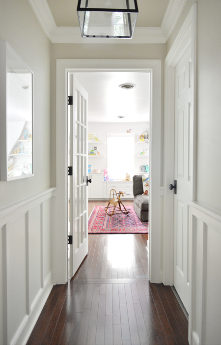
… but that part of the house looks like this now, since we shifted the laundry area to the right (behind that closed door you see below) to give it more space and to create a bona-fide room. This also allowed us to transform the unfinished storage space above our garage into an awesome family bonus room, which you access through this pretty glass door that we added. But we’ll get to that room in a minute.
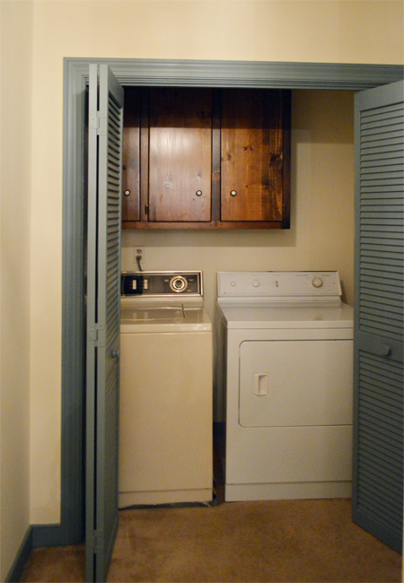
Back to our laundry room. Before we shifted anything it was a small closet at the end of the hall.
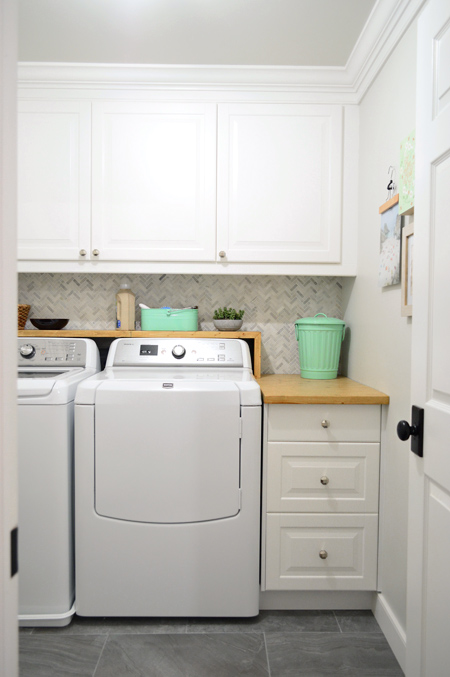
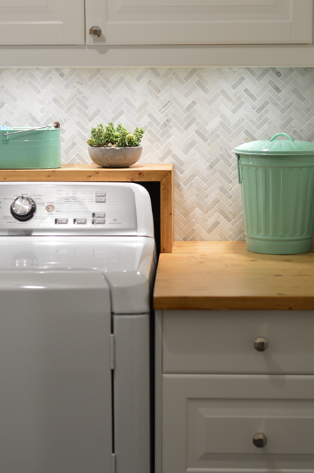
Then we got new appliances and decided to reconfigured the entire layout. Here’s a post full of laundry room finishing touches & details, and this one links to most of the previous steps of the project (some of our favorite touches are the backsplash tile, the mint green trash can and bin, the laundry sorter, the drying rack, and the wooden pants hanger that we used to hang art).
Bonus Room
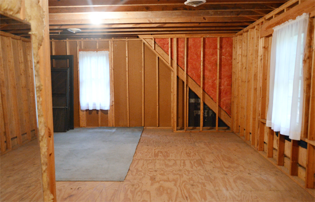
This was the bare unfinished storage space that we started with, which lacked obvious necessities like insulation, drywall, and flooring (the door used to be here in the back corner of the room).
When we moved our laundry room, we got much easier access to this room from the end of our upstairs hallway (you can read more about how we finished this room here with walls, hardwoods, and a much bigger window). We’ve loved gaining 360 square feet of livable space, and extra function with some built-ins & shelving in the nook, and a wire-free TV wall across the room. Things like a patterned rug, sofa cushions, butterflies on the wall, and crisp neutral curtains also made a huge difference. Here’s a post with all of the other decorating details about the space.
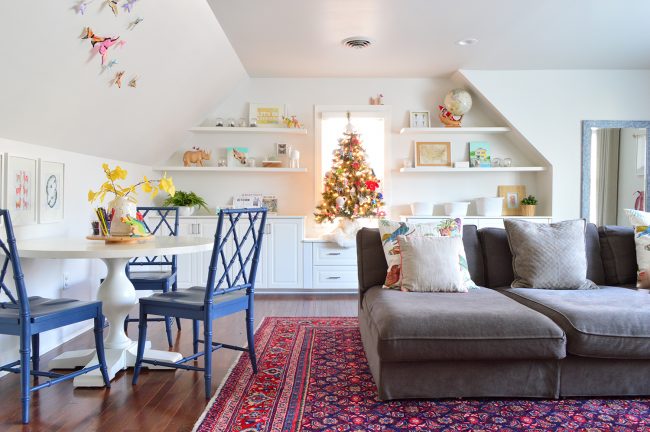
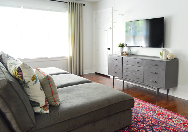
And if you want to see a tour of the upstairs, watch the video below:
The Veranda (said ironically with a fancy accent)
This area started out as a fishbowl-feeling sunroom full of old carpet. Nearly every sliding door was broken, so it sealed us off from the outside world, and the glass doors were constantly fogging up to obscure the view.
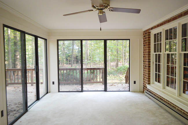
We realized that opening it up to this space to create a back porch of sorts would add a lot more function for our family (now there’s a shaded area with easy flow to the rest of the backyard), so we ripped up the old carpet and removed the old broken doors. We also lofted the ceiling as well as installing a blue beadboard ceiling, hanging two fans, and laying some outdoor-friendly tile. Then we got/made some outdoor furniture and hung some outdoor sconces for evening ambiance.
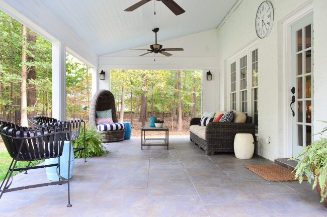
The Back Of The House
The back of the house was pretty brown looking thanks to the rotting roof and the cream trim & siding.
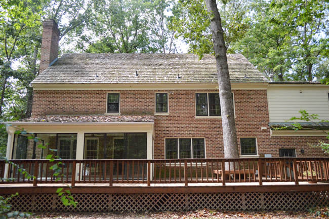
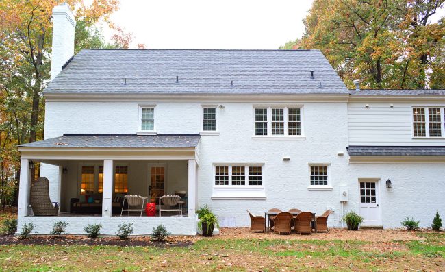
We love the new darker roof for making the house feel more dimensional and balanced. But the biggest changes for sure were ripping off the old rotting deck, and painting the house white, glorious white.
The Backyard
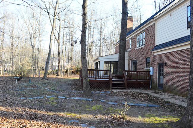
The backyard was a little lacking in grass when we moved in, so we knew we’d have some leveling and seeding to do.
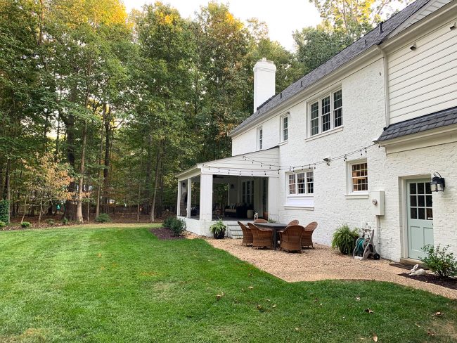
So we leveled the yard and seeded some grass and added a little pea-gravel patio out back (to avoid a mud pit where the old deck had been – more on that here). Hanging up some string lights over the table makes it super cozy, and painting all of our exterior doors Tranquility by Benjamin Moore (to match our front door) was a fun project too.
The Shed
What started out as a corner of the backyard where we felt the most exposed to our backyard neighbors (especially when all the trees drop their leaves in the winter)…
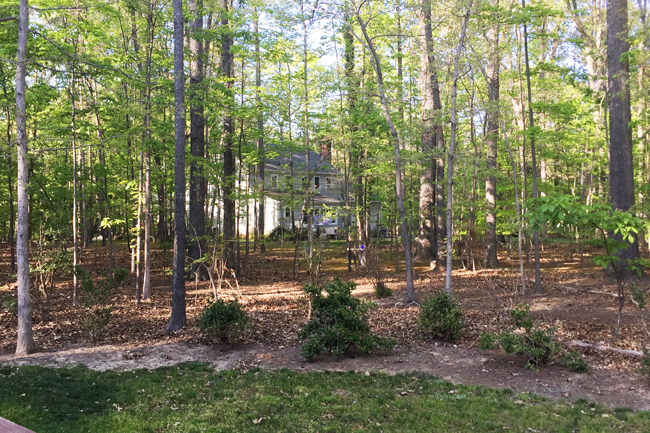
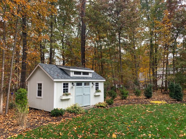
… now houses our shed, which not only looks pretty darn cute and provides some great privacy, it also contains all of our tools, so we can work in there without coating everything in the garage with sawdust like we used to. You can read all about our shed selection process here (it also covers how we built that step, added sconces, and picked lighting for the inside). And then when we painted the house white, we made the shed match, so here’s the post about that (along with adding new lights and window boxes).
So yes, that is a lot of projects and work and time spent updating every inch of this house, but it all evolved over seven whole years (Rome wasn’t built in a day!). We’ve learned just to take things one day/project/victory at a time to avoid getting too overwhelmed. And seriously, is there anything more fun than crossing things off of a giant list? (NO. The answer is NO).
Psst- Wanna know where we got something in our house or what paint colors we used? Just click on this button:
*This post contains affiliate links, so we may earn a small commission when you make a purchase through links on our site at no additional cost to you.
