2, 4, 6, 8, Who Do We Appreciate? Planning!
And why do we appreciate it? Because we get burned when we don’t do it. At least we did on the frame arrangement we just hung above our sectional.
Here’s the story. We’ve always planned to take the big empty space above Karl and do a grid of large picture frames. We sort of envisioned it as a larger version of the frame grid that we hung above the couch in our old den…
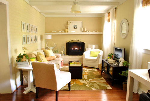
… but instead of 8 x 10″ frames we’d use oversized 20.5 x 20.5″ Ribba frames from Ikea for more impact (since we already own and love four of them – and they’re just $19 a pop).
After some rough math and holding up a couple of the Ribba frames that we already owned, Sherry and I determined that we wanted to do a grid of six frames (two rows of three) to fill the space in the middle of wall, allowing for some empty space on either side for two table lamps that would sit on the future console table that we’ll eventually build to go behind the sectional. Note: we moved the 5 x 8′ Pottery Barn rug into the guest room for my in-law’s stay, and it will eventually live there permanently, we just brought it back into the living room until we upgrade to a bigger rug, since we’re currently guest-less and Clara appreciates having a soft place to play.
Anyway, back to the frames. We went to Ikea, bought six new Ribba frames (they sometimes vary slightly in color, so we figured it would be safest not to mix and match old frames with new ones, and we have a ton of other spots for the four that we already own) and headed home to begin the whole hang-it-up process. When we got home with our six new Ribba frames from Ikea, I suggested that we tape up some paper to figure out how high we want them to hang and how much space to leave between them. After all, we both know these things are worth planning out. And luckily the paper that comes in the frame is almost perfectly sized to help you figure this out. So we started with two sheets to see how high to hang them.
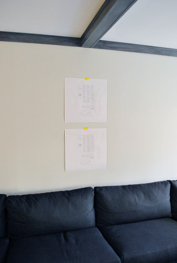
This is where things veered off course (thanks to me, I’ll admit). Sherry suggested that we tape up the other four sheets of paper to make sure we liked how all six looked together. Maybe I was just an eager beaver and wanted to get to drilling. Or maybe I decided we should blow it off because we had already accidentally thrown away one sheet of paper to complete the all-six arrangement. Whatever it was, I reassured Sherry that it would look just fine and we didn’t need to be all paranoid and hang the remaining three sheets to double-check everything. Famous last words.
She believed me (albeit hesitantly), so I started drilling. Insert happy testosterone filled sound effect here (there’s nothing like a little afternoon drilling). It wasn’t a fast process to measure, mark, and double check everything to make sure it was all lining up, so maybe an hour or so later I had five out of six frames hanging on the wall.
That’s when Sherry broke the news that the arrangement wasn’t big enough. We needed eight frames. As much as I hated to admit it (for more than one reason), she was right – the five frames looked too small on the wall (and adding the sixth wasn’t going to help). They floated awkwardly and just didn’t have the impact we wanted.
**I’d insert a picture here of giant Karl sitting awkwardly below those poorly placed frames but I was too pissed/disgruntled/ashamed to snap one.**
This was all my fault. Had I taken the time to tape up all of the sheets of paper we would’ve realized it before I put a single hole in the wall. I even would have taken a picture of the taped-up configuration to show you what a learning process taping them all up on the wall can be, and how grateful we were to have taken the time to complete that first to save a step. Duh, John. Grumble, grumble, grumble.
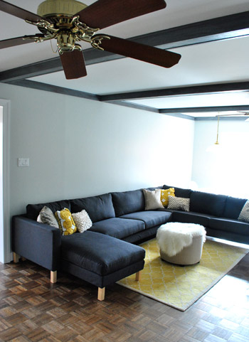
The next step was to take down the five already-hung frames with a big ol’ sour face and begin re-measuring everything so that eight frames would be centered above the sectional (and on that middle ceiling beam). Then came the not so fun process of not only removing the ten screws that were already in the wall (I was doing two per frame to be safe) but marking, drilling, and screwing in an additional sixteen. And since we already had two old Ribba frames that happened to match – finally, a lucky break – I was able to hang all eight frames in place without another four-hour-round-trip to Ikea, leaving us with this:
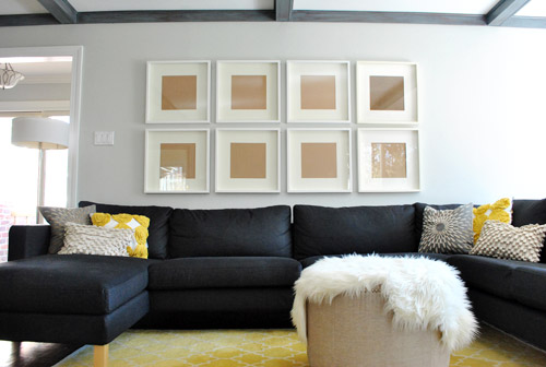
We definitely needed all eight frames. They should be just right when we add table lamps on either side of the arrangement after I build an über long console table.
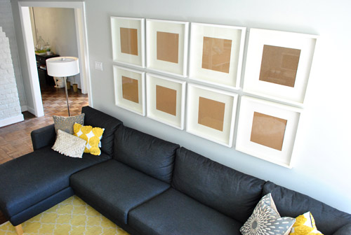
We’re still debating exactly what to put in them (maybe family photos? maybe something more graphic?) but we’re certainly glad to have the whole frame hanging part over with. Even if it involved a lesson learned the hard way. At least it was a mistake that only took time and energy (and a bit of humility) to fix. You know, as opposed to a big wad of cash. Oh and speaking of time and energy, there are still some holes and pencil marks from the first attempt that need patching. Sigh.
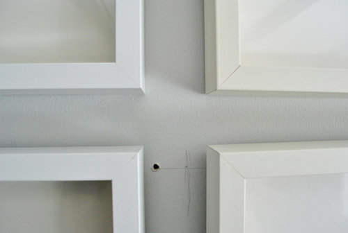
Wait, who am I kidding. That’s Sherry’s department. Have fun with that babe.
What about you guys? Surely we can’t be the only ones who’ve made the mistake of not planning well. Or maybe we are. But we’d love to hear some of your stories if you’ve got ’em. Bad planners unite!
Psst- Speaking of frames, we found a really cool one for displaying kid art (or any art that you like to rotate out without taking it off the wall and removing the back). Check it out over here on BabyCenter.

Jess says
I am so glad to see two people who I SO admire make the same mistake that I have made so many times! It makes me feel better that I am not the only over-anxious ready to take the plunge person. Love the end result! On another note, Clara is so precious!
MaryBe says
I absolutely adore all your projects! I get so many great ideas from you. But I have to say (and I apologize for it) that the parquet floors really distract me. I think you’ve mentioned redoing them? I would love to see them with a dark stain.
That video of Clara reminds me of the joy I felt the first time I went to Ikea
YoungHouseLove says
Yes- we’d love to refinish it in a rich dark stain! Admittedly it’s probably not something we’ll tackle tomorrow, but someday!
xo,
s
Laurie says
When I hung a grouping of disparate bronze-ish frames above my couch I did like you and just hung empty frames and filled with art afterward. However, I didn’t quite get around to filling them soon enough and had a large party in the meantime. Not a single person commented on my artful arrangement of more than a dozen tonal brown backed 11×16+ frames in the middle of my living room except to say they looked nice. I think they assumed that it was some abstract piece of wood/brown paper art.
elle says
Is your blog struggling? I unfollowed long ago but subbed again when you bought your new house, thinking it would get better or more interesting. Please stop moving that damn rug. And also, your readers are mostly adults that can assume that colors look different on their computer monitor than they appear in real life, they don’t need to be reminded every. single. time. you post a picture.
HTH!
YoungHouseLove says
Nope, our blog doesn’t seem to be struggling to us, but feel free not to drop in on us if we’re not your cup of tea! We explained that we moved the rug back in there temporarily for Clara’s comfort, and that’s a good enough reason for us! As for the computer monitor color thing, we didn’t mention that in this post (although we do occasionally bring it up since we’re such visual people and chronic over-explainers) but either way, no need to read our blog if you hate it! Haha. We hope you find a blog that you love – and happy decorating to ya!
xo,
s
Ames says
Oh my gosh, how rude! Why is a comment like this even necessary? Clearly their blog is doing well, it gets more and more popular every day. Also, this is their HOME, they can move the rug as many times as they like. And from the amount of comments they get asking about things like the true paint color in their dining room, clearly the reminder that things look different on each monitor is a helpful one.
Yet again, the graciousness that Sherry and John show when replying to comments like this is truly amazing! I would have snapped long ago :)
jenn says
you know if they didn’t say why they moved the rug at least five people would ask. this saves them repeating a comment over and over.
it’s a rug, get over it.
Erin C. says
ew. please “unsub” again.
Stephanie says
WHAT is with people???? How are you supposed to answer such a snarky question??? The gall of some people. It’s one thing to offer an opinion or constructive criticism on a design choice, since that might lead to a new idea, layout, etc. I fail to see why a comment like Elle’s above is EVER necessary. If your blog annoys her so much, why would she keep reading? You guys are great.
Jacqueline says
Elle, just a little something for you to meditate on…
“Harsh words are like hailstones in summer, beating down and destroying what they would nourish were they melted into drops.”
J & S: For what its worth, I think most readers understand the practicality of adding brief reminders and explanations to your posts. I actually enjoy getting a glimpse into your thought process. As someone who is new to this whole decor/DiY game, knowing why you do something actually helps me flesh out my own ideas.
I know I’ve said this before, but I think it bears repeating. I am in awe of your tact and grace when responding to commenters who have less than kind things to say. What a wonderful example you will be setting for Clara.
Kristin F says
Sherry and John stay classy! :)
Kathryn says
If you don’t have something nice to say……
Also, everything you said was really dumb, Elle. We love you, John and Sherry!
Melody says
I’m sorry it was such a rocky road, but the frames look amazing above Karl!
carrie says
I love it that you share your project foibles and successes!
I think it’s a happy accident that you have eight frames and your last name has eight letters–perhaps that’s what should go in those frames. Funky, tie-it-all-in prints of the letters in your last name!
YoungHouseLove says
Haha, that’s too funny. We never thought of that!
xo,
s
ginai says
aww Clara is a lovely baby!!! ((:
the new frames look great! I love your new house so much! and it seems everything that you and John do to it make it more lovelier and lovelier each time! I am YHL obsessed!!!!
Love you guys!!! Burger too!!
ginai
Ingrid says
We are in Sun Valley on vacation and had to bring the laptop to get my fill of design blogs!! The frames look great! I think the same thing would have happened in our house. My husband would have thought he had it all under control and I would have wanted to plan it out! That room is coming together great! I love those frames from Target and will be off to get some when I get back to hang my girls art. What a genius idea, I wish I would have thought of it!
Kristin F says
I just finished doing a wall collage with a mixture of frame sizes over my desk. Hubby took one look once they were all hung and announced he didn’t like it. Well, sorry Charlie, those are holes in painted wood paneling, I am NOT taking it all down. My problem though was getting them all evened up. I had lined them all up on the floor and took a picture so I knew where I wanted to hang everything for symmetry but didn’t think to use the sheets from the Ribba frames I used up on the wall. I’m petrified to do a 2 lines like you have….how do you measure it all to make sure it’s straight? I measured from the ceiling down, taking into consideration where the hangar on back of the frame was, and they still weren’t completely lined up correct. Some tutorial on that would be great as I want to do another pic wall in the LR after we paint it.
YoungHouseLove says
We use a level and try to measure from one hole to another to keep them straight. Admittedly it’s a bit of trial and error for sure!
xo,
s
bridget b. says
a trick that i learned (on yhl, if i’m not mistaken) was that when lining up pictures vertically , you can get straight lines every time by hanging a pencil on a string from the top picture’s nail. the weight of the pencil will make the string form a straight line to where the bottom nail should go.
bridget b. says
oooohhh, love it! it almost looks good enough to leave as-is with no pictures in the frames.
stuff like this happens to me ALL.THE.TIME. even with planning.
like the time i wanted to install knobs on my bathroom vanity drawers. i centered and measured and drilled through the drawer faces…only to discover that a)the drawer box already had a hole in it for inserting a knob, and b) it didn’t line up with my carefully centered and measured and drilled hole. GRRRRR!
thanks for sharing!
BarbaraB says
It looks amazing even w/o photos. Love it!! And the video of Clara in IKEA was adorable and almost as cute as Surprised Kitty. I’m sure you’ll disagree. LOL.
YoungHouseLove says
Adorable. I’m dying.
xo,
s
Mindy@FindingSilverLinings says
Thanks for the constant inspiration! This post was just what I needed. We are hosting a party of about 100 people at our house next week & I’ve been scrambling to fill up some of the monstrous wall space we have.
That desperate post with pics:
http://fisilis.wordpress.com/2011/03/03/thats-a-whole-lotta-wall/
This just might do it (plus the closest Ikea is a 10 minute ride away!)
Thank you again!!
xo
Mindy
liz @ bontempsbeignet says
Eight looks great! And HAPPY MARDI GRAS!
Erin says
Your frames look great! I can’t wait to see what you put inside them! I recently created a gallery wall with vintage prints I found online for free (the prints all had expired copyrights).
My post provides links to some of the sites I found to get my prints; if you decide to go this route you should check it out! :-) http://stillwaterstory.blogspot.com/2011/02/how-to-create-and-hang-any-gallery.html
YoungHouseLove says
Love it so much! Thanks for the link!
xo,
s
Elizabeth says
Hey J&S did you notice what was on the wall in this pic from that previous link?
http://2.bp.blogspot.com/_cvQ0O6DvUyw/TDvtQ5dMYoI/AAAAAAAAGNU/4gi2kDxLsZY/s1600/beautiful-blue-living-room-white-combination-elegant-design-idea-sofa-cushion-combination-rug-chequered.jpg
YoungHouseLove says
Haha, too funny! Love those navy mats!
xo,
s
braelin says
I have to admit… I was skeptical about this room… UNTIL I saw today’s post. To me, the frames really make it all come together. Now I can’t wait to see what you put into the frames themselves. I’m also pondering how/where I could do a grid arrangement… hmmm… Love the blog!
YoungHouseLove says
Aw thanks! That’s one of the hardest things about blogging in real-time as we go. Trying to explain how we have all these ideas for a room that’s so obviously odd looking and in-progress. Sometimes we wish we were an HGTV show that would have a big reveal at the end of every post. Realistic, right? Haha. Anyway, so glad it makes more sense to you now!
xo,
s
the S's Beach House says
No don’t have a big reveal at the end of every post! It makes me feel better about my half done wallpaper project in our master bedroom for the past few weeks!
Courtney says
I love how the frames accent Karl. It’s amazing to see this room transform! I really like the floor lamp next to Karl. Is it an IKEA find?? My husband and I purchased our first home in October and we love YHL……major inspiration!
YoungHouseLove says
That’s actually from Home Depot a while back. They might still carry them!
xo,
s
Charlene @ Sweetchic says
AHHH! Clara is soooo cute! Her excitement for decorating and home stores must run in her blood :)
YoungHouseLove says
Hmm, good theory. I think it must be true!
xo,
s
Sadie says
If someone already asked this, I apologize, but how far apart did you put each frame? Do you follow a general rule of thumb? I read that Sarah Richardson suggests 4″, but I suppose the size of the frame could make a difference.
YoungHouseLove says
We just eyed it without thinking about rules, but they ended up 2″ apart. Hope it helps!
xo,
s
julie g. says
Looks great!!! I just did the same thing yesterday in our hallway. It was the first time that I cut out paper to plan out the arrangement and then taped everything to the wall. One that was done it was a breeze. The first time I ever got hanging right without a bunch of nail holes!
casey says
I LOVE everything that you guys decorate. This dramatically transformed that space and I never would have thought to do something like that. Seriously, can I have like a tenth of your creative brain juices…my house would finally come together, I just know it! lol;0
Michelle @ Dream Home DIY says
We are so guilty of the “act now think later” phiolosphy. Suprisingly we have not yet learned our lesson. *sigh* hahaha
Elaine says
Love Love Love Love Love that you are raising Clara to be an IKEA girl! You’re doing it right!
Angie Nikolas says
At one point, shortly after moving into my first home, my dad took away my hammer. I had not planned a few too many times and ended up with the majority of the things I had hung on my own being framed by pretty little “mistake” holes and / or pencil marks.
He got tired of helping to right the wrong, so he took away my hammer until I learned appropriate planning and measuring.
Happy to say, I’ve earned my hammer back!
Janina says
HOw about taking the matting out and hanging maps in the frames? If not go for some graphic art with color. Photos are too “Pottery Barn”. you guys are beyond that now.
YoungHouseLove says
We do love maps so it’s definitely a possibility!
xo,
s
Monica V. says
I’m really glad you posted about this because I’ve been meaning to do a similar arrangement over our couch, and was wondering what the size of those original frames you had was. Are those from Ikea, too?
Also, Clara should definitely be Ikea’s new spokesperson! She’s such a cutie!!
YoungHouseLove says
Those were 8 x 10 frames from Target. We actually registered for them when we got married!
xo,
s
heather says
I imagine Clara’s reaction to Ikea will precisely be Sherry’s reaction when the furniture God’s bless the dining room with 8 apple green leather parsons chairs!
YoungHouseLove says
Haha. Yup, times ten. I’m going to be a crazy lady.
xo,
s
Jessica says
Did y’all get anything else while at IKEA on this trip or are you saving that for a future post? ;). We have the same issue in our living room (blank wall) but we’re in the process of picking out a new couch.. and its starting to drive me mad! We just need to pick something.
Also I have a question regarding th Richmond typography map Sherry bought John. Did y’all get it framed yet? Where are y’all going to out it up? We have one (and love it!) but I still need to frame it. I decided on a silver frame and its home will be above a replica Eames rocker. I’d love to see where you put yours!
Jessica
YoungHouseLove says
Nope, we were in and out for frames while visiting John’s parents. We sneak in 30 minute Ikea trips whenever we can! Haha. And nope, we haven’t framed the type map of Richmond yet but we can’t wait to do that. Still not sure what room to put it in!
xo,
s
KellyD says
Glad to see you mentioned family photos! I was just wondering the other day why you guys havent used them more. I was feeling a bit like a crazy lady because, since having my 5 month old boy, my walls and shelves went from being empty (I don’t decorate but I love reading about it) to COVERED in family pictures. I smile everytime I look at them! There is so much you can do with them…black and white, canvas wraps, closeups, etc.
Kat says
Clara is the most adorable, happy baby!! She brightens up my day whenever she makes an appearance on your blog.
Barb says
Don’t beat yourself up John…we all have moments like this. EVERYONE!!! But it looks great (the frames all up on wall) BRAVO!! Brilliant. I vote for the black and white FAMILY photos!!
Questions for both of you…… here I go again.
1. John: when you went to your high school in t he DC area did you ever take EARTH SCIENCE from a teacher called Dennis McFaden…..my brother-in-law.
2. Living in the Bon Air area…was Clara born at Chippenham Hospital? We lived there and that is where my 2 kids were born.
Just wondering about both Q’s…hope to hear back.
B.
P.S. Nice post today!!
YoungHouseLove says
Hey Barb,
Aw man, nope to both. So sorry! John didn’t have Dennis McFaden in northern VA and Clara was born at Henrico Doctors Hospital here in Richmond. But Dennis sounds like fun, as does Chippenham Hospital (where both of our nephews and our niece were born). Hope it helps!
xo,
s
Lindsey says
I am such a bad planner that I have been known to use my wedge heel to pound in nails and hang a picture as I am walking by.
Jacqueline says
Ha! Last week I was giving our hardwood floors a final check before we got them refinished, and my fiancé caught me hammering in a rogue nail with my stiletto. BUSTED!
YoungHouseLove says
That’s my kind of girl. So resourceful! Haha.
xo,
s
Zoe Feast says
How about a selection of scrap booking papers as art work? I framed a couple recently (in Ikea frames) when I did some before and after magic in a grotty basement room. Now I have a penthouse. Check it out at
http://www.indigoimage.com/wpblog/2011/02/a-teenage-chicago-penthouse-in-my-basement
Nikki says
I used the same frames for an 8 frame wall collage. After I hung them I discovered the price of blowing up square photos, so I used scrapbook paper…
http://thelovelyresidence.blogspot.com/2011/01/12×12.html
Elizabeth says
Waaahhhh I can’t get the video to load. Any chance you put it on Youtube?
YoungHouseLove says
We’ll try to get to that when we can! Otherwise you might have more luck with this direct Flickr link: http://www.flickr.com/photos/younghouselove/5496103490/
Or you can try watching the video from another place (if you’re at work they may have blocked Flickr). Hope it helps!
xo,
s
Lindsey says
Take heart, John: even when you do all the prep/planning/measuring you can still end up screwing up the layout. Or, at least, I can. :) I put up a similar ‘wall gallery’ sort of layout (using Ribba frames too!) and it took a LOT of measuring and remeasuring and hanging and drawing of lines, etc. And I STILL ended up with a few errant holes. Sigh.
Anyway, I loved the finished product but it took some doing: http://www.flickr.com/photos/zeegirl/5509625086
(Excuse the boring beige walls: I live in an apartment and am not allowed to paint…)
the S's Beach House says
Love this! It looks perfect, John I so just did the “I am not wasting my time taping all these papers to the wall when I can be hanging the actual frames deal and then figuring out that I should have bc I just ruined my walls with an uneven arrangement” We live and we learn, but the final outcome is what matters the most. I say you go with some family photos, ya it would be cool to add things like maps and all but what says family room like family photos. Can not wait to see what you guys come up with!
Zoe Feast says
oooh forgot in mention in my last comment that I did some serious planning for the yucky basement room with Photoshop. It paid off big time.
Here is the link again.
http://www.indigoimage.com/wpblog/2011/02/a-teenage-chicago-penthouse-in-my-basement
Emily says
I’m wondering how you guys determine the distances between your frame arrangement? Just kind of go with what feels right, or is there a secret scientific formula you use that you’d be willing to share? (I’m currently staring at a set of 6 ikea Ribba frames we bought to hang above our sectional, and feeling a bit overwhlemed!)
Those frames look fantastic, and Clara is beyond adorable! What a fun girl to have around :)
YoungHouseLove says
We have heard that Sarah Richardson liked 4″ spaces but we just eyed ours and went with what we liked best and it ended up being 2″. Hope it helps!
xo,
s
Allison says
Could this be where the map prints end up framed? It would brings lots of color to the room. Can’t wait to see the next update
YoungHouseLove says
That’s definitely one possibility!
xo,
s
Tash says
Love the configuration.
On another note, are those 2 small ottomans serving as a coffee table in the picture of your old family room? Where did you get them? Approximately how big are they?
YoungHouseLove says
They were from Target and are approximately 17″ square. Hope it helps!
xo,
s
Tash says
Thanks!! We are looking for a more child friendly coffee table arrangement to include storage and I think this might be the way to go. I have dreams of a huge round storage ottoman but those dreams are shattered once I see how much those run.
Annie says
So, it may seem like I am copying you when I have a yellow living room rug and the same charcoal sectional, but I promise I came up with those thoughts independently. Mostly. Ok well I loved your rug, that was definitely an influence.
Anyway, I am going to build a long console table to go behind the sofa too. I was just going to get a 1″x12″x8′ board, paint it, and slap some legs on. I don’t know which type of legs to choose yet, so I can’t wait to see how you do yours!
Nichole@40daysof says
We have done this before and are still living with the consequences – big wall, little pictures.
PS Go have eight pieces of non-glare glass cut at a local frame shop. It’ll be so worth it. :)
Jeanne says
I don’t measure and just place random holes more times than I’d like to admit. My husband? Horribly anal and will re-measure what feels like a million times before he drills! Not a bad trait, I suppose, however impatient me thinks otherwise!
By the way – I think I’m pretty much in love with those frames!
Krys72599 says
My story is less about planning than about my potential divorce. IF this perfect couple ever does divorce, it will be only due to hanging picture frames!!!
I tend to wing it, and yes, I’ve been burned (too close, too far apart, holes that needed to be either patched or covered by a frame and left as a surprise when that photo was removed from the wall, etc.).
What’s worse, though, is trying to hang them with my husband. He of measure twice, cut once fame.
Oh, yes, he measures, then guesstimates down for the actual hook on the back of the photo.
Which is not the same on every frame because of my love for mix-and-match frames. So nothing ever winds up where I want it hung when we hang things together.
Someday one of US will be hung by the other!!!
Kay says
I don’t know if this is because of poor planning or not, but my husband and I bought IKEA shelves to put up on the wall above the desk in our office. We used anchors in the wall because our wall studs were spaced out so far apart. After throwing the shelves up, and the “organizational boxes” I also bought to separate our office materials, we noticed that the weight of the boxes was pulling the shelves out from the wall. So… now we have a “man down” and a huge hole in the wall because we haven’t found the time to fix it. Of course, as I’m writing this, I realize that I could be in the office patching the wall right now… but reading your blog is much more fun. :)
I guess the lesson learned is… no matter what, find a stud in the wall?
Elisa says
It’s a bird.. it’s a plane.. no.. it’s ART! Hurray for hanging your first frames – Clara’s room not included! Gosh, *so* many ideas on how you could fill those frames.
Photoshop has become my best friend when trying to figure out frame galleries!
Emily says
Wow, the frames look really great! Envious that you have the wall space to do a big display like that, and even more envious that you have an IKEA within reasonable proximity (I have to go to Canada to get my fix, 2 hours away, with spending restrictions because of customs).
And that’s perhaps the cutest video I’ve ever seen of your girl.
YoungHouseLove says
Don’t feel so bad, Ikea is two hours away for us too! But no customs though, so you win! Maybe you’ll get an Ikea near your house soon. We keep hoping one will just pop up here in Richmond…
xo,
s
Charmaine says
I have almost that exact same picture arrangement above my sofa. It’s a 3 seater, so 6 frames worked for me. I filled them with pictures from a Robert Bateman poster. One of the pictures was even signed by him… how cool it that?
YoungHouseLove says
Love it.
xo,
s
mommahen says
ah! You have my rug!! I wet rug shopping at Ikea this past weekend and that is the one that I absolutely fell (hard) in love with! I just couldn’t convince my husband that it would be totally fabulous. So, I decided to paint my coffee table that soft buttery yellow instead. *Sigh* I still wish I had the rug.
Oh! Your frames look super cute! Even empty!
carolinaheartstrings says
That is just what that wall needed. It is going to look amazing finished. Love it!