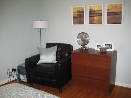
All this time we’ve been happily solving other people’s design dilemmas while silently stewing about our own. This part of the house isn’t on display in our before and after gallery- in fact, we often avoid photographing it altogether. But here it is, in all it’s cringeworthy glory. It’s the other side of our master bedroom (which looks especially bad by comparison to the opposite wall that looks like this).
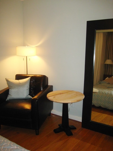
Back when Sherry surprised me with that big comfy leather chair, we thought it would transform the other side of the bedroom, but with the dog crate and the weird dresser as a side table, the space just wasn’t working.
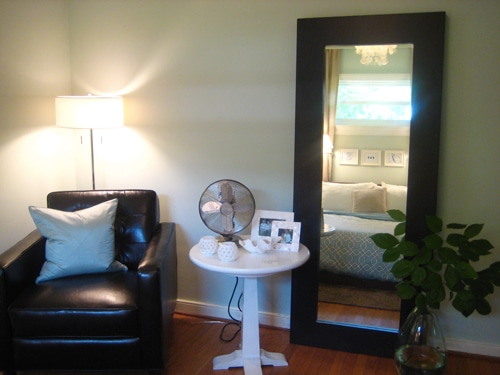
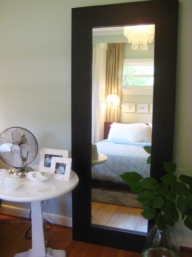
So here’s how we went about transforming that sorry before of a bedroom wall into this much-easier-on-the-eyes after:
But let us rewind. First, we decided to shop our own house for some objects in hopes of pulling the ultimate switcheroo. We immediately knew we needed something a lot bigger and more vertical to balance the height of the floor-to-ceiling built ins around the bead. So we dragged in our only floor length mirror (which used to live in the third bedroom) for some much needed height. Now the room had a surprise Sherry got for me (the chair) and a surprise I got for her (the mirror was actually a surprise wedding present). Sweet. And the height of the mirror was really working to balance the other side of the room and reflect the swankiest part of the space- the cozy built in bed and the window above it.
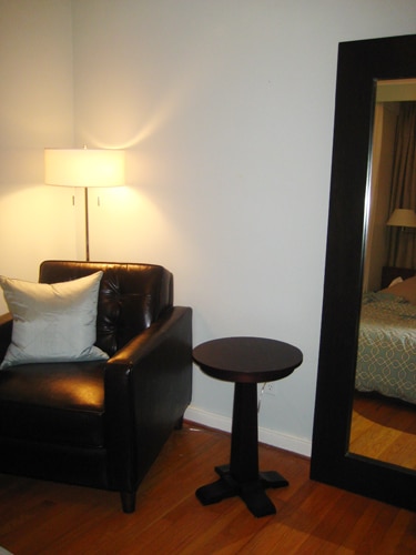
We also brought in a little side table we got a while back from Target, but since the mirror and the chair are so big, we knew immediately that the top was too tiny in proportion to the other objects around it.
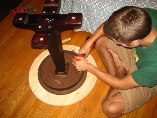
But that’s actually a pretty easy fix. Luckly, we’re no strangers to making our own pedestal table, so we just hit up Lowe’s for a $19 table top with a bigger circumference. Then we screwed the new 24 inch tabletop right onto the old 16 inch table, and viola, a bigger table that works much better in the space.
And since the new tabletop has only a 4 inch overhang around the Target table’s old top, the pedestal can easily support the new top without it feeling rickety or unsteady.
Then all we needed to do was prime it and paint it white, to echo all the pale colors that are abundant on the other side of the room and to break up all the dark wood and leather. The finishing touches came down to relegating Burger’s crate to another room (he doesn’t mind- honest) and bringing in an oversized vase we found for $14 at Marshall’s- along with some free greenery courtesy of our backyard. Total transformation cost: $33 (our only purchases were the tabletop from Lowe’s and the vase from Marshall’s).
Not too bad, eh? Especially when you consider that we sold the old Ikea dresser that used to be in the space for $30 on Craigslist since we no longer needed it thanks to our bedroom’s new built-in closets. Actual project cost: $3. Oh and for anyone saddened by the displacement of the three sunset pictures that used to hang on the wall, they’re looking great in the third bedroom (which needed some wall art since we stole the big mirror from there).
What about you guys? Do you have any spaces that you made over in your own home (on the cheap or otherwise)? Share and share alike.

becky says
Wow! I love it. Very inspiring.
Megan says
Your built in bed is one of my favorites. I dream of doing that with my little 50’s bedroom to gain some much needed storage space but alas, I have a small window in the way that I am not brave enough to cover.
The room looks great and very cost effective. Those are my favorite transformations!
jen says
19 + 14 = 34. what an uber cringeworthy (not insanely swoon worthy) mistake.
Amanda says
Oh my god I love this!
I have to tell you guys- you are my inspiration when it comes to lovely transformations!
Gràcia says
I really like what you’ve done to the space, it looks much better now… and feels more “you”!
For now, we’re just transforming empty spaces into furnished spaces, but we’re loving our kitchen table transformation; http://squeeeeeze.100webspace.net/2008/08/04/day-27.html
Heather says
I bought those honeycomb votive candle holders as well and I love them. So pretty when they’re all lit up. Good job guys! xoxox
freckles chick says
Love how this nook turned out, really balances out your lovely MBR now. And the gorge mirror reflects the sweet window and capiz chandy. Hey, I think I have the smaller version of your floor vase from HomeGoods. =)
I just finished our home office by doing what you guys did: used stuff from around the house, DIY wall art, and only shelled out $80 for a rug & mini chandelier. Design on a Dime:
http://freckleschick.blogspot.com/2008/08/office-space.html
Reichel says
It looks amazing. What a pretty little vignette! I was just curious though…it looks as though it might be a lot of dark wood on that side of the room, especially when compared to the wall your bed is against, which is pretty light, no? I guess I can’t really say though since I can’t see it all at once. Seeing the two pictures separate…all I can say is that you guys have great taste. Your Master bedroom transformation is one of my favorite DIY designs of all time. Keep up the inspiring work!
Elizabeth says
I love the update! Will y’all let us know if you have any feng shui related problems from having a mirror at the foot of your bed?
Chris says
Love it, love it, love it. I have been wanting a round end table for some time, but I keep thinking they’re too small! How brilliant to add a top to it! Guess who I’m copying!?
YoungHouseLove says
Glad you guys dig our new bedroom digs. (And thanks for catching our funny math, Jen).
Reichel, the room is definitely pretty light overall, but these new dark accents just play up some of the darker tones we’ve already got in our platform bedframe and headboard. Sorry we can’t get a good pic of it all together. We just need a bigger bedroom, I guess.
Elizabeth, I’ll admit I don’t know enough feng shui (or dare I say, believe enough in feng shui) to know whether we’ve messed anything up by putting the mirror at the foot of the bed. I’m mainly just enjoying finally able to see my whole outfit in the morning while I’m getting ready for work. How would I know if my feng shui is off? Should I watch out for lightning bolts?
Chris, we’ll let you copy as long as you promise after pics! :)
Thanks as always for the comments, everyone.
-John
Elizabeth says
I’m not sure what you should look out for?! I think I’m just paranoid b/c I’ve gotten too many feng shui books for white elephant Christmas presents!
Diana says
What happened to the crate? We have a hard time incorporating it into our living room and I’m curious what you guys did with it. :)
YoungHouseLove says
Elizabeth, I let you know if anything tragic or uncomfortable happens to us as a result of bad feng shui. Let me know if you come across anything in all of your white elephant gifts. :)
Diana, we moved Burger’s dog crate into the tiny closet in our guest bedroom. We realized it fit perfectly in the floor space of that closet (which took a little bit of work to clear out). Maybe we’re lucky because he’s a small dog. We of course leave the door open when he’s in the crate, but can close it whenever we have company. Hope that helps!
-John
Elizabeth says
How to incorporate dog crates into your home stylishly might be a good blog topic! I’ve seen some in catalogs that are built in to furniture, but they are so expensive and the furniture isn’t that great. I’m sure you two could come up with some better options.
Erin says
I love it! You guys always have the best little fixes to make a space that much more friendly and beautiful. So, where did you get the glass jug/vase on the floor. I love it and have been looking for something similar (and not painfully priced) for awhile now.
YoungHouseLove says
Elizabeth- Love it. The dog crate post is totally on our to-do list. We’ll put on our thinking caps and hopefully deliver some creative ideas. Fingers crossed…
Erin- The vase is from Marshall’s for $14 (we’ve also seen identical versions at TJ Maxx). Hope that helps!
xo,
Sherry
G&D says
Beautiful re-do! I love your idea for making the tabletop larger–so clever, yet so simple. And the mirror looks perfect there, too!
Rebecca says
I am loving your blog! A friend introduced it to me a few weeks ago and I have already been inspired to revamp my bedroom. I am looking for a floor length mirror to add in and I L.O.V.E. the one you have moved into your bedroom…where did you get it?? Thank you so much for all of the advice and ideas you share!! I would be living in a blah house from now until forever without your blog, lol!!
YoungHouseLove says
We actually got our bedroom mirror at West Elm (it was a wedding gift from John) but Ikea has similar ones that are even cheaper (a lot cheaper actually). Hope it helps!
xo,
s