Almost every surface in our home is constantly evolving, so I thought I’d document a bit of the presto-change-o process that regularly occurs around here, starting with the fireplace mantel in our den. Here’s what it looked like before I started switching things out and shifting things around. Not too bad, but not too exciting either:
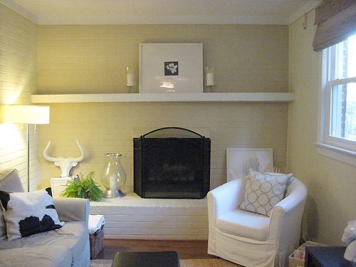
So I brought in an assortment of pale blue vases and green bottles (old wine and Pellegrino ones work) for a little color (and added some purple hydrangeas for even more interest). Switching out the second hurricane for our white ceramic horse (from Target) and sticking a twiggy manzanita branch behind the pony subtly broke up all the symmetry, which is always less expected than something that’s perfectly balanced.
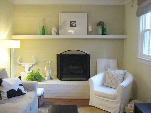
Then I tried layering frames to escape the “box on top of box” look of the big centered frame above the fireplace opening. And since I liked the pop of green from the glass bottles above, I again injected some emerald, this time in the form of a feathery fern and a leafy potted orchid.
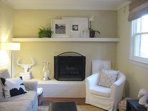
Then I switched out the fern and the orchid for two ceramic horns that I snagged at Pottery Barn Outlet (on clearance for $7 down from $50 a pop). I loved how they introduced soft curves to what was once just a boxy and geometric display.
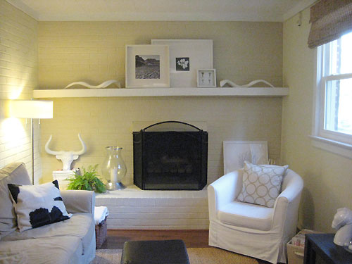
Fearing that all the overlapping frames were getting a bit top heavy, I went back to a super symmetrical display (my initial set up + the new ceramic horns).
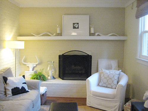
But once again all the symmetry was just a bit too predictable, so I added some potted herbs from the kitchen and brought in our other orchid (in a lighter pot with vibrant pink flowers). By shifting both hurricanes to the right side of the frame and keeping the herbs from feeling totally balanced (one is closer to the frame while one’s a bit further away) things still felt balanced but not overly symmetrical and static.
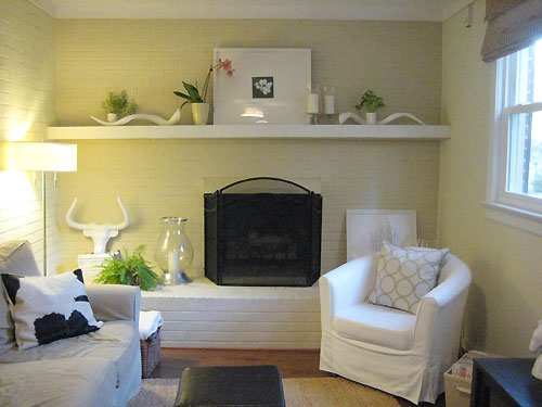
But storing herbs up on the mantle wasn’t exactly as convenient as housing them on our kitchen windowsill, so I switched the extra greenery out for some random items I found around the house: a framed collection of keys, a glossy green ceramic pear, and a big silver P.
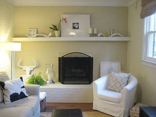
But things started to feel a bit busy, so I edited out the pear, the P and the framed keys. What remained was the winning mantle arrangement. At least for now…
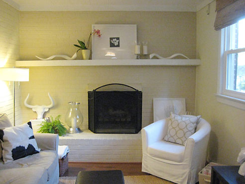
I hope you’ve enjoyed this little mantel makeover play-by-play. We love that we were able to evolve our fireplace for free using items that we already had around the house (save for the ceramic horns). And we hope we’ve encouraged you guys to mix and match the things you have at home for a varied look that always holds your attention and never looks stale. We’re planning a few more accessorizing tutorials for arranging a coffee table, a bookcase, and more. So, as always, stay tuned…
For a few mantel makeover ideas from BHG, click here and here.

Paula says
Hi-Love this, but can I ask, is the picture too small? Not the frame, but the actual flower picture? When you had the two frames together, the one with the bigger picture really popped out more? I love your site and all of your fantastic ideas. I’m constantly looking for the right arrangement too! Although, I haven’t gotten to the stage where I’m taking pictures, but who knows??? Thanks again.
Pauline says
I actually really love the arrangements with the different frames overlapping one another– especially the third one with the fern and orchid. Its wonderfully asymmetrical.. but not.
Kirsten says
Horns and herbs, that’s my pick.
DecorPad says
I really like the first and third photo from the top. Excuse my dirty mind, but the PB ceramic horns looks like over sized sperm! HeHe! ;)
Casamacho says
My favorite is the 3rd one down (3 overlapping frames with the fern & orchid on either side). I wish I had a mantle to decorate!
heather s. says
The last is my favorite since it seems to have just the right balance. Some of the others seemed too cluttered or too sparse.
Lissa says
I was wondering if you thought of mixing up the shapes a bit? I noticed in one of your house tour photos that you have a round mirror above the TV in the same room. What if, instead of the square frames that sort of mirror the same shape and similar size of the fireplace, you replace it with the round mirror? Or if you have another round mirror that is slightly larger than that one? It might be just what you need….or perhaps even a rectangular mirror that extends out on either side of the fire place so that you are mixing up the elements. :)
Allison says
I agree with Pauline. I really like the 3rd one the best! But do you know what I think would look really fabulous above your mantle? A sunburst mirror/piece in a white or silver shade!
KK says
Hmm. . .the only thing that never changed was the center frame.
I like the ideas above about trying something round since the fireplace is a box, too.
In the far left corner, maybe you put tall sticks in a vase that almost hit the ceiling.
It is almost the holiday season, so a green round wreath would look great, too.
Whatever you do, don’t move those fabulous horns! :)
TWB says
I love this idea so much, it’s perfect for a small livingroom.
TWB says
Where did you get the couch?
freckles chick says
I love the different variations. Those horns are fab. While something new over the mantle might also look great like some of the suggestions above, I think the point you’re making is that a “freebie” or no cost makeover is easily achievable just by creatvely looking around at what you already have. Refreshing! =)
YoungHouseLove says
Hey everyone,
Thanks so much for all the ideas, opinions, and commenting in general! Love it. I guess the best thing it teaches us is that design is always subjective so while everyone likes a different picture, we all can agree that playing around until you land on something that works for you is often the best medicine for bored-of-your-house syndrome.
As for the round mirror/wreath ideas, we’ve been searching for a big white feathered wreath (or white magnolia wreath) for above the mantle during the holiday season for two straight years now. Hopefully this year’s the charm… And of course stay tuned for our holiday decorating pictures because we’re definitely gonna switch everything around again. Wheee!
About the image in the frame being too small, that’s really a subjective call too. We like how it allows a lot of the white mat to show (goodness knows we love white) and we also thought a big graphic print might steal a lot more focus than something more subtle and small (which is what we went with). But to each his own- we’ve loved other homes full of bright and bold art, we just reach for tamer pieces for our own little personal haven.
Oh and as for the Pottery Barn ceramic horns, the pictures do them no justice (I’m actually not surprised to hear them compared to sperm). But in person they’re detailed and cast to look just like sculpted horns with graceful twists and curves. Honestly, they’re one of our favorite things in the whole house these days.
We got the couch at Pottery Barn (it’s the PB Basic) but we’d never do that again. We purchased our living room couch (see the “house tour” tab by the header to check it out) directly from a local Rowe dealer which ended up saving us $400 and providing a far superior product in quality and beauty. So learn from our mistake, google your town and “Rowe dealer” and get something straight from the source without the huge PB mark up and compromised options (there were about a million more fabric options from the Rowe dealer). Hope it helps!
xoxo,
Sherry
Meggan says
Sometimes I think you might be reading my mind. Or my blog. Or something. Because I have had the worst time lately trying to figure out what the heck to do with our mantel. It’s improved a lot – I used to have our entire Lemony Snicket book collection there, but it was right in the center and it just… everything ended up the same height and it looked very blah.
I ditched those and scooted everything else closer to the left and right edges and while I don’t love it yet, it’s waaaay better than it was before.
Christy says
Not that you are asking, but #3 was my favorite & I do like the last one too, over the others (other than 3). :)
I can’t wait to see This Young Christmas though! I bet you two will have lots of fun & creative (& green?!) ideas! Can’t wait!
EastEnd says
LOVE those Pottery Barn horns! And the large frame with the small picture. I’m thinking it would look good off center of the fireplace. To the left so it is centered on the wall. And that fern – I loved it on the mantle, but also love it on the hearth! It adds great texture……..
Kimberly says
Love this post! Its fun to watch the progression of the display. Look forward to more like this!
Liv says
It’s so refreshing to be able to change the feel of a room without moving furniture!! Thanks for reminding me that when I get tired of a room, I should just switch out the accents!!
jbhat says
Ahhhh, Best Post Ever! So inspiring, and yes, such a great reminder that we can use what we have in different ways. I love the one with the horse and the gorgeous bottles the most.
Could you make a feathered wreath? And maybe one for me too, while you’re at it? : )
LeilaMac says
So many options! I like the final one you settled on. Thought – did you try to stand the left hand sp-, I mean horn upright? If it can stand on its own, it might draw your eye high to low out the window and make it less symmetrical. Or, if you stood up the right hand horn, it might balance your longhorn steer horn below!
Also, for your wreath idea, if you can’t find one pre-made this season, check out your November 2007 Martha Stewart – she did a gold painted magnolia leaf and turkey quill feather wreath that could very easily be done in white!
jenn12pm says
About your white feather wreath, you might check Peir 1. I bought mine from their, although it was 2 years ago. But you might get lucky.
heather says
I cant wait to see how you decorate this for the Holidays! My living room could be your rooms “before” twin, and I have a hard time with the 13 foot mantle.
Leslie says
Hi guys!!
My husband and I just bought our first house and sadly it is lacking a fireplace! Booo!
I found a fireplace surround from the early 1900s that came from a house in Richmond for 70 bucks on CL.
I would love to know how to make this a focal point in my living room. I’ve been googling away trying to find pictures of where people have just decorated with the surround/mantel.
Not really sure what to put in the part where the fireplace usually goes. Plants are off, cause my Great Dane seems to think they are all tasty treats just for him! Haha And we have carpet, so I’m not sure about lit candles on the floor.
I would love to hear any tips or see any similar pictures you guys may have! Thanks a million!!
Leslie
YoungHouseLove says
How about a basket of chic birch logs? Or a platter or tray with candles inside of that (so they’re not on the carpet)? We’ve also seen people put a large mirror in the firebox to reflect light and add some interest or even a big faux fern (which is a bit more dog friendly than the real thing) just to fill things in. Hope it helps!
xo,
s
Leslie says
Thanks so much!!
I love the mirror idea. Maybe I will google around and see if I can find some insperation pictures!
Y’all rock! Thanks again!!
Leslie