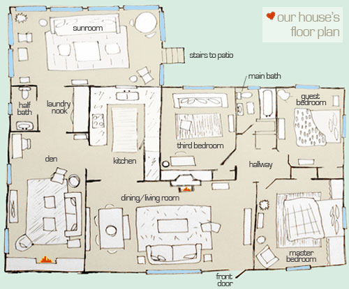
We had so much fun showing you the ins and outs of our house’s exterior layout back in June, that we’re back to share Casa Petersik’s actual interior floor plan. We know it’s pretty hard to picture how rooms flow into one another when you’re looking at a series of photos (like the before & afters on our House Tour page), so here’s hoping this makes some sense out of the three bedroom, one and a half bathroom brick ranch that we call home…
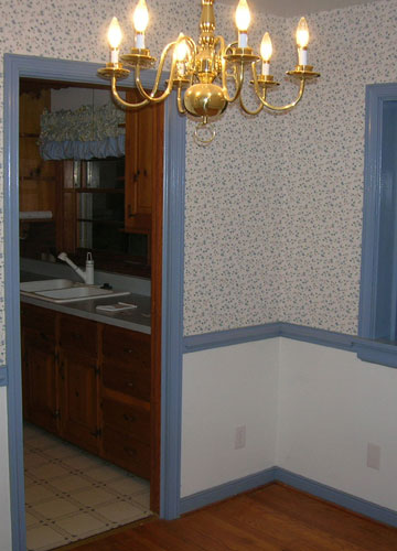
Of course the house didn’t start out as a three bedroom (remember we moved our dining area into the living room and converted the formal dining room into a third bedroom by closing off the old door to the kitchen- which gained us a heckova lot more cabinet space?). Ah those were the days. Just for fun here’s the old dining room we inherited (see that doorway on the left that led into the old kitchen?)
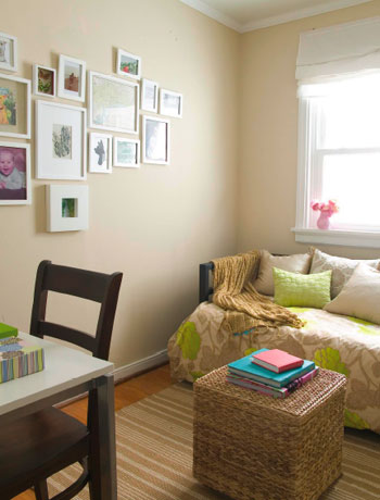
And here’s the same room as a bedroom, with that doorway sealed off and drywalled (it already had a closet so it was practically begging to be converted):
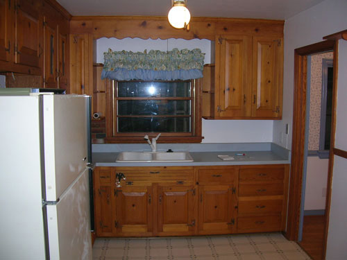
And because we sealed off that doorway from the old dining room that led to the kitchen (see it there on the right in the picture below?) we were able to take an old room that looked like this…
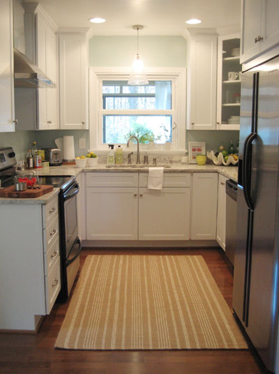
… to an updated kitch with over 50% more counter space & storage now that the door on the right wall was replaced by an entire wall of cabinetry and appliances (including a dishwasher that the original floor plan never would have accommodated).
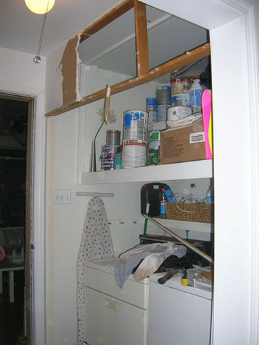
That’s one of the reasons we always encourage people to live in a space for a while before renovating, since it’s a solution we never would have thought of off the bat. Not in a million years. We also probably never would have had the guts to tear down the bifold doors and the wall in the laundry area to create a nice little exposed laundry nook that’s a lot less closed in (as you can see from the floor plan above, that hallway was a bit claustrophibic before we opened things up- just imagine a line where the bifold doors once were). Here are things mid-demo (so you can see where the old doors and upper wall were):
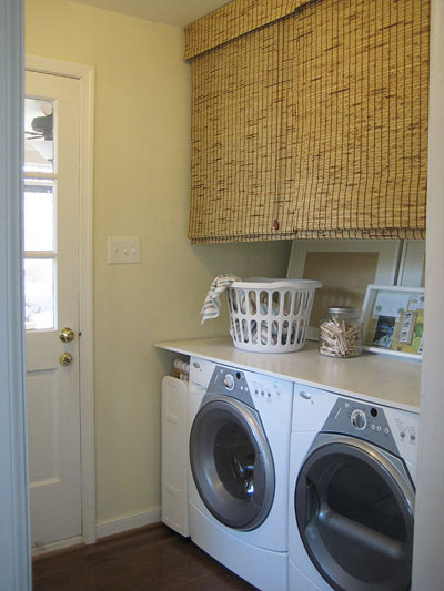
And here are things now, more open and functional (plus you can actually do laundry and have access to the back door which leads to the sunroom (back in the days of the bifold doors, if they were open they blocked access to the back door- frustrating, no?).
As you can see, a workable floor plan really does make all the difference. Not only can it make for a seamless feeling and effortless flow, but it can actually make day to day life easier and your entire house more functional for you and your family. And the glorious thing is that while others might consider a formal dining room a necessity or want to keep their washer and dryer behind closed doors, owning a home is all about personalizing it for the way you live so you love coming home to it every single day. So don’t be afraid to tailor your house to best meet your needs (unless you’re planning to sell, say, next week)… after all you’re the one paying the mortgage!
So what about you guys. Have you altered your floor plan in any way to accommodate something that the original layout was missing? Are you planning any restructuring to add functionality or just plain beauty to your home? Do tell.
Update- Due to tons of room size requests, we’ve added each of our room’s approximate measurements: sunroom: 18′ x 13′, half bathroom: 3.5′ x 5.5′, laundry nook: 6′ x 7′, den: 19′ x 9′, kitchen: 13′ x 10′, living/dining room: 22′ x 12′, third bedroom/nursery: 8′ x 10′, full bathroom: 7′ x 6′, guest bedroom: 10′ x 10.5′, our bedroom: 12.5′ x 11.5′.

Diane says
Thank you – I am a visual person and the floor plan helps me!! For a while now, I have been thinking that a floor plan would be a great addition to your design boards. But that may be just too time consuming?? Keep up the good work!
YoungHouseLove says
Hey Diane,
We would love to find the time to whip up a floor plan to accompany every mood board but because our clients already know the ins and outs of their own rooms they aren’t absolutely necessary. We would love to add them for our readers though! Here’s hoping we can squeeze even more time out of the day soon…
xo,
s
Kim says
I’d been hoping you guys would do this :)
Letty says
Thanks for sharing and yaay for another adorable floor plan!
Juliana says
Hi, I’m doing a small makeover.
Easy to say but hard to do… I’ll close the balcony, to have more space in the living room that I’ll become a dining and a living room.
Good luck for me.
Cindy says
We were missing a garage! Well, we HAD one when we bought the house, but one wall had fallen off of its foundation (yikes) so we knocked that one down and left the backyard empty for the winter. This summer we started building the garage from scratch, no contractors involved (double yikes) but we definitely pulled the appropriate city permits. We put the roof on last weekend and we start siding tonight!
travis says
Good morning Sherry! We are thinking about a slightly different floor plan to improve the openness of our 1st floor, which would include the kitchen, dining and living area. It might be a little more simple with a one story, but did you all have to inquire about how to deal with load bearing walls? I want to do a lot of the work (especially demo) ourselves, but want to be extra careful about structural integrity. We have a 3 story house plus a basement. Do you have any sugestions on who to ask to take a look at such a thing? Thanks!
Danielle says
Thanks for sharing the layout!
I was wondering how did you make this? I would like to do this for my home too! Is this with help from a computer or did you draw this out!
P.S. I absolutely love your blog! You guys have the cuteest ideas! Keep up the great work!
Sugar Cookie says
Hi, Sherry. I’m just wondering if you and John have had conversations about any possible floor plan changes in the future. For example, have you talked about one day needing a bigger dining room space once you start a family? If you’ve had “what if’s” like that, what are some possible solutions that you have discussed? You seem to view your home as an evolving, ever-changing space and I’m interested in what further floor plan changes might be in your future. Thanks for sharing!
Jennifer says
We have a brick ranch that was built in 1969 that has the usual formal living room and dining room. We never used the formal living and the dining room was quite small, so we bought a huge 12 seater dining room table (to use on holidays and birthday gatherings) and put it in the old formal living room. The room was longer and more narrow and had wood floors so it worked out just fine. We then turned the old formal dining area into an office. The only problem was there was no overhead light in the living room (and still isn’t), so we put lamps in two corners on buffets. There are all these hooks in our ceiling, though, so some sort of fixture must have hung on those at one time?!?!
Tiki says
This is great, and so cute!
I have a question about your third bedroom…which West Elm daybed do you have in there? I’m looking for a daybed for a room in our new house, I’m leaning towards the white one thaat you have in your sunroom though. Thanks!
Janell Beals says
Great visual, the aspect I really love about this floor plan is the “drawing” quality of it. Is this a specific program you use? It adds life to something that can become quite technical.
Thanks for sharing!
Janell
YoungHouseLove says
Kate, Janell and Danielle- So glad you guys are digging our little layout sketch. I actually drew out the floor plan by hand, scanned it in and added the typed words and washes of color in Photoshop. Hope it helps!
Tiki- The West Elm daybed that we have in the third bedroom is no longer available (it was a slightly cheaper option than the one in our sunroom so we snatched it up to sleep one more person in the third bedroom on the cheap) but perhaps you can find it on ebay? Otherwise the “overlapping squares” one that we have in the sunroom is still available. Good luck!
Sugar Cookie- We do talk about how the house will evolve over time when our family grows, and I think we both love the idea that our house can change with us (we’re never annoyed to talk about future changes, we actually get excited about it). We have talked about our third bedroom becoming a nursery and maybe even making the sunroom a finished interior room that’s heated and cooled (right now it’s a three-season room that can’t be used in the winter) so that’s another way we can add livable square footage. We also talk about our impending basement makeover (since it’s a detached space we’ll use it for storage, not living, but down the line it would make an adorable finger painting studio for our future kiddos to really get messy since it won’t be full of upholstered pieces and good furniture). I guess to answer your question we’re always thinking about how we could change our house for the better, and we’re certain there will be a lot of little alterations as we go- and we wouldn’t have it any other way!
Travis- Load baring walls are no joke so we always get an expert opinion when we’re altering them, even in the slightest way (like widening a doorway by a few feet). In fact when we widened the doorway from the den to the kitchen we had to call in a mason since that was once an exterior wall so it was super important that we did things correctly (or the roof could have actually collapsed!) so he helped us use a big metal rod to support the new doorway and remove parts of the wall safely and efficiently (and only charged around $200 for the whole shebang). Although it sounds like you want to do a lot of the work yourself, at least getting an expert opinion (maybe even several opinions) is always the way to save money (and your home’s structural integrity) in the end. Hope it helps!
xo,
s
Kate says
That floor plan drawing is super cute – did you do that yourself?
I have dreams of adding a half bath to our basement. Our laundry room is HUGE (it’s actually bigger than our smallest bedroom!) so we have the room add it there, but I’m not sure about getting all the plumbing there. Maybe someday :)
Loren says
Not sure if this counts as a ‘renovation’ because I’m a renter. But my apartment has an extra ‘bedroom’ that is about 7ft by 11ft. When I moved in it was filled with poorly constructed shelves because the previous occupant had SO many clothes they didn’t fit the two smaller closets in the apartment.
So I took the shelves down and we are creating a ‘bednook’ a-la Thomas Jefferson. Because a queen-sized bed and small dresser(maybe even a tiny bedside table) will fit into the room with inches to spare. Hanging some white floor length curtains creates a cozy little nook for two.
And this lets me turn the current bedroom into an ‘office’ so the computer and the TV won’t have to be in the same room any more.
Leslie says
I have heard that indoor/outdoor rugs are great to use in kitchens b/c they are durable and easy to clean. I noticed you have a rug in your kitchen – is it an indoor/outdoor rug? If it is not, do you have any issues w/cleaning it? Thx!
YoungHouseLove says
Hey Leslie,
Our kitchen rug (along with the one in the den and the third bedroom) are all natural fiber jute rugs, so while they’re not made for ourdoor weather they really hold up well to stains and crumbs and spills (we occasionally vacuum them and shake them out outside to keep them clean). If you can imagine how spilling something on a broom might be (the fibers are straw-like so they don’t absorb things like wool or cotton rugs would) that’s a good indication of how a natural fiber rug like ours will work in your home. They’re not the softest things to cozy up to like a bear rug or anything, but for the durability and the classic look we can’t help loving jute!
xo,
s
Samantha says
The first thing we did in our house, once we closed, was tear down the wall between the kitchen and the living room to make a large open kitchen/dining room/living room. We LOVE it. It was the perfect decision.
http://ourlonghaul.blogspot.com/2009/09/first-demos.html
susan says
Yay! How cool that you would share this :O) I’ve always been wowed by your kitchen/dining room/bedroom makeovers. SOOOOOO inspiring. It’s been your den that’s had me puzzled, though. I’ve often wondered, where in the heck IS it??? On the other side of the wall near the front door??? Etc. etc. Thanks for settling that for me. My online feng shui is back in perfect harmony now :O) ha ha ha
Sophie says
Kinda going along with previous posters comments – I’d love to see a drawn floorplan of how you would want your household to evolve. I remember you guys even talking about additions – just curious to see what’s in those creative minds! Maybe a future post idea? =]
YoungHouseLove says
Hey Sophie,
That sounds fun! The only problem is that things change by the day (we like talking things to death before doing them, which actually helps us know that we’re making the right choice) so unfortunately many of the ideas that we mentioned in our comment above about how our house may evolve are just flickerings of an idea. Nothing’s set in stone for us yet!
xo,
s
Nikki G says
LOL I felt like such a dork looking at your floor plan and going “Oh! Now I get it! There’s the mud bench and the desk!” etc etc etc.
Too much YHL some days…if there is such a thing as too much :)
Kasey at Thrifty Little Blog says
I actually just redid my master bathroom’s layout. We used space from a closet to add enough room to the bathroom so that a soaking tub now fits where a tiny shower stall once was. I’m so glad I talked to a professional who was able to “find” the space to do that!
I love that you added such a snazzy layout feature… maybe one day you could add dimensions to it? When planning my own space, I often wonder if certain furniture would fit comfortably (especially in a office/ guest room) and I would love to know the specifics on your rooms as a reference.
YoungHouseLove says
Hey Kasey,
Dimensions are a great idea! Why didn’t we think of that? Hopefully we’ll be able to tackle that soon and share all the info!
xo,
s
Amanda says
Hi Sherry!
I just bought a doozie of a fixer-upper, and I have been a HUGE fan of your blog since the day I googled “small space design” or something like that and stumbled upon you. I love your advice about living in a space for a while before you make changes, buy furniture, etc. One of the most frustrating things has been friends walking in and saying “You need to go buy a TV stand. And a bookshelf. And a new ______.” (It’s particularly frustrating when they say it while looking at the torn-apart bathroom- as if furniture is my top priority right now!) Anyway, I guess what I’m saying is, it’s nice to have a virtual “friend” that can relate to living in a less-than-perfect space for a while. You keep me sane!
YoungHouseLove says
Aw thanks Amanda! It’s so nice to hear!
xo,
s
heather s. says
Thanks for posting! I’ve always assumed your master and guest bedroom were swapped (meaning the master was next to the bath and the guest bed was next to the living room).
For anyone who wants to draw up their own floorplan there’s a program called Floor Planner (http://www.floorplanner.com/) that I used to create the floor plan posted on my blog. It’s incredibly easy to use.
YoungHouseLove says
Hey Kristin,
We actually have used floorplanner.com (as Heather S mentioned above) and really liked it. We’ll have to check out sweethome3d too!
xo,
s
Kristin says
Hi Sherry & John,
nice floor plan! I love the space-efficiency, no loooong and narrow hallway which just consumes space without the possibility to at least store anything there… that’s the main problem with our rented apartment at the moment.
By the way, have you heard of this little program?
http://www.sweethome3d.eu/index.jsp
(Of course, I’m not affiliated with the project…) It’s open source and free, and you can even add your floor plan as a background image to easily create a 3D plan with furniture and all. I love it to plan furniture rearrangements!
Karlie says
I absolutely LOVE your home! I love you taste in style and i am hoping to one day get my house to be exactly what I want! We bought our house last december. We knocked down a wall between the living room and formal dining room to make it one bit living space since we arent very formal people! Okay, well we didnt do it, we hired a professional. It has been the best investment/change we have done do far!! Although there are many other things we want to do, but it takes time and money both of which are MIA right now, well at least for the changes and updates we want to do!
erika says
Thanks for the floorplan! It’s hard for me to visualize layouts without a site plan. I especially love the way you drew in the beds, tables, etc.
maura says
Love your floor plan. The rooms are laid out absolutely perfectly with all the functionality of a multi-level house! :)
Mackenzie says
This is one of my favorite blogs that I read, and your awesome is beautiful! I just dont understand how you saw ALL of this potential when you bought your house. Its so completely inspiring and great. You two really have a gift!
Mackenzie says
your home is awesome and beautiful* sorry typo!
Tasha says
I’d actually wondered if you guys had any hallways. Do you believe in decorating the walls in the halls? Of course people do family photos, but I’ve never seen anything else really – and can’t decide if anything should go there or not. Love to hear what you think.
YoungHouseLove says
Hey Tasha,
Good question! In long hallways we love the idea of a gallery effect with multiple frames but our hallway is just too short/small for us to add much art. We do have an idea for a little built-in shelf project at the end of the hall though. Stay tuned for those details…
xo,
s
Meredith K A says
What’s in the lower-left corner of your kitchen? It looks like nothing’s there in the floor plan, and it’s just kind of floating in what would otherwise be an open area in the middle of the kitchen/den/living room. I’d love to see a picture of that area from inside and outside of the kitchen, and how you use and/or decorate that little corner – it looks like a tough space to do anything with. And thanks! Love seeing the floor plan.
YoungHouseLove says
Hey Meredith,
That’s just a light switch and a tiny slice of wall (but it’s weight baring so it had to stay). There’s not even art or a tiny table there since it’s so small but it still feels pretty proportionate since it sort of flows into the den doorway anyway. Hope it helps!
xo,
s
Holly says
We just bought our first home–a five year old 1600 square foot house on a small lot–and while the lot size doesn’t really allow for any expansion we have big plans to put our stamp on it.
Someday we want to do a full kitchen reno to replace all of the builder grade cabinets and fixtures, but for now we are getting ready to paint the cabinets a glossy white. We also want to convert the linen closet in our master bath into a shower and replace the builder grade cabinets and lights (sooo much builder grade in our house. bleh.)
Our first big project (after painting the kitchen cabinets that is) is to replace the desert landscaping out front with a big patch of grass to compensate for the small (though beautifully landscaped) backyard. So no major reconstruction for our little home, but some small changes that we’re hoping make a big difference!
miriam & christoph says
Very nice indeed!
Miriam, floor plan addict
miriam & christoph says
P.S.
I love the red fires. You could try adding yellow blobs around the lamps too.
Camila says
Love the sketch Sherry! I haven’t learned autocad yet so all of my floor plans are hand drawn as well. I think the added touches with the color washes and the typed in label make it look so great!
LauraJane says
Hi Youngsters!
Thanks for the layout, really helps in visualizing your place. Quick question, which I think you may have touched on before, but was the third bedroom ever a bedroom before? It seems odd there would be a closet in the dining room, so it made me wonder. Maybe it was just a nook?
Love your blog, and can’t wait to transform our place along with you!
YoungHouseLove says
Hey LauraJane,
We actually learned from our home’s original owners that it was once a little bedroom that must have been converted years later. Here’s that fun little story: https://www.younghouselove.com/our-young-houses-old-history/
xo,
s
celia says
What a fun plan! lol…
I love all your “before & after” pics!
City Chic - Jamie says
Love the drawing of your floor plan as well as the actual layout. And I love the fact that everything is on one level, especially the laundry! Dimensions would be awesome, as another reader mentioned :) I have a tiny house that I rent out (hope to sell it when the market turns around) and it’s a 1 bedroom (8 x 10) so it’s a tough sell. I’ll have to look at the floor plan and see if I can come up with a way of adding another bedroom…the only other possibility would be to raise the house up so that the basement ceiling is higher and install an egress, but not sure if that’s worth the $$.
micah says
You guys have done a great job getting all the potential out of your home! We are in the middle of a kitchen remodel right now, we had part of a wall taken out to make it feel more open.
stacy says
We rerouted our kitchen layout. We removed a small pantry/closet and moved the doorway so that traffic no longer goes through the kitchen. It made a world of difference!
A rough original sketch is:
http://img.photobucket.com/albums/v83/stacylu/kitchen/housePlan.jpg
and the kitchen like this
http://img.photobucket.com/albums/v83/stacylu/kitchen/kitchenFinalFP.jpg
To
http://farm3.static.flickr.com/2185/2167317804_27675a9319.jpg
and
http://img.photobucket.com/albums/v83/stacylu/kitchen/KitchenLayout3.jpg
It was 2 different remodels and one included an addition. The kitchen we DIY’d and the addition we used a contractor.
Sarah says
Love this post!! I know that floor plans can be tricky and this looks great.
I second the idea of including floor plans with mood boards. I know that it can be time consuming, but maybe you could try to rough out the space planning for mood boards that retain a lot of the same furniture. I feel like so much change can occur by rethinking the location or use of big furniture items. Your house is an example to that! You have really maximized your space… thinking of your bedroom storage.
I love this blog. :)
Lisa says
I didn’t read each of the comments so maybe this has already been addressed…
I know you guys have shown a picture of your to-be-finished-in-the-future basement but I never see a stairwell in your floorplans. Am I missing something?
Thanks for your awesome blog! I check it daily and have found so much inspiration from you.
YoungHouseLove says
Hey Lisa,
The basement actually has a separate entry from the back of the house (and is located directly under the sunroom) so here’s a post that shows the door and the stairwell more clearly. And there are certainly more details and photos to come! Hope it helps…
xo,
s
YoungHouseLove says
Hey Janine,
Good question! The office is just a table in the corner of the den (it shares a wall with the half bathroom)- you can see a photo of it in this little roundup of after pictures. And the basement actually has a separate entry from the back of the house (it’s located directly under the sunroom) so here’s a post that shows the door and the stairwell more clearly. Hope it helps!
xo,
s
Jenny @ Making the Most of Money says
This is cute! I love floor plans – I used to do them all the time for my bedroom when I was a kid (I rearranged my room almost monthly). I wish we could switch up our floor plan right now but we’re renting :( Our kitchen is a tiny cubby of a space, and you can’t open the dishwasher, fridge, or oven at the same time, especially if you’re standing at the sink. We would love to rearrange it and add an open countertop that looks out into the living room, but alas – no can do! Can’t wait til we own our own space and can do that sort of thing!
Carol in Indian Springs says
We built a ranch in 1986 on our dream location; 2 acres close to a State Park so there is lots of wildlife and trees and not so many houses. Since then we have finished the basement and turned our screened porch/upper deck into a year round sunroom retreat. The house has gone from around 2400 sq ft of heated area to 4500 sq ft. Our next project is to add an elevator (for my crumbly knees) and greatly expand our master bathroom. One thing I would love to tackle is to widen the opening between the kitchen and sunroom. Right now it is just an exterior door and a window. Since that used to be an exterior wall, we would defenitely get an expert to do that – if I can convince my husband that the entire house won’t fall down around us that is!
Jennifer S. says
We have a 1960s tri-level. It had no back door but two side doors 15 feet apart on the driveway side of the house. We have added French doors on the back of the house, off the dining room, and tore down the wall between the kitchen and the dining. It really opens up the space, and with 5 kids we really needed it. We have blocked off one of the side doors with furniture (in the den) and hope to close it up with bricks and a window one day. The other side door is the main entrance for kids when they come home from school so they can dump all their stuff in the mud room. I’m hoping to build them each a locker to store their stuff in.
Dana Miller says
Whoa… I totally had the guest room and master bedroom switched up in my mind! Wondering what your future plans are for the master bath reno…would you add on to the house off of the master bedroom or update the current full bath into a master???
As you know, we switched out a hall closet for a small mudroom after we lived in our home for a year and a half. It’s the BEST improvement we’ve done thus far bc we use that space on a daily basis now and it works for our family. We haven’t physically changed any other flow patterns (taking down walls, etc) but we totally use rooms as WE see fit, not as they are labeled in the builder plans. For example, our ‘formal living room’ is actually a combined entry, office, sitting and extra dining space room. Super functional. Our fourth ‘bedroom’ serves as a guest room/playroom/craft room. It made total sense to us bc I spend a lot more time sewing or crafting while watching my boys play than entertaining overnight guests. I love getting to use these rooms instead of just looking at them.
Thanks for the post and letting us see how you USE your home! The best of form AND function.
Mary @ StyleFyles says
I love this blog.
Just wanted to say it =)
Roeshel says
Thanks for the floor plan. It’s so cool to see where things are – there were a couple of things laid out differently than I thought! I love seeing where I was wrong! haha
Thanks for sharing it!
Melinda says
I would really like to see more before and afters and less layout of your house and halloween decorations. I don’t expect you to post this but I wanted to share it because I am a huge YHL fan.
salley says
yhlers-
thanks so much for sharing your floorplan and your supercute house!
would you mind sharing how many square feet you all are working with?
your place seems cozy and right-sized, but not huge. as a fellow small house owner i always appreciate your storage and organization tips (and covet your basement and garage…)
YoungHouseLove says
Hey Salley and Laura,
Our house is roughly 1250 square feet (probably a little less as the sunroom isn’t considered finished square footage since it’s not heated or cooled). It’s certainly enough house for us (I wouldn’t want to clean anything bigger!) and we love how flexible it has proven to be for us. Here’s hoping we stick around forever!
xo,
s
Stephanie G says
Hey Sherry-
I notice your use of bamboo blinds throughout the house and also in the laundry nook. I’m in the process of re-doing our windows to look larger by mimicking yours… where did you choose to buy your blinds and how much were they?
Thanks,
Stephanie
YoungHouseLove says
Hey Stephanie,
We got ours at Walmart (in store, no online) for something like $14-25 a pop. We’ve also heard Target and Home Depot have them very affordably as well (along with amazon.com). Hope it helps!
xo,
s
Laura says
Yes, ditto on wanting to know your approximate square footage. I love the look of cozy ranchers and cottages and I don’t believe bigger is necessarily better!