As promised, we’re back to detail the simple steps that anyone can follow to DIY some chic and cheap vintage-looking wood signs. We first unveiled these guys in our big bathroom reveal post yesterday morning, but now we’ll divulge the step-by-step process so you can follow along at home. Just remember to sing “I saw the sign” by Ace of Base the whole time you’re making them like we did. Good times.
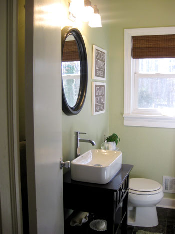
John actually came up with the idea of creating vintage-looking wood signs (isn’t he quite the artisté?) after I lamented that square frames next to the rounded mirror might look a bit chaotic. We wanted something simpler (nothing with reflective glass or a strong raised edge to compete with the frame of the mirror) so John’s one-plane-only wood sign idea was the perfect fit.
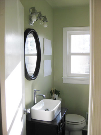
And speaking of the perfect fit, we didn’t have a clue how big we wanted our art to be (or even how many pieces we wanted to make- two? three?) so we simply taped up white paper cut to different sizes in a few different arrangements until we settled on a layout that we liked. Two rectangles on top of each other would subtly mimic the shape of the window and feel balanced and inviting next to the mirror (and my fears of creating something that would compete too much with the curved mirror happily faded away). Hooray for fast and free paper templates to take the guesswork out of art size! The next step was just to measure those pieces of paper (they each turned out to be 16″ x 13″) and figure out what the heck our signs would look like…
We knew we wanted to draw inspiration from our time spent in NYC (where we met and fell in love) so we decided to try our hand at making signs that would resemble the look of old NYC subway signs, like these that we hunted down on google.
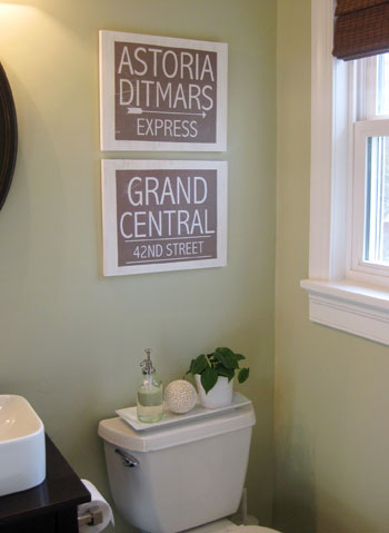
Did you guys click over and check out the $1600 price tag?! Yowsa. But when it came to inspiration, they were dead on. Of course we adapted ours to be horizontal in format and a bit less dark to complement all the white and neutral tones in our bathroom (and in our house for that matter). We also picked two subway stops with the most meaning to us to add a customized vibe that we love (we met working together near Grand Central and both lived in Astoria Queens at different times). We created our signs in Photoshop (but any program that allows you to edit type a bit should work). We also integrated some fun little details like the arrow and the horizontal rules around 42nd Street just to keep things interesting, but they still looked pretty flat as jpgs on the screen. Not to worry though, we had a few ideas for adding a bit more vintage character to them once we printed ’em. Note: the typeface that we used was Abadi MT Condensed Light in case anyone wants to duplicate them that closely.

After we printed them out ourselves for free on regular old printer paper (we ran off a couple of extras so we could experiment with them a bit) we headed off to Home Depot. There we picked up one $6 piece of 1″ thick plywood (it was in the area near the chair legs among a ton of differently sized plywood options). The plywood sheet that we selected happened to be 16″ x 30″ so it was easily sliced down by the kind folks in the wood cutting area. They quickly transformed our plank of wood into two 16″ x 13″ rectangles with only a bit of scrap wood leftover. Gotta love getting two pieces of art out of one piece of $6 wood.
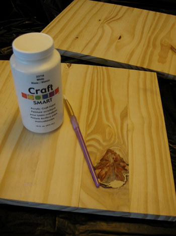
After bringing home our pre-cut planks it was as easy as painting them white with craft paint that we already owned (it was thinner than latex wall paint so some of the wood grain still showed through)…
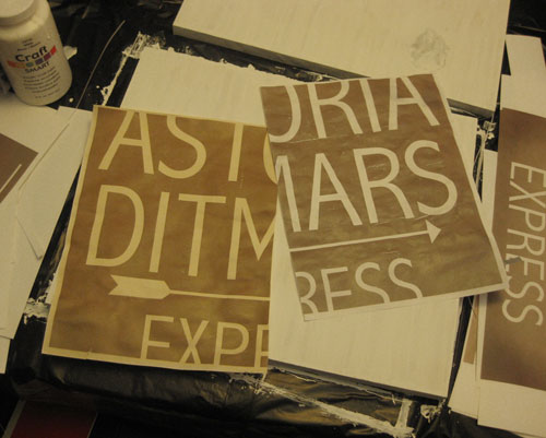
… and trying our hand at a few different aging techniques to bring our “vintage signs” (aka: modern day computer printouts) to life. As you may be able to tell from the print on the left below, we had some fun brewing tea and rubbing the empty tea bags on one of our “tester”printouts but opted against it since it made the prints look so yellowed that they didn’t feel as crisp as the white painted wood that would be behind them (and we really wanted to maintain a clean and airy look, even after the “distressing” stage).
So after just saying no to the tea-staining process, we moved on to trying to rough up our prints with some good old fashioned elbow grease. First we placed one of them on a slightly textured (ie: nubby plastic) cutting board. Then we simply ran a sponge over it to wet it down and slightly wear away at the perfectly printed finish. We thought it might smear the ink, but happily it just buffed the surface for a pretty convincing timeworn look.
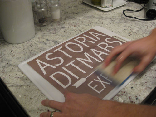
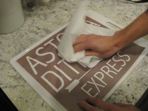
Next we rubbed a paper towel across the surface, being careful not to rip the paper but doing it vigorously enough to rough up the surface of the dampened piece of paper to further wear away at the formerly crisp appearance.
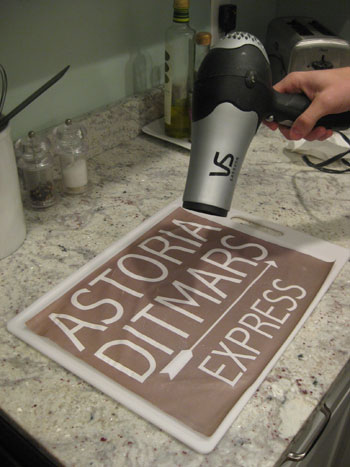
Then it was time to break out the ol’ hairdryer to get rid of any remaining moisture so the sign was ready to be attached to its designated wood plank.
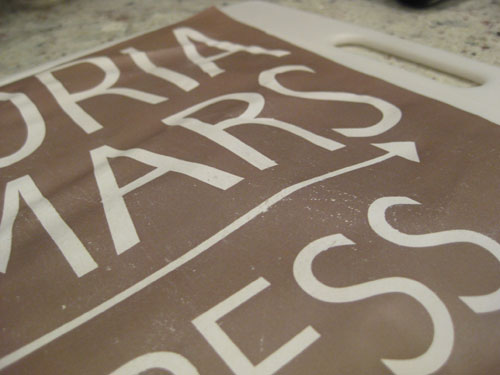
It dried a bit lumpy bumpy but that’s all part of the plan. Of course at this stage we thought it might be ruined but we just went along with it and what do you know, it all worked out in the end. Trial and error is the name of the game here. Anyway, this is a detailed shot to show you what the sponge + paper towel technique did to the finish of our prints. See those worn down areas and those slightly rubbed off spots? These babies were looking less freshly printed already!
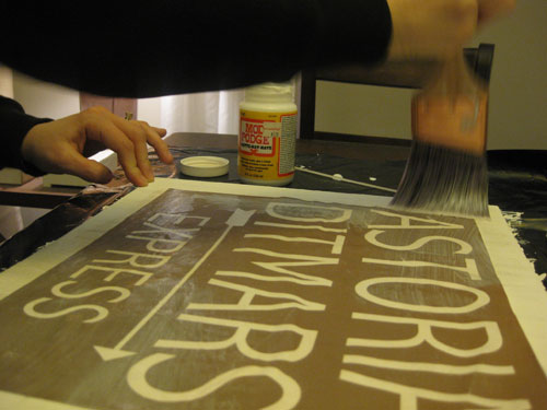
Then it was Mod Podge time. We already owned a big tub of it (and actually used one of our paint brushes) so this step was also free like the printing and distressing phases. We flipped the paper over and applied a semi-thick coat of Mod Podge to the back of the print and then flipped it over again, carefully placed it in the center of our wood plank, and applied a thick layer of Mod Podge to hold everything in place. The great thing about the stuff is that although it looks like white Elmer’s Glue going on, it actually dries clear, so not only did our top coat of Podge hold our print in place, it also created a glossy hardened appearance (which is perfect for a bathroom since it “sealed” the sign from any future moisture-related problems).
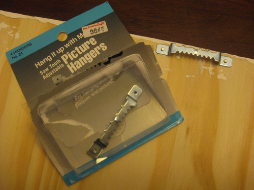
Once everything was dry we flipped over each sign (on an old towel so as not to scratch the front) and gently hammered in two little nails to secure 98 cent picture hangers that we already had in our hardware drawer. Presto, an easy way to hang our new bathroom art for zero dollars and zero cents. Note: If you don’t already own white craft paint, Mod Podge or Picture Hangers, they can all be picked up at a craft store like Michael’s or Hobby Lobby for around five dollars total.
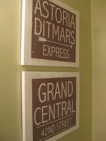
Here are our new “vintage” wood signs hanging happily in the bathroom. One of the coolest things about the fact that our prints were a bit bumpy from the wetting, distressing, and drying stage was that when we Mod Podged them they each got a wrinkle or two which looked oh so worn and weathered (see the one through the D in Ditmars and the G in Grand Central?). This was, well, perfect for the imperfect look we were going for and once the Mod Podge dried it was seamless and sealed (so there wasn’t a big wrinkle that stuck out from the wood or anything- everything looked flush, flat and pretty darn fantastic).
There you have it. The story of our $6 homemade wooden sign art. We hope you guys are inspired to try your hand at something similar. And you don’t have to stop at subway sign ideas either, you can always pick a small shop in your hometown that has special meaning to you, create a message of some sort (like a “please remove your shoes” reminder by the back door), or even whip up a personalized sign for your son or daughter’s room with their name on it. The possibilities are pretty much endless.
So we’ll leave you with this detail shot which further shows our gently distressed signs hanging happily above the toilet (a place that all art aspires to be hung, we’re sure).
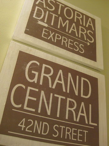
Isn’t it funny how two pieces of paper that we taped up on the wall could so easily turn into this with six bucks and a bit of let’s-see-what-happens spirit?

But enough about our little Mod-Podge-Meets-Ace-Of-Base DIY fest. What kind of art have you guys been whipping up with your own two hands these days? From painting colorful canvases to framing collections like bottle caps and matchbooks, we’d love to know what made-it-myself masterpieces hang proudly on your walls.
Psst- Speaking of DIY art, here are a few other homemade art projects you might enjoy: making a magazine monogram, whipping up custom pet art, making free inspiration art, using chalk for freehand wall decor, painting pop art over old art, and creating a bunch of other cheap wall art.

Carol N. says
I’m inspired!!! Hubster and I have always frequented locally owned restaurants as much as possible. Sadly, some are closed now but we could easily make signs to hang in our kitchen with the names of our fondly remembered places to eat using this method. I feel a DIY project on the horizon!
Sarah says
LOVE YOUR NEW BATHROOM! We are starting the plans for our powder room remodel and plan to figure it out with links from your site! Thank You!! I’m not super crafty, but I got a lot of compliments this past holiday season for framing our 3 year old’s mitten from a couple years ago. I bought a frame that matched my mantle-scape and just took a T pin and pinned one of his crocheted mitten’s to some beige art paper. It was so adorable and it warmed my heart to see that little mitten everyday b/c it’s so sad when you have to pack their clothes up in boxes because they grow so fast!
ESBlondie says
Bravo! Another amazing and creative project that looks like a million bucks.
Jason says
Love it – I love wooden wall art, like letters, signs like yours, etc so this is awesome! You can modge podge anything – greeting cards, etc it’s great stuff.
What program did you use for designing your sign and what paper – regular printer paper?
I like to paint wooden shapes – stars, letters or what not and have done that recently, sometimes sanding the edges after for a weather look. I also made a wall hanging from different layered pieces of foam board hot glued together to be 3 dimensional and then covered with layers of tissue paper varying the color hues from light to dark attached with white glue instead of modge podge. It has lost favor with me though recently so I may need to modge podge something new to replace it for the new house!
Delaware – J
YoungHouseLove says
Hey Jason,
Good questions! We used photoshop to create our signs but any program that allows you to edit type a bit should work. We also printed them out on regular printer paper- nothing extra thick or glossy or anything. Hope it helps!
xo,
s
Jessica @ How Sweet says
I LOVE that! I have learned so many new things since coming to your site. I can’t wait to get to work.
Joy S. says
Sarah, that’s such a great idea! I really love it.
Domestic Princess says
What a great idea! You guys are so creative
Christin says
Thanks for sharing the details on this project – I really want to try it! Just out of curiousity, what kind of computer program do you normally use to create the pictures you used in the art? Just wondering if you need a certain program or if it’ll work in lots of different ones. The art is really great!
YoungHouseLove says
Hey Christin,
We used photoshop to create our signs but any program that allows you to edit type a bit should work. We also printed them out on regular printer paper- nothing extra thick or glossy or anything. Hope it helps!
xo,
s
Amanda says
I absolutely love this. Thank you so much for posting the tutorial, as I will be copying it :-)
Erin @ Domestic Adventure says
“I saw the sign” and Ace of Base…the seventh grade memories are flowing back!
Fabulous tutorial, as always, and the signs are the perfect finishing touch to an amazing bathroom. Congrats on checking that major project off the list!
Amanda R says
I managed to fix my fireplace last night and make it a tiny bit prettier until we can find a style we like to replace the whole thing. The best part? It was pretty much $0 cost. http://geekdetails.com/blog/?p=2170
I love your bathroom reno and it’s given me ideas to show the husband so that my bathroom can be renoed too!
Jane @ the Borrowed Abode says
Fah-bulous idea!
I recently fell for ModPodge when I DIY’ed some coaster sets for cheap holiday gifts. http://theborrowedabode.wordpress.com/2009/12/29/a-thrifted-christmas-part-4/
As for making art . . . my only attempts so far have failed, but that doesn’t stop me from trying again!
Mrs.Limestone says
Always a fan of DIY art. I just think its nice to have a little story to go with what hangs on your walls.
The passport squares I made are probably my favs
http://www.brooklynlimestone.com/2009/08/passport-art-on-cheap.html
followed by my dictionary prints
http://www.brooklynlimestone.com/2009/03/dictionary-art.html
Out of curiousity, did you ever find a font that matched the original signs well? Im kind of a font addict so I’d love to know if you did.
YoungHouseLove says
Mrs. Limestone- The font we used was Abadi MT Condensed Light. It definitely wasn’t a perfect match, but the light and airy lines of it seemed to be the closest of the mazzillions that we sorted through.
Sarah- We actually thought about including a few weathered signs in our shop, but we love that anyone can do this at home (and personalize them far more than we could if we had a pre-set group of available designs) so for now we won’t be adding them since we’d love to see people whip up one (or ten!) of their own. Hope it helps!
xo,
s
AlysonO says
These look great!! I have also drooled over the vintage subway signs (my husband and I used to live in NYC too!) but it never occurred to me to make my own!! Thank you!! I think I will also use this process to make a sign for my bathroom I’ve been meaning to do… there is a towel rack next to the shower, which is across from the toilet, which means when there are towels on it it hides the little cubby in the wall where the toilet paper is, and guests are left to search for, and/or yell for the toilet paper… so I’m going to make a vintagey sign that says ATTENTION GUESTS: THE TOILET PAPER IS BEHIND THE TOWELS… I think it’ll be funny…
Okay, but seriously, I may have to stop coming to your site because you are making my to-do list MILES long, lol!!
Sarah says
Wonderful job!! Do you think you’ll make some more and put them in your shop?
candace says
I love your art and I love the price even more. Last weekend, I was working on my own little bathroom art so this post is crazy perfect timing (does that mean we were meant to be BFFs? Please say yes.) Maybe I’ll be gutsy enough to send it to you when I am finished. I like that you used wood so they feel substantial and with subtle depth.
Anyway, cheers to Ace of Base and you guys, because “You opened up my eyes and I saw the sign.”
Holly says
Question: Is it okay to apply decorative paper to the inside/back of a desk with Mod Podge? I have a tall black desk that I’d like to lighten up and I thought this might be a good idea, but wasn’t sure how it would work with furniture? It’s not solid wood, it’s laminate – any ideas or suggestions?? Thanks you guys – and as always, this looks fab!
YoungHouseLove says
Hey Holly,
That should totally work! Just be sure to take it slow and steady so your paper goes on nice and smooth without any wrinkles or bubbles (sometimes using Mod Podge to do a large plane like that is a bit tough). Another approach could be to double stick tape or even glue-stick the paper in place (which is easier to get a straight and even application) and then use the Mod Podge to create the top coat (putting it on the back of the paper or the back of the furniture item might make application harder than just using it to go over the top). Hope it helps!
xo,
s
Jenifer says
I minored in art in college, so I’ve picked up some fun techniques and really appreciate your aging process on the signs. Great job! Very cool looking.
My lastest projects at dressing up our home has been creating an abstract painting with my husband’s and my initials to hang over the fireplace (after painting a section of the wall to make it stand out more). I also painted some glass table tops we could no longer use and hung those on the wall with some monkey hooks as the table tops were pretty heavy.
I haven’t done anything in a while, but you guys are definitely giving me a lot of inspiration to get back to it.
Erin @Cultivating Home says
Good idea, great execution. I see these types of signs in the stores alot but they are never personal enough. I love that you made art that both looks great and is meaningful. I’m inspired to do a little decoupage myself!
Angel Cutsforth says
Hi,
I love these signs, and I love the significance that they have for you.
Today I finished my artwork project for my living room, I posted it on my new home blog. I am really happy with it. It gives a feminine touch that the living room really needed.
http://honey-sweet-home.blogspot.com/2010/01/homemade-art.html
Fawn Becker says
You two are awesome! I LOVE the pics of your wedding…in fact our 10 year anniversary will be in 3 years and I am planning a vow rennewal that is inspired by your outdoor wedding. Your ability to go after and tackle all the projects in your home is so inspiring! Thanks for sharing with the blog world :) Oh and congrats on your pregnancy, you will LOVE being parents…I sure do!
Jacquelin Hicks says
I recently printed art on my color printer from the internet. I searched things like “Royalty Free Vintage Wallpaper” or “Royalty Free Flowers.” I found really cute images and framed them in chunky IKEA frames.
http://ourcondospace.blogspot.com/2010_01_03_archive.html
Sonya says
This is so fun. Love your DIY signs! I’ve actually been working on something similar. I wanted one of those “Keep Calm and Carry On” prints to frame (a repro of a motivational poster produced by the British government in 1939 during the beginning of World War II) but didn’t want to pay for one and wanted to be able to customize the size and color of the print to match my decor… so I printed one of my own out using my home computer/printer like you did, and I’m planning to put it in a white Target frame. It will be so cute and perfect in my kitchen, reminding me to “Keep Calm” when preparing for my dinner parties! :)
lana says
love the signs! my husband and ijust moved from brooklyn to westchester, and this project is something that would look awesome in our new home AND remind us to visit the city often. thanks for the tips!
lana
http://www.joeyandlana.com
Leah says
I LOVE your blog, my husband says I am obsessed. Ok, maybe a little. First of all,this bathroom renovation is so timely. Here is a photo of ours before we had an ice dam on our roof and now have to replace some of the sheetrock/walls http://hjelseth.blogspot.com/2009/11/big-reveal.html It’s so similar to yours, I’m taking this as a sign (ha, get the pun?, funny, no?) that we shouldn’t just stop at the walls, we should just go for it. Second, I also love the wall art, we lived overseas for a while and would love to do something similar with some places that are special to us. I did make these though, with some paper and Mod Podge, I think they turned out great! http://hjelseth.blogspot.com/2009/12/paper-wall-art.html Thanks for being so awesome!
YoungHouseLove says
Thanks for all the fun art project links guys! We love seeing what you’re up to- and you’re quite the creative bunch!
xo,
s
Liz says
I had just gotten ‘I Saw the Sign’ out of my head and then you had to mention it again at the end of the post. It’s gonna be in my head all day long. Oh well, maybe it’ll remind me to go make some cheap art when I get home. Thanks for the idea!
Erin says
Do I see that you don’t have CFL’s in your bathroom!?! If they are, I apologize, but if not I am shocked! But not really, I love you guys!
YoungHouseLove says
Hey Erin,
For the renovation process the boys switched our our CFLs for regular bulbs since they’re brighter off the bat (and they needed all the light they could get when wielding saws and sledgehammers) but fret not, they’re back now that the pointy objects have been taken out of the bathroom!
xo,
s
Sarah says
Oh. My. Goodness. John & Sherry I love your bathroom!! My husband and I are going to re-do our master bath this month, and you’ve given me so much inspiration! We chickened out on re-doing the tiling on the tub, but we’re doing the floors, toilet, and vanity/sink. Your art project is wonderful, thanks for all of the great ideas!
Chrissy says
Love your bathroom and your art! My kids and I have been mod podging their one of a kind art onto tiles to make coasters for Valentine presents for the grandparents. I’ve got some extra boards laying around and may have to try your project! Such a great idea! I love personal art! We’ve got quite a bit of it in our house. My latest project was framing my husband’s great grandma’s stamp collection. http://homekidslife.blogspot.com/2010/01/stamp-collectors-nightmare.html
Thanks for all your inspiring ideas!
Janis from Scotland says
Sherry and John – they look absolutely brilliant – would not even have guessed they were home-made. I am so jealous of all you creative people I just don’t have that in my genes nor my fingers, nor my toes. Sonya – I’m not ashamed to say I bought the “Keep Calm & Carry On” poster and white frame from an English company which sits at the top of my stairs. I cannot envisage doing what you want to do – maybe I’m too frightened – it’s well out of my comfort zone.
Melissa Head says
I love your bathroom! It is amazing.
Robin says
Okay, this may be a dumb question. But did you print the sign out on brown paper or did you color the space brown on the computer and then print it out? Thanks! Love your site!
YoungHouseLove says
Hey Robin,
We printed our signs out on plain white printer paper (so the file that we created had a brown background which was then printed out onto the paper). Hope it helps!
xo,
s
kelly says
love it, the bathroom looks amazing and the signs are so cool.i am very inspired to make my own from some things i have seen on line! thanks for sharing it helps us all!
jessica says
Great job! They look awesome & I love your DIY spirit! I’m trying REALLY hard to re-ignite that in myself, I used to love doing stuff myself, but have gotten married, busy & lazy. :) Anyways, thanks for the inspiration & keep up the good work..!
Valerie J says
Hi! This is my first time commenting! I’m wondering about printing as well….if you used regular printer paper, did you also use regular letter-size paper and just piece together? If not, what size paper did you use?
Thanks! You (and Bower Power) have inspired me to start my own blog as I’m in the process of buying my first home now! (I’m waiting to hear back on the appraisal this week and will then start posting before and afters). Your blog is already referenced on my page as some inspiration. :)
YoungHouseLove says
Hey Valerie,
The size of the signs we printed were actually 11 x 13″ (since we opted to leave a border of wood around them, they didn’t have to be printed at 13 x 16″ like our wood pieces). Of course we know that this is a bit larger than a standard printer. We can print up to 11 x 17″, so we were able to do it for free, but anyone who needs to make larger prints than their printer allows can simply piece them together as you suggested or head over to Kinkos/Office Maxx for super cheap prints while they wait. Hope it helps!
xo,
s
Kim at Yellow Brick Home says
Great job, you two! Homeade art is where it’s AT.
D says
You’re so creative!!
Lea says
Great idea, as always!
My walls currently sport a collection of quirky vintage science-themed book covers scored off ebay and the local used book shops. Just xacto off the front cover, glue down the extra flap of spine fabric for a seamless look, then pop them on the walls with renter-friendly mounting putty!
Kimberly @ Attempting Creative says
So great! I’ve been wondering if modge podge would stick to wood. And now that I know it does, I have a great project for this weekend! Thanks for sharing.
LauraC says
Hey, thanks for the photo that shows you printed the signs on more than one page. I was going to ask how you printed a 16×13 sheet. I didn’t think you had an extra-fancy long printer. That means the rest of us can do it too!
For our bathroom I ordered a vintage sign on ebay that reads, “Please do not use the toilet while the train is standing in the station.” It’s a really heavy, original iron sign, and I guess I was being immature that night because it totally cracked me up. I’m planning on putting it on the wall right behind our toilet! Ha!
Katie says
A few weeks ago I was lamenting what to do with a big ol’ expanse of white wall in my bedroom. Looking around my apartment for ideas, I realized I had a huge collection of embroidery hoops that I’d gotten from thrift stores and yard sales. One trip to the fabric store to buy fat quarters in fun colors later, I had a whole wall full of embroidery hoop-framed fabric. It cost a total of $6 to make, and the best part is that the fabric can be changed out to change the whole look, and the pieces are easily moved around since they’re only hung by tiny nails. You can see part of the wall behind me here: http://interrobangsanon.wordpress.com/2010/01/02/nice-ascot-my-names-not-scott-but-thank-you/
Katie says
That looks great! Thanks for sharing all of your wonderful ideas – my husband and I, although we *try* to do many DIY projects, are not nearly as handy or crafty.
I know you mentioned several times that you used regular printer paper, but is it 8 1/2″ x 11″? That is as big as my printer will go, but yours look bigger to me since the white boarder around your paper doesn’t look like it’s more than a couple inches wide…
YoungHouseLove says
Hey Katie,
The size of the signs we printed were actually 11 x 13″ (since we opted to leave a border of wood around them, they didn’t have to be printed at 13 x 16″ like our wood pieces). Of course we know that this is a bit larger than a standard printer. We can print up to 11 x 17″, so we were able to do it for free, but anyone who needs to make larger prints than their printer allows can simply piece them together as you suggested or head over to Kinkos/Office Maxx for super cheap prints while they wait. Hope it helps!
xo,
s
Caroline @ The Feminist Housewife says
Great idea!! Thanks for the easy-to-understand tutorial!
lauren says
where did y’all get your sink??? is it a DIY project? i LOVE it.
YoungHouseLove says
Hey Lauren,
Yup, we retrofitted a night table to create a bathroom vanity! You can check out more info here and here. Hope it helps!
xo,
s
Caitlin @ That House on the Corner says
Awesome idea, I need to break out my old mod-podge jar!
As far as art projects, I made a linen covered bulletin board for my kitchen with some ribbon details and it turned out so darn cute that I wont pin anything on it…all to the tune of under $5!
Handy Man, Crafty Woman says
You guys are so crafty! Gotta love mod podge!
_meganORSI__ says
HEY! Great job! But I was wondering if you ever thought about Xerox Transfers?! A process where you print your image either from a color or b/w copier or laser printer, backwards, soak in a solvent solution, then rub onto a surface.
Depending on the solvent you choose, the fumes can be a little much. I was doing research on the technique as a possible way to create my wedding invites. I decided against it as smaller text may not come out as clearly as I would need it to for a wedding invite. But I’ve also done this in school.
Here’s an article I found on the subject!
http://www.diyhappy.com/solvent-transfers/
Have fun!
YoungHouseLove says
Thanks for the tip Megan! We’ll definitely look into that method. We love trying out new DIY art-related methods! And let us know if you try it as well. We’d really like to know how it goes!
xo,
s
sheila says
Beautiful space. Good work.
Do you consider this space trendy, with the vessel sink, the dark colors? Or do you always just plan on switching things out about every 5 years? (with that budget, no reason not to!)
YoungHouseLove says
Hey Sheila,
Since our sink was more of a farmhouse-sink-meets-a-vessel-sink (not one of those highly raised glass bowls) we thought it had a bit more of a timeless appeal since it’s white and a bit more lower-profile… but we can definitely agree that it wasn’t a safe choice that everyone would have made! However thanks to the selection of always-classic white subway tile for the shower and basic mocha marble for the floors we did our best to balance interesting accents with timeless materials and finishes. Of course we can easily switch out the sink in the future if we tire of it, but we actually hope to enjoy this bathroom just as it is for at least a few decades. Maybe we’ll repaint or switch out the shower curtain but we’re pretty much too smitten to even think about changing more of the major fixtures like the sink or the dark vanity any time soon. Hope it helps!
xo,
s
Carrie says
How freaky is it that as soon as I started reading this post “I saw the sign” came on the radio! Love these signs!
Amanda says
Since I discovered your blog…I’ve been in love..We bought a fixer upper in May 08 and have been working away at it…I LOVE your style but we have 3 kids so I cant have it as PERFECT as yours…However since discovering your blog and knock off wood we have made collector shelves, a chalkboard, and some dining room shelving!!
YoungHouseLove says
That’s so great Amanda! It’s amazing that you’ve made so many things for your home even with kiddos underfoot! It gives us hope for the future! We’re totally teaching our toddlers how to hold hammers and sledgehammers. Kidding… I think.
xo,
s