Q: I need help with space planning! Just your tip in the comment section of Ania’s design dilemma to “let the room breathe” made me realize that I’m so guilty of filling ever available inch of wall space. I need to edit some rooms! I’d love to get a post on space planning and room flow somewhere down the line! – Threadbndr
A: This is such a good question, and a topic that we’ve been meaning to tackle for ages. First we’ll include the comment that Threadbndr is referring to in her question above. Someone asked what we thought Ania should stick in the bottom right corner of the room (between the desk, #10, and the bookcase, #3, that we hunted down for her in this mood board).
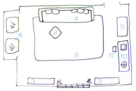
And here was our response: “Ania could always pop a potted plant into that corner (we love a crisp white Ikea planter with something green and leafy) but we tend to like keeping spaces that tight blissfully bare. Otherwise there’s something lining the entire perimeter of the room every 12 inches or so, which can look a lot less airy and open than leaving a few spaces like that for the room to breathe.”
So our first floor planning tip would be to resist the urge to stick something into every bare corner and fill the entire perimeter of a room with furnishings and accessories. Sometimes you want to keep certain areas open for flow and to keep things from looking too cluttered and chaotic. But when it comes to creating a true floor plan, like the sketch above, we actually have five specific approaches, all of which can help pin down the best furniture and accessory arrangement in any space. Let the fun begin…
Floor planning method #1 is graph paper. It’s a super easy way to experiment with endless room layouts without any commitment at all (all without breaking a sweat). We’re definitely no stranger to this method- in fact here’s a detailed how-to video (see more basement planning details here) so you can whip up your own graph paper models of each room in your house and play around with the layout until you hit on something you love. Watch the video below or check it out here on YouTube.
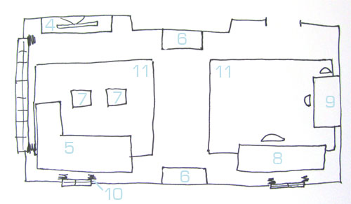
Floor planning method #2 is sketching. The upside is that it’s not as numerically demanding (no counting graph paper squares) but the downside is that it’s not as exact as the graph paper method outlined above. But it can still really help you uncover a number of floor plan ideas that you might not see while standing in the space and staring at the furniture. There’s something about the aerial view and the act of drawing a number of options that lets your brain go a bit further than it usually can when you’re standing in the room looking around. And although this method isn’t super exact, it definitely saves you (and your back) from moving the sofa to every wall in the space (since you can sketch it on each wall and hopefully hone in on which layout will work better than the rest). See more info about this specific floor plan right here.
Floor planning method #3 is blue painter’s tape. This approach is so simple that nearly everyone we suggest it to is chomping at the bit to get started. We’re huge fans of using blue painter’s tape to outline where a piece of furniture could be placed on the floor (just to get a feel for the flow of the new arrangement without having to actually move anything. This method is especially helpful before ordering an item, so go ahead and tape off the floor where your new buffet would sit before you buy it online- just to be sure the proportions and the placement don’t crowd the dining table. In fact we even used this method when we were changing our kitchen’s floor plan from this L-shaped arrangement…
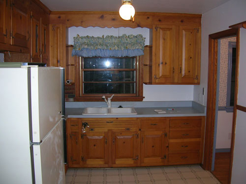
… to this U-shaped one…
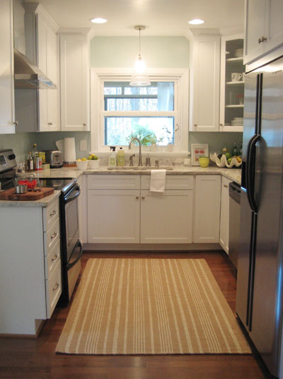
Because as nice as it was to refer to the computer renderings of the new layout, we really liked the idea of standing in the space and seeing exactly where we would be able to walk and where the new cabinets and appliances would be placed. It really eased our nerves that everything would be too cramped, because once we taped things off on the floor we could actually “stand” in the new floor plan. It was so worth the ten minutes it took to stick down that blue tape.
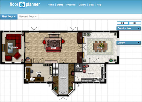
Floor planning method #4 is floorplanner.com. We’ve definitely relied on this free (and pretty simple to use) site to lay rooms out and to help wrap our minds around what something might look like before we pull the trigger. Again, it’s just another tool to help you see things from a new vantage point and experiment with a bunch of options… all without lifting a finger (or a sofa).
Floor planning method #5 is furniture sliders. We definitely like to avoid the dreaded furniture shuffle when we can, but sometimes there’s nothing like shifting a few pieces around to see exactly how everything will look in a few new configurations. And the good news is that you can save yourself some major aches and pains by investing a few bucks in some easy furniture movers which you can use over and over again in every room of your house. They slide seamlessly on hardwood flooring or carpet and they make one-person-furniture-arranging possible (no more waiting for the hubs to come home with these babies). Which makes them great for surprises. In fact John has come home to many a new layouts here at Casa Petersik thanks to sliders like these.
So there you have five ways to approach floor planning along with the obligatory warning that the perimeter of a room likes to breathe (so resist the urge to fill every corner and expanse of wall with tiny tables, plant stands, and other items that can take away from that airy effect). We also love using large area rugs to define floating furniture arrangements, so that’s another way to anchor furniture that may feel unfinished or restless when you pull it away from the wall without anything defining that new room within a room. And if you’re still stuck in the space planning department, feel free to scroll back through some of our more recent Design Dilemmas for a number of sketched floor plan ideas that you might be able to implement in your house. So many possibilities, so little time.
But what about you guys? Do you have any other floor planning tips to pass along? Any specific room layouts that you love? Share and share alike.

liz @ bon temps beignet says
I’m a huge advocate of the painter’s tape. We used it to plan out our wall cabinets in the kitchen. We had a huge blue grid all over our walls for a few weeks till we decided on the best layout.
I’d also have to suggest the Forearm Forklift. It looks ridiculous but it TOTALLY works.
k says
Ooh! I’ll have to get those furniture slidey things. I don’t have whole lot of furniture or choices about where to put it, but I do rearrange at least twice a year ( by myself cause usually the urge hits me when my husband isn’t home). Have to make room for the Christmas tree!
Deb says
I love floorplanner.com! It’s such a great tool (especially with my penchant for knocking down walls, etc.)
Jessica M says
I love floorplanner.com! Maybe it’s the engineer in me, but it just geeks me out to have a fairly accurate picture of our entire [one story] house! You can change the dimensions on all the pieces of furniture, etc. so you can customize to what you actually own. It’s been invaluable to me as we transform our home office into our daughter’s new room (she’s moving out of the nursery to make way for baby #2) and turn our bonus room into our home office/storage room!
leslie says
http://www.amazon.com/Above-All-L74995CN-Forearm-Forklift/dp/B00005TPUZ/ref=sr_1_1?ie=UTF8&s=hi&qid=1276697870&sr=8-1 – love these for moving big items easily!
Emily says
I’ve also used icovia.com (on the recommendation of the Domino decorating book) to lay out floor plans. I measure each piece of furniture and layout windows/doors/etc before moving around the furniture in each room. Instead of paying to save my image I just do a screen shot so that I can reference it later if need be. It has really helped me figure out what size rug would work best in a room or what shape coffee table we need.
k & b adventures in renovating says
im not a huge planner. im more of a doer and do-overer. while this isn’t always the easiest and most proficient way to do things, i’ve come to terms that i need to learn all the ways i DONT want my layout to learn how i actually want it… basically i’m not afraid to swap a room around every few months!
Carol N. says
I was just looking at buying some furniture slides so this is a timely post! Off to order them from Amazon.
Erika says
I am planning a move, so this post was very timely :) I used your blue painter’s tape trick the last time I moved, and it was SO EASY and SO HELPFUL. I had moved into a much smaller space, and it really did help me decide on a layout, and if I would have room to move around the corners, etc.
Mike says
I’ve used all of these! I’ve had the worst luck with free hand drawing because I always draw the furniture the size I want it to be, but then it’s always smaller or larger in real life and disappointing!
In terms of flow, we’re trying to get away from the spin-cycle “everything against the wall” look. When we did our porch we set up the furniture as we would in a living room. It looked nice but all the pieces were facing the wall to the house, not the great views out the windows! We rearranged it a little non-traditionally and the result was a fun flow and great views.
Carole says
great ideas, I’ve used ’em all, except floorplanner.
My 12-year-old uses Google SketchUp for all sorts of things, including space planning
http://buckcanuck.blogspot.com/2010/05/guest-blogger-conor-talks-about-plans.html
Kate@TwentySixToLife says
When we finally start buying new furniture (someday…) my plan is sort of use a combination of those methods. I really like the idea of having everything to scale on graph paper, and then once I think I know what I want, taping everything off in the real space just as a double check. Plus I think it would be fun to move around little paper sofas and tables on graph paper… but that could just be the nerd in me talking ;)
BetsyH says
We just implemented your painter’s tape method last night! After reading your post on the bookcase in your office/guest room/playroom, I fell in love with the idea for our nursery. And then I visited Burger’s blog and fell madly in love with the blue symmetrical design in the background. I’m going to curse myself when I’m in the middle of taping, drawing, and painting, but I think the pay-off will be huge. I’m so excited!
A side note: Shout-out from RVA! When I first discovered your blog, my first thought was, “Wow, their house is so Richmond.” And then I read your wedding post, and what do you know! That’s because it IS in Richmond.
Lindsay says
If you have hard-surface floors and don’t want to buy the furniture sliders, some old beach towels work really well, too!
I’m also a big advocate of the blue painter’s tape trick! We used that recently to layout a bed/media/library room and it made us realize that all the furniture we were *planning* on bringing into the room was just overwhelming. Back to the drawing board!
xoxo,
Lindsay
Lesley H says
I am a huge fan of the graph paper/painter’s tape combo!
Kelley says
We moved into a new house last month and in doing so, we down-sized our living room a significant amount. So much so that we had to sell our old rug and sofa because they were absolutely HUGE in the new house. We used floorplan.com and the blue painters tape method BEFORE we bought new furniture to fill the room and they both worked like a dream! I was a bit nervous that my measurements and paint tape lines weren’t accurate due to user error, but when we finally bought the couches and brought them home, all fell in to place just as floorplan.com and the tape promised! As long as you know exact measurements of your furniture and room, I don’t see how these 2 methods could steer you wrong.
Katie says
I love love love that floorplanner.com! We are in the process of buying a house so as soon as we find one and it’s ours I am going to use floorplanner.com to figure out where everything should be. Thank you for introducing me to it!
Shanns @ It's All B&S says
Great tips! When we were planning our new kitchen, and after the demo was done, I just took a sharpie and drew on the floor :P But I guess that doesn’t work if you aren’t tearing up the floor…
jeff_williams says
These ideas can work on a larger scale too…
I’ve been using autocad lately for planning landscape stuff on my house. Google sketchup would be a good and free alternative. Obviously the blue tape method wouldn’t work on the lawn so I’ve been using the hose or string line to mark out curves.
Wendy says
A big mistake I’ve seen time and time again is to push all the furniture up against the walls. As a professional interior designer I’ve often heard homeowners say they think this makes the space look larger. It doesn’t! Trust me, taking the furniture out into the space and even angling it actually opens the space up. I like your phrase “letting it breathe”. This is soooo true. It makes a big difference!
Miranda says
Similar to the graph paper method, I use Excel for planning. I adjust the rows and columns so that each cell is a square and then just assign it a scale. For example, if each cell = 6″ in my spreadsheet, I just outline 30 squares to make a 15′ wall. After creating scaled boxes for furniture, it’s easy to move it around the spreadsheet and adjust if necessary. Much faster than using a pencil and scissors, and you can save it along with several iterations in the same workbook right on your computer.
Miriam says
Is it the inches that keep you from drawing?
I use a centimetre scale rule for my planning; 1:20 works for single rooms; 1:50 is smaller and less detailed and works for a moderately sized house.
I make a rough sketch of the room and write down the measurements along the walls – then draw the thing to scale on a (big) sheet of paper according to my notes.
Have a go, it’s really fun!
Miriam the Metric
YoungHouseLove says
Ooh metrics sound intimidating. We’ll have to give it a try!
xo,
s
Lisa in Seattle says
We’re doing room planning for the living room and basement right now. Downstairs we’re physically moving the furniture around from place to place. But we’re still shopping for upstairs furniture. I bought a bunch of king-size sheets from the thrift store and I just fold them to the size of prospective chairs and sofas and then move them around the room to see how it will look. Seven-foot sofa? Fold-fold-fold, plop onto floor, scooch around the other way, slide it under the window… Throw down another sheet or two as a 9’x12′ rug, no, let’s make that 9’x14’… We may not have any furniture but *man* are we set for linens.
Holly says
Great tips! Growing up I was always a fan of sliding things around and seeing what I came up with…but that drives my husband crazy.
His brilliant idea actually roughly uses two of your ideas (the graph paper method and the painters tape method). What he does is finds some larger cardboard that we have lying around and cuts them to size of the furniture (a few pieces placed next to each other works for the really large pieces) and we move them around the room. Works well for us.
Lauren @ chezerbey says
I second the comment about Google Sketchup…it’s free, easy to use, and very addicting! While it’s meant to be a 3D progam, you can also set up 2D plan views (you can also just build one room rather than your whole house if you want). There’s also Google 3D warehouse that has all sorts of “products” that users or companies have made (plumbing fixtures, IKEA furniture, etc.) so it can get pretty realistic. We’ve been amazed at how closely some of our finished projects match our sketchup model.
YoungHouseLove says
Thanks for all the suggestions everyone! So many more fun things to try…
xo,
s
Renee says
totally unrelated to floor plans… but every time I see the before and after of your kitchen I have to do a double take. It’s just absolutely perfect!
Just thought you should know :)
amy goodhouse says
I have a question about your kitchen – when it came time for the renovation – how did you plan out what cabinets to order? I understand that you wanted to change the layout, etc, but did you have a kitchen planner or cabinet salesperson come and measure the space and recommend exactly what model numbers to buy, or was that also a total DIY?
YoungHouseLove says
We used a free kitchen designer through Home Depot. Their services are usually quite expensive since they’re certified experts so we loved the free perk. Hope it helps!
xo,
s
Patti says
I’m a firm believer in the graph paper method. Saw it first here and for me, I find it’s the easiest and most exact way to figure out what will work in my space.
margie says
I was actually going to write you about a smiliar request. I thought it would be a cool idea if you showed different floor plans and how you would stage the most common used furniture (ie. sofa, sectional, accent chairs). This would be so helpful! I have no idea how to put funiture anywhere but against a wall. Also my house was bulit before people ha tvs and the steps are in the living and its so hard for me to decide how to put of funiture.
If you ever decide to do this PLEASE PLEASE email me so I can send you a floor plan of my living room. I feel like no one ever addresses this style living room and so many people are trying to deal with these horrible steps!!
Thanks love your blog!
YoungHouseLove says
Great idea Margie! Well add it to our (admittedly very long list). In the meantime be sure to check out the mood boards that we’ve done for the past few months (all of which have floor plan sketches that you can reference). Good luck!
xo,
s
LoquaciousLaura says
Hi John and Sherry! I have been enjoying the blog (well, more like devouring it) over the last couple of months — and just closed on my first home on Monday!
I have a related comment/question to Margie’s. I used MS Visio to come up with six different arrangements for my new living room, and now I think I’m throwing them ALL out. One particular problem that I notice whenever I come up with layouts is that I tend to either shove everything against the wall, or use a “most expected” layout, which feels … boring. I am particularly hesitant about angling anything, and in this room there are two doors in/out, plus a fireplace and a weird “angled in” corner.
I would LOVE it if you guys came up with tips or pointers or even some common “more interesting” layouts. That would be amazing!
YoungHouseLove says
It’s on our list so stay tuned! Our advice for the time being would be to follow the link we recommended to Margie and also to look at magazines and design blogs and save spaces that inspire you. Then you have a great reference guide to furniture arrangements that appeal to your aesthetic. Hope it helps!
xo.
s
Threadbndr says
yeah! As the original comment person, I’m so grateful for the tips. A corporate move is in the offing (I’m leaving my little bungalow (sob!)) but I’m certainly keeping the tips for my new place.
I intend to get a floorplan with dimensions nailed down BEFORE I even move in. It’s SO much easier when you aren’t having to work around furniture to take the measurements!
meredith says
oh this post is so helpful! I am a painters tape on the floor kind of gal, but that doesn’t work for my husband. however this graph paper idea is exactly what his math teacher brain will need. thanks for the marital assistance!
Lindsay says
I was an interior design major, so I love using AutoCAD for space planning. If I didn’t already know and own this program, I’d probably use one of the free online ones. I like being really precise when I’m planning so there are no surprises later on when moving furniture.
Rebecca says
Google Sketchup is great. And free. And you can take a 2D floorplan, and lift it up into 3D, and then add stuff from the 3D warehouse.
Thanks for the floorplanner tip. I’ve never tried it, but I’m about to.
Ashley says
so i just tried out Floorplanner.com… its amazing! new favorite site. we’re just about to move to a new place in less than 2 weeks and this has helped me get everything perfectly planned!
Anna, Sydney says
Slightly off topic (sorry) but for some reason this post made me wonder what your “old” desk in the den looks like now, with the new office an’ all.
YoungHouseLove says
Hey Anna,
We’re actually planning to keep that desk area in the den. It’s a great spot to write letters and even to sit down with the laptop on the weekend to look up a movie or read a few favorite blogs (that area will come in handy for more casual computer use as opposed to the real hours that we’ll put in slaving away in the office across the house during the week). We also think that down the line it’ll be a great drawing desk for Clara (and eventually a handy homework spot as well). And since it’s right in the common area where we hang out it’ll be nice to have her so close to the kitchen, dining area, den, and sunroom (instead of tucked back into the more private area of the house away from us as we prepare dinner or decompress on the sofa). Stay tuned for photos of how that area evolves once we finish the office makeover.
xo,
s
Rebecca says
I have used the graph paper method for many, many (many) years with one little difference…I draw the outline of the space on the paper, then measure all my furniture and cut pieces of sticky notes to correct size. Then I start to play with the sticky note furniture pieces to see where they will fit. They don’t slide around, and once I find a combo I like, it stays put! (Until I decide to try something different)
Felicity says
I’m curious, have you guys found a similar free online program like floorplanner but for outdoor spaces? We’re days away from starting to build a shed and last night my dad asked us if the shed’s location will work with an addition, if we ever choose to do one. Um, no! I’d really love to whip up a few options before we start hammering away.
YoungHouseLove says
We haven’t found anything like that but wonder if other readers have. Anyone care to chime in?
xo,
s
Nicole says
This is what I use whenever I’m in the mood to rearrange a room: http://www.homelement.com/contents/room_planner.html
It’s super fun!
Andi says
Hi!
I LOVE your kitchen and your floorplan tips. I’m totally going to use this for my kitchen. Speaking of kitchen…I have one burning question for you.
Is it okay to have two different types of countertops in one kitchen? The previous owners have white corian countertops, but we are knocking down the opposite wall half way and making a bar with a countertop. We don’t know if we want to use the white corian because it’s not our “style” but I’m big into matching. Any thoughts on this?
Thanks again for this post. It’s going to be REALLY helpful!
YoungHouseLove says
We love when people switch it up, in fact one of the biggest trends is to have an island with a totally different countertop. We say go for it!
xo,
s