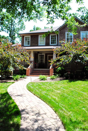
We do our best to crash a variety of homes, both old and new, big and small, traditional and modern, expensivo and super cheap, etc. This one falls into the glamorous high-end realm, but its cup runneth over with adaptable ideas – even if you’re on a tight budget. So we’re happy to bask in the inspirational eye candy (and pass it along to you guys of course). As we mentioned in yesterdays post, this gorgeous home is located in Charlotte, NC. So on with the tour. Here’s the charming exterior:
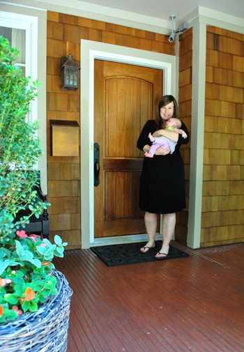
And here are Jennifer and her sweet six week old daughter Eleanor to let us in:
Here’s the gorgeous view that greets you when you step in the front door, which you might recognize from yesterday’s surprise-we-were-road-tripping post. Seriously, I pretty much walked into this house and went crazy with delight and excitement. So sorry for jabbering mindlessly and running around screaming, Jennifer. Your house is just too much goodness for my brain to handle.
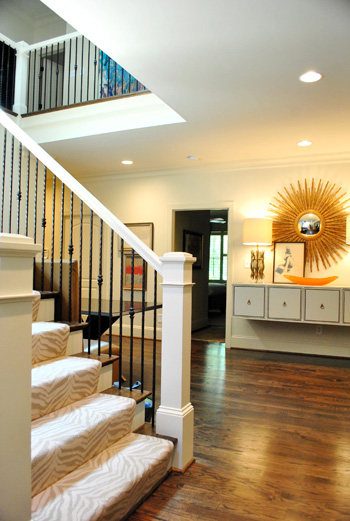
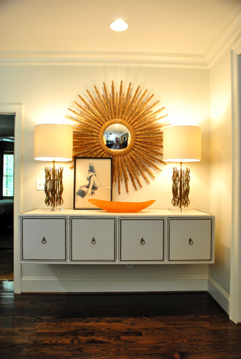
When it comes to that gorgeous tonal zebra carpeting on the stairs, it’s by Stark. And that gigantic mouthwatering mirror is from Circa (well, I’m 90% sure that’s what she said – remember my brain was exploding). I think the lights on the floating console are also from Circa, but I’ve seen dead ringers at HomeGoods along with other starburst mirrors. So checking there (or at their sister stores: TJ Maxx or Marshall’s) can help you get the look for less. And speaking of that floating console, how cool is that? Finding a four-drawered piece like that at a thrift store or garage sale and adding nail heads around the edge of each drawer along with ring hooks could mimic the look. You could even remove the legs and mount it on the wall like Jennifer did. The girl is creative to the nth degree.
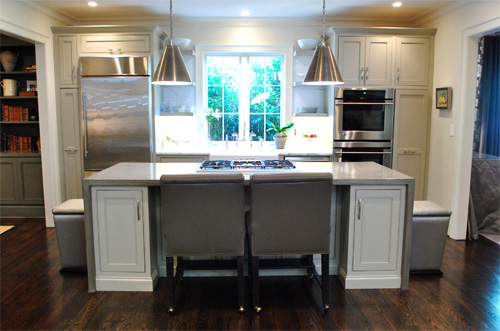
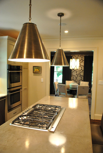
Behold, the kitchen. The cool thing is that it wasn’t a massive space but Jennifer made the most out of it by adding as much function (along with a heaping portion of form) as she could. The steel pendants (by Visual Comfort) provide task lighting for the island, which is packed with useful range space as well as food prep area on either side and a spot to sit and eat in front of the cooktop. And instead of using pricey granite or marble, Jennifer actually chose poured concrete for the top of the island, which was molded to wrap around the base of the cabinets on each side like a parsons desk. I was in lurve (she also said it held up really well for those considering DIYing concrete counters like this previous House Crashing homeowner did here).
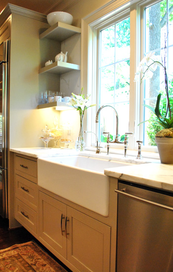
There were two small areas next to the sink with marble, but it was actually scored as a remnant to save loot (using concrete for the majority of the kitchen was definitely a money saving choice). And how great are those simple clean-lined shelves on either side of the window? So simple and sweet. The faucet is Rohl (I love the raised neck) but overstock.com often has similar looking versions for those on a budget (you might have to check back a few times since they seem to go fast).
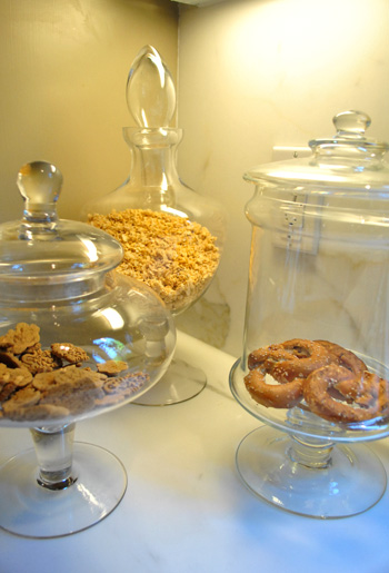
Oh and did you notice that cluster of items under the shelves in the photo above? I loved this idea. Jennifer got a few glass apothecary jars (HomeGoods, Marshall’s, and TJ Maxx sell these for under $15) and filled them with kitchen stuff like granola, pretzels, and cookies. Such a chic way to dress up any counter.
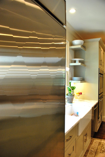
And file this under never-seen-it-before-but-I-went-crazy. The fridge is “quilted” with a cool diamond pattern that actually bumps out ever so slightly to create a faceted textured look. Jennifer went with standard GE appliances, but she sent the door of her fridge to a guy in Atlanta who added the special detailing for a completely customized look.
Beyond the kitchen was the dining room, which was a gorgeous contrast to the light and lovely space.
It felt moody and luxe thanks to darker tones (in that stunning wallpaper and those great gray velvet drapes). If you’re looking to recreate this look on the cheap you could always experiment with a light gray stencil on a dark gray wall. You could even dye some $7 Ikea curtains (we like the Vivan ones) in a deep gray tone. It won’t be completely the same (the sheen of the wallpaper and the texture of the velvet curtains is amazing) but it would definitely swank things up and add that moody vibe.
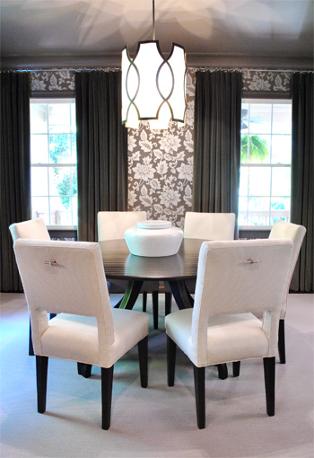
And how amazing is the light fixture? This picture doesn’t even do it justice (it’s by Baker). You can kind of see the shadows that it casts on the ceiling but it was ten times cooler in person. Oh and look closely at the chairs above. See those cool hardware handles on the back of each one? Those are also the brainchild of Jennifer, who added them because she thought it would be easier to pull them out (and they might save the upholstery a bit more since grubby hands won’t constantly be gripping the sides). Is she a thinker or what? I love that no detail was left unaddressed. Especially since I know firsthand how hard it is to have focus like that when you’re furnishing a house (it’s so easy to get caught up in the big stuff and forget about all the cool little finishing touches that make a room feel personal and functional).
Here we have the cozy living room with a gorgeous ottoman that I wanted to strap on top of our Altima and take home. It was covered with this amazing painted fabric. That’s right, I said painted fabric. It was a velour/velvet type upholstery that was stenciled with paint and then weathered/distressed/worn down so it looked irregular and tonal and amazing. The weathering process (sanding it down) made it soft, so it didn’t feel crunchy or hard. Just textured and special. I’ve never seen anything like it.
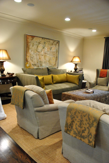
So for anyone brave enough to try stenciling velvet our velour with watered down paint and then sanding it with high grit sandpaper for a weathered and worn in look, I can tell you firsthand that it might just be the coolest thing you ever do. In your life. Ok that might be an exaggeration (creating a human or graduating college might be up there too).
Oh and see those pieces of fabric folded over the top of each arm chair? Once again Jennifer used her brainpower to creatively solve a problem. Her cat loves to jump up from the floor to the back of her chairs, so draping some pretty fabric over the back of each chair was her solution to keep the chair’s upholstery from being clawed (it’s much easier to switch out the draped fabric if it gets ruined than redo the chair). Smart right? And that’s something you can make with a fabric remnant and some Heat N Bond (or a sewing machine if you’re getting braver every day like I am).
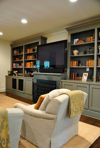
Aren’t those built-ins gorgeous? I loved the elegant greeny-gray color (try Benjamin Moore’s Senora Gray for a similar look), and the hidden storage underneath will definitely come in handy when it comes to stashing Eleanor’s toys.
Since Jennifer loves to add unexpected pattern and texture from room to room (like her light kitchen next to her ornate wallpapered dining room), she thought the small powder room was the perfect place for a little more wallpapered drama. It was a very small room so we were really impressed with her bravery (bold pattern, dark trim, dark sink) but it looked like a bling-y little jewel box instead of a tiny and bland little builder bathroom, so it was such a great call.
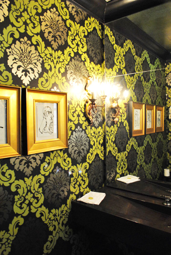
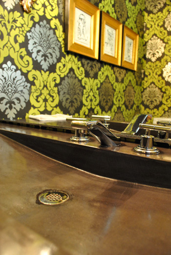
I also loved the dark modern sink, which was poured concrete just like the kitchen island. And the faucet is by Kohler (so sexy, right?) which often ends up on overstock.com or a place like plumbersurplus.com for those in a deal-hunting mood.
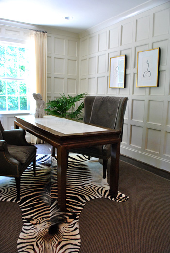
This room is a little office/bill paying area that was another modestly sized space that Jennifer maximized with a skinny floating desk and two comfy chairs (so much more inviting than traditional office chairs and still just as functional). And those amazing paneled walls make you notice the luxe architecture of the room instead of how small it is. As for how they attained that paneled look, it’s just cheap wood from the home improvement store that they used to create a rectangular grid pattern with molding around the edges to finish each one off. Then they just painted it all for a seamless effect.
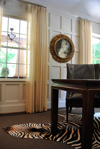
Oh yeah and this mirror is another thing I wanted to sneak out with. How pretty is that patina-riddled glass? It’s an antique from Circa, but there are tutorials online for antiquing your own mirror (like this one), so finding something new and then glazing the frame and patina-ing the glass could yield something similar on a budget.
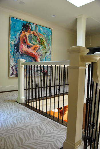
Jennifer and her husband are hardcore art collectors, and one of their favorite pieces is this giant figure by Carl Plansky. It’s such an amazing focal point in a hallway without much else going on (except for that cool zebra runner which snaked upstairs). A giant abstractly painted canvas (made by you) or even a large wooden frame with colorful fabric stretched around it could add similar color and boldness.
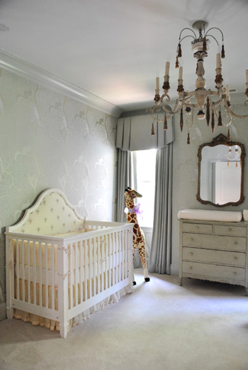
And of course little Eleanor needed a nursery to call her own, and Jennifer didn’t spare a single detail. The gorgeous chandelier is from Circa and the dresser is actually her own childhood dresser that she painted to work with the wallpaper.
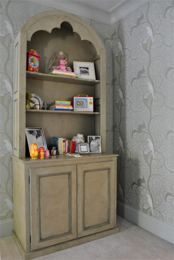
Speaking of the wallpaper, here’s a shot that might be easier to make out. It was actually these tone on tone vines that snaked up the wall with squirrels and birds on some of the branches. So sweet yet sophisticated. I felt like I was in an enchanted forest.
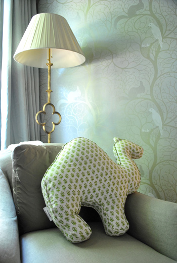
And you know I love a good quatrefoil worked in there, so of course this lamp was yet another thing I wanted to grab while screaming “what’s that over there?” and running out to the car with it while Jennifer looked the other way. But I didn’t. It looked perfect right where it was. And how cool is the camel pillow (by Rikshaw Design)? I love how it layers in with the tones of the room while adding more of that “enchanted animals” vibe from the wallpaper and the giant giraffe near the crib. Clara was in love with this room (and that camel pillow in particular).
So there you have one of three house crashing adventures (well one was actually an office crashing) of which we partook during our weekend road trip. We’ll be back to share the other two in a little while (we don’t want them to be jammed on top of each other and we’re still waiting on some source info for those, but they’re definitely coming within the next week or two). Oh but we can’t sign off without sending a huge thank you to Jennifer and her sweet family for so graciously letting us in to snap photos for you guys (even with such a fresh little newborn around)! They were amazing and we’re so happy that we were able to stop by. Now let’s play the what’s-your-favorite-part game. Mine is the floating nailhead console with the sunburst mirror over it. And the poured concrete counter that runs up and down the side of the island. Le sigh.
Psst- Wanna check out other house crashing adventures? We have them all right here.
More random pssst- Is anyone else watching The Voice? I’m in love with Dia and Xenia. Who are your picks?

Kristen @ Popcorn on the Stove says
Um, the fridge is awesome! I didn’t know you could do that!
I also love the powder room and zebra-print rug on the steps. There’s so much going on visually without being too much. Very jealous (although filled with good ideas!)!
Tana says
Was this on Apartment Therapy? It looks familiar.
YoungHouseLove says
Maybe it was something similar? Jennifer just completed her house and has never had it featured before. Which is insane because it’s so worthy of a ton of coverage, right?!
xo,
s
Adriane Wacker@FortheLoveofPainting says
Her house is amazing…I have to admit though, I do not really like the nursery. I like color in baby rooms…the room is too grown up looking and not fun enough!
Brooke says
I have to agree. It felt like it was more of a show room rather than a nursery. But, that said, it was still lovely. :)
Antarctica says
Agree.
It’s VERY elegant and beautiful room, but not practical. Soon enough it’s going to be in need of the reno to fit toddler’s needs. Unfortunately some things have to be learned making your own mistakes. I had to redo my daughters room 3 times before she turned 5! Now with my son I realized that a baby doesn’t really need much except for a crib, chair for mommy, place to go crazy with toys :)
Very beautiful home, I love the kitchen!
Way to go, Jennifer!
Annakat says
I’ll beg to differ here. I think it is neutral enough to have the baby develop their own personality as they grow up. But has a subtle enchanted forest feeling to help their imaginations along.
Beautiful home, Jennifer!
Elisa says
I love the giant piece of art in the upstairs hallway. It really makes the space feel GRAND. And those concrete counters are a total inspiration!
Kate says
Gorgeous! That front entry with the stairs and the console is just perfect in every way. Love the zebra stair runner. Love the mirror. Love the floating storage. Perfect. Perfect. Perfect.
Allison says
Great inspiration! My favorite was the dining room chairs–the handles, the shape, the cutout part. They’re sexy!
Krystal Lee says
i agree, that is such a good idea, soo clever!
Nicole Marie says
I’ve seen cut-out white leather chairs like that on overstock.com if you’re ever interested in buying some. They are beautiful!
Jill says
Gorgeous house! Love that patina mirror. So, The Voice…faves from The Voice are Xenia and Dia as well. Xenia is my fav b/c she has a very unique sound but Dia is as cute as a button. Also, I’m looking forward to hearing Casey (on Adam’s team). Blake’s team singing a Maroon 5 song was great! And how ’bout Christina’s hot pants? Whoa momma!
YoungHouseLove says
Haha, those were definitely short and sweet. Haha.
xo,
s
Robin @ our semi organic life says
The fridge is crazy awesome! Like woah! How come I’ve never seen that before? Pinterest anyone?! Also I love the dining room and that light! Also I would love to have that style of concrete (or otherwise) wrapping counters.
YoungHouseLove says
Pin it! Pin it! Pin it! Haha. I really am chanting that as I type it. I was so in love.
xo,
s
SingleMama says
BEAUTIFUL! Makes me change my opinion on wallpaper for sure!
holly@LoveofLifeblog says
I love when y’all do these! I love the subtle animal prints- And that carpet- yowza! Its also inspiring when people find classy wallpaper to put up, too. I keep seeing it in House Beautiful magazine and I can’t get enough.
Whitney says
Love The Voice. Love Javier Colon! I didn’t watch it last night but I cant wait. I am also in love with the lamp in the nursery!
cc says
I am so impressed with so many aspects of this home– I think she had me at the front porch, and it just keeps going! I kept saying, “Why didn’t I think of that?” at details where I would never have thought to add them!
Katie says
I can barely think of anything to type- that house is so beyond gorgeous I’m speechless! Jennifer is SO creative! My favorites are the kitchen, dining room (amazing light!), and office.
Side question- I tried finding this on your BabyCenter page and may have missed it, but do you (or anyone else) have any suggestions for unique/thoughtful baby gifts? My co-worker is having a baby boy soon and I’d like to surprise her with something. Thanks!!
YoungHouseLove says
One of our favorite gifts ever were Aden + Anais swaddle blankets (sold in fancy stores and Target also sells affordable versions of them). They’re priceless for swaddling your baby off to sleep and light enough to use as stroller blankets in the hotter months without making the baby all sweaty! Just an idea. Anyone else have thoughts?
xo,
s
Jessica says
Pottery Barn Kids has amazing personalized baby gifts if you know the baby’s name….we got a beautiful rocking chair with our little one’s name hand-painted on it, and also a towel wrap with her name embroidered on the back. We use both all the time, and they were very special gifts that we will always remember. Maybe you could use the baby’s last name if you don’t know the name they chose….
Sarah B says
I think the most thoughtful gift was actually for me after the birth of our 1st daughter! Someone gave me some luxury bath oils and lotion. It’s a small reminder that Mom needs to be taken care of too!
laura says
I also love the aden and anais swaddle blankets! My son was born in the end of July and even tho it was hot sometimes I felt since he was so new I should have him somewhat covered to shield him form sun and bugs so the thin swaddles blankets are a must have for summer born babes!!
Liz says
I also LOVE the Aidan and Anais swaddle blankets! Just had to chime in!
Amanda says
Best gift we got was freezer meals. My aunt looked us enough meals for our freezer that we didn’t have to cook dinner for 2 months. It was amazing. I’m bringing trays of food to freeze to every friend now when they have a baby.
Jenny B says
Someone gave me a pre-natal massage gift certificate. Divine! Another favorite gift was a Barnes and Noble gift card. A couple of people went in together for a gift card total of $75! I was able to make several trips:) Picture frames are great, too. I’m always buying picture frames!
Jenny B says
Okay–I feel like such a dummy. I actually got an Aden and Anais swaddle blanket as a baby gift. It no packaging or explanation so I didn’t know what the heck it was (it was mailed from a friend from way out of town). So I just used it for a nursing cover up and it was terrific. I could cover the little guy without him sweating like a little piglet! I just looked it up after reading your post and now the mystery is solved. Thanks:) Maybe we can actually use it as it was intended if we ever have #2!
YoungHouseLove says
I never would have known if my bff didn’t explain it to me! Haha. They’re mysterious little things.
xo,
s
kim says
I received a fantastic little book called “Mom’s One Line a Day” (http://www.amazon.com/Moms-One-Line-Day-Five-Year/dp/tags-on-product/0811874907) when my son was born. I can write a few sentences about what he did/milestones/etc each day for 5 years, but I’m not overwhelmed.
Amy @ larryspearslive.com says
I LOVE LOVE LOVE the nursery! Rarely do you see such a sophisticated look for a baby’s room. Love how it’s actually playful in the details, but sophisticated enough to blend with the rest of the house.
Meredith says
I SO agree. I’ve been grabbing every inspiration picture I can for our nursery. I want to have our rooms blend together too, and it seems that many nurseries focus on bright rather than sophisticated AND playful. I think this works really well. Lovely house and great details guys!
Angie @ The Country Chic Cottage says
Holy Awesome House Batman!! :) Wowzers!! My fave — the kitchen. Awestruck and mouth gaping here…
AmiDawn says
this. yes. me too.
Ashley says
That really is a beautiful and stunning home. I love how every detail is in order and the scale is just right. Beautiful. I almost feel like this is a model home and no one lives in it!
As for The Voice, Dia is so friggin cute. And how sweet is it that she writes children’s books? My husband barely recognized Xtina during her performance. We later concluded that she’s looking like Snooki with a blonde wig these days. I also love Frenchie just b/c of the power in her voice and her stage presence. She performs as if she’s already a star.
Lastly for anyone living in the D.C. area who subscribes to Living Social the deal today is “$30 to spend on home improvement products” at Ace Hardware for $15! So basically half off and if you find yourself a good deal then you’re really in business!
Julia @ Chris loves Julia says
Thanks for the heads up on that deal! I can usually log into my account and select a different city and the deal will come up (I am not in D.C.), but I don’t see it. Do you mind linking?
Chris Loves Julia
Ashley says
Sure! Here’s the deal:
http://livingsocial.com/deals/30990-30-to-spend-on-home-improvement-products
Ashley says
Oh yes. And one last thing about the house crash (sorry to double post)I love love love LOVE the Cape Cod shingles. I WILL have them on my home one day. Gives such a beachy and relaxed vibe IMO.
Amy @ Triangle Honeymoon says
I think that house crashing is one of my favorite features you do! Love it, especially that sunburst mirror and floating console.
Future Mama says
That camel pillow was adorable!!!
Much love,
Future Mama
http://expectingablessing.blogspot.com/
Amanda B. says
The powder room is definitely my fave! That sink! And I am so in awe of the idea of handles on the backs of the dining chairs. Love when function and form come together like that!
Julia @ Chris loves Julia says
I just went on a pinning spree. And then I started rethinking all of the color choices in my home. (haha)
Chris Loves Julia
Lindsay says
Love love love Xenia!! Dia is super sweet, too. But, I just love Xenia’s voice!
Kay says
It is a very stunning home! But I am curious… that wasn’t a real zebra skin rug was it? Just a fuax one?
YoungHouseLove says
I’m not sure – here’s hoping Jennifer can stop in with that info.
xo,
s
Emily says
Oh, I hope it wasn’t real. I loved the house but the rug made me so sad.
Cat@BudgetBlonde says
I highly doubt it judging from the look of it as well as how difficult that would be to obtain. Many zebra rugs you see in designs are just printed on cowhide, but that picture looks like a rug with a design on it. Just a guess.
Christie says
I think the front door and wood shingles on the outside of the house had me at hello. Simply gorgeous.
Caity says
You are so funny!! “And you know I love a good quatrefoil worked in there, so of course this lamp was yet another thing I wanted to grab while screaming “what’s that over there?” and running out to the car with it while Jennifer looked the other way.” That cracked me up. Thanks for all the tips throughout this post…I might have to steal some of these ideas! :)
Kim says
Great. Now I’m never going to be fully satisfied with any future house until I get a subdued zebra runner on a staircase. Le sigh.
Jen F says
I am SOOOO with you on this. That was my fave part and I’m going to want it in every house. I don’t even have stairs and I’m trying to work it in. Ha!
Krysta @ Domestic for Dummies says
Holy Crapola that house is amazing! Wish I could get bold with wallpaper like that.
holly says
i think the floating console and whole entryway thing was my favorite. that console is clever.
xenia is my fave too. her voice is so interesting. it’s a nice change from every girl that sings like Christina Aguilera and waves their hands wildly. And she’s so young and sweet. My other fave is Javier.
Erin says
I just pin’ed the heck out of this post. THANK YOU for sharing and CONGRATS on a job well done Jennifer – i’m in love!
Cheryl says
I luuuurrrrvvvvv lurv lurv the zebra carpet/hall runner! It is gorgeous!!! I also loved the bathroom sink. Hubby is a plumber, so I think he could DIY that in our first home….whenever we get it… The kitchen sink is one we’ve both loved for ages, too. *sigh* I can’t wait for the babies and houses in my future.
Cait @ Hernando House says
Love it! Especially the kitchen and the zebra print carpet on the stairs!
DJ says
Gorgeous home. But I have to ask- with a newborn in the house, where were the pack-n-play, the bouncer, the piles of diapers and wipes… Did she hide it all in the closet before you arrived?
YoungHouseLove says
We didn’t shoot certain rooms (her bedroom was the main baby headquarters so it was loaded up with all of that stuff). Don’t worry, Jennifer is definitely human… even though her design sense leads you to think otherwise! Haha.
xo,
s
karen says
the cedar shingles had me at hello!! top notch yo!
Kellie says
That dining room makes me swoon! The bold contrast and the colors. Love it! I dont know how she has a child with that white carpet & chairs though!
And that zebra rug up the stares is a perfect combination of sassy, style & yet its muted to not be so in your face. Love it!
Blair says
I love the wallpaper in the bathroom. Gorgeous! Also, that camel pillow can’t be that hard to make. I am sure there are some simple patterns out there you could use to sew one up and stuff it!
~Blair
YoungHouseLove says
Great idea! Clara might need one.
xo,
s
Sharon says
THNX for this post!! Outstanding!! As a Realtor – I see homes everyday! – But THIS one is A++++!! :-).
PS – Does Jennifer have a blog, too? Would love to follow her and her fab ideas. THNX!
YoungHouseLove says
Not yet, but I definitely suggested that she start one! I think with a newborn it might not be something she does right away but I’m crossing my fingers that she’ll do it someday!
xo,
s
Lindsey says
This. House. Is. Perfection. Now I have to clean up this pool of drool thats collected on my desk…
Seriously – beautiful, beautiful home.
Carol N. says
My work neighbors think I’m having an attack because I’m over here ooohing and ahhhing so much and gasping in delight. I love this house and can see all kinds of ideas for mine here. Thanks to Jennifer for letting you crash and thanks a bunch for bringing it to us!
RC says
Beautiful house!
After you talked up the ottoman as so amazing, I would love to see it closer. Do you have a closeup photo?
YoungHouseLove says
We took some close up shots but since it has a weathered almost metallic look they didn’t come out (just looked dark and blurry). So saddddd.
xo,
s
Rebecca says
I love the front entry, but what really got me was the wrought iron spindles on the staircase. Major attention to detail!
Maddy says
Wow, I didn’t want this post to end! I love everything from the painting to the wallpaper. It’s funny because I used to work at a wallpaper shop and thought mostly older people bought it. It’s nice to see it used in such a fresh and bold way! Lovely home.
Maddy
Erica says
love raquel! i dont know why but i just do!
Alisa says
OMG!!! It’s fantastic and I flippin’ hate my house now.
Erin says
Love the Voice! Xenia and Dia were super cute last night, but my favorite thus far is Jeff from Adam’s team. Love a good country voice!
Nette @ This Dusty House says
Oh wow. It’s a dream home!
Amy says
Question – what is Circa? I tried to Google it and there were a ton of options. It sounds like a place that I need to check out. Thanks!
YoungHouseLove says
Here’s that link for ya: http://www.circalighting.com/lights.aspx
xo,
s
Eleanor says
This “Circa” is actually the design firm in Charlotte that helped Jennifer with her home. The website is http://www.circainteriors.com. The website listed before is for a completely different company that sells lighting! Thanks!
YoungHouseLove says
Thanks for the link!
xo
s
NettyC says
That Nursery is perfection. The wallpaper, the mirror, the lighting, and all of the little details and patterns make up a gorgeous spot for their bambino.
myhonestanswer says
I absolutely love it!
Christine says
the zebra carpet on the staircase is beautiful! so subtle and glamorous! and that camel in the nursery is the cutest.
Amy @ All In A Day says
Oh my word!! I’m having a hard time deciding which room I want to “pin” onto my For The Home board!!! Oh heck….maybe I’ll just pin all of them!
Amazing house crash!!! I love it!