We did it. Completely out of order. Yup, we finally decided what color to paint the office and went for it. Which would have been a lot easier if we had pinned down our color pick before we built our wall-to-wall two person desk. Oh well, such is DIY life. We didn’t want to rush into choosing a wall color and then hate it after we built the desk (which would have meant having to repaint everything again after the desk was built anyway). So we waited. And waited. And discussed. And rediscussed. And waffled.
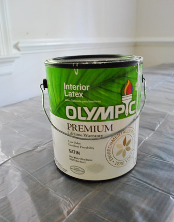
And it’s a good thing that we actually did wait. Because before the desk was completed we were considering some dark muddy colors (which you might have seen on the wall here). And after the desk was built we were both 100% sure that we wanted the dark wood desktop to really pop (a dark color on the walls would just make it all blendy and muddy in there), so back to something light and airy we waffled again…
Here’s a brief synopsis of our thought pattern:
- let’s go dark and enveloping!
- wait, that + a dark wood desktop = a dark muddled space… we don’t want the dark wood to blend into the walls
- plus we’ll lose light when we convert the carport to a garage so dark walls aren’t smart
- ooh, but some bright color might be fun!
- but the attached kitchen & laundry room are bright cheerful grellow and we don’t want the office to compete since it’s right next-door
- plus we want to add bright colors and bold patterns with upholstery/accessories/art/window treatments/desk chair paint
- so bright walls would be way too much with a bunch of bright fabrics/art/accessories, especially in a room where we have to concentrate/work
- plus bright walls would be seen from the adjoined dining room which has deep teal built-ins and brightly patterned curtains, and we don’t want those to fight for attention
- hmm, this is harder than we thought
- all we know is that we want the chair-rail and molding to pop, but not too much since that might be too chaotic/in-yo-face
- and we don’t want something too dark or too bright…
So we actually ended up exactly where we initially were six months ago: Benjamin Moore’s Moonshine (color matched to Olympic No-VOC paint in a satin finish). That’s the same soft gray that we have (and LOVE) in the living room, dining room, and hallway. Allow me to expand upon those weird stream of consciousness bullets above. We thought about going just a shade darker than Moonshine in here, but realized that we like light and bright workspaces (plus once we convert the carport into a garage – even though we plan to add windows to the exterior walls and door – we might lose a little light).
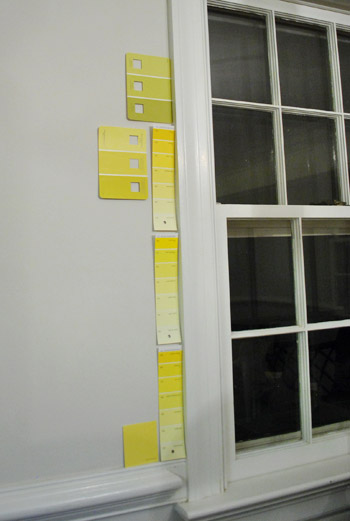
Some of you might be yawning because you were imagining something like sunny yellow (to tie in the front door)…
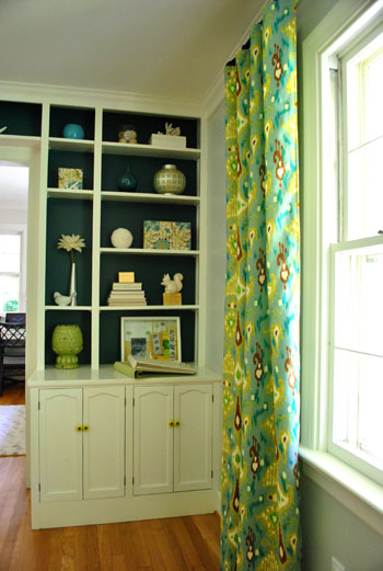
… or green (to tie in some of the tones in the living room curtains) or blue (again, to pick up on the dining room built-ins and curtains)…
… but after thoughtfully considering belaboring all of those options, we finally decided that going soft gray with the walls will really give us the freedom to bring in some seriously fun brightly colored & boldly patterned fabric (for the two desk chairs and the window treatments) along with some punchy art, bright lamp shades, and even in fresh paint for our desk chairs. We definitely like the idea of some fun cheerful pops of color in the accessories as opposed to all over the walls since we don’t want the room to feel too chaotic/hard to concentrate.
Besides, since we already have such a bright greeny-yellow tone in the middle of the house (the kitchen and laundry nook)…
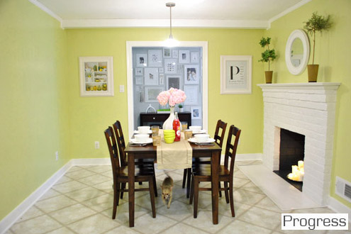
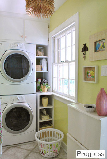
… we kind of love the idea that all of the soft gray rooms lead to the cheerful kitchen in the heart of the house. So we decided that we didn’t want some other bright color competing with it since they’re next-door neighbors. There’s something kind of nice about a burst of happy color in the center of our home with three soft platinum gray rooms around the perimeter (with pops of color in the accessories like the art/rug in the living room and the curtains/built-ins in the dining room):
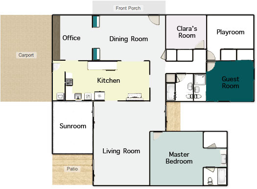
The funniest thing to us is that we only have a few unpainted rooms remaining (the playroom, sunroom, hall bathroom, master bathroom, and guest bathroom). And since those spaces aren’t ones that we spend the majority of our time in (meanwhile we practically live in the office), it’s kind of ironic that it was one of the last few that we got to. I wholeheartedly admit that the whole house color scheme above might not make much sense to you now, but hopefully once we paint those last few spaces and add touches like wainscoting in the hallway and other major furnishings/accessories that are still woefully missing (window treatments, lighting, rugs, furniture in the playroom instead of junk, etc) it’ll make a lot more sense. One step at a time.
Speaking of which, our office painting method was slow & steady. First we cleared the room.
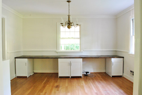
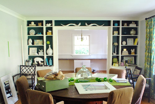
Which of course meant the dining room got full of offset office stuff:
Oh and while the office was cleared we snapped some pics of the desktop since so many of you wondered where the seams fell. We had to highlight them with a white line in photoshop to help you out (they’re actually really subtle in real life, so they were impossible to see from this distance without some white-line help):
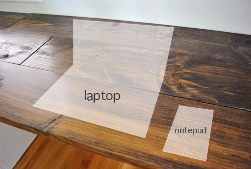
As you might notice, to the right of both of our laptops (when they’re actually on the desk) there aren’t any seams, so we don’t have any lumpy-bumpy seam-related writing issues (we write on pads and notebooks anyway, so I don’t think it would matter).
Oh and didja notice the holes in the back of the desktop behind both of our computer areas? Let’s have a little side chat about those, shall we? First we made a pilot hole where we wanted them to be (John used a paper template so they were both spaced the same distance from the wall):
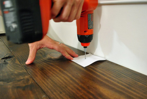
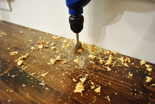
Then John used a 1 1/2″ bit…

… to drill a nice ol’ hole for all of our cords (for desk lamps, computers, the home phone, etc):
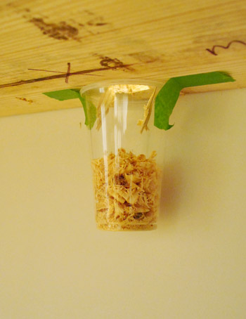
And John was a smartie pants and taped a cup under the hole to catch shavings, which was a huge time saver when it came to clean-up:
But of course the wood was unstained, so I used a little craft brush to get in there with some dark walnut Minwax to blend the hole in a bit better (we sanded things first, just to keep them nice and smooth so we don’t get splinters while retrieving cords):
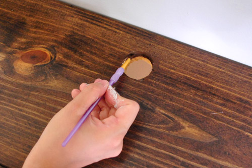
So that’s how those handy holes came to be. As for how we painted the wall behind the built-in desk, the entire thing actually slides away from the back wall, so we slowly slid it out towards the middle of the room…
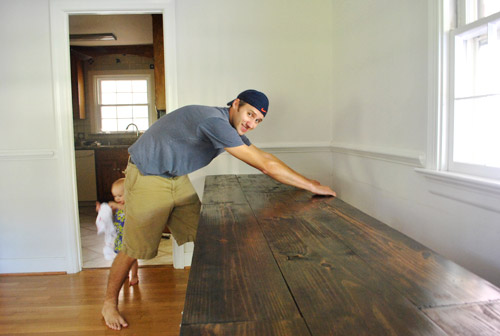
… and covered it with a giant drop cloth to protect our beloved dark wood desktop. That way we could roll/cut in behind it and then later push it back into place and paint the two sides of the wall that it blocked while it was pulled forward.
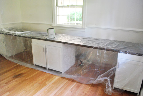
As is our tradition, John got his roll on while I did tons of cutting in (thanks to that chair rail, two doorways, and two windows). About two coats and four hours later she was looking like a soft fluffy cloud. Ugh, but ignore the light fixture. That thing’s having surgery as we speak- er, write. More on that soon.
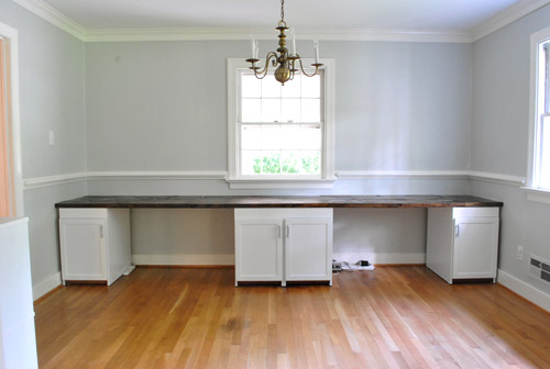
Then we just pushed the desk back against the wall and loaded everything back in there. The walls look a smidge blue-gray in these pics, but in real life they’re a true gray color (not icy blue or anything close to purple at all). Oh yeah but remember that everything on the desk is just sort of tossed there, so the leaning frames won’t stay (we need height, so we’ll probably hang some over-sized art on the walls) and everything else will likely evolve as we settle in a bit more.
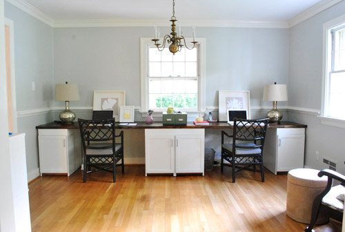
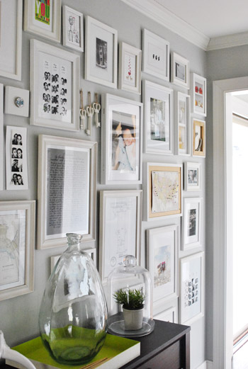
The lamps are from HomeGoods but we’re not sold so they might go back. We’re thinking we may use new lamp bases or shades as a place to add color along with art, paint on those desk chairs, patterned window treatments, etc. But thankfully we’re still as enamored with the wall color as we were when we chose it for the hallway frame gallery (the color reads more true to life in this pic)…
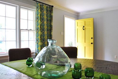
… and we definitely still love it in the dining room…
… and the living room too…
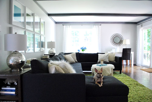
We especially appreciate how it makes the super thick crown molding and the nice chunky chair rail pop without being too high-contrast (which would also compete with our big beautiful desktop). Of course the chair rail will make a lot more sense when we hang proper art instead of leaning too-small stuff it in front of it.

And we love that this phase of the office upgrade was $0 since we still had a bunch of paint leftover from painting the dining room (we bought three cans back in January when we initially planned to paint the living room, hallway, dining room, and office all that color – and finally completed that initial plan this weekend). Only seven months later. Haha. Oh and we owe you a wide shot from the dining room of the fresh paint job, but since we’re making those aforementioned light fixture tweaks, we can’t shoot one quite yet. Soon!
But wait, there’s more than just a paint plan in here. We actually love the idea of adding a subtle tone on tone stencil around the entire room above the chair rail (hooray, no more desk shimmying necessary). We don’t want anything with too much contrast since it’ll compete with the dark teal built-ins and the fun curtains in the nearby dining room, but we’re seriously considering something like this with just a softer gray color for the feather part over our Moonshine walls (although I love the pop of yellow, so we might try it and bag it if we step back and it’s too much):
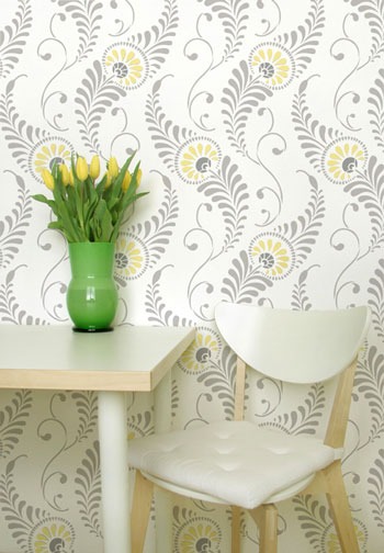
At 54 honking dollars it’s hardly a drop in the bucket (the stencil is over two feet tall and almost two feet wide to hopefully make the project go faster/smoother), but we figure that we did snag six cabinets for $6 and we built a 13 foot counter for $27… so maybe we should just bite the bullet and spend $54 for something we love. Any type of wallpaper (even the cheap stuff at Lowe’s and Home Depot) would be way more than $54 for the entire room above the chair rail, so I guess that’s another way that we’re rationalizing our possible purchase. Haha. We shall see. You know we’ll let you know when we make a final decision. We’ve never done a giant repeating stencil like this on a wall (we did stencil the floor of our first house’s sunroom) so that should be interesting too. And who knows, maybe I’ll find it as soothing as my little potato stamp project in Clara’s closet (I enjoyed that repetitive motion more than a person probably should).
Did anyone else paint their walls or drill holes into something this weekend? Or move a giant 13 foot desk? Or figure that we might be painting or drilling holes? Or dream that we had a secret son that we never told anyone about (two different commenters had that dream last week – crazy!). Oh and we painted this room four hours before my mom came to town for the weekend from NY. Nothing like a little en-route visitor to light a fire under ya.
Psst- You can see some mom-visit pics over on Young House Life today. Clara does not have a healthy fear of alligators. At all.

Lisa says
Typo alert – I think you mean “soft” gray rooms, not “sofa” gray rooms.
YoungHouseLove says
Haha, thanks! Off to fix it!
xo,
s
Lisa says
Wow, didn’t realize I would be the first comment – woohoo! And I didn’t even say…LOVE the decision to stay with the gray! Looking great and can’t wait to see the rest! (and I edit for a living, so hope you don’t mind me catching the typos – it’s a sickness, I tell ya.)
YoungHouseLove says
We appreciate all the type help we can get!
xo,
s
Janet says
No green no yellow. You have that ugly green all over your house.
YoungHouseLove says
Huh? We love that color. But paint is like that – it’s definitely one of those to-each-his-own things!
xo,
s
Donita says
OH MY GOODNESS how could you call that green ugly. WE LOVE IT, and want it in our kitchen. YOU GUYS ROCK!!!! LOVE your color theme.
YoungHouseLove says
Haha, no worries! I don’t think there’s a single paint color in the universe that everyone would agree on. And that’s sort of the fun, so we don’t all end up with clone-houses full of the same colors/stuff.
xo,
s
Brianne Franklin says
Well, isn’t that just a piss-in-the-Cheerios comment. Good morning to you, too, Sunshine!
Jessica says
lol….don’t know why but this comment made me chuckle…..tell us how you REALLY feel, why dontcha? hahahaha!
ps….i love the grellow….
Barbara says
I LOVE that green. To each his own.
Tanya @ Lovely Greens says
Wow…that’s just rude. It’s not even constructive criticism, just pure meanness.
@Sherry – I’m a relative newcomer to your blog but really find it inspirational and love your decor choices :) You may have discussed this in another blog entry but am just wondering about the layout and amount of light your kitchen gets from the above schematic. Did you consider knocking down some walls at some point?
YoungHouseLove says
Yes, we’re so excited to create that big doorway that leads to the dining room since that room has a giant picture window (it’s like 6+ feet long) and it will hopefully flood the kitchen with light when that extra-wide doorway is knocked out!
xo,
s
Kinsey says
I agree that paint is a to-each-their-own. However, I love the idea of the yellow. My husband and I actually just bought our first home… and you will love this… it’s a fixer upper rancher!! We are definitely going to be on a very strict budget. One of the things I am hoping to work with for now, is the second bathroom’s retro yellow counter top. I think it has real potential. After seeing that yellow and grey stenciling I was filled with hope. Love your blog! We actually got married last year and I used so many ideas from your wedding blog. When I started looking for home decor blogs and stumbled upon your blog a second time, I knew it was fate!
Sheryn says
Wow are people so rude… “Ugly color”???? I want to slap them. You should practice the same manners online as you do in real life! Ok, ok, I probably wouldn’t literally slap someone in real life, but I’d definitely be giving that person a dirty look.
Rude.
Melissa says
I love it! I just recently started reading your blog and have officially become obsessed! It is so inspiring and fun!
Amber Lee D. says
I just did a huge 2 foot stencil in my son’s room. I say go for it! I was having trouble with the price tag too, but I reasoned that wallpaper would be at least double that. It turned out really good and gave it that “wow” factor as you walk it. I am so pleased I did it. I do recommend practising on something so you can work out your technique on matching the first and second row…but other that than you guys will be pros!
Donita says
Stenciling tip: I saw on a DIY show, how to stencil and not have bleeding under the stencil. Spray the back lightly with an adhesive, put on the wall, then roll a light coat of the wall color over it first. Let it dry. Then paint the color you want for the stencil. The wall color will make a seal, that keeps the new color from bleeding under the stencil. I hope that makes sense. They made it look so easy and perfect. I haven’t tried it yet, but it makes perfect sense to me. :-)
YoungHouseLove says
Love that tip! It also works for taped off stripes, which I love!
xo,
s
Julie says
Did you paint your chairs too? They look spruced up!
YoungHouseLove says
Nope, they’re definitely on the list. We’re thinking of something with some pop, but who knows where we’ll end up. It might depend on what fabric we choose for the seats (and the window treatments).
xo,
s
Gloria says
Paint the chairs that “ugly green color” I happen to love it!
YoungHouseLove says
Haha, that’s actually one of the colors on our short list!
xo,
s
heather s. says
While I like the green, I’d do something new for the chairs. Maybe yellow to tie in the front door or a dark purple or even the teal color of the shelves in the dining room might be fun.
I’m surprised you didn’t remove the chair rail since it screams dining room to me. Maybe the stencil will help – we’ll see how it turns out!
YoungHouseLove says
Yup, yellow and plum are two other chair color contenders along with the same deep teal as the built-ins (or something lighter or deeper). Should be fun to see where we land. I think it’ll come down to what sort of fabrics we choose for window treatments and chair upholstery.
xo,
s
Amanda @ Our Humble A{Bowe}d says
I like the Moonshine and completely understand that you don’t want to overpower any elements near the office. Just curious why you painted Moonshine above and below the chair rail? We have chair rail and painted the bottom portion white for nice contrast: http://ourhumbleabowed.wordpress.com/the-grand-tour/
I’m excited to see if you do the stencil, too. I think to add more color you could add yellow or green lamps, fun patterned curtains, and your chairs will look great once you’ve refinished them. How do you plan to tackle the curtains for the window above the desk? I know it’s so much easier to go with floor to ceiling, but you can’t because of the desk. Roman shades? Just wondering…
YoungHouseLove says
We figure since we’ll do the gray-on-gray stencil above the chair rail we’ll like the solid gray under it, just to ground it. Yours is very pretty in white though! As for the curtains, we’re thinking about brightly colored/patterned roman shades so there’s not a length issue.
xo,
s
Megan says
sherry- I’d love to hear where you get roman shades done! Or maybe you could post a DIY! I’ve been wanting roman shades since we moved in FEBRUARY- but we have giant heater boxes under all our windows, so annoying.
(By the way, I originally ordered roman shades from a company on Etsy- Kona Interiors- they are no longer on etsy because their rating went down so much, but they now have a website and are extremely shady. Sent them fabric and money and waited and waited, never got them :( So, yeah…hopefully you find somewhere else to have them done)
YoungHouseLove says
I’m actually planning to DIY my roman shades. Yikes! Could be a disaster! Haha. I’ll share all the details. Hopefully I won’t royally bomb!
xo,
s
Hannah says
I found a great DIY Roman shade tutorial on Pinterst (original site here: http://365days2simplicity.blogspot.com/2011/04/easy-no-sew-roman-shades.html)
Might be worth a shot.
YoungHouseLove says
Thanks for sharing the link!
xo,
s
Kristen @ Popcorn on the Stove says
If you guys paint a stencil, a fun trick is to use the same color but pick a glossier finish. You’ll still see the stencil but it won’t be so in your face. It may be worth trying!
Anyway, I love the color and I think this space is coming along very well! Do you have plans for curtains? Are you going to buy a bright yellow rug??
YoungHouseLove says
A rug is challenging for the room since it would have to be really skinny not to interfere with the chairs when we pull them in and out, but we’d love to find something fun and colorful if we can! As for the glossier finish for the stencil, that’s definitely another option!
xo,
s
Rachel says
Anthro is a good source of colorful patterned rugs in the skinny runner size. They are not cheap (the one I like is $248), but you could stalk the clearance section. :)
YoungHouseLove says
Thanks for the tip!
xo,
s
annabelvita says
Could this be the perfect room to try out FLOR tiles if the dimensions are funny?
YoungHouseLove says
Ooh that’s definitely a good thought!
xo,
s
Julia @ Chris loves Julia says
We finally got our bedroom painted this weekend. We have lived with white walls and seriously dated stenciled edges for 5 months. We went with Martha Stewart’s Mushroom and I have never been so in love with a paint color. Especially in a bedroom. I feel like I could sleep all day–alas, my 18 month girl wouldn’t let me.
Posting pics over at my place (blog) right. now.
Julia @ Chris loves Julia says
http://chrislovesjulia.blogspot.com/2011/09/marthas-mushroom.html
YoungHouseLove says
OOh so warm and enveloping. Love it.
xo,
s
Bob says
“Then John used a 1 1/4? bit…”
Check your picture. :)
A template to mark the pilot hole? John… you do this to drive me crazy. Admittedly, though, the cup underneath the hole is kinda genius. So kudos for that!
YoungHouseLove says
Oops, all fixed!
xo,
s
Pam the Goatherd says
That cup was a great idea, but it would be just my luck to drill right through the bottom of the cup! LOL
heather says
Our house has a lot of very soft gray tones to it as well. We use Reflection by SW – seems to be a similar tone. It’s a great neutral that makes the white pop. I love that I can easily add bright colors to the room without having the walls bright (less of a commitment if I ever want to change something out). We’ve pretty much stuck to Extra White, Copen Blue and Reflection, but I’m jonesin for a pop of color. I think I’m going to do it in our office with a bright green wall for a creative burst.
Vanessa says
Once again you guys amaze me! I think it looks great and I love the stencil idea. That wall color is so pretty with the crown molding. I love it and looks like a great place to get work done. Cannot wait to see what else you have up your sleeves!! Have a great week.
Laura D. says
I love the gray! But when are you going to get rid of the chandelier? I keep seeing it and wonder if you keep hitting your heads on it. Do you have any ideas for what to replace it with?
YoungHouseLove says
Check out this post for some details about that. It’s actually in “surgery” now. You know we love to work with what we have, but we’re definitely tweaking it!
xo,
s
abode love says
I am loving this desk area. I think the color is really soothing and I LOVE the contrast between the wood top on the desk and they pale gray. What a great look! LOVE the desk, great job!
abodelove.blogspot.com
Debi says
Could I possibly be the first to comment no way can’t be possible!!! lol Love the stencil alot go for it. I have some stenciling I want to do watching you guys would give me courage to go for it… Love you guys!!!
Adriane Wacker says
I like the more neutral color…I was thinking you were going to go bright based on the paint chip colors, but I also think it is important to stick with something you can live in everyday! Good Job!
Karen F says
Love it! It looks great. Can’t wait to see what you do with the light fixture, and the art, etc.
Jenny @ Words On Wendhurst says
I think a bright bold color could have been fun, but with how open your whole house is, I totally get having a consistent “background” color throughout. I think the stencil could really add a lot to the space, especially with the yellow!
Jen says
Great tip with tapping a _catch-all-cup” to the bottom of desk! I always make such a mess.
The office looks fantastic. You were right – the desk really pops!
Jen says
PArdon my typo – “taping a “catch-all-cup”
Laura says
Love the stencil idea.. I was actually going to suggest it! Glad I read the whole post ;) Some great artwork will also make it pop. And nicely done on the cup to catch the wood scraps.. I agree with the above poster… pretty genius!
Laura says
PS, if you are really up for a challenge, and want to make a custom rug, check out this link for a great tutorial that I found… pretty awesome.
http://xoelle.com/2009/05/t-shirt-latch-hook-rug-tutorial/
YoungHouseLove says
Woah- that’s awesome!
xo,
s
Saleha says
Did you think of trying the left over horse art in the office? Maybe in the corner with the rocker?
YoungHouseLove says
Always a possibility!
xo,
s
Amanda @ Our Humble A{Bowe}d says
I know you pinned an image from my blog, the state love art in our master bedroom, which we used as a cute way to show his and hers: http://ourhumbleabowed.wordpress.com/2011/05/19/new-bedroom-art/ You could make or buy the state love prints for you and John to hang above your sides of the desk. It would be a cheap art project and in large frames? Yes please.
Oh, and I know desk lamps can be tricky, but you’re spray painting pros. Why not but adjustable desk lamps (like the one you have on the parsons desk) and give them a coat of spray paint for a poppy color? Just a thought… I love having the adjustable light and you could steal the lamp from the living room so you’d only have to buy one lamp for the office.
YoungHouseLove says
We thought about desk lamps but thought a 13′ desk might need something more heavy/weighty in the corners. Not sure where we’ll end up, but we love the idea of adding color with spray paint! And as for the art, I definitely have a giant Pinterest folder full of ideas! Love it.
xo,
s
Saleha says
Okay, i take the horse-art-comment back….forgot about the stencil for a bit :)
YoungHouseLove says
Haha- no worries! We definitely hope the stencil is nice and subtle. And we have to find a home for the horse somewhere! Who knows where he’ll end up!
xo,
s
lindsey says
i have a big glass bottle (actually a wine bottle i dumpster-dove for!) & a glass cloche just like yours in the hallway picture… now i know how to style them! thanks for the inspiration! loving your double desk set-up too. the family that laptops together, stays together :)
Lori says
I have those same lamps from HomeGoods and love them, but my walls are dark gray so I can see why you aren’t sold. Too bad you can’t just change out the shade (or dye it a really awesome color).
YoungHouseLove says
Yeah, since the shade is so dark we worried that it wouldn’t take to dye as well as something white. We’ll have to see where we end up!
xo,
s
Monica says
Would love to see those chairs spray painted yellow to match the door!
YoungHouseLove says
That’s definitely one of the colors on our short list!
xo,
s
Sara says
I was thinking the same thing!!
K (Barking Babymama) says
Okay, I agree with the paint the chairs yellow idea!! I was just coming to comment on that and saw I was beaten to the punch. But I think pops of yellow would be so fun in here, tie in the front door, and coordinate without matching the dining room (and even the “grellow” kitchen walls)!
Jessie says
Is it just me, or do I see hints of Sue the Napkin in your little diagram of room colors? Or am I just *looking* for her everywhere now? LOL
Jessie says
Oh,and I think the stencil is going to look AWESOME. I can’t wait to own my own house to do a stencil.
YoungHouseLove says
Haha, she’s a huge inspiration so I wouldn’t be surprised!
xo,
s
Melody says
I love the stencil idea! I hope you decide to do it! :)
Kylee says
I actually just stenciled my hallway this past weekend!! I found some expensive wallpaper that I really wanted (http://pinterest.com/pin/82096200/), so I just decided to make a $5 stencil and DIY it.
I bought an x-acto knife and stencil paper to make my own stencil, then used a paint marker to easily draw the stencil on the wall. I’m super excited with the results, and with challenging myself to DIY it!
YoungHouseLove says
Ooh I’d love to see it!!
xo,
s
Allyn says
Every time I see your dining room, I smile. Especially at the teal bookshelves.
Sadly, the most thrilling thing I did this weekend was clean out the fridge. Trust me, it was terrifying.
T.D. says
Positively LOVE the color choice in the room (also love that you guys kept a color sort of throughout the home). Definitely subtle.
My initial reaction after seeing the whole room was placing the horse art, you removed from the bedroom, in the office area. I think it would be playful to put the art above the desk space whose side it was on in the bedroom.
However, with the idea of the stencils, I don’t know how much the art would ‘work’ in the room then. Just suggestions/ideas.
YoungHouseLove says
Yeah, I think we’ll wait to finish the stencil (if we actually end up pulling the trigger) and then add art afterwards to see what works and doesn’t look too busy/block all of our hard stencil work. Haha.
xo,
s
Pam the Goatherd says
I had that same thought. You might want to stencil the other walls and leave the wall over the desk clear so the art and desk clutter don’t compete with the stenciling.
YoungHouseLove says
We definitely love the idea of seeing the subtle stencil along the back wall from the dining room, so we’re just going to aim for something very soft so it hopefully doesn’t feel too cluttered and art can still live in front of it (sort of how art can hang in front of tone on tone grasscloth). Here’s hoping it works!
xo,
s
Meagan says
I knew y’all would go for Moonshine…and I totally agree with that decision. A bold color would be fun..but that room is so open to the dining room…it just makes sense to keep with Moonshine. And now you are open to doing bold things with curtains and the chairs…that would have been too much with a bold wall color. I am also loving the desk…the top is beautiful. So excited to see where y’all go with accessories and the potential stencil!!
Tamryn says
office is looking good. Can’t wait to show hubby the taped cup idea to catch the mess – nice one!
Lauren says
Love that stencil!
JennyB says
Love, love the color choice. You need something calm & warm in an office, I think. I also love, with how open the office & dining room are, that the colors tie the 2 spaces together. It looks terrific!
PS-I was in Gaffney, SC this weekend for a wedding and went to Pottery Barn…lots of good stuff right now:)
YoungHouseLove says
Oh man so jealous. I love that place!
xo,
s
Lauren says
Love the post and that you went with the grey! I like calming colours for office-space anyway.
Just one question – how did you decide to keep the chair rail? I was betting it would be removed during the painting project and I’m surprised you kept it. It seems a little “traditional dining room” for what you’re doing with the space… maybe I missed an explanation somewhere but that’s what I was wondering! :)
YoungHouseLove says
We just like the idea of using it to define the stencil on the upper half of the room. Wish such boxy ranch-like spaces we’ll take all the built-in architecture and molding that we can get!
xo,
s
Lauren says
Good to know – thanks!
Kelly says
You should paint the chandelier a bold color that ties into the dining room. Maybe a yellow or the teal/blue on the back of the bookcase?
YoungHouseLove says
Ya never know what we’re doing today. Haha. We’ll keep you posted!
xo,
s
Donita says
This looks great guys. I’m so glad you posted this, before I went to Homedepot today or tomorrow. We are in process of making over my studio/sewing/office room. I had initially thought that I wanted the walls a light, bright turquoise. I saw a laundry room makeover on PINTEREST, from the Houseofturquoise. I am not thinking that maybe a soft gray, then add bright colors. I have a passion for Orange right now, with turquoise. I know, crazy, but again, saw it on PINTEREST. Sherry have you ever made a roman shade? I’m craving making some. :-P Just wondering if you have a tutorial. There have been a few on PINTEREST. I’m all about EASIER though, and thought you may have a pattern idea .
YoungHouseLove says
I actually haven’t made one yet but I’m planning to take one on (well, two on) for the office. I promise to share all the details!
xo,
s
Kylee says
I plan on making some roman shades soon as well, and found a creative way of making a roman shade from really cheap blinds. Here’s the link, if you’re interested!
http://pinterest.com/pin/95976914/
YoungHouseLove says
Love it!
xo,
s
Donita says
Ok great. Thanks! ;-) I have FINALLY decided to make some for my kitchen windows and my sewing room. Hope you get yours done before I need to start. HEE HEE ;-) If I figure them out first, will let you know. :-D
Heather says
Love the gray!
This weekend I started the process of painting stripes in my foyer and making a fun/cheap/DIY window treatment with a morroccan style stencil and some contact paper. None of it is finished yet (I have project ADD and do too many things at once), but I’m already LOVING it.
YoungHouseLove says
Ooh sounds fun! Would love to see pics!
xo,
s
Veronica says
Speaking of dreams..I had a dream last night that I was at an estate sale and found a rocking chair that had no seat or back on it but it was the perfect size for a future nursery. I was so ecstatic becuase I wanted to paint it white and reupholster the back and seat. Kind of weird since I’m not even looking for a rocking chair right now, nor am I pregnant. Must be something about the one that you made over!
YoungHouseLove says
Haha, that’s funny! Maybe the universe is telling you something…. haha. Just kidding.
xo,
s
Veronica says
Well we have been trying for a while so it’s either the universe’s way of telling me that I’m thinking too much about it or that something is in the works ;)
YoungHouseLove says
That’s so exciting! I think it’s a good sign!
xo,
s
Ruth says
Love it, as usual!!
Where are you getting your stencil? I’m on the hunt for some large patterns, but am not having any luck finding ones that are big enough.
Thanks!!
YoungHouseLove says
We linked to it over on Royal Design Studio. They have lots of cool stuff (and offer 10% off for YHL peeps since they’re a sponsor)! Hope it helps.
xo,
s
Nancy says
Your office looks great!! We are working on our den (knotty pine..ughhh) We are going to “white” wash it using tan paint. Do you think that it would look ok to paint the trim and crown the same solid tan? I really don’t want everything whitewashed.
Your house is coming along beautiful.
YoungHouseLove says
Oh yeah, that’ll be a nice contrast while still relating to the paneling. I say go for it! Good luck!
xo,
s
Ashley says
I think the color turned out great! I was kind of rooting for something bright and cheerful, but I totally get your idea of using the pops of color to brighten things up. And I think you should definitely go for the stencil – it would look amazing in the office!
anne says
love the desk! it is beautiful
Brittnee says
I actually like that you went with the lighter tone of gray. Looks great with the desk! You should some funky lighting in place of the chandelier in there.
YoungHouseLove says
We actually have some “new” lighting in progress! Pics as soon as we’re finished!
xo,
s
Kaytie @ GardenKitchenHome says
That cup trick is one of the best ideas I’ve seen in a while! Good thinking! I’m sure I’ll be using that technique in the future :)
Chelsea says
I love the gray so much, in fact it’s quite similar to what we chose for our foyer! Perfect backdrop for some serious punches of color. :)
Emily says
I think your office chairs would look fabulous painted deep plum! Or you could do a fun turquois to coordinate with your dining room curtains.
YoungHouseLove says
Plum is definitely up there with yellow on our love list for those chairs! Haha.
xo,
s
Kristen says
Looks great!! Have you thought about getting out your can or ORB and painting your chandelier!! I bet it would look great!!
YoungHouseLove says
Yeah, we wanted to do something with a little more oomph. We’ll share the details as soon as we’re finished!
xo,
s
Bea says
Love the gray! Just finished a damask stencil in my front hall this weekend. I did a semi-gloss on flat in greige. Took me 18 hours for about 150 sq. ft. And this is far from my first stenciling project. But I love it, and with a coupon it only cost me about $40. That is far less than wallpaper, and a lot easier to change!
Meagan@Keeping up with the Jenks says
Hi ya’ll!
I’m not normally one to impart my opinion (well atleast not on people who I don’t know), especially to someone who knows a heck of a lot about a topic more than I do…but, I got the most crazy idea when I was reading your post and just wanted to share.
I remember Sherry saying how she wanted lime greenish chairs in the dining room, but gave up that dream when it just didn’t work out (good call). But! What if you painted the desk chairs the color of the kitchen? It would pop on those walls and tie into the kitchen/laundry room. And you could see them from the dining room, so you could get the color you were originally envisioning in there. It looks like the grellow would coordinate with the dining room curtains too. (not sure if this rings true in person.)
Ok, well, I’ve gone on too long about somthing I don’t know too much about.
Just a thought!!
P.S. LOVE the stencil. Please do it.
YoungHouseLove says
That’s definitely one of the colors on our short list for those chairs! We love it!
xo,
s