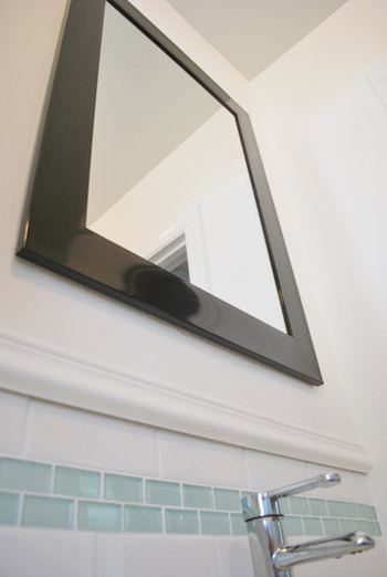
The bathroom makeover below that Gemma sent us impresses us for lots of reasons – the cool dark mirror choice, the attention to detail in using some of the shower tile over the sink, etc, etc. But what gets me the most is that the gorgeous vanity you’ll see, which was built from scratch. Color me impressed. Better yet, color me the greeny-grey color they used because it’s awesome. Here’s her letter:
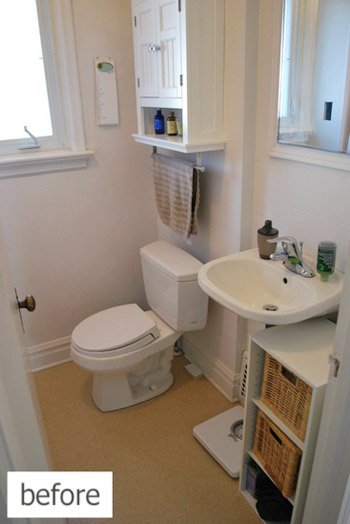
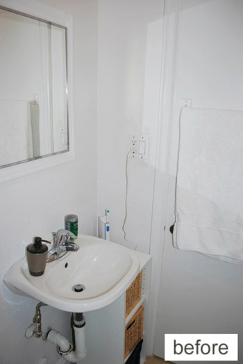
Hey John & Sherry! My hubby and I have just recently re-hauled our bathroom. What was a boring and beige space (and seriously outdated) has now become fresh, sleek, and classic. The whole project was a DIY affair – from the plumbing, to the tiling – we even built the vanity. We did it all ourselves and saved some big bucks.
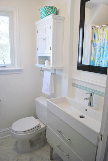
There were two main things that we wanted to accomplish: to make the space feel bigger (it’s a pretty teeny room), and to make sure there was plenty of smart storage. Here’s where we ended up:
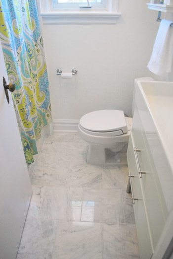
By keeping the walls white, injecting some colour into the ceiling, and using an extra tall mirror above the vanity, the space appears to be a whole lot bigger than it is.
We don’t have a lot of square footage, so we splurged on some carrera marble tile for the floors, which feels totally luxurious.
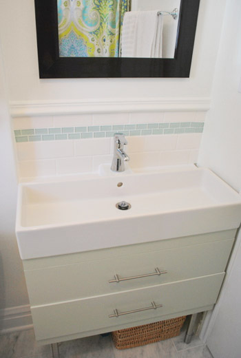
Since we couldn’t find a budget-friendly vanity that would utilize the long and narrow space, we decided to build one. I painted it a pretty green-gray colour (which was the same colour I carried up to the ceiling), and kept all of the finishes in classic chrome.
One month of chipping away at the room and putting in a ton of elbow grease was absolutely worth it – we now adore the space. Every time I walk by, I can’t help but peer in and think “I can’t believe we did that!” Thanks for all the inspiration, you two! – xo, Gemma
So yeah, isn’t that vanity awesome? Gemma’s got more details and pics on her blog, including a full budget breakdown. The whole thing – carrera tile and all! – was only about $1500 thanks to some leftover wedding gift cards. Now let’s play the favorite part game. We have already established that I’m obsessed with the homemade vanity, and Sherry’s loving the tile behind the sink and the color from the vanity that they playfully brought up on the ceiling. Your turn.
Psst- We shared our Labor Day adventures over on Young House Life. Hello photo bombs, beach dancing, and cannonballs…

Jess @ Little House. Big Heart. says
I’m loving their whole design!
Kevin and I actually have the same white subway tile, sea green accent, and carrera marble floors (although ours are tiny hex tiles) picked out for our bathroom… we’ve even priced everything and ordered samples! It’s uncanny how similar they are!
I love the idea of building your own vanity, too! Our bathroom is so tiny and the nook for the sink so shallow, building our own vanity may be the way to go!
Erica F says
Love it…and that cool sink is sooo dreamy!
Tania @ Run To Radiance says
So cute! Love the color for sure…and that marble!!
J+H @ Beyond The Stoop says
i love everything about this bathroom!! the rectangle sink (when on earth do you ever see that in a home!?), the marble floors (i’m in love with marble right now), how bright it is with the white and the pop of color on the shower curtain… :) :) :)
KJ says
The shower curtain is my fav. But overall amazing job!
Kristen | Popcorn on the Stove says
I’m digging the white walls and pop of color on the ceiling – very fun!
Chelsea @ Riding Escalators says
Holy Cow! This is seriously perfect timing – we’re currently working on pricing out our bathroom overhaul – including white subway tile and the accent tiles! This project looks fantastic and I’m bookmarking it for reference! Awesomeness!
gemma@thesweetestdigs says
OMG I’m in a tizzy over here!!! Thank you SO much for featuring our bathroom, guys. You two are the bomb diggity.
Sending lots of blogger love your way!!
xo
YoungHouseLove says
Aw you’re welcome Gemma! Thanks for sharing it!
xo,
s
Crystal @ 29 Rue House says
I love the tile backsplash behind the sink and that vanity/sink is perfect!
Julia @ Chris Loves Julia says
What a great inspiration for our mini bathroom update to come. Love those floors!!!
Brenda says
I really like the smaller subway tile between the larger. What an interesting pattern!
Amy @ a new old house says
Love it! We used the same green accent tiles with white subway in the bathroom we’re in the middle of redoing!
I love that they used the same color as the vanity up on the ceiling… never would have thought to do that in the bathroom!
Tabitha says
My parents just gifted us a bathroom reno and this looks so much like what we ended up with! The vanity is the same sink, and Dad even made the legs exactly like that! Plus, our space is also super-tiny and we stuck with white to make the room look bright! Very impressed and a little relieved someone else had the same styling ideas we had for almost the exact same space!
Christine says
All the details around the sink make such a focal point and really do make the room look bigger!
Maury @ Life on Mars says
What a great makeover! I love everything, but especially the blue tile. it’s the perfect thing to break up all the bright white.
If we want to submit a reader redesign, what’s the best email to submit it to?
YoungHouseLove says
[email protected]. Wahoo!
xo,
s
Stephanie says
I’m all about that gorgeous floor tile. Totally worth the splurge.
I love when you guys post bathroom redos. It gets me thinking about all the awesome things I could do.
Also, I would like to wear that shower curtain as a dress it’s so pretty. lol
YoungHouseLove says
Hahaha- me too! Let’s all wear different styles of it like a Destiny’s Child video.
xo,
s
Gabriella @ Our Life In Action says
I love that sink!!! And those blue tiles….they look familiar, don’t they. ;-)
Sarah K says
My favorite is definitely the marble floor! What a great splurge. It really makes the whole room feel expensive!
Sarah
Amy says
Color name for the vanity paint…please!!!
YoungHouseLove says
I think if you click over Gemma has all that info on her site! Although maybe she’ll drop by with it here for ya too!
xo
s
Alice says
The marble…oh the marble! Just wanna press my face against it.
Being a lover of color, I used to think white walls were stark, but am learning through all these great blogs that it can give a very clean, crisp look and a great backdrop for color. I was on the fence about redoing my builder-grade beige, window-less powder room a soft white but now I’m convinced and inspired.
Erin {Home Everyday} says
HELLO Sleek drawer storage. This is like a Sarah Richardson bath with the marble. Fabulous!
Lindsay L. says
Yeah i love the whole project but mostly, i love that her name is Gemma! That’s our little girl’s name too! Since it’s so uncommon, i can’t help but get excited about that. oh and the beautiful marble floors.
Stephanie says
This is great. Love your blog but was just talking with a friend (who also loves your blog) about how although I love what you guys do it isn’t always helpful as I have a townhouse so many of our spaces are small. This bathroom reno is so in line with the space we have. I’m very excited to use this as a stepping stone to our own.
Rebecca says
Totally unrelated, but do you have any tutorials on taping/mudding after drywall (before painting?) I found some mention on the dining room header post, but it was mostly just saying that you taped and mudded it. I also saw the post on patching a hole in the ceiling or wall, but I’d LOVE to see a play by play with photos on any mudding projects (we just opened up a room and put up a header and drywall, so we need to get mudding!) I go here for nearly all my inspiration and house how-tos and that’s the only thing I can’t find! Haha. Thanks in advance.
YoungHouseLove says
We’ll have to add that to our to-do list! Love that idea of a play by play. This might be the closest we got: https://www.younghouselove.com/wanna-be-a-baller-shot-caller-drywaller/
xo,
s
Diane says
Another vote for Sarah Richardson influence! Style on a budget.
Jocelyn Pascall says
Looks great. We have a very similar bathroom that is in need of a similar transformation.
Courtney says
Not to be a snark or anything, but isn’t it Carrara marble (with two a’s)? Named after the city of Carrara, Italy where the marble comes from?
I used to live in Italy and was lucky enough to visit Carrara a few times and see the marble quarries and all the cool shops everywhere selling unique marble pieces. So it always confuses me to see it spelled with an “e”.
Carrara, carrera, tomato, tomahto?
YoungHouseLove says
Haha, it’s both:)
Here’s a link for ya (first line): http://en.wikipedia.org/wiki/Carrara_marble
xo,
s
Danielle says
Wow, really gorgeous! I love that sink/console!!
Rebecca says
Wow I love that marble floor. It’s perfect! Definitely worth the splurge.
Carla says
So clean and classy, but also very welcoming! So many bathroom remodels come across as overdone or more suitable for a hotel. Yours is just lovely. The marble flooring has a wonderful reflective surface that helps make the room feel larger than it is. :o)
Erin says
Very cute!
It’s very interesting that the sink from Ikea didn’t come with a vanity, as we have the same sink with a vanity that came as one piece. Maybe they only sell the sink now?
Mary A says
Love the look, but is a marble floor safe with wet feet?
YoungHouseLove says
I think there are things you can do to it (hone it, apply a clear matte sealant) to keep it from being too slick. Anyone have more info?
xo,
s
gemma@thesweetestdigs says
Thanks for all the sweet comments, guys!!
@Amy: the colour on the vanity is sterling by Benjamin Moore (you can read about our making & painting it here: http://thesweetestdigs.com/2012/04/11/project-bathroom-the-vanity/)
… and yes, I have definitely been influenced by Sarah Richardson (like a few of you noted). She’s my hometown Canadian girl! Love her.
Jessika says
Sigh, I do very much long for a sleeker sink in our bathroom (ours is similar to their “before” photo). It’s on our radar!
Also, have you seen this: http://fab.com/sale/10203/product/214343/ (alternative photo here in case fab.com is funky for ya: http://dogs.thefuntimesguide.com/images/blogs/dog-sleeping-in-a-croc-bed-by-ann-dabney.jpg )? They had a photo of a dog that looked like Burger, and when coupled with Clara’s Crocs, I had to crack up.
YoungHouseLove says
Hahaha- hilarious!!
xo
s
Meghan says
I love the sink – but can you put anything on it? Like I need some counter space when I put on my make-up or curl my hair. Just wondering – would love that for our bath but not sure how functional it is?
gemma@thesweetestdigs says
@Erin: Yep, they sell just the sink! The vanity didn’t fit into our space (we have an awkwardly placed heat vent), so we built our own!
@Mary A: The floor is surprisingly not at all slippery. We were worried about it at first, too. We have sealed it to keep it looking polished, and ensure to put a bath mat down when we’re having a shower.
T. Y. Lee says
The great thing about small bathrooms is that splurging on luxurious details doesn’t break the bank!
I splurged on marble too, but on the counters instead of the floor, and it’s black with white marbling (I love the high contrast, to add some drama to my builder-beige-boring powder room).
I love that vanity, and everything you chose helped make that room feel so much larger, good job! :)
Paula M. says
Great choices on colors and elements! Very nice! Well done! :)
And I am really entranced with rectangular and/or trough sinks for home bathrooms. Who knows why? (LOL) – They just look clean and modern to me. …
… though I hadn’t thought about the lack of surface space that some of those sinks offer, til I read a comment above on that. Hmm, that’s a good point. I need to at least have a few inches for my contact lens case and solutions for my lenses when putting those in, taking them out …
my honest answer says
That vanity is fabulous!
jessica says
Love it!
We need to tackle our bathrooms, and I really like this. Definitely have to pin it for inspiration :)
house Crazy Sarah says
They did a great job in a small space! That sink is really visually appealing. I’m wondering if the drawers are non-functioning due to the plumbing?
Paige @ Little Nostalgia says
I loooooove that they splurged on the floor. If you’re going to do marble, a tiny bathroom is a great place to do it!
Lisa says
I love this, it’s amazing how the bathroom looks so much bigger!
Eve says
Oh my goodness, I *love* this bathroom! I’m drooling over the floors and the sink… and it’s giving me ideas because our bathroom is nearly the exact same layout. We’re planning a bigger overhaul at some point (tub, tile, sink, toilet, floors) I’ve been racking my brain over the floors – marble never came to mind, but it looks stunning. Great job!
gemma@thesweetestdigs says
@house crazy Sarah: Nope the drawers are fully functional! The plumbing with the IKEA sink is pretty small, so we were able to still get fairly deep drawers. We based our model off IKEA’s Godmorgon vanity.
KarenH says
My favorite part is that she has MY Ikea sink (mine is currently in the closet in the spare room, tho :) :D Even better, she kind of has my bathroom. My bathroom is pretty much that size, including having no where near enough space from the wall behind the sink to the doorway, so finding sinks to fit was nearly impossible until I found that same narrow sink at Ikea.
I’ve been considering a traditional mosaic tile pattern in my bathroom, but I think I’m going to steal their idea and pony up for the expensive floor instead. And I won’t have such a nice vanity because I need to leave floor space and plumbing access for a Cat Genie cat box.
Really nice job, Gemma! Thanks for sharing :)
Shauna @Satori Design for Living says
Looks so fresh and pretty- great job!
how2home says
Congrats Gemma! We love her blog! This bathroom is so fresh and bright. Love it!
Gary | Gift Guide for Guys says
I think it looks great. I like how the dark border around the mirror breaks things up and draws the eye. I also like the long sink. I don’t think I’ve ever seen a sink that shape/size. Very cool.
My initial thoughts were the same as Mary A about the floors. They look super slippery to me. I redid the tile in my master bath with a slippery tile and won’t be doing that again. I have to have a pair of flip flops waiting on me to step on when I exit the shower.
The vanity is killer too. I love seeing stuff you can’t just go down to the big box stores and buy.
Great job!
Leslie F. says
I found Gemma’s blog through Houzz and had already seen this bathroom and feel in love. We will likely be doing something similar whenever we get around to renovating our main bathroom. I love the tub but I think its only available in Canada :(