Since a bunch of you guys have requested more details on what layout changes we’re pondering and what paint colors we’re currently leaning towards, we thought we’d share a giant brain dump about what’s flying around in our heads at the moments (which will change as we go I’m sure!). Y’all ready for this? Lots o’ words. Lots o’ diagrams. Lots o’ links. Please fasten your blog-reading seatbelts and be sure that your desk chair is in its upright and locked position.
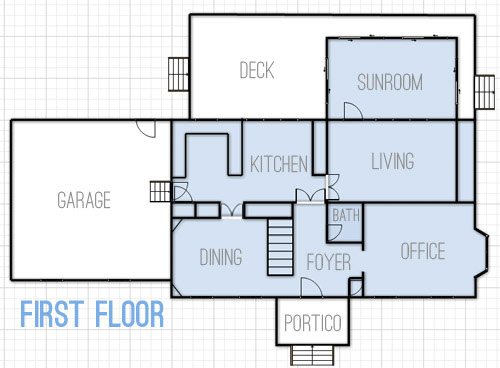
This is what the first floor looked like when we bought our house (we’ve since removed the three sets of the double doors off of the kitchen).
But here’s what we’re thinking we’d love to do over time with the first floor.
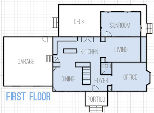
- Widen the doorway between the kitchen and the dining room for easier flow
- Create a wide centered doorway between the kitchen and living room with built-ins around it (sort of like the opening between the office and dining room in our last house)
- Change kitchen layout from U-shaped with a peninsula to an L-shaped area with an island (and add french doors to the eat-in area that lead to the deck)
- You can’t see this change in the floor plan, but we’d eventually love to convert the sunroom to an open covered porch with new columns and no more sliders (many of the sliders are bad and the posts are rotten) – we’re envisioning something like this
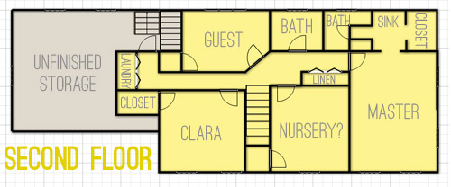
As for the second floor, this is what it looks like now.
And we’ve thought about changing things up like this.
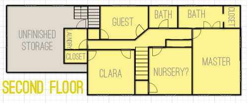
- The most major layout change will be opening up the sink nook and the bathroom area in our bedroom to create one big bathroom instead of having two single sinks separated by a wall
- In the hallway between the nursery and our bedroom there’s a double doored linen closet that we’d love to open up to make a built-in nook in the hallway, sort of like this (but with concealed cabinetry on the bottom and nice built-in shelves on top)
- You’ll notice there’s a door added to the end of the hallway where the laundry nook is. We briefly considered adding that to make it a legit room, but we actually think it’ll close things off more (and it will be weird to have to walk through a room to get to another room when we finish the unfinished storage area) so for now we’re unsold and plan to keep it open.
- And of course eventually we want to drywall the unfinished storage space to create a bunkroom/movie room that we think could come in handy for older kiddos and their friends.
As for color scheme ideas, here are a few swatches (they’re all Benjamin Moore) that we’ve been loving lately. They wouldn’t all be wall colors, so some might be the color of a bathroom vanity or a piece of furniture or even the color of a ceiling or another “accent” spot (like the back wall of Clara’s play-closet). *This is a first-thought paint palette (meaning there will be accessories, art, fabric with many other tones in it – and it’ll most likely evolve as we go).
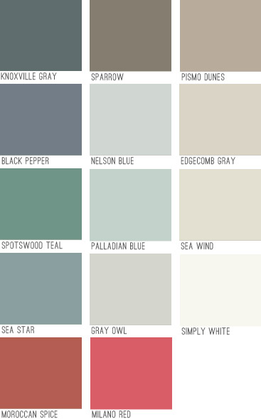
We think colors like Knoxville Gray or Black Pepper could be awesomely dramatic in the dining room with crisp white trim and built-ins, while many of the lighter neutrals will go in living and bathroom spaces and some of the deeper mid-tones might end up in bedrooms (we like the idea of Sea Star or Sparrow in our bedroom with lots of white furniture and linens). The brighter pops of color like Moroccan Spice, Milano Red, and Spotswood Teal are just for accents (like a piece of furniture, a bathroom vanity, or even a mirror or frame – most likely in a white or neutral painted room).
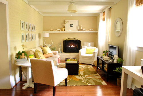
It’s fun to see how the new swatches compare to our first house’s palette (which was almost entirely tan, cream, and soft blue-gray)…
… and our second house’s color scheme (which had a bit more boldness like deep teal walls along with softer gray, pink, and taupe ones).
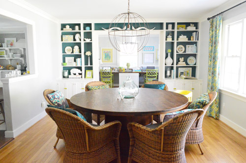
We feel like this palette will be a nice blend of our previous homes (more traditional and warmer than our last house’s palette with a lot of the neutral and classic feeling that our first house had, but with more happy hits of color). We’re excited that among the soft neutrals and rich moody hues there are also some warm accent colors like red and coral. We think we’ll like the mix of the warm colors (tan, coral, red, brown) with the cool tones that we’ve always been known to love (like blue, green, and gray). It’s also nice to have classic white trim and doors, mocha hardwoods, and gray slate flooring to temper things and keep things classy (Stay Classy San Diego!) as we go.
And now I’ll end this brain dump with some inspiration images that I’ve been pinning like crazy when it comes to the “vibe” of this house:
- a dark tailored bedroom like this might be nice
- we can’t wait to whitewash the brick in the living room like this
- we’d love an airy and open kitchen vibe like this (especially once we add our future french doors and built-ins)
- a dark dining room with bright white built-ins like this (maybe more navy like our swatches?) could be fun
- some chic wallpaper like this somewhere (maybe in the half bath downstairs) would be awesome
- this office feeling would be cool (love the wall of built-ins and the floating table for meetings/laptops)
- we’d like to make a nice cozy TV room and bunk-room like this in the unfinished storage space a while down the road
- this might be a pipe dream, but how boss would a closet full of built-ins like this be?
- this could be a fun look (wallpaper + wainscoating) in the foyer or the upstairs hallway someday
*update: here’s why we don’t post these photos on our blog instead of linking to them
We’re still working on just getting things back to a non-blue-trim-and-wallpapered state, so nearly all of those more major room transformations are probably a ways down the pipeline (big builds and furniture/fabric purchases will mean saving our pennies each time, so they’ll definitely be spaced out between cheaper and easier things over the next few years). But It should be fun to see where we actually end up down the line. And to have this post to look back on so we can see how close – or how incredibly off – these early predictions of ours are.
Oh and I thought it might help to say that since these are all half-formed first-thoughts, if you have specific questions about what will go where or how we’ll accomplish a certain future project, chances are we haven’t thought it through yet… but when we do we’ll just mumble about it to our beanie babies. Just kidding, you know we’ll blog all about it!

Anele @ Success Along the Weigh says
I love the colors you have picked out. You know I’ll be along for the ride! :)
Megan @ the brick bungalow says
Love the idea of opening up those walls! I’d love to open up the wall between my kitchen and dining room so I can see into it and the attached living room. Some day I’ll take a hammer to it! Gotta finish our deck, my daughter’s room, our future son’s room and possibly a bathroom first.
Kristen says
I really like the color scheme you’re leaning towards (it reminds me of the historic colors that a few paint companies have featured)!
Karen F says
I agree about the historic colors! When we were choosing paint colors for our home, my mother’s advice (she has a great eye for decorating) was that you can never go wrong with the Benjamin Moor historical colors.
The colors you chose are really beautiful! So calming, but not boring. Can’t wait to see what you do!
Suzanne in NW Illinois says
Good to see the how your planning is coming along. This house is turning out really cool, Guys. Loving the post yesterday and painting the inside of the front door too. Very cleaver! :)
Your Fan in NW Illinois,
Suzanne
Anne says
Love the color scheme and inspirations! We painted our dining room a dark navy and applied picture frame wainscoting to the bottom half of the wall. It’s surprisingly light due to the big window. I love it!
http://strawberryjampackedlife.files.wordpress.com/2013/05/photo1.jpg
http://strawberryjampackedlife.files.wordpress.com/2013/05/dsc05172.jpg
YoungHouseLove says
So pretty!
xo
s
Allyn says
Bwah hah hah, it’s too funny that you’re considering putting wallpaper BACK up on the walls! Seriously, though, there’s some gorgeous wallpaper out there and, in limited doses, it can really look terrific. I’d love to put up some really fabulous wallpaper in my small first floor bathroom, but the stuff I like runs $750 (yes, seven hundred and fifty dollars) a roll. Even though it’s probably a double roll, that’s way too far out of my price range!!!
YoungHouseLove says
Woah, that’s crazy expensive!
xo
s
Constance says
That color palate screams (in a good way) Ralph Lauren to me (at least all the vivid memories I have of it growing up).
Marissa C says
Funny…I have the kitchen layout you are going for and want the kitchen layout you currently have. Then again, our kitchen is completely open to the rear den, so I want some dividers.
Mary | Lemon Grove Avenue says
Man, I am SO pumped to see these changes happen in your space! Love the colors y’all picked, too. We’ve got Edgecomb Gray in our Living/Dining/Kitchen space and I’m totally loving it.
Rebecca | the lil house that could says
Looks like it’s going to be beautiful guys!
Gia says
Oh how exciting! Loving your color choices… we have a somewhat similar color scheme in my own home and 4 years later, we are still happy with the colors. BTW… we have pismo dunes on our bedroom walls, with some sparrow accents in the cream bedding, crisp white trim,creamish white window panels and dark wood floors. It is SO relaxing and calm in there. On the swatch, it looks a little bland, but it really is beautiful on the walls!
YoungHouseLove says
Sounds gorgeous!
xo
s
Rachel says
Would you consider selling the double doors that you took of the kitchen? Our new townhouse is in desperate needs of them. If not any suggestions for a DIY?
YoungHouseLove says
Are you local? What size opening do you have? Why don’t you email us and we’ll measure ours and get back to you :)
xo
s
Jessica says
Rachel: If their doors don’t work out for you, try the ReStore run by Habitat for Humanity on Roane St off Chamberlayne. They have TONS of salvage doors.
ange says
Love all the color choices, very close to what I am using in my own home. I did gray owl in my kitchen, entry and living area and I love it! Our bedroom is hale navy right now and I love the moody feel of the room. Can’t wait to see you transform this home!
Kerrie says
I love these colors. I like how you were neutral in your first, bright in the second,and leaning toward more of muted brights in this home. It’s so fun to see the evolution, and what having a blank slate does to your color choices.
Also, there is a typo in the list of changes to the first floor. You listed expanding the entrance to the dining room twice. I think that one of those is supposed to be putting a door in the kitchen to the deck?
Can’t wait to see it progress as the foyer is already leaps and bounds above what it was! :)
YoungHouseLove says
Thanks Karrie! Off to fix that!
xo
s
Becky says
I just painted my dining room edgecomb gray this week and I love it! And I’m looking forward to you whitewashing brick -it’s been on my to-do list for years but I just can’t build up the courage to do it.
FRECKLES CHICK says
Your color palette is winning in my book! A nice mix of neutral & drama (like me, no wonder I love the colors you’ve chosen).
We have BM Gray Owl in our whole basement level & we love how airy & versatile it is. I think you’ve already tested it in House #2 so you probably remember it does read a bit blue-grey (in our house at least) but is a great grey with just a hint of warmth all the same. I highly recommend it!
YoungHouseLove says
Thanks Freckles Chick!
xo
s
Megan says
I just told my husband a few days ago that I wanted to white wash our fireplace. He said, “Did YHL do it to theirs? You only do what they do.” And I said, “Nope, this one was all on my own!” He totally won’t believe me now ;)
YoungHouseLove says
Doooo it! Doooo it!
xo
s
heather says
Just do it before them, and then you can say YHL was inspired by you.;)
Jen says
Haha Megan, my husband always asks me the same thing! I’ve been thinking about painting our master bedroom a navy blue…I better get on that soon or he’ll say I was only copying John and Sherry!
Ellen says
I love that color palette! How do you envision your turquoise front door meshing with it, though?
YoungHouseLove says
That’s just one door so to us it’s an accent color that should hopefully mesh really nicely (just like colorful drapes might be added, or a deep toned rug, etc).
xo
s
Kim says
Is there any way to add in the turquoise from the front door to the palette? I’d be interested to see how it looks with the other teal and blue shades!
YoungHouseLove says
Here ya go: http://images.younghouselove.com.s3.amazonaws.com/2013/07/house-colors-door.jpg
xo
s
Jessica says
Ooooh, I love the blue lake door with sea wind walls. Gorgeous! These colors are amazing and you’re making me want to repaint my house! I don’t think my husband will be on board with that though.
Kathy says
Ahh, nice! The turquoise door color is a lot warmer and coordinates well with your palette! Beautiful!
Elaine says
I’m so happy you added the blue door color to the palette! Not only does it look wonderful, but it gives you a perfect rectangle of colors, lol! Perhaps you could update the actual blog post to reflect the more complete palette?
YoungHouseLove says
Thanks Elaine!
xo,
s
Dana says
Great color choices! I like the Milano Red and Moroccan Spice. Nice. Can’t wait to see results.
Jamie says
Palladian Blue = Awesomesauce. It’s such an amazing color, I really love how it changes in the light.
Kelsey says
We have Palladian Blue in our baby’s nursery, and it’s absolutely gorgeous. During the day it’s bright and airy, but with a hint of sophistication, and at night it’s calm and cozy. I wish I could use it for every room in my house.
heather says
The paint pallet is almost dead on with the way we leaned on our house too. Something about the dusty blue/green colors with tans/browns/grays and then pops of color too.
Also, you know how you linked up to that yellow door you loved (I have it on my board too, it’s beautiful). This might be a nice look for a set of doors going out onto your deck on the left.
YoungHouseLove says
Ooh that could be fun!
xo
s
HeatherB says
FUN color palette! And I think your percolating plans look excellent :~)
One question: Why are you not considering removing the closet next to the laundry and putting the access to the unfinished storage there, so that you can have a stand alone laundry room with a door? Is there an architectural difficulty of some sort? Just curious.
Looking forward to walking each step with you on this new home adventure!
YoungHouseLove says
That closet’s Clara’s favorite part of her room – it’s nice and large with a dollhouse and some toys in there like a little hideaway so we value that more than a bigger laundry room. In our area, removing closets from bedrooms makes them not count as bedrooms so that’s also usually not the best call for resale either (a 4 bedroom house would sell better than a 3 bedroom house with a slightly wider laundry room).
xo
s
HeatherB says
No, I meant the hall closet to the left… Unless I looked at the drawing wrong?
HeatherB says
I see now. For some reason I saw that closet as part of the hall, not Clara’s room. Oh, well.
Lea says
Love your color palette! I’m trying to find a new apartment to move into and I’d love to go in this direction as well.
Maybe you’ve always done this, but is there a reason you link to the inspiration photos instead of post them? (if you always have you don’t need to link back to proof, just curious.) For what it’s worth as a reader (and general internet person) I’m disinclined to follow a list of links. Maybe I’m just psychologically scarred from the old, frustration filled days of AOL and slow internet connections: best to just stay on one page! haha!
/ramble
YoungHouseLove says
So sorry Lea! There have been some changes in online photo-sharing laws and since all of those photos were shot by a professional for a publication (neither of whom have given us permission to share them here) we could actually be violating copyrights by posting them (a few other bloggers have been sued for sharing photos that aren’t theirs). So given the fact that we’re rule followers to the max (and skeeeered to get slapped with a lawsuit) we’re just following the new photo sharing rules, which generally are just posting pics we shoot or have express permission to share (and linking over to the rest).
xo
s
Lea says
Oh wow, that sucks! I know what you mean about rule following though. My husband has Asperger’s and has an extremely hard time breaking even the tiniest rule like jaywalking. Now it has rubbed off on me! Thanks for your answer :)
YoungHouseLove says
You’re welcome! And it’s so funny about the jaywalking thing – I’m a rebel about that and John’s like “just wait for the crosswalk!” – haha!
xo
s
Jamie says
This has been bugging me too. Good to know the reason for it.
YoungHouseLove says
Sure thing!
xo
s
Leah says
The other good thing is that many of us are fellow-pinterest-addicts, and if we want to add one of these inspiration images to our own collections, it’s better to “re-pin” from the YHL board and retain the link-back to the original source, rather than to pin from this blog, which can get really confusing and mis-attribute.
Just a thought from a just-striking-out-on-my-own photog, Pinterest-addict, and fellow Lea(h)!
YoungHouseLove says
Oh yes, that’s nice too! That way no one’s pinning and giving us credit, they can repin from the source where they originated on Pinterest instead (assuming they’re linked back right, sometimes Pinterest isn’t the best at this, but it’s certainly closer to the source than our page would be!).
xo
s
Kelly A says
Good call Sherry & thanks for letting readers know. If you’re selling/teaching/working online there are huge liabilities out there. I found a great resource that’s free called small business bodyguard if you’re paranoid :)
YoungHouseLove says
Thanks Kelly! Off to check it out!
xo
s
Jenni Escobar says
I totally get not putting the pictures directly here. I just wish you would link to the actual source not Pinterest. I do most of my blog reading during my lunch break and I can’t get on Pinterest here at work but could probably get to the original site.
YoungHouseLove says
So sorry Jenni! When you want people to see just one photo it’s hard to link to the original source because there’s a lot of confusion (ex: you click through and see a post with ten kitchens in it and you don’t know which one I’m talking about). So sorry Pinterest is blocked at work for you though! We figure since we only link over to inspiration images occasionally (I think we’ve done it 3 times in the past month and a half since we moved) it’s hopefully not too much teasing for those who can’t get to them until after work :)
xo
s
Jess says
Can’t you put the link IN the picture? (like when you click on the picture, it links to the owner’s site – not sure what that’s called…picture link?)
Or put both the picture AND a text link?
YoungHouseLove says
Sadly that’s not allowed since you’re still using a copyrighted image on your blog (it can be argued that people won’t click the link to go to the original and will just stay on your site and state at someone else’s “property.”
xo,
s
Lyndsay says
Awww man! I’ve noticed a lot of blogs linking out to images lately. Thought is was a trend not a law – I too am old skool and like seeing the images in the post vs clicking link list. :( Does that mean you can guess may age now? I sucked it up though; luh-uv the dark dining room wall and bunk room. S’pose I’d find a way to deal with the ginormous closet if I had to.
Do the new laws affect things like mood boards that have product images in them or imagery posted pre-law change? Like, do you have to go back through everything and clean out all non-permitted imagery? Booo if you do! Looking forward to seeing all your transformations…
YoungHouseLove says
Thankfully product images on white from major companies don’t seem to be as heavily guarded since they generally like when people pin and share things (etsy items can be though!) so you’re less likely to run into an issue using something from West Elm or Pottery Barn or Ikea as you might be from using a styled image by a magazine/designer/photographer :)
xo
s
Jill says
As someone in the professional image-making business (I’m an illustrator), I want to say thank you for being conscientious about copyright issues. Sure, having to click a link is mildly annoying, but image piracy is SO rampant online! Any small effort to lessen this is most appreciated by all us illustrators and photographers.
YoungHouseLove says
Thanks Jill!
xo
s
Lauren says
I love all your ideas! I love that you guys are taking this house with already awesome bones and a practical layout and making it even more awesome and practical for you!
My kitchen/living room is the exact layout as yours. We tore down the wall between the kitchen and living room when we moved in cus we just couldn’t live with it up, but we have yet to redo the kitchen. Initially, I wanted the same kitchen layout you guys have in your “we’d love to do” layout, but after living with my u-shaped kitchen for a while I might just keep the exact layout. It is sooo functional. I know the peninsula is not exactly cool, but it is super functional and if I change the layout to the way you have it I can’t stand at the peninsula part and make lunches for the week or cook while I watch tv. Just thought I’d throw my own thoughts out there on a similar situation :).
I’m so excited to watch this house evolve. Even though I have a one story ranch in Florida, so many of the details are similar to yours since they were built around the same time and I’m dying to see what kind of choices you make!
YoungHouseLove says
Thanks Lauren! We’re definitely not diving into major kitchen reno for at least a year so we’ll definitely be thinking and rethinking everything!
xo
s
Sarah says
If you can’t find a spot for the All You Need Is Love art, feel free to send it my way! :)
Cate says
This is great to see how your plans progress. What program do you use to create the layouts? Also, is that unfinished space on the same level as your second floor? If so, could Clara’s closet be made larger by extending to the lower wall or is there a structural barrier? #morecloset :)
YoungHouseLove says
We use floorplanner.com (love it). And yes, that storage area is the same level, but there are heating registers and some other ductwork right behind the closet so we’re ok with leaving it for now :)
xo
s
Meg says
What program do you use to make your floorplans? We’re planning a few lay-out changes too and so far I’ve just been using plain old graph paper.
YoungHouseLove says
Floorplanner.com
xo
s
Carrie says
Love the color pallet! Goodbye Sue the napkin!
And I want a nook of bunk beds soooooo badly!!
Erika says
I love your proposed ground floor layout. It looks like it will be very airy and a good use of the space. And love love love the idea of dark walls and white built-ins in the dining room!
Amanda B says
Love it! (Mostly because our house is a 2 story victorian we’ve been slowly updating and that’s basically our color scheme. )
Sarah W says
I love the idea of whitewashing the brick, and I’m curious to see how you would ‘make it your own.’ It seems like with brick it goes one way or the other–exposed brick for a more modern feel, or painted brick to go with a country or shabby chic feel. I think the whitewash will be an interesting component to that modern-with-a-dash-of-traditional look you guys seem to pull off seamlessly.
Super excited to see where this house takes us all!
A.J. says
I know next to nothing about feng shui but one miniscule concept I once heard (that may not even be true) was that you don’t want your front door and your back door to be aligned…as in, you shouldn’t be able to walk in your front door and out your back door. It has something to do with putting money into the house endlessly…in the front door and right out the back. In my parents’ case, it was totally true of a house they built. Became a money pit.
Kind of kooky/woo but I thought it was pretty interesting!
A.J. says
ok I could have googled before I commented. I’m partially right, but it has to do with positive energy, not cash. :)
http://fengshui.about.com/od/fengshuiforhome/qt/doorsfengshui.htm
YoungHouseLove says
So interesting!
xo
s
betty says
I heard that if your stairs to the second level are in front of your door, that means cash will travel down the stairs and right out the front door..
i bought a house with the stairs right in line with the front door. oops :)
YoungHouseLove says
So funny! Can you do something to keep the money in? Like plant trees on either side of the door or something?
xo
s
littlebylittle says
On the stairs thing, my inlaws have a house with the staircase infront of the front door & not only are they extremely well off, they also have a large & happy family & a very happy marriage. So I’d call that myth busted!
Jen M says
I love that your going back to a more traditional look. I think it will tie in well with the style of your home.
Lindsey says
As soon as you posted your first house tour I was gleefully texting a friend and fellow YHL fan because their house is almost an exact imprint on the first floor of yours. They’ve been pondering how to deal with some of the same issues so I can’t wait to see how both of you end up as it relates to opening up the living/dining/kitchen flow and all that.
I’m also a huge fan of being able to remember your original idea versus the final product. When we bought our house 5 years ago, I wanted to turn the upstairs laundry room into a walk through pantry with a laundry chute… but 5 years later I ended up with a room that houses the china cabinet, dog bowls, and a study corner for my 1st grader! haha! That laundry chute would’ve made sitting at her little desk awfully perilous… ;)
Emily says
Those colors are very similar to what we have in our house, except we have a warm tangerine and light orange in place of the reds and our blue is slightly bluer and less green. Lovely choices! Warm and soothing.
Anne @ Planting Sequoias says
I just fell into a Pinterest wormhole because of your inspiration pics. You know, when you click on link after link chasing down the ever-elusive name of the absolutely perfect wallpaper name/paint color/light fixture…That wallpaper/wainscoting hallway look? GAH. I NEED that.
YoungHouseLove says
Haha yes! I’m in that wormhole all the time!
xo
s
JustMe says
I love seeing your visions! I recently moved into a 1990s house, full of teal and hunter green. I have zero creative abilities, but I get some outstanding ideas from your blog. You totally inspired me to rip down the wallpaper with purple grapes on it from my kitchen. My kitchen looks 100 times better already! I can’t wait to see what else you do.
As for the blue trim & wallpaper everywhere, it reminds me of my sister-in-law’s house, except her trim and doors were all a minty-seafoam green. Wallpaper in every room, including glittery ducks in one of the kid’s rooms! Best of luck!
Flynnie says
My hubby whitewashed out house. He researched and used a “old” recipe for whitewash- salt, lime and water. It came out beautifully and I love it! We have an old red brick ranch and we never loved the brick. Whitewash brick and Wythe blue doors and shutters make me happy when I come home!
YoungHouseLove says
Sounds so pretty!
xo
s
Liz says
Love the colour palette choices so far! Quick question… Sorry if I missed this earlier, but is there an extra set of stairs to get to that unfinished storage space? :)
YoungHouseLove says
The unfinished storage space is on the same level as the bedroooms, so those stairs just lead to the attic, which is above all of the bedrooms.
xo
s
Annie says
I know the open feel looks great. And it certainly works well for parties. But I found that as my kids got older like around 7 it was frankly annoying. It’s one thing to have an open space when you are going to be watching your kid every second. It’s another when you are not. Clara and her friends playing and laughing loudly in the living room when you are still working in the office would not be that fun with no doors to close. Thinking you’d relegate a 3 kid playdate to her room seems unlikely. I know you are thinking about finishing the attic area, but given the pace you are taking this it doesn’t seem that this is in the works in few years before Clara will be having more totally independent times.
As a parent, I know its hard to look just a few years down the road and see how that will feel with a kid at a totally different stage. But my two cents is think about that
YoungHouseLove says
Thanks Annie! We definitely like to think about how the house will work for us down the line, and don’t believe in making any major changes until we live somewhere a nice long time (over a year) so we’ll keep mulling everything over for sure. These are just our first thoughts so we’re sure it’ll all shift as we go – and as Clara grows :)
xo
s
Maureen says
Ok, my brian has exploded with all these amazing idea you guys are brewing. I love that color palette!
Allison says
Love the colors! The pinned inspiration pics are all lovely. I have seven kids (4 boys followed by 3 girls) and the bunk room looks like such a fun idea. I think I might have just the place for it too. Have you come across any diy tutorials for bunks like that?
YoungHouseLove says
I would just google or pinterst “bunk room” and see what comes up and if anyone has blogged about a tutorial. Good luck Allison!
xo
s
gabrielle c. says
Anna white does some great tutorials, and if you google it, you’ll find people that have made them.
Elle says
Nice! One thing that’s nice about your color selections is you could pretty much dump them into a hat and draw out two at random and they’ll go together. As someone who has been thinking about the “house house palette” that’s definitely handy.
Lauren T. says
I love all your ideas for re-configuring both floors to be more suitable for your family needs, but here’s what I would do to fix the whole weird entrance situation to the bonus room. It would entail re-assigning closet space…take the current linen closet and close it off to the hallway and open it into the nursery as a closet. Take the current nursery closet and close it off to the nursery and make it the new Clara closet. Take the current Clara closet and extend it into that weird narrow void in the bonus room and make it the laundry room space (with the possibility of being able to add a window in there now). Then where the current laundry room is could be the entrance to the bonus room, with a book shelf nook on the wall where the door to the bonus room used to be. Clear as mud? (lol) Just some other ideas!
YoungHouseLove says
Haha, that’s a lot of closing/opening walls! Definitely could work down the line if we find that the laundry room is cramped! Oh no wait – the linen closet in the hallway isn’t deep enough I don’t think (it wouldn’t accommodate hangers at that depth like the other deeper closets). I think since our first and second house had little laundry nooks we’re used to them, but who knows where we’ll end up :)
xo
s
Jo says
I love that idea!
Jill says
You wouldn’t have to extend the linen closet far into the nursery to make it deep enough to be a proper closet, and then this would all work.
This is actually pretty brilliant, honestly (kudos, Lauren!). You’d end up with a larger laundry room, a convenient entrance to the kid bunk bed playroom, and the nursery would have the best kind of closet — wide and not very deep — so you can easily see all your stuff and nothing gets lost in the bowels of the back.
YoungHouseLove says
Oh yes, if we extended the closet into the nursery it could work, it would just be about whether the cost/time would be worth it for us. I know lots of folks who would kill for a bigger laundry room (John’s sister, my mom) but we’ve had small laundry nooks in both of our previous homes and never minded them (not to mention that Clara’s extremely attached to her deep slanty-ceiling-ed closet and we have plans for creating a built-in with the linen closet in the hallway). We’ll just have to see where we end up!
xo
s
Carrie Lea says
Or you could just move the w/d onto the wall where the door to the unfinished space is now and have the door to the unfinished space a straight shot from the hallway. Water line moving but no closet rearranging. :)
Just curious where the dryer vents too?
YoungHouseLove says
I think they’re behind it and go into the ceiling of the storage space? Not quite sure!
xo
s
Jess says
This is a fantastic idea of switching up the closets!! Plus you could even extend the laundry nook a few more feet back into that small narrow space in the storage room beside Clara’s closet.
I personally wouldn’t let a little kid liking a closet determine the functionality of my house layout. I mean…she’s THREE. She’s not even going to remember it. Guess I’m cold and heartless…
YoungHouseLove says
No way, you’re not cold and heartless! We just all value different things in a house and have different budgets, so to us spending all the money and time to relocate and build out and close walls for a bunch of closets to gain a few feet in the laundry room is time/money we’d rather spend in other places. Our laundry area was smaller than this in our last two homes and we didn’t even mind that, so this layout works for us for now. But who knows where we’ll end up!
xo
s
Heather says
Do you guys have an “inspiration fabric” that you’re going from this time? Like Sue the Napkin from your last house?
YoungHouseLove says
Nothing yet but we’ll definitely share it if we find something!
xo
s
Jo says
I love the way you’re thinking of opening up the dining, that makes so much sense. Though my poor little head can’t figure out where the fridge will go if you widen into it’s current slot. Maybe in that desk/shelving/console area?
Great colours too, needs some yellow…
Ashley@AttemptsAtDomestication says
I love seeing this kind of post! It makes you guys so much more relateable to me because my mind is all over the place thinking about our house too. :)
Thanks for keeping it real!
Lauren (in PA) says
Yay!
I’m so glad you’re going towards warmer tones! That’s my comfort zone, and I think that they are more representative of the style of your home!
I loved all the stuff that you did to the last home, but wasn’t in my color wheelhouse. This should be fun!
Sarabeth says
I love the whitewashed brick! I wish we could do that to the outside of our loft…maybe we can convince the HOA to consider it.
Alison says
What are you thoughts on the color of the living
room? I am relieved to see everything won’t be painted white. Colors are a hard decision. Last time we painted I hired a color consultant.
YoungHouseLove says
I think we like Pismo Dunes with white trim and a whitewashed brick wall maybe? Still percolating…
xo
s
Alison says
Good luck with it! So many decisions…I am glad its you and not me. Paint is tough, it always looks so different on the walls, and in different rooms. Whitewashed brick sounds great.
Katie says
I know you’re still percolating…do you think you would keep Karl with the Pismo Dunes color (if that’s the color route you end up taking down the road)? I ask because our living room is the same color and have been curious if Karl would be a good fit for us. Ikea in 2 weeks..whoop whoop!!
YoungHouseLove says
Oh yeah, I think charcoal and mocha are both neutrals that can layer well together.
xo,
s
Janet says
I have loved Palladian Blue for years…..I found it for my first Condo and painted all the Ceilings PB. I used it in my house for all the Ceilings too, until I tired if the look and went back to white……..my Porch still has it and I was thrilled to find that BM made one of their tiny samples in it, so when we changed the Fixture on the Porch I could touch up the area around the top! Score!!