Remember we mentioned the show house that we’d be working on to benefit Habitat For Humanity over the next ten months? Well, we’ve been itching to give you guys an update but we haven’t broken ground quite yet. It’s not that we’re behind schedule (the goal is to be under-roof by Christmas) but it turns out there’s a whole lot of prep before a house is even built. So as people who have never built a house or been part of that process before, it has been really interesting to see what goes into it.
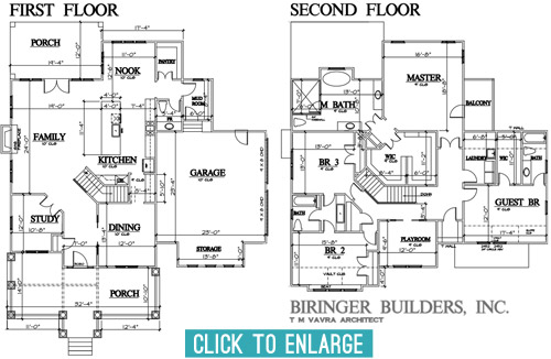
Over the last few months we’ve been having lots of planning meetings and have even made some site visits to look at some finishes/materials (more on that in a sec). So we thought it would be fun to share an update on the floor-planning front. After about five rounds of revisions and tweaks, we’ve arrived at this: the final floor plan!
Getting here was a process with lots of cooks, so the final plan is by no means one person’s sole influence. The builder, John Waters, and his architect, T M Vavra, originated the plans, but they also had to factor in requirements from the neighborhood’s review board. To make sure it fits nicely within the look of the larger community, they require specific things like a certain square footage, and can even veto features on the front and inside the house if they don’t like them. There’s also input from the Homearama show team (to make sure it’s not too similar to other homes in the show, since the goal is for each house to have a variety of features). So lots of it was set before our eyes ever laid on it, but we were welcomed into the process early enough to still make some suggestions to help achieve some of the ideas that we had brewing. So here’s a quick rundown of some of the tweaks that we made to the floor plan, with the help of the builder and the architect after we all put our heads together.
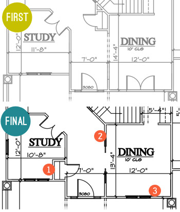
- Moved the coat closet. To make the foyer feel more open and provide an unobstructed view into the family room when you walked in the front door, we borrowed space from the study for the coat closet instead of putting it under the stairs (which cut into the line of sight a lot more than being a door in the hallway that would be flush with the wall when closed). It wasn’t a perfect solution (we actually debated scratching it entirely at one point) but as we’re learning – this is a process of collaboration and compromise.
- Hello pocket doors! We upgraded the doorway to the dining room to include glass paned pocket doors with a transom window across the top (like this) to make that space feel a little more special.
- Goodbye french doors. As much as we love french doors, the original set of ’em planned to open into the dining room from the porch, which felt a bit impractical. It would cramp the dining room unless we picked small furniture, and we figured that access to the porch from the nearby foyer made it easy enough to get out there while allowing for more room, flow, and a larger table in the dining room.
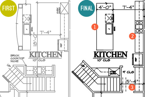
- A simpler island. The original had a raised, curved bar top and columns to the ceiling, but we all agreed that a big open, rectangular island would probably be more functional and less visually busy, especially if the architect could devise a way to lose the columns that would have obstructed the view to…
- The star of the kitchen. We wanted to achieve that quintessential view of the kitchen with a beautiful exposed hood as the centerpiece. This meant shuffling around some of the appliances so the range could sit centered across from the island. Now when you look in from the living room you won’t see a fridge one one side and an oven on the other side – the fridge will be more tucked into a built-in cubby further down, and the backsplash and range hood will be center stage.
- A bigger butler’s pantry. That appliance shuffle also accidentally earned us more space between the kitchen and the dining room for a larger dry bar area. Plus, by moving it to that wall we’ve earned another pantry/closet under the stairs.
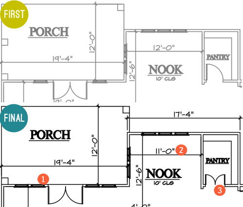
- More windows, please! We first considered turning this whole wall between the family room and the porch into french doors, but Builder John reminded us that it would cut into the function of the family room to make clearance for all of those swinging doors. So instead we just added large fixed windows beside the original french door for the appearance of a wall of glass without all that stuff swinging out and hitting potential furnishings.
- A built-in breakfast nook. This is the hardest change to see based on the floor plan (since it looks like we just made it a foot smaller). But that’s actually because we’re planning an awesome built-in breakfast table with a feature window behind it. Something sort of like this, but with a big interesting window in the back like this. More on that table in just a moment…
- Pantry door tweak. We thought it’d be fun to make these two frosted glass doors instead of just one (like this). But enough about that, let’s talk about the table for the breakfast nook…
Remember when we mentioned making a site visit to source some materials? Well, Builder John and Justin from Homearama introduced us to this place just down the road from us called Dreaming Creek Timber & Frame, where they craft incredible stuff from all types of wood. And they’re going to custom make a raw-edge table (kinda like the in-progress one that we saw during our visit, shown below) to contrast against the otherwise crisp and white breakfast nook that we’re envisioning.
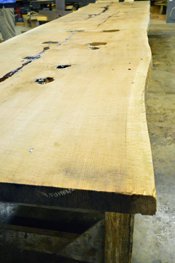
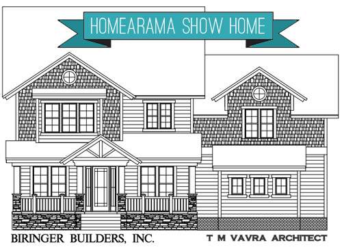
They’re also going to provide some other focal points to the house, like the open A-frame rafters on the front porch, which you can see in the rendering of the facade at the top of this post. If the color had been right, we totally would’ve ask to used these boards they snagged from Coney Island. That’s the old wood boardwalk just chillin’ in the Virginia countryside. Sherry was feeling the NYC love.
Okay, back to the floor plans. Let’s go upstairs, shall we?
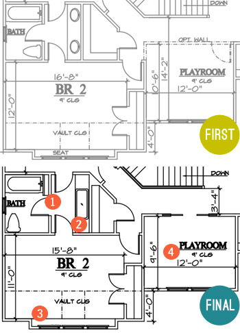
- Some fun towel storage. Since the jack-and-jill bathroom between the kids’ bedrooms didn’t really have (nor did it need) a formal linen closet, we made room for a narrow vertical cubby (for some casual rolled towel storage).
- Go big or go home sink. Again, since it was a kids bathroom we thought it’d be fun to put one big trough sink in there instead of the traditional setup of two smaller sinks. It’ll still have two faucets so it’s easy for two people to use at once, it’ll just be extra wide for some added fun. I think Clara would play for hours in there.
- Light-filled homework spot. Rather than the bench seat that was originally planned for this spot, we decided that a built-in desk would probably get more use and give the room as much function as possible.
- Defining the playroom space. We’re actually thinking of this room as a “Kids Reading Room,” so it will have more of a quiet, curl up with a book (okay, or maybe video game) kind of feel. So we opted to close it off with a wall, but still give it an open feel with pocket doors. We’re envisioning something kind of like this.
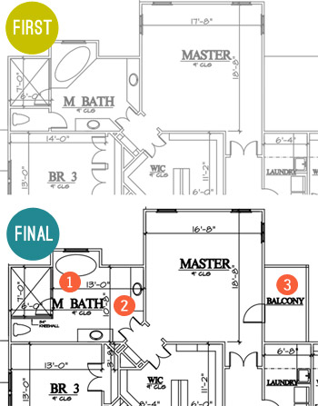
- Freed the tub. We thought the tub would have more presence if it was centered under the back window and freestanding (instead of built into the corner), so we changed its angled placement so that it didn’t block the shower as much (which also allowed for the entire front of the shower to be glass, instead of being walled in with just a small glass door for entry).
- Freed the vanities too. We also thought the twin vanities would be nice and stately if they felt less like angled cabinets with granite on them and more like pieces of furniture set in the room, so we squared them off and are hoping to find some cool dressers or something to convert.
- Balcony, baby! When the builder realized there would be unused roof space on one side of the main bedroom (the breakfast nook is below it) we all thought it would be awesome to add a private balcony up there. We originally had one off the front of the house (attached to a kids room) but the placement off of the main bedroom made a lot more sense.
There were a few other changes not mentioned, but those are probably the easiest to show at this stage. But I can’t believe we spent so much time talking about the inside without even addressing what happened outside. I don’t have the original version, but here’s where we ended up.
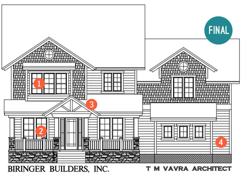
- Ix-nay on the alcony-bay. As I just mentioned in that last bullet, the original plan had a balcony with a pergola on this front window (incidentally, it was the presence of this pergola that helped us know that Builder John was the right partner for us). But the neighborhood’s review board killed the pergola, which made us reconsider the presence of a balcony on a kid’s bedroom anyway (for safety and mischief reasons). So it became a regular window, but that’s where our built-in desk is going to go, so we’re cool with the swap.
- Fake frenchies. Remember how we got rid of the french door in the dining room? Well, we’re going to try to capture the look of french doors with big floor-to-ceiling windows on both sides of the front door instead. That way both rooms get lots of light and easy access to the porch through the entryway door, but they don’t need to account for the clearance of swinging doors (which would impede on the size of the furnishings and their placement in those rooms).
- Open frame. We suggested an open frame look right above the front door. Builder John was all about it and was the one who suggested that we get the Dreaming Creek Timber guys to get us some really awesome accent beams to top things off out there. We think a big hanging glass pendant will look so great shining through that framed detail over the front door.
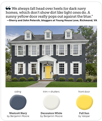
- Go navy! We said early on that we were leaning towards the idea of a navy house with crisp white trim and cool gray-toned stonework around the foundation. Builder John said “dude, I just sold a house that was tan and the realtor said if it was navy she thought it would have sold faster. Say no more, I’m sold on navy!”
We still need to settle on an exact navy color, and we’re actually meeting this week to look at a few options along with choosing the exact stone and brickwork that will make up the exterior. We’re also thinking of going glossy red or bright yellow for the front door, maybe bringing to life the exterior color combo that Sherry told HGTV magazine she was crushing on a few months ago?
Sorry there aren’t more real pics to share at this point. All of this talk of the house is really making us excited to see it come to life in person! Have any of you guys built a house, or been involved in the process through a relative, friend, or work project? It’s amazing how much there is to think about, but insanely exciting to think that scribbles on a piece of paper can actually become rooms that you can stand in someday.
P.S. While we often take on side gigs like this to help pay the bills, this one is a purely creative endeavor for us. Homearama compensates their designers for their year of planning and work, but we’ve opted to donate our entire fee to Richmond’s Habitat for Humanity, a cause that Homearama will also be supporting in other ways throughout the event.
Update: Wanna see the finished showhouse? Click here for Our Full Showhouse Tour, which includes final pictures of every room, the floor plan, budget info, a video walk-through, and shoppable showhouse furniture & accessories.

Anele @ Success Along the Weigh says
I don’t know how you guys do it. There’s no way I could house both this project and home projects in my brain at the same time! I hope Listy McListerson is keeping track! :)
Tania says
I love it!!! So exciting- ya’ll are awesome. ;))
Laura @ Rather Square says
I’m really liking that raw-wood-edge table, such a nice contrast in a finished space. And I usually don’t like navy, but for some reason the one you chose for the house exterior is muted enough that it doesn’t scream “NAVY!” (it’s more of a navy whisper). What a fun project!
Manda Wolf says
What a cool opportunity for you guys. I have to say I won’t be surprised if you end up building the forever home down the road (I know you say you see yourselves living in this one forever but things change!).
Wendy @ New Moms Talk says
Appreciate the collaborative walk through from ideas to reality-ish.
My uncle is an architect and when he built their second home, he studied the land for 3 years before building it. Do you know that in some areas you don’t need a foundation?
He was shocked to learn that, disputed it with the contractors, and even pulled his credentials. (He’s behind some big name buildings like GM’s headquarters.)
Yet, he listened to them and when it was all done, he had an amazing little cabin that is built into the land. His driveway is where the winds are the strongest, so he rarely shovels snow in the winter- even in snow heavy Michigan.
YoungHouseLove says
That’s amazing! Never knew that! I would be shocked to be told that too!
xo
s
Wendy @ New Moms Talk says
In his area, it’s based on the amount of sand.
YoungHouseLove says
So interesting! I guess if it’s super dense or something the soil is more trustworthy?
xo
s
Wendy @ New Moms Talk says
I’m not 100% sure, and just Google’d it but didn’t find a best link to post.
For reference, though I don’t think it makes much of a difference, his house is 2 bedroom cabin. Nothing with extreme square footage.
He noted that the collaborative process was quite awesome. In all of his professional years, he’d never experienced anything like it before. He was humbled, learned a ton, and his house is a true home as a result of the many hands that worked on it.
YoungHouseLove says
Yes! Working with so many pros is insanely interesting and fun! We’re learning so much. Feels like we’re the newbies but everyone is so nice to us. Whew.
xo
s
julie says
My grandparents lived in a house on the water that was only a concrete slab…no foundation! The soil there is also very sandy (Berlin, MD).
Ashley says
I would guess that what they used as a foundation is actually a monolithic footing. It’s very common in sandy areas for one story houses, like Florida. The 4″ slab would be thickened on the edges to 16″ minimum to carry the load of the bearing exterior walls.
sarolabelle says
I have never seen a modern two story house without what people in TX here call a “Gameroom”….is that something that is not standard in the rest of the country?
YoungHouseLove says
Good question! Anyone else have gamerooms? Here I think some showhouses have them but it’s not a standard thing.
xo
s
Rachel says
The house I grew up in in New England had a “Playroom.” When I moved to Georgia for college, it seemed like every house down there had a “Bonus Room.” Maybe it’s just a regional difference of what to call the room?
YoungHouseLove says
That could be! Here sometimes it’s called a playroom or an upstairs media room!
xo
s
Kate says
I’ve heard of game or rec rooms in basements, but here in New England, it’s usually bedrooms on the top floor, living space on the main floor, and a finished (or partially finished) basement. The house I grew up in had a dirt cellar, root cellar in a door in the kitchen floor and an attic as well. No playroom.
Emily says
Growing up in MD, everyone had basements which were your playroom/gameroom. I had never seen a house without a basement. And then we moved to North Carolina. Not many houses down here have basements (unless they are built into a hill). They don’t have to dig the foundations as deep so they don’t put basements in. Therefore, we have “Bonus Rooms” which are typically 2nd floor playroom/media rooms/gamerooms. I think it all depends on where you live in the country!
Ali says
We just built a house 3 years ago and noticed that the thing in our area in NC is for builders to offer the option of having a “loft” or a “3rd/4th bedroom” – basically the same space but either having a wall/door or being open to the upstairs hallway. So perhaps the “loft” has replaced the “playroom”?
Megan says
Oh man I would love to live in that house! Can I sign you guys up to design my forever home some day? Love the navy color choice too. We are talking about painting our uggggly brown colored house blue and this, along with the blue house on the home tour you posted about yesterday, are really making me think thats a good choice! Can’t wait to see more as the project progresses. Great job!
YoungHouseLove says
Thanks Megan! It’s so much fun to weigh what would look really cool with what’s really functional/helpful to have in a house. I think we like wearing both hats and sort of debating each other.
xo
s
Tracy says
I think the walk-in pantry would be more functional with a door that opened out rather than in… I wouldn’t want to have to go in there, and close a door behind me to access the shelves (I’m envisioning shelves on 3 walls). The two smaller doors helps, but I still think a closet door should open out.
YoungHouseLove says
You’re totally right! I love that idea!
xo
s
Angel says
I also love the idea of a frosted pocket door for a pantry a la http://www.pinterest.com/pin/328199891565589663/
YoungHouseLove says
Really pretty!
xo
s
Elizabeth says
I picture a swinging door on the pantry…easy to get in and out with your hands full. Love the plans, can’t wait to see it come to life.
Alice says
My walk-in pantry door opens out and it works well for us. Also, when we built our house, we had automatic lights installed in our pantry and in the toy closet. The lights go on when the door is opened and go off when the door is closed.
YoungHouseLove says
Ooh that’s nice!
xo
s
Jennifer says
We built our house in Australia – have been in it almost 7 years (we spent three years designing then it took another 2 to build). With regards to the pantry – our walk-in pantry also has a door that opens outwards – its great. Also, you can never have too many electrical outlets. In Australia its “standard” to have one double-socket in a large room – crazy! Our building company thought I was nuts when I showed them my electrical plan and I had added about 3 times as many sockets. Little did they know, I only had them add the ones that had to be put in by the builder (due to double-brick layered homes, not drywall). My electrician brother-in-law then came in and added more and upgraded doubles to quads. I had him put one in the pantry – great or the bread maker or other crockpot – can have them working and not in the way on the counter. He installed one under the ledge of our overhanging kitchen counter (where we have stools). We have an appliance garage with a quad socket. A quad socket in the laundry room, etc. You can never have too many!
YoungHouseLove says
Love those tips!
xo
s
Ashley says
Keep the pantry door swinging in- an outward swing gets in the way of traffic outside the pantry, and it’s easier to push a door open than pull with your hands full.
Be careful with outlets- they are usually not put into pantries or closets because it is a huge fire hazard… too much stuff gets crammed into those spaces & ignites quickly.
Kari says
If this blogging gig ever stops working for you, I think you would have an amazing career in helping design tract homes. The changes you detailed here are those that make the difference between functional and amazing. Thanks for sharing.
YoungHouseLove says
Aw thanks Kari! It’s so funny because we still feel like complete newbies! But it’s really fun to dip our toes into the water and learn what goes into new constructions!
xo
s
Janelle @ Two Cups of Happy says
I really enjoyed this post! It seems like you put a ton of thought into the utility of the floorplan. I used to draw floorplans when I was younger of my dream home. haha.
YoungHouseLove says
Thanks Janelle! John spent a ton of time on it, so I’m glad it was helpful. You know him and his little bullets and diagrams. Haha!
xo
s
Connie says
I love this house… so well thought out! Can I live there?
YoungHouseLove says
Haha, come on down!
xo
s
Becky Wilson says
We just painted the exterior of our house Sherwin Williams Outerspace and love it! It appears dark gray on the swatch, but it looks navy on the house with white trim. We have had so many compliments!
YoungHouseLove says
Sounds gorgeous!
xo
s
Ashleigh says
Becky Wilson, I would love to know the name of your new dark gray/navy exterior color!
Becky Wilson says
Ashley, it is called ‘Outerspace’ by Sherwin Williams.
Angel says
I am such a floor plan nerd. This is my favorite post ever. I am so excited about this show house its not even funny.
Tawnya Marney says
Oh Angel I am a floor plan nerd too! I am the weird kid that loved the Sunday paper not for the comics, but for the Home section. I always cut out floor plans I loved and tucked them into a folder. I still look over them all the time and have a mental checklist of what I want, like, dislike etc.
Megan @ Rappsody in Rooms says
Wow! What a fun process! It looks like you are learning a lot. Very interesting to see what all goes on before ground is even broken! How fun will it be to see it come to life?!
YoungHouseLove says
We can’t wait. Seriously, we’re like “is it Christmas yet?”
xo
s
Tandy says
This house reminds me a little of Katie Bower’s house! With the study and dining room at the front (I think hers has doors to the porch though?), and some of the upstairs with the Jack and Jill and the playroom. It looks like an awesome layout!
YoungHouseLove says
Oh my gosh it does! I didn’t even think of that, but you’re right! It’s the builder’s favorite base plan (that ended up getting pretty heavily tweaked by everyone) so maybe he and Katie’s builder were inspired by the same one?
xo
s
Richelle says
This project is so interesting to me. I’m assuming you have an assigned budget for this project, how does it compare with what you would budget for projects in your own home? Do you get to use different materials/elements that would normally be outside your own budget?
YoungHouseLove says
It’s actually really interesting because we have a budget for “decorating” (that includes things like all the beds and bedding and curtains and art and furniture) which is pretty modest for doing an entire house – especially one of this size, but the builder’s budget goes into finishes (like flooring, tile, vanities, toilets, showers, architectural features like beams and pocket doors, appliances, etc). So it’s sort of like we’re working from a few pots. There’s also the awesome charitable aspect to it, since some companies want to help out, they might donate things for the cause (Habitat) so for example Kohler could offer 50% off to the builder on all bathtubs and sinks. And there are also some vendors who provide things like furniture which is then sold during the showcase when the homes are open (so we might get a sofa for free for the living room just for the three weeks that the show is running because they’re hoping someone walking through will buy it off the floor). In the end, the house will most likely have more high end finishes than our typical DIY budget allows, but it feels fitting for this neighborhood/house and the cause, so we hope it’s inspirational and fun for everyone who walks through!
xo
s
Alexandra says
I was excited to hear that you plan to make the range hood a focal point in the kitchen! Especially because I’ve been looking for a visually interesting (island) hood, that is reasonably priced, for months. They all seem to look so similar and industrial to me. Any suggestions you all have for where to shop (a chain or online retailer since I don’t live in Virginia) would be awesome!
YoungHouseLove says
This is a good question! We haven’t started sourcing those yet, but does anyone have tips for Alexandra? I know Ikea has a bunch (some are white and some are silver and a few different shapes) and of course Lowe’s and HD have them too. Hmm, anyone know of something else?
xo
s
Jill says
We found our range hood on Overstock.com for an awesome price. Their site often has really useful reviews too. Ours wasn’t an island hood, but I imagine they’re worth checking. We love ours and use it every day :)
Loreen says
Will the house be sold furnished? What happens to all the great furnishing you will choose when it is finished?
And I vote yellow for the door!! Red doors have been around for so many years. Looking forward to seeing what you do!
YoungHouseLove says
A lot of the furnishings will be for sale during the event, so people walking through can buy them or buy the house, but the house only comes furnished in the very rare case that the buyer decides to buy the furniture too! Otherwise it gets sold to others or returned to wherever it was borrowed from. The stuff that is purchased (instead of borrowed) is donated to Habitat I believe.
xo
s
Dizee says
Hey!!! Nice!! I don’t remember reading – but do you guys have a budget? I love all your ideas but was wondering if there is some sort of cap?
A few of my friends have had custom built homes out on Long Island – very cool. I actually work for a General Contractor. There is something very cool walking though an unfinished space.
YoungHouseLove says
It’s actually really interesting because we have a budget for “decorating” (that includes things like all the beds and bedding and curtains and art and furniture) which is pretty modest for doing an entire house – especially one of this size, but the builder’s budget goes into finishes (like flooring, tile, vanities, toilets, showers, architectural features like beams and pocket doors, appliances, etc). So it’s sort of like we’re working from a few pots. There’s also the awesome charitable aspect to it, since some companies want to help out, they might donate things for the cause (Habitat) so for example Kohler could offer 50% off to the builder on all bathtubs and sinks. And there are also some vendors who provide things like furniture which is then sold during the showcase when the homes are open (so we might get a sofa for free for the living room just for the three weeks that the show is running because they’re hoping someone walking through will buy it off the floor).
Dizee says
That is really interesting. What an amazing project to be part of.
Ruthie says
*Insert squeal here* How did I just now notice your collection on Shades of Light! And the subtle YHL watermark on one of the shades!
Oh yeah and working with Habitat is pretty cool too :)
YoungHouseLove says
Thanks so much Ruthie!
xo
s
Britiney @ Consider the Lilies says
Hey! You mentioned today and yesterday that you’re looking at a freestanding tub. Do you have one in mind? We’re getting ready to demo our master bath and I REALLY want a freestanding tub with a skirt but the one I want is a budget-breaker at $5k. *gasp* My husband says we should just get an acrylic tub. *boo* I was wondering if you found a good one for a reasonable price.
YoungHouseLove says
We have a hot tip that Costco sells some really nice ones around 1K! So we’re thinking we could look into those and a few local places to see if there are any on sale floor models or something.
xo
s
Amy says
The house looks great – I love your attention to detail. You gotta do the little yellow door that pops.
I assume you have a building and furnishing budget to work with? Have you had to compromise things yet for the sake of sticking to budget?
YoungHouseLove says
We’re not to the buying stuff stage quite yet, but it’s actually really interesting. We have a budget for “decorating” (that includes things like all the beds and bedding and curtains and art and furniture) which is pretty modest for doing an entire house – especially one of this size, but the builder also has a budget that goes into finishes (like flooring, tile, vanities, toilets, showers, architectural features like beams and pocket doors, appliances, etc). So it’s sort of like we’re working from a few pots. There’s also the awesome charitable aspect to it, since some companies want to help out they might donate things for the cause (Habitat) so for example Kohler could offer 50% off to the builder on all bathtubs and sinks. And there are also some vendors who provide things like furniture which is then sold during the showcase when the homes are open (so we might get a sofa for free for the living room just for the three weeks that the show is running because they’re hoping someone walking through will buy it off the floor). In the end, the house will most likely have more high end finishes than our typical DIY budget allows, but it feels fitting for this neighborhood/house and the cause, so we hope it’s inspirational and fun for everyone who walks through!
Ang says
Omg I am obsessed. This layout would be perfect for hubster and I and our potential future kiddos. Feel like building another one in South Jersey when you’re done?
YoungHouseLove says
Hmm, I’ll have to see if we can just clone this one and mail it to ya!
xo
s
Katie says
um wow. I want this floor plan!
Karen says
You should totally do a beautiful wood front door with windows at the top. Something with a rich stain and very craftsman or prairie style. I know a house near me that is a deep navy colored (real) cedar shake siding wih this beautiful front door that just accents it perfectly. I’ll try and take a pic and send it to you guys. It might be the inspiration you need… :)
YoungHouseLove says
That sounds gorgeous Karen!
xo
s
CohoesMom5 says
I used to draw floorplans in High School when I was supposed to be taking notes. I love this post and the tweaks are very function and/or fun. We built our house 3 years ago and went through something very similar. Except we had to take the cost of everything into account since we had to pay for all the changes to the standard plan.
I agree with the person who commented above about the pantry doors opening out instead of in. Our pantry door opens out and it is much easier than having to close the door to get the the space behind it. Our closet door opens in and I am always closing myself in to get to my clothes.
JMK says
a pocket door on the pantry would also work and not interfer inside or outside the pantry.
YoungHouseLove says
Another possibility for sure!
xo
s
Britiney @ Consider the Lilies says
The ones I’ve seen at Costco are acrylic. What are your thoughts on that? We’re getting rid of a fiberglass shower insert and tiling and to me it feels a little “cheap” but maybe I’m just a tub snob? Truthfully I’m not a bath taker, so logically it seems silly to spend too much on something that’s mostly just for looks. I’ll be anxious to see what you finally decide on! I might buy a lottery ticket to see if I can pay for the $5k Kohler one! ;O)
YoungHouseLove says
Hmm, I think I’d have to see/feel it in person. If it’s chunky and sort of the same feeling I think I might not even be able to tell the difference, but if it feels plasticy I would totally pass on that for something more substantial I think. Don’t want to cheap anything up!
xo
s
JMK says
when we build going on 20 years ago we put in the honkin big jetted tub and have used it maybe 5 times. I have dusted it weekly for the past decade… Even with oversized water supply lines to the tub it takes so long to fill it I just can’t be bothered. Guess I’m just not a bath person. Now the 5×5′ all glass and tile shower stall? That was money well spent. The frameless glass walls/door were $1500 20yrs ago, but on balance we did the tiling ourselves for about $200.
Kristin says
There are less expensive cast iron options than Kohler out there. I would strongly discourage putting in an acrylic one – they feel cheap and hollow and don’t hold the heat.
YoungHouseLove says
Thanks Kristin! Good to know!
xo
s
Heather says
I love the idea of the breakfast nook with the built in. Might I gently suggest, though, that you make sure it seats 6? I have 3 kids and we rarely get to sit in booths in restaurants because many many booths are designed to accommodate 4 people. If I were looking at a house with a fabulous breakfast nook that only seated 4, I would have to pass.
YoungHouseLove says
Thanks for the tip Heather! A lot of it has to do with how much room there is in the floor plan to schooch things around, but we’ll have to see if it’s doable!
xo
s
denise says
Really good point! As another family of 5, I’d have to agree. That would certainly make us pass on a house.
YoungHouseLove says
Thanks guys! So helpful to hear! It looks like it’s going to be big enough for 3 people on each side plus someone on the end – so it could even seat 7 in a pinch!
xo
s
Jenny says
Cool to hear that! I can see how even for a family with two kids, if you figure in a sleepover or two, generous breakfast seating would be the way to go.
Toni says
I never consider how much the little details matter until clicking through to the links! I *love* the window and door details especially.
Cristina says
We just painted our shutters hale navy by BM and LOVED it, the look is great but not TOO bright. :)
YoungHouseLove says
I keep hearing great things about that color! Love that you love it.
xo
s
Kim says
Oh wow – I just love it! And I love the navy color! Such thought went into the final floor plan – it’s those little things that are so hard. My parents are downsizing and are in the final stages of building a small ranch home in a 55+ neighborhood near me. After living on 5 acres and a rather large house it’s tough for them to think “smaller”. And while they tweaked their floor plan, now that it’s mostly done my mom has already said several times that there are things she wished she’d thought of – like a garage entry door that opens almost onto the mudroom cabinet and the closet at the bottom of the basement stairs that she wanted, but no one told her in order to do it it would take over 2 ft of space from one of the guest bedrooms and make an insanely large closet in the actual bedroom (strange plan). Their builders are nice and all but just don’t seem to have that final “vision” that you all do. It’s probably why I hear so many people say that they’d build a second time to “get it right this time”!
I must say the stress of building (and I’m only the daughter helping with decisions!) is a lot, but I secretly want to do it!
Can’t wait to see this process unfold!
Sharon S says
I love all the changes you’ve made and can’t wait to see it come to life!
Might I suggest a grayish-green for the front door? That’s one of my favorite accent colors with Navy, very classic.
I can’t believe it will be finished by Christmas, talk about instant gratification (for readers anyway)!
YoungHouseLove says
Sounds really pretty! As for by Christmas, it’ll be under roof, which just means framed out. Probably won’t have walls that are drywalled/painted until around Feb and then we hope to have it all decorated and ready for the show within the next few months (it opens in early May).
xo
s
Megan says
Beautiful house! How many square feet is the house (living and with the garage)? I am awful at estimating those things myself!
YoungHouseLove says
I am too! Square footage was one of the things mandated by the neighborhood developer, so it’s coming in at around 3,400 square feet (that’s heated and cooled, so not including the garage). They wanted to add a full finished basement but we said “ahhh! too big!”
xo,
s
Katy says
Was it up to you guys to make the call on the finished basement? Wouldn’t that have been the builder’s call if they have to sell the house? It might be too big for you, but then it’s not your house… What’s the basement status going to be for the other show houses?
YoungHouseLove says
Oh yeah, it definitely wasn’t our call! The builder didn’t want to do one either (only two of the seven showhouses were on lots that called for basements, due to their grade, which meant they’d end up being bigger and needing more furniture for the showhouse). To the builder, it meant adding room for another staircase down in our floor plan, which he disliked, as well as preferring to do a two level build, so he made the call to essentially bring in extra fill dirt to fill in the basement area since the lot we were assigned called for a one without that solution – and thankfully the neighborhood developer approved that option.
xo,
s
Ginger says
Woah! I have a navy ranch with white trim and a gray roof. I love the color – it’s sort of a muted navy. There is a pic on this page – http://gibsonswafford.blogspot.com/p/about-us.html
YoungHouseLove says
SO charming! Love it!
xo
s
Karen says
http://southernhospitalityblog.com/feature-friday-craftsman-home-in-cartersville-part-1/
something like this…
YoungHouseLove says
So pretty! Thanks for sharing the link Karen!
xo
s
Sophie says
So excited for you guys taking on this new challenge! Will you be posting about the house as it’s being created, or will it be one huge reveal when it’s finished?
(Also, I had a really strange dream about you guys last night! Apparently, Sherry was pregnant with triplets and you decided you needed more space, so you moved here to London (except it looked like Amsterdam…) into a huge house right next to the river Thames and Justin Timberlake came to visit you… My brain is confusing!)
YoungHouseLove says
That’s hilarious! Sure beats my dream last night that Burger got hit by a car. I woke up crying. Traumatic!
xo
s
YoungHouseLove says
Oh and as for your question about keeping you guys posted or just doing one big reveal, we want to share the whole process. So we’ll do some posts about choosing materials like the counters and backsplash and flooring and stuff like that and we’ll share photos as the house is built and any changes/obstacles we make/hit! Then we’ll share how we’re filling up those rooms (hopefully with some fun DIY art/curtains/ideas) and then in early May we’ll get to share the finished room photos!
xo
s
Leslie says
This house is amazing and I always wanted to have a bathroom connecting 2 bedrooms. Just like in 90210! haha, I’m so lame!
YoungHouseLove says
ME TOO! 90210 soul mates.
xo
s
E.D.R. says
Ahhh, I LOVE it! I want this house. Must look at our house and see how it can be tweaked! Great job you guys! It must be SO MUCH FUN! Aaagh, dying of envy!
Lindsey d. says
LOVE the idea for a navy exterior… I just painted my 1935 cottage Sherwin Williams Gibraltar, a moody grey-navy and love it every time I come home. I painted the door SW Hep Green (a bright green with some yellow undertone, more green than grellow).
http://www.flickr.com/photos/lindsey_w/9819522266/
YoungHouseLove says
You have the cutest house everrrr! I love it.
xo
s
Tanya says
Is the house going to have a DIY style – or is it more a dream home where you just go with your own style and purchase whatever you like?
I was thinking if you were going DIY the study/play room would be cool if it had sliding barn doors that you could DIY (I have seen some cool one with old glass french doors)- though it may not work with the overall style (and are barn doors now “so 2012”? I can never keep up).
YoungHouseLove says
We’re definitely planning to DIY some aspects of it, probably more like art and decor-related things (curtains, etc) just because the builder will be installing all of the doors and cabinets and stuff (we’re not certified to do that stuff in the showhouse). The cool thing is that we’re involved in the process of choosing what goes where – so a good example is that if we found an awesome cabinet that we wanted to convert into a sink for a bathroom, we’d hunt it down but the builder would most likely install that. But if we wanted to DIY some art on an old piece of wood for over the fireplace, we’d do that and hang it ourselves.
xo
s
Theresa M. says
I was going to say the same thing. Hide the toilet! But you guys were spot on with the kitchen. A non-cook must have designed the first one.
denise says
Love the changes and the floor plan as a whole! This is going to be a fabulous house! I think my favorite changes are the butler’s pantry and the pantry doors. I do think having them open out, as someone else mentioned, would be much more practical.
My only question…why on earth did you get rid of the door in the master bath that separated the toilet?!? IMO, having a separate toilet area in the master bath is standard in higher end homes. It’s a small luxury that makes sharing a bath with someone else much more livable. :)
YoungHouseLove says
I think that’s just one of those 6 people prefer them and 6 people don’t like them things. We thought not having that closed in toilet cubby would feel more open, and it would allow that wall of the shower to be half glass for even more light/airyness in there, so instead of segmenting the bathroom within itself we made it one big master bathroom suite. Totally a different strokes for different folks thing though!
xo
s
Jen says
I thought the exact same thing about the master bath toilet – I’m a close-it-off kinda girl, I guess! Otherwise I LOVE this floorplan! So functional and I love that it doesn’t bother with a formal living room. A lot elements in this plan are things we have in my current house and the formal living room NEVER gets used!
I actually got to design and build a house with my dad (a contractor) when I was in grad school. I loved the process of deciding how to divide the spaces, but didn’t really have the knowledge or money to put together a dream house. I would love a do over some day!
Krista says
Haha! I was just scrolling down to say how much I loved that you freed up the toilet! I cannot stand those little separate bathrooms, but I am glad the the toilet is still back in a little nook… its like semi private!
YoungHouseLove says
I’m seriously considering posting a poll, just because it’s so funny how many people have strong opinions on each side!
xo
s
MichelleR says
My vote goes for a toilet door! I love all the changes you made, but when I saw the toilet door was taken out, I was all “noooooo!” We have a separate toilet room (I think some areas call them water closets??) and I LOVE LOVE it! No more seeing your spouse in the mirror doing his business while you’re brushing your teeth/getting ready. Plus, it just contains…uhhh… stinky smells better than if it were open to the rest of the bathroom.
YoungHouseLove says
That’s so funny because someone else said “no door! It gets stinky in there!” – so funny how many people have door/no door opinions!
xo
s
Debbie says
Vote for keeping the Toilet door!
Vickie says
Oh my gosh …. leave the toilet door off! I can’t believe so many people have such a big hang up about having their spouse seeing them pee. We both grew up in families with five children and only one bathroom. As a result, we both learned young how to share a bathroom.
Aimee says
Hate floor plans where you have to trek through an entire large bathroom just to get to the toilet. When I wake up at 3am and gotta go, I want to stumble half-asleep through the bathroom door and have the toilet right there – I don’t want to go on a hike for it. Just as an aside, I have a friend in New Zealand and they don’t put toilets in the bathrooms there. They have 2 separate rooms – one for the tub/shower and a sink, another for the toilet and a sink. They think it’s gross that Americans have their toilets next to their toothbrushes and soap!
priscilla says
It is so strange how the toilet placement draws so many strong opinions!!
As a realtor, I sell over 100 homes every year, and in my state, if the master toilet does not have a separate space with a door, then the price drops by at least $15,000. People use their baths differently, and the main comment is
something like this:
“If I am relaxing in my beautiful spa tub, or doing my hair, the last thing I want is to hear the sounds and smells from a toilet”.
I work with a lot of builders and it is the kiss of death here to have the master toilet open to the rest of the beautiful bath, haha!
How fun for you two to get to work with this home.
Ashley says
Another vote for enclosing the toilet again… it’s a must on any high end homes that we do in the architectural office I work in. We actually have had quite a few asking for “his” and “hers” toilet rooms lately.
Rebecca says
The floorplan of this house is UH-MAZING, and I don’t think that master suite could get any better. You guys made the coolest changes, and this will be one lucky family when they get to move in.
Molly says
How will you approach your decorating budget? I think it would totally overwhelm me to be given a set amount to decorate an entire house. Will you break it down by room first or pick your top ten big budget items and then work around those? I’d just like to know your thought process when faced with one lump of cash and about a dozen rooms to decorate. Any tips?
YoungHouseLove says
Oh man, I’m scared about that part! I think we’ll divide the total budget by room so we have a per room ballpark, but then hopefully rooms like bathrooms and the kitchen might be less expensive the decorate than rooms that need lots of furniture so then I think we might systematically do certain things (ex: buy/make all the window treatments in all rooms, buy/borrow all the beds for each room, buy/make all the bedding for each room, etc). Should be interesting to learn what works and what doesn’t! We’ll share the coups and baaad ideas as we go for sure!
xo
s
Heather P. says
Amazing floorplan! I can’t wait to see how you use what you’ve learned over the years to build and decorate this brand spankin’ new home!
karen @ paperfancy.com says
Hi there,
I love the navy house with the yellow door!! Gray and yellow look great together too.
Can’t wait to see the show house completed. What a great charity Habitat for Humantity too!
~Karen
Amy E. says
we had entered a contract with a builder for what would have been our first home. it was a lot of fun to give input on the layout and finishes. we also enjoyed watching the building process, though i KNOW the builder didn’t like us watching because we caught a lot of shortcuts they were trying to take.
in the end, we had to walk away due to financial disparities between what the builder wanted and what we were able to afford (thankfully we retained our entire escrow down payment intact with the help of a clause in our contract).
it was a good learning experience and we do plan on eventually building from scratch again (dream home!), but i’m glad it didn’t work out. the house we ended up in is MUCH better in SO many ways.
Valerie says
I’m so glad you guys have broken down the plan-tweaks in a way that helps people understand floor plans better! I am a residential architect and one of my biggest frustrations is that most people can’t read or understand a floor plan (or elevation) if their life depended on it! You do an excellent job narrating the implications of what looks like a couple little lines on a page. If you ever want to do a post on “How to Read a Floor Plan” I would probably send it to all of my clients! Thx for being awesome as always!
YoungHouseLove says
Thanks Valerie! I love this stuff.
-John
Robin says
I love this stuff too! I spend a extraordinary amount of time studying floor plans considering I’m not in the market! It’s just so fun!
Ashley says
I second Valorie’s comment… as someone “in the biz” it’s nice to see how y’all are approaching things with respect to the professionals.
YoungHouseLove says
Thanks Ashley!
xo
s
Samantha Cobos says
As a interior designer who has also built 4 homes for our family, I love your changes! The home is a great design with no wasted space. What is the square total footage of the home? Can’t wait to hear more!!
YoungHouseLove says
Thanks so much Samantha! The square footage is mandated by the neighborhood developer so ours is coming in right at around 3400 square feet, which is admittedly bigger than John and I are used to, but you’re right about them not wanting to waste any space, so it feels like there’s a lot of function in every corner!
xo
s
Heather {A Fire Pole in the Dining Room} says
As a fellow home building novice, this is so interesting! Thanks for putting together such a detailed post. It has me itching to measure and start tinkering with the plans for our (eventual) kitchen redo.
Robin says
I love this project that you’re doing. As someone who would love to someday (farrr off!) build their own house it really interests me! Plus I LOVE floor plans!
Also I can’t even believe your’re not even taking a portion of the pay here. You’re due a little for your hard work! Are there perhaps other perks besides ‘the experience’ (which ps I would get tons of joy out of!)?
YoungHouseLove says
We knew it would be a lot of work, but we’re having so much fun, and we love giving back to Habitat (they’re our favorite local charity), so this was just a way that we could learn and have a new experience while earning them some much deserved cash! And of course we love that we can share the whole journey with you guys too!
xo,
s