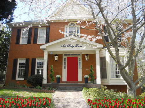
We’re not sure how many of you are knee deep in a turkey somewhere (wait, that sounds terrible) but there’s nothing we like more than a group brainstorming session, so if you’re around, Wendy would love your suggestions. She has an exterior issue and she’s ready to dive right in (you know what that means… after pics! Hopefully really soon!) so here’s her letter:
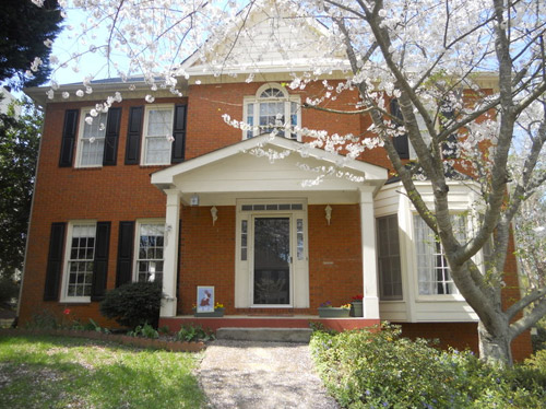
I’ve been a YHL reader since house #1 and I’m so excited that you’ve started this group advice feature! I have a problem I hope you and your readers can help with. We’ve lived in our home for about four years, and the front needs a major paint job. It’s a two-story brick house, and the trim is peeling and in desperate need of re-painting, but we keep putting it off because we can’t figure out the color! I’m not a fan of the off-white color, and our style is not particularly traditional, though that is the style of the house. We have an HOA so we can’t go too crazy, but I’d like to inject some fun color somehow to give it more appeal and personality. Maybe a bright front door?
The one thing that has me tripped up is that our brick is more orange than red. I’d love to hear what colors might work with that for our door, shutters, & trim. I have great fantasies of one day painting the brick, but for now I would love some advice for working with it as-is. Thanks! – Wendy (and Mike, Lucas, and Jackson) Note: for anyone who wants to play around in photoshop, just click the image above this paragraph to enlarge it – and you can share your creation in the comments by linking to it on a free photo-sharing site like Flickr or Pinterest.
After staring at that before photo for a while, I dragged it into photoshop to see what stuck. Here’s what I did first:
- Made the off-white trim white (this wouldn’t be scary or dramatic, but it’s a little crisper and less traditional, since it sounds like Wendy leans that way – and let’s face it, the HOA probably won’t go for something like blue trim)
- Added a glossy red door (it sounds weird to pair orange-y brick with a red door, but we did that with our first house and for some strange reason it made the brick seem less red/orange by comparison – sort of like how if something looks yellowed but you put a super yellow object next to it, it almost looks white by comparison). We used Fabulous Red by Valspar and loved the look in a nice shiny semi-gloss. It’s bold but still really classic.
- Planted a whole mess of red tulips out front (it would add even more color without annoying the HOA)
- Hung some nice oversized porch lanterns (something like these on either side of the door would look nice and weighty)
- Put some potted plants on the porch
- Added a scripty house number over the portico (spelling out the entire address with black metal numbers and letters could be really charming if there’s room)
- Painted the porch steps a nice neutral mocha color (just to neutralize that red top step)
For my second go, I:
- Tried a rich navy tone on the front door (like Regatta by Sherwin Williams or Hale Navy by Benjamin Moore)
- Went deep charcoal-navy with the shutters (like Rock Bottom by Sherwin Williams – since some people are suuuper anti navy door + black shutters, painting the shutters a few shades darker than the door, so they’re still deep but not quite black should do the trick)
- Hung some sweet and simple house numbers on top of the portico
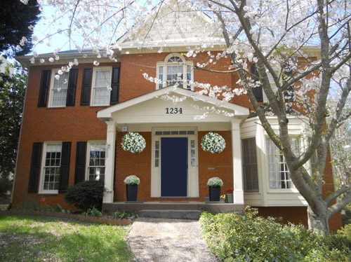
- Added hanging flower baskets on either side of the door
- Put two clean-lined planters on the porch
- Painted the porch steps a nice neutral mocha color (just to neutralize that red top step)
This one is a “squint a little” solution since the photoshopped shutters aren’t perfect, but this time I:
- Went white with the shutters (just to see how they’d look with the white trim)
- Added a spring green color on the door (that’s usually a pretty foolproof-yet-fun choice since there’s SO MUCH green in nearby nature that it tends to tie into that instead of looking like it’s out of left field. Of course this is photoshop, so it doesn’t look as real and layered as it would in real life, but it hopefully gives Wendy an idea so she can hold up some swatches in real life and just see what she likes – maybe try Lemon Grass by Behr and go from there?)
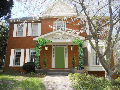
- Brought back the lanterns from my first rendering
- Added topiaries to the porch for height
- Tossed in some greenery to grow up those porch columns (Wendy can just ask what creeping plants don’t harm brick or wood at a nursery and see what they recommend)
- Hung the address above the door (this time I went for the scripty look with the numbers written out)
- Painted the porch steps a nice neutral mocha color (just to neutralize that red top step)
A few other options that came to mind were that Wendy could…
- go for dark charcoal shutters, white trim, and a glossy plum door
- try a robin’s egg blue door with navy shutters and white trim
- add window boxes for more color and interest
- hunt down a really great old doorknocker and doorknob for the front door
And just for fun, here’s Clara’s suggestion. She told me to do purple bushes and grass with blue bricks. Clearly she wasn’t following the “keep the brick as-is” directive. Ah, to see through the eyes of a child…
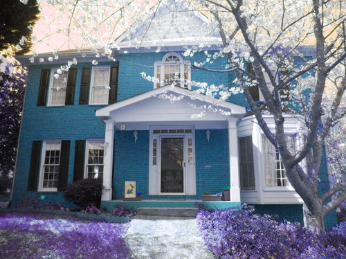
Do you guys have any votes or ideas for Wendy? Are you Team Red? Team Navy? Team Green? Team Edward? Team Jacob? There are tons of other ways she could go, so she’d love to hear everyone’s ideas. Picture me passing you the baton – er, the mic? The keyboard?
Psst – Got a particularly tricky spot or a dilemma in a certain area of your house? Please submit at least three photos of the space along with a quick sketch of the floor plan and a short description about what has you stumped to [email protected].

Kara says
I am partial to the red – it Pops! Happy Thanksgiving.
Courtney says
Well obviously, I have to vote for Clara’s version! :) But in case the HOA doesn’t go for that, I love love love the version with the navy front door!!!
mary says
i absolutely have to agree: some creeping charlie in the grass, plant some lilacs in front… clara’s onto something big!
Hayden says
I like the red the best out of 3. But I agree her house would be beautiful with painted brick!
Chase says
I love #1 the best. Something about those red tulips with the red door! Keeps it traditional for the HOA but has such warm, welcoming appeal :)
Christy says
I LOVE the blue house! Second favorite is the red door option
Sheila says
If painting the brick were an option I would go with Clara’s rendering in a heart beat. I truly think that the blue could be so pretty. But 2nd choice would be the green door. I just think the red and blue are pretty I have seen alot of them. The green is just a little daring without being in your face. What a calming but happy color to come home to each night. As always your creativity astounds me. Happy Thanksgiving to you and yours!
Robin says
Love the green door and the greenery but would like to see different lighting fixtures perhaps in copper?
Nan says
Another green door fan here. Fresh and bold without being too crazy.
Emily E says
Team Navy! I think the red looks terrible against the brick but the Navy looks charming. Especially with crisp white trim and pretty white flowers! Could just be the American girl in me but the red(bricks), white(flowers) and blue(door) really speak to me!
Pam says
I agree – the blue is unexpected but with the brick and trim looks very traditional.
Anne says
I like the blue door!
Mary | Lemon Grove Blog says
I’m personally a total sucker for painted brick a la this photo (http://www.pinterest.com/pin/256986722460703365/)
In the mean time, I think they could spruce things up by picking a nice, neutral greige color (similar to your paint job, YHL) and just paint the siding along with some nice, crisp white trim …
Jess says
I like the green option the best. It stands out, but not TOO much.
Nikki says
I really like Sherry’s second suggestion the most. I think the white trim will pop, the blue door is excellent, and the traditional house numbers are great.
One thing to consider is removing your screen/glass door. No matter what color you put on the front door you won’t be able to see it as well with the glass reflecting it. I took mine off and haven’t missed it. (I live in an urban area and would never leave the front door open with just the screen door closed because of the security risk).
This is a gorgeous home! I think even just freshening the trim white and painting the porch would make a big difference if you want a phased approach! Best of luck and hope we get to see pictures!
YoungHouseLove says
Oh yes, no screen or storm door = bright happy front door color. We have done that in each of our houses and never missed it! Great tip!
xo
s
Lisa E says
I guess it’s a matter of personal preference and practicality. I recently added a storm door because I needed that cross breeze. I also painted my door a bright blue and you can still see it, however probably not so much with a subdued color.
YoungHouseLove says
Oh yes, totally a personal thing. My friend can’t live without her storm door (loves the light it lets in).
xo
s
Samantha says
I’ve been having the storm door war raging in my head. We’re going to replace our front door in the spring and I want to paint it a fun colour, but we also want a storm door to help with air flow (we have a wall of windows that don’t open, so stupid!). But the storm door will block the pretty door. Decisions, decisions.
Cathy says
They make screen doors that disappear when closed up. You get the door in the color of the trim and it blends right in. Then you only see it when you unroll the screen. Just google retractable screen door. They’re a bit more expensive (for a good one) but worth every penny!
Rachel says
Hi,
Calling from the UK here, where we don’t have storm doors. Can’t you paint the storm door to blend in with the main door behind it? Or am I being stupid…?
Rachel
YoungHouseLove says
Yes, many people do that too!
xo
s
bfish says
I so agree with Vikki and Sherry — lose the storm door. A nicely painted wood front door can be such a great focal point; please don’t cover it up. On a traditional house a full-louver wood outer door with a screen on the inside (painted same color as front door) can be a good compromise though.
All of the examples have some merit; that said Clara’s is my favorite because I’m a painted-bricks-all-the-way person. But please, no white shutters!!! They are absolutely the worst. (Sorry, I’m very opinionated on these things and the white shutters are one item I just can’t hold back on.)
JenB says
Team navy! I really wanted a navy blue front door but my hubs wasn’t feeling it. Like you said, he didn’t like the blue with black shutters & white trim. We went with green and love it as well. But I still look at the navy door I pinned on Pinterest…sigh…someday. http://www.onsuttonplace.com/2011/06/my-new-blue-front-door
Am I crazy to kind of like Clara’s blue brick idea? I do love painted brick.
Karyl says
Love the blue door, grey shutters, and green planters on the link! Very nice!
Cristin says
I think I like Team Navy and Team Green…. I like the white shutters in Team Green but with the Navy door. Although, white shutters make me shudder (am I channeling Dr. Seuss??) because I hate to think about cleaning them every year, I like how they look against the brick. I also like the hanging baskets and the numbers in Team Navy too. It has a more classic feel.
This is such a cute house!!
Carrie says
I vote for the navy door! Love it! Whatever you decide, I hope you post pics.
Courtney says
I like a mixture of all three! The full address idea on the triangle part from #1 + the navy door/white shutters from #2 + the ivy from #3. Either way, the house is gorgeous – good luck!
Nichole K says
We had white shutters at our old house and I just sprayed them off with a hose once or twice a year to clean them. Easy peasy.
We chose vinyl shutters with a faux wood grain for pretty much no maintenance and you really couldn’t tell the difference even from just a few feet away.
Can’t wait to see what they decide to do!
Leila says
I have to agree! The green door is charming, but I really like the idea of white shutters and a blue door.
Also, I’d combine the simple numbers of #2 with the lanterns and plants in #3… My only other thought is to maybe add planter boxes to the bay window; flowers spilling over the sides would be delightful. Looking forward to seeing the final result!
sarina says
I actually like the blue brick! But of the others.. I think the navy door is my favorite. Definitely toning down the step color is important!
Mrs. Money says
I love the red door! I think that would really make the house pop and not be hard to do.
KathyL says
Wow, is it wrong to say I love Clara’s the best, that blue brick is so pretty. (and I’m not a blue person)
I think I like the green door the best, but in an olive color.
Meg Gardner says
I just loooooove the red! We have a red door, too, and it is such a cheery sight every time we come home. I love it! Team RED!
Blake says
Blue door/charcoal shutters!
Krystin says
I’m actually kind of loving Clara’s version!
Kaye says
The navy! Good luck with that HOA. So glad to live in a city where no one tells us what color to paint anything! (Our house is historic and lovely but no one tells us what to do!)
Melody says
First of all, my husband and so are doing battle with our HOA so I really feel for you there. I was surprised but I really liked the white shutters. They help balance out the bay window and allow the door to become the focal point. Love the crisp white as an alternative to the traditional off white and it’s probably very HOA friendly. Mocha steps are a must and I loved the red door and address on the portico! Such a cute little house- good luck!
J.Mill says
Team red or navy (or Purple Clara!) … although all look great! I think the red or navy are both classic and punchy which might mix the tone of the house with the style of the owner.
HouseTalkN says
I saw a brick colonial in St. Louis with a canary yellow door. It was gorgeous! Hold the phone and I’ll see if I can find a picture!
Monica says
I’m team RED!!!
Sasha says
Personally option three is my favourite. Clara’s is pretty snazzy too though ;)
Christina says
Team Navy for sure!! Love it!
betty (the sweaty betty) says
agreed!!
Casey says
I really like the plum door idea and that blossom tree is beautiful! I would love flowering trees in my yard when I buy a house someday.
jennT says
I like the plum dooR too with navy or white shutters!
Erin says
Red door all the way. Classy touch with the tulips!
Amy says
I think that the green door looks the best since green/orange are complementary colors. Something medium green http://www.lowes.com/pd_34143-4-50086CFIELDTIMEGREEN_0__?productId=3813773
The dark shutters seem depressing so I think painting them white to match the siding would be better. Or maybe even get rid of the shutters? See how it looks if you take them off to paint them.
Repaint the porch brownish or gray to match the concrete step.
The landscape could also use an updating. The single bush on the left side looks out of place. A row of 3 or 5 bushes of the same type would look much better.
Laura Hazel says
I vote for the charcoal shutters and deep plum door. The purple and charcoal will be gray enough to cool down the warm brick color. I think that will really pop with the terra cotta brick contrast, since orange and purple are opposites on the color wheel. I just changed my bedroom to dark plum, charcoal furniture and coral orange accents recently – Love!!
Try BM “Tropical Dusk, or BM “Darkest Grape” or Valspar “Purple Buzz”.
Betsy says
I love the first option! I agree, the red door makes the orange brick look less orange. Crazy! I have a similar problem but the brick on my house has a purple maroon color to it, and is very dark. Thanks for all the fun ideas and Happy Turkey Day!
Bridget says
Hello, What a beautiful home.
Personally I’d paint the door a yellow which based on the picture will complement the orange nicely. You can see in picture one with the black door that the little yellow flowers in the flower post on the veranda pop!
From a Feng Shui perspective the door is recessed meaning tucked in under the veranda which make the mouth of chi (the front door) rather difficult to see. Yellow is a vibrant happy colour which will brighten up the space and be very welcoming. I’d also add some larger exterior lights to the veranda to illuminate the space as well.
I would not choose to paint the exterior brick as once you paint them there will continuous maintenance and the need to paint again every few years as the paint fades over time.
Very beautiful. Have fun infusing the love into your space. Blessings. Bridget
Ana Silva says
I love your suggestions and great points. I have a grey sidding house with yellow double doors and I love it. Yellow doors are awesome! I also painted my garage door and shutters black. I think just refresh the trim with white paint, color the front step a brown like Sherry suggested, leave the shutters black (refresh with new paint if needed), and paint the door a fun color that you choose. I’d try yellow : )
Nicole says
Yes, I agree with the yellow front door and I’d also do the shutters in a dark teal or navy. A nice bright-white trim and add some vines, I recommend honeysuckle, to the columns. Morning glory’s for a punch of purple might be nice too. Keep them neat and trimmed and it won’t take over.
http://thumbs.dreamstime.com/z/front-door-27594647.jpg
http://media.al.com/living_impact/photo/11750448-large.jpg
Those lights definitely need to be replaced as well. Maybe a nice revivalist style, like your house: https://rejuvenation.s3.amazonaws.com/catalog/products/a9845/alt-images/enlarge/508abe90e694aa3981000214/sized_Ashland_lg.jpg
Keep the brick, or if you really are offended by the orangey color, stain them using dye brick (http://www.dyebrick.com/) or a similar system. Try to avoid painting… it’s a major nightmare to apply and maintain.
Nicole says
Like this:
http://img.photobucket.com/albums/v517/ng22/Untitled-1_zps3872ccbb.jpg
YoungHouseLove says
So much fun, Nicole!
xo
s
Jennifer says
We have a double yellow front door also (grey washed siding as well)and have had so many compliments on the color. It is so cheerful and since our door sits pretty far back and under a covered porch it helps to still see it from the curb. I yellow would work nicely on the brick as well to keep with the warm color scheme.
Em says
Our home is also an orangey brick, though there are some darker, almost eggplant tones, and our trim is tan. There’s siding on the back of the house that is also tan, so we were stuck with the tan when it came time to freshen it up last year. I decided on a purple, almost eggplant, but PURPLE front door, and I love it! I told a much more stylish neighbor ahead of time that I was thinking of doing it, and she made the funniest face. Then, after I did it, she actually made a point of coming over to tell me that she had thought I was nuts but that she absolutely loves it. I have been very happy with it year round, but it’s particularly nice in the autumn and winter. Our fall wreath has several small pumpkins on it, which really pop against the purple door, and our Christmas wreath is that red wood chip rose wreath from Target, and it’s gorgeous against the purple.
Janelle @ Two Cups of Happy says
Team Navy all the way! A couple of my suggestions for #2 would be to remove the shutters, nix the hanging planters and choose a saturated jewel tone for the clean-lined planters on the porch. This would tone down the traditional feel & make it fresh :)
Lauren says
In your “other options” section you mentioned a plum door, and I’ve never seen one so I googled it…and now I’m in love! Look at these:
http://tinyurl.com/ovmj9ud
http://tinyurl.com/nwqzok5
So Wendy, that’s my vote for a place to start!!!
Em says
That arched plum door is the one that convinced me to go for it. I’m still in love with the arch, but at least I can have the color. ;)
Gabi Barrick says
We have a plum front door – LOVE it! http://www.bgbarrick.blogspot.com/2013/03/a-door-able.html
Jennifer says
I perked up when I read about the “glossy plum door with charcoal shutters”, too! Anybody adept at Photoshop able to give that suggestion a go on Wendy’s house? I’d love to see it!
Amy says
Team Red!
Geertrude says
I love Clara’s ideas, especially with the pink sky ;-) My second choice is the green door. I love how fresh and spring like it feels.
Cari says
I like option 3 but would change the front door to the navy color. I think the white shutters, greenery, and navy door would look nice. I love Clara’s take on it too…it reminds me of a fairytale house!
Diana says
Loved the green…unique stands out against the brick, but also blends well with the grass/trees!
I love your advice. I am a renter, but it always gets my creative juices flowing. Keep doing what you’re doing!
Patty says
I actually like the blue brick …well done Clara:-)…..just think lavender bushes instead of grass
rachael says
This post made me laugh out loud! I like the first one. And Clara’s of course. She’s HILARIOUS!
melissa says
Could you paint the siding over the porch and the top peak a gray color? then add a gray/charcoal door and shutters?
Shelby says
I think it’s time for them to buckle down, paint that brick and go w/ Clara’s suggestion! You have a little design genius on your hands, and like with most brillent artists, she has a hard time w/ someone restricting her vision! Haha!
Wendy says
Hi! This is Wendy. My husband just came in the room and said “Did you send a picture of our house to Young House Love?!” Too funny. Thanks so much for the great ideas, there are so many little details I never would have though of, like the large lanterns and the tulips. I am loving them all so much that I don’t even know which one we will pick, but it has me so motivated to get it painted & spruced up ASAP and we will for sure share after pics. Thanks so much, and I’m also excited to keep checking out the comments for more great ideas.
Tell Clara that I love her idea! The purple grass is seriously awesome!
Happy Thanksgiving!!
YoungHouseLove says
Wahoo! So awesome to hear from you already Wendy! We can’t wait to see what you do. Good luck and snap lots of pics when you’re done!
xo
s
Brittany says
Love that your husband reads YHL! I’m a fan of the red door and love the idea of window boxes!
Cheryl @ The Creative Me and My McG says
I love the white shutters – it helps to balance out the white trim on the large bay window – and I would go with a teal door instead of a bright green and bring some bright pops of color into the landscape with roses and other flowers
TC says
I am lov-lov-loving the Navy Door iteration!
Brianne says
Plain brick is relatively maintenance free (besides repointing small spots every 50 years or so). Painting brick means adding maintenance by having to repaint every so often and can possibly trap moisture in the brick and cause it to deteriorate faster – just something to consider before deciding to paint your brick. As long as your brick still looks nice, I wouldn’t paint it.
Kristina says
I wanted to second this with a caution against painting brick. Bricks are porous and need to breathe. Painting will create a barrier to the exterior meaning the moisture will build up in the brick or the wall unit and will always try to find a way to escape. Often this happens by forcing the paint off which takes with it the hard baked surface layer of the brick. Without the baked surface the brick’s inside become like a sponge and draws in even more moisture.
Taya says
I’d say definitely go with white trim, whatever bright color for the front door that suits your fancy, and then either leave the shutters black or paint them a color like navy or charcoal to coordinate with the front door color. I also love Sherry’s idea of painting the steps a mocha color. I also think any of the “accessories” Sherry mentions are great options. You can easily go along with the traditional feel of the house but add your own twist that will still fit in! Can’t wait for after pictures!
Johanna says
Team Clara all the way!! You should throw her idea’s in every time- we would be living in a fantasy land soon enough!
amy says
I love the navy door suggestion personally!
Christy says
Love the Navy! That color would also allow a lot of experimenting with different colored flowers during the seasons. Yellow in the Spring, Red in the summer, Orange in the fall. It draws your eye in without being like “BAM! HERE I AM!!”