The Homearama Showhouse train continues to careen towards our deadline (you can read more about it here, here, here, and here). The show opens May 1 – although we have a baby who’s due a few weeks before that – so we’re scurrying to get things done and holding on for the ride. It simultaneously feels like we have a million things to tell you, yet no tidy way to share the news, so this post may feel a bit scatter-brained as I attempt to update you on everything swirling around the project these days.
First up, thanks for all of your input on the front door color. We can’t believe 38,000 votes came in (!!!). It was fun to see you guys launch rust into the lead early on, where it remained the winner with 36% of the votes (the runner up was red with 21%). As we mentioned, we’re waiting for the porch columns to go in and get sealed (they’re going to darken a bit), so we need to take that into consideration before a final decision is made.
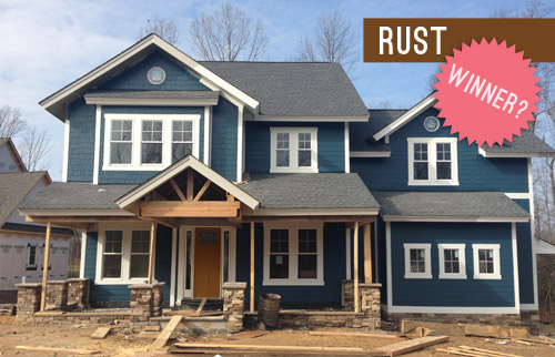
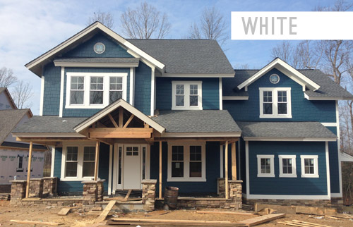
One surprise was a strong “write in” option that emerged repeatedly: white. Sherry had actually wanted to include that as one of the vote-able options, but I assumed it would show dirt too easily and wouldn’t be practical, so I talked her out of it. My bad. The good news is that the constant “what about white?” comments gave us the opportunity to ask folks with a white door if they liked it, and the resounding response was that many people with a porch/overhang like this house and a white door had no issues with it, and generally loved it.
So if the sealed beams, the porch floor tile, and other elements that we’ll be layering in start to feel too heavy, this write-in candidate could just steal the show. We like how it would integrate the white sidelights and make the whole entryway appear wider and more grand. So we’ll have to see what the builder, architect, and realtor think once the beams get sealed and we grab some paint test pots for the door. We promise to report back to you guys with all the details!
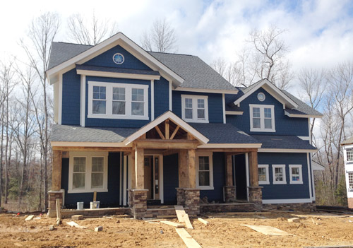
One exciting step forward, as some of you saw on Instagram, is that the porch columns are now in! It was so quite a moment to pull up and see them smiling (staring?!) back at us. They still need to be sealed, which will enrich/darken the tone of the wood, so we can’t wait to see how they look when they’re done.
Now onto the rest of the house. We’re facing a pretty constant internal debate when it comes to the choices that we’re making for this project. Do we pick the “safe” and more universally appealing option? Or do we take a risk and try something unexpected or against the grain? Since the home will eventually be put on the market, we don’t want to create a wild-card house that scares everyone off.
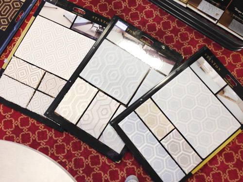
But the whole purpose of Homearama is to showcase a variety of interesting design ideas across all seven houses in the show, so they don’t all look like clones of each other – or of every other home in the neighborhood. So nearly every decision for this house has been an interesting (and sometimes paralyzing) dance between “is this too polarizing to please the masses?” and “is this too safe to make for an interesting home show?” We were even debating this yesterday while checking out some unique wall-to-wall carpet options for the kids bedrooms…
For the most part we’ve been trying to lean more towards the “risk” since the folks putting on the show have really encouraged that (along with the builder, who reminds us that the house only needs one buyer). Of course that doesn’t mean every element that we choose will be crazy, but it does mean that we’re shooting for a few showstopping choices in each room. And since there’s a whole team involved – the builder, the contractors, the architect, the Homearama coordinators, the realtor, etc – we’ve got a pretty good safety net to keep us from going off the rails.
Speaking of decisions, we’ve been checking more and more off of our TBD list. We recently picked all of the interior paint colors, and we’re starting to pin down furniture for each space. Can I just tell you how much furniture you need when you’re outfitting an entire house at once?! Our lists go on for pages. The good news is that it has been much easier to visualize what we need now that the house is all drywalled.
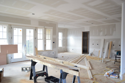
Filling this place with furniture, rugs, curtains, art, and accessories is an exciting design adventure, but also a bit of a puzzle. Things that will be sold with the house (like hardwired lighting, plumbing, tile, and paint) come out of the builder’s budget, and then each designer (or design blogger, in our case) is given a separate budget to spend on decor. But that decor budget breaks down to less than $500 per room, which could be drained by a single rug, bed, or couch.
Thankfully Homearama has arranged for each of the seven showhouses to borrow furniture from a local-ish place called Green Front Furniture (which we’ve randomly explored a few years ago here and here). So that means we can check off some of our big ticket items without bleeding the budget. Green Front is made up of twelve massive buildings with floors upon floors of options, so we road-tripped there last week and did as much shopping as Sherry’s little pregnant feet could handle.
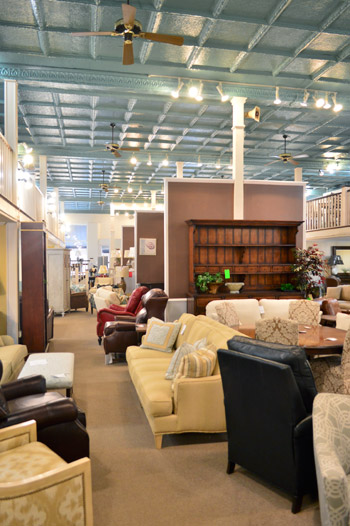
Even with that HUGE helping hand, there is a limit to how much we can get there, so like all of the design teams for each of these seven homes, we have to hustle to fill out this house. For some of the other designers it may mean borrowing items from other models they’ve decorated or calling in favors to stores they work with frequently. And for us, it means tapping some of the local artists or favorite shops that we’ve grown to know through blogging (so it’s sort of like how we recruited decor donations for The Children’s Hospital a few months back).
In the end, the more we can hustle to get donated or discounted for this house, the more it’ll help our goal of supporting Richmond’s Habitat for Humanity, because every dollar that we save from those building/decorating budgets means more can be donated to them.

We’re also donating our design fee to Habitat, and Homearama itself is collecting a bunch of generous contributions from their sponsors, vendors, and ticket sales. Oh and locals, take note – there are going to be goodies to grab at the ReStore when the show ends, since we’re also donating some furnishings and decor to them – and they’d love your business!
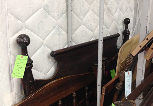
But this house won’t just be filled with new items. We’ve also been visiting some secondhand stores to score vintage and thrifted things that we’ll upgrade with everything from fresh paint to new upholstery. For example, we found this great wooden full-sized headboard for $9.98 that we can’t wait to paint for the girl’s bedroom (it reminded us of this $1,559 version from Ethan Allan).
After we paint it and add a bed, it’ll sit against the right-hand wall in the picture below, which we’re also planning to treat as an accent wall with a cheery wall stencil donated from Royal Design Studio. Oh, and you can see the beginnings of the built-in desk that the carpenter (also named John) has been working on based on some very sketchy plans that we drew with him right on the wall.
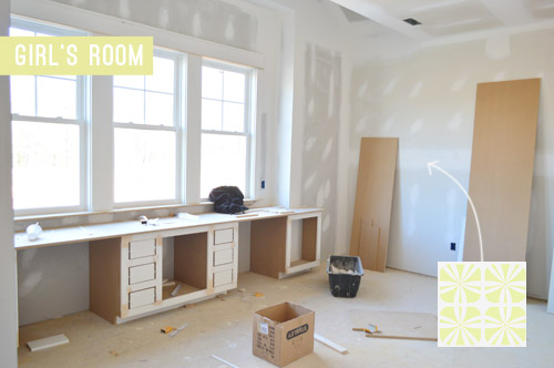
Since there’s no specific client to design the house for, we’re approaching it as if we’re accommodating a future version of us. So that might be a tweenage Clara’s space. Can you tell she’s very studious? She’s got one desk area for homework and another for artistic pursuits.
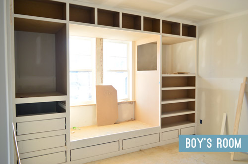
The second kids bedroom is an imagined room for the 8-year-old version of Barnacle, who is getting a sweet built-in bed/storage system. Clearly we instilled a love of built-ins in him at birth. It’s fun for the builder to add these custom creations so he can show future clients what his team can do, and it’s really fun for us to help design them since, for once, we don’t have to build them.
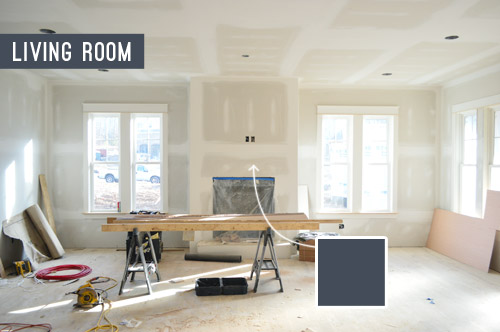
I’ll leave you with a peek at one last room: the living room, which opens to the kitchen (your back would be facing the kitchen island in this photo below). Said island will be painted navy and have some great gold pendants hanging over it, so we thought it’d be cool to pick up that same navy color on the fireplace column across the room. We think it’ll help the white mantle and the light stone surround that we’ve picked pop – sort of like this living room shot. We even have an artist friend of ours painting a big colorful portrait of Burger to hang up there. At this point we work some random Burger reference into every side project that we do, so we couldn’t resist.
We’ll do a more comprehensive overview of how each room is shaping up, well, once they’ve shaped up a bit more (perhaps with an updated video tour). Right now we have around 20 mood boards that are 40% complete, so we can’t wait to get those finished up and share all the plans with you guys. This baby boy of ours is coming in less than eight weeks, so we better get cracking.
Psst – Wanna see the finished showhouse? Click here for Our Full Showhouse Tour, which includes final pictures of every room, the floor plan, budget info, a video walk-through, and shoppable showhouse furniture & accessories.

Jessica M says
Wahhh I can’t believe it’s only 8 weeks until the barnacle gets here. It only seems like yesterday you guys announced the new addition!
I like all the built ins :)
Laura @ Rather Square says
Looks great – what a fun project! I love that you’re taking design risks with this one. Sometimes that can lead to amazing discoveries. The kids rooms in particular are looking really intriguing – can’t wait to see how those turn out!
YoungHouseLove says
Thanks so much Laura! We’re starting to look at fabric options for the little girl’s room and I’m having TOO MUCH FUN. It should be illegal.
xo
s
Jess @ Little House. Big Heart. says
Gah! I’m in love! It’s looking so gorgeous! Next time, come build a house in my neighborhood in Dallas, mmkay?
BTW, what navy are you going with? We’re still shopping navys for the kitchen (it looks like a patchwork quilt with all the sawtches we have painted everywhere.
YoungHouseLove says
We brought all of our swatches over to see how the light in the house looks and Hale Navy was the winner! The irony of that was it was also a contender for the outside of the house but we preferred another swatch more out there, but the inside light of the house made it stand out as our favorite.
xo
s
Jess says
For what it’s worth… we just painted our kitchen cabinets Hale Navy on the bottoms, Simply White on the uppers with maple butcher block. The walls in the kitchen are Edgecomb Gray and the adjoining dining room is Revere Pewter. I love how the Hale Navy has enough of a greyish undertone in it to make it blend nicely with the neutrals on the walls, but is still navy enough to pop and give the kitchen a nice, classy feel.
Before picking Hale Navy, we also considered Old Navy and Deep Royal. Both those colors are great in their own respect (Old Navy makes a feature on our shutters outside), but they didn’t work with the greys. Good luck!
YoungHouseLove says
Sounds so pretty!!
xo
s
Kelly says
Oh man, Jess, it would be awesome to see pics of the hale navy and simply white combo kitchen!!
anele @ Success Along the Weighn says
Gotta say, I’m loving the white. I know it’s not a pop of color but man, rust really doesn’t look right to me for some reason. (No offense to anyone who likes it!) SO if I had to vote over again, white. :)
Elise says
I agree! I don’t remember what I voted for the first time, but I think a white door would be perfect!
Jennifer says
I agree! I love the white option…clean and classic. The rust and blue combo don’t seem to compliment each other. I vote white!!
paintergal says
Totally agree on the white! I was not loving any of the options, but that rust just doesn’t do it for me.
Crystal says
I’m really liking the white too – especially when I picture green grass and landscaping around the house.
I think I really liked the plum too though.
Kati @ This Wandering Life says
Ah-HAH!!!!!!! Welcome to the white police, Anele. I’m just kidding, I just remember your funny comment from the door color voting post.
Nichole K says
We have a white front door under a covered porch and it only gets dirty from fingerprint smudges which are easily removed with a clorox wipe or some white vinegar.
I really wanted to paint it an accent color (still sort of want to) but my hubby pointed out that, since it’s so shaded, if we painted it a darker color it would sort of just fade away.
I was a rust fan too, but I really like the white. It might be “boring” but it’s so bright and does make the porch look bigger!
Nichole K says
PS: I LOVE, LOVE the fun carpet choices for the kids rooms.
Barbara says
One more vote for the white. Please. Not the rust.
deb says
Yep, I’m for white, too! I don’t think I voted the first time, but if I did, I suspect it was for red (which I always love)…but I really like the white with all the other trim!
Anastasia says
I completely agree- white really would be awesome!
While I love a painted front door and I nice pop of color, I feel like you have a lot of other bold elements going on that white would keep those things the shining stars. With that intense blue (which I love) the stone work and the woodwork, you don’t really need another thing thriving for your attention.
Cheryl says
I like the white as we’ll for the front door. A redder version of rust would work as well.
Valerie74 says
I think I’m the only one not feeling the white! I didn’t like the rust either – I was so surprised it was the front runner!
I’m a big fan of the red. Call me patriotic, but a splash of red just looks so distinguished with that gorgeous navy blue!
Whatever you choose always looks great! Can’t wait to see how it turns out!
Haley says
I want to change my vote to white!
Crystal says
Sounds nice! I can’t wait to see it finished!
Kylha says
Hey guys, it’s looking great! I’ve been reading through the whole ‘white door’ comments and I totally resonate with a few of them!! I LOVE a painted door, and the red was the best, for me, for that pop of color. I apologize to anyone who liked the rust, but all I see is a door the color of baby poo! I really like the white- it opens the space up, ties everything in, and is unexpected when everyone else is painting in color.
Anyways, that’s my two cents. Have fun!!
Heidi says
OMG – in love with those built-in/bed combination. Seriously, so.much.storage. Amazing feature and I’m sure whoever is in that room is going to love it.
http://jax-and-jewels.blogspot.com
YoungHouseLove says
Thanks Heidi! That’s John’s baby. He pets it and stuff. It’s weird.
xo
s
Kristen says
I love the built-in as well but I’m confused about the bottom drawers. Won’t those be under the bed and fairly unusable? Maybe I’m not picturing the bed in the right place.
YoungHouseLove says
They’ll sort of be like this, so they can easily be accessed as long as the duvet or quilt isn’t hanging down in front of them.
xo
s
Kristen says
Ohhh, that makes a lot more sense. I was picturing the bed coming out so the head of the bed being in the built-in, and the rest of the bed jutting out. I gotcha now. Love it! :)
YoungHouseLove says
So glad. A picture’s worth a thousand words, sometimes!
xo
s
Manda Wolf says
Looking good!!!! Please share the mood boards when you get them done(or at a later point if you don’t want to give anything away). I miss those and often go back and look at the ones you have done in the past.
YoungHouseLove says
For sure! Right now they’re each missing a few key elements, so they won’t make as much sense as they hopefully will in a week or two.
xo
s
Jessica says
Congrats, you guys! The home is coming along beautifully… someone will be VERY lucky to have it :)
Emily Mc says
This is such an awesome project, wish I was local and could come see them all in May! And by see I mean become a squatter and not leave. LOVE the living room fireplace/island color and cannot wait to get a peek of the kitchen, squeal!!
YoungHouseLove says
Oh man, we’re itching to see the kitchen too! It’s just a white drywalled box right now (no cabinetry has gone in yet), but once the painters get done (and I think the floor refinishers too) those cabinets are on schedule to be dropped in.
xo
s
Jenna says
What a fun project to get the opportunity to work on. I think this is definitely the perfect place to take daring risks – do things you might not necessarily do in your own home. I’m sure it will pay off and show a new side of you!
Lynn @ Our Useful Hands says
You know, if only you guys applied yourself you’d really be able to make something of your lives. ;o) Wow, that is a whole lotta sawdust going on at the project house. I’m so giddy now that the drywall is up. It’s shape is taking…shape. I wish I lived up there so I could hit up the home show and donate some cash to the cause and see it in person of course. But these recaps are great. Thanks! Have a great weekend.
My best, Lynn
*Just got out of the hospital yesterday (oy!) and just wanted to say that your site and you’s guys were my happy place to turn to when all the visitors were gone and all was quiet and I felt lonely or weepy. So. Thanks. Keep up the great work.
YoungHouseLove says
Oh man, Lynn, you’re so sweet. So sorry you were in the hospital, and we hope you’re feeling awesome now that you’re back home!
xo
s
Kristin says
Are you happy with the turquoise exterior?
YoungHouseLove says
Wahoo! So happy with it! And relieved to hear that both the builder and the realtor love it too. Not sure why it looks turquoise to you though. Here it is on BM’s site if that helps (it’s part of their historic collection).
xo
s
Annie R says
I take back my rust vote! The white is a definite winner, especially seeing the columns in place. It’s so exciting to see y’all put together an entire house and even more exciting that it’s for such a worthy cause. Keep it up Petersiks!
YoungHouseLove says
Thanks Annie!
xo
s
Hillary says
I agree! I voted rust (but secretly wanted mustard yellow) but I think white would look great and make the dark blue the focal point. However, waiting until the columns are sealed is a great idea and might change everything. I have a feeling I will love whatever you guys choose, I always do!
Lydia K says
You know, I voted for Rust, and my first thought when you mentioned what was, “WHAT?! ICK! BORING!” But the mockup you posted is actually really nice – I think that white would really brighten up the whole porch – not only with the color but with the reflection the door would cast on the whole area. I say this having just painted my front door plum, and wishing I’d gone a bit brighter with the color. It looks kinda dark from the street, and it bugs me that you can’t really tell it’s purple until you’re knocking on the door :/
julia says
Just curious – how much will this house sell for (roughly)? I live in California and dream of living somewhere where normal people can afford a nice home like that. my husband and I are debating moving and wonder if Richmond should be on our list. Would this house cost less than $1,000,000? Where I live, it would easily cost about $2-3 million. Thanks!
YoungHouseLove says
These homes will sell for around $500,000 here. They get filled with new kitchens and top of the line appliances/finishes (along with awesome landscaping and outdoor patios and stuff) so they’re like getting a car that’s fully loaded!
xo
s
Chloe says
Julia, I think I see what you mean about housing prices being more affordable in some parts of the country than in others. But i thought I should mention that the comment about “normal people” affording a mansion like the Homearama houses bothers me. (Maybe you meant non-celebrity, non-multimillionaire?) The median US income is just over $51,000, so the typical, “normal” person would be nowhere close to being able to afford that house. To the people for whom this house or similar houses fit in their budget, congratulations and be thankful (never guilty) about what you have. But please remember that owning a house like this is a huge blessing and sets you way above average in assets compared to other people in the US. So in that respect you are remarkably abnormal :)
YoungHouseLove says
Oh yes, it’s definitely more of a “fully loaded” house (these showhouses happen once every two years through Homearama and they go all out). I mentioned in another comment that it’s way out of our price range, so it’s not even close to a median house price in our area :)
xo
s
sally says
I was thinking the same thing Chloe. It’s all relative to your location and life. I was recently visiting family in the Midwest where an aunt remarked that her in-laws had bought an extravagant house beyond their means…it cost $150,000.
Lydia K says
*white
Lina says
I really don’t think that you need to worry about being “safe” with your design choices. You’ve sold two houses already that were very “you,” and you have enough fans out there that are probably chomping at the bit already to buy this house. If I didn’t live in Nashville, I definitely would be, and the house isn’t even done yet! I just know that you design beautiful rooms and have amazing taste. Don’t sweat it. Go with your gut! Can’t wait to see how it all turns out!!
YoungHouseLove says
Aw thanks Lina, that’s so sweet of you to say!
xo
s
Megan CC says
I’m curious why you are choosing wall-to-wall carpet for the bedrooms instead of hardwoods with rugs? That seems to be more your style, but maybe that’s the point, not to go with your normal choice and make a “risky” decision? I’m sure it will look great whatever you choose, just wondered. :)
YoungHouseLove says
The builder said his clients tend to prefer wall to wall carpet in the kids rooms, so we deferred to his judgement. But the house will have an entire downstairs full of hardwoods as well as a master and hallway upstairs with them, so we have a lot of spaces to play with area rugs and soak up the pretty wood tone!
xo
s
Sally G says
I’ve lived in homes where I’ve had hard woods in the bedrooms and my personal preference is carpet. The sound carries soooo much with hardwood and it’s nice to have the bedrooms a little bit insulated from that.
Stardancer says
I voted for rust (I think), but I remember thinking that it still wasn’t quite right. I definitely agree with white, especially how it makes the entryway bigger. I think that was my issues with all of the colors–they were lovely, but the spot of color was so small compared to the whole house that it felt out of proportion.
Aisha says
I soooo can’t wait to see the house when it’s finished. You guys, and this blog, are partly responsible for my decision to move back to Richmond. Fingers crossed that I’ll be back home by the time everything is finished. :-)
YoungHouseLove says
You’re so sweet Aisha!
xo
s
Amber says
I wish white had been in the door color poll from the beginning. It looks soooo good! I feel like the door is going to get lost behind all those big columns if you go with rust. I also love how the window in the door is accented with white. Sometimes plain ol’ white really is the way to go :)
Robin Grey says
I’m a designer for a home builder in Georgia. I know just what your talking about with the risk vs. safe mentality. It’s so tough! I also know how hard this job is! You’ve got my admiration, newbies! You’re doing a great job!
I’d love a post about the ideas that got nixed by the committee. What exactly IS too crazy? ;0)
YoungHouseLove says
Haha! That would be awesome! And it’s so nice to hear from you Robin. Thanks for the kind words and good luck on your GA projects!
xo
s
Anastasia says
That would be a fun post to see!
YoungHouseLove says
We’ll have to work those details in for you guys! What hit the cutting room floor, so to speak ;)
xo
s
Aimee says
That must be so exciting to be putting a house together from scratch, I can only hope that I will get to do that someday. My parents built the house they live in when I was 8 and I remember going over there all the time and watching it develop through the stages. Can’t wait to see how it all comes together! I’m loving the built ins in the kids rooms.
YoungHouseLove says
Thanks Aimee!
xo
s
Rachel says
Oooh, I would love to hear more about your carpet options and final choices…especially since you seem to focus more on the hardwood+rug options. I’m one of those people that still likes carpets in the bedrooms.
YoungHouseLove says
We hope to share that with the mood boards when each room is more mapped out so things have more of a context. Soon I hope!
xo
s
Sara says
I wasn’t in a white door write in but I gotta say, I’m converted! I love it!! It makes the house so much brighter. I love the way it plays with the trim!
I can’t wait to see what you guys go with!
Jessica Leonard says
Sadly, in Arizona, I’m a little too far to come to the home show! :(
I love that blue swatch in the last photo. It looks exactly like the color I’m painting an accent wall in our future bedroom. This is the look I’m going for: http://www.pinterest.com/pin/480126010246157062/
YoungHouseLove says
SUCH A GORGEOUS COLOR! Send pics when you’re done for sure!
xo
s
Caitlin says
It’s really coming together! I can’t wait to see it in person! But the ticket link appears to be broken…
YoungHouseLove says
So sorry it’s acting glitchy for you. We just clicked it on our end and it seemed to work. Maybe providing the full URL here will help?
http://richmondhomearama.com/
xo
s
Erin says
So exciting!
What is the gorgeous navy paint name & brand you’ve chosen for the living room?
YoungHouseLove says
Thanks Erin! It’s Hale Navy by Ben Moore.
xo
s
Sarah Stirling W. says
Everything is coming along so nicely!! I love how the outside is turning out and I can’t wait to see the final product!
About the ReStore… Do you know roughly when things will be taken over there? I work nearby and would LOVE to score some awesome things for my home from the showcase homes :)
YoungHouseLove says
We’re not sure but can make a little post announcement (like in a PS or something) when they do! Maybe a month or so after the show ends? It depends on if the builder sells it right away or rents it back to keep it a little longer and show future clients.
xo
s
Dayna says
Now that I see all the wood toned details with the columns, I change my door vote. Could you do a wood stained door to match the columns? I think that would look so nice!
YoungHouseLove says
The door isn’t stain-grade so it has to be painted, although we included rust and chocolate in the original poll so folks could visualize two wood-ish colors :)
xo
s
Karen says
Look at what I just found. SO adorable!
http://round321.com/shop/names-monograms/alligator-wall-decal-2/#prettyPhoto
YoungHouseLove says
Cute!
xo
s
Lisa | Winter Heights says
Looking good! Loving the white door option, I think it’ll make the natural wood “shine” and other colors will be brought in by the landscape.
Have a great weekend, be sure to kick those feet up from time to time, Sherry! :))
YoungHouseLove says
Aw thanks Lisa!
xo
s
Kathy says
YES to the white door. It is such much brighter and crisp than any of the other options. It makes a great place for the eye to rest. Love everything else too – it much be a (very hardworking) dream to get to do this house. So fun!
Jennifer-Mommy Life After Ph.D. says
LOVE the white door and I agree it makes the entry look larger! The headboard is such a find–I never seems to come up with good finds when I go thrift-shopping!
YoungHouseLove says
Thanks Jennifer! We couldn’t believe how lucky we got! I thought it would be $100 at an antique shop, but it was just hiding at this thrift store in the back of the pile for $9.98!
xo
s
Mel says
I am in love with the white door. It makes the whole entry way seem so much brighter and inviting. Plus I think it ties in with the trim much better. It lightens the whole place up I think.
Keep up the good work, it’s coming along nicely! I can’t wait to see the finished project.
PS… how is it that Baby Boy is due in just 8 weeks??? I swear you just announced your pregnancy last week. Man, time flies!
YoungHouseLove says
I know, right?!
xo
s
Kate says
I’m going to have to disagree with the white option for the door. I would still encourage you to go with Rust. There is plenty of white in the trim work and I agree with John that white on a door is just a hassle and a half in practicality.
Kati @ This Wandering Life says
Maybe there’s some kind of special seal out there that can make it more practical?
Kate says
I think you could definitely seal it to make it better. I’m just saying as someone with a couple dogs and a white door that I pretty much hate it…haha…
kim says
Would you mind sharing the carpet supplier/brand? I love it. It looks like some vinyl flooring that I would love to get for our kitchen.
YoungHouseLove says
Oh man, those were just samples that we had laid out to consider, but it looks like the brand is Stanton. The supplier is a place here in Richmond that only works with builders/new builds (not open to the public) but I bet Stanton is sold in a bunch of places. The middle pattern is called Revere but I can’t remember the other two.
xo
s
Megan says
Soooo glad you showed some cool carpets! They have amazing patterns out there… long ago are the days of just one-colored textured options. I commented a few months ago about recarpeting our stairs, we were leaning towards Wyeth Mountain…
http://www.stantoncarpet.com/ProductDetail.aspx?ProductID=588&SKUID=2736
but ended up going with Milliken Cavetto Sable…
http://www.millikencarpet.com/en-US/products/productcatalog/pages/design-details.aspx?DesignID=19086
We just felt this was more home-y and less nylon/commerical looking – plus for high traffic, we felt the darker pattern would never be interrupted/stained.
There are some AWESOME options available and such a great alternative to the expense of wood/rugs!
YoungHouseLove says
So pretty! I love both of those options! And funny enough, the samples on the floor in that shot are Stanton!
xo
s
Jess says
Team white door all the way!!
Meredith C says
I have a question completely unrelated to this post. I have become obsessed with your blog leading up to the purchase of my first house (21 more days!!) and I’ve seen that you mentioned that Sherri has a color deck. I checked out B.M.’s website and they have 5 of them (overwhelmed) any recommendation on a deck?
YoungHouseLove says
I love the Classic Colors one best. And the Affinity one is awesome too!
xo
s
Katie L. says
I’m changing my vote! Go for white!! I originally voted for Rust, but after seeing the white mock up, wow, so much better. I hadn’t even noticed before that there was a window in the door. The white just makes the whole entry seem bigger and brighter. I can’t wait to see how it all comes together! BTW, my dream house is a blue craftsman style with lots of built ins, so I’m loving following along on this journey of yours.
Katie L. says
Also, we have a white front door, under a large porch roof, and we have never had an issue with it being dirty.
Ann says
So, you’re definitely buying the showhome. No doubt about it.
YoungHouseLove says
Haha, we wish! It’s waaaay out of our budget and we’re very happy in our current house/neighborhood. Check back with us in a few decades, I bet we’ll still be here :)
But we’d love to House Crash whoever moves into the showhouse! It will be so much fun to see how other people make it their own with new furnishings, accessories, etc.
xo
s
Kiersten says
I would be intrigued to see you do another poll of “least favorites” :) I am loving the white over rust, and I think it would be interesting to see if some colors evoked stronger emotions then others…”I love rust, I hate rust”, etc…and see if white leads to more of a general consensus..! Maybe that’s just the psychologically curious side of me though…love the house! Keep up the great work!
YoungHouseLove says
That would be funny! There certainly are some strong votes on each side (and there were some people who were just saying “I HATE PLUM!” or “HOW IS RUST WINNING?!” on that first post. Door colors = lots of emotions!
xo
s
Meg says
Thanks for the heads up for the locals! I’ll have to check out the Restore & Green Front Furniture. We’re closing on our house in about a month and I’m itching to get some new items, on a budget of course!
YoungHouseLove says
So exciting! Good luck with everything Meg!
xo
s
Rebecca B. says
I didn’t vote for the rust colored door and I think white is a spectacular choice. We have a white door and it doesn’t get dirty like one might think. If it does need a touch up, a magic eraser does the trick.
Susan says
I’m adding another vote for a white front door. :)
Patti says
I think I just might drive down to Virginia for a nice weekend in May! Btw, have you guys revealed the big news you were waiting to reveal to us from a while back?? I think I may have missed it?
YoungHouseLove says
Agh, we can’t wait! Last we heard we were finally allowed to let it all come spilling out in three to four weeks (middle of March) so we can’t wait!
xo
s
rachael says
I know you aren’t going to say anything but my official guess is that you are in that new book that’s being released in March called “Design Bloggers at Home: Fresh Interiors Inspiration from Leading Online Trendsetters”. Or, you’ve teamed up with Target. If it’s the latter, can you please make sure it comes to Canada?!
YoungHouseLove says
Haha, we love the guesses ;)
xo
s
Samantha @ Fabulous Fabris says
I love the blue! I was never a fan of the rust coloured door, my vote is for white!
Cannot wait to see all of the design choices inside. Good luck!
Jess says
I totally missed the write in option on the survey, and my original vote was for rust… but I have to say – I love the white and am officially changing my vote! Seeing it again, I think that the rust color will take away from the columns and those are going to be such a great feature and add such character to the front of the house. Can’t wait to see what you guys end up choosing!
Sarah @ Sarah's Daybook says
I am SOO super excited to see the end result! You guys are doing an amazing job!
Sarah
http://www.sarahsdaybook.wordpress.com
YoungHouseLove says
Thanks Sarah!
xo
s
Andrea says
This is fun to see coming together. I would also like to switch my vote to white for the front door — I think it looks so clean and classy.
And OHMYGAWD 12 buildings filled with furniture to pick from??? I almost passed out just thinking about it.
I’m so looking forward to more updates :)