It seems our excitement for the plans that we’ve been cooking up for the showhouse office has spilled over to our own office. Well, that and the fact that ours is looking pretty sad lately, having recently pilfered both its armchair and Expedit for the nursery. It doesn’t help that our chalkboard still says “Merry Christmas” on it. So basically, yeah, this office screams “I’ve got my ish together.”
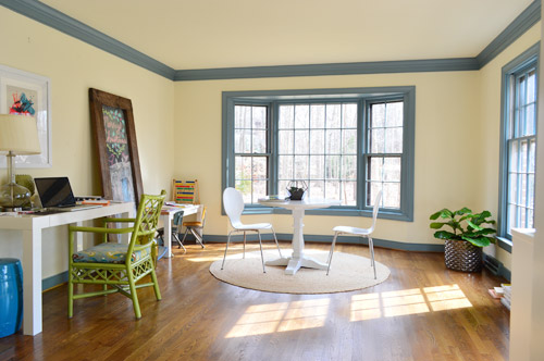
We’re excited to be thinking about the office because it’s one of our favorite full-of-raw-potential spaces in the house (so much space! so much light!). And with the baby’s impending arrival (six weeks!) we’re feeling the urge to consolidate our business life so it’s less likely to infiltrate family time. You know, like making “no more laptops on the diner table” rules. Another example of our completely not-contained work spread is that all of my accounting stuff currently lives in a kitchen cabinet because my desk wall lacks storage (but apparently not holiday cheer).
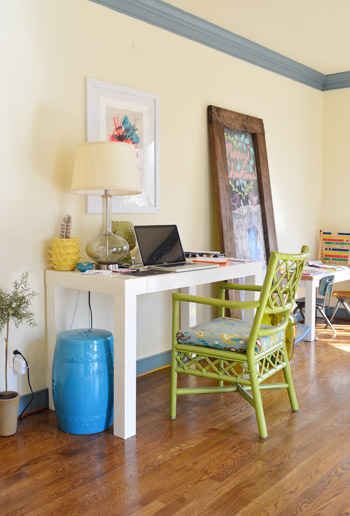
This is a room where we’ll skip the Phase 1 stuff and jump right to Phase 2 (like we’ve done in the sunroom, for instance) because it doesn’t require the amount of planning/saving/splurging that a kitchen or bathroom makeover does (no pricey appliances, new counters & tile, etc) and we’re fairly confident that we can end up with a space that works for us for the long-haul (the kitchen & bathrooms tend to take more percolation time – we’re still changing our minds everyday). Note: There’s more on how/why/when we tend to do Phase 1 updates here.
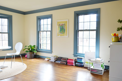
We actually think this space has a ton of potential to not only be functional, but to be beautiful, thanks to the fact that it’s one of the most light-filled rooms in our house, and it has that pretty bay window in the back.
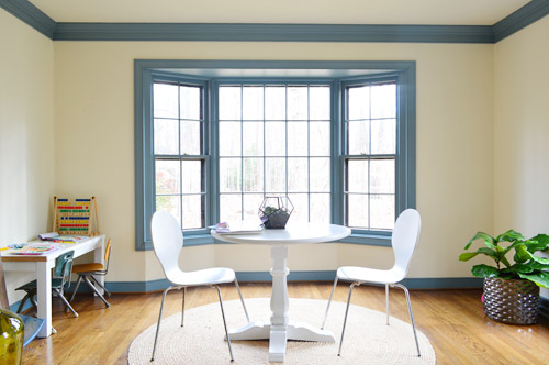
We want the bay window to remain a focal point, since it’s so nicely centered in the room – but we’ve thought it through, and officially nixed the idea of adding a built-in bench seat because:
- we don’t see a bench seat as being super functional for an office
- the window is actually really shallow so it would be a very narrow seat
- it might get in the way of our current Christmas tree spot (is that really my third X-mas mention? Geez) – although I’m sure we could find another tree spot if necessary, so the tree isn’t a deal breaker on its own

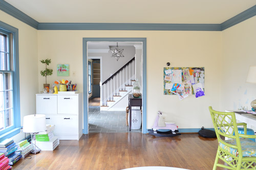
But what the room giveth with the bay window, it taketh away elsewhere. As in, we’ve got some other challenges to work around, like the less-than-centered doorway on the other side of the room. I guess we can only have so much symmetry in our lives…
The front window wall is also great for light, but not so great for furniture placement. Since the windows are so close to the floor, they really make it hard to put anything on that side of the room without blocking a lot of light (and making for a strange view from the street).
With those challenges in mind, Sherry and I brainstormed a list of priorities for our office. Some are just carried over from our last office, but some are new given the larger, more light-filled space.
- Two Desks: Duh, right? Sherry usually works at the kitchen table (more on that here), but we’d love to create a dedicated space in here for her to really spread out. And my small parson’s table could definitely be improved by more space and more drawers. So there’s a lot we can do to improve on this.
- Storage: We don’t have a ton of paperwork, but we’d love to expand our file storage. Mostly to bring in some of the stuff that we have shoved into other rooms – like tax documents and side gig paperwork – rather than having that stuff spread randomly around the house.
- A Big Meeting / Craft Table: We don’t have a ton of meetings here, but we’ve had enough recently (mostly showhouse related) that we’d like to stop having them in our kitchen or dining room. Plus, it would serve the double function of an area for completing/shooting smaller projects (with all the natural light in this room, it’d be a great spot for photography).
- Whiteboard / Pinboard / Magnetboard: We want a nice big wall where we can organize our to-do list, calendar, future project ideas, etc, etc. where we can both see everything. Right now we both keep ourselves organized on our own phones and notebooks, so some communal organization is needed to get us both in the same loop again. We’re not sure exactly what this looks like yet, but we’re already brainstorming a few options that we could implement.
- Doors: Partly because this room seems made for some nice french doors, but also because it would be great to get some added soundproofing in here – especially during conference calls or other times that one of us really needs to concentrate.
- Kid-Friendly Space: It’s been nice to have Clara’s drawing desk in here (so we have the option to “work” together during less intense moments of the day) – so we’d like to create a flexible little area that works for smaller kids but also can transition to work for bigger kids (so it’s not something that we outgrow in a few years).
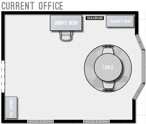
With priorities set, we started floor planning (I took a few new apps for a spin to plan the room, so I’ll share more on those in another post). Here’s a rough representation of the current furniture plan. Yes, it’s pretty sad.
We started by just expanding on our current layout to include the things we wanted and bring things up to scale for the room. We’ve liked having the table centered in the bay window, so maybe just upgrading to a bigger table and some curtains could work? And then we could wrap an L-shaped desk around that corner to give us some built-in desk storage (kinda like our last office) and make room for both of us to sit.
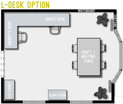
But we weren’t crazy about the corner-desk in that option since it seemed kinda cramped. And since that’s where we’d likely be spending most of our time, it felt weird to not give it more priority in the room – and to take advantage of all the windows by actually getting to see out of at least one of them.
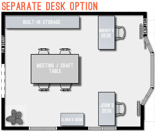
Then we went crazy and tried making the desks “the stars” of the room by keeping them symmetrical with the bay window. The most logical version of this was two separate desks sort of flanking the window. But even that attempt wasn’t very logical because it put one desk right in front of a too-low window (so you’d see the side of the desk from the street) – and it also would require us weaving around the big table every time we wanted to get to our seats.
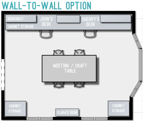
So next we tried mocking up an idea that was actually our original concept for this space. It includes office storage along the entire back wall, with desk areas that are integrated into them. Here’s our inspiration picture, complete with a friendly looking feline.
We originally discarded this idea because we thought it’d screw up the symmetry of the window – which was something we really liked about the room. But as we played around with the floor plan, we realized we could maintain the symmetry by putting something in the bottom right corner too, so the bay window still feels centered. Plus this plan would leave the middle of the room pretty open for a big table, which we could move around – or even move completely out if the need arose. We also could move our laptops to the meeting/craft table to get a nice view out the window if we ever feel too wall-locked at our desks (Sherry currently unplugs and works at the kitchen table everyday, so that shouldn’t be too much of an adjustment).
Update: We’re getting some questions about where the Barnacle will go, but Clara’s desk actually has two chairs and is long enough for two kids (we’ve even had four kids at it if we pull it away from the wall) so it’ll accommodate the bun as well as the bean.
Update #2: We’re also getting questions about window glare from working along that back wall, but John has worked there for the past 9 months without an issue (the sun streams in but the room is wide enough for it to hit the floor about 5′ from his chair – so it’s not up at screen level).
We’re still letting the concept simmer in our heads, but we’re fairly confident that we’ll start heading in that last layout’s direction since it feels like it makes the most sense for the way we work. Although “start heading” involves painting a whole lot of blue trim first (sixty six window mullions to be exact). And it takes four coats… so that’s a whole lot of painting.
What’s on your priority list when it comes to a home office? Do you have a desk tucked into the corner of your den (we totally did that in our first house)? Is there a little work area in your kitchen with a laptop hookup? Or do you have a dedicated home office? Does anyone have work stuff in the bedroom? Growing up Sherry’s dad had a computer and all of his paperwork in there, but that doesn’t seem to be something most people do anymore.

Maya says
I love the L-desk option!! Maybe I’m just not seeing it, but it still seems like the long desks will crowd the trim of the bay window even if you balance things out. It wouldn’t be so appealing to have a long room with a bay window at the end that was no wider than the bay, right? I get your point about being crowded at the desk, but I love the way that design feels open and lets the windows really shine. I can’t wait to see whatever you do, though!
YoungHouseLove says
That’s a good point! That bay window is actually nearly 9′ wide, so we hope it won’t feel too cramped (we thought the corner desk scenario would lead to feeling a lot more cramped) but we’ll have to tape things off to make sure it doesn’t turn the room into some sort of alley-way!
xo
s
Sara Richins says
I think you can avoid crowding the window by keeping the shelving low instead of to the ceiling. I’m imagining only two or three tiers, leaving space above for colorful art to make use of all that light. The final plan also leaves a nice space on the wall by the doorway to have calendaring/cooperative planning space. With the right size and a nice frame, it can help balance the off-centered door.
Estrella says
The L-desk option is my favourite, too. If feels open and leaves a lot of space for standing in front of your common organization board. And since you said that you don’t have a lot of paperwork, you wouldn’t lack storage.
Bonnie says
My number one need is to be located near electrical outlets. I live in a circa 1940 home where the outlets are limited!
YoungHouseLove says
Such a smart thing to think about! We have outlets in every wall and corner except for that space between the two low windows. Our last house wins for outlets though – they were every 18″ in the sunroom! Seriously, we laughed that they were spaced “one Burger length” apart.
xo
s
AmyJ. says
This is going to be SPECTACULAR!
AmyJ. says
Is there overhead lighting? Is that in the plan, or is the natural light during the day/commitment to not work at night the way you’re going?
YoungHouseLove says
There’s actually not any overhead lighting in here (or any of the bedrooms) so we’d love to add some. Maybe a great pendant floating over the table in the middle of the room? Right now we have a few lamps, but I miss being able to flip a switch on the wall and illuminate a room.
xo
s
Catherine says
We have a living room with no overhead lighting either. What is with that? Must have been a design trend in the 80’s I guess!
YoungHouseLove says
Totally! I think “moody table lamps” were the rage, but I just love the convenience of flipping a switch – and overhead lights (like pendants and chandeliers) are so pretty these days!
xo
s
Lindsay says
Overhead lights are often left out of the design to save money on the light fixture/additional wiring. Usually in their place is an electrical outlet that is controlled by a light switch. So in theory you plug a lamp into that outlet and can flip on the switch for the lamp when you enter the room. But I agree, what a pain! I need to install some overhead lights in my house too!
Chris says
No overhead lighting was definitely a 70s thing too. Totally irritating.
Kate says
Ha! No overhead lighting in my 90’s ranch, either. Instead of being “on trend” though, it’s definitely just “cheap.” :) :)
betty says
cant wait to see it all come together! 66 window mullions.. i’m so sorry. haha
Lisa says
Love it too and can’t wait to see how it comes together.
Regarding the window mullions… how old are your windows in the house? I can’t remember that detail being talked about. But if they’re old and inefficient, man, I would be so tempted to just replace those suckers instead of painting!!!!
YoungHouseLove says
This house is a lot newer than our last two (they were 50s/60s and this is late 70s/early 80s) so the inspection said they were in good shape and not really wasting much energy at all, so it makes more sense to keep them. I actually love that they’re real wood (not plastic) and they have those smaller panes – they’re just a HUGE PAIN to paint! Haha!
xo
s
bfish says
For Lisa — I think John and Sherry would have to save up for a LONG time to replace all of the windows in their large home. To buy wood windows of the same quality (but presumably more energy efficient as they would be newer) would cost close to $1K/regular window and more for bays — and that’s not including installation. People, keep your older wood, true divided-light windows unless they are horribly busted and/or inefficient! The crappy vinyl kind they advertise on TV for less than $200 wouldn’t fly in the Petersiks’ hood either — don’t know if you have convenants but even if not, you’d make your neighbors really mad if you replaced with anything less attractive than what you have now.
Ila says
OH, I would definetly go for the wall-to-wall option!
I look forward to see the end result of this project ;)
Martha says
Love it! Where is the whiteboard going in this set up?
YoungHouseLove says
We have a plan for the message board/bulletin board area, but it’s just sort of half-baked – so we’re going to try mapping things out and taping them off to see if it’ll work in the next week or two.
xo
s
AmyJ. says
That allows for a Barnacle play mat hangout in front of the bay window too!
Bren says
I was thinking the same thing. I can see his little play gym and quilt right there!
Diane says
Love the Christmas tree placement. Please keep. Your neighbors will thank you!
judi says
but you still don’t get to look out the windows with that latest layout, which is something you didn’t like about the L desk right? could you have the desk on that wall, but instead of built-in/attached, floating out a bit so you can sit facing the windows? or is the space between the wall and the beginning of the bay window just too narrow for that to work?
i also really love the flow of the room w/ the L desk; i agree it’s sort of a shame not to face the window, but you still have it in the room for light/ambiance.
(also as i was reading this, where you wrote “small parson’s desk” i totally read “small person’s desk” at first and thought, WHOA did he just say that?! had to reread to make sure. haha.)
YoungHouseLove says
So funny about the small parson’s desk! As for the window thing, you’re right. We’re still technically facing a wall, but we both have a window to the right of us (the big bay) as opposed to facing that corner which felt the furthest away from those other light sources. Back when we had offices with windows they were rarely right in front of us, but if they were to the side of us, we still could easily see out of them, so I guess that’s what we thought we’d gain vs. being in that corner? Still could completely change our minds though!
xo
s
Christy says
I read it as “small person’s desk” too and actually laughed out loud at myself when I figured out what it really said.
Lisa says
Chairs on wheels make it real easy to spin and gaze out the window. But I love your avocado green chairs too much to really suggest those ugly office chairs on wheels!
YoungHouseLove says
Haha, thanks Lisa!
xo
s
Meredith says
This has nothing to do with anything, but I’m loving that plant in the corner! Is it real or fake? If it’s real, what kind is it? I want one! :)
YoungHouseLove says
Thanks Meredith! It’s real, but a cheap-o from Ikea. It’s one of those fiddle leaf figs. We hear they’re tempermental, but he has been really easy to keep alive so far – although it has only been about a month so the jury is still out…
xo
s
Christy says
I love the last layout. I work from home 2 days/week and sit at a desk in my bedroom. I would love to have a dedicated office room but that won’t happen for years (if ever). I can’t wait to see the room without the blue.
Heidi says
I love the wall-to-wall option. It’s a nod to your long desks in your second home, which were absolutely lovely. Plus, if you held off on french doors for a bit with that desk placement someone who just entered your house wouldn’t see everything on your desk when they walked through because the door placement would still keep the focus on the big bay window.
http://jax-and-jewels.blogspot.com
Meredith says
I immediately thought of a wall to wall option, similar to this: http://www.gohausgo.com/2013/10/daybed-office/ for the space. Fairly inexpensive and lots of space. I’m excited to see what y’all do because a large office space is on the list of our projects too.
Erin says
Love that 3rd option– that is what I envisioned when I looked at your space, as it seems the most flexible, practical AND good-looking! :)
As for your questions, we have a dedicated office space and, as of 3 years ago, a No Work In The Bedroom rule. The bedroom is for bedroom, er, activities. Including SLEEPING. I find that our No Fouling The Nest rule enables us to enjoy the bedroom activities MUCH better.
Leslie says
I think the wall to wall option is great – although it has the largest amount of built-in furniture, it seems that it will give you the most flexibility in the long run. Plus, with the upper cabinets at your built in desks – it gives you lots of room for ceramic animal display (..er I mean storage)!
YoungHouseLove says
Haha! I like the way you think ;)
xo
s
normaleverydaylife says
Such a light-filled room! Storage is my number one priority in an office. It’s hard to concentrate on working when I see clutter around me!
Mary | Lemon Grove Blog says
Love the wall to wall option!! I think that would look so nice from the front door. I bet you guys will totally utilize the meeting table a ton as well! Can’t wait to see the space evolve.
Crystal says
Love it and can’t wait to see it come together. Did you consider placing your desks in front of the windows? Sort of like this – http://www.bing.com/images/search?q=desk+in+front+of+window&qpvt=desk+in+front+of+window&FORM=IGRE#view=detail&id=DA25713F58B9A48E49368D483FBF3127E16C096E&selectedIndex=1
Lots of factors to consider I’m sure!
YoungHouseLove says
That’s a fun idea too! I think we might both feel too “on display” since those windows face the street (granted we’re far away from the curb and it’s a sleepy little street, but at night with the darkness outside I think we’d be illuminated like window displays. Haha!
xo
s
Megan H says
I also think the wall to wall desk is the best option. I do like the idea of having separate desks but my concern would be the light on the computers from the huge bay window. I know you will have curtains, but are you always going to want to close them when working on the computer. I think the large table in the center of the office is a FANTASTIC idea. What a great space for crafting and meeting. With the way your family and business is moving, this seems like an essential element. Also, with the third layout, it would allow you to still do very special things in front of the bay window (christmas tree). So excited to see what you guys choose. On a side note, I am also expecting my second like you are, I’m only 2 weeks behind you. I’ve been working
to design the new room!
YoungHouseLove says
Aw thanks Megan! And good luck with your little one on the way!
xo
s
Lauren says
Ahhh I have been excited for this since your first house tour! Such a big and exciting space. The long wall desk mock-up feels the most streamlined, and has the least amount of dead space. In reading the other comments, I’d be super interested in a post on adding overhead lighting. I have been thinking about that for my own house, but it seems like a dry-wall smashing nightmare.
YoungHouseLove says
Oh yeah, I think it’ll be something we’d have to hire out since we don’t have attic access and there’s a second floor above us. Will keep you posted for sure!
xo
s
Julia Kent @ The Domestic Blonde says
I think I am on team Separate Desk! But I also like the L desk option.
You must be SO EXCITED to be rid of blue trim. But I’m also sure you wish you could snap your fingers and have it done!
I agree this is an awesome room with tons of options. I like what you guys have come up with!
Sarahmia says
We have a dedicated office in our house, with some awkwardly placed inbuilt wardrobes (which we will eventually get rid of) and a chimney stack, plus the biggest window you ever did see, oy.
We ended up putting in one long desk for the two of us, with some bookshelf storage at the end for things like the printer and paper, etc. We both have laptops but also have a monitor we can connect to if we’re working on something big, so we put that in the middle of the desk so we can both reach it – it also helps to break up the space :)
I really like the setup actually, we get to work next to each other, it’s easy to show each other our screens if we like something and it doesn’t take up too much space in the room.
YoungHouseLove says
That sounds awesome!
xo
s
K says
I agree with the wall-to-wall desk option. I think the flow works best in that layout. Can’t wait to see it!
Angie says
I love a wall to wall desk but I also like how in the L shape the craft table is near the bay window, leaving a large floor space for the kiddies to play.
Evelina says
I love the layout you guys chose!! This room is going to be stunning, I just know it. And I love the positioning of Clara’s desk too! lovelovelove :)
Carolyn says
Good morning!! I love the first two options (mainly the separate desks, since you essentially have your back to a wall and if you have meetings no one is looking over your shoulder to whats on your computer screen) The third option is nice, but you would lose all that sunshine while looking at a wall. And with the windows behind you the glare would drive me batty!
On a side note – I LOVE your blog and am in the process of looking to buy my first home and I can’t wait to do all the fun projects I’ve learned here! =)
YoungHouseLove says
Aw thanks Carolyn! John’s desk is actually along that wall now and the room is wide enough that no glare gets on the computer (light hits the floor about 5′ behind his desk chair, but that’s it for the most part). I do agree that I’d rather face windows though, so I think I might put my laptop on the craft/meeting table (right now I pull it off the charger and park it at the kitchen table right next to the big window in there and bask in the glow, haha).
xo
s
Melissa@TheChicDream says
I am diggin’ the last layout. I’m a sucker for symmetry. We are turning our smallest bedroom into a den/office with a chic masculine vibe. I can’t wait to see what y’all do. Such a great space! This is what I’m thinking for our office: http://www.thechicdream.com/2013/11/moody-monday_18.html
YoungHouseLove says
Love those plans! Can’t wait to see how it turns out!
xo
s
Angela says
Was this room originally the dining room? And did you leave all your neat office desks behind at the last house? Love that huge bay window – definitely perfect for a Christmas tree!
YoungHouseLove says
Thanks Angela! It was originally a formal living room, but since we have the family room on the back of the house, which we plan to open up wider to the kitchen, we didn’t need a second more formal living space. As for the desk at our last house, that was built-in, so it conveyed with the house.
xo
s
Megan says
Are your mullions detachable? If so you could take them off and spray paint them outside. That would save a bunch of time! The ones on my windows are just a metal frame thing that pops out of little holes around the edge of the window. I’ve been taking them off because they are a gross gray/brown color that I don’t care for, but they might look better if they were white, so I might try spray painting them. Just a thought!
YoungHouseLove says
Oh man, I love that idea, but ours are real (each pane of glass is individual and the wood mullions literally hold them in place, so they don’t pop off). Would definitely be a huge time saver if they did! Holy cow, we’d be outside spraying them rightthissecond. Haha!
xo
s
Cathy C. says
hmm, honestly, i wonder if spraying and then scraping the paint off the windows wouldn’t save a TON of time. I usually don’t tape my windows anyway (I had real wood mullions), so I find scraping to be super quick, WAY faster than all that priming and painting with a brush?
YoungHouseLove says
That does sound compelling…
xo
s
Cathy C. says
random question:
Are you going to add your showhouse to your house tours? I think you should, it would also be a quick reference for us to see how things are progressing :)
YoungHouseLove says
We’d love to add that when it’s complete! I think keeping it updated right now just wouldn’t happen in a very timely matter, but when it’s done we can gather before pics and after pics and make a whole page for reference (with sources, etc)
xo
s
Amanda says
Could you make a cardboard or plastic template to fit over the windows panes as you go? Might not be perfect, but could save you some scraping time.
YoungHouseLove says
That’s smart too!
xo
s
Kate says
Maybe something like this? http://www.thepaintstore.com/Jasco_Liquid_Mask_Seal_p/gjms00.htm
Might have seen it on This Old House?
YoungHouseLove says
Looks awesome! Pricey though!
xo
s
Jordan@the2seasons says
You do have a tough space to work with but I am impressed with your layout options. I do work from home as well and I have moved my desk around a couple of times. We finally are almost finished with some Ikea Billy Bookcases looking built in and I am shocked how it now feels like a real office and gives lots of storage. It is key to have a place to close the door so you can leave the office and enjoy home life, so I know you will love having doors on your office. Can’t wait to follow along.
kim says
what’s the dimensions of that room?
YoungHouseLove says
The room is roughly 16 x 13′
xo
s
jessvii says
I like the L-desk option best. It seems like the most practical way to use the space, plus it seems like the most Feng Shui compliant layout (good energy flow).
Lauren says
The one you chose is my favorite, too. The best part to me is how you’re using the vertical space in the room too, with the bookshelves on top of the desks.
Rona says
Love the wall-to-wall option. Leaving the room looking open when you walk in. Our office is in the basement which has recently turned into a storage room (who knew a baby comes with so much stuff!?). So right now I’m spread out on the dinning room table. Organization is on the top of my priority list. Can’t wait to see what you will do!
Anne Phillips says
I love the idea of a big central craft/meeting table. You can keep it mostly cleaned-off with just one centerpiece and the room will look picked up from the hall even if the desks along the wall are cluttered. We have a new-to-us (donated by a friend!) wood table that expands with two leaves to seat 12. We use it a lot more than I would have ever guessed. I love having the ability to put so many people together at one table. You could conceivably to the same, using the desks along the wall as a sideboard. So festive!
Anne Phillips says
Nevermind, i forgot you had a dining room too!!
YoungHouseLove says
That’s still a great idea though!
xo
s
Kathleen says
I like the wall to wall option, but would put cozy reading chair and side table in the corner with the storage cabinet closest to the door. that way you have a cozy spot in a quiet part of the house on the main level to enjoy a cup of tea in the afternoon sunlight between tasks to read. I have a spot just like it in my house and use it more than I thought I ever would.
YoungHouseLove says
Ooh, that’s a sweet idea!
xo
s
Sara Richins says
I was imagining a cozy chair by the bay window. Maybe two to keep things centered.
Rachel says
My desk is in my closet. The previous owner left the desk in a small little room that I use as my closet (we live in a 1920 bungalow with 3 tiny closets). I now work from home with my husband. His office is the next room over. We look and talk to each other through a mirror on the wall. It’s kinda funny, but it works. We have our own space, but feel like we’re together.
Bethany Ann says
I’m jealous of your 1920’s bungalow, that is my dream home! The idea of you communicating through a mirror cracks me up though! Can you actually see eachother through it?! Haha
CandiceMcC says
Oh, thank you for tackling this before the baby. I thought surely it would have to wait. I work from home, too, and a dedicated office was a priority when we bought this house. My challenges? One wall with a big, low window (off-center). One with a big ol’ empty hole of a doorway (slightly off center), one with French doors (centered but off-center with that big window across from it). Sigh. The one wall with nothing is my future built-in wall but I need to figure out the configuration. It’s all very challenging, especially since I like facing a window while working. Ho hum. Anyway, I expect big inspiration from you guys. No pressure.
YoungHouseLove says
Haha, thanks Candice! We hope to at least get rolling before the bun arrives, but we’re not sure it’ll be finished in 6 weeks since we have a fair amount of adapting/constructing/building with that wall to wall plan. We’ll definitely try to knock out as much as we can before Tiny Cute Lump Of Love comes and I’m laid up nursing and healing ;)
xo
s
Sarah @ Sarah's Daybook says
Love both the separate and the wall to wall!
Sarah
http://www.sarahsdaybook.wordpress.com
Ellen says
I am liking the last opt.
Angeline says
Oo I love the L-desk and wall-to-wall options. The project/meeting table in the middle seems super functional, toO!
And can I just add how ecstatic it makes me to follow along with your pre-baby prep? I’ve got 6 weeks to go, too (my first), been reading this blog for years and years, and we’ve always been renters (currently in a 700sf 1br condo), so that is one of the few things I can immediately relate to on this blog (I love the house stuff, but mostly make note of that for the future). Almost there!
YoungHouseLove says
That’s so sweet! Best of luck with your little one Angeline! Doesn’t six weeks feel like nothing?! Ahh! It’s going so fast!
xo
s
Elizabeth says
Can I ask what software you use for your floor plans? Is it SketchUp?
I love the last option — you can never have too much desktop surface in an office.
YoungHouseLove says
I’m planning a post about that for you, since I actually tested out a few floor-planning apps. More on that soon!
-John
Karie says
I love love the Wall-to-Wall option, and it definitely seems like the best fit for the way you guys work! It actually reminds me of what I did for my home office.
I work at home full-time as a commercial interior designer, so I too have a dedicated separate room (one of our house’s extra bedrooms) for my office. The hubs and I built a wall-to-wall desk with Ikea Adel cabinets and stained 2×8 plank countertops on each side, then put a dropped-down desk-height top in the middle. We did wall-mounted shelves up to the ceiling, and added corkboard to the space between the counter and lowest shelf (the “backsplash” area if it was a kitchen) and I have more storage than I know what to do with! I actually work more because I love being in here.
Can’t wait to see your results! I know it’s going to be fabulous!
jessvii says
One more thing to add – in the wall-to-wall option, both adults’ backs are turned to Clara when she is at her desk and you are at yours. And, her back is turned to you, too. You might not want that – if Clara is anything like our son, she will want to be able to watch you or feel like you are all in the room together, which isn’t conveyed as easily if you’re back-to-back and on opposite sides of the room from her.
YoungHouseLove says
Great point! I think since I pull my laptop off the charger everyday and sit at the kitchen table (I’m typing from there right now) I might be at the meeting/craft table a lot, so I can face the windows – and Clara when she’s in there – instead of the wall. The desk area might just be more for charging and sitting there if I truly want to concentrate without little ones or random deer outside distracting me. Haha!
xo
s
Geertrude says
Can’t wait to see what you’re going to do with the space. It’s so big and light!
I think I’d like the two desks facing each other behind the meeting/craft table, forming a very long table in the middle of the room (does that make any sense?). Or maybe just a very, very long table, divided into work spaces and meeting table by thoughtful placing of accessories. I guess that would block the bay window a bit, but if you don’t add storage under the desks, just against the walls behind you, it wouldn’t be too bad and the long continuing table would draw the eye right to it. Ever since I saw that room I’ve been dreaming about that option ;-)
We do have a home office, but it’s tiny. Really tiny, only 75 square feet (that does sound a lot bigger than 7 square metres though ;-) ) We have two small desks (really just tables) next to each other, a file cabinet in the corner, and lots of storage (well, in comparison to the tinyness of the space) on the wall behind us by hanging adjustable shelves.
Right now we’re in a rented apartment on Curacao and working from the porch. After 5 weeks I am longing for a bit more storage. And a printer, that would be nice too. But nothing beats being outside (almost) all day…
YoungHouseLove says
That would be fun too! Love all the suggestions guys!
xo
s
Ang says
Interesting ideas! Both my husband and I work at home part of the week. My husband works in the office or on a couch (our office is very chilly in the winter) and I work at the dining room table (also my craft space) or kitchen table if I need a change. I’ve been known to hide in a walk-in closet for a work call if the kids are home :) We also have two small desks in the living room where my kids do their homework on various (old) laptops.
One big thing for me is view out a window – I’m happiest if I can turn my head and see something outside. I actually liked the separate desk option – but I would put the chairs on the other side of the desks so you can face the window. Looking forward to seeing the outcome!
YoungHouseLove says
That would be fun too!
xo
s
Alyn says
I like the wall to wall by far the best option.
I’m guessing the front of your house is south facing? It’s true that you’ll have much less glare on the screens if the light is coming at them from the side. I think I’d like that meeting table on some sort of rollers that have brakes, so you could park it length wise between your 2 workstations when needed, even slide your monitor over on a sunny day. Maybe because I worked with large papers doing computer drafting- I love having a large side layout table.
I’d also love a comfy chair in the bay window, when it’s not Christmas. Because that would be a wonderful place to sit and work and enjoy the view and sunshine. You could face mirrors behind your workstations, if that would help you feel less “walled in”.
YoungHouseLove says
Our house is sort of south-west facing, so we get some really nice light, but the office is wide enough that the light lands on the floor about 5′ from John’s chair (he works on that wall currently) so his screen doesn’t get any glare. As for the table on casters, I LOVE that idea! Keeping things flexible will be really nice!
xo
s
Christina B. says
Alyn, adding casters to the table was the first thing I thought about too!
B says
Along those lines – have you thought about making that craft/meeting table counter height? I’m thinking that way you can easily tuck in stools below, and have a comfortable place for working on projects that are just more comfortable to do standing up. And if it’s on castors, you can roll it out of the way if you need extra floor space (like when hauling in the Christmas tree).
YoungHouseLove says
That’s a great idea too!
xo
s
Jamie D says
Maybe there is an adjustable height table out there you can easily move up and down?
YoungHouseLove says
Never even thought of that!
xo
s
Amanda @ Rhody Life says
We have our filing, paperwork, and main printer in the master bedroom, and then I have a craft room on the first floor. Our bedroom is large enough (20’x27′) to have a work area in it without the room seeming crowded, and we preferred having important documents upstairs with us rather than on the first floor of the house, where the guest bedroom is.
Alyn says
Oh-the white board/planning space. I think It could go between the 2 of you- in your main collaboration space. Or it could go on the wall that backs up to the foyer- so it’s not visible to every person who walks in the house. That would be a good organizational space.
YoungHouseLove says
Yes! I was thinking a lot about the wall that backs up to the foyer too, so we only see it from within the room, and not when we’re in the hall (it will probably get pretty cluttered and crazy).
xo
s